1,129 search results
(0.016 seconds)
- PIGSTY - Unknown license
- Singer Mears - Unknown license
- Skatter - Unknown license
- Dot2Dot - Unknown license
- Of the Fleshlady - Unknown license
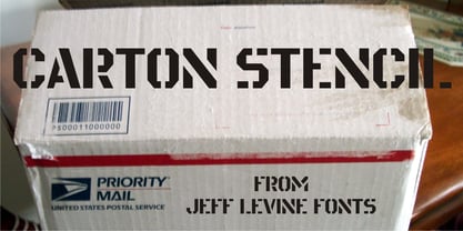
- Carton Stencil JNL by Jeff Levine,
$29.00 - FiftyTwoLetters - 100% free
- DingMaps - Personal use only
- Creation - Unknown license
- COnsume - Unknown license
- RNS SERIAL - 100% free
- KR Batty - Unknown license
- Gubbröra - Unknown license
- Reticulan - Unknown license
- InkyBear - Unknown license
- Konfekt - Unknown license
- Minisystem - Unknown license
- Mouth Breather BB - Personal use only
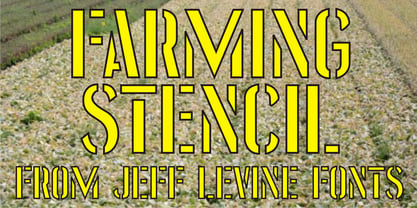
- Farming Stencil JNL by Jeff Levine,
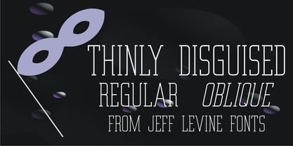
$29.00 - Thinly Disguised JNL by Jeff Levine,
$29.00 - Red Star Line NF by Nick's Fonts,
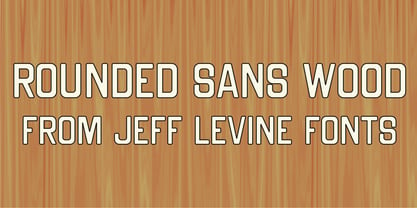
$10.00 - Rounded Sans Wood JNL by Jeff Levine,
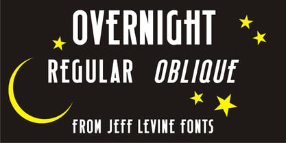
$29.00 - Overnight JNL by Jeff Levine,
$29.00 - eurofurence light - 100% free
- TheOneRing - Unknown license
- Catwalk - Unknown license
- 10 Cent Soviet - Personal use only
- DIY One - Unknown license
- Titanic - Unknown license
- HotButteredGiraffe - Unknown license
- Simbolos 1 - Unknown license
- verrutscht - Unknown license
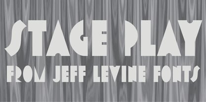
- Stage Play JNL by Jeff Levine,
$29.00 - Handprint by Turtle Arts,
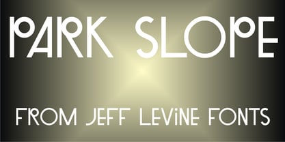
$20.00 - Park Slope JNL by Jeff Levine,
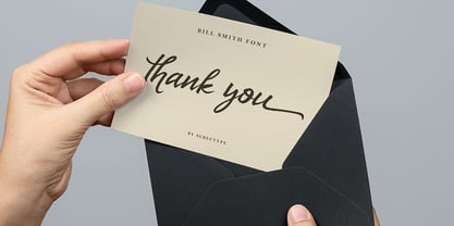
$29.00 - Donattio by Subectype,
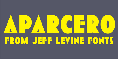
$12.00 - Aparcero JNL by Jeff Levine,
$29.00 - Freeform 721 by Bitstream,
$29.99 - Byzantine - Unknown license
- Blazing - Unknown license


