10,000 search results
(0.034 seconds)
- Aqua Casual by Scholtz Fonts,
$18.00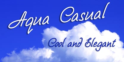 The script equivalent of the cool, header font. This font is essentially embedded, by its styling, in the 20th century. Inspired by fragments of some pre-20th century script fonts, I modernized it and added lower case characters. The result captures the cool elegance of the 1920s & 30s, yet also embodies the free optimism of the 60s. Aqua Casual is a fully professional font, carefully letterspaced and kerned. All upper and lower case characters, punctuation, numerals and accented characters are present.
 - EB Humboldt by Fenotype,
$9.95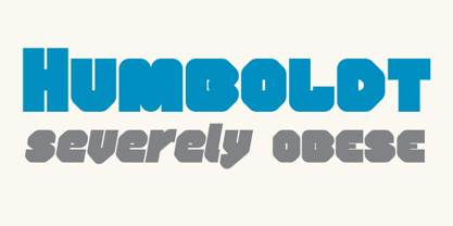 Humboldt is an ultra fat headline face. How bold can you go? Humboldt is an experiment to push the boundaries of character recognition: Its forms are extremely bloated yet highly distinctive. Open type savvy features provide an unexpected embellishment: small capitals, both lower case and upper case figures and several alternate glyphs are intrinsic in the design. Humboldt makes nice headlines and striking poster typography or logotypes. It can to some extent be used for setting even short phrases of text.
 - Deco Donut by Just My Type,
$20.00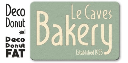 On the very northern edge of South Tucson lies an Old Pueblo institution, Le Caves Bakery, Home of the Vegetable Donut. That’s what they were called when Le Caves opened; now you’d say Vegan Donut, or No Animal Products Used. Radical concept in the Brave New World of 1935. I started with the letters from their sign and extrapolated the rest of the font from those. Deco Donut Fat is extrapolated from Deco Donut. If you want a donut, type a 0 (zero).
 - Byronic by Alan Meeks,
$30.00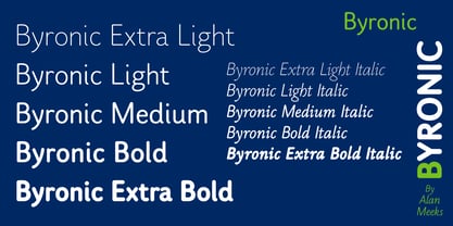 Byronic is soft modern sans-serif but with an antique style lower-case. The rounded end soft look gives Byronic a friendly soft look whilst still retaining a classical typographic appearance. A very clean style and slightly condensed it is excellent for text setting and headline with an unusual loser case that compliments the caps perfectly. Available in a range of 5 weights and 5 italics and a Latin Pro character set of 430 characters including ranging numerals and small caps.
 - Trinculo by Scriptorium,
$12.00Trinculo is a cursive font which combines traditional letter forms with ridiculously ornate embellishments and flourishes. It's rather like what an 18th century clerk might have done with his lettering if he was bored to distraction with writing the same old letters again and again. The upper case characters are more complex with simpler versions of the same characters in the lower case. Trinculo is a lot of fun, though if you use it too much it may become overwhelming. - Sprig by Scholtz Fonts,
$19.00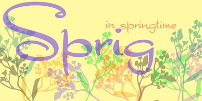 Sprig is a dynamic font that combines in-your-face chutzpah with contemporary brushstrokes. The character shapes are contained, yet give a feeling of casual, off the cuff ease. In some, subtle ways it pays its respects to the sign painters of the 30s and 40s The font comes in three styles: - Display, with extravagant upper case characters and some opentype features - Text, with more contained upper case characters (suitable for "all caps" use) and some opentype features - Professional, where OpenType features include alternative upper case characters (both the TEXT the DISPLAY caps), as well as a number of ligatures. (For use in applications that access OpenType features.) What this means is that Sprig Pro combines all the characters of Sprig Text and Sprig Display in one font and it also has additional ligatures. Sprig Pro contains over 283 characters, while all styles of Sprig contain a full upper and lower case character set, punctuation, numerals, symbols and accented characters for both all characters that they contain. It has all the accented characters used in the major European languages. The Sprig User Guide provides you with more information on how to use Sprig Pro.
 - Refresh by Scholtz Fonts,
$12.00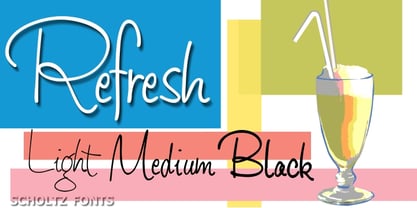 Refresh was inspired and partly based on handwritten text from advertisements for a popular cola-based soft drink from the 1950s. I designed the missing characters in the handwriting style of the original. The Refresh family comes in three styles: - Lite- possibly the most elegant of the three styles -- use at larger sizes for greater legibility; - Med -of intermediate weight - more legible than Lite; - Blak - for bolder statements and best readabilty. Refresh, with its three styles, is ideal for any display work needing a feminine, handwritten effect. Use it for product branding, book covers, invitations, greeting cards where you're looking for charm and movement. Refresh has not been designed to be used with capital letters placed next to one another: it is not advisable to use text in "ALL CAPS". The best effects for headings and subheads are obtained with an initial upper case letter followed by lower case characters. If you are using upper and lower case then it is not necessary to use kerning. Refresh contains over 250 characters - (upper and lower case characters, punctuation, numerals, symbols and accented characters are present). It has all the accented characters used in the major European languages.
 - Gritty Pencil by Hanoded,
$16.00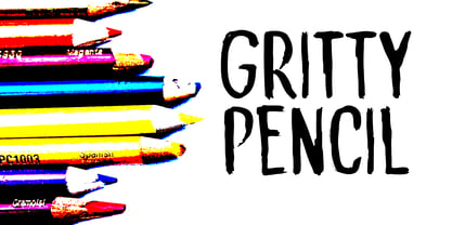 As the name implies, this font was made with a gritty pencil. Gritty Pencil comes with language support and a set of cool alternates for the lower case letters.
 - Hogwild by Aerotype,
$29.00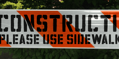 Spray stencil Hogwild uses the OpenType ligature feature to substitute a unique pair of distressed characters when any upper or lower case letter is keyed twice in a row.
 - P22 Stanyan by P22 Type Foundry,
$24.95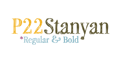 P22 Stanyan Autumn is a set of three fonts based upon a casual hand lettering text created for the deluxe 1969 edition of "...and autumn came" by Rod McKuen.
 - Classy Diner by Haiku Monkey,
$10.00Handwritten with care, and made bold and consistent with an art deco flair. If I owned a classy diner, this is how I'd like my chalkboard menus to look. - Dreamland by Monotype,
$29.00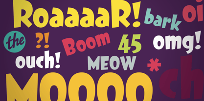 Dreamland is a bold, top-heavy style inspired by mid-20th century poster lettering. It has a lower case and is quite informal. Featured in: Best Fonts for Logos
 - PL Fiedler Gothic by Monotype,
$29.99PL Fiedler Gothic Bold is a display sans serif designed by Hal Fiedler. The distinguishing characters in the PL Fiedler Gothic Bold font are lower case q and t. - Cartelle Inline by Stereo Type Haus,
$30.00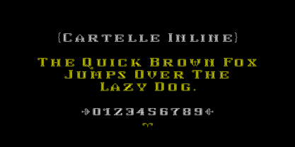 Cartelle is a sexy small caps bitmap design characterized by it's whimsical curls and ornate flourishes. It's inspiration came from a French poster design from the early 1900's.
 - Great Vibes - 100% free

- Iphegenia™ - Unknown license

- Worst Hunter by Senekaligrafika,
$12.00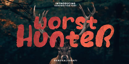 “Worst Hunter” has hard strokes and signature style that speak to instant unique sensation. Take your creative projects to the highest level with this font. “Worst Hunter” will help you to create special and touching typographical design for your characteristical and exclusively projects, for branding, food product, cafe product, restaurant product, labeling, clothing, movie title, album cover, logos and many more. It is really universal and modern font. The owner of endless possibilities!
 - Moranga by Latinotype,
$29.00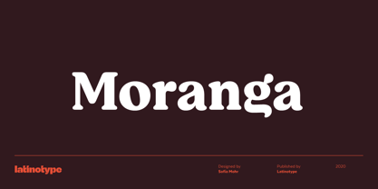 Moranga is a contemporary, serif, retro-style typeface with a strong personality. Its design is a mixture between Café Brasil's flowing, organic shapes and elements from 70's popular fonts such as Cooper and Souvenir. Moranga, in 5 weights and matching italics, is the perfect choice for headlines, display use and high-impact or friendly designs. Moranga contains a set of more than 400 characters and supports over 200 Latin-based languages.
 - Void Age by Senekaligrafika,
$12.00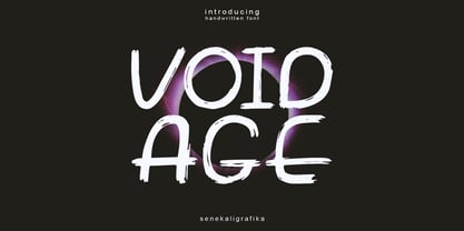 “VOID AGE” has hard strokes and signature style that speak to instant unique sensation. Take your creative projects to the highest level with this font. “VOID AGE” will help you to create special and touching typographical design for your characteristical and exclusively projects, for branding, food product, cafe product, restaurant product, labeling, clothing, movie title, album cover, logos and many more. It is really universal and modern font. The owner of endless possibilities!
 - Radio Stereo by Senekaligrafika,
$12.00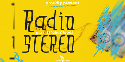 "Radio Stereo" is experimental vintage font style that to speak instant retro sensation, it was inspired by the inscription on the radio/televisiom in the 2000's era. "Radio Stereo" will help you to create special and touching typographical design for your nostalgic and oldschool projects.Perfect when you place them into magazines, book cover, cafe product, newspaper titles, poster, and many more. It is really universal and modern font. The owner of endless possibilities!
 - Variety by Studio K,
$45.00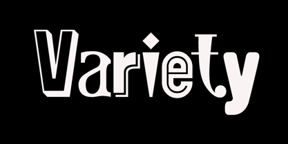 Now that there are more Studio K fonts than there are characters in the alphabet it occured to me that I should produce a sampler font that showcased them all: hence Variety. The 'What the font' experts amongst you should enjoy identifying individual characters, but to start you off, the featured fonts in the font title are, in order of appearance: Alma Mater Outline Shadow, Aspidistra, Signpost, Cafe de Paris, Showbiz, Barrowboy and Soft Rock.
 - Arnold Böcklin by URW Type Foundry,
$35.00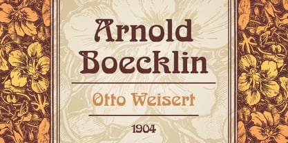 Arnold Boecklin is a true Art Nouveau font, evocative of outdoor cafes in the years prior to World War l. Arnold Boecklin seems to be telling a story, with its decorative curves and varying emphasis of strokes. The Arnold Boecklin font should be used for specific copy as in headlines or advertisements, bearing in mind its strong design. Arnold Boecklin is a trademark of Linotype GmbH and may be registered in certain jurisdictions.
 - Cortland JNL by Jeff Levine,
$29.00Cortland JNL was modeled [in part] from lettering spotted in the opening credits of Columbia Pictures 1945 Batman® serial. The classic clean lines of the Art Deco lettering used were perfect for translating into digital format. - Rabno by Baqoos,
$18.00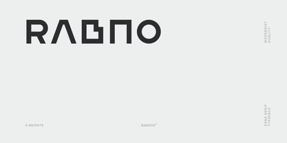 Rabo is a modernist duality linear sans apt for headline, editorial, branding, packaging, printed materials and typographic applications. 200+ glyphs with ligatures, fractions and alternatives(supported by Illustrator, Photoshop & InDesign) provided in opentype .otf and .woff format.
 - Roman Wells by Wooden Type Fonts,
$15.00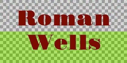 A revival of one of the popular wooden type fonts of the 19th century, suitable for display, heavy stems, very thin serifs, short descenders. Heavily revised, very much improved, extensive kerning. Now in otf and ttf formats.
 - False Widow by OhType!,
$18.00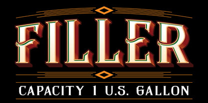 False Widow is a display typeface, designed for graphic pieces looking for a great visual impact. Aggressive but measured in its proportions is easily adaptable to different uses and formats such as posters, headers; print and digital.
 - AE Prosperity by Altered Ego,
$50.00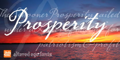 Well suited for headlines, packaging and display applications, AE Prosperity will be a robust and versatile addition to your script library. It’s purposefully designed to infer the visual connections of letters for a hand-lettered feel. Some characters will connect, and others will guide your eye to the next letter from, making it highly legible. In 1779, the schooner Prosperity sailed the high seas. Commissioned by a young continental congress, with 6 guns & at twenty tons, she sailed under a Letter of Marque for patriotism and profit. Look lively, because with contextual and alternate glyph sets (contextual glyphs, alternate lower case glyphs and an extended set of alternate capitals), this robust typeface is as inspiring as her namesake and adapts to whatever winds may blow. Prosperity is designed as a free-flowing script, for a spontaneous and historic aesthetic. Contextual glyphs include variations on tt (short and longbar), t longbar, ll, cc and other characters. Contextual features change ascender heights and descender styles. Alternate glyphs (set 1) include variations on b,d,f,g,h,l,o,p,r,s,t,y. Alternate capitals (set 2) include a complete set of alternate upper case letters. Most useful with Adobe® InDesign®, multiple variations of letter combinations can be achieved by selecting Contextual glyphs, and/or set 1 and set 2 from the Character Palette: OpenType: Stylistic Sets menu. Alternate glyphs and contextual characters will be available based on the OpenType support of your application. AE Prosperity™ is available exclusively in OpenType format.
 - Bill Corporate Medium by OGJ Type Design,
$35.00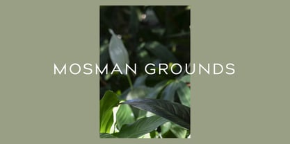 Bill Corporate is a geometric typeface with generous capitals. A modern classic, based on Max Bill’s lettering work, its straightforward and uncompromising construction can be both edgy and sublime. With minimalist letterforms, pointy apexes instead of flat ones, and archetypal proportions, this font family doesn’t follow any trends but strives to achieve a timeless formal vocabulary. The skeleton of its letters is based heavily on the famous primary shapes of the Bauhaus: square, circle, and triangle. This makes for quite wide uppercase and much narrower lowercase letters. The contrast between uppercase and lowercase benefits inexperienced users, who will be able to get appealing results quickly. At the same time, it’s a powerful tool for seasoned designers, who can employ either case selectively to set the desired typographic course. Bill Corporate Medium’s 16 styles (including a set of eight lighter-than-light fonts from “Two” to “ExtraLight”) are an excellent choice for editorial design, branding, headlines, and even short to mid-length copy in a wide range of applications and industries. The uppercase letters in particular—with their varied widths and lavish dimensions—are suitable for cosmopolitan and stylish logotypes and wordmarks. Whenever a timeless, staid, and classy look is demanded, choose Bill Corporate.
 - Pollen by TypeTogether,
$49.00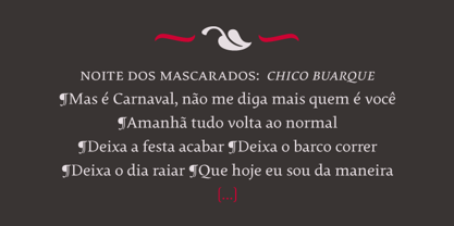 This typeface finds a perfect balance between technical excellence, careful design of letter forms for extended reading, and a measured dose of charm and personality. Its informal feel allows for successfully typesetting a wide range of applications, from magazines and fiction books to advertising and websites. Calligraphy, be it done with the broad-edge pen, brush, or other tools, has been fundamental in the development of Pollen. Its influence is clearly visible in the construction of the top serifs contrasting the curved bottom serifs and the fluid aspect of terminals and tails, such as on “g” and “r”. The shapes of the diagonal letters are based on a less formal calligraphic model, but still uses the broad edge pen. The letters were then subject to a further process of pencil drawing and digital re-interpretation, which gave them the final shape. The designs of “e” and “c” are derived from drawings made with only one continuous line, with the pencil always touching the paper. The letters “g” and “y” express the intention to bring informal elements to a typeface intended for long text reading, usually characteristic of casual writing. Pollen consists of 3 basic styles with an extended OpenType Pro character set and large language support, perfectly serving the most common typographic needs.
 - Peleguer by Tipo Pèpel,
$22.00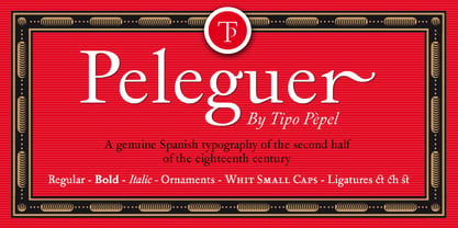 Peleguer typeface is the reinterpretation of the characters that the valencias goldsmiths Peleguer Manuel, father and son had opened and merged between 1779 and 1783 on behalf of the Royal Economic Society of Friends of the Land of Valencia “in order to create a Factory letters. Then during that time, reached 6 degrees of open letters (small pica, pica, gross pica, text, great primer and double pica). It appears that the letters never were done, and were themselves Manuel Peleguer who kept the punches and dies, leading to create a foundry-printing which only came out 5 or 6 books or documents for the single year of 1784 . One of these books, “Praise in the solemn funeral service …” made with the degree of “gross pica” samples were selected to take the characters for subsequent drawings on the following parameters for the unity and a contemporary look to the source: Keep the proportions of the original source (but unifying the shapes of the serifs, as these were different according to repose at baseline or in descending order). Match the counterforms and match the fallen traces from the cursive. En short, “catch” the formal essence of the source and following update current typographic design criteria to achieve a source with good legibility and subtle personality.
 - Ronduit Capitals Light - Personal use only

- Nitaka - Personal use only

- Adlanta - Unknown license

- Akademie Alte - 100% free

- Angel LemonaDemo - Personal use only

- Aukim ExtraBold - Personal use only

- Indulta SemiSerif - Personal use only

- LT Carpet Text - 100% free

- Media Gothic - Unknown license

- Ingleby Regular - Personal use only


