10,000 search results
(0.025 seconds)
- Courtland by Garisman Studio,
$22.00 One name originating from Canada greatly inspired the birth of this vintage font. With the opentype feature: standar ligature, stylistic alternate (specifically for lowercase), Stylistic Sets 01 through 06 with different styles in each letter. Courtland is perfect for use in logo types, vintage logos, posters, labels, packaging, headlines, t-shirts and other designs.
 - Pen And Ink by Rachel Kick,
$10.00 Pen & Ink is a quirky hand-drawn font. Inspired by notetaking and classroom doodles, this font has a friendly and approachable feel that perfectly compliments artwork and social media. Mix and match uppercase and lowercase letters throughout each word to get a truly hand-drawn feel. There are also 33 swash and icon extras.
 - Rosereta by Almarkha Type,
$33.00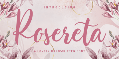 Rosereta - Lovely Script font with a natural handwritten feel. This handmade font will make your design has a beautiful natural touch for each details. It is perfect for any design project as Invitation,logo, book cover, craft or any design purposes. This font is PUA encoded which means you can access all of ligatures.
 - Lucky Night by Epiclinez,
$18.00 Lucky Night is a cute, quirky, and childish handwritten font. Whimsical and relaxed, this font will brighten up each of your designs. So what’s included: Basic Latin A-Z, a-z, numbers, symbols, and punctuations Multi-Languages support: from Afrikaans Albanian Catalan Danish to Dutch English Spanish Swedish Zulu. Accented Characters : ÀÁÂÃÄÅÆÇÈÉÊËÌÍÎÏÑÒÓÔÕÖØŒŠÙÚÛÜŸÝŽàáâãäåæçèéêëìíîïñòóôõöøœšùúûüýÿžß Thank you
 - Larsson by GRIN3 (Nowak),
$19.00 Larsson is a hand-drawn, all-caps, ultra-narrow font created by Bartek Nowak. It contains two variations for each letter and a lot of ligatures. Use for invitations, greeting cards, posters, advertising, weddings, books, menus etc. Language support includes Western, Central and Eastern European character sets, as well as Baltic and Turkish languages.
 - Inbrush by Alex Camacho Studio,
$15.00 Inbrush is a monospaced font whose letters and characters each occupy the same amount of horizontal and vertical space. All the characters, including diacritics, fits in the same space.This makes this font ideal for texts in both directions, horizontal and vertical. A fun and playful display font made by brush to make interesting compositions.
 - ITC Isbell by ITC,
$29.99ITC Isbell font is the work of Dick Isbell and Jerry Campbell of Detroit, Michigan, a highly stylized roman typeface which retains an exceptional legibility. The unusual arches and curves of several lowercase characters give the typeface its individuality. ITC Isbell font is ideal for advertising, brochures, menus, and a variety of other applications. - ALS Dulsinea by Art. Lebedev Studio,
$63.00 Decorative font based on XIX century Cyrillic handwriting. Dulsinea is a handwriting-based font, that is why most of the letters are tied to each other. Such handwriting is often seen in documents dated 2nd half of the XIX century. Its special features are rounded lengthy movements and unusual for present days sequence of strokes.
 - Party Trick by PizzaDude.dk,
$15.00 Party Trick is loosely based on the capital letters of a classic typewriter, but I have added a bit sugar and spice to the letters - making them more funky and loose. Another great thing is the contextual alternates, which gives you 6 different versions of each letter - and they automatically changes as you type!
 - Lost In South by Gassstype,
$27.00 Introducing Lost in South – Natural Brush Font is a Signature Style and classy style, this font is great for your creative projects such as watermark on photography, and perfect for logos & branding. Lost in South a natural handwritten feel. This handmade font will make your design has a beautiful natural touch for each details.
 - FunFair by Andrew Footit,
$14.00 This fun sans-hand typeface gives your designs and layouts a personal touch that leaves a smile. FUNFAIR has two weights each with italics. FunFair has tall letters and tight kerning to give a natural hand written style. It’s great for posters, cards and headings but also versatile enough for many kinds of typographic layouts.
 - Unytour by NicolassFonts,
$25.00 Unytour is a modern sans serif font family of 54 fonts. It includes nine weights with italics from Extra Light to Heavy. Each weight includes alternatives (A,G,I,R,a,l) and OpenType features. Unytour is easy to read and perfect for logotypes, advertising, packaging, book covers and magazines, headings, corporate identities, and more.
 - Celebration by RMU,
$35.00 A blackletter font of decorative style and of obscure origin which was rescued for all devotees of these old hot-metal letters. This font contains a bunch of useful ligatures, and by typing 'N', 'o' and period and activating the OT feature Ordinals you get an old-style number sign.
 - Lonestar Western by FontMesa,
$25.00Lonestar Western is a revival of the old classic slab serif font named Hellenic which was very popular in the middle to late 1800s. While watching an old western movie the opening credits caught my attention, it was the Hellenic font with spurs added which gave it a more western look. - AZ Text by Artist of Design,
$20.00 AZ Text font was inspired from a need for a generic worn san serif text of letters that looks old. This font utilizes an "old look" to the line work which is designed to have a "worn feel" to it. Ideal for use as the body or text in your design.
 - Midsole SC by Grype,
$16.00 Geometric/Technical style logotypes have been developed for car chrome labels since the early 1980’s, but automobile companies don't monopolize the style by any means. Shoe companies have a foothold in the geometric sans serif styles as well, and range from straightforward to full of techno styled play. Nonetheless, these logotypes all lack an expansive family which shows off all the logotypes are and what they "could" be and do. And that's where we come in. The Midsole SC Family finds its origin of inspiration in the CONVERSE shoe company logo, or an older version of their logo, and from there we expanded it into a 40 font family of weights, widths, and obliques. Midsole pays homage to the styling of the earlier logotype, including unicase variations to match the original look, while further evolving beyond the brand inspiration to yield a family that pulls on modern and historical styles. It adopts a sturdy yet approachable and recognizable style with its uniform stroke forms and curves, and goes on to include smallcaps, numerals, and a comprehensive range of weights, creating a straightforward, uncompromising collection of typefaces that lend a solid foundation and a broad range of expression for designers. Here’s what’s included with the Midsole SC Family bundle: 489 glyphs per style - including Capitals, SmallCaps, Numerals, Punctuation and an extensive character set that covers multilingual support of latin based languages. (see the 10th graphic for a preview of the characters included) Stylistic Alternates - alternate characters and unicase variants for a less standardized text look. 4 weights in the family: Light, Regular, Medium & Bold. 4 obliques in the family, one for each weight: Light, Regular, Medium & Bold. Here’s why the Midsole SC Family is for you: - You’re in need of stylish sans font family with a range of weights and obliques. - You’re love that older CONVERSE letter styling, and want to design anything within that genre. - You’re looking for an alternative to Eurostile & Handel Gothic. - You’re looking for a clean techno typeface for your rave poster designs. - You just like to collect quality fonts to add to your design arsenal.
 - From the Internet by Typodermic,
$11.95 Introducing From the Internet, a sleek and pragmatic sans-serif typeface that exudes technical sophistication. The narrow and square shapes of this typeface create a compact and organized appearance, perfect for modern industrial design. With softened edges, the boxy letterforms have a sense of approachability that is sure to draw in any reader. From the Internet’s austere and uncomplicated style ensures that your message is delivered with clarity and precision. Its lack of intricate detail prevents any distractions, keeping the focus on the essential message. This typeface avoids clichés, ensuring that your designs are always fresh and unique, without any conspicuous sci-fi influences. This font’s versatility is enhanced by the “stylistic alternatives” feature available in OpenType-savvy applications, allowing for access to alternate versions of the “f” and “t” letters. From the Internet offers a range of styles, including Regular, Italic, Bold, and Bold Italic, each with its unique personality. Whether you’re looking to create sleek tech manuals or modern business presentations, From the Internet is the perfect typeface to convey your message with sophistication and style. Its pragmatic and precise style ensures that your designs will always be on-trend and highly readable, making it an excellent choice for any designer looking to create an impact. Most Latin-based European writing systems are supported, including the following languages. Afaan Oromo, Afar, Afrikaans, Albanian, Alsatian, Aromanian, Aymara, Bashkir (Latin), Basque, Belarusian (Latin), Bemba, Bikol, Bosnian, Breton, Cape Verdean, Creole, Catalan, Cebuano, Chamorro, Chavacano, Chichewa, Crimean Tatar (Latin), Croatian, Czech, Danish, Dawan, Dholuo, Dutch, English, Estonian, Faroese, Fijian, Filipino, Finnish, French, Frisian, Friulian, Gagauz (Latin), Galician, Ganda, Genoese, German, Greenlandic, Guadeloupean Creole, Haitian Creole, Hawaiian, Hiligaynon, Hungarian, Icelandic, Ilocano, Indonesian, Irish, Italian, Jamaican, Kaqchikel, Karakalpak (Latin), Kashubian, Kikongo, Kinyarwanda, Kirundi, Kurdish (Latin), Latvian, Lithuanian, Lombard, Low Saxon, Luxembourgish, Maasai, Makhuwa, Malay, Maltese, Māori, Moldovan, Montenegrin, Ndebele, Neapolitan, Norwegian, Novial, Occitan, Ossetian (Latin), Papiamento, Piedmontese, Polish, Portuguese, Quechua, Rarotongan, Romanian, Romansh, Sami, Sango, Saramaccan, Sardinian, Scottish Gaelic, Serbian (Latin), Shona, Sicilian, Silesian, Slovak, Slovenian, Somali, Sorbian, Sotho, Spanish, Swahili, Swazi, Swedish, Tagalog, Tahitian, Tetum, Tongan, Tshiluba, Tsonga, Tswana, Tumbuka, Turkish, Turkmen (Latin), Tuvaluan, Uzbek (Latin), Venetian, Vepsian, Võro, Walloon, Waray-Waray, Wayuu, Welsh, Wolof, Xhosa, Yapese, Zapotec Zulu and Zuni.
 - Midsole by Grype,
$16.00 Geometric/Technical style logotypes have been developed for car chrome labels since the early 1980’s, but automobile companies don't monopolize the style by any means. Shoe companies have a foothold in the geometric sans serif styles as well, and range from straightforward to full of techno styled play. Nonetheless, these logotypes all lack an expansive family which shows off all the logotypes are and what they "could" be and do. And that's where we come in. The Midsole Family finds its origin of inspiration in the CONVERSE shoe company logo, or an older version fo their logo, and from there expanded it into a 40 font family of weights, widths, and obliques. Midsole pays homage to the styling of the earlier logotype, including unicase variations to match the original look, while further evolving beyond the brand inspiration to yield a family that pulls on modern and historical styles. It adopts a sturdy yet approachable and recognizable style with its uniform stroke forms and curves, and goes on to include a lowercase, numerals, and a comprehensive range of weights, creating a straightforward, uncompromising collection of typefaces that lend a solid foundation and a broad range of expression for designers. Here’s what’s included with the Midsole Family bundle: 489 glyphs per style - including Capitals, Lowercase, Numerals, Punctuation and an extensive character set that covers multilingual support of latin based languages. (see the 10th graphic for a preview of the characters included) Stylistic Alternates - alternate characters and unicase variants for a less standardized text look. 4 weights in the family: Light, Regular, Medium & Bold. 4 obliques in the family, one for each weight: Light, Regular, Medium & Bold. Here’s why the Midsole Family is for you: - You’re in need of stylish sans font family with a range of weights and obliques. - You’re love that older CONVERSE letter styling, and want to design anything within that genre. - You’re looking for an alternative to Eurostile & Handel Gothic. - You’re looking for a clean techno typeface for your rave poster designs. - You just like to collect quality fonts to add to your design arsenal.
 - Corrente by d[esign],
$17.38 Corrente, named aptly for its “electric” letter shading (“corrente” is Italian for “current” (electrical)) will add a little spark to your works. Corrente’s “Dagger” glyphs are lightning bolts!
 - Edgar No 9 by Type Innovations,
$39.00 Edgar No. 9 is an original design by Alex Kaczun. Edgar No. 9 is a derivative work based on his Big Boy typeface series. It was designed specifically for display headlines, logotype, branding and similar applications. Primarily a display, this extremely versatile font has generous proportions, large counters and loose fitting which also allow the font to work well across a wide range of text sizes. Edgar No. 9 is a heavy baroque slab serif and although it shares the underling skeleton of 'Big Boy', it is a much more compact in overall proportions and spacing. A handsome bold headline font that works well in text as well as display sizes—ideally suited for publications and advertising. Alex plans to expand the font series to include a large range of weights along with corresponding italics numbering 1 thru 9, as well as, true small capitals and old style figures. Distressed version(s) will also be available in upcoming releases. Stay tuned, more to come soon. The large Pro font character set supports most Central European and many Eastern European languages.variations to expand this 'hip' new font series. Groovin' baby.
 - Aviano Copper Variable by insigne,
$199.99 The retro-inspired design of Aviano Copper Variable echos the bold style of America’s Gilded Age. Inspired by the copper-inscribed intaglio printing designs of the early 20th century, the powerful, wide character shape of this font walks softly across your page while carrying a big stick. To create the right balance, small wedge serifs were added onto Aviano Sans, giving you a sophisticated style that looks and acts like it belongs nowhere short of Boardwalk. Developed to a new level of excellence, this design offers a wide range of weights from thin to black. There's full multilingual support of all Latin-based languages and five stylistic sets, swash designs, and 1000 glyphs per weight, including some unique ligatures. Number options include old style figures, tabular figures, and superscripts. Unique median spur alternates, swashes, and ligatures will help you customize every single design. The feel of last century’s personal and business correspondence is waiting for you in this member of the Aviano family. While ideal for headings, displays, logos, and short texts, Aviano Copper’s use for everything from letterhead to wine labels may just give you the monopoly you’re looking for.
 - Nsai by AukimVisuel,
$15.00 Nsai is a modern sans serif font family with a geometric twist, created in 2021 by a Congolese type designer, Audry Kitoko Makelele. It is available in two versions (normal and extended) making a total of 36 fonts. There are 9 weights with their true italics. Over 600 glyphs per font provide a wide range of language support, from Latin to Cyrillic, as well as powerful Opentype features such as professional kerning, stylistic variations, very special ligatures, old-fashioned tabular figures, Fractions, denominators, exponents, unlimited indices, arrows and more to satisfy the most demanding professionals. On the one hand, it features rounded curves with very open terminals that make this font family elegant, user-friendly and contemporary and on the other hand very useful for writing titles on any medium. Perfectly suited for graphic design and any display use. It could easily work for web, signage, corporate as well as editorial design. It’s a wonderful, bold and elegant font. This font is guaranteed to make your design stand out from the crowd and leave a lasting impression, as it has the potential to enhance any creation.
 - Troback regular by Alit Design,
$20.00 Introducing Troback - A Vintage Display Font Step into a realm of timeless elegance with Troback, a meticulously crafted vintage display font that pays homage to the design aesthetics of the past. With its distinctive retro charm, Troback encapsulates the spirit of a bygone era, where every letter tells a story. Inspired by the ornate typography of vintage signage, Troback is a masterful blend of boldness and sophistication. Its characters are imbued with intricate details, from the delicate serifs that harken back to a more refined age, to the captivating curves that dance along the baseline with a sense of purpose. This font conjures nostalgia with every stroke, summoning memories of old cigar box labels, antique shop signage, and classic posters that once adorned bustling city streets. Troback isn't just a font; it's a journey through history, a bridge between the craftsmanship of yesterday and the creativity of today. Ideal for branding that craves a touch of vintage authenticity, for designs seeking to recapture the allure of a vintage era, Troback stands as a testament to the enduring power of timeless typography. Let your words resonate with the elegance of a bygone time - let them speak through Troback.
 - Mack Dutch by LetterStock,
$25.00 MackDutch MackDucth font pair was inspired by old magazine that i saw at barbershop. It was crafted by hand specially to add natural handmade feeling in its brand identity than i make it clean with pentool. We add some rough to make it retro feel, this font is bold so it can look strong if you use it for branding or even title for your retro poster design. Opentype features MackDucth font is a great retro rough font that will looks good in logotype, labels, t-shirt prints, product packaging, invitations, advertising and others. If you looking for retro rough font style, this font is a great choice for you to make your design awesome and flawless. This fonts works with folowing languages: Afrikaans, Albanian, Asu, Basque, Bemba, Bena, Chiga, Cornish, Danish, English, Estonian, Filipino, Finnish, French, Friulian, Galician, German, Gusii, Indonesian, Irish, Italian, Kabuverdianu, Kalenjin, Kinyarwanda, Low German, Luo, Luxembourgish, Luyia, Machame, Makhuwa-Meetto, Makonde, Malagasy, Malay, Manx, Morisyen, North Ndebele, Norwegian Bokmål, Norwegian Nynorsk, Nyankole, Oromo, Portuguese, Romansh, Rombo, Rundi, Rwa, Samburu, Sango, Sangu, Scottish Gaelic, Sena, Shambala, Shona, Soga, Somali, Spanish, Swahili, Swedish, Swiss German, Taita, Teso, Vunjo, Zulu Thank you for using this font. LS
 - Milk Drops by Duck Soup Design,
$12.00 Milk Drops is a semi-casual-feeling cross between a didone and slab serif display font. Elegant, flourishy, whimsical and bold, as much as one font can be any or all of those things! It has highly contrasting weights, but not so much to take itself too seriously or risk legibility. Playfully, it entertains the teardrop motif wherever it can – in expected areas like the descender of a "y" and the ascender of an "f", but also in some whimsical flourishes. Many of the uses of the teardrop motif are implemented on the terminals and ears where many old prints may have suffered from bleed of ink – answering a "what if" question like "what if those accidental bleeds were designed on purpose?" or "what if a font were designed as though it was already seen through blurry eyes?" Milk Drops also features stencil-like open counters and lots of ligatures (32). Note also, it has some super-nerdy additions like symbols for Bitcoin, Pilcrow, Interrobang and Irony Mark. Language Support Milk Drops is highly versatile – with an impressive count of 470 glyphs, it can accommodate up to 78 latin-based languages.
 - Aviano Copper by insigne,
$29.99 The retro-inspired design of Aviano Copper echos the bold style of America’s Gilded Age. Inspired by the copper-inscribed intaglio printing designs of the early 20th century, the powerful, wide character shape of this font walks softly across your page while carrying a big stick. To create the right balance, small wedge serifs were added onto Aviano Sans, giving you a sophisticated style that looks and acts like it belongs nowhere short of Boardwalk. Developed to a new level of excellence, this design offers a wide range of weights from thin to black. There's full multilingual support of all Latin-based languages and five stylistic sets, swash designs, and 1000 glyphs per weight, including some unique ligatures. Number options include old style figures, tabular figures, and superscripts. Unique median spur alternates, swashes, and ligatures will help you customize every single design. The feel of last century’s personal and business correspondence is waiting for you in this member of the Aviano family. While ideal for headings, displays, logos, and short texts, Aviano Copper’s use for everything from letterhead to wine labels may just give you the monopoly you’re looking for.
 - Zarlino by Patricia Lillie,
$29.00 Zarlino is an original typeface in the Blackletter style. It does not solidly adhere to any of the historical Blackletter classifications, but draws from all of them, with some characters owing more to the Roman than the Fraktur. Zarlino Delux includes three complete sets of upper case, ranging from the simple to the embellished to the even more embellished, two complete sets of lower case, and two more sets of embellished alternates for selected lower case characters. These alternates are available through Stylisitic Sets in OpenType aware applications. For use in non-OpenType aware applications, Zarlino Delux comes with a set of separate, standard fonts, one for each style. These standard fonts are also available for individual purchase. Zarlino was named by my cousin, a musician. Gioseffo Zarlino was a sixteenth century composer and musical theorist. Among other things, he offered detailed advice on the setting of words to music. With its blends of the old and the new, the simple and the ornate, Zarlino is suitable for many uses, from the elegant to the aggressive.
 - Bordonaro Script by Estudio Calderon,
$35.00 Bordonaro Script - Bordonaro Spur’s partner - is an interpretation of the “English Roundhand” style with a strong influence by the logos of American basketball and baseball teams. It is designed from simple shapes ideal to be used in long titles and fits perfectly into the branding design. Psss...Check out the NEW Bordonaro Script with Rounded corners , same version but soft! Bordonaro has a complete set of special and original characters: Stylistic Ligatures, Discretionary Ligatures, Swashes, Contextual Alternates, Titling, ss01,ss02, ss03 & apostrophes' ligatures that work as complements to enrich the text composition. Bordonaro Script and Bordonaro Spur are two typographic styles that were designed under the same characteristic features with the idea of combining them to obtain better results, for that reason, we recommend merging them in a creative way and you will realize everything you can design with them. The banners designs are based on old brands of beer labels, coffee packaging, sports logos and in some cases we use Copperplate Gothic but only as a complementary font in order to harmonize the layout of the elements in each banner.
 - Zin Slab by CarnokyType,
$46.00 Zin Slab is a contemporary slab-serif typeface designed for various situations of typographic usage. Characteristic feature is a large x-height and balans between neutral construction of letters (strictly vertical axis) and dynamic open forms (opened terminals). Another typical feature is a visually narrower connection between stems and strokes. The complete font family consist of three width proportions (Normal, Condensed and Extended). Every sub-family has 5 weights, ranging from Light to Black with matching Italics. Each font includes small capitals, old-style and tabular figures, standard and discretionary ligatures, alternate glyphs and a many of typographic options applied by the Opentype features. Zin Slab can be effectively used for both text and display typesetting. It can be used especialy in magazine layouts and editorial design, as well in advertising typography, orientation systems, corporate identities and many other situations. Zin Slab is a member of the Zin super family, which also includes Zin Sans, Zin Serif and Zin Display fonts. You can try Demo styles in Medium weight fully for free.
 - Zin Sans by CarnokyType,
$46.00 Zin Sans is a contemporary sans-serif typeface designed for various situations of typographic usage. Characteristic feature is a large x-height and balance between neutral construction of letters (strictly vertical axis) and dynamic open forms (opened terminals). Another typical feature is a visually narrower connection between stems and strokes. The complete font family consist of three width proportions (Normal, Condensed and Extended). Every sub-family has 5 weights, ranging from Light to Black with matching Italics. Each font includes small capitals, old-style and tabular figures, standard and discretionary ligatures, alternate glyphs and a many of typographic options applied by the Opentype features. Zin Sans can be effectively used for both text and display typesetting. It can be used especially in magazine layouts and editorial design, as well in advertising typography, orientation systems, corporate identities and many other situations. Zin Sans is a member of the Zin type system, which also includes Zin Slab, Zin Serif and Zin Display fonts. You can try Demo styles in Medium weight fully for free.
 - Precious Sans Two by G-Type,
$60.00 Precious Sans Two is a complete reworking of the 2002 design which was only ever available in PostScript format. Over a decade later G-Type’s Nick Cooke decided to re-appraise the typeface, scrutinise the old letterforms and overhaul the family. Make no mistake though, Precious Sans Two is no rudimentary re-release; nearly every character has been redrawn, re-proportioned, respaced and improved. Precious Sans Two is now in cross-platform compatible OpenType format with extended Latin language support for Western & Central Europe, the Baltics & Turkey. The original quirkier glyphs (f, g, I) have been retained as an OT style set feature and the typeface now contains small caps and an extensive set of discretionary ligatures as well as both proportional & tabular figures. The character set is further enhanced with the addition of 20 directional single and double arrows in each of the six weights which range from Thin through to Black, all with accompanying italics. Precious Sans Two is a distinctively modern typeface, well equipped for advanced typographic use in print, web and digital publishing environments.
 - Soda Fountain JNL by Jeff Levine,
$29.00 In most cities during the 1950s and 1960s the corner pharmacy or soda shop was a mainstay of teenage life. It was a place to hang out with friends, hear the latest hits on the jukebox and indulge in everything sugary from malted milkshakes to banana splits. During this time, a popular form of window advertising was supplied by the Coca-Cola Company to promote its product being served by these locations. Specialty window decals designed to emulate drawn (raised) Venetian blinds "bookmarked" by the soda's logo were adhered to the shop's windows, with a space provided to add in customized lettering. The store's name or its specialties were applied to each window pane, and this formed a consistent border at the top of all of the shop's windows. Although few visual images exist of this specific bit of advertising nostalgia, an old record album by a late-1950s singer named Chip Fisher called "Chipper at the Sugar Bowl" provided a somewhat usable sample for what is now Soda Fountain JNL.
 - Ansage by Sudtipos,
$49.00 Ansage does not claim to be neutral; it escapes from the rationalist sans of closed strokes and regular forms. Meaning Announcement in German, Ansage is versatile and communicates effectively across a broad range of media and formats such as branding, posters, websites, apps, titles and compositions with little spacing). Ansage is a sans serif font with a strong personality that emerges from an interest in and the study of a wide variety of typographic specimens of Gothic fonts from the nineteenth century. The design process behind Ansage brought about constant transformations in form; the result is a compact and robust font, with a large x-height, small ascenders and descenders, and open terminals that grow in expressiveness as it increases in weight. It is available in 10 weights, ranging from Hairline to Black, and 3 widths – Condensed, Regular and Expanded – plus italics, which make a total of 60 perfect variables to combine and contrast with each other. In addition, it also includes multiple open-type functions such as alternative styles, Old Style Figures, Tabular Forms, fractions, case sensitive, ligatures and more.
 - Vialog by Linotype,
$50.99Vialog is a large and versatile sans serif family consisting of four weights of roman with corresponding italics, each with small caps and Old style Figures. Designers Werner Schneider and Helmut Ness based the concept for Vialog on the forms in "Euro Type," an unpublished type designed by Schneider in 1988 for the German Federal Transportation Ministry. For Vialog, Schneider made comprehensive legibility studies of the existing European transportation fonts, and combined and adapted the best features to make a new information system font family. He fine-tuned Vialog's characters and spacing with a special regard to the legibility problems of transportation settings, such as viewing type at distances and while moving. For example: cap I, J and lowercase i, j are common legibility problems in sans serif fonts, so in Vialog, these characters have serifs. In addition to its usefulness to the transportation industry, the Vialog family confidently meets the needs of corporate design and branding systems with its space-saving attributes for text settings, as well as the large number of weights and styles. - Mairy by Typesketchbook,
$39.00 Mairy font family is a modern sans serif font family. Featuring 9 separate weights each followed by own true italics Mairy is positioned somewhere between rounded sans with humanist touch. In fact the humanist presence in Mairy is a little bit more than the usual doze adding more calligraphic elements mostly noticeable in italic weights but also very important in regulars. This symbiosis of Grotesk geometry with handwriting is well balanced regarding contrast and legibility so that at the end we have a highly usable font family. Light weights are very tender and elegant while the old and blacks are soft, friendly and full of vitality. The mid weights are just perfect with their medium contrast and excellent legibility. Mairy is very fresh font family and is surprisingly flexible when it comes to screen or print use – it is optimized for both even if the conditions are poor. Use it with OpenType compatible software and explore its true potential by accessing additional set of ligatures, alternates and multilingual support.
 - Diad by Andinistas,
$29.95 Diad was born on 2000 in order to design posters about second World War. The original idea was obtained by breaking, burning and getting wet a bunch of written copies with an old writing machine. Today, Diad is a small typographic system useful for bringing relevance to any content with a grunge look. Each and every detail passed through a strict experimentation process. Its outrageous and unconventional spirit travels from high leveled corrosion, up to a delicate visual neglect. Diad 2 and 3 work for designing words. Diad 1 is ideal for long phrases and titles. Diad dingbats includes 26 illustrations about motocross. In total, adding Diad 1,2 and 3, it has around 260 glyphs. Diad will make your design shine providing different graphic atmospheres, optimizing time and work to its users. Diad is perfect for graphic design on contexts such as death metal, drum and bass, films, war and horror video games. It could work also for logos, words, titles and short texts in covers, tags, clothes, wraps, cards, stickers, toys, bicycles, surf boards, etc.
 - Technical Rounded VP by VP Type,
$24.00 The initial inspiration for the typeface came from examining precisely machined labels on tools of various kinds, from cameras to cars, which need to be perfectly legible at all sizes. Such processes create a distinctly streamlined, clean look that feels both robust and stylish - universal and unique. Technical Rounded VP includes ten diverse styles, offering great versatility. All styles in this family include an extensive Latin character set, the Greek alphabet, multiple sets of numerals, a large set of punctuation marks, and other symbols. With 1120 glyphs in each style, it guarantees full support for all Latin languages. To make the family even more powerful, twenty OpenType features are included, such as multiple vertical positions, diagonal fractional forms, optional slashed zeros, separate old-style and lining figures, small capitals, and contextual alternates. If you are looking for similar typefaces, note that Technical Rounded VP is the soft counterpart of Technical Standard VP. A stenciled version is also available. They can be used either on their own or together seamlessly.
 - Bolgica by Soerat Company,
$25.00 Bolgica is a Neo-grotesque slab serif inspired by the slab serifs of the 1800’s century. By combining modern elements in several letter characters, the Bolgica family is very suitable for various design needs such as advertising, packaging, logos, editorial and publishing, branding and other creative industries. The family has 9 weights, as well as the matching true italics forms, provides typographical support with features such as ligatures, alternate characters, case-sensitive forms, fractions, and super and subscript characters. It comes with a complete range of figure set options – old style and lining figures, each in tabular and proportional widths. With over 752 glyphs per style, Elioth supports around 150+ languages in Latin and Cyrillic script. Family overview: 9 weights (from Thin to Heavy) + italics Extended Latin Cyrillic 726 glyphs Variable Font 150+ languages OpenType Features: Localized Forms Subscript and scientific inferiors Superscript (Superiors) Numerators and Denominators Fractions Lining Figures Tabular Figures Oldstyle Figures Circled Number Case-Sensitive Forms Standard and Discretionary Ligatures Stylistic Alternates Contextual Alternates
 - FS Clerkenwell by Fontsmith,
$80.00 A creative context 2003. Fontsmith was sharing a small, cold, whitewashed studio space in Northburgh Street, Clerkenwell. But things were on the up following prestigious custom type commissions for The Post Office and E4. “Slab serifs were on the brink of another revival, we could feel it,” says Jason Smith. “All we wanted to do was have a play with these slabs, go as far as we could within what was acceptable and readable.” “It wasn’t initially clear what was happening,” recalls Phil Garnham. “We were becoming very influenced by our surroundings, outside the studio space. We absorbed the essence and the designer grime of where we were.” Process Jason began by drawing stems on-screen. “The key aspect of the font is the upward bend of the leading shoulder serif, the way it kind of ramps up and then plummets back down the stem. “The regular and light characters are quite narrow – great for text but the bold is quite wide and chunky – better for headlines. I think ‘y’ is quite different for a slab design. We call it the Fontsmith ‘y’.” Promotion Fontsmith were determined to get FS Clerkenwell noticed. To launch the font, Ian Whalley, a designer friend of Fontsmith, captured words heard on the streets of Clerkenwell, set them in the new font and crafted a small book of typographic conversations. It was a first for Fontsmith. “I think that’s part of why this font has been so successful,” says Phil. “It really does embody the spirit of the area, as a special place for design, arts and crafts. And designers love that.” Contemporary twist FS Clerkenwell, based on influences in and around this part of London with a rich tradition of printing and design, mixes tradition with creation. Old-fashioned values meet new-school trends. Its quirky, contemporary character lends an edge to headlines, logotypes and any large-size text.
 - LHF Ambrosia by Letterhead Fonts,
$39.00 An old turn-of-the-century style commonly used on billheads, letterheads, certificates, etc.