2,790 search results
(0.037 seconds)
- Vertical by Alias,
$60.00 Alias Vertical is a sans serif typeface with a vertical cut-off point for letter endings. The vertical cut-offs bend round characters (b, c, o, etc) into a squarish, high-shouldered shape, suggesting Roger Excoffon’s Antique Olive. In mid-weights, the typeface mixes Antique Olive with typefaces such as Gill or Johnston, for example the shape of the t, the l borrowing Johnston’s flick. Vertical has the same minimal difference in weight between verticals and horizontals as Gill and Johnston, and the same sharp connection point where curves meet straight lines. Like Antique Olive, Vertical has a narrow connection point here, adding contrast and definition. The overall effect feels austere at lighter weights and strident and graphic at bolder weights, and sharp and incised throughout. In the Bold and Black weights, the squarish and top heavy shape of Antique Olive is most noticeable. For example the wide uppercase, with the B having almost-even width between top and bottom curves, and the almost-overhang of the top curve of the G. But Vertical does not have as extreme an aesthetic or square shape as Antique Olive. As well as its wide design, the upper case is given extra authority by being a slightly heavier weight than the lower case. This is a device borrowed from Gill, and other ‘old’ typefaces, where the upper case is presented as a titling design. Modern sensibilities are more focussed on an even colour between upper and lower case. Vertical was originally intended as a sister typeface to Ano, like AnoAngular or AnoStencil. Vertical developed into a similar but separate design. Ano was designed for use in Another Man — in its modular, circle-base design, and the way there aren’t the amendments usually made in bolder weights to ensure letter clarity. This is for layouts where different weights are used together in different sizes so that the overall letter weight is the same, a feature of the magazine. Where Ano is simple and graphic, Vertical has nuance and texture. It is a pragmatic, utility design. In the balance between graphic and typographic, its focus is the latter.
 - Aachen by ITC,
$39.00 Note: Neue Aachen is an updated and expanded version of Aachen featuring 18 fonts! The Aachen™ typeface design is a thick slab serif created by Alan Meeks at Letraset, type directed by Colin Brignall. Aachen only comes in two weights: medium and bold. This strong typeface features sharp outlines, stubby serifs and heavy strokes for use in headlines, posters, signage, apparel and other display uses (24 point size and above).
 - Vortices by Jorsetype,
$12.00 Vortices is a font that made the hand by having the character up and down like a dancer. Vortices has a very unique style of calligraphy, it is very suitable for use in the work of modern design. combines from copperplate to contemporary typeface with a dancing baseline, modern and elegant touch. Vortices features 531 glyphs and alternate characters Include . including initial and terminal letters, alternates, ligatures and multiple language support. Programs that support in this font is a Adobe Photo Shop, Adobe Illustrator, Adobe Indesign, Corel Draw and Microsoft Office. Languages supported: Breton, Catalan, Czech, Danish, Estonian,French, German, Hungarian, Icelandic, Italian, Romanian, Scottish Gaelic, Slovak, Latvian, Lithuanian, Norwegian, English, Finnish, Polish, Portuguese, Slovenian, Spanish, Swedish, Turkish, Welsh. Basically, all european languages that are based on latin alphabet Can be used for various purposes.such as headings, logos, wedding invitation, t-shirt, letterhead, signage, lable, news, posters, badges etc. To enable the OpenType Stylistic alternates, you need a program that supports OpenType features such as Adobe Illustrator CS, Adobe Indesign & CorelDraw X6-X7
 - Hertical by Edignwn Type,
$12.00 Hi everyone, how are you today? We hope you are good. And don’t forget to stay safe. Today we release a crafted display font again, it's called Hertical. Hope you are enjoy the design of font. Hertical come with two typefaces, serif and sans serif. Every typeface contains four styles (regular, smooth, rough and texture). This matches applies in some designs such as the logotype, poster, label, badge, packaging, branding, quotes and more custom design. Hertical includes : 2 typefaces (serif and sans serif) 4 style typefaces (regular, smooth, rough and texture) All-caps, numeral, symbol and punctuation 2 sets alternates on serif font Multilingual PUA Encoded Thank you for your support and choosing us.
 - Vertical Tuning - Unknown license

- Huxley Vertical by Bitstream,
$29.99 The PARATYPE library is our latest major addition, consisting of more than 370 typefaces. In the spirit of the perestroika changes and following the collapse of the Soviet Union, a group of Russian type designers quit the state-owned Polygraphmash foundry to establish ParaType, the first, and now largest Russian digital type foundry. The ParaType team under the supervision of Vladimir Yefimov creates new typefaces and explores the Russian typographic heritage by making digital versions of existing Russian designs: these include the hits of Soviet typography such as Literaturnaya and Journal Sans. Most ParaType fonts are available in Western/Roman, Central European, Turkish and Cyrillic encodings. The Russian constructivist and avant garde movements of the early 20th century inspired many ParaType typefaces, including Rodchenko, Quadrat Grotesk, Ariergard, Unovis, Tauern, Dublon and Stroganov. The ParaType library also includes many excellent book and newspaper typefaces such as Octava, Lazurski, Bannikova, Neva or Petersburg. On the other hand, if you need a pretty face to knock your clients dead, meet the ParaType girls: Tatiana, Betina, Hortensia, Irina, Liana, Nataliscript, Nina, Olga and Vesna (also check Zhikharev who is not a girl but still very pretty). ParaType excels in adding Cyrillic characters to existing Latin typefaces — if your company is ever going to do business with Eastern Europe, we recommend you make them part of your corporate identity! ParaType created CE and Cyrillic versions of popular typefaces licensed from other foundries, including Bell Gothic, Caslon, English 157, Futura, Original Garamond, Gothic 725, Humanist 531, Kis, Raleigh, or Zapf Elliptical 711.
 - Huxley Vertical by Image Club,
$29.99A delicate narrow sans serif face with an apparent even weight, it is characterized by low cross strokes extended to the left. - Huxley Vertical by Tilde,
$39.75 - Vertical Sans by S6 Foundry,
$12.00 Vertical Sans is an extremely condensed sans set in 3 weights offering a balanced, stylish font perfect for branding and communications projects.
 - Huxley Vertical by URW Type Foundry,
$35.99 - Aachen SB by Scangraphic Digital Type Collection,
$26.00 Since the release of these fonts most typefaces in the Scangraphic Type Collection appear in two versions. One is designed specifically for headline typesetting (SH: Scangraphic Headline Types) and one specifically for text typesetting (SB Scangraphic Bodytypes). The most obvious differentiation can be found in the spacing. That of the Bodytypes is adjusted for readability. That of the Headline Types is decidedly more narrow in order to do justice to the requirements of headline typesetting. The kerning tables, as well, have been individualized for each of these type varieties. In addition to the adjustment of spacing, there are also adjustments in the design. For the Bodytypes, fine spaces were created which prevented the smear effect on acute angles in small typesizes. For a number of Bodytypes, hairlines and serifs were thickened or the whole typeface was adjusted to meet the optical requirements for setting type in small sizes. For the German lower-case diacritical marks, all Headline Types complements contain alternative integrated accents which allow the compact setting of lower-case headlines.
 - Neue Aachen by ITC,
$40.99 Impressed by the quality of the Aachen typeface that was originally designed for Letraset in 1969 and extended to include Aachen Medium in 1977, Jim Wasco of Monotype Imaging has extended this robust display design to create an entire family. Derived from the serif-accented Egyptienne fonts dating to the early 20th century, Aachen has serifs that are very solid but considerably shorter than those of its precursor. The incorporated geometrical elements, such as right angles and straight lines, provide the slender letters of Aachen with a slightly technological, stencil-like quality. Despite this, the effect of Aachen is by no means static; its dynamism means that this typeface, originally designed for use in headlines, has come to be used with particular frequency in sport- and fitness-related contexts. Jim Wasco, for many years a type designer at Monotype Imaging, recognized the potential of Aachen and decided to extend the typeface to create an entire typeface family. He appropriated the existing Aachen Bold in unchanged form and first created the less heavy cuts, Thin and Regular. Wasco admits that he found designing the forms for Thin a particular challenge. It took him several attempts before he was able to achieve consistency within the glyphs for Thin and, at the same time, retain sufficient affinity with the original Aachen Bold. But he finally managed to adapt the short serifs and the condensed and slightly geometrical quality of the letters to the needs of Thin. The weights Light, Book, Medium and Semibold were generated by means of interpolation. Supplemented by Extralight and Extrabold, the new Neue Aachen can now boast a total of nine different weights. Wasco initially relied on his predilection for genuine cursives in his designs for the Italic cuts. But it became apparent with these first trial runs that the soft curves of cursives did not suit Aachen and led to the loss of too much of its original character. Wasco thus decided to compromise by using both inclined and cursive letters. Neue Aachen Italic is somewhat narrower than its upright counterparts; the lower case 'a' has a closed form while the 'f' has been given a descender, but the letters have otherwise not been given additional adornments. The range of glyphs available for Neue Aachen has been significantly extended, so that the typeface can now be used to set texts not only in Western but also Central European languages. Wasco has also added a double-counter lowercase 'g' while relying on the availability of alternative letters in the format sets for the enhancement of the legibility of Neue Aachen when used to set texts. The seven new weights and completely new Italic variants have enormously increased the potential applications of Aachen and the range of creative options for the designer. While the Bold weights have proved their worth as display fonts, the new Book and Regular cuts are ideal for setting text. And the subtlety of Ultra Light will provide your projects with a quite unique flair. The new possibilities and opportunities in terms of design and applications that Neue Aachen offers you are not restricted to print production; you can also create internet pages thanks to its availability as a web font.
 - Aachen SH by Scangraphic Digital Type Collection,
$26.00Since the release of these fonts most typefaces in the Scangraphic Type Collection appear in two versions. One is designed specifically for headline typesetting (SH: Scangraphic Headline Types) and one specifically for text typesetting (SB Scangraphic Bodytypes). The most obvious differentiation can be found in the spacing. That of the Bodytypes is adjusted for readability. That of the Headline Types is decidedly more narrow in order to do justice to the requirements of headline typesetting. The kerning tables, as well, have been individualized for each of these type varieties. In addition to the adjustment of spacing, there are also adjustments in the design. For the Bodytypes, fine spaces were created which prevented the smear effect on acute angles in small typesizes. For a number of Bodytypes, hairlines and serifs were thickened or the whole typeface was adjusted to meet the optical requirements for setting type in small sizes. For the German lower-case diacritical marks, all Headline Types complements contain alternative integrated accents which allow the compact setting of lower-case headlines. - Ventilate - Unknown license

- Certificate by Scholtz Fonts,
$18.20 Elegant, fluid and romantic are but a few of the words that describe this beautiful font. Certificate is a perfect choice for awards, wedding invitations, greeting cards - in fact any products for which a sophisticated, contemporary yet formal look is sought. Certificate was designed for situations that require: - a classical, “award” like font (for certificates, invitations, formal notices etc); - a very legible font (particularly important for invitations to events such as weddings and formal occasions where details of the occasion are very important and should not be mis-read); Certificate is fully professional, carefully letterspaced and kerned. All upper and lower case characters, punctuation, numerals and accented characters are present.
 - Tertius by Scholtz Fonts,
$21.00 Tertius, with its high ascenders and clubbed serifs, is a modern interpretation of the classic Carolingian style (7th - 9th centuries AD). There was no capital form in the Carolinian hand and Roman square capitals were originally used with it. The Carolingian hand began, after a while, to develop more cursive tendencies as people looked for a way to speed up the writing process. I have “capitalized” on this trend and have devised an appropriate and dramatic set of flowing capitals for this family. With its elegant swashes and bold letter shapes, Tertius embodies the romance of medieval life, of knights, castles, and chivalry. Tertius comes in four styles:- -- Regular: with elegant, smoothly penned characters; -- Crenellated: written with a scratchy pen over rough parchment -- many drops of ink and blotches have been left on the parchment (“Crenellated” means battlements -- the rough protrusions on the top of castle walls); and -- Romantic: the capitals have been loosely overwritten generating a contemporary version of illuminated capitals. -- Illuminated: richly decorated illuminated capitals for use with Tertius Regular (28 characters) All fonts have been carefully crafted, letterspaced and kerned and contain full character sets of 237 characters.
 - Celtic by Mecanorma Collection,
$45.00 - Mortice by ArtyType,
$24.00 I set out to create a solid, bold, strong, rugged font, one that would lend itself to any industrial type of use, and by that I mean industry in general, but probably sectors that would still be considered male preserves such as carpentry or metalwork. I thought specifically of mortice & tenon joints, whilst toying with shape and form for this self imposed challenge. I was also visualizing a router tool used for producing most wood joints nowadays. I think the general premise worked out well; in the end I settled on the name Mortice, referring to the slots or negative spaces that the matching part, or tenon would fit into.
 - Veotec by Hashtag Type,
$29.00 Veotec is a classic humanist sans that skilfully works for both screen and print due to its steep and precise angles enabling more negative space. Not only does this methodical approach improve legibility and readability at small sizes, it allows the bolder weights to feel harmonised and consistent without the compromise of this legibility. Angles are refined and considered with a balance between sharp and round curves adding a unique feature to this font. This also gives a modern and appealing feel at large sizes. Details include 6 well constructed weights, manually edited kerning, which is more open for on-screen devices, ligatures and alternatives.
 - Vactic by Typodermic,
$11.95 Introducing Vactic, the typeface that will take you on a journey back in time to the days of ticker tape parades and room-sized computers. Designed with a keen sense of nostalgia, Vactic captures the essence of the classic pixel board with its round, pinpoint pixels that create a stunning visual impact. This unique typeface offers a range of colors and effects to suit all your design needs. For a punch-card impression, try using black on beige, evoking the feeling of a bygone era of technology. To replicate the iconic pixel board lighting, experiment with red on black, adding a touch of retro glamour to your design. Whether you’re creating a design for a retro-themed event or simply looking to add a touch of nostalgia to your branding, Vactic is the perfect typeface for the job. With its round, pinpoint pixels and range of colors and effects, Vactic is a true testament to the timeless appeal of classic design. Most Latin-based European writing systems are supported, including the following languages. Afaan Oromo, Afar, Afrikaans, Albanian, Alsatian, Aromanian, Aymara, Bashkir (Latin), Basque, Belarusian (Latin), Bemba, Bikol, Bosnian, Breton, Cape Verdean, Creole, Catalan, Cebuano, Chamorro, Chavacano, Chichewa, Crimean Tatar (Latin), Croatian, Czech, Danish, Dawan, Dholuo, Dutch, English, Estonian, Faroese, Fijian, Filipino, Finnish, French, Frisian, Friulian, Gagauz (Latin), Galician, Ganda, Genoese, German, Greenlandic, Guadeloupean Creole, Haitian Creole, Hawaiian, Hiligaynon, Hungarian, Icelandic, Ilocano, Indonesian, Irish, Italian, Jamaican, Kaqchikel, Karakalpak (Latin), Kashubian, Kikongo, Kinyarwanda, Kirundi, Kurdish (Latin), Latvian, Lithuanian, Lombard, Low Saxon, Luxembourgish, Maasai, Makhuwa, Malay, Maltese, Māori, Moldovan, Montenegrin, Ndebele, Neapolitan, Norwegian, Novial, Occitan, Ossetian (Latin), Papiamento, Piedmontese, Polish, Portuguese, Quechua, Rarotongan, Romanian, Romansh, Sami, Sango, Saramaccan, Sardinian, Scottish Gaelic, Serbian (Latin), Shona, Sicilian, Silesian, Slovak, Slovenian, Somali, Sorbian, Sotho, Spanish, Swahili, Swazi, Swedish, Tagalog, Tahitian, Tetum, Tongan, Tshiluba, Tsonga, Tswana, Tumbuka, Turkish, Turkmen (Latin), Tuvaluan, Uzbek (Latin), Venetian, Vepsian, Võro, Walloon, Waray-Waray, Wayuu, Welsh, Wolof, Xhosa, Yapese, Zapotec Zulu and Zuni.
 - Letric by Mans Greback,
$59.00 Letric is a high-energy capital typeface. With traits of a brush comic title, it has rough and cut edges, electric in nature but with smooth curves. The strokes are reminiscent of a tiger's skin, making for a great jungle or wildlife font. Used in the right context, with the right wording, it fits perfectly as a vintage thriller/splatter/horror movie header typography. This cartoon sans-serif is slanted/italic as default but also comes with a professional upright style. The font is built with advanced OpenType functionality and has a guaranteed top-notch quality, containing stylistic and contextual alternates, ligatures and more features; all to give you full control and customizability. It has extensive lingual support, covering all Latin-based languages, from North Europe to South Africa, from America to South-East Asia. It contains all characters and symbols you'll ever need, including all punctuation and numbers.
 - Vertex by Device,
$29.00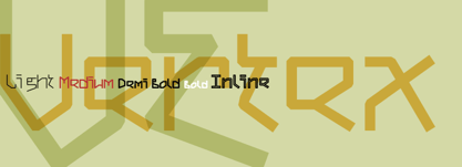
- Veritas by Altered Ego,
$45.00Veritas is a serif text family. It is a narrow-width typeface, with a taller x-height than Times Roman for added legibility, but maintains a similar character count in text. It is typeface designed for publication, newspaper (anywhere where narrow columns are necessary) and identity design. It is exquisitely spaced and kerned, even in European characters. The Digital Type Review states "...Veritas is one of the most important contributions ... from any independent foundry." - Hertine by Ef Studio,
$15.00 Hertine is a signature style font, this font is perfect for watermarks, invitations, stationery, wedding designs, social media posts, advertisements, product packaging, product designs, labels, photography, logo, special events and more. Hertine is equipped with many additional features that allow you to customize your text. You will get a complete set of uppercase and lowercase, multilingual, punctuation, ligatures, stylistic alternates a-z.
 - Versica by Letrasupply Typefoundry,
$25.00 Versica is a handcrafted display font. This font family consists of multiple style fonts that can be used either as authentic individual fonts or can be combined to get cool layered type. The package is completed with swashes, shadow and serif font. Don't forget to play with stylistic alternates character that featuring the font. You may get a perfect font for any advertise or editorial work issues.
 - Heil Vertica - Unknown license

- Vertical Roundpoint JNL by Jeff Levine,
$29.00 Vertical Roundpoint JNL is one of a number of classic hand-lettered typefaces found in a 1941 edition of the Speedball® Lettering Pen instruction book and re-drawn digitally by Jeff Levine.
 - Align Vertical Mono by Mom,
$89.00 Align Vertical Mono has an innovator construction which gives to the designer the ability to align the letters creating beautiful patterns on the page. It was design by the Tyner (typography Designer) Pedro Mascarenhas to fill a gap in type design. With Align Mono Family type will be the leading role of the design. The final result of the art work depends of the choices designer makes for each glyph.
 - Zacken - Unknown license

- Lochen - Unknown license

- Cachex - Unknown license

- Machin by Hanoded,
$15.00 Machin is a French word meaning 'thing'. Apparently, it is also a species of macaque from the Philippines, but I named this font after the French word! Machin is based on a really old font I made back in the day. It was called Whynot and (because I didn't know a thing about making fonts at the time) I could not get it to work properly, so it had its 15 minutes of fame before it was pulled off of the internet. Machin was made using the recycled glyphs from Whynot and it does work. It comes with extensive language support (yes, Vietnamese and Sami too), some handy ligatures and a lot of scribbly panache.
 - Gadhen by Imoodev,
$20.00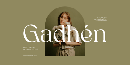 Gadhen is elegant display fonts with visual elegance, smooth curves and beautiful ligatures clear, making your work look true and attractive. A very versatile font that works in both large and small sizes. This font is suitable for a wide variety of projects such as invitations, logo, branding, magazine, photography, card, product packaging, mugs, quotes, poster, label, signature and more. Font which is perfect for all business sectors including personal projects, studio, corporate, creative agency, industrial, company, etc.
 - Aschere by Nurrontype,
$15.00 Aschere is not just yet another retro font. It was designed carefully to give harmony ambient when you use it in your project. You can play with plenty ligature option. Or use unique stylistic to make your project stand out. Nevertheless you can find some prebuilt ornament, it would help to create instant logo or quotes. Be it as body text, or header/title, Aschere is the right choice.
 - Rachele by Resistenza,
$39.00 Rachele is a mono line based script thin font. Inspired on the cute “Italian Bella Scrittura” handwriting but influenced by Spencerian. Ornaments and ligatures make this hand more expressive offering round stroke endings and a flowing shape. Rachele is a big family, its stroke expand into extra light till medium and passing through a calligraphic/ribbon effect. At the same time the width varies, that’s make this script even more flexible, from Ultra Condensed to Super Extended. Enjoy it. Check out also Check out also ‘Mentha’ based on Rachele’s skeleton. We recommend to combine Rachele with: Turquoise
 - Fanhen by Twinletter,
$15.00 Fanhen Black font is our newest font. Blackletters have long been used in the design of posters, invitations, and packaging to provide a bold and classic look that exudes style and elegance. as well as this font when you use it will cause that effect in each of your projects.
 - Caghen by pentagonistudio,
$19.00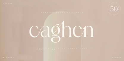 Caghen Is Classic Serif Character Inspired By Modern and Rich Characters. SOFTWARE REQUIREMENTS : Fonts and alternate : No special software required they may be used in any basic program /website apps that allows standard fonts That's it folks! You can go ahead and get cracking :) Follow My Shop For Upcoming Updates Including Additional Glyphs And Language Support. And Please Message Me If You Want Your Language Included or If There Are Any Features or Glyph Requests, Feel Free to Send me A Message. Have a Good Day !
 - Rachel by Gatype,
$8.00 Rachel is modern script font, where every single letter has been carefully crafted to make your text look beautiful. With a modern script style, this font will perfect for many different projects including: quotes, blog headers, posters, weddings, branding, logos, fashion, apparel, letters, invitations, stationery, and more. Rachel includes alternate glyphs and beautiful swirls.
 - Bachenas by ParaType,
$30.00 The typeface was designed for Polygraphmash type design bureau in 1963 by Lithuanian book and type designer Vitoldas Bachenas. There is a low-contrast Serif with some unusual elements. For use in text and display matter. The digital version was developed for ParaType in 2003 by Lyubov Kuznetsova.
 - Cachet by Monotype,
$50.99According to designer David Farey, Cachet is a monospaced, monostroke typeface -- that isn't."" Why the sleight of hand? Typefaces that are limited to a single character and stroke width suffer in terms of legibility. Farey's goal in drawing Cachet was to create a typeface that gives the illusion of monospacing, while delivering a subliminal dose of reader-friendliness. At first glance, Cachet appears to be constructed of straight and nearly-straight strokes. A closer look, however, reveals several subtleties. Curved strokes have an almost calligraphic spontaneity. Places where character strokes meet are tapered slightly, while stroke ends have been flared. These quiet deviations from geometric uniformity give the design a human, organic, and decidedly non-digital look. An added benefit is that the subtle design modulation benefits readability. Farey's subtle design modulation results in a legible and highly usable new typeface.


Page 1 of 70Next page