10,000 search results
(0.12 seconds)
- Majidah by insigne,
$21.99Majidah is an attempt to replicate the look and feel of an ancient script taken from the pages of an antique document. It has a Middle Eastern feel to it, but could be used for a wide range of applications. Majidah includes a number of OpenType features, including alternatates, ligatures and old style figures, and includes accents for wide range of languages. - Resotho by Glukfonts,
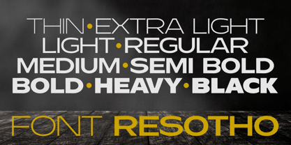
$10.00Resotho is a geometric sans serif (uppercase) family. It comes in 18 weights, 9 uprights and 9 italics. Perfect for graphic design, branding, packaging design but very versatile. Language support covering Western, South, and Central Europe. The Extralight & Extralight Italic weights are free of charge. - Brave Vintage by Rassht.dsgn,
$9.00 - Cowboy Stories by Open Window,
$19.95 - French Lettering JNL by Jeff Levine,
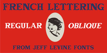
$29.00An example from the vintage lettering book "100 Alphabets Publicitaire" ("100 Advertising Alphabets") provided the inspiration for French Lettering JNL. This stylized Victorian [or Western] type face evokes the era of fanciful lettering design from the late 1800s. Available in both regular and oblique versions. - Lovely Bluebells by Susan Brand Design,
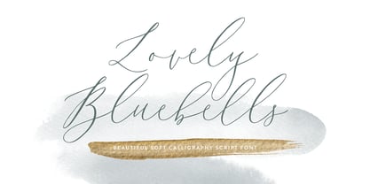
$18.00Introducing Lovely Bluebells Script font. A totally swoon worthy romantic font. Perfectly suited for a diversity of design projects, including logos, branding, wedding designs and social media posts. Lovely Bluebells include multilingual support for All Western Europe languages, as well as Afrikaans. xx Susan - Rapstomer by Dhan Studio,
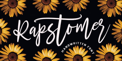
$19.00Rapstomer is a modern brush font, organic, dynamic, and energetic. It can be used for various purposes such as titles, signatures, logos, correspondence, letterheads, signage, labels, newsletters, posters, badges. Rapstomer includes alternates letters, ligatures and International support for most of the included Western Languages. - Bad Medicine by Hanoded,
$15.00 - Muge by Linecreative,
$18.00 - Kremlinology by Lauren Ashpole,
$15.00 - Investigator JNL by Jeff Levine,
$29.00Investigator JNL gives a serif treatment to Cold Case JNL, which was modeled from some old lettering stencils manufactured in the 1950s. - Dix by Just My Type,
$20.00An offbeat not-quite-slab, not-quite-bracketed serif. And its extreme weight and width. Richard Dix started as a surgeon and turned out an actor, one of the lucky few who made a successful transition from silent film to talkies. In 1929 he made the movie western, “Redskins,” and his name appeared on a brilliant poster promoting the film. “Richard DIX”; four upper case and six lower case letters. The font Dix is derived and extrapolated from impressions of those 10 letters. Inspired by the poster for the 1929 film, “Redskin,” and a desire to create a black Edwardian font with an offbeat serif. Usage recommendations Western movie or 19th century-style advertising posters. - Neographik by Monotype,
$29.99Neographic is one of the first fototype fonts that had been designed by Robert Barbour and produced from the Monotype UK office for the Photolettering machine - Stenson JNL by Jeff Levine,
$29.00Stenson JNL is another "lost" stencil typeface, re-drawn from punches made by a commercial stencil machine as used in rubber stamp shops and industrial warehouses. - Untold History by Arterfak Project,
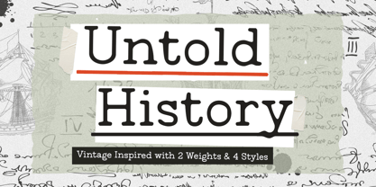
$15.00Lights up your past memory with Untold History font, a classic typewriting font designed in modern style. Comes in four available styles: regular, bold, underlined, and inky. Each style has its own unique touch, allowing you to create a variety of designs. The inky style adds a subtle ink bleed effect to the letters, giving it a more authentic vintage look. Inspired by classic typing machines, this font gives the taste of the past while still being versatile enough for modern designs. Untold History is suitable for a range of projects, such as editorial designs, vintage posters, books, branding, and quotes. Fonts featured : Uppercase Lowercase Numbers & symbols Punctuation Stylistic alternates Multilingual support Thank you for always supporting our work! - Horatio by ITC,
$29.00British designer Bob Newman's Horatio family is a delightful look back into the modernists experiments of the 1920s. This geometric sans serif design was created in 1971, and was originally released by Letraset. We are please to offer the family in digital form, in light, medium, and bold weights. Many designers during the 1920s were interested in reforming the alphabet, and wanted to reconcile letterforms with the machine and manufacturing technology of the age. Herbert Bayer at the Bauhaus was one of many designers who developed a universal alphabet," creating letters using only the simplest of geometric forms. Similar experiments in 1920s-style revivals were also created during the 1970s, most notably Herb Lubalin's ITC Avant Garde Gothic." - Magic World by Mozatype,
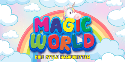
$13.00MAGIC WORLD is embodied in fun and joyfulness. It is a bold and thick lettered display font. This font is perfect for children-themed designs, especially when combined with bright colors. No matter the topic, this font will be an incredible asset to your fonts’ library, as it has the potential to elevate any creation. Get creative with its childlike playfulness, and use it to brighten up any kids and school project! Use this font for any crafting project that requires a personalized look! What’s Included : - Works on PC & Mac - Easy to use ( Installations ) - Compatibility Windows, Apple, Linux, Cricut, Silhouette, and Other cutting machines Thank you for purchasing this font. Please appreciate it, if you like this. ENJOY it :) - Candida by Linotype,
$50.99Candida roman was designed by Jakob Erbar and appeared after his death with the typeface foundry Ludwig & Mayer in Frankfurt am Main in 1936. Due to the original designer’s death, the italic was designed by Walter Höhnisch shortly thereafter. In 1945 the roman was reworked, the breadth of the figures was reduced and the strokes made heavier. The bold weight followed in 1951. Later the typeface was expanded with further weights, which have for the most part fallen out of use. Three weights can still be found in catalogues, available as early as 1937 for the Linotype machine. Candida is a modest text font which retains its legibility even in smaller point sizes. - Grand Label by Gleb Guralnyk,
$14.00 - LeftheriaPRO by Sea Types,
$29.00LeftheriaPRO has its structure projected from the capitals of the Greek columns of Ionian order, it is a typography condensed with vertical emphasis composed by 5 weights (light, regular, medium, semibold, bold) including ligatures, alternates, smal caps, old styles figures, fractions, superiors, inferiors. | Download Specimen - Haglos by Vultype Co,
$29.00 - Aneba Neue by Borutta Group,
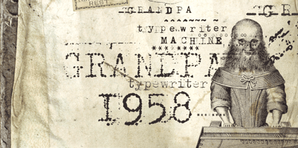
$27.00 - Grandpas Typewriter by Misprinted Type,
$20.00Granpa’s typewriter comes from an antique Olivetti Typewriter Machine I have. This font has all of the effects a typewriter machine can offer you: a regular version, a strong hit version, a light distressed version, a double-hit version and X version, which is a compilation of several typewriter mistakes, tests and stains. This font is specially handy when trying to use a typewriter effect on an edgy/grunge work, where there's no worry about perfection! - Basic Choice by PizzaDude.dk,
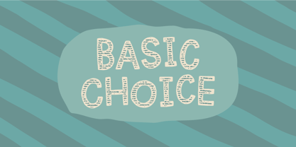
$14.00I don't know what is it with me and bad copy machines these days...my previous font also had that look, like it was made using a poor copy machine! :) Basic Choice comes in a regular, solid and distressed version - use these versions as they are, or play around and use them as layers. Each letter has 6 different versions, and they automatically cycle as you type. It makes the text look scrambled and random at the same time! - Coin Ding Dong by Inumocca,
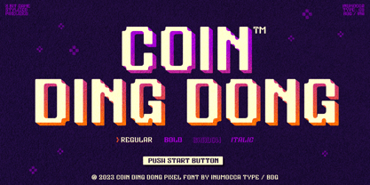
$18.00Coin Ding Dong pixel Font inspired from 8 bit game with beautiful stylized pixelized, game machine really reminds me of my childhood, with coins you can play it, in my country machine games are called "dingdong", inspired me to create this pixel font name. Really Beautiful font to covering your Project, like For Game Names, Poster art, Magazine, Branding, Logos, and more your project design. - Unique glyphs - Multilingual Characters - UPPERCASE - Lowercase - Numeric - Symbol - Punctuation Character - PUA encoded inumoccatype - Leppertrez by Ilhamtaro,
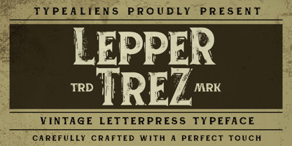
$14.00LEPPERTREZ is a font that is basically a classic serif font then to make it different from other serifs is to give the effect as if it were a letter on a letterpress machine, it will add a vintage impression because remembering that letterpress machines were the beginning of a printing press. To enable the OpenType Stylistic alternates, you need a program that supports OpenType features such as Adobe Illustrator CS, Adobe Indesign & CorelDraw X6-X7. Cheers! - Kropotkin Std by sugargliderz,
$30.00This typeface design was influenced by the British Rail corporate type introduced in an old lettering instruction book published in Japan. Of course, the only clue to this typeface is the lettering instruction book at hand. Therefore, this typeface is based on the British Rail corporate type introduced in an old lettering instruction book published in Japan, and I have expanded the design variations. I started with the Bold design first. Then I designed Light, Regular, and Black in that order. Light and Regular are intended to be used as the text type, while Bold and Black are intended to be used as the base for logotypes, headlines, and other eye-catchers. - In Shipment JNL by Jeff Levine,
$29.00In Shipment JNL is modeled after lettering made from an industrial stencil cutting machine - generally used for marking shipping and inventory information on boxes. Limited character set. - Solo Print by PizzaDude.dk,
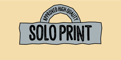
$11.00 - Kyotce by Soerat Company,
$24.00Kyotce is inspired by the Egyptian serif which has a strong and bold typeface. This family of 8 weights from Light to Bold along with italics and is perfect for advertising, packaging, logo, editorial and publishing, branding and other creative industries. Each style includes 700+ glyphs, Kyoto supports around 200 languages in the Latin and Cyrillic. This font provides advanced typographic support with features such as ligatures, alternate characters, old-style figures, fractions, numerator/denominator, superior/inferior, and various symbols. - VVDS Benigne Sans by Vintage Voyage Design Supply,
$14.00VVDS Benigne Sans is geometric font family consisting of 8 weights ranging from Thin to Ultra Bold with matching italics. Balanced and gently Thin or fat and heavy Ultra Bold, good wide range of widths, which allow use this font not only as a Headers, also as sub-headers or block texts. Also, I love how it looks in infographics. VVDS Benigne Sans is latin-based multilingual and contains all mathematics symbols. OpenTypeFeatures Ligatures, alternates, old style numerals and fractions. Enjoy! VVDS - Estencil by RG Hunt Type Design,
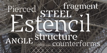
$15.00 - Thomson by Linecreative,
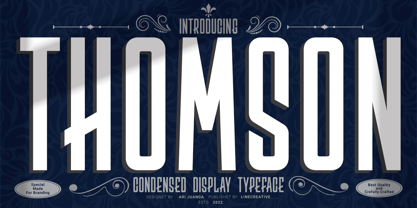
$16.00Thomson is is an Condensed font with a modern look, It's Perfect for branding, logo design, shirts, name card, magazin layout,headers, or oven large scale artwork Thomson offers you: - Upper and Lowercase characters (All Caps) - Stylistic alternates - Numbers and Punctuation - Multilingual Support (Latin Western Europe) - Horse Thief JNL by Jeff Levine,
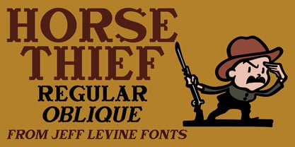
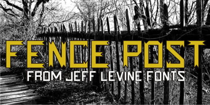
$29.00 - Fence Post JNL by Jeff Levine,
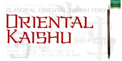
$29.00 - Oriental Kaishu by Indian Summer Studio,
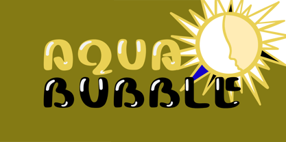
$65.00Classical Oriental brush font Western Latin + Greek + Cyrillic typeface, created using the principles of Chinese traditional Kaishu brush script (Kaisho in Japanese) and Japanese kana. All Caps Fonts There are different oriental styles in this project, first of them was developed in 2005 for orientalist community Oriental.ru. - Aqua Bubble by Rachel McBride Creative,
$9.00 - Springfield by ITC,
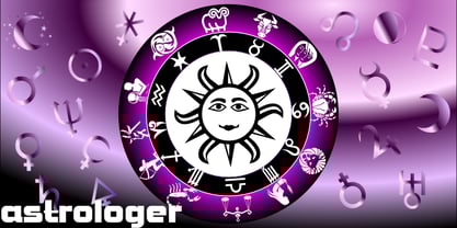
$29.99Springfield is a narrow, western-style display face from Bob McGrath. The design recalls wood types that were popular during the late 19th and early 20th centuries, but which also found resonance during the 1970s. Use Springfield to liven up otherwise dull headline and logo projects. - Astrologer Symbols by Deniart Systems,
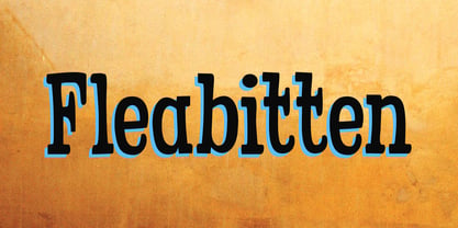
$20.00 - Fleabitten by Hanoded,
$15.00I love going to flea markets and second-hand stores; in fact a lot of the furniture in our home is second hand (or pre-loved, a euphemism I find rather peculiar). I personally believe that buying used products is a good way to help this planet, as no new stuff needs to be made and the old stuff gets a second life. Fleabitten is a ‘western style’ serif font. You could use it to pimp the posters for your line dance festival, but hey, be creative! I am sure you’ll find some good use for this very nice pre-loved font. Yes, pre-loved: I loved it first!
