10,000 search results
(0.035 seconds)
- Satreva by Balevgraph Studio,
$12.00 Satreva is a stylish and elegant sans serif font. It can easily be matched to an incredibly large set of projects, so add it to your creative ideas and notice how it makes them stand out! What's Included : Light, Regular, Bold (TTF) Alternates & Ligatures Works on PC & Mac Simple installations Multilingual support PUA Encoded
 - Rough Cut NF by Nick's Fonts,
$10.00An old Art Nouveau typeface named "Daphne" provided the inspiration for this decidely different font. This version is upright, but the linocut treatment employed visually suggests the slight rightward slant of the original typeface. Bold, unusual and distinctive. Both versions of the font include 1252 Latin, 1250 CE (with localization for Romanian and Moldovan). - Throostle by Allouse Studio,
$16.00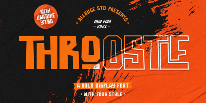 Proudly Presenting, Throostle a Bold Display Font Family. Throostle is perfect for any titles, logo, product packaging, branding project, megazine, social media, wedding, or just used to express words above the background. Throostle also come with Multi-Lingual Support. Enjoy the font, feel free to comment or feedback, send me PM or email. Thank You!
 - Bigroads Script by Figuree Studio,
$20.00 Bigroads Script is a layered bold script with extruding, inspired by a Retro aesthetic. Made in combination with hand lettering, it comes with dramatic movement and it’s great for any next creative project that needs a retro vibe or modern touch. Ideal for logos, handwritten quotes, product packaging, header, poster, merchandise, social media & greeting cards.
 - Radio Actor JNL by Jeff Levine,
$29.00 Bold and squared with rounded corners, the hand lettering found within the November, 1936 issue of Radio Mirror magazine really stands out. This stylized sans serif design, when used in poster displays or headline lettering, is attention-getting and drives the point home. Radio Actor JNL, is available in both regular and oblique versions.
 - Guidebook by Fenotype,
$25.00 Guidebook is a bold vintage style serif font with a nonchalant charm and sturdy confidence. Guidebook has clean features and it expresses credibility with a reminiscence of familiar nostalgic feeling. Guidebook is equipped with Swash, Stylistic and Titling alternates. These features can be accessed by OpenType controls or straight from Character or Glyphs window.
 - Staywild Modern by Typetemp Studio,
$20.00 Stay Wild Serif Display a modern-style serif font with alternatives and ligatures that create stunning logos, quotes, posts, blog posts. branding projects, magazine imagery, wedding invitations, and much more Features : Multilanguange PUA Encoded Web Font Included Illustration Include (.Ai) Contact me with an inbox message If you have any question. Thank you! Happy Creating.
 - P22 Sniplash by IHOF,
$24.95 Sniplash is a lively font inspired by cartoons and comics of the 1960s and '70s. Casual and organic, this font features curly lines and irregular weights in Regular, Light and Bold styles. This design defies serious analysis and offers a fun attitude for lighthearted design. Excellent for parties, retro packaging or any number of uses.
 - Mechaniclove by ahweproject,
$14.00 Mechaniclove is a gorgeous and bold handwritten font, crafted to give your headlines and logotype projects a retro touch. This font reads as strong, confident, and dynamic and can add tons of nostalgic character to your designs. This font is PUA encoded which means you can access all of the glyphs and swashes with ease!
 - Suspiria Vampira by Konstantine Studio,
$10.00 Halloween is coming. Get prepared earlier with our Suspiria Vampira. A bold and bouncy fonts with 2 styles, Clean and rough. Very good for a halloween concept, but the versatility level are high in this font. It can be placed into any fun and cheerful branding or event concept. So many possibilities coming up!
 - Hetigon Vintage by RahagitaType,
$17.00 Hetigon Playful Vintage is a bold and captivating font that seamlessly blends vintage charm with a playful twist. Its distinctive character lies in its ability to evoke a sense of nostalgia while maintaining a contemporary and dynamic feel. This versatile typeface is suitable for branding, logotypes, and flyers, where it effortlessly injects personality and style.
 - LA QATRIE by Hishand Studio,
$15.00 Experience refined design with La Qatrie, a display font that boasts an elegant look and a touch of luxury, setting a new standard for sophistication in typography. Perfect for those needing a touch of elegance, classy, stylish, beautiful bold type, and modernity for their design. Complete with ligatures alternates regular hollow icon kerning multilingual support
 - Creamer by Creativework Studio,
$14.00 Creamer is a gorgeous and bold handwritten font, crafted to give your headlines and logotype projects a stylish touch. This font reads as strong, confident, and dynamic and can add tons of nostalgic character to your designs. Creamer is PUA encoded which means you can access all of the glyphs and swashes with ease.
 - Rooster Scratch by Fat Hamster,
$20.00 Rooster Scratch is an uppercase handwritten typeface, it'ill give your work natural and hand crafted feel. Now you can see what happens, when rooster takes a marker pen in its foot. Perfect for quotes, logos, magazine & poster design, bold headers, apparel, packaging & label design. In other words this typeface is perfect for your next project!
 - Freich Monsta by Nasir Udin,
$15.00 Trick or treat! The spookiest time of the year will be here soon! Spread the Halloween spirit with this chilling, creepy, and scary typeface, Freich Monsta! Freich Monsta is an evolution of my previous font - Freich. It's mutated from a clean, strong, and bold font to a spooky display font with a vintage horror twist.
 - Roelle by Supfonts,
$12.00 Roelle will look beautiful on holiday invitations, wedding invites and stationery, logos, and more. Test it out below and watch the posters to see how it could look for your next project! Includes: Opentype SVG with ligatures Uppercase and lowercase Numbers and punctuation Foreign language support Check out my blog: www.instagram.com/zloillev pinterest.com/dmitriychirkov7
 - Montageway by Allouse Studio,
$16.00 Proudly Presenting, Montageway A Bold Brush Script Font. Montageway is perfect for any titles, logo, product packaging, branding project, megazine, social media, wedding, or just used to express words above the background. Montageway also come with Multi-Lingual Support. Enjoy the font, feel free to comment or feedback, send me PM or email. Thank You!
 - Angelic Bonques by Craft Supply Co,
$15.00 Angelic Bonques – Perfect Pair Font Duo is a combination of an elegant sans serif font & beauty handwritten script font based on the expression of real handwriting. Angelic Bonques – Perfect Pair Font Duo will work perfectly for fashion, e-commerce brands, trend blogs, wedding boutiques or any business that wants to appear upscale and chic.
 - Blackside by Din Studio,
$29.00 Blackside is a bold and authentic blackletter font. The font is suitable for any branding project like logo, t-shirt printing and many more. Outstanding in a wide range of contexts. Includes: Blackside (OTF) Featured : Alternates Accents (Multilingual characters) PUA encoded Numerals and Punctuation (OpenType Standard) Thanks for downloading premium font from Din Studio
 - Drakoheart Revofit Sans by G3 Typefaces,
$- Drakoheart Revofit is an initiative to make sans fonts. It’s one of my personal favorites, in fact. In its first release, this font had a cool appearance but was improved with better kerning and a cool look in this new release. Perfect to write some digital texts as in web articles, blogs and branding.
 - Sun & Rain by Bonez Designz,
$25.00 A fun and fresh font that encapsulates both summer and winter with its tall, hand rendered style. A versatile style,the family works well for all kinds or projects from window displays to music albums The Sun and Rain family consists of three weights, light, regular and bold. The weights cover diacritic, Greek and Cyrillic.
 - Walftower by Arendxstudio,
$15.00 Walftower - Bold Handwritten Font with its distinctive character that can be easily implemented in your various design projects . Walftowert came with opentype features such stylistic alternates, stylistic sets & ligatures good for logotype, poster, badge, book cover, tshirt design, packaging and any more. Features : • Character Set A-Z • Numerals & Punctuations (OpenType Standard) • Accents (Multilingual characters) • Ligature
 - Chellinda by Portograph Studio,
$20.00 Chellinda Bold Script is a stylish and refined Script font. It looks beautiful on a variety of designs requiring a personalized style, such as wedding invitations, thank you cards, weddings, greeting cards, logos and so much more. This font is PUA encoded which means you can access all of the glyphs and swashes with ease!
 - Benoa by Creativemedialab,
$20.00 Benoa is a versatile font family for your design, consist of 6 weights from thin to black with dozens of alternates. Benoa works well with any style of design concept, from branding to a nice bold modern look! Benoa also available in Variable format, multilingual support, numbers, and currency symbols, and dozens of alternates.
 - Claudia Fiesta by Brenners Template,
$19.00Claudia Fiesta's sensitive and natural contrast appeals their styles more cultivated. The bold contrast between styles is minimized, but individual styles are displayed to stand out. And Uppercase's valiant Alternates will make your designs impressive. These stylistic alternates apply to all uppercase glyphs. You can choose according to your concepts to improve your design. - Telepath by Coniglio Type,
$19.95 TELEPATH Telepath by Coniglio Type, first appeared in 1998. It is now in opentype .otf as of 2021. Telepath is a master sampling of a Royal office typewriter of industrial strength provided by the Miller Furniture store, of Dunkirk, New York. It had a baseline set of numbers to make accounting practices easy and line up nicely on the statements. (No gentile old fashioned numerical ascenders and descenders.) Yet, for a a rather old and stolid machine, it was very luxurious and built to definitely take the test of time. Cudo's for Royal Typewriter Company, is all I can say. The set of images were very carefully gathered and has fallen into the preferred category for a typewriter font that has it all. The font has exceptional value as a text font -and- a display font. It contains a great deal of graphic information and doesn't spike at higher sizes. Telepath presents a strikingly handsome typewriter font with a uniquely intuitive difference. Unlike the original source material—scans of monospaced typewriter copy, every font is painstakingly hand kerned for your most demanding copy fitting work in justified or casually ragged settings for print or the web. All Coniglio Type fonts are 100% embeddable. It will get you there.
 - NS Blackbooks Victorian by Novi Souldado,
$35.00 Reminiscing the old era of historical books (seriously, that old), circa 19th century. We crafted the letters by connecting the dots from the past with research for every flow, ornaments, look, and feel, to precisely aim for that perfect shape. Ephemera Blackbooks are born with a dark and robust personality. Feel the European historical mood right away, even with just typing it with your keyboard. You don't even realize when the design is done cause we make it so easy as a one-click-time-machine to your works using Ephemera Blackbooks font. It will be a perfect armory for a vintage headline, old book cover concept, sign, posters, playing cards deck design, vintage labels, beer labels, bar decoration, apparel, merchandising, you name it. OTF Features : Stylistic Set 01 to 07 and Ligature Glyph Count : 355 glyphs Language support : Afrikaans, Albanian, AsuBasque, Bemba, Bena, Breton, Catalan, Chiga, Cornish, Danish, Dutch, English, Estonian, Faroese, Filipino, Finnish, French, Friulian, Galician, German, Gusii, Indonesian, Irish, Italian, Kabuverdianu, Kalenjin, Kinyarwanda, Luo, Luxembourgish, Luyia, Machame, Makhuwa-Meetto, Makonde, Malagasy, Manx, Morisyen, North Ndebele, Norwegian, Bokmål, Norwegian Nynorsk, Nyankole, Oromo, Portuguese, Quechua, Romansh, Rombo, Rundi, Rwa, Samburu, Sango, Sangu, Scottish Gaelic, Sena, Shambala, Shona, Soga, Somali, Spanish, Swahili, Swedish, Swiss German, Taita, Teso, Uzbek (Latin), Volapük, VunjoZulu
 - Bembo Book by Monotype,
$34.99The origins of Bembo go back to one of the most famous printers of the Italian Renaissance, Aldus Manutius. In 1496, he used a new roman typeface to print the book de Aetna, a travelogue by the popular writer Pietro Bembo. This type was designed by Francesco Griffo, a prolific punchcutter who was one of the first to depart from the heavier pen-drawn look of humanist calligraphy to develop the more stylized look we associate with roman types today. In 1929, Stanley Morison and the design staff at the Monotype Corporation used Griffo's roman as the model for a revival type design named Bembo. They made a number of changes to the fifteenth-century letters to make the font more adaptable to machine composition. The italic is based on letters cut by the Renaissance scribe Giovanni Tagliente. Because of their quiet presence and graceful stability, the lighter weights of Bembo are popular for book typography. The heavier weights impart a look of conservative dependability to advertising and packaging projects. With 31 weights, including small caps, Old style figures, expert characters, and an alternate cap R, Bembo makes an excellent all-purpose font family. Bembo® Book font field guide including best practices, font pairings and alternatives. - Webdings Windows compatible by Microsoft Corporation,Webdings™ is a symbol font designed in 1997 as a response to the need of Web designers for a fast and easy method of incorporating graphics in their pages. Webdings contains a wide variety of Web-related images of the kind found in common use across the Web, as well as some more unusual drawings. User Interface icons suitable for creating page navigation elements are also included. Webdings is ideal for enriching the appearance of a Web page. Because it is a font, it can be installed on the user's system, (or embedded in the document itself) is fully scaleable and quick to render. It's a perfect way of including graphics on your site without making users wait for lots of graphic files to download. Each Webding has been fine-tuned to ensure high quality and clarity on the screen, regardless of the complexity of the individual symbol. Character Set: Picture/Symbol This version of Webdings is the licensable equivalent to the font versions coming preinstalled with Microsoft Windows® since version 8. It is identical regarding font name, language coverage and other font behaviour and is perfect for document exchange with machines that are not running the Windows® operating system.
- 946 Latin by Roman Type,
$35.00 946 is a multilingual techno-style family developed by Berlin-based type designer Roman Wilhelm (RomanType). While more and more text families have recently been extended to a multilingual and multi-script level, not so much attention has been given to the more decorative styles. The 946 family does exactly that. A lot of care has been given to the various diacritics: they were designed a little more brutal, a little more European than with some other fonts of this category. Do also watch out for the non-Latin legs of this family. 946 is inspired by electronic music. When Roman found a second-hand Roland TR-606 drum machine in a store in his hometown back in 1995, he started to hang out with would-be DJs and musicians, trying to play the beats that went around the globe. When he started to study visual communication three years later, he was assigned the matriculation number of 946, which has now become the name of this family. Language support: Afrikaans, Albanian, Catalan, Croatian, Czech, Danish, Dutch, English, Estonian, Finnish, French, German, Hungarian, Icelandic, Italian, Latvian, Lithuanian, Maltese, Norwegian, Polish, Portuguese, Romanian, Slovak, Slovenian, Spanish, Swedish, Turkish, Vietnamese, Zulu. Do also watch out for the other script versions of this family!
 - LOVE-BOX - Personal use only

- WetPaint - Unknown license

- Gabardina - Personal use only

- bowellberalta - Personal use only

- Bionic Comic Condensed - Unknown license

- Fh_Ink - Personal use only

- OXIDISASTER - Personal use only

- Times Eighteen by Linotype,
$29.00In 1931, The Times of London commissioned a new text type design from Stanley Morison and the Monotype Corporation, after Morison had written an article criticizing The Times for being badly printed and typographically behind the times. The new design was supervised by Stanley Morison and drawn by Victor Lardent, an artist from the advertising department of The Times. Morison used an older typeface, Plantin, as the basis for his design, but made revisions for legibility and economy of space (always important concerns for newspapers). As the old type used by the newspaper had been called Times Old Roman," Morison's revision became "Times New Roman." The Times of London debuted the new typeface in October 1932, and after one year the design was released for commercial sale. The Linotype version, called simply "Times," was optimized for line-casting technology, though the differences in the basic design are subtle. The typeface was very successful for the Times of London, which used a higher grade of newsprint than most newspapers. The better, whiter paper enhanced the new typeface's high degree of contrast and sharp serifs, and created a sparkling, modern look. In 1972, Walter Tracy designed Times Europa for The Times of London. This was a sturdier version, and it was needed to hold up to the newest demands of newspaper printing: faster presses and cheaper paper. In the United States, the Times font family has enjoyed popularity as a magazine and book type since the 1940s. Times continues to be very popular around the world because of its versatility and readability. And because it is a standard font on most computers and digital printers, it has become universally familiar as the office workhorse. Times™, Times™ Europa, and Times New Roman™ are sure bets for proposals, annual reports, office correspondence, magazines, and newspapers. Linotype offers many versions of this font: Times™ is the universal version of Times, used formerly as the matrices for the Linotype hot metal line-casting machines. The basic four weights of roman, italic, bold and bold italic are standard fonts on most printers. There are also small caps, Old style Figures, phonetic characters, and Central European characters. Times™ Ten is the version specially designed for smaller text (12 point and below); its characters are wider and the hairlines are a little stronger. Times Ten has many weights for Latin typography, as well as several weights for Central European, Cyrillic, and Greek typesetting. Times™ Eighteen is the headline version, ideal for point sizes of 18 and larger. The characters are subtly condensed and the hairlines are finer. Times™ Europa is the Walter Tracy re-design of 1972, its sturdier characters and open counterspaces maintain readability in rougher printing conditions. Times New Roman™ is the historic font version first drawn by Victor Lardent and Stanley Morison for the Monotype hot metal caster." - Times Europa LT by Linotype,
$29.99In 1931, The Times of London commissioned a new text type design from Stanley Morison and the Monotype Corporation, after Morison had written an article criticizing The Times for being badly printed and typographically behind the times. The new design was supervised by Stanley Morison and drawn by Victor Lardent, an artist from the advertising department of The Times. Morison used an older typeface, Plantin, as the basis for his design, but made revisions for legibility and economy of space (always important concerns for newspapers). As the old type used by the newspaper had been called Times Old Roman," Morison's revision became "Times New Roman." The Times of London debuted the new typeface in October 1932, and after one year the design was released for commercial sale. The Linotype version, called simply "Times," was optimized for line-casting technology, though the differences in the basic design are subtle. The typeface was very successful for the Times of London, which used a higher grade of newsprint than most newspapers. The better, whiter paper enhanced the new typeface's high degree of contrast and sharp serifs, and created a sparkling, modern look. In 1972, Walter Tracy designed Times Europa for The Times of London. This was a sturdier version, and it was needed to hold up to the newest demands of newspaper printing: faster presses and cheaper paper. In the United States, the Times font family has enjoyed popularity as a magazine and book type since the 1940s. Times continues to be very popular around the world because of its versatility and readability. And because it is a standard font on most computers and digital printers, it has become universally familiar as the office workhorse. Times™, Times™ Europa, and Times New Roman™ are sure bets for proposals, annual reports, office correspondence, magazines, and newspapers. Linotype offers many versions of this font: Times™ is the universal version of Times, used formerly as the matrices for the Linotype hot metal line-casting machines. The basic four weights of roman, italic, bold and bold italic are standard fonts on most printers. There are also small caps, Old style Figures, phonetic characters, and Central European characters. Times™ Ten is the version specially designed for smaller text (12 point and below); its characters are wider and the hairlines are a little stronger. Times Ten has many weights for Latin typography, as well as several weights for Central European, Cyrillic, and Greek typesetting. Times™ Eighteen is the headline version, ideal for point sizes of 18 and larger. The characters are subtly condensed and the hairlines are finer. Times™ Europa is the Walter Tracy re-design of 1972, its sturdier characters and open counterspaces maintain readability in rougher printing conditions. Times New Roman™ is the historic font version first drawn by Victor Lardent and Stanley Morison for the Monotype hot metal caster." - Times Ten by Linotype,
$40.99In 1931, The Times of London commissioned a new text type design from Stanley Morison and the Monotype Corporation, after Morison had written an article criticizing The Times for being badly printed and typographically behind the times. The new design was supervised by Stanley Morison and drawn by Victor Lardent, an artist from the advertising department of The Times. Morison used an older typeface, Plantin, as the basis for his design, but made revisions for legibility and economy of space (always important concerns for newspapers). As the old type used by the newspaper had been called Times Old Roman," Morison's revision became "Times New Roman." The Times of London debuted the new typeface in October 1932, and after one year the design was released for commercial sale. The Linotype version, called simply "Times," was optimized for line-casting technology, though the differences in the basic design are subtle. The typeface was very successful for the Times of London, which used a higher grade of newsprint than most newspapers. The better, whiter paper enhanced the new typeface's high degree of contrast and sharp serifs, and created a sparkling, modern look. In 1972, Walter Tracy designed Times Europa for The Times of London. This was a sturdier version, and it was needed to hold up to the newest demands of newspaper printing: faster presses and cheaper paper. In the United States, the Times font family has enjoyed popularity as a magazine and book type since the 1940s. Times continues to be very popular around the world because of its versatility and readability. And because it is a standard font on most computers and digital printers, it has become universally familiar as the office workhorse. Times™, Times™ Europa, and Times New Roman™ are sure bets for proposals, annual reports, office correspondence, magazines, and newspapers. Linotype offers many versions of this font: Times™ is the universal version of Times, used formerly as the matrices for the Linotype hot metal line-casting machines. The basic four weights of roman, italic, bold and bold italic are standard fonts on most printers. There are also small caps, Old style Figures, phonetic characters, and Central European characters. Times™ Ten is the version specially designed for smaller text (12 point and below); its characters are wider and the hairlines are a little stronger. Times Ten has many weights for Latin typography, as well as several weights for Central European, Cyrillic, and Greek typesetting. Times™ Eighteen is the headline version, ideal for point sizes of 18 and larger. The characters are subtly condensed and the hairlines are finer. Times™ Europa is the Walter Tracy re-design of 1972, its sturdier characters and open counterspaces maintain readability in rougher printing conditions. Times New Roman™ is the historic font version first drawn by Victor Lardent and Stanley Morison for the Monotype hot metal caster."


