10,000 search results
(0.036 seconds)
- Kinanshi by Yoga Letter,
$17.00 "Kinanshi" is a very elegant and beautiful signature font. This font is very easy to use because it has been specially designed. Equipped with uppercase, lowercase, numerals, punctuations and multilingual support. It is very suitable for weddings, engagement, certificates, logos, business branding and so on.
 - Ganbate Script by Balevgraph Studio,
$12.00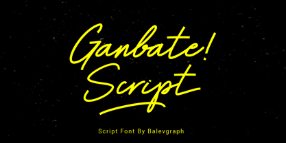 Gilbert Script is a bold and modern script font. Be intrigued by its ravishing style and use it to create beautiful wedding invitations, beautiful stationary art, engaging social media posts and more! What's Included? Uppercase & Lowercase Numbers & Punctuation Ligature, Alternate & Swashes Multilingual Support PUA Encoded
 - Dabistha by Yoga Letter,
$16.00 "Dabistha" is a beautiful handwritten font with butterfly decoration on the alternate letters. This font is perfect for Valentine's Day, weddings, engagements, Christmas, stickers, posters, banners, and more. Equipped with uppercase letters, lowercase letters, numerals, punctuation, swash, titling, uppercase alternates, ligatures, and multilingual support
 - Poipoi by Dharma Type,
$14.99 Extraordinary impact and visual conspicuousness. Poipoi is a super 3D sans family for posters, logos and all display. The basic idea is not a brand new. The Stacking type system has been used since before wood type age. As you imagined, colored wood type(woodcut), many other engravings and contemporary printer machine print many colors separately with different printing plates for each color. Poipoi uses the same system for 3d effect. Please use Photoshop or Illustrator, or your favorite graphic design apps that can handle layers. Layers are the printing plates of wood type. You should be able to change text color for each layer. Poipoi "Standard" style is the base of this font family. You can add effects by stacking Highlight and shadow layers. Stacked layers in different color make the text in 3D. Instruction 1. Type your text as you like. 2. Set font-name "Poipoi" and font-style "Standard" 3. Set color of "Standard" layer. 4. Duplicate the "Standard" layer twice (One for Highlight, one for Shadow). 4'. The layer order should be Highlight, Standard, and Shadow from top to bottom. 5. Set font-style and color of "Highlight" and "Shadow" layers. 6. Adjust tracking if you need. (Please use same tracking value for all 3 layers.) For further detail, https://www.dropbox.com/s/xymis7dh5hwxn9q/Poipoi.pdf Poipoi Standard, Highlighted, and shadowed style can be used solely. Rounded terminals add soft, cute, and casual impressions to your design. Spec: Over 400 glyphs! Basic Latin ✓ Western Europe ✓ Central Europe ✓ South Eastern Europe ✓ Mac Roman ✓ Windows 1252 ✓ Adobe Latin 1 ✓ Adobe Latin 2 ✓ Adobe Latin 3 ✓ Almost all Latins are covered.
 - Albus by Gustav & Brun,
$20.00 Albus is bold and friendly. It is your wizard when you're lost in communication. Perfect for the not so serious statements, or maybe for the very serious ones? Maybe it fits on your next children’s book, or maybe on your webshop? The Albus Friends (ornaments) includes speech bubbles, clouds and other fluffy stuff. You can also buy the whole family for an extra friendly price. Let Albus be your wand and let it help you create the kind of message you want. Let’s create some magic!
 - Waltery by Sensatype Studio,
$15.00 Waltery is a hand-lettered cute font for brand, logo and quotes design. Based on our experience as a graphic designer who works for a lot of companies, we often are requested to design a logo in a unique style but with an cute hand-drawn shape. So, we try to brainstorming and create this font to make the idea is going out. This is perfect for BRANDING and LOGO DESIGN. You will get outstanding, cute, and certainly unique logos with this font. Waltery is also included full set of: uppercase and lowercase letters multilingual characters numerals punctuation What will you get? Waltery-Regular Waltery-Italic Wish you enjoy our font. :)
 - Blusty by Craft Supply Co,
$15.00 Blusty Font Duo is an handwritten script font based on the expression of real handwriting, lets you transform type into an exciting and beautiful piece of work. The irregular, hand-lettered look adds a real human touch to things and comes along with a lot of loving details.
 - Kinghood by Rockboys Studio,
$19.00 Kinghood is a delicate and elegant serif font. You can use this modern serif font with ligature & stylistic set for fashion, magazines, cooking websites, quotes, social media posts, labels, and many more! Add it confidently to your favorite creations and let yourself be amazed by the outcome generated.
 - BMX Radical by Eclectotype,
$15.00 BMX Radical is inspired by the titles of the cult 1980s BMX movie "Rad". The characters R, A and D were designed after this, with the rest of the character set being completely made up. The font is uppercase only, but with two different alphabets. In OpenType-capable applications, engaging contextual alternates will make the alphabets automatically switch between each other, meaning double letter combinations always contain two different glyphs to give the text a much more handmade feel. It is a very versatile brush font. It can look cheesy and retro in bright colors with outlines or gritty and modern in more muted palettes.
 - Artios Pro by DBSV,
$70.00 There are a lot of narrow passages... like the Straits of Gibraltar, Hormuz, of Malacca, of Thermopylae, the Dardanelles, the Dervenakion, Magellan, Rentina of Naruto, Kerch etc. I tried to pass into mine closely with the name «Artios Pro". Walking on the same considerations as the previous series (Khamai/Aeolus/Corset) I tried to give some sense of diversity for narrow passages of the letters. These twelve style are the result. And here, the "Rail" engage with "Semi Bold" in the same way as the previous series. This series is composed and includes 12 fonts with 625 glyphs each, with true italics and supports Latin, Greek and Cyrillic.
 - Quieta by Italiantype,
$39.00 Quieta is a humanist serif typeface inspired by the aesthetics of Italian Renaissance and by the empowering history of the painter Artemisa Gentileschi, first woman to be admitted to an Academy of Fine Arts in Italy. The designer, Maria Chiara Fantini, has used sharp flat-nib calligraphic strokes to add a vibrant contemporary vibe to the traditional humanist proportions. Classical details (such as the beak of the “e” and the angled stress of the “o”), are balanced by a modern and readable low-contrast design, developed in a range of six weights with a matching set of true italics. A Display weight, with lighter shapes and stronger contrast has been developed excel in logos, headlines and captions. The wide array of alternate, decorative and swash glyphs and the full coverage of over 200 extended latin languages make Quieta a solid, highly readable and elegant typeface perfect for body text both on the screen and on the printed page. Graceful and powerful at the same time, this typeface family is ready to help you when in need of the timeless appeal of a self-conscious feminine elegance.
 - Manteiga by Plau,
$49.00 Julia Child once said: the secret to great french cooking is butter, butter, butter. Thus, we present to you Manteiga - butter in Portuguese! - a typeface for heart-melting, word-spreading goodness. The idea we had was to play with brush lettering - a style we love - and go as far as we can with the shapes of the letters while finding balance between positive and negative space. We wanted biiiig personality. And small inconsistencies - the ones that add texture and life to lettering. We left extensive OpenType features and technical stuff aside for a moment, adding later only what we thought was necessary, like different shapes for the Q, a and g - for example. All caps setting was something we wanted from the beginning. In text case, the x-height is rather short for a brush script, and this lends a quirky voice. Spacing is ultra tiiiiight so don’t go too small, but make it as big as you want! Ah! And there are some fun dingbats thrown in for good measure.
 - Historic Warehouse by Just My Type,
$25.00 Gotta tell ya: think out of the box and this font is addictingly fun to use! Introducing Historic Warehouse, a substantial, yet elegant family, invoking advertising fonts of the early 20th century. Why the name? When asked to design a banner for Tucson’s Historic Warehouse District, I couldn’t find the look I wanted from any known fonts. After drawing what I wanted in Illustrator, there were three (and in the process, four) fonts just waiting to be realized. Happy to oblige. Here’s Historic Warehouse Regular, setting the stage. It’s sturdy, bold, and plays curves against rounded angular shapes. To its left is Historic Warehouse Condensed, trim, elegant and at its best at very large sizes; to the right is Historic Warehouse Wide, with charming style and presence. Finally, there’s Historic Warehouse Extended, extravagant in its proportions, with a beautifully-crafted form like a fine carriage. As the song says, “Everything Old Is New Again,” and this family looks as fresh and clean at the beginning of this century as it might have at the beginning of the last.
 - Verao by insigne,
$24.99 Remember clear summer days as a kid? Remember open fields that you explored? Sun shining? Simple breezes sweeping past your face as you ran far and free? The feeling was uncomplicated and enjoyable. It was natural. That’s Verao, the simple spirit of summer. Alive and vibrant, Verao takes a turn away from the cold structure of today’s rigid creations and embraces the movement back to the value of things handmade. This artisan creation represents the rare, soul-invested fusion of the craftsman’s tools, materials, and hand movements, which shapes the solid--but beautifully defined--parts, pieces that, when put together, breathe a measure of life into everyday paragraphs and other bodies of text. Verao’s hand-written brush script, with its characters’ imperfect elegance and handmade quality, keeps your work looking organic. Write a word in more than a hundred different ways thanks to the large number of extra letters it offers. Two sets of lowercase alternative letters without connectors are included as is a set of swashed endings. Verao contains stylistic substitutions and ligatures, too, that you can combine however you like. Whichever way you design, the elements continue to appear balanced and separate and will undoubtedly add more personality to your design. So stop switching out cogs in your rigid set of fonts. Take time again to play with a natural face that’s both easy and energetic. Verao’s great temperament makes it a joy to design with. Let this spirit of summer take you away from the mundane. There’s a good chance Verao will lead you where you need to go. Production assistance from Lucas Azevedo.
 - Trumania EEN - 100% free

- ITC Cali by ITC,
$29.99 There are a few professions in which being left-handed confers an advantage-think of the great southpaw pitchers in major league baseball, like Sandy Koufax. Now, think of all the great left-handed calligraphers. Not so easy, right? Here's a hint: Luis Siquot. Far from being an advantage, Siquot's lefty orientation proved a hurdle to overcome. When I was young, I had serious problems writing," he recalls. "If there was a lot of text, I almost always soiled the paper with wet ink as my hand followed the pen." Then, a friend told Siquot about a special store in London that catered to left-handed people. It was there that he found an Osmiroid pen specially designed for left-handed calligraphers. ITC Cali is based on Siquot's use of this pen. "Electronic scans of my calligraphy were the foundation of the design," he says. "I was careful to leave in some imperfections to avoid an excessively mechanical look, and added the little notches in the strokes to imitate the texture of writing on a rough cotton paper." ITC Cali works equally well in text and display sizes, but it is a calligraphic script, Siquot warns, "and shouldn't be set in all capitals." That said, ITC Cali is a remarkably versatile design, well-suited to a variety of communication projects."
 - Charlotte Script by Vástago Studio,
$10.00 A funny Script typeface with a simple construction for to show a dynamic texture playing with the baseline. This letters are inspired on the work of House Induestries mixing a traditional serif with a playful script, like some retrospective alphabets in the vintage ads. Enjoy it, and thanks for buy it!
 - Music Course by Jeff Levine,
$29.00 The 1927 beginner’s book for Shefte’s Rapid Course in Modern Piano Playing had its title hand lettered in a bold serif typeface that reflected some of the influences of the Art Nouveau era. This became the model for Music Course JNL, which is available in both regular and oblique versions.
 - Palmilla 2.0 by RodrigoTypo,
$25.00 Palmilla 2.0 is a continuation of palmilla which added more glyphs such as Alphabets, Cyrillic was added like Greek, in addition to Alternatives such as Ligatures, more Ligatures were also added in Latin to play more with the title, in total there are six special weights for informal and creative titles.
 - Mattoa by Bombastype,
$35.00 Introduce Mattoa, a bold and sporty script. This font is very great for bold logotype . Comes with many swashes options that you can play with. Will works well for both modern and retro style. If you need a font for your display purposes, you defintely need to consider this font.
 - Tecna Wide by Descarflex,
$20.00 The Tecn@ Wide family was designed so that its characters are legible and easy to interpret in any writing in its headers or titles to cover more space; For example, the descriptive memory of Plans or Instructions. Tecn@ Wide complements the Tecn@ Background Light and Dark Square Triangle font family.
 - Adana by astype,
$19.00 The roots of Adana going back to the year 1930, to the Berlin-based German graphic designer Wilhelm Berg. His typeface can be interpreted as an answer to Lucian Bernhards Schönschrift. Adana Circular and Regular play well together in all kinds of adverts, as well with designs like Bodoni or Didot.
 - Freaky Prickle by ParaType,
$25.00Freaky Prickle script was written using ink and various wooden sticks and digitized/ Autor’s target was to create the spontaneous, light, flying script with dynamics and energy at the same time. Upright and cursive styles are available. The type was planned for use as headline in fiction and display matter. - #NAME? by OtherwhereCollective,
$29.00 -OC Format Sans is the third incarnation of this geometric grotesk sans serif which fuses the style of Futura with the rhythm and proportions of Akzidenz. It comes in two styles, standard and a new Print family where crisp sharp edges have been made blunt in reference to the ink spread that occurs when printing on uncoated paper stock. It can give digital media a softer more approachable analog aesthetic. Typical of both grotesk and geometric styles the design has an even weight with minimal stroke contrast and the slanted form is an oblique rather than a true italic. The default double-story �a� and �g� give an academic touch, the single story versions of Set 1 are more friendly and approachable while Set 2 changes the look into something more scientific. Made with tireless attention to detail and kerning it's perfect for logotypes and extensive text, supports multiple languages and comes with a plethora of OpenType features including standard and discretionary ligatures, social icons, symbols, and multiple figure styles including roman numerals.
 - Monogram by Yoga Letter,
$20.00 "Christmas Holiday Monogram" is a beautiful and natural monogram font. This font is equipped with a floral decorative monogram, so it is very suitable for Christmas, Valentine's, winter, wedding invitations, weddings, engagements and others. Equipped with uppercase letters, lowercase letters, numerals, punctuations, monograms and multilingual support.
 - Spring Easter by Yoga Letter,
$14.00 "Spring Easter" is a very beautiful and elegant handwritten font. This font is very easy to use because it has been specially designed. Equipped with uppercase, lowercase, numerals, punctuation, and multilingual support. It is suitable for birthdays, weddings, engagements, spring, summer, Easter, stickers, banners, posters, and others.
 - FS Sophie by Fontsmith,
$50.00 Slinky Chic, svelte and slinky, FS Sophie was inspired by and designed in partnership with ATTIK UK. With clean lines, simple, elegant curves and dynamic forms, it brings a feminine sophistication to text and headlines in publishing and advertising. Kinky FS Sophie’s engaging simplicity arises from its construction, using a modular set of core, rounded shapes and straight strokes, drawn and then repeated to create letterforms. An extra technical detail of occasional, short 45-degree diagonals adds a distinctive little kink to Sophie’s cool exterior. Alchemy By some kind of typographic alchemy, the combination of simple curves and lines with unexpected twists to the shapes of characters creates an unusually spirited and lively design in all three weights and their italic sets. Born for the spotlight, FS Sophie is a natural for big headlines, pull quotes and other high-profile text elements.
 - ALS Schlange Slab by Art. Lebedev Studio,
$63.00 Schlange is a rich typeface with rounded terminals. The family includes five sans serifs and five slab serifs in weights from ultra light to bold. Schlange’s personality is determined by an open aperture and quite large lower case characters in comparison with the upper case set. Schlange’s personality is open and friendly, giving a text it’s used for a soft, warm appeal. Schlange will work well as a display type (think titles, short magazine call-outs, ad banners, and such), but it’s not a good choice for extensive bodies of academic text. Available in numerous weights, the typeface provides rich opportunities for mixing and matching and is great for typographic compositions. These qualities make Schlange a dream type for a packaging designer. It will feel at home in design for cosmetics or sweets, postcards, children’s books and menus.
 - ALS Schlange Sans by Art. Lebedev Studio,
$63.00 Schlange is a rich typeface with rounded terminals. The family includes five sans serifs and five slab serifs in weights from ultra liight to bold. Schlange’s personality is determined by an open aperture and quite large lower case characters in comparison with the upper case set. Schlange’s personality is open and friendly, giving a text it’s used for a soft, warm appeal. Schlange will work well as a display type (think titles, short magazine call-outs, ad banners, and such), but it’s not a good choice for extensive bodies of academic text. Available in numerous weights, the typeface provides rich opportunities for mixing and matching and is great for typographic compositions. These qualities make Schlange a dream type for a packaging designer. It will feel at home in design for cosmetics or sweets, postcards, children’s books and menus.
 - Rekita by Twinletter,
$13.00 Introducing “Rekita Font” – Your Gateway to Playful Typography! Rekita Font is a captivating typeface designed to infuse playfulness and creativity into your projects. With its whimsical and charming characters, this font is your perfect companion for any design that seeks a touch of lightheartedness. Whether you’re crafting children’s books, eye-catching posters, or engaging social media graphics, Rekita Font effortlessly adds a fun and youthful vibe to your work. It’s a versatile choice that breathes life into your designs and sparks joy in your audience. Embrace the lively spirit of Rekita Font and unlock a world of creative possibilities. Elevate your design game, grab attention, and leave a lasting impression with this delightful typeface. Discover the magic of Rekita Font and let your creativity run wild with playful typography today! – PUA Encoded Characters – Fully accessible without additional design software.
 - Celtic Monograms by Kaer,
$24.00 Here is my next Celtic Monograms font family. I used a lot of authentic knots and curves to imitate Insular art style. The term derives from insula, the Latin term for “island” in this period Britain and Ireland shared a largely common style different from that of the rest of Europe. I've drawn sketches set, manually vectorized it and assemble the font family. In an attempt to replicate the intricate patterns found in Celtic art, I endeavored to create a design that embodied the essence of true Celtic knot work. The interweaving lines, which were prominent motifs in Celtic art prior to the arrival of Christian influence around 450, served as the foundation for my creation. Over time, these designs seamlessly integrated into early Christian manuscripts and artwork, incorporating depictions of various elements from everyday life, including animals, plants, and even human figures. In the beginning, the patterns were intricate interwoven cords, called plaits. This particular style is often linked to the Celtic regions, but it was also widely embraced in England and spread throughout Europe through the efforts of Irish and Northumbrian monks. The utilization of the Celtic knot as a tattoo design gained popularity during the 1970s and 1980s in the United States. Consequently, it has proven to be a highly advantageous font choice for various applications such as posters, banners, and sportswear. You can also create a vintage color shift effect. Please note, you should use graphic applications such as Adobe Illustrator or Photoshop, but not Microsoft Word. All you need is put Two or Three lines style initial on the top of Back style. I’m happy to present you the Rough, Two lines, Three lines, and Back styles for your design. You’ll get uppercase and numbers set. Thank you!
 - WILD1 Toxia by The Fontry,
$7.00 Toxia is a creepy—yes, eerie face, like something wet and poisonous clambering out of the swamp. It’s spooky too—yes, but it’s also frighteningly easy to read. Just don't let it drip on you! Toxia is just one font in a package of five known as Wild Bunch Pak #1.
 - Metalmark Stencil JNL by Jeff Levine,
$29.00 A lot of interesting variations in lettering style can be found in sets of antique tin or brass marking stencils. One such set was the model for Metalmark Stencil JNL, a bold sans with a chamfered look.
 - Chapman by James Todd,
$40.00 Chapman is the result of spending too many hours staring at the often all-capital engraver typefaces from long-gone foundries. The wide serifs, high contrast, and various widths seem to have so much character but also remain so neutral. From these references, Chapman began to emerge. It seemed natural that the lowercase would be based on a Scotch Roman model, much like the original all-capital faces. Chapman does not pull directly from any one source but from the genres themselves. It was, from the beginning, the goal to create a typeface that would be relatively neutral but not boring; an adaptable solution that works anywhere and, depending on the chosen width, can be squeezed or stretched to fit anywhere. The idiosyncrasies of the original designs are tamed in some places and turned up in others. The result is something familiar but unique and contemporary.
 - Amor Serif by Storm Type Foundry,
$55.00Antique monumental incriptional majuscule, originally carved in stone, and sometimes called “Roman Capital”, is the origin of the upper-case part of our latin alphabet. Its narrowed form, derived from handwritten originals used between the first to third century A. D., served as the inspiration for the Mramor typeface, which I drew with ink on paper in 1988 under Jan Solpera’s leadership. After composing negative letters on a strip of film it was possible to use Mramor with the early phototypesetting devices. In 1994 with the help of Macintosh IIvi I added the lowercase letters and bolds, and issued this typeface as 14-font family. After some years of using Mramor for various purposes, I realized a need of modernization and humanizing its very fragile appearance, as well as removing numerous decorative and useless parts. Besides that, type design made a huge technical progress in past few years, so I was able to finish the remaining approximately 9600 glyphs contained in the present font system named Amor. It is already usual to combine sans and serif fonts within one family in order to distinguish (e. g. in a book) historical part from contemporary, a plain chapter from a special one, or, in quotations, to divide speaking persons. Sans-serif typefaces don't arise by simple removal of serifs; they have to be drawn completely separately, when occasionally many declined forms may be made, considered to the serifed original. Nevertheless, both parts of this type system appear consistent as for proportional, aesthetic and emotional atmosphere. Usage of type is often closely linked to its original inspiration, in this particular case with architecture and figurative sculpture. An inner “order” was also text setting in smaller sizes. A smooth scale of weights enriches the possibilities in designing of magazines, brochures, exposition catalogues and corporate identity. Economizing, but opened shape of characters is well legible and antique hint comes into play after longer reading. - Planet Express by Estudio Calderon,
$29.99 Family type designed by Felipe Calderón. This type is a display with a modern style and a different and innovative concept. The development of this type was a challenge because it was set out from the begining as a script font with ornaments and complements, where the round shapes do not have prominence in the result. Planet Express is an interesting job from the aesthetic point of view, it works for big scale texts and contains little shadow-cuts in each character to give it more personality and stand out among other fonts from this gender. I hope this new project works to solve issues in design. Planet Express is composed of Regular & Italics, it has 250 intelligent ligatures to produce the best signs in big scale, it is perfect for branding and works very well with the geometric complements. It is designed with programming in opentype: Ligatures, Discretionary ligatures, Stylistic Alternates, Stylistic set 01, Stylistic set 02, Stylistic set 03, Stylistic set 04, Stylistic set 05, Stylistic set 06, Stylistic set 07, Stylistic set 08 & Stylistic set 09, multiple language support and a complete set of extras like arrows, catchwords, flags, emblems, hands, fleurons & crossed elements. Planet Express can be used in different ways, each character pretends to cover the needs in any circumstance where it is used. It is funny to write words and play with the complements. It also works with current concepts in graphic design like sports, cars, hip hop, music, social network, skateboarding and more. Everybody can use this font, it works with different languages like italian, french, portuguese, danish, german and so forth. See specimen and samples here. Enjoy it!
 - Nutcase by ArtyType,
$29.00 Nutcase is a perfect example of a font that principally designed itself. I created a hexagonal template (the most economical form in nature by the way) and took out the center to increase the decorative element. I played around with it, creating some pleasing characters at first but it soon became clear it would translate into a complete alphabet, so I set to work applying the idea to both upper and lower cases. It wasn't all straight forward though, avoiding awkward characters and retaining legibility took a little perseverance but it eventually paid off. I thought of this primarily as a decorative display face but having tested it out, found it reads surprisingly well as body copy too.
 - Brolly Fight by Rachel White Art,
$16.00 Brolly Fight is a fun, slim line font with off-kilter lines. I had so much fun creating this one! It has a stick figure art deco feel. It's fun and playful, with lots of ligatures and alternates to play with. Mix and match lowercase and uppercase letters for a unique look. There are four alternate ampersands, and fun double letter ligatures, as well as playful ligatures for r, k + a, e, o, u combinations. That high lowercase o with an underscore has a twin lowercase a alternate you can access too! Mix and match capitals and lowercase (plus the ligatures & alternates) to create unique text designs. Now with a bold version!
 - Apnea by The Type Fetish,
$25.00 Apnea is a layerable type family consisting of fifty weights. It is an all caps font with a few lowercase alternatives (a, e, i, m, n, t, w, and y) thrown in for a more casual feel. The base letterforms are inspired by a painted sign I found in the garage of an old house I moved into years ago. All the hand-drawn elements were done directly in FontLab to keep them loose and playful without getting distorted or grungy. At its core Apnea consists of eight base weights (Base, Drop Shadow, Halftone, Inline Fill, Outline, Outline 3D, Shading and Shadow) that when combined, can make up the rest of the family. Have fun, experiment and play!
 - Hendrix by Scriptorium,
$18.00I had a chat recently with a customer who is a big fan of lettering from the psychedelic poster era. The discussion got me thinking about poster lettering we hadn't yet made into fonts, and a particular sample from a Jimi Hendrix poster I had played around with but never finished making into a font. So I went back to the drawing board and the result is the new Hendrix font. Unlike many of our other Psychedelic fonts which are stripped down to their basic character forms, this font includes the outlines characteristic of a lot of poster lettering from that period. It also includes variant versions of a number of the characters
