10,000 search results
(0.016 seconds)
- LHF Birgitta by Letterhead Fonts,
$43.00
- WildWords by Comicraft,
$49.00
- Classic Clips JNL by Jeff Levine,
$29.00
- Sure thing! Rainy Days by PizzaDude is a truly special font that carries a unique essence, making it stand out in a sea of typefaces. At its core, Rainy Days embodies a playful yet slightly melanchol...
- Imagine diving into a world where the very concept of order is thrown out the window, and the rule book is not just ignored but shredded, burned, and then danced upon. That's the essence of Turmoil (...
- Halter Pinchy by Apostrophic Labs is a typographic journey beyond the ordinary, embracing the quirky side of type design with open arms. This font, crafted with care and a sense of adventure, stands ...
- Oh, Havelseen! Imagine if your charmingly eccentric aunt, who spends her summers sailing through Europe in a hand-painted boat, decided to become a typographer. That's Havelseen for you. It's not jus...
- Incy Wincy Spider by Comicraft,
$19.00
- The Black Shapes by Intellecta Design,
$15.90
- OK Chorale NF by Nick's Fonts,
$10.00 - Rocket Space by Fargun Studio,
$13.00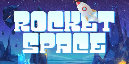
- Bang Zoom by Midwest Type,
$29.00
- Section by Monotype,
$29.99 - Jungle Bones by Phat Phonts,
$10.00 - Black Palm by Just Lett,
$17.50
- Scriptonite by Jonahfonts,
$30.00
- Sky Clipper JNL by Jeff Levine,
$29.00
- Vivala Line by Johannes Hoffmann,
$16.00
- Hamis Pro by Fo Da,
$9.00
- Buddy Slender by Hackberry Font Foundry,
$24.95
- Kiddie Stencil JNL by Jeff Levine,
$29.00
- Poum Boum by Larin Type Co,
$12.00
- Good Eatin AOE by Astigmatic,
$19.95 - Sweet Melody by Artcity,
$8.00
- National Gothic by BA Graphics,
$45.00 - Delamotte Large Relief by Intellecta Design,
$9.00 - S&L Gothic by BA Graphics,
$45.00 - Illustrator - Unknown license

- Fifteen36 by Grummedia,
$24.00 - Alan Walker by Goodigital13,
$20.00
- Jungle Leopard by Yoga Letter,
$18.00
- Bluebeard by Canada Type,
$24.95 - Gashouse Gang by Solotype,
$19.95 - Yellow Balloon by Hanoded,
$15.00
- Keltichi by Dima Pole,
$27.00
- Ongunkan Irk Bitig Viking by Runic World Tamgacı,
$99.00
- As of my last update in April 2023, the font "Mahamaya" by Rajan M. Vasta might not be widely recognized within mainstream font databases or among popular font collections. Fonts, as a form of artist...
- Hebrew Dot III by Samtype,
$34.00
- Angry Ronin by Artcity,
$16.00
- Hebrew Dot by Samtype,
$34.00
