10,000 search results
(0.659 seconds)
- Backstage by AVP,
$19.00Backstage is a bold sans serif stencil with subtly rounded corners. - KG Inimitable Original by Kimberly Geswein,
$5.00 A bold kid-friendly title font in a whimsical unicase style.
 - Alpine Mtn by Wooden Type Fonts,
$15.00 Sans serif, bold, display font, useful for brochures and display advertising.
 - Shapiro Base by OGJ Type Design,
$29.00 The bold cut is a good starting point for a branding.
 - Elevate by Mans Greback,
$59.00 A bold, high-quality handwriting font, perfect for logos and headlines.
 - Captain Blackbeard by Joanna Rzezak,
$14.90 Captain Blackbeard is a bold headline font with a western look.
 - Redrail Superfast by astroluxtype,
$20.00 Bold mutant typography. Retro-futuristic. Sixties meets 1990’s comic book inspired, superfast for your superhero? The pencil tissue was dragged out from the very back of the file cabinet, stuck in the metal rail, it was lost then found- to bring a unique look to your project. A companion font to astroluxtype’s Spacepod, both fine ways to mark and identify your spacecraft. Note the lowercase letterforms that make connectors such as g, j, y, b, d and g. See the posters at myfonts.com for examples of how to you might use this feature. Redrail Superfast is a minimal glyph set which can be used at various sizes, we consider it a headline/display font and best applied larger than 36 points in size.
 - Altra Mano by Kate Brankin,
$32.00 Altra Mano is based on the designer’s second style of handwriting, one that is more refined and controlled. Altra Mano is a decorative display typeface ideal for headlines, logotypes, magazines, posters and short text.
 - Haarlemmer by Monotype,
$29.00 Haarlemmer is a recreation of a never-produced Jan Van Krimpen typeface that goes one step beyond authentic: it shows how he wanted it to be designed in the first place. The original, drawn in the late 1930s, was created for the Dutch Society for the Art of Printing and Books and was to be used to set a new edition of the Bible, using Monotype typesetting. Hence the problem: fonts for metal typesetting machines like the Linotype and Monotype had to be created within a crude system of predetermined character width values. Every letter had to fit within and have its spacing determined by a grid of only 18 units. Often, the italic characters had to share the same widths as those in the roman design. Van Krimpen believed this severely impaired the design process. The invasion of Holland in World War II halted all work on the Bible project, and the original Haarlemmer never went into production. Flash forward about sixty years. Frank E. Blokland, of The Dutch Type Library, wanted to revive the original Haarlemmer, but this time as Van Krimpen would have intended. Blokland reinterpreted the original drawings and created a typeface that matched, as much as possible, Van Krimpen's initial concept. While Van Krimpen's hand could no longer be on the tiller, a thorough study of his work made up for his absence. The result is an exceptional text family of three weights, with complementary italic designs and a full suite of small caps and old style figures. Van Krimpen would be proud.
 - Werksatz by Identity Letters,
$39.00 Inspired by early grotesque typefaces such as Akzidenz Grotesk and Venus, Werksatz is our contemporary interpretation of this beloved genre. Some things are timeless. These are the things that only get better with use. The aforementioned typefaces certainly belong into this category. Rediscovered by designers from every generation again and again, they are here to stay. However, as tools evolve and technology moves on, even a well-tried design has to adapt to this evolution continuously in order to stand the test of time. Werksatz is such an adaptation, taking the best from the invincible classics and infusing them with the warm blood of today’s tech. With 10 weights from Thin to Black, each with painstakingly fine-tuned obliques, and more than 940 characters per style, this font family is ready for the future. Its Extended Latin support ensures you won’t miss a letter in any of hundreds of languages. Special glyphs like three variations of arrows and additional shapes will make your design work so much easier—for well-structured forms as well as radical editorial layouts. Among a treasure trove of OpenType features, you’ll find essentials such as Capital Spacing, Case-Sensitive Forms, and Ligatures, but also advanced functions like Small Caps, Subscript and Inferior figures and letters, plenty figure sets (Lining Figures, Tabular Figures, Old-Style Figures, circled and squared figures, figures for small caps … you get the idea), Slashed Zero, and more. You’ll discover that Werksatz is less formalistic and rigid than your average neogrotesk typeface. Sure, you can use it for serious business—whether in corporate design, branding, editorial design, publication design, or web design for industries and topics ranging from politics, government, management, or law to technology, entrepreneurship, commerce, or finance. However, Werksatz is much more versatile than that. Its more human appearance also allows for effective use in culture, fashion, art, entertainment, sports, exhibitions, leisure, and luxury. It’s an excellent choice for wayfinding applications, apps, packaging, and all kinds of nonfiction books. Other Grotesks with big names are left behind outdated by their proprietors, but Werksatz is here to stay. The classic industrial warmth of these letterforms will age like fine wine.
 - Comicblast by Kustomtype,
$25.00 Comicblast is a comic and hand-drawn font family with a universal and timeless design. The font is inspired by the work of acclaimed Belgian comic artists. The font is unique and helps you to complete your designs with a custom and handmade look. This typeface has six styles, available in regular, medium and bold weights, with italic counterparts, all-in-one style-linked. In short: a complete and affordable package for each designer. Comicblast has smooth and round shapes. It looks friendly and casual, is completely handmade and suitable for comics, logos, titles, package design or wherever you need a fun and warmhearted comic font, for all your fantastic designs! Comicblast is designed by Coert De Decker in 2018 and published by Kustomtype Font Foundry.
 - Alterhard by Popskraft,
$19.00 The Alterhard typeface combines the inimitable craftsmanship of the great condensed styles of the early twentieth century and at the same time looks organic and even unusual among modern ones. A distinctive feature of the Alterhard typeface is the smooth transition from the geometrically strict extremely compressed shapes of the bold typefaces to the classic sparse shape of the compressed typeface in light weights. Also unusual for vertical fonts are oblique elements in lowercase letters, which give uniqueness, liveliness and originality to the classic type of font. This allows the Alterhard typeface to be used in any design field such as corporate identity, typography, posters, web design, and other design areas. The set comes in 9 font sizes for rich typography.
 - Hatsch Sans by Mans Greback,
$59.00 Hatsch Sans is a modern uppercase typeface. With balanced letterforms in a fresh appearance, this grotesque font is a new take on classic sans-serif design. It is legible and clean, optimized for a non-complex design or headline. The Hatsch Sans font family consists of Thin, Regular and Bold, and each weight as Italic, totalling in six styles. The font is built with advanced OpenType functionality and has a guaranteed top-notch quality, containing stylistic and contextual alternates, ligatures and more features; all to give you full control and customizability. It has extensive lingual support, covering all Latin-based languages, from Northern Europe to South Africa, from America to South-East Asia. It contains all characters and symbols you'll ever need, including all punctuation and numbers.
 - Alstoria by Bombastype,
$35.00 Alstoria is a Bold Serif Display font. Suitable for your projects like branding, packaging, printing, header, and many more. Contains 320+ glyphs and 10 ligatures. You could check the full glyph map at this link. This font also contains many swash alternates option to play. Works well for vintage and modern style like you see in our preview images.
 - Boedimant by Fype Co,
$14.00 Pleased to introduce you to Boedimant new grunge display font! The letterforms have slight quirks to them, giving this bold sans-serif display font a perfect imperfection. You can use it for making special event logos, such as a skateboard or off-road bike races. This unique font is perfect for posters, T-shirt prints, and other promo designs.
 - Movelite by Bale Type,
$15.00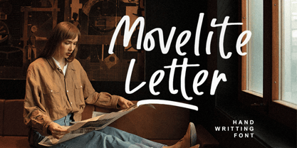 Presenting Movelite! A smooth bold Font with many ligatures. This font was made for the perfect combining of unique but simply character. You can use this font for various project, such as for advertisement, cover of book or magazine, logo, quotes, poster design, personal branding, promotional materials, logotype, product packaging, etc. Movelite also support Multi Language!
 - Daily Bubble by HansCo,
$15.00 Daily Bubble is a modern, bold, clean and decoration retro font style. Yes, you will get two versions of this font, a clean version and a decoration version. Equipped with all complete characters ranging from uppercase letters, lowercase letters, numbers, punctuation marks and multi-lingual support, this font is ready to be used in any project. Enjoy!
 - Road Work JNL by Jeff Levine,
$29.00 The October 5, 1935 issue of “Universal Weekly” (a publication detailing current film releases from Universal) was promoting the film “Remember Last Night”. Hand lettering used for this advertisement was an ultra-bold sans serif design with chamfered corners and some stylized characters. This is now available digitally as Road Work JNL in both regular and oblique versions.
 - Alnis by Daily Studio,
$16.00 Alnis is a bold type font with a round but straight shape. This font creates a formal yet relaxed vibe for any of your projects. Best font for designers. Alnis is excellent for logos, posters, cards, ext. Make your project look fascinating by combining it with another font. This font comes up with full uppercase, lowercase, and multilingual letters.
 - Doll by FaceType,
$30.00 Who needs counters? Although this typeface is bold as hell, it is still absolutely legible. If You are looking for fat curves, this is may be Your choice! There are also extra letters (A, V, v) to let You make better logos and headlines. Please take also a look at Dollbats for suitable Arrows, Symbols and Numbers.
 - Devans by Ronny Studio,
$19.00 Devans is a high-contrast blackletter typeface, it adds a bold touch to your projects and will inspire you to create something unique and modern. This font also comes with alternative characters, and multi-language support. This font is ideal for titles, flyers, book covers, printed quotes, logotypes, clothing designs, branding and album covers. Files include:
 - Write Marker by Balpirick,
$15.00 Write Marker is a Bold Marker Font. Whether you’re using it for crafts, digital design, presentations, or making greeting cards, this font has the potential to become your favorite go-to font, no matter the occasion! This font only has allcaps letters. - also multilingual support Enjoy the font! Feel free to comment or feedback! Thank you!
 - Fatigue by Typesthetic Studio,
$13.00 Heroic is a bold and playfull handwritten brush font. This font is very unique because sometimes it can look fierce like in modern street art graffiti if with capital letters, but sometimes it can look cute if it is included with the lowercase letters. As a result, this font can matches a wide pool of designs.
 - The Brande and Lotaline by Arterfak Project,
$25.00 A beautiful bold serif specially designed for display. Inspired by modern fashion and classic typography, this font equipped with hundreds of alternative characters and ligatures. The Brande and Lotaline typeface represented luxurious, elegant, glamour, fashion, and wealthiness. This font works perfectly for logotype, invitation, cards, magazine, apparel, fashion, lifestyle, poster, social-media kit, and many more!
 - Peach Lotus by Nathatype,
$29.00 It can be a tough challenge to present the best display for your projects, especially in limited options of fonts. For that reason, let us introduce you to our display serif font to amaze your audience with your projects. Peach Lotus is a display serif font we created by mixing the classical serif elements with big, bold-sized letters for you to impress and attract your audience. On top of that, it gives you more artistic, creative touches as a result of the display font combinations. A display font with thickly-lined and high contrast capital letters will produce a prominent display to strengthen the impressions delivered. In addition, you can apply this font for big-sized texts to be legible. Also, you can enjoy the available features here. Features: Multilingual support PUA encoded Numerals and punctuations Peach Lotus fits best for various design projects, such as brandings, posters, banners, headings, magazine covers, quotes, printed products, merchandise, social media, etc. Find out more ways to use this font by taking a look at the font preview. Thanks for purchasing our fonts. Hopefully, you have a great time using our font. Feel free to contact us anytime for further information or when you have trouble with the font. Thanks a lot and happy designing.
 - Saral Devanagari by Linotype,
$187.99Saral, meaning simple in Hindi, is a monolinear design supporting most Devanagari based languages. Derived from the older Linotype typeface Rohini, it has been greatly expanded into three weights and a wide character set. Saral Light, Regular, and Bold are made to coordinate with the respective weights of Helvetica. This design works well in many environments, such as corporate designs, advertising, packaging, signage, and especially for bi-lingual texts. The OpenType font format accommodates hundreds of pre-composed conjuncts, accurate placement of vowel signs, and supports varying length matras. Saral's Unicode encoding guarantees your text is rendered correctly and is compatible across different software and computer platforms. Please note that due to current operating system and application limitations the OpenType features in complex scripts such as Davanagari are not universally supported. Saral is designed to be rendered correctly in Microsoft Word on Windows running the latest version of Uniscribe. If using a Mac or Adobe products such as InDesign then many features may not function as expected. This is including glyph reordering, substitutions, and mark positioning. In the case of small passages of text, alternate input methods can be employed. Apple's character palette and Adobe's glyph palettes are two readily available options that can be used to manually insert glyphs as needed." - Amorie by Kimmy Design,
$12.00 Amorie is a tall and skinny hand drawn font. It comes in various weight and styles, and with an array of opentype options. Built to appear completely hand crafted, different designers could produce completely different results, selecting either Modella (classic and chic), Nova (fun and fancy) or SC (Small Caps and all business.) Each style comes in light, medium and bold and has an accompanying italics version. Opentype for this font includes Contextual Alternatives, which produces three versions of each character, making sure no two identical letters appear next to each other thus giving your design a fully authentic look. There are also stylistic alternatives, which offer different style to a select few characters, including capital letters: A, K, R, Q, Y and lowercase letters: a, e, k, t, y. Lastly, is a large set of swashes, 3 for each letter they accompany. For the most part this includes the whole uppercase alphabet as well as lower case letters with an ascender or descender. Amorie includes a large set of graphic extras, including stylish frames, arrows, line breaks, corners, flourishes and more. The complete package gives you one unbeatable font family. If you do not use Opentype but are using a program that includes a full glyph panel, you will be able to access each of the style variations you want.
 - Greek by Scholtz Fonts,
$8.95The Greek font started from an experiment with designing fonts based on a geometric grid. I joined the points on the grid with straight lines to form the various characters and found that this resulted in a font that closely resembled Greek writing (derived from inscriptions carved in stone) of ancient times. I continued to develop this theme but I now accentuated the look and feel of Greek writing. The three styles shown are the results of this development. I did not kern or letterspace the individual letters since this would have been out of character with the orignal Greek writing. This means that the font is mono-spaced. At a later stage I may produce more refined and "modern" versions of these fonts. Surprisingly, the Greek SCF styles are very readable. The font is fully professional in terms of its character set. It contains over 235 characters - (upper and lower case characters, punctuation, numerals, symbols and accented characters are present). In fact, it has all the accented characters used in the major European languages. - Scripta Pro by John Moore Type Foundry,
$54.00 Scripta is a family of typefaces that leads "Scripta Pro", a commercial script writing similar to those used in ads advertising the decades 40 and 50, with fine lettering combinations of that time, Scripta Pro is ideal for composing headlines and subheads and this is supplied in two weights. This system is complemented by a Roman Sans "Scripta Gothic" an artdeco style typeface to harmonize with the style of that fonts. To add style to set fonts, created "Scripta Icons", one dingbats font based on a series of graphs that help recreate the ornamental fantasies of a postwar generation, a society in transition between the classical world and ornament and promises of a cosmic and atomic world. For those wishing to use words made was created "Scripta Catchwords". "Scripta Pro" is a script typeface inspired by the style works of the american typeface designer LH Copeland.
 - Maree by Ashton,
$5.00 If you want to write something sincere and genuine but not too formal then this is the font for you. It is based on real handwriting, not some artificial calligraphy made to be either too haphazard or spiky or have loads of elegant flourishes but an ordinary person's writing, and designed to look as natural and as close to the original lettering as possible. Like any person's writing it is individual and distinctive, but so easy going on the eye those differences sit comfortably with you. It is friendly and open with easy to read glyphs both as lowercase and uppercase. The letters are relatively wide with clearly shaped distinct outlines. This font may be ideal for projects where you expect a wide readership with different reading abilities from young to old. When you are using this font a slightly bigger point size usually gives a better result so for a standard letter or similar you should size up to 15 points or more. Maree has been individually crafted to the smallest detail. To create a realistic handwriting font that looks relatively simple but works in a wide variety of languages requires a complexity and attention to detail most fonts will never require. This font in any ordinary business environment would never have been made, the effort required to make it too great, the length of time too long. There have been no shortcuts in this font, no automatic scanning or tracing, no automatic generation, no class kerning. Not only is each glyph individual but the width of letters, the height, the accents and the positions of the accents are all different. Even the line weight of the letters is designed to have natural variation but yet similar enough that the font appears as though it were written effortlessly in the same pen. And in order to keep the spacing consistent even though the letters have different widths, heights, lengths of descenders and so on, there are a vast number of kerning pairs, letter to letter, number to number, letter to number... All kerning has been individually assessed with an eye to proportionality taking in character shape, size and weight. For instance if you write a telephone number the numbers all sit close together but if you write a number before a letter such as in a UK post code or before a unit of measurement an extra little bit of space has been added which makes the number more distinct and therefore readable. That space is so natural to the eye that you don’t even know it is there. However even in the spacing allowance has been made for the fact it can’t be too perfect because when you write by hand the spacing is inconsistent. There have to be some letters which are too close or far apart otherwise the font would look artificial. For similar reasons if you are going to print out this font for a letter, etc, check the print version before you make any letter spacing changes because with the zoom functions in modern applications that uneven spacing and lettering can seem more pronounced than it actually is. When this font is printed out you will find it is surprisingly neat. This font is what it is, simple clear handwriting. You will not go wow. But if you want something unique and different and looks good on the page you won’t be disappointed. This font is not a work of art but it is a work of love. This font has a soul. How many fonts can you say that about?
 - Naive Inline Sans by S&C Type,
$8.00 Naïve Inline Sans is a layered sans serif handwritten font designed by Fanny Coulez and Julien Saurin in Paris. Our goal was to draw a font with finely irregular lines that give a human and whimsical feeling. We designed three weights to assure a good readability whatever the size. They can be enhanced with five different interior patterns and three shadows to improve your designs and bring a charming and unusual feeling. To do so, you can simply superimpose the layers with a compatible software like Photoshop, the weight above and the pattern(s) below, then choose a color for each. This font is part of our Naïve superfamily that contains lot of variations: Line, Inline, Serif, Sans Serif, and a special Art Deco one. Just click on our foundry name to see them all! We hope you will enjoy our work. Merci beaucoup!
 - PiS VinoZupa by PiS,
$28.00 PiS VinoZupa is based on a logo found on an old Serbian bottle of brandy. The vintage 1971 plum fuel burns down your throat and blinds your eyes, the serifs you draw grow bigger and bigger with every sip you take. A Western-style slab serif font, coming from the finest distilleries in an Eastern European village. Features heavy caps with a few alternating glyphs in the lowercase letters and all the nice diacritics you need for super-drunk Serbian babble.
 - Rohn by Nine Font,
$29.00 Rohn is a modern squarish typefamily with a large x-height. Its letterforms are based on the shape of square with rounded corners. With particular details and large x- height, it is more legible at small sizes both on screen and paper. It has seven weights from Thin to Black with corresponding oblique styles and each weight includes ligatures, fractions, old style numbers, case-sensitive forms and more. Rohn is ideally suited for branding, logo, packaging, magazine, poster and editorial design.
 - Caslon Titling by Monotype,
$29.99Monotype Caslon Titling was made available for hot metal casting in 1932. The capital Monotype Caslon Titling letters were based on types from the Stephenson Blake Foundry, previously the Caslon Foundry. Originally designed by William Caslon in the eighteenth century, Caslon is considered an old face although it has characteristics which were later found in the transitional typefaces. The Monotype Caslon Titling font has a distinctive style, generous width and strong color, ideal for use in advertising, magazines and on book jackets. - Deco Francois JNL by Jeff Levine,
$29.00 The 1930s-era French alphabet collection entitled “La Lettre Dans le Decor & La Publicite Modernes” (which somewhat translates to “The Letter in Modern Decor and Advertising”) has page after page of attractive and unusual type interpretations. One particular Art Deco design puts an entirely different spin on the classic “rounded terminals and geometric design”. Unusual character shapes add a fresh new/old take to the “Streamline Movement”. The aptly-named Deco Francois JNL is available in both regular and oblique versions.
 - Vladimir Script by ITC,
$40.99Vladimir Script is a brush-style font, similar to the kind of lettering found on old hand-painted department store signs during the 1950s. The letters have a steep slant, and the uppercase letters and the numbers are rather informal. Many of the letters' strokes end in looped terminals, some with dynamic amounts of contrast. Vladimir Script is best used in larger point sizes, where its subtle details can dance across the page. The typeface looks fabulous on signs and cards. - Thequilla by Rometheme,
$25.00 Thequilla is vintage monoline script font. It has vintage, elegant, old school, classy, and cool. It’s a great font for fashion, apparel projects, signature, album cover, logo, branding, magazine, social media, & advertisements, but also works great for other projects. Highlight: - Easy instalation - Work on PC or Mac - PUA Encoded Support - Basic Latin A-Z and a-z - Numbers - Symbols - No special software is required, The fonts can be opened and used in Adobe Illustrator, Adobe Photoshop, Adobe InDesign, even work on Microsoft Word.
 - KT Higer by Kotivoro Lab,
$18.00 KT Higer is a display font inspired by old design archives. This font Designed by Wahyu Ichsan Fauzi & Fikri Maulana Ikhfa. they focused develop Higer to a Display Headline font. This font have total 381 Glyphs and the families is still under development to be super family typeface. This font suitable with your projects such as poster, user interface, magazine, logo, apparel design, etc.
 - Oona by Autographis,
$39.50 Oona is a joining script with that classic, elegant "Old England" touch.
 - Kingthings Spike Pro by CheapProFonts,
$10.00 You gotta love this extreme take on the "gothic" blackletter traditions! Roger Nelsson edited a few letters, drastically improved the spacing - and then gave it the usual large CheapProFonts character set. Fun! Kevin King says: "Kingthings Spike was made because Buffy has one, I made Willow... Xander is yet to come. Oh and because I hate Engravers Old English! Pugin, eat my shorts! Sorry!" Kingthings Spikeless is a toned down version of Kingthings Spike. Kevin King says: "Kingthings Spikeless was requested by those who actually want to read text... well I call that tedious, but if you must, here it is no flourishes, just my small homage to black-letter." ALL fonts from CheapProFonts have very extensive language support: They contain some unusual diacritic letters (some of which are contained in the Latin Extended-B Unicode block) supporting: Cornish, Filipino (Tagalog), Guarani, Luxembourgian, Malagasy, Romanian, Ulithian and Welsh. They also contain all glyphs in the Latin Extended-A Unicode block (which among others cover the Central European and Baltic areas) supporting: Afrikaans, Belarusian (Lacinka), Bosnian, Catalan, Chichewa, Croatian, Czech, Dutch, Esperanto, Greenlandic, Hungarian, Kashubian, Kurdish (Kurmanji), Latvian, Lithuanian, Maltese, Maori, Polish, Saami (Inari), Saami (North), Serbian (latin), Slovak(ian), Slovene, Sorbian (Lower), Sorbian (Upper), Turkish and Turkmen. And they of course contain all the usual "western" glyphs supporting: Albanian, Basque, Breton, Chamorro, Danish, Estonian, Faroese, Finnish, French, Frisian, Galican, German, Icelandic, Indonesian, Irish (Gaelic), Italian, Northern Sotho, Norwegian, Occitan, Portuguese, Rhaeto-Romance, Sami (Lule), Sami (South), Scots (Gaelic), Spanish, Swedish, Tswana, Walloon and Yapese.