10,000 search results
(0.074 seconds)
- Global Street by Letterhend,
$17.00 Global Street is a bold font with playful & cartoonish looks. This type of font perfectly made to be applied especially in cartoon or child theme which is need a standout font, and the other various formal forms such as invitations, labels, logos, magazines, books, greeting / wedding cards, packaging, fashion, make up, stationery, novels, labels or any type of advertising purpose. Features : Reguler, inline & extrude version Upercase & lowercase Numbers and punctuation Multilingual Ligatures PUA encoded We highly recommend using a program that supports OpenType features and Glyphs panels like many of Adobe apps and Corel Draw, so you can see and access all Glyph variations.
 - Black Rocket by Letterhend,
$19.00 Black Rocketis a standout handwritten font with a touch of grunge and free look and feel. If you want to pick bold and standout font for your design, this is the font that you're looking for! This font is perfect for packaging, flyer design, event poster, event greeting,or any type of advertising purpose. Features : uppercase & lowercase numbers and punctuation multilingual PUA encoded We highly recommend using a program that supports OpenType features and Glyphs panels like many of Adobe apps and Corel Draw, so you can see and access all Glyph variations. How to access opentype feature : letterhend.com/tutorials/using-opentype-feature-in-any-software/
 - Winnie The Hoop by LetterMaker,
$28.90 Winnie the Hoop is a bold, friendly and round display family inspired by a certain well known teddy bear. The family consists of three styles; Roman, Italic and Script, which are designed to be combined together. You can use any of the three styles as your main style and use the others to create multilayered typography that all share the same aesthetic. The typeface is well suited for branding and packaging design, advertisements, posters and even editorial design as a headline style. The Script is packed with ligatures and has Swash alternates that make it easy to customise your design. All styles include two sets of numerals.
 - Waddle by Ben Sanders,
$18.99 Waddle is inspired by the playfulness of mid-century jazz albums, opening title sequences and movie posters. Friendly, rounded, slightly roughed, with a bouncy baseline, this unique typestyle boasts a generous number of glyphs and ligatures across all three weights. Waddle Thin is perfect for body copy and is both fun and elegant. Waddle Plump has been designed for bold headlines and titles. Waddle Regular is an ideal all-rounder. Combine the Waddle Family for maximum affect the next time you need to get a playful and positive message across to an audience of any age. Not too kiddy, not too serious ... just right.
 - Linotype Tapeside by Linotype,
$29.99Linotype Tapeside is part of the Take Type Library, chosen from the entries of the Linotype-sponsored International Digital Type Design Contests of 1994 and 1997. British designer Stephan B. Murphy created this typeface with light, regular and bold weights, each with its matching italic. Consciously awkward, the characters line themselves up and produce a young, lively image. Linotype Tapeside is best for headlines and shorter texts in point sizes of 12 and larger and its varying stroke strengths allow this font to be set more universally than others of its kind. - Jutlandia Pro by David Engelby Foundry,
$12.00 Jutlandia Pro is a redesign of Jutlandia Slab. About the Jutlandia font family: made for straightforward and functional typographic design. Its design is rooted in clarity and legibility which is the slab serif tradition. The unpretentious, yet sturdy and functional visual expression of the regular form, and the subtle bold and italic forms is an homage to Jutland – the Cimbrian Peninsula of Denmark and my birthplace. It's suitable for package design, logotype, poster design, editorial design and anything you can dream of! Great for tons of text copy as well. Enjoy!
 - Aure Jane by Aure Font Design,
$23.00 Aure Jane defines grace under fire. These clean, sans-serif forms engage the reader with a subtext of trust. Jane’s excellent legibility will stand up under almost any typographic challenge, bringing confidence to text and titles, and clarity to astrological expressions and chartwheels. Jane is an original design developed by Aurora Isaac. After more than a decade in development, 2018 marks the first release of the CJ and KB glyphsets in regular, italic, bold, and bold-italic. The CJ glyphset is a full text font supporting a variety of European languages. A matching set of small-caps complements the extended lowercase and uppercase glyphsets. Supporting glyphs include standard ligatures, four variations of the ampersand, and check-mark and happy-face with their companions x-mark and grumpy-face. Numbers are available in lining, oldstyle, and small versions, with numerators and denominators for forming fractions. Companion glyphs include Roman numerals, specialized glyphs for indicating ordinals, and a variety of mathematical symbols and operators. The CJ glyphset also includes an extended set of glyphs for typesetting Western Astrology. These glyphs are also available separately in the KB glyphset: a symbol font re-coded to allow easy keyboard access for the most commonly used glyphs. In addition to Aure Jane’s versatility as a text font, Jane can enhance the message of other designs. Aure Jane pairs well as an innocuous foil to any decorative font; Aure Sable, for example, will shine all the more beside Jane’s sensible utility. The witty highlights of Aure Brash will sparkle against Jane’s practicality. Give Aure Jane a trial run! You may discover a permanent place for this font family in your typographic palette. AureFontDesign.com
 - Mackay by René Bieder,
$39.00 Mackay is a powerful transitional serif in 6 weights plus matching italics, designed for screen and print. The eccentric serifs on uppercase letters like E, F, L and T are inspired by Alexander Kay’s “Ronaldson” from 1884, working as the starting point for the family. The lowercase letters follow the traditional Antiqua model with attributes tracing back to drawings from the early 20th century. The “grotesk” lowercase a, as well as the sharp lowercase s, derived from the closed shapes of uppercase letters like C, G or S, create a compact and bold appearance while a large x-height and small descenders add a modern look. In favor of a dynamic and elegant impression, the design of the italic cuts come with a strong calligraphic influence. This results in completely new shapes for letters like lowercase a or g, ensuring a smooth integration into their surrounding letters while maintaining a distinctive appearance when combining with romans. The family comes with a variety of opentype features like case sensitive shapes, old style figures, fractions, ordinals and many more. Additional attention was given to the standard and discretionary ligatures, extending the structure of the basic glyphs with elegantly designed letter combinations for g/i, i/t or s/t. According to their dynamic architecture, the italic weights are equipped with additional initial swash characters to subtle accentuate the calligraphic roots. As a result of a high stroke contrast the family works great in paragraphs with medium to large font sizes like headlines, short paragraphs or logos. With its 12 cuts, the family meets all requirements on high quality typography.
 - Austin Antique by HiH,
$10.00 “More is better” may have been the motto of Richard Austin of Austin and Son’s Imperial Letter-Foundry on Worship Street at Finsbury Square in London when he designed and cut his Antique typeface. The year it was created is uncertain, but it is known to have appeared in a specimen book produced in 1827. At first glance, the upper case letters of Austin Antique look very much like Figgins Antique. But, upon examination, one will note that the Austin face is much darker. In general, the letters designed and cut by Richard Austin have fatter strokes, larger serifs and smaller counters -- more metal and less daylight. The premise was that the darker the letter, the more attention an ad using the typeface would receive. In old pictures of London and Paris one may see walls crowded with posters and “bills” -- competing for the attention of the passerby. Morris and Updike aside, the early nineteenth century marked the beginning of a commercial as well as industrial revolution. Patterns of commerce were changing. With new methods of marketing came the need for new typefaces to support the new methods. Foundries found the display types were very profitable and competed most energetically and creatively for the trade. There was a lot of trial-and-error. Some ideas faded away. Others, like the Antiques or Egyptians, were refined and developed. From them came the Clarendons that were to prove both popular and long lasting -- because they worked. Their job was to sell goods, not please the aesthetic sensibilities of the critics. They did their job well. Austin Antique has a full Western European character set, plus the following ligatures: ct, st, fi, fl, ff, ffi and ffl. Tabular numbers. Surprisingly readable.
 - Doublethink by Barnbrook Fonts,
$30.00 Doublethink was developed from lettering drawn in the 1960s by Vinko Ožić-Pajić and used on the shop fronts of Yugoslavian state-owned clothes company Standard Konfekcija. The original design has been reinterpreted and expanded and is offered as a two weight typeface—Doublethink Medium and Doublethink Bold Inline. Standard Konfekcija was established first as a military fabric company and later became the premier fashion brand outlet in the Communist state of Yugoslavia. It is famous for being the first shop in the country to offer plastic bags (Standard Konfekcija stores ceased trading after the fall of Communism).
 - Blue Carousel by Letterhend,
$19.00 Blue Carousel is a bold handwritten script typeface with fun and playful look. This type of font perfectly made to be applied especially in logo, and the other various formal forms such as invitations, labels, logos, magazines, books, greeting / wedding cards, packaging, fashion, make up, stationery, novels, labels or any type of advertising purpose. Features : uppercase & lowercase numbers and punctuation multilingual alternates and ligatures PUA encoded We highly recommend using a program that supports OpenType features and Glyphs panels like many of Adobe apps and Corel Draw, so you can see and access all Glyph variations.
 - Centrale Sans Condensed by Typedepot,
$29.00 Centrale Sans Condensed is not just a "squished" version of our Centrale Sans family, it's designed as a stand alone typeface with the family characteristics in mind. It bears all the qualities of the normal width being even friendlier because of the closer relation it has with the humanist model. The condensed width is with 15% narrower than its normal sibling, which makes it precious space-saving tool. Centrale Sans Condensed also have 9 weights from Hairline to Extra Bold plus their matching italics. It includes Some OpenType features like discretional ligatures, tabular figures and stylistic alternatives.
 - Spitting Image by preussTYPE,
$25.00 SpittingImage is a font which speaks of mechanical exactness, cool and reserved. The SpittingImage font family is formed by two different weights (regular and bold), each one with uppercase and lowercase letters, numbers, punctuation marks and diacritic characters in regular and italic. The outline version included as a part of OpenType-Feature. There are in all styles numerous ligatures, alternate characters, small caps, and different sets of numbers that you can put both headlines and short texts without any problems. OpenType features: contains over 1.000 Glyhps Central European Glyhps Standard Ligatures Small Capitals Stylistic Alternates Discretionary Ligatures OldStyle Figures Ordinals Slashed Zero Feature
 - Number Five by Laura Worthington,
$29.00 Number Five is pure Americana, suitable for titling, display, logo, signage, and editorial work. Its bold and casual down-to-earth lettering evokes the spirit of the 1940s and 1950s in America. Number Five has 433 alternates, including a set of unconnected letters (the default set is all a connected script), and 10 ornaments. See what’s included! Rough • Smooth *NOTE* Basic versions DO NOT include swashes, alternates or ornaments These fonts have been specially coded for access of all the swashes, alternates and ornaments without the need for professional design software! Info and instructions here: http://lauraworthingtontype.com/faqs/
 - Ballasticus by Shapovalov Fonts,
$15.00 Ballasticus is a controversial bold grotesque for logos, big headlines, posters, signage, gyms, and bodybuilders. The outer contour of the beech is rounded, while the inner space is square. The font contains two barbell icons that can be immediately inserted into your company logo. The character of Ballasticus is honest, stable, open, grounded like a weight. Ballasticus contains extended Latin, Cyrillic, ligatures, barbell and peace sign, as well as alternatives for some letters, the total number of glyphs is more than 700. It contains OpenType functions: liga, numr, dnom, calt, ss01. The font is also case sensitive, has fractions, currency signs, and arrows.
 - Alda by Emigre,
$59.00 The original idea for Alda came from exploring an alternative approach to generating different typeface weights by adapting the characteristics of physical objects. I was interested to find out how far this could be pushed before the letters became a parody of what they referenced. Initially I took this treatment very literally, with the boldest weight expressing the tension of bent steel, and the lightest being as spineless as a rubber band. This allowed me to infuse each weight with unique characteristics, where the bold is robust and angular, and the light is delicate and soft.
 - Montix by Linotype,
$49.00Montix is a narrow, constructed type family that developed by the German designer Diana Fischer in 2003. With five weights (light, light italic, regular, regular italic, and bold), Montix is a particularly effective small family, especially when used for headline or display purposes. Montix's letterforms have relatively long ascenders and descenders, which compared with its horizontally compact body gives it its unique style. Words or lines of text set in Montix would look best when some amount of white space is left around them. Because of this, the faces are well suited for logos and corporate identity uses. - Better Kamp by Ingrimayne Type,
$6.00 BetterKamp was originally constructed in 1995-6. It was not constructed to meet any specific purpose but out of curiosity, to see what the result would be if two quite different faces were blended. KampIngriana is the offspring of BetterTypeRight, which has characteristics of a typewriter face without the monospacing, and KampFriendship, which mimics a serifed face drawn by hand. The original blending had many oddities that I did not clean up until 2020 when I also added the semi-bold weights. BetterKamp lacks polish and elegance, but it is very readable at small point sizes.
 - Reality Goals by Fikryal,
$22.00 Reality Goals is a beautiful and stylish handwritten display font that exudes creativity and inspiration. This font is perfect for a variety of projects, including branding, marketing materials, social media graphics, quotes, invitations, and more. The font features unique and eye-catching letterforms that are carefully crafted to convey a sense of playfulness and sophistication. The characters are designed to appear as if they were hand-drawn, with irregular lines and strokes that add a personal touch to any design. With a bold and modern look, “Reality Goals” is sure to catch the attention of your audience and make a lasting impression. It is versatile and easy to use, and can be paired with a variety of other fonts to create a unique and cohesive look. Reality Goals Multilingual Support Thank you
 - Happy Maggie by SIAS,
$29.90 The design of this font was created by a 13-year-old girl. The digitisation is faithful to the original drawings and keeps all of the wonderful special details which make this font absolutely unique.
 - Cala by Hoftype,
$49.00 Cala is a reflection of Venetian Renaissance types but with a contemporary look. It has an energetic profile, achieved through soft outlines and a flowing rhythm. It is lively, remains stable in small sizes and is beautiful in display sizes. Cala comes in eight styles, in OpenType format and with extended language support. All weights contain standard and discretional ligatures, small caps, proportional lining figures, tabular lining figures, proportional old style figures, lining old style figures, matching currency symbols, fraction- and scientific numerals.
 - Oblonga by Eurotypo,
$28.00 Oblonga shows thin, elegant lines. The continuity of the trace is only suggested through the curves of the letters, a soft effect of bonding that maintains the identity of each character. Oblonga is an Art-Déco font proposed in a modern key, a revival performed without aggression. More than three hundred glyphs (regular and Italic) that ensure legibility in Central-European and Slavic languages, enriched by some appropriate discretionary ligatures that enhance the charme of a time gone away.
 - Ottanio Pack by Fontscafe,
$39.00 As the most classic and traditional style pack of the Fonts Café, the Ottanio family take a place of honor in the list of the Fonts Café handmade Vintage style fonts. Clearly born for being noticed, the boldness and the almost imperceptible, but present to the eyes of subconscious mind, irregularities of the Ottanio Family has been well balanced to create a set of handmade Serif fonts that can be used as “jack of all trades” where traditions, origins and a touch of Vintage style are required. From the integrity of the Ottanio Regular, the stronger style of the Shaded version and the scraped look of the Stamp option, the whole Ottanio Pack will be the perpetual solution always useful to have on hand!
 - Merrivaux by Greater Albion Typefounders,
$18.00 Some time ago, when we were working on our Merrivale family, it occurred to us that an adaptation of the design, incorporating selected Blackletter elements, would be in the best traditions of 19th and 20th century blackletter revivals, which combine all the spirit of the middle ages with modern legibility-think of Goudy Medieval as an example. In the case of Merrivaux (best quality faux-medieval name there!) we've produced a typeface which has the ready legibility of Roman titling, but which gives a subtle blackletter feel. The regular form of Merrivaux is incised with a visible midline, a solid form with identical metrics is also offered. Both forms include a range of opentype features including ligatures, fractions, old style numerals and terminal forms. Merrivaux is ideal for posters, signage and design work, where a touch of that 'Olde-Worlde' feel is needed.
 - Claretta by Cooldesignlab,
$10.00 Claretta is a Family Font full of modern styles. It comes with a completely new set of letters & glyphs, all filled with love. This font has 4 Styles: Normal, Bold, Italic & Outline. However, Claretta offers a futuristic design approach and sharp personality. Created & designed for Design purposes such as Titles, Logos, Games, Applications, Films, Posters, T-shirts, etc. Mac users can use the Letter Book, and Windows users can use Character Maps to view and copy additional characters to be included in your favorite text editor / application. I hope you enjoy this font. If you have questions, don't hesitate to give me a message :) CooldesignLab,
 - Sanehya by Crowntype Studio,
$12.00 Sanehya is a script type family of three fonts. It is inspired by Gorgeous Fonts and has a soft and welcoming look. Sanehya can be used for branding, packaging and wherever you need a script font that is easy to read and smooth. Sanehya has many ties, strokes and alternate characters that will make your designs unique and beautiful. You can also purchase Sanehya as a Font Family and adjust the weight of Sanehya seamlessly between Italic and Bold weights. Note that you need design software that supports the Font Family. If you have any questions, feel free to contact me by email: crowntypestudio@gmail.com Thank you!
 - Marmaris by Larin Type Co,
$15.00 Marmaris this is a soft and elegant serif font. It carries a bold weight, round shapes it is well readable and works well in headlines and with text. This font is suitable for a wide variety of projects such as: logos, labels, branding projects, magazines, homeware designs, product packaging, mugs, quotes, posters and much more. It can also be more expressive and playful, thanks to the many alternatives and ligatures that are harmoniously combined in this font and make it more attractive and versatile. Try to change the alternatives, ligatures and you will get a lot of options for your project that will make it unique.
 - Ang Thong BT by Bitstream,
$29.99Bitstream developed Ang Thong for the Microsoft Windows operating system. The font is encoded with a Microsoft defined Thai character set, Thai Code Page 874. The font includes Thai glyphs and Latin glyphs from Dutch 801. Ang Thong (basin of gold) is a province in central Thailand which consists mostly of flat agricultural land used for growing rice. - Graveyard Smash by Comicraft,
$19.00 Tombstones tumble as the night shift begins; as bloodsucking bats turn into pale predators and the undead reach through the dirt that covers their coffins to crush and destroy those who dare cross the cemetery path... Finally there emerges a cold cast of creepy characters, a macabre cadre of lurid letters we had to call… GRAVEYARD SMASH.
 - Kertayasa by Akufadhl,
$25.00 Kertayasa is a layered typeface inspired by an old signage and vintage letter painting. It consists of 10 layers, a wide support of latin languages, and some alternates. You will imbue beautifully vintage display typography in anything – including editorial and packaging – which you might create.
 - Shaken, Not Stirred by Hanoded,
$15.00 Shaken, Not Stirred. A famous line from just about every James Bond movie (yes, we're talking Martini-time). The font is also quite shaken (and not stirred). It looks like someone scrawled something onto paper, or etched the letters in metal. Shaken, Not Stirred comes with a set of diacritics befitting a Secret Agent.
 - Tiler JNL by Jeff Levine,
$29.00 Tiler JNL is a novelty font with geometric styling. Its use can be as diverse as an ad for wall or floor tile to conveying a modular feel within a futuristic setting to signage on the wall of an old-time subway station.
 - Muscle Cars by Vozzy,
$10.00 Introducing vintage label font duo named Muscle Cars. These two fonts has an additional characters and multilungual support (check out all available characters on previews). Bold and Script fonts has two styles: Clean and Aged. This font will look good on any vintage styled designs like a poster, T-shirt, label, logo, etc.
 - Hittedal by Edignwn Type,
$18.00 The font collection is called "Hittedal", it is a display font for logotype. These collections contain bold script and sans serif font. This script font includes some alternates and ligatures. The Hittedal matches apply in some designs such as the logo, poster, label, badge, packaging, t-shirt, branding, quotes and more custom design.
 - The Hungry by Zeenesia Studio,
$14.00 The Hungry font. It has a bold and smooth style and is perfect for making any design stand out. Best suitable for branding, packaging, print titles, tshirt design, food design, and similar projects. more than 50 stylistic alternates and some natural ligatures to make this font very classy and look so beauty.
 - Mightsilly by Qwrtype Foundry,
$14.00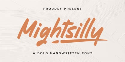 Proudly presenting Mightsilly Mightsilly is a bold handwritten font. Mightsilly is perfect for product packaging, branding project, magazine, social media, wedding invitations, or just used to express words above the background. Mightsilly also comes with multilingual support. Enjoy the font, feel free to comment or feedback, send me PM or email. Thank you!
 - Softrock by Doehantz Studio,
$18.00 SOFTROCK, a bold sans serif font with 3 styles Regular, Rounded, and Textured Effect. SOFTROCK is made as neatly as possible with great attention to detail. softrock is very suitable to be used in making quotes, headlines, logos, labels, lettering, and packaging. What's Included? Uppercase & Lowercase, Numbers, Punctuation, and Multilingual Support. Thank You
 - The Signage by Fikryal,
$18.00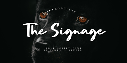 The Signage is a bold script font perfect for crafting, branding, invitation, stationery, wedding designs, social media posts, advertisements, product packaging, product designs, label, photography, watermark, special events, or anything. Included : The Signage multilingual support If you have any questions please don’t hesitate to contact me Thank you best regards, Fikryal Studio
 - Mounth by Linecreative,
$16.00 Mount is Modern Slab Serif Font Mount is a bold slab-serif font for titling, captions and logo. this font is similar to Simple Note font, but it comes in round and rough shapes. Mount offers you: 1. Upper and Lowercase characters 2. Multilingual Support (Latin Western Europe) 3. Numbers and Punctuation
 - Undeka by WildOnes,
$24.95 Undeka™ is a modern contemporary sans serif typeface that embodies simple geometric shapes combined with strong typographical foundations. Inspired be the grotesk typefaces made in the early 20th century. It was made by Krisjanis Mezulis at the WildType Foundry. Undeka is available in 6 different versions - Regular/Italic, Light/Italic, Bold/Italic.