10,000 search results
(0.025 seconds)
- Willpower Slab by Sign Studio,
$9.00 Willpower Slab is made to write neatly and to make it easy to read properly. Smooth design and balanced thickness. Each character has been set kerning. You can just write comfortably with him 5 thickness options.
 - Catalpa by TypeTogether,
$35.00 The Catalpa font family is José Scaglione and Veronika Burian’s wood type inspired design for an overwhelming headline presence. It has no regular weights, only four slender and four hulking weights. Catalpa wasn’t made to be normal; it was made to overwhelm, to stand out, to bellow. Catalpa is the first font family within a trilogy that will be released through 2020. Each of the three have a distinct purpose and their own look, but they serve a common goal: to act as a complete family covering an editorial’s wide array of needs. As the first of the three, Catalpa is the bookend font family with a headlining purpose. What requirements are there for a great headline typeface? Distinction, weight, and cohesiveness are a good start. Its distinctiveness must catch attention, it must have a range of weights applicable to its purpose, and its internal consistency and external look must create a cohesive family. Catalpa is a distinct and unified family whose weights are attuned to its single-minded purpose — headlines and large text. Catalpa has only eight styles that are divided into two ranges of weights — four very light weights (Hairline, Thin, Extralight, and Light ) and four very bold ones (Extrabold, Heavy, Black, and Extrablack). The thin and heavy ends of the spectrum also have their own variable fonts, each with one axis of weight so designers can fine-tune their work. The geometric influence of the design is more obvious in the light range, with their line thickness increasing in the classical manner. The bold weights increase more in width and substance to serve well in websites, mobile apps, posters, advertisements, and magazines that aim for impact more than spreading information. As a family, Catalpa gels in big headlines, short sentences, and isolated words. The family has many recognizable features, in the bolder weights especially, like the reversed contrast ‘S, s’ or the angular design of ‘Q, M, W, w, a, f, 2, 3’. Catalpa’s headlining mixture of geometry and quirkiness leaves an impression that is so characteristic of wood type, but designed for substrates and screens.
 - San Giuseppe by Mans Greback,
$59.00 San Giuseppe is a serif font with finesse and unique charm. Inspired by the romantic, ornate style of the Victorian era and the bold, captivating geometry of Art Deco, San Giuseppe is the perfect blend of neo-classic and vintage aesthetics. This serif font family is designed to infuse your work with an air of grace and refinement that is sure to leave a lasting impression. Ideal for wine labels, luxury branding and high-end packaging, San Giuseppe is an all-capitals font, featuring a stunning array of alternate characters that allow you to create a truly bespoke typographical experience. With its fine, intricate serifs and delicate, artistic letterforms, this font is a testament to the beauty and craftsmanship of yesteryear, created for a modern setting. The San Giuseppe font family consists of six high-quality styles: In addition to the Regular font, it is provided in both Bold and Light, and each of the weights as Italic. The font is built with advanced OpenType functionality and has a guaranteed top-notch quality, containing stylistic and contextual alternates, ligatures and more features; all to give you full control and customizability. It has extensive lingual support, covering all Latin-based languages, from Northern Europe to South Africa, from America to South-East Asia. It contains all characters and symbols you'll ever need, including all punctuation and numbers.
 - Denominary by Balibilly Design,
$19.00 Denominary typeface is about precision, beauty, and refinement. It's crafted with care and attention to detail for professional creative people who value quality and distinction. The Denominary typeface has an advanced feature that sets it apart from others: auto-active contextual alternates. Our font engineer writes this feature to minimize kerning between characters automatically, making it very convenient and easy to use, especially for web purposes where minimal kerning means a smaller font size. The feature adjusts the kerning based on the specific characters being used, ensuring optimal spacing between letters. Contextual alternates will push your typography project to a balanced form. We designed the letterform by considering the white space and contrast to get a natural voice and fluid, and of course, this will happen in a legible and stylish. Denominary typeface offers extensive language support and stylistic variations, thanks to its 482 glyphs. It also has discretionary ligatures, case-sensitive forms, and slashed zeroes for added typographic options. The condensed style saves space, and seven weights will provide more options. Denominary typeface brings refinement, exclusivity, and sophistication to any design project. It's a typeface that tells a story of precision, beauty, and distinction. Go ahead with the game in terms of its advanced auto-active contextual alternates feature, giving you a competitive edge in the design field.
 - ITC Tickle by ITC,
$29.99When Patricia Lillie was growing up, she thought the coolest thing in the world would be finding her own name listed in a library catalog. The fantasy came true in 1986 when her first children's book was published. Five more followed. The thrill of seeing her work on library shelves hasn't abated, but today, Lillie is just as likely to see one of her typefaces on the cover of a book. She has created several display faces and image fonts. My first typeface designs were based on lettering I'd done while working for a library, doing graphics work for the children's section," she explains. "I currently do a lot of web design, but type is my favorite thing." The Tickles (ITC Tickle and ITC Tickle Too) are Lillie's first ITC typeface releases. "I was playing around with a Sharpie marker one day and liked the way the letters looked," she recalls. "I started redoing the letters from scratch in Fontographer to see what developed, and liked those letters too." ITC Tickle is a bi-form font (with both cap and lowercase letters of the same size) that clearly breaks a typographic rule or two. ITC Tickle Too has the same basic lettershapes, but they've grown clusters of stipples that give a three-dimensional quality to the design. The result is a friendly, offbeat display family that's guaranteed to add a giggle to your work." - Marceaux by Hexagon Foundry,
$17.00 Marceaux is a sophisticated font with a touch of elegance and modernity. The letterforms are sleek and slender, with clean lines that give this font a refined and graceful appearance. Whether you're creating a logo, a book cover, or a website, Marceaux will bring a touch of class to your project. Marceaux features a complete set of small caps, uppercase, and lowercase letters. The font has been developed in six weights, from light to black, with corresponding true italics and oblique letters, and two styles (serif and sans-serif) for a total of 24 styles, making it versatile enough to use in a variety of design applications. Marceaux includes an expanded character set that supports over a hundred latin-based languages.
 - Letteria Pro by Latinotype,
$29.00 A triple threat, Letteria Pro is a typographic trio designed for branding and packaging. With the soul of a broad nib pen and the grace of a brush, it has five weights and a lot of style. In order to achieve a pragmatic contrast between a composition’s communication levels, we have created a mechanical typeface with only capital letters in sans and slab versions that elude to a De Stijl style. Ligatures and swashes provide a plethora of options, including Thin, Light, Regular, Bold and Black weights, while its companions offer a single weight. Together, this Latinotype original covers more than 200 languages within the Latin alphabet. Yet another powerful tool for your arsenal of fonts that command consumer attention.
 - Tropical Lounge by Fenotype,
$19.00 Tropical Lounge is an interlocking display typeface inspired by the hand lettering in 60s pulp magazine covers. It’s filled with a playful and vibrant 60s vibe, as well as modern OpenType features. Contextual Alternates switch the previous letter depending on the following one, giving it a bouncy, jazzy feeling. Both lowercase and uppercase letters are capitals, but uppercase features a set of taller and wider letters. You can also mix and match uppercase and lowercase for a suitable combination. In addition, Tropical Lounge has a set of Swash and Stylistic Alternates that can be used for a larger variety. There are also lining numbers and a set of arrows and swooshes in lowercase Stylistic Set 1.
 - Flamouse by Ilhamtaro,
$23.00 FLAMOUSE is a beautiful, retro-style script font, characterized by a fat font and has a halftone texture at the bottom. This font is of course very suitable for supporting retro designs on food or beverage brands, classic American style restaurants, promos at supermarkets and can also be used as a sign for hotels. A font that is quite unique and different from other scripts, as display text on a t-shirt design will also be very good, with the Baseball style I think it will be more suitable. To enable the OpenType Stylistic alternates, you need a program that supports OpenType features such as Adobe Illustrator CS, Adobe Indesign & CorelDraw X6-X7. Cheers!
 - Las Palmas by Fenotype,
$20.00 Las Palmas is a vintage type collection with print texture. • Brush - Two weights of a connected Brush Script with Contextual and Swash Alternates • Pen - A connected monoline Script with Contextual and Swash Alternates • Slab - Two weights of a chunky Slab Serif with rounded corners, Bold has the same proportions but fuller texture. • Condensed - A bold and tight condensed Sans Serif with rounded corners. Las Palmas fonts are designed to work together - in pairs or more. Las Palmas is great for branding, posters or any display use. If you need a clean version of Las Palmas try Steak And Cheese by Fenotype. All fonts are PUA encoded and have a wide language support.
 - Dunhill Script by Lipton Letter Design,
$29.00 A bit of happenstance and accident are always full of possibility — Richard Lipton’s Dunhill Script is based on observations of the work of his left-handed calligraphy students and then from a small detail generated by his own freehand sketching. Like his other script typefaces, Dunhill was born from the desire to achieve a certain visual drama. Many details show the pen at work, like the terminal shapes and the caps and ascenders. Dunhill also has a range of alternate stylistic glyphs and contextual features that can transform it into a connected script. It’s a great choice for editorial display or advertising and branding settings on its own or paired with a Roman sans or serif.
 - Gitchhand by Monotype,
$29.99By day, Ken Gitschier is one of Monotype Imaging's in-house type designers, busy creating fonts for on-screen typography - a demanding undertaking that requires meticulously editing fonts on a pixel-by-pixel basis. His tools are Fontographer software, a Wacom digital tablet, a high-resolution monitor and a keen understanding of typographic forms. But by night, Gitschier uses the same tools to indulge his passion for experimental typeface designs. GitchHand is one of Gitschier's nocturnal projects. The design has an almost painterly quality. Depth, texture and even a sense of color are found in the lettershapes. Edgy, iconoclastic, and not for the typographically faint of heart, GitchHand makes a strong visual statement. - Mushmouth PB by Pink Broccoli,
$14.00 If your looking for a vintage animated typestyle that still feels current today, you've just found it! Mushmouth PB started as a digitization of a film typeface called "Albert" by LetterGraphics. This all capitals font has a super subtle bounce and a playful heavy weight. An extruded film variation of this typeface was used back in the day on Post's Frosted Rice Krinkles cereal. Named in tribute to the original font name "Albert", we picked a fellow member of Fat Albert's gang for the name of this font. We think it is fitting, even though the original film font naming had nothing to do with the cartoon at all. Give Mushmouth a spin and pick it up today!
 - Eventyr by PizzaDude.dk,
$17.00 Eventyr is danish and means fairytale. You may know the name of the famous danish author, HC Andersen, who was well known for his fairytales. Actually I finished this font while listening to one of his fairytales, and that inspired me to call this font Eventyr. Most fairytales include the number 3 (3 choices, 3 wishes ... etc) but this font has the number 4 - because you have 4 slightly different versions of each letter to choose from. Enough to make your project look magical! Of course, the font has multilingual support, because fairytales are well known all around the world! :) Caps only Fonts.
 - Chubs by Type.p,
$24.00 "Chubs," a typeface specifically designed for large display sizes, perfect for making a bold statement. Each letter in Chubs has been meticulously crafted to possess a thick and prominent appearance, ensuring that your designs leave a lasting impact on viewers. Chubs's distinctive weight and blackness make it an ideal choice for a wide range of applications, including posters, packaging, and logos. Whether you want to create eye-catching promotional materials or design a powerful brand identity, Chubs has got you covered. Within the Chubs typeface family, you'll find two distinct styles, each with its own personality and visual appeal. The first style, "Chubs Black," features letters with a captivating slit, reminiscent of a belly that overlaps. This distinctive groove adds an extra layer of visual interest and uniqueness to your designs. On the other hand, "Chubs Filled" offers a solid and plump appearance, without the characteristic slit. This style amplifies the chubby nature of the letters, resulting in a bold and impactful display. To further enhance your creative options, both styles within the Chubs family include an alternate character set featuring a wink shadow in every letter. These additional characters provide a touch of fanciness and playfulness, allowing you to experiment and add unique elements to your designs. Choose "Chubs" for your next big project, and witness the boldness and charm that sets your designs apart from the rest. Let Chubs bring your ideas to life and make a powerful visual statement that captures attention and leaves a lasting impression.
 - Madison Street by Studioways,
$40.00 Madison Street is a font family with 8 fabulously fun typefaces! Eliza Gwendalyn & Jim Lyles of Studioways have teamed up with Spencerian calligrapher Elaina DeBoard to create a classic pointed pen calligraphy font. From its ornamental monograms, to its variety of complimentary text styles, and to its Madison Street Pro, with its elegant stylistic swashes and OpenType goodies, there is a font for every designer. Enjoy the sleek Madison Street Sans, Serif or Script, paired with the Ornaments font, complete with ornate monograms, or use each typeface on its own! Madison Street Pro has all the OpenType bells and whistles. The Ligature feature automatically substitutes beginning and ending letterforms, as well as 100 ligatures. Turn on the Swash feature for elegantly sweeping swash lowercase forms. Enable Stylistic Alternates for even more variations. There are also 10 Style Sets to chose from. And many more OT features! Madison Street is a basic version of the Pro font, intended for users who do not have OpenType savvy applications. Madison Street Stylistic is also a basic version of the Pro font, intended for users who do not have OpenType savvy applications. It has stylistically different ascenders and descenders. Madison Street Swash is intended to be used with the basic fonts, Madison Street and Madison Street Stylistic. It has lowercase beginning and ending swash glyphs and cannot be used to set text by itself. Madison Street Sans, Serif, and Script are text fonts modeled after the handwriting of Elaina. They are intended to be complimentary to any of the script fonts. However, you'll need to set them at a smaller point size (about 1/3 the size) in order to get the preferred scale and weight. Finally, the hairline weight of the Madison Street script fonts is very thin, and at small sizes up to 40 pt, you may notice some breaking up when printing to desktop printers. To remedy this, we recommend outline stroking the text a small amount (.1 -.3 value). this should improve the output without adding to much weight overall.
 - MPI Old Style by mpressInteractive,
$5.00 Old Style is an example of classic roman type design. It has little contrast in stroke weight, small rounded serifs, open characters, and is very easy to read. It is based on wood type of unknown origin.
 - Ordinary Guy by PizzaDude.dk,
$15.00 Just another ordinary brushfont? No! There is more to the picture than meets the eye! Ordinary Guy has 8 different versions of each letter! Just like magic, they cycle as you type! Included is multiple language support!
 - HallowHell Dingbats by Just in Type,
$20.00 Halloween can be either fun or scary when you look closely. As well as the dingbats, Samuel Casal has created magnificent illustrations on the same theme. When enlarged, nightmarish fun is revealed behind the masks and fancies.
 - Smitta Bali by Beary,
$14.00 Smitta Bali is an amazing hand lettering, looking attractive and natural! Every single letter has been carefully crafted to make your text look beautiful. This font is suitable for invitation, branding, advertising, classic design, poster design etc.
 - Payback by Subectype,
$16.00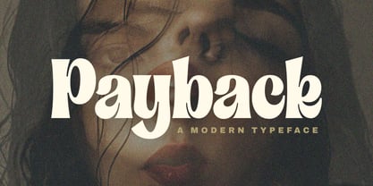 Introducing "Payback" Modern Serif font, that has own unique style & casual look. This font is perfect for an elegant & luxury logo, branding, title project, fashion brand, magazine, clothes, lettering, quotes, and so much more. Thank You. Subectype
 - Cross Stitch Medieval by Gerald Gallo,
$20.00 Cross Stitch Medieval is not intended for text use. It was designed specifically for use as fancy monograms or initials. Cross Stitch Medieval has an uppercase alphabet, 9 stitches tall, located under the shift+character set keys.
 - Resiliency2 by Alphabet Agency,
$15.00 Resiliency2 has been designed for use in sports,and fitness themes to elevate design work in those genres. The fonts work great with esports themes, in particularly. .The font family contains 6 fonts;3 weights, 2 styles
 - Quirky by PizzaDude.dk,
$20.00 Quirky is so unpredictable and full of weirdness that you don't know what’s coming at you! The font has more than 250 different ligatures, that should be enough to boost your text into something funky and wild!
 - Peitago Goulya by Herry92,
$13.00 I like the letters on the Peitago goulya because each letter is curved and rounded at the edges, it looks unique and has characteristics. Peitago goulya is handwritten, intentionally made with indentations. This font looks very pleasant.. !
 - Zoo Dingbats by Beewest Studio,
$10.00 Zoo Dingbats is cute and adorable dingbats font. Whether you’re using it for crafts, digital design, presentations, or making greeting cards, this font has the potential to become your favorite go-to font, no matter the occasion!
 - Laser Dots by Etewut,
$17.00 Laser dots display font is based on sans serif. Use it in your design be it cards, outside commercial, web or product adds and laser cuts. It has foreign characters so you may use your mother language.
 - Aaarp by Drawwwn,
$15.00 Aaarp's an arty farty cut paper display font - inspired by Jean Arp & Henri Matisse’s amazing work. Get creative with extra glyphs and shapes... Aaarp also has alternative letters so you can make all your designs look unique.
 - MPI Bodoni Ultra by mpressInteractive,
$5.00 Old Style is an example of classic roman type design. It has little contrast in stroke weight, small rounded serifs, open characters, and is very easy to read. It is based on wood type of unknown origin.
 - Vertical by Alias,
$60.00 Alias Vertical is a sans serif typeface with a vertical cut-off point for letter endings. The vertical cut-offs bend round characters (b, c, o, etc) into a squarish, high-shouldered shape, suggesting Roger Excoffon’s Antique Olive. In mid-weights, the typeface mixes Antique Olive with typefaces such as Gill or Johnston, for example the shape of the t, the l borrowing Johnston’s flick. Vertical has the same minimal difference in weight between verticals and horizontals as Gill and Johnston, and the same sharp connection point where curves meet straight lines. Like Antique Olive, Vertical has a narrow connection point here, adding contrast and definition. The overall effect feels austere at lighter weights and strident and graphic at bolder weights, and sharp and incised throughout. In the Bold and Black weights, the squarish and top heavy shape of Antique Olive is most noticeable. For example the wide uppercase, with the B having almost-even width between top and bottom curves, and the almost-overhang of the top curve of the G. But Vertical does not have as extreme an aesthetic or square shape as Antique Olive. As well as its wide design, the upper case is given extra authority by being a slightly heavier weight than the lower case. This is a device borrowed from Gill, and other ‘old’ typefaces, where the upper case is presented as a titling design. Modern sensibilities are more focussed on an even colour between upper and lower case. Vertical was originally intended as a sister typeface to Ano, like AnoAngular or AnoStencil. Vertical developed into a similar but separate design. Ano was designed for use in Another Man — in its modular, circle-base design, and the way there aren’t the amendments usually made in bolder weights to ensure letter clarity. This is for layouts where different weights are used together in different sizes so that the overall letter weight is the same, a feature of the magazine. Where Ano is simple and graphic, Vertical has nuance and texture. It is a pragmatic, utility design. In the balance between graphic and typographic, its focus is the latter.
 - Bree by TypeTogether,
$37.50 The Bree font family is a spry sans serif by Veronika Burian and José Scaglione that delivers a spirited look and feel for branding and headline usage. As an upright italic, Bree shows a pleasant mix of rather unobtrusive capitals with more vivid lowercase letters, giving text a lively appearance. Bree is clearly influenced by handwriting. As such, some of its most characteristic features are the single-story ‘a’, the cursive ‘e’, the outstroke curves of ‘v’ and ‘w’, the flourished ‘Q’, and the fluid shapes of ‘g’, ‘y’, and ‘z’. Alternates of these letters are available when a more neutral look is desired. Bree has a touch of cheekiness, a wide stance for each character, and an extra-large x-height. All this adds up to a big personality, so even when set in small text there is no skimming past the words Bree voices. In 2019, the Bree font family got a huge update. A few shapes were updated or added (the ‘k’ and German capital ‘ß’), two entirely new weights were added (Book and Book Italic), and spacing was perfected. More than that, Vietnamese support was added to Bree Latin, and the Bree Greek and Bree Cyrillic scripts were designed from scratch to parallel the Latin’s tone. Additionally, Bree was designed in variable font format for those who want complete control over the font’s appearance while simultaneously saving digital weight in the form of kilobytes and megabytes. Bree is in the perfect position for the next digital revolution. The complete Bree font family, along with our entire catalogue, has been optimised for today’s varied screen uses. Bree has been chosen for such wide-ranging uses as Breast Cancer Awareness Month in the US, the branding for the country of Peru, and numerous layouts including mobile apps, magazines, newspapers, and books. Awards – Tipos Latinos exhibition 2008 – Several best-of-the-year typeface lists of 2008 MyFonts Top 10 Fonts of 2008 Smashing Magazine: 60 Brilliant Typefaces For Corporate Design https://www.smashingmagazine.com/2008/03/60-brilliant-typefaces-for-corporate-design/ Die besten Schriften 2008 http://www.fontwerk.com/619/die-besten-schriften-2008/ – Selected for Typographica’s Best Typefaces of 2008 – Won Bronze for Original Typeface in the 2009 European Design Awards
 - Madurai by insigne,
$24.75 The rounded forms found in Chennai have proven to be one of insigne's more popular designs for web-based company logotypes. Now, insigne's new superfamily Madurai takes its popular predecessor to a new level, offering a wide range of complementary fonts. Madurai removes Chennai's rounded stems and then adjusts the character width to account for its reduction in geometry, resulting in a balanced sans-serif face with humanist touches that works well for extended text. The Madurai family has a full range of six weights from thin to black and includes Condensed and extended options for a total of 36 fonts. All members of the Madurai series include a wide variety of OpenType alternates. Madurai is equipped for complex professional typography, including alternates, small caps and plenty of alts, including "normalized" capitals and lowercase letters that include stems. The face also has a number of numeral sets, including fractions, old-style and lining figures with superiors and inferiors. OpenType-capable applications such as Quark or the Adobe suite can take full advantage of automatically replacing ligatures and alternates. You can find these features demonstrated in the .pdf brochure. Madurai also includes the glyphs to support a wide range of languages, including Central, Eastern and Western European languages. In all, Madurai supports over 40 languages that use the extended Latin script, making the new addition a great choice for multi-lingual publications and packaging. For your next project, explore the fantastic potential of Madurai.
 - Super Retro by RagamKata,
$14.00 Super Retro is a font that offers a classic groovy retro style with a unique hand-drawn sketch touch. It draws inspiration from the retro era, filled with vibrant colors and a sense of fun. Each uppercase letter has its own distinctiveness compared to the lowercase letters, providing an interesting visual variation. Super Retro features chubby and rounded letterforms, creating an impression that embodies cheerful and joyful characters. Each capital letter is written with winding and wavy lines, adding an artistic effect reminiscent of trendy hand-drawn art. The font showcases a style inspired by the energetic music scene of the retro era, characterized by freedom of expression. The letters appear to sway and move dynamically, as if they are dancing on stage. Rough lines and details add an authentic touch, capturing a strong vintage aura. Super Retro highlights each letter with its unique qualities and characteristics. Every uppercase letter has a special touch that sets it apart from the lowercase letters. Some letters may have extra extensions at the top or bottom, providing distinctive decorative elements. There are also letters written in a more eccentric style, with slightly elongated or condensed proportions, creating intriguing and refreshing differences. This font is ideal for designing posters, logos, titles, and various designs that require a strong retro impression. With its ability to adapt to different letter characteristics, Super Retro offers limitless variations in your design creativity.
 - pks-masry - 100% free

- Ornata E by Wiescher Design,
$39.50 Ornata E is the fifth of a series of old ornaments that I am trying to save from oblivion. I am completely redesigning the ornaments from scratch, trying in this one to keep the rough "letterpress" character. These ornaments were designed around 1910, I could not find out by whom. This set is perfect to design flowery frames since it has an enormous amount of flowery things. Your digitizing type-designing savior, Gert Wiescher
 - Cheesy Bread by Putracetol,
$24.00 Introducing Cheesy Bread, a super playful bold font. This font is perfect for your projects related to kids, which is playful and fun. This font also has 2 versions, clean and rough. Cheesy Bread also perfect for branding design, posters, apparel, logotype, header, quote, invitation, greeting card, cover, poster, fashion design and any more. Come with lot of ligatures character, its help you to make great lettering. This font is also support multi language.
 - Metro Nova by Linotype,
$57.99 Metro Nova comprises seven weights, from ultra thin to extra black in regular proportions, and six weights as condensed designs. Each has an italic counterpart for a total of 26 fonts. The family is available as OpenType® Pro fonts, which provide for the ability to easily insert typographic features such as ligatures, fractions and alternate characters. Pro fonts also offer an extended character set to support most Central European and many Eastern European languages.
 - Flicker by PizzaDude.dk,
$20.00 Handpainted font with attitude! An attitude which will help you when designing posters, packaging, headline, invitations and alike, that needs that authentic brush-look! I haven't got the count of how many pieces of paper I used to make this font. It was a lot! Comes with “contextual alternates” which means that the font has 6 different version of each letter. These different versions cycle as you type, and makes the font look more realistic!
 - Delicia Pro by Wiescher Design,
$69.50 Delicia Pro Script is a versatile fat script designed with delicatessen shops in mind, it has lots of variations. There are for example seven different versions for the uppercase letters that can be accessed with opentype savy software. different ampersands, @-signs, Th combinations, lots of different lowercase letters and so on. The font can be used in all of Europe, Turkey and the Baltic countries (sorry no Greek and Cyrillic). Yours very versatile Gert Wiescher
 - Blessed Efforts by Epiclinez,
$18.00 This playful display font has a handwritten style that's perfect for any project. Get ready for eye-catching headlines and adorable quotes with this fun typeface! You can even use it for logo designs or scrapbooking projects! So what’s included : Basic Latin Uppercase and Lowercase Numbers, symbols, and punctuations Ligatures Multilingual Support. PUA Encoded and fully accessible without additional design software Simple Installations works on PC & Mac Thank You and Happy Designing!
