10,000 search results
(0.039 seconds)
- Groute Script by Gian Studio,
$16.00 Groute Font Elegant serif specially designed uppercase letters in creative moods and perfect shapes, inspired by the bold, natural look of serifs that are so beautiful for today's fashion. bold, balanced and varied, born for luxury and beauty. including uppercase letters, numbers, and various punctuation marks Groute also comes in a script version so it is very suitable for invitation designs, logos & branding, photography, advertising, watermarks, social media posts, product packaging, product designs, labels, wedding designs, stationery, special events or whatever is needed to create a theme . Groute is built with OpenType features and includes start and end language styles, alternative characters for most lowercase letters, numbers, punctuation, alternatives, endings, and also supports other languages. Hope you enjoy our fonts and if you have any questions, feel free to message & I'll be happy to help :)
 - Boldistrike by Letterhend,
$19.00 Boldstrike is a retro bold script which will bring you back to 60s feel. The bold letterform with swash makes this typeface looks standout to be used for your retro theme project. This font perfectly made to be applied especially in logo, and the other various formal forms such as invitations, labels, logos, magazines, books, greeting / wedding cards, packaging, fashion, make up, stationery, novels, labels or any type of advertising purpose. Features : uppercase & lowercase numbers and punctuation multilingual ligatures alternates swashes PUA encoded We highly recommend using a program that supports OpenType features and Glyphs panels like many of Adobe apps and Corel Draw, so you can see and access all Glyph variations. For accessing opentype feature, kindly check this link letterhend.com/tutorials/using-opentype-feature-in-any-software/
 - Fordor Incised NF by Nick's Fonts,
$10.00Based on a old standard, Tudor Black, this version offers a dramatic inline treatment that adds sparkle and grace. The typeface takes its name from Ford Motor Company's old designation for a sedan. Both versions of the font include 1252 Latin and 1250 CE (with localization for Romanian and Moldovan) character sets. - Le Monde Courrier Std by Typofonderie,
$59.00 A rounded slab in 4 styles In our age, since the arrival of microcomputing, the majority of professional letters have been composed in quality typefaces. Typewriters & the typestyles they used have become antiques. A letter set in Times or Helvetica & printed with a laser printer at 600 dpi or more are of such quality that one can no longer distinguish it with a document produced by offset printing. But letters composed in this way appear overly institutional when a bit of informality is needed. Le Monde Courrier, designed by Jean François Porchez, attempts to re-establish a style halfway between writing and printing. Informal neo-tech style This rounded slab serif returns the informal character of “typewritten” fonts to letters and suit well all bad conditions, from inkjet printed memos to webfonts use. With a unique typographic colour, it integrate itself with the rest of the Le Monde family with effective contrast. The verticals metrics and proportions of Le Monde Courrier are calibrated to match perfectly others Typofonderie families. Bukva:raz 2001 Type Directors Club .44 1998 European Design Awards 1998
 - Mosler by Carmel Type Co.,
$19.00 Inspired by the interior of a now defunct Mosler Safe Company bank vault door located inside of what is now an Irish Pub in Stroudsburg, Pennsylvania, Mosler is a typeface that is impenetrability incarnate. This all uppercase, slab-serif brawny beauty comes in four weights - Safe, Strongbox, Vault, and Fortress, and each one is more powerful than the last. Each weight has 450 glyphs included, making for a whopping 1800 glyphs for the full family, complete with small capitals, total support for nearly 80 different languages, decorative word glyphs, and a handful of select alternates. Ranging from the low contrast of the "Safe" weight to the extreme contrast of the "Fortress" weight, Mosler is effective in a wide array of applications but serves best as a titling, headlining, or display face that need to make a mammoth statement. Features Include: 4 Weights Uppercase Only with Small Capitals Numerals, Punctuation & Symbols 450 Characters per Style Stylistic Alternates and Word Glyphs Supports 75+ Latin Languages OTF files Designed and Developed by Jason Carne
 - Subway Hunter by Variatype,
$24.00 Waltowns is a dynamic and expressive typeface that captures the essence of street art with its bold and energetic design. The letters are characterized by organic shapes, reminiscent of marker strokes on urban surfaces. The font exudes a raw and brave vibe, reflecting the spirit of graffiti culture. The font includes a diverse set of characters, allowing for creative and eye-catching compositions. Whether you’re designing posters, album covers, or any other graphic project, Waltowns inject a sense of urban attitude and artistic edge. Its versatility makes it suitable for a wide range of applications, making your designs stand out in the crowd. Waltowns is not just a font; it’s a statement. It represents expression, the vibrancy of the streets, and the bold creativity that defines graffiti art. Use Waltowns to bring a touch of urban authenticity to your design projects and let your creativity run wild on the walls of the digital world. FONT FEATURES Additional Accents 68 Languages Kerning SOFTWARE RECOMMENDATION Adobe Photoshop CC 2020 or later Adobe Illustrator CC 2020 or later
 - Basurero Humano by Woodcutter,
$49.00 "Basurero Humano" is a bold and avant-garde typeface that defies conventions. Its irregular and captivating letters are framed within rectangles, creating a unique and eye-catching visual effect. With influences from the poster Punk style, this typeface stands out for its rebellious energy and its ability to break boundaries. "Basurero Humano" is ideal for projects that aim to convey a sense of rebellion, challenge, and originality. Whether it's in posters, fashion designs, album covers, or urban art projects, this typeface becomes the focal point, capturing the viewer's attention and leaving a lasting impression. With its striking style and deconstructed shapes, "Basurero Humano" becomes a versatile tool to communicate provocative messages and break away from conventional aesthetics. This typeface is perfect for those who want to push boundaries and make a bold statement in their designs. Discover the power of "Basurero Humano" and elevate your projects to a new level of originality and expression. Let this unique typeface be your ally in creating designs that stand out and leave a lasting impression in the minds of your audience.
 - User Stencil by DSType,
$30.00 User is a monospaced type family with 30 styles, from Hairline to Bold, divided in Regular, Upright and Stencil, with five weights (Hairline, ExtraLight, Light, Medium and Bold) all with Cameo versions. Complexity and versatility are the keywords for this type family. Despite being a monospaced font, which means there's no kerning, all the glyphs were designed in order to sit comfortably in the 600 points width, a hard task because some glyphs are too narrow ('i' and 'l'), while others are too wide ('m' and 'w'), but they must fit the same width. The desire for keeping a comfortable readability in User was one of the key elements, therefore we designed several ligatures that fit both single and double space width, allowing to maintain a certain idea of proportional design. In this digital booklet you will find a detailed vision of the anatomy of the typefaces, the amount of characters available, the styles and weights, along with a series of features, specially designed to make User a very versatile and usable type system.
 - User Upright by DSType,
$30.00 User is a monospaced type family with 30 styles, from Hairline to Bold, divided in Regular, Upright and Stencil, with five weights (Hairline, ExtraLight, Light, Medium and Bold) all with Cameo versions. Complexity and versatility are the keywords for this type family. Despite being a monospaced font, which means there's no kerning, all the glyphs were designed in order to sit comfortably in the 600 points width, a hard task because some glyphs are too narrow ('i' and 'l'), while others are too wide ('m' and 'w'), but they must fit the same width. The desire for keeping a comfortable readability in User was one of the key elements, therefore we designed several ligatures that fit both single and double space width, allowing to maintain a certain idea of proportional design. In this digital booklet you will find a detailed vision of the anatomy of the typefaces, the amount of characters available, the styles and weights, along with a series of features, specially designed to make User a very versatile and usable type system.
 - User by DSType,
$30.00 User is a monospaced type family with 30 styles, from Hairline to Bold, divided in Regular, Upright and Stencil, with five weights (Hairline, ExtraLight, Light, Medium and Bold) all with Cameo versions. Complexity and versatility are the keywords for this type family. Despite being a monospaced font, which means there's no kerning, all the glyphs were designed in order to sit comfortably in the 600 points width, a hard task because some glyphs are too narrow ('i' and 'l'), while others are too wide ('m' and 'w'), but they must fit the same width. The desire for keeping a comfortable readability in User was one of the key elements, therefore we designed several ligatures that fit both single and double space width, allowing to maintain a certain idea of proportional design. In this digital booklet you will find a detailed vision of the anatomy of the typefaces, the amount of characters available, the styles and weights, along with a series of features, specially designed to make User a very versatile and usable type system.
 - Chunky Beard by IKIIKOWRK,
$17.00 Proudly present Chunky Beard - Retro Type, created by ikiiko. Chunky Beard is a vintage font with bold, rounded letterforms with vintage vibes from the 60's era. These fonts often have heavy, wide strokes and lack clear borders, giving them a warm and inviting appeal. Rounded edges, exaggerated curves, and exaggerated serifs are some of the characteristics of 60s vintage-type typography. Additionally, they often have very constant stroke weight across letters, further accentuating their distinctive appearance. From posters and flyers to logos and branding materials, bold typography with a vintage '60s feel is a great way to add a dash of retro charm to any design project. The font it self is grab people's attention with their vibrant, fun, vintage appeal and undeniable aesthetic. This kind is ideal for projects that seek to convey a sense of nostalgia and the retro vibes as well as retro-themed designs. As a movie title, corporate logo, quote, poster design, magazine layout, or just as a chic text overlay to any background image. What's Included? Uppercase & Lowercase Numbers & Punctuation Multilingual Support Works on PC & Mac
 - Birdman - Unknown license

- Electric Pickle - Unknown license

- Lygard by Tadiar,
$14.00 LYGARD Bold is modern stylish font good looking as header and text both. Good for Fashion, Games, Sports, Technology etc. Multilingual Latin symbols are included.
 - Boheld by Graptail,
$21.00 Boheld comes with 6 different style variations such as Sans, Serif, Bold, Condensed, and Inline. It is inspired by classic labels, tickets, posters, and more.
 - Susa by Hubert Jocham Type,
$29.90 Susa is an elegant and flowing brush script typeface. Ideal for short text in the lighter weights and for headlines in bold and heavy weights.
 - Avenir Next by Linotype,
$97.99 Avenir Next Pro is a new take on a classic face—it’s the result of a project whose goal was to take a beautifully designed sans and update it so that its technical standards surpass the status quo, leaving us with a truly superior sans family. This family is not only an update though, in fact it is the expansion of the original concept that takes the Avenir Next design to the next level. In addition to the standard styles ranging from UltraLight to Heavy, this 32-font collection offers condensed faces that rival any other sans on the market in on and off—screen readability at any size alongside heavy weights that would make excellent display faces in their own right and have the ability to pair well with so many contemporary serif body types. Overall, the family’s design is clean, straightforward and works brilliantly for blocks of copy and headlines alike. Akira Kobayashi worked alongside Avenir’s esteemed creator Adrian Frutiger to bring Avenir Next Pro to life. It was Akira’s ability to bring his own finesse and ideas for expansion into the project while remaining true to Frutiger’s original intent, that makes this not just a modern typeface, but one ahead of its time. Complete your designs with these perfect pairings: Dante™, Joanna® Nova, Kairos™, Menhart™, Soho® and ITC New Veljovic®. Avenir Next Variables are font files which are featuring two axis, weight and width. They have a preset instance from UltraLight to Heavy and Condensed to Roman width. The preset instances are: Condensed UltraLight, Condensed UltraLight Italic, Condensed Thin, Condensed Thin Italic, Condensed Light, Condensed Light Italic, Condensed, Condensed Italic, Condensed Demi, Condensed Demi Italic, Condensed Medium, Condensed Medium Italic, Condensed Bold, Condensed Bold Italic, Condensed Heavy, Condensed Heavy Italic, UltraLight, UltraLight Italic, Thin, Thin Italic, Light, Light Italic, Regular, Italic, Demi, Demi Italic, Medium, Medium Italic, Bold, Bold Italic, Heavy, Heavy Italic. Featured in: Best Fonts for PowerPoints
 - Historic Warehouse by Just My Type,
$25.00 Gotta tell ya: think out of the box and this font is addictingly fun to use! Introducing Historic Warehouse, a substantial, yet elegant family, invoking advertising fonts of the early 20th century. Why the name? When asked to design a banner for Tucson’s Historic Warehouse District, I couldn’t find the look I wanted from any known fonts. After drawing what I wanted in Illustrator, there were three (and in the process, four) fonts just waiting to be realized. Happy to oblige. Here’s Historic Warehouse Regular, setting the stage. It’s sturdy, bold, and plays curves against rounded angular shapes. To its left is Historic Warehouse Condensed, trim, elegant and at its best at very large sizes; to the right is Historic Warehouse Wide, with charming style and presence. Finally, there’s Historic Warehouse Extended, extravagant in its proportions, with a beautifully-crafted form like a fine carriage. As the song says, “Everything Old Is New Again,” and this family looks as fresh and clean at the beginning of this century as it might have at the beginning of the last.
 - PF DIN Stencil B by Parachute,
$43.00 This is a new version of our popular DIN Stencil family designed with a wider cut than the original. This overcomes the diminishing effect of the stencil at smaller sizes where the cuts tend to disappear, whereas it makes a bold statement at display sizes. Traditionally, stencils have been used extensively for military equipment, goods packaging, transportation, shop signs, seed sacks and prison uniforms. In the old days, stencilled markings of ownership were printed on personal possessions, while stencilled signatures on shirts were typical of 19th century stencilling. DIN Stencil B manages to preserve several traditional stencil features, but introduces additional modernities which enhance its pleasing characteristics and make it an ideal choice for a large number of contemporary projects. It consists of 7 diverse weights from Extra Thin to Black. This version supports Latin, Cyrillic, Eastern European, Turkish and Baltic. DIN Stencil B includes several additions such the recently unicode encoded character of the German uppercase Eszett (ẞ), the Russian currency symbol for Rouble (₽), Ukrainian Hryvnia (₴), Azeri and Kazakh letterforms.
 - Mellow Serif by ParaType,
$30.00 Mellow Serif is a soft and friendly typeface. It looks compelling in large point sizes due to the rounded terminals and calligraphic details. Mellow Serif also works well in body text with a small leading size as it has even proportions and a large x-height. Mellow Serif includes ten styles—five upright and five italic, ranging from Light to Extra Bold. The typeface supports extended Latin, extended Cyrillic, and Greek. The character set also includes old style figures, small caps in the Light, Regular, and Medium upright styles as well as stylistic alternate sets that slightly change the way Mellow Serif looks in large point sizes. The Regular style also has alternative letterforms with swashes. Mellow Serif is great for book printing (from fiction and children’s books to science literature), headings, and large texts on the web as well as for toys and confectionary packaging. It also works perfectly with a rounded sans serif Mellow Sans. Mellow Serif was created by Natalya Vasilyeva, an expert in designing text and calligraphic typefaces, and released by Paratype in 2023.
 - HGB Info OSF by HGB fonts,
$20.00 It's nice when a font provides old style figures, small caps and alternate letters. But what to do if my typesetting program doesn't support Open Type features? The solution may be old-fashioned, but it's effective: the variants are placed in separate font families: Standard, Old Style Figures (OSF), and Small Caps (SC). Any word processor can handle it. As a special feature, my OSF fonts also contain alternative letters such as a looped g or descenders in the italic f.
 - Fabiola by Lián Types,
$49.00 -Fabulous, beautiful, friendly, talkative, sweet, caring, a little on the odd side, very desirable by many, good at almost everything- That's the definition of Fabiola according to the slang dictionary of americans. If you were you looking for something delicious, a font that covers a really wide range of uses and always looks amazing, Fabiola should be your choice. Although it may look as another of my scripts with juicy swashes, this time I explored in depth the pairing and interaction with capital letters for more unique results. Why? We are going through some crazy days where the number of people interested in letters is only growing. We see lettering everywhere: I can say that finally our field is shouting out loud; letters are THE protagonist more than ever. Hence the need of combining and pairing different styles is booming. Fabiola Script and Fabiola Caps were done in a way that they seem to need each other. There's nothing better than the above images to prove this. But, how does it work? The big swashes of the Script style were designed so they can surround, wrap and mingle with the Caps styles. The smaller swashes are meant to be used when the Script is alone. Simple, right? I hope you find Fabiola useful on your projects and enjoy using it like I did when making the posters! Have a super fabulous day!
 - Tolyer by Typesketchbook,
$25.00 Tolyer font is an extra large super family of 50 fonts! In many cases quantity doesn’t mean quality but here we have such a big abundance of contrast, styles, weights and special effects in one place that it actually doesn’t pay attention to the fact this is an all caps family. When it comes to strong headlines, titles, posters, masculine brand names Tolyer type family is probably one of the best choices in sans serif typography. You could easily pick from low to high contrast outlines, uprights and obliques, 3D effects or different artistic textured styles to make your work diverse, expressive and attractive. Tolyer font offers you maximum readability even in poor display conditions like low quality printing or low resolution monitors. In some cases poor print quality could even add more value to the final result, because Tolyer has a lot of potential to be used in difficult conditions. Letterpress and high embossing are one of those print effects that really suit Tolyer best. Use it in high contrast with background environment, higher ink flow, don’t think about the dot gain and you should definitely use a textured paper – this is what Tolyer really likes and deserves. It will thank you for this with authentic look, classic vintage style and strong but attractive presence.
 - Zuume Rough by Adam Ladd,
$25.00 Zuume Rough is a textured, bold, condensed sans display family. A sister to Zuume, this version features a rough printed texture for a more natural and raw look. The fonts can be tightly spaced and stacked for a visual punch or loosened for a little more breath. A distinct characteristic is the notched and extended ink traps meant for both function and aesthetic interest. The strong and sturdy design makes it ideal for eye-catching headlines, branding, packaging, sports, logos, and more.
 - Techno Retro JNL by Jeff Levine,
$29.00 Techno Retro JNL looks like a design straight out of the 1980s, but it actually appeared as hand lettering on a sheet music cover for the circa-1940s edition of the song "To You Sweetheart, Aloha", proving the old saying that "everything old is new again".
 - Lokales by Maulana Creative,
$16.00 Lokales is a fat handwritten display font. With bold stroke, fun character with a bit of ligatures and alternates. To give you an extra creative work. Lokales font support multilingual more than 100+ language. This font is good for logo design, Social media, Movie Titles, Books Titles, a short text even a long text letter and good for your secondary text font with sans or serif. Make a stunning work with Lokales font. Cheers, Maulana Creative
 - Blippys by Maulana Creative,
$14.00 Blippys is a cartoonish handwritten display font. With extra bold rough stroke, fun character with a bit of ligatures. To give you an extra creative work. Blippys font support multilingual more than 100+ language. This font is good for logo design, Social media, Movie Titles, Books Titles, a short text even a long text letter and good for your secondary text font with sans or serif. Make a stunning work with Blippys font. Cheers, Maulana Creative
 - Kloges by Maulana Creative,
$15.00 Kloges is a casual handwritten sans display font. With bold stroke, fun character with a bit of ligatures and alternates. To give you an extra creative work. Kloges font support multilingual more than 100+ language. This font is good for logo design, Social media, Movie Titles, Books Titles, a short text even a long text letter and good for your secondary text font with sans or serif. Make a stunning work with Kloges font. Cheers, Maulana Creative
 - Smithmagis by Maulana Creative,
$15.00 Smithmagis is a handwritten brush display font. With bold brush stroke, upright and fun character with a bit of ligatures. To give you an extra creative work. Smithmagis font support multilingual more than 100+ language. This font is good for logo design, Social media, Movie Titles, Books Titles, a short text even a long text letter and good for your secondary text font with sans or serif. Make a stunning work with Smithmagis font. Cheers, MaulanaCreative
 - Kruiseta by Maulana Creative,
$15.00 Kruiseta is a fun handwritten sans display font. With bold stroke, fun character with a bit of ligatures and alternates. To give you an extra creative work. Kruiseta font support multilingual more than 100+ language. This font is good for logo design, Social media, Movie Titles, Books Titles, a short text even a long text letter and good for your secondary text font with sans or serif. Make a stunning work with Kruiseta font. Cheers, Maulana Creative
 - Shields BKL by Bakeel Studio,
$30.00 Shields is a unique and versatile typeface that can be used for a variety of applications, from branding to editorial design. Its bold and modern look makes it a great choice for titles and headlines. Its letterforms have been carefully crafted to ensure a consistent look across all sizes, while its open counters provide a unique, yet subtle touch. With its refined details and balanced shapes, Shields is the perfect typeface to create an eye-catching presence.
 - MC Blitez by Maulana Creative,
$19.00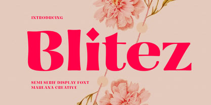 Blitez is a modern semi serif display font. Bold stroke, fun character with a bit of ligatures and alternates. To give you an extra creative work. Blitez font support multilingual more than 100+ language. This font is good for logo design, Social media, Movie Titles, Books Titles, a short text even a long text letter and good for your secondary text font with script or serif. Make a stunning work with Blitez font. Cheers, Maulana Creative
 - Ragrots by Maulana Creative,
$14.00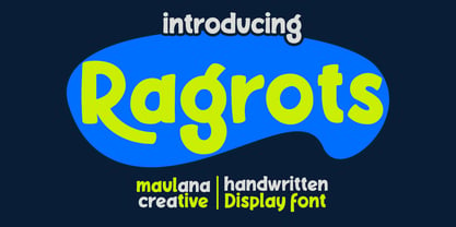 Ragrots is a cartoon-is handwritten display font. With bold bounce stroke, fun character with a bit of alternates. To give you an extra creative work. Ragrots font support multilingual more than 100+ language. This font is good for logo design, Social media, Movie Titles, Books Titles, a short text even a long text letter and good for your secondary text font with sans or serif. Make a stunning work with Ragrots font. Cheers, Maulana Creative
 - Bionzhe by Maulana Creative,
$14.00 Bionzhe is a strong and power vibes font. With ultra bold stroke, fun character with a bit of ligatures and alternates. To give you an extra creative work. Bionzhe font support multilingual more than 100+ language. This font is good for logo design, Social media, Movie Titles, Books Titles, a short text even a long text letter and good for your secondary text font with script. Make a stunning work with Bionzhe font. Cheers, Maulana Creative
 - Spiceland by Maulana Creative,
$14.00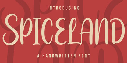 Spiceland is a fancy handwritten script font. With bold contrast stroke, fun character with a bit of ligatures and alternates. To give you an extra creative work. Spiceland font support multilingual more than 100+ language. This font is good for logo design, Social media, Movie Titles, Books Titles, a short text even a long text letter and good for your secondary text font with sans or serif. Make a stunning work with Spiceland. Cheers, Maulana Creative
 - Cine Miroir NF by Nick's Fonts,
$10.00This bold yet elegant script is patterned after the logotype lettering from a 1927 issue of the French film magazine named, not surprisingly, Ciné Miroir. Ornate without being fussy, this font’s large x-height gives it a strong color, a commanding presence and a remarkably contemporary feel, even after more than three-quarters of a century. Both versions of this font contain the Unicode 1252 Latin and Unicode 1250 Central European character sets, with localization for Romanian and Moldovan. - Arlego by Maulana Creative,
$14.00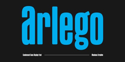 Arlego is a modern condensed sans serif Display font. Bold stroke, fun character with a bit of ligatures and alternates. To give you an extra creative work. Arlego font support multilingual more than 100+ language. This font is good for logo design, Social media, Movie Titles, Books Titles, a short text even a long text letter and good for your secondary text font with script or serif. Make a stunning work with Arlego font. Cheers, Maulana Creative
 - Belgro by Maulana Creative,
$13.00 Belgro is a modern sans serif font. With bold stroke, fun character with a bit of ligatures and alternates. To give you an extra creative work. Belgro font support multilingual more than 100+ language. This font is good for logo design, Social media, Movie Titles, Books Titles, a short text even a long text letter and good for your secondary text font with sans or serif. Make a stunning work with Belgro font. Cheers, Maulana Creative
 - Logisco by Ideabuk,
$16.00 Introducing Logisco - a sleek and versatile display font family that combines modern geometry with a retro-cool vibe. This six-font collection boasts soft, rounded corners that add a dash of playfulness to any project. Logisco Light, Regular, and Bold offer a range of weights to fit any typographic need, while the Stencil variations add a unique edge to your designs. Whether you're creating sleek logos or funky posters, Logisco has you covered with its stylish and versatile letterforms.
 - MC Cardifa by Maulana Creative,
$13.00 Cardifa is a casual handwritten script font. With bold stroke, fun character with a bit of ligatures and alternates. To give you an extra creative work. Cardifa font support multilingual more than 100+ language. This font is good for logo design, Social media, Movie Titles, Books Titles, a short text even a long text letter and good for your secondary text font with sans or serif. Make a stunning work with Cardifa font. Cheers, Maulana Creative

