10,000 search results
(0.088 seconds)
- Magic Heart by Mans Greback,
$49.00 Magic Heart is a swirly script typeface. A valentine typeface with a romantic flow, Magic Heart has a lovely personality and a passionate appearance. Its swashy capital letters gives any project a sincere vibe. Use characters # ¤ for decorative heart symbols. Use underscore _ anywhere in a word for swashes. Example: Won_der Use multiple underscore for different swashes. Example: Love____rose The Magic Heart family consists of eight styles: The ornamental Swash and Swash Bold, the normal Regular and Bold, plus each of the styles as Italic. The font is built with advanced OpenType functionality and has a guaranteed top-notch quality, containing stylistic and contextual alternates, ligatures and more features; all to give you full control and customizability. It has extensive lingual support, covering all Latin-based languages, from North Europe to South Africa, from America to South-East Asia. It contains all characters and symbols you'll ever need, including all punctuation and numbers.
 - Melina BT by Bitstream,
$50.99Melina Plain and Melina Fancy are characterized by graceful lines, strong contrast and nostalgic overtones. These typefaces are patterned after two members of a type family named Greco, released by Fundición Tipográfica Richard Gans of Madrid, Spain, in the 1920s. Melina Plain is a refined version of Greco Bold, and Melina Fancy is based on Greco Adornado, with the notable addition of a lowercase, which was not a part of the original design. Melina is based on two typefaces (ca. 1920) from the Fundición Tipográfica Richard Gans in Madrid, Spain. Nick Curtis first found Greco Adornado in a type specimen at the Library of Congress. It was a cap only design. He made a cut of the original (Melina Fancy) and created his own lowercase, and many other characters to support contemporary character sets. Later he came across Greco Bold, which had a lowercase, but he chose not to use it and instead, adapted his Melina Fancy to create Melina Plain. - Exarros by Kotak Kuning Studio,
$15.00 Exarros is a unique and futuristic sans serif font family. The combination of futuristic and geometric elements renders a modern design. Exarros includes 4 fonts family with futuristic caps, thereby creating more variability. This font is suitable to use as a logotype, product designs, label, watermark, social media posts, apparel, invitation, signboard, sports club, motor/car, special events or anything that need handwriting taste. Exarros is encoded with Unicode PUA, which allows full access to all additional characters without having special design software. Mac users can use Font Book, and Windows users can use Character Map to view and copy one of the extra characters to paste into your favorite text editor/application. We hope you enjoy the font, please feel free to comment if you have any thoughts or feedback. Or simply send me a PM or email me at kotakkuningstudio@gmail.com. Thanks for purchasing and have fun!
 - Space Colony by Dharma Type,
$19.99 Before the original sketches, I had imagined and dreamed this font was used for side characters of retro robot animations such as Gundam and Ideon. But the sketches were put in a PENDING folder. It was a few years ago. In the begining of 2011, I restarted working with the sketches to complete as a font file. Detail and some shape were improved retaining the original concept and they were completed, then named ‘Space Colony’. Just as the name implies, this wide and geometric font family consisting of six weights was designed targeting at use for futuristic product of game, movie, logo and so on. Not only that but the rounded shape makes a lovely, cute and soft impressions so this font is also suited for cartoons, animations and character merchandise too. We released 4 big Sci-Fi families in 2013. Check it out! Clonoid Controller Geom Graphic Space Colony
 - Paneuropa 1931 by ROHH,
$19.00 Paneuropa 1931™ is a faithful recreation of XX-century Polish classic, made by Idzikowski foundry in Warsaw, 1931. Original Paneuropa was a renowned and highly popular typeface in XX-century Poland, and was widely used in all kinds of design, editorial use and printed materials for decades. Paneuropa is a geometric, clean and versatile font family inspired by Paul Renner's famous Futura - it is a bit narrower, with different proportions and details in drawing, completely different figures and punctuation shapes than Futura. It is an interesting and refreshing alternative to Futura with its own distinct personality and a subtle authentic vintage flavour. Paneuropa 1931 contains separate styles for display and large sizes as well as styles for small text sizes - differing in spacing and the softness of letterforms. The family features an original Paneuropa Double font - a beautiful inline style for headlines and display use. The whole family is completed with added missing inbetween styles as well as italics. The original subfamily set is available for purchase and it contains solely the original Paneuropa styles (Thin, Regular, Bold, Text Regular, Text Italic, Double). Paneuropa 1931 characteristics: letter shapes and proportions are very faithful to the original, keeping its idiosycrasies and inconsistencies spacing and kerning are carefully adjusted in order to achieve the colour of the original fonts, keeping maximum possible consistency - a compromise between authentic vintage feel and legible consistent text colour (for hardcore users: just turn off the kerning) weights precisely matching the original (Thin, Regular, Bold, Text Regular, Text Italic, Double), inbetween weights were added (Light, Demi Bold, as well as missing italic styles) italic angle faithful to the original (8 degrees) softened corners help achieving the character of old imprecise printed display styles for big sizes are sharper and have tight spacing, text styles have softer shapes (recreating small print imperfect print) and broader spacing for use in paragraph text (spacing in both display and text styles matches the original as well) original style names in Polish for devices with Polish set as their primary language The family is very versatile. The Inline style as well as bold and thin weights are perfect for headlines and display use, other styles works wonderfully as paragraph text. Paneuropa 1931 consists of 18 fonts - 5 display weights with corresponding italics + 3 text weights with corresponding italics + 2 inline styles (for big and small print sizes). It has extended support for latin languages, as well as broad number of OpenType features, such as case sensitive forms, fractions, superscript and subscript, ordinals, currencies and symbols.
 - Stat Display Pro by Jure Kožuh,
$45.00 www.Stat-Type.com Complementary Type Family Stat Text Pro Stat Display Pro is an information design sans serif type family legible in circumstances of low visibility. Its large character set with multiple weights is defined by optimal size ratio, distinctive letter shapes, wide aperture and balanced counters. Stat Display Pro remains legible in unfavorable circumstances of distance, size, movement and similar. It contains nearly 700 glyphs, including diacritics, ligatures, small caps, old–style figures, arrows and more. This enables it to achieve wide language support. It consists of four main (Light, Regular, Medium, Bold) and four secondary, negative weights (Light Negative, Regular Negative, Medium Negative, Bold Negative) which are accompanied by their corresponding obliques. Stat Display Pro type family has higher than average x height (72% of cap height) which is accompanied by matching ascender and descender size ratios. With its distinctive letter shape detail it minimizes the possibility of letter shape confusion, while optimizing legibility with wide aperture and balanced counters. Its main intended use is information design, where it, with its characteristics, meets the requirements of wayfinding, infographics, table setting and much, much more. The development of the type family was based on research in legibility to achieve highly legible letter shapes, while not diminishing their visual character. A detailed description of Stat Pro type family is available at Stat-Type.com where a DEMO font can be downloaded.
 - Nuovo Deco by Ben Burford Fonts,
$20.00 Following from the continued popularity of the original MB Deco, here is Nuovo Deco, its new and improved big brother. Nuovo Deco comes in three weights, Light, Regular and Bold. A full character set of Caps and lower case letters, alternate characters, plus some very nice Ligatures to give some added art deco style and a much wider scope.
 - Okomito Next by Hanken Design Co.,
$30.00 Okomito Next is a sans serif inspired by the classic typefaces that were imbued with a sense of functionality, boldness and industrial strength. OpenType features: Access All Alternates, Case-Sensitive Forms, Glyph Composition / Decomposition, Discretionary Ligatures, Fractions, Kerning, Standard Ligatures, Localized Forms, Mark Positioning, Mark to Mark Positioning, Ordinals, Proportional Figures, Stylistic Alternates, Stylistic Set 1, Superscript, Tabular Figures
 - Qwatick by Ingrimayne Type,
$7.95 Qwatick is a decorative serifed family with three weights, each with an italic style. It is squarish and has small serifs. The bold style has high contrast and the regular style remains readable even at small point sizes. The family originated as a reworking of the odd display font Quidic, moving it toward normality and greater legibility.
 - Paragon by Greater Albion Typefounders,
$12.50 Paragon is a display Roman family of nine faces, combining elements of formality and fun. It embodies a high degree of contrast between near hairline horizontal strokes and bold vertical strokes. The family is offered in three widths and in regular, small capitals and title faces. Use Paragon to lend impact to your next design project.
 - Loathing by Arendxstudio,
$13.00 Loathing is a bold Display Font with its distinctive character that can be easily implemented in your various design projects . Loathing came with opentype features such stylistic alternates, stylistic sets & ligatures good for logotype, poster, badge, book cover, tshirt design, packaging and any more. Features : • Character Set A-Z • Numerals & Punctuations (OpenType Standard) • Accents (Multilingual characters) • Ligature • Alternate
 - Shaunte by Trophy Font,
$21.00 Shaunte is eye-catching display bold typeface that comes in four styles: normal, inktraps, rounded, inktraps rounded. a display sans-serif with an inverted or reverse contrast. Its imperfections keep it casual while still providing legibility. Shaunte is a powerful option at large sizes for use on headings, posters, billboards, magazines, advertisements, from casual to hipster. etc.
 - Jungle Drums JNL by Jeff Levine,
$29.00 Jungle Drums JNL is based on the hand-lettered title on the 1929 sheet music of its musical namesake. A bold, free form design with a hint of the Art Deco movement of the coming decades, this casual typeface has the vintage charm to enrich many design projects. Jungle Drums JNL is available in both regular and oblique versions.
 - Joe Cool by Studio K,
$45.00 Joe Cool is a bold geometric sans with minimal counters designed to achieve the maximum weight, solidity and impact on the page. Joe Cool Extended was actually created first, then it seemed like a good idea to add progressively more compact versions for added variety and versatility. See also Gravitas, my Bauhaus inspired font family which explores similar territory.
 - Layla pro Arabic by Zaza type,
$29.00 Layla pro Arabic typeface is a modern Arabic typeface designed by Ahmed Zaza. the design is inspired by the Kufi calligraphic style and influenced by the Naskh style. The result is a hybrid that combines modern proportions with Classic Arabic scripts it’s suitable for branding, editorial, packaging, and advertising. Layla pro Arabic Features five weights from Light to Bold,
 - Brother Scribble by Mvmet,
$18.00 Brother Scribble is a bold scribbly handwritten font. You can use it for anything ranging from t-shirts, book designs, and greeting cards to stickers and posters, packaging designs or anything that needs a casual touch, it will be your perfect font to pick. Fall in love with its incredibly versatile style, and use it to create lovely designs!
 - The Macksen by Kotak Kuning Studio,
$17.00 The Macksen is a new, bold script font which has two styles: Clean and Textured. With those kind of styles, The Macksen will give your designs a vintage and classic look. The Macksen is great for logotype, branding design, logo design, digital lettering arts, t-shirts/apparel, posters, magazines, signs, advertising design, and any vintage design needs.
 - Notelia by Gatype,
$14.00 Notelia The elegant font I work with is creative in mood and perfect in shape, inspired by today's beautiful serif look. bold, balanced and varied, born for luxury and beauty. includes uppercase letters, numbers, and a wide variety of punctuation marks. Serif font with a modern style. Made for posters, web design, branding, illustrations, badges and many other works.
 - Boedimant by Fype Co,
$14.00 Pleased to introduce you to Boedimant new grunge display font! The letterforms have slight quirks to them, giving this bold sans-serif display font a perfect imperfection. You can use it for making special event logos, such as a skateboard or off-road bike races. This unique font is perfect for posters, T-shirt prints, and other promo designs.
 - Variant by Letterara,
$14.00 Variant is a wild style outstanding sans serif font. Urban and incredibly bold, this font will most certainly make your designs stand out. It will add a unique spark to any design project that you wish to create! This font is PUA encoded which means you can access all of the amazing glyphs and ligatures with ease!
 - Legal Obligation Sans Serif by Wing's Art Studio,
$4.00 Legal Obligation - Sans Serif Version A dedicated compressed Sans Serif font for movie poster credit blocks and cinematic title designs. A workmanlike tool for adding extensive cast and crew information to movie posters without dominating the overall layout. Supplied with lowercase characters and three weights. Contents: - Legal Obligation (Sans Serif Version) - Light, Regular and Bold Weights
 - Lichtspielhaus Slab by Typocalypse,
$19.00 Lichtspielhaus Slab is an ultra condensed handwritten typeface based on Lichtspielhaus. It still transports you back to a time where neon lights and marquee letters decorated cinema facades. This time with Slab. There are 8 styles: Hairline, Thin, Light, Regular, Medium, Bold, Black and Heavy. “Lichtspielhaus Slab” is the third part of a Type Noir Quadrilogy.
 - Attitudes by ITC,
$29.99Hugh Whyte, best known for his geometric computer graphic images, created these designs to encompass a variety of today's modern attitudes. These illustrations can be used imaginatively in book jackets, brochures, logos, posters, or wherever bold, creative imagery is needed. 'Attitudes' includes many striking and fanciful images from cats, masks and robots to a skull and crossbones! - Amina by Wayne Fearnley,
$40.00 Amina was created using the DNA of Metrik. A neutral grotesque sans serif, chopped and remixed to create Amino. The ink traps have been raised to create a dynamic typographic language that makes Amina contemporary and dynamic. Amina works great for bold, typographic treatments and still maintains readability in body copy. Includes language support, stylistic alternates.
 - Lovia Peach by Archer Wood,
$10.00 Use this font in your branding to showcase your personality. It's clean, professional and bold. Each letter is its own character. Perfect for use on social media posts and other marketing materials. Make your business stand out by writing in a way that’s unique to you. Use our handwriting font and give your brand a distinctive look.
 - Collonse by Liartgraphic,
$16.00 Hello guys! Introducing our newest product, we call this product the Colonse font Colonse font is a font family consisting of regular, bold and hollow colons With a unique and firm touch Colonse font is great to use on: fashion magazines, logos, and photography, landing pages, flyers, What's included - multilingual support Thank you, best regards Ali Sifak Muftari
 - Film Reel JNL by Jeff Levine,
$29.00 In a World War II training film from the U.S. Signal Corps, the opening title card saying “First Aid” was hand lettered in an extra bold, Art Deco inline style. Those two words (with seven available letters) used as a work model has inspired Film Reel JNL, which is available in both regular and oblique versions.
 - Skipper by Fenotype,
$35.00 Skipper is a bold and flowing connected script. Skipper is equipped with three alternate characters for every basic letter: click on Swash, Stylistic or Titling Alternates on any OpenType savvy programs to create custom looking designs. Inside Skipper there’s a set of 35 ornaments designed to support the font. Access the ornaments from the Glyph Palette.
 - Porlane by ATK Studio,
$15.00 Porlane™ is a condensed sans-serif typeface created to be used for bold titles with distinctive shapes into a display fonts way to make it legible for contemporary use. Come with single weight, legible and expressive shapes. Its glyph catalog provides an easy to compose system for Latin languages with high x-height and tight line spacing.
 - Marige by Azzam Ridhamalik,
$16.00 Introducing Marige, a bold, high contrast typeface that stands out and exudes strength and confidence. Marige has 550+ glyphs, including advanced open type features like stylistic set, standard ligature, discretionary ligature, oldstyle figure, and smallcap. Ideal for any aspect of design, such as logos, headlines, posters, and so on, and will give your projects a classic yet contemporary look.
 - Ponte by SilkType,
$47.50 Ponte is a high-contrast display typeface with smooth serifs, designed for impactful headlines. The ten-style typeface features over 80 decorative ligatures, with roman and italics available in five weights, ranging from extra light to bold. This offers a variety of options for sophisticated design applications. Elevate your compositions with Ponte's timeless elegance and aesthetic precision.
 - Maybrook JNL by Jeff Levine,
$29.00 One of the type examples found within the pages of “Lettering” by Harry B. Wright (1950) is a bold hand lettered serif typeface with a unique twist – the slab serifs had rounded corners, looking very much like show card lettering of the early 1900s. This design is now available digitally as Maybrook JNL, in both regular and oblique versions.
 - World Peace by Letterara,
$14.00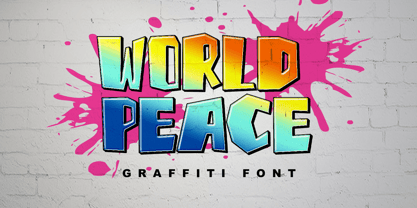 World Peace is a wildstyle outstanding graffiti display font. Urban and incredibly bold, this font will most certainly make your designs stand out. It will add a unique spark to any design project that you wish to create! This font is PUA encoded which means you can access all of the amazing glyphs and ligatures with ease!
 - Vidalia Sunshine NF by Nick's Fonts,
$10.00A single line of type, identified as "Ornamented No. 5" and spelling out "ROPE ONIONS", from the 1888 MacKellar, Smiths & Jordan specimen book provided the pattern for this whimsical face. Offbeat yet elegant, graceful yet bold, it’s a natural choice for distinctive headlines. Both versions of the font include 1252 Latin, 1250 CE (with localization for Romanian and Moldovan). - Concavex by Ingrimayne Type,
$9.00 ConcavexCaps is a whimsical bold display typeface family in three styles that are designed to used in layers. It is caps-only, with the upper-case and lower-case keys differing for the BCGKRS characters. Horizontal elements of the letters are straight and vertical elements are curved, flaring either in or out. ConcaveWarp is a distorted form of ConcavexCaps.
 - Buttermilk by Jessica Hische,
$49.00 Buttermilk is the first font from illustrator/designer/typographer Jessica Hische. It’s a wonderful display script that is feminine but bold. It’s equipped with decorative caps (which would make great drop-caps), fancy numerals, and a far too extensive array of ligatures (automatic in most programs thanks to OpenType) to make it easier for you to set it beautifully.
 - TF Bombass by Teenage Foundry,
$19.00 TF Bombass – Groovy Display Font By Teenage Foundry Introducing our latest font creation – a groovy typeface that’s sure to transport you back to the funky, psychedelic era of the 60s and 70s! With its bold, playful style and unique character, this font is perfect for adding a retro feel to your design projects. Features: Uppercase, Lowercase, Numeral, Punctuation & Multilingual.
 - LTC Hess Monoblack by Lanston Type Co.,
$24.95 A very rare metal face made a brief appearance in Lanston Specimen books and has all but vanished from use. In fact no examples of the font in use seem to exist. It shares some of the hand-rendered casual feel of Nicholas Cochin, but much heavier and well suited for bold headlines and package design.
 - Roshmary by Putracetol,
$28.00 Roshmary is a Display sans serif font with beautiful ligatures, tons of alternative glyphs and multilingual support. It's bold clean and simple. Come with open type feature with a lot of alternates, its help you to make great lettering. Roshmary best uses for heading headlines, cover, poster, logos, quotes, product packaging, merchandise, social media & greeting cards and many more.
 - Monzane by Salamahtype,
$19.00 MONZANE is a visually strong and impactful font style consisting only of capital letters. It is characterized by its bold and eye-catching appearance and can be used in a variety of design applications, including advertising, branding, news headlines, and graphic design projects. Features : All caps with 6 styles (clean, rough, outline, and slant) Punctuation and symbols Multilingual support