10,000 search results
(0.052 seconds)
- Blacker Mono by Zetafonts,
$39.00 Blacker mono was developed out of a brief by Isabella Ahmadzadeh, by Cosimo Lorenzo Pancini and Francesco Canovaro for the editorial project "A beautiful mistake" by OFFF Tlv in 2022. It is a monospaced version of our typeface Blacker, bringing its "evil serif" aesthetics in the realm of typewriter and coding typefaces. In designing these, usually the letterforms are deformed to better fill the space, but in Blacker Mono only the serifs are modified to balance letters, while letter skeletons are kept consistent with the ones of the original Blacker family. This gives the typeface an uneven, unexpected rhythm, underlined by the unusual choice of providing three optical sizes and some extreme display weights - both uncommon choices in monospaced fonts. The resulting typefamily is thought for use in editorial situations where readability must be married by a strong personality, and is complemented by all the wide array of Open Type features that are present in all Blacker variants, from positional numerals to small case letters and alternates.
 - 1589 Humane Bordeaux by GLC,
$38.00 This family was created inspired from the Garamond patern set of fonts used by S. Millanges "imprimeur ordinaire du Roy", in Bordeaux, circa 1580-1590. Especially for reprint L'instruction des curés (Instructions to parish priests), from Jean Gerson. The set contains two styles, Normal and Italic, the second one with a lot of caps and ligatures variants. The initials, except a few decorated letters (six in total) where only large caps, covering no more than three lines. Added are a few fleurons. It can be used as variously as web-site titles, posters and flyers design, publishing texts looking like ancient ones, or greeting cards, all various sorts of presentations, as a very elegant and legible font... This font supports strong enlargements as easily as small size (legible from 6 points when printed) remaining very smart and fine. Its original cap height is about five millimeters. Decorated letters like 1512 Initials, 1550 Arabesques, 1565 Venetian, can be used with this family without anachronism.
 - Fathuk by Twinletter,
$13.00 Introducing “FATHUK Font” – Where Playfulness Meets Creativity! Unleash your inner creativity with FATHUK Font, a playful display font designed to ignite your imagination. FATHUK Font adds a whimsical touch to your projects, making it perfect for playful and imaginative designs. Whether you’re working on children’s books, fun posters, or quirky branding, this font brings an element of joy and creativity to your work. Crafted with precision, FATHUK Font’s unique style is sure to capture attention. Its playful and charming appearance invites readers to engage with your content and sparks curiosity. With FATHUK Font, the possibilities are endless. Use it to infuse a sense of fun into your designs, and watch as your projects come to life with personality and flair. No matter the creative endeavor, FATHUK Font is your go-to choice for adding a playful twist to your work. Embrace the spirit of creativity, and let FATHUK Font elevate your designs to new heights. – PUA Encoded Characters – Fully accessible without additional design software.
 - Emilio by Narrow Type,
$35.00 Emilio is a modern serif family available in 14 styles. It's an elegant typeface with friendly and warm personality which seeks a balance between traditional and modern. Emilio is inspired by the visuality of the 1980s and the typefaces that were widely used in advertising at the time, such as Times and Garamond. However, Emilio offers a contemporary take on the serif font family, adding new elements such as reductive, calligraphy-inspired details or the "K" and "R" legs shape. If you want a more traditional look, you can achieve it with the stylistic alternatives available. Of course, the typeface also provides standard and discretionary ligatures and many other Open Type features. In addition, it offers support for most Latin languages. The big headlines and titles are where Emilio shines the most, but due to large x-height and decent contrast will work for smaller text as well. Emilio is the ideal typeface for editorial design, posters, covers, branding and much more.
 - Libertinas & co by deFharo,
$28.00 Libertinas & co. is a handwritten typeface, with a casual, elegant and sensual style, with many possibilities to compose different titles, flyers, publications or typographic posters for example. The font has an extra set of capital letters and another one of decorative lowercase for word end, also 3 stylistic set with more alternative letters and many other Open Type functions. Includes the Bitcoin symbol. The Commercial version includes - 734 glyphs. Latin Extended-A • OTF & TTF - Libertinas & co. can be used unlimited for both Commercial and Personal projects. - The download file includes a PDF with the specimen sheet of typography. - OpenType features compatible with: Photoshop, Illustrator, QuarkXpress, Indesign. - OpenType Functions: Scientific Inferiors, Swash, Terminal Forms, Titling alternates, Extended Fractions, Inferiors, All Alternates, Superiors, Contextual Ligatures, Denominators, Contextual Alternates, Contextual Swash, Discretionary Ligatures, Capital Spacing, Superscript, Additional languages, Superior letters, Oldstyle Figures, Historical Forms, Historical Ligatures, Kerning, Localized Forms, Numbers Small Caps, Numerators, Ordinals, Subscript, Ornaments, Slashed Zero, Standard Ligatures, Stylistic Alternates, Stylistic Set, Fractions. - Bitcoin symbol (ligatures): b#
 - Correspond by Create Big Supply,
$17.00 Create beautiful invitations, eye-catching logos, engaging social media posts, and more with Correspond. Its seamless integration of uppercase and lowercase characters, along with its extensive range of numbers and punctuations, ensures a harmonious and cohesive look throughout your design. One of the key features of Correspond is its multilingual support, allowing you to express your creativity in various languages and reach a global audience. No matter the project, Correspond has you covered with its wide array of characters and symbols. Unlock the full potential of Correspond with its PUA encoding, granting you easy access to a wealth of alternate glyphs and ligatures. This enhances your design possibilities and lets you add your personal touch to every project. Experience the power of Correspond Script Font and elevate your typography game. Its seamless curves and elegant flourishes make it a timeless choice for any design. Discover the beauty of Correspond and let your creativity shine.
 - Conte Script Plus by Ingo,
$61.00 A personal handwriting done in pencil. Conté Script is a computer font but has the extraordinary look of handwriting. The typeface is exceedingly lively, diversified and distinct thanks to more than 300 different ligatures, i.e. letter combinations. In addition to the letter combinations in Conté Script, there are also double letters and figures included (aa, ff, AA, MM, 22, 66…) as ligatures with stylistic alternates. Type set in Conté Script appears remarkably similar to a text actually handwritten with a pencil. The typical style of the pencil — crumbliness where pressure lessens and the deep darkness where the pressure of the graphite in it's fullest denseness smudges — is another earmark of Conté Script. The font appears to be written quickly, fleetingly, casually, as if not really to be taken seriously, and as if it would be written one minute and erased the next. Conté Script looks most ”authentic“ around the point size of 18 to 22.
 - Bleach by Ronny Studio,
$19.00 Bleach is a luxurious and beautiful serif font. It looks lovely on a variety of designs requiring a personalized style, such as wedding invitations, thank you cards, weddings, greeting cards, logos and so on. Calfine is PUA encoded which means you can access all glyphs and swashes with ease! It is suitable for branding, invitations and business cards, christmas cards, branding, logos, product packaging, invitations, t-shirts, poster labels etc. 2 Style Font : - Regular - Italic Bleach Features : - Uppercase - Lowercase - Numbers & Punctuation - Ligature - Alternative - Multilingual Support - Simple installation All of features and special characters of this font are included in one file. So it is easy to accessed by using program or software that support the opentype like Adobe Illustrator, Adobe Photosop, and Adobe Indesign). This font also very easy to use because compatible for all software even for non-opentype supported. Please comment us if you have any questions Thank you and have a nice day. thank you
 - Algarabia by Macizo.com.mx,
$30.00 • Algarabía "Joy" is a provocative and multilingual text face designed by Leonardo Vázquez. • It was created for a mexican magazine with the same name that uses it as the body text font, and now it's released for the public. • In 1397, Frederic Goudy's was asked to draw a face for the exclusive use of the University of California Press at Berkeley. The font was called California. In 1983 a digital version of this typeface was created by Aaron Burns and it was called ITC Berkeley. • Algarabía is inspired by ITC Berkeley, it keeps the calligraphic touch and weight, but it presents certain features in its design that might result unexpected, yet at the same time they are invisible when used as body text and provides the typeface its unique own personality. • Small Caps and Small caps italic, Included in each version. • Ideal for magazines, Art books or any editorial purposes where legibility and originality are needed.
 - Grit Gothic by Baseline Fonts,
$39.00 You can hear the wheels of imagination turning within this font - Grit Gothic, from Grit History™ B Series, by Baseline Fonts. Both highly stylized and very legible, the extreme height of this font can give even a goblin vertigo. Extended X heights create lowercase that adventurously reach up through extended shoulders and spines while persistent grunge warns of skinned knees that may result along the climb. It’s easy to envision children’s rallying cries in Grit Gothic, perfect for book titles, film titles, poster headlines, and any other epic that needs a strong font with a dark edge of mystery and wonder. This font is rife with personality, including large and daunting punctuation, whittled wood-look vertical bars that berate and argue with beveled bowls, ascenders that attempt to intimidate one another with their height variances, and tittles that bully one another, as they're a variety of context dependent sizes. Grit Gothic is available in Regular and Bold with full Greek-lettered foreign language support.
 - Upper Clock by Casloop Studio,
$5.00 Introducing Upper Clock Typeface, your ticket to a world of typographic innovation, drawing inspiration from the sleek design of the ETCH Clock. Prepare to explore a myriad of creative possibilities for your Display Text with this cutting-edge typeface. Tired of mundane, uninspiring fonts that lack personality and flair? Upper Clock Typeface is here to infuse your digital designs with the vivacity of Retro Flat, the whimsy of Memphis, and the evocative nostalgia of Modern Nostalgia. Comprehensive multi-language support, including Western European, Central European, South Eastern European, South American, Oceanian, and even Esperanto. Upper Clock isn't merely a typeface; it's your ultimate solution to typographic challenges. This versatile tool is your gateway to crafting visually stunning, one-of-a-kind designs within the realm of Display Text. As you implement Upper Clock Typeface, watch in awe as your typographic dilemmas seamlessly transform into relics of the past. Take your design endeavours to new heights with Upper Clock Typeface today! Upper Case.
 - CT Ausetan by Cosmos Type,
$27.00 CT Ausetan is a typeface designed for perfect reading in continuous text. With humanist proportions and calligraphic details but actual, both in appearance and in function. Its asymmetric serifs and slightly curved stems recall the warmth, dynamism and character of the first humanist typefaces built according to the logic of the flat pen. It has a high x-height and its moderate contrast make reading in small bodies comfortable. The many OpenType features make it a versatile typeface that fits into any publishing project. To cover present-day needs, CT Ausetan consists of six weights and their corresponding italics. Each font includes small caps, ligatures, old-style, lining, proportional and tabular figures, superscript, subscript, numerators, denominators, and fractions as well as various geometric figures and stylistic sets. With an extensive Latin character set, CT Ausetan covers a large number of Latin-based languages. Initially designed for small texts, below 14 pt, its calligraphic details accentuate its personality when used in larger bodies such as headlines.
 - Natashabela by Scoothtype,
$10.00 Natashabela Script is a modern handwritten font written in a gentle motion using Artline brush pen, this font is perfect for logos, T-shirts, product packaging, greeting cards, brands, blogs, wedding invitations, all including personal charm, etc. The Natashabela script also includes a full set of upper and lower case letters, as well as alternative lowercase letters, swash, multilingual symbols, numbers, punctuation. Natashabela Script is coded with PUA Unicode, which allows full access to all additional characters without having special design software. Mac users can use Font Book, and Windows to attach your favorite text editor / application. Files include: - Natashabela .OTF To enable OpenType Stylistic Alternates, you need a program that supports OpenType features such as Adobe Illustrator CS, Adobe Indesign & CorelDraw X6-X7, Microsoft Word 2010 or newer. How to access all alternative characters: https://www.youtube.com/watch?v=Go9vacoYmBw https://www.youtube.com/watch?v=XzwjMkbB-wQ https://www.youtube.com/watch?v=x1A_ilsBsGs https://www.youtube.com/watch?v=xFlMwARHusY Thank you very much for searching!
 - The Lingke by Afkari Studio,
$13.00 The Lingke - Stylish Modern Serif Font The Lingke is a Stylish Modern Serif Font created with many stylish alternates and ligatures. The Lingke Stylish Modern Serif Font Perfect for a multi-purpose serif font that will fit perfectly into any project such as logo, headline, magazine cover, poster, branding, posters, monogram logo, flyers, outdoor advertising, fashion labels, stationery, business cards, and much more. You can also use alternates and ligatures of this stylish modern font for variety and this will add more charm to your project and emphasize your personality. Features; - Uppercase, Lowercase, Number, and Punctuation - Special alternates and ligatures - Special Stylish Set for Uppercase & Lowercase - Works on PC & Mac - Simple installations - Accessible in Adobe Illustrator, Adobe Photoshop, Adobe InDesign, even work on Microsoft Word - Fully accessible without additional design software. - Mültîlíñgúãl Sùppört for; ä ö ü Ä Ö Ü ß ¿ ¡ Hope you enjoy our font and this font is useful for your projects!
 - VVDS My Spellbound by Vintage Voyage Design Supply,
$10.00 My Spellbound an authentic groovy typeface. So, The Stranger Things series is already watched and you'll waiting the last one season for another two years. Well, if you miss for late 70s or early 80s in your design – this one is for you. Smooth, groovy and playful – exactly for your vintage projects. This typeface will suit for the display block texts like package labels or will be perfect for an any display header. Create a vintage t-shirt print or make groovy stickers - Spellbound will suits perfectly. A lot of alternates will give you a really wide range of results. You may combine it with Italics and get a really playful pair. Two characters for any caps and up to 6 alternates for lowercases. Regular and true Italic Open Type Features Multilingual I would really love to see what you create with my products, so please feel free to tag me @vintagevoyagedesign on Instagram. Happy creating! Thank you.
 - Corporative Sans Rounded by Latinotype,
$26.00 Corporative Sans Rounded is the rounded version of Corporative Sans. Its curved terminals provide it with a marked personality and distinctive traits, but turn it into a friendly face at the same time. The font works well at both display and small sizes. Corporative Sans Rounded is the perfect choice for logotypes, posters, signs, branding, packaging and so on! Corporative Sans Rounded comes with Latinotype’s standard set of 350 characters, making it possible to use the font in 128 different languages. Corporative Sans Rounded provides users with a wide range of characters, weights and widths for every project. By combining different variants, designers can achieve the best results. The family consists of 32 fonts: a basic family that includes 8 weights plus italics and an alternative family of 8 weights with matching italics as well. Corporative Sans Rounded was created by LatinotypeTeam and developed by Elizabeth Hernández and Rodrigo Fuenzalida, under the supervision of Luciano Vergara and Daniel Hernández.
 - Donnerstag by insigne,
$22.00 Donnerstag is an extended slab serif and a new companion to insigne's Montag, Dienstag and Mittwoch typefaces. Donnerstag conveys power and personality with its strong slab letterforms and ball terminals. Donnerstag's seven different weights give it a great deal of versatility, from its beefy and masculine black weight to the delicate and feminine hairline. Because of Donnerstag's width, this typeface is best used for logotypes, headlines or short blocks of text. Donnerstag includes many useful OpenType features, including a set of upright italic swash alternates, ligatures, small caps, fractions and old style figures, alternates for the ball terminals and simplified characters for titling. OpenType-capable applications such as the Adobe suite or Quark can take full advantage of automatically replacing ligatures and alternates. This family also includes the glyphs to support a wide range of latin based languages. For complementary companions, be sure to check out the rest of the typeface super family, also available from insigne.
 - Rough Sketch by Java Pep,
$13.00 Introducing Rough Sketch fonts duo. This font has character like the name "rough" but yet elegant. Rough Sketch is suitable use for stand out and contradiction themes. This font also elegant for logo, web titles, poster, quote, book or magazine cover, poster and more. Benefit of Rough Sketch Packages Perfect collaboration of Rough Sketch and Roug Duo. You can get two fonts that always well-suited to collaborate in your design or project so this font complete each other. Multilingual Support and ligature set. This font is already for multilingual support for Italian, French, Spain, Danish, Czech, Portuguese, Hungarian, Irish, English, Finnish, Norwegian, Polish etc or contact me if you need to add your language. Ligatures is two or more of letters are joined as a single font like or, sr, pr, and etc. I hope you enjoy using Rough Sketch - fonts duo, if you have anything question about this font please let me know with your comments. Thanks for reading and have a nice day:)
 - Prognostic - Personal use only

- Americana by Linotype,
$40.99 Americana was designed by typeface artist Richard Isbell in 1965. The generous forms of this typeface contain large inner spaces. Lines of text look light and airy and require generous line spacing. The high cross strokes and the open inner spaces make this font highly legible even in small and very small point sizes. The triangular serifs are a distinguishing characteristic of Americana. These first appeared in the 19th century in France and inspired by the developments in lithography, which allowed for freer forms. The forms were typical for advertisement and display typefaces. The sophisticated Americana is particularly suitable for advertisements and personal correspondence.
 - Soutumi by MYSTERIAN,
$9.00 SOUTUMI Features: 6 Ampersand options per weight Extended Latin characters 2 Pi symbols Capital and lowercase 'sharp S' Loathing the time it took me to complete the family for my personal freelance identity, Multipolar (& the first font I ever authored myself), I vowed to take the challenge of working within considerable record time. Soutumi was conceived of this challenge; it's vain purpose as such is more meaningful than the forms or any other semiotics that make up itself. Whereas Multipolar took me 9 months to complete, Soutumi was finished within the span of 3, and also sports three times more ampersand alternatives (as that theme was a running joke in Multipolar).
 - Historism Border 2D by 2D Typo,
$36.00 Historism Border 2D is a collection of ornaments organized into four font files. The ornaments can be divided into two groups: Friezes (borders) and Rapports (patterns). All the ornaments attribute to the period of Historicism, which prevailed in art in the middle of the 19th century. The ornaments are based on elements of architectural decorations of Lviv buildings in Ukraine. The author personally collected the material and embodied it in the font. This makes the font exclusive and unique among other digital collections of ornaments. These patterns are perfectly suited to be used in the design of invitations, diplomas, certificates or other printed materials in classic-style design.
 - Bestlady by Dhan Studio,
$19.00 Bestlady is a romantic textured brush font suitable perfectly for invitations, brand projects, logos, greeting cards, news, product packaging, posters blogs, everything including personal charm etc. This font is alternates all lowercase,also have equipped with 69 ligatures unique and beautiful: zz yy ww vv uu tt tl th st ss sh rr qq pp oz oy ow ov ou ot os or op oo on om ol ok oj oi og of od oc ob nt nn nl ng mm lt ll lh kk is ii id hh gg ff et el ee cl ck ch cc bl bb aw at ap an am al ah af ab aa
 - Sattler by astype,
$25.00 Joseph Kaspar Sattler, one of the great German art nouveau artists created these nice initials in 1897 for the famous royal monumental book project Die Nibelunge for the Reichsdruckerei Berlin. Only 200 exclusive signed masterpieces were printed in four years from 1900 till 1904. Joseph Sattler was the art director, typographer and designer in one person. The Reichsdruckerei showed samples of the unfinished work in 1900 at the world exhibition in Paris to advertise the high craftsmanship of the German presses. Style Initials A uses the OpenType features Superscript and Scientific Inferiors to change the fill layer. You can combine up to three different color inks.
 - Americana EF by Elsner+Flake,
$35.00Americana was designed by typeface artist Richard Isbell in 1965. The generous forms of this typeface contain large inner spaces. Lines of text look light and airy and require generous line spacing. The high cross strokes and the open inner spaces make this font highly legible even in small and very small point sizes. The triangular serifs are a distinguishing characteristic of Americana. These first appeared in the 19th century in France and inspired by the developments in lithography, which allowed for freer forms. The forms were typical for advertisement and display typefaces. The sophisticated Americana is particularly suitable for advertisements and personal correspondence. - Trellis by Adriprints,
$25.00 The Trellis font family was an effort to combine my love for Art Nouveau and storybook lettering. The capital letters are intricately illustrated and fully appreciated when magnified. Trellis is a font family decidedly decorative and ready for greeting cards and holiday cheer. I was inspired by Storybook caps for the capital letters, and wanted to combine it with some lettering from early 20th century posters. What are its main characteristics and features? Leaves intertwined and growing out of the ends of the capital letters. Although it's highly decorative, it remains legible. Usage recommendations - Holiday Greetings, scrapbooking, personal seals since the capitals are quite attractive.
 - Landa by Sudtipos,
$39.00 As good as Nylon is, there’s nothing better than a nice woolly blanket. The smell and coarse, uneven texture are relaxing and feel reassuring. More comfortable. In a world where technology can reach millimetric precision, sometimes it’s good to connect with the imperfect and controlled impurity that is nature. Font design in particular has matured through software that can generate the most perfect letters in the world. But most of them don’t have soul. Landa is a glimpse from the cutting edge into the past. Inspired by Venetian lettering from the 15th century, whilst giving them new meaning, its letters become expressionist and have a modern touch. A rendez-vous between Nicolas Jenson, Oldřich Menhart, and nature itself. In Landa you can feel the texture of trunks and branches, from full fertile splendour to dried-out frailty. It takes the reader for a stroll through the woods on a late autumn evening, or on an adventure through the Amazonian rainforest, depending on the weight chosen. In the lighter and italic options, Landa text is organic and rustic, and very comfortable to read. What’s more, while it’s discreet on smaller screens, when enlarged it reveals brittle and expressive calligraphic shapes. This also makes it ideal for packaging or display elements. Landa provides advanced typographical support in several languages and OpenType features including case-sensitive forms, small caps, contextual alternatives, stylistic alternates, fractions, proportional and tabular figures. In this case it is technology that serves lettering, not the latter being technology dependent. Let’s not forget, as Erik Spiekermann said “we are still analogical beings. Our brains and eyes are analogical.” Perhaps that’s why to disconnect we always need to go back to forests, rivers, nature. Perhaps that’s why we still prefer wood to steel or wool to nylon.
 - VLNL Bonen by VetteLetters,
$30.00 While sketching for a music project logo, Donald DBXL Beekman looked at several wood type alphabets as a starting poing. One of these was No.120, patented in 1880 by William Hamilton Page. With its distinct diagonally cut serifs and round shapes cut off at top and bottom, it bore just the right feel for the project. DBXL digitized the alphabet, adding all characters needed for a full set. During this process all shapes were widened, tweaked and streamlined to enhance consistency and rhythm along the whole font. VLNL Bonen is an all-caps display font with a very specific western cowboy or circus look. For instance burger or barbecue grill restaurants would do well with this one. We can easily see it shine on a festival flyer or poster as well, and not just country & western festivals. VLNL Bonen is suitable for any ‘big’ use that needs to stand out of the crowd. Bonen is the Dutch word for beans, a world wide source of nutrition and proteins it comes in a multitude of shapes, colours and sizes. Beans are also the most eaten foods in a cowboy’s diet along the trail. Available in abundance and easily preserved and transported, many recipes on the cattle drives in the American Wild West used beans. Think of chili, mashed beans with biscuits and bean soups. “Keep them doggies movin’, cowboy!”
 - We Love Nature Forest by kapitza,
$79.00 We Love Nature Forest is inspired by long walks in the woods and features decorative wintery pine needles, fir branches and cones. Perfect for designing your seasonal cards. It consists of 52 highly detailed, hand drawn illustrations. The illustrations can be used on their own to create beautiful designs, or in combination with other illustrations in the We Love Nature font collection.
 - Whortle by Katsia Jazwinska,
$19.00 Bold, free-flowing and confident, Whortle is guaranteed to add an eye-catching appeal to your designs. Irregular shapes and dancing baseline make it feel much more personal. It looks great in both all-caps as well as lowercase. Whortle comes with upper and lowercase characters, large set of punctuation glyphs, numerals, and supports international languages. Hope you like it!
 - Squat by BA Graphics,
$45.00 Squat may be vertically challenged but hey, even the vertically challenged need love too! And you know what? Squat is worth much more than Diddley Squat! It gets the tough jobs done in half the vertical space with its sturdy, low profile. Randy Newman may not care for it, but Squat shows that short fonts got plenty of reason to live! So there.
 - Summer Midnight by Jos Gandos,
$15.00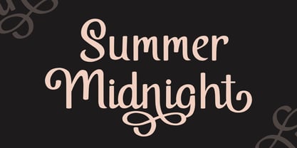 Summer Midnight is beautiful and elegant script font. Each glyph has its own uniqueness and when meeting with others will provide dynamic and pleasing proximity. Summer Midnight also comes with alternate style to make its style more unique and elegant. Summer Midnight will be perfect for your projects such as quotes, poster design, personal branding, promotional materials, logotype, product packaging and more.
 - OL Hebrew Qumran Torah by Dennis Ortiz-Lopez,
$30.00 This font contains every variant found in the Hebrew Bible such as the “mutilated” Waw in Numbers 25: verse 12, the small Heh in Genesis 2: verse 4 and the Nun Inversum before Numbers 10: verse 35 and after verse 36 and elsewhere as well as certain oversized consonants such as the Shin with hireq from the beginning of the Song of Songs.
 - Super Bob Triline NF by Nick's Fonts,
$10.00One of countless variations possible from the modular lettering system called "Super Veloz", developed by Spanish type designer Joan Truchut-Blanchard in the 1930s. This particular variant, for whatever reason, was called "Bob" in the style sheet announcing the system, and it seemed particularly apt. Both versions of this font include the complete Unicode 1252 Latin and Unicode 1250 Central European character sets. - Telka by BumbumType,
$39.00 Ideas are diverse and modern applications are complex. Telka is the typeface to answer this contemporary needs, following our studios approach in creating multi-dimensional tools. Characteristic for this typeface is the character-width variation. From the standard, neutral width collection to the wide collection, with its quirky details and strong personality. Telka is in our shop as variable font available.
 - Echo Soul by Set Sail Studios,
$14.00 Introducing Echo Soul; a free-flowing and carefree brush font duo, hand painted with love. Echo Soul speaks from the heart and doesn't hold back. With elongated brush strokes and a natural flow, it's the perfect choice for handwritten quotes, product packaging, and logo designs with a personal and affectionate touch. The Echo Soul family consists of; 1. Echo Soul • A handwritten script font containing upper & lowercase characters, numerals and a large range of punctuation. 2. Echo Soul Alt • This is a second version of Echo Soul, with a completely new set of lowercase characters. If you wanted to avoid letters looking the same each time to recreate a custom-made style, or try a different word shape, simply switch to this font for an additional layout option. 3. Echo Soul Sans • An all-caps font containing uppercase-only characters, perfect for supporting text to compliment the Echo Soul Script font. Also includes numerals and a large range of punctuation. Stylistic Alternates • Are also available for several lowercase characters - these have elongated tails and look great when placed at the end of a word. These can be used by turning on 'Stylistic Alternates' in OpenType capable software, or accessing via a Glyphs panel.
 - Pressato by Resistenza,
$180.00 Pressato Font is a dynamic and innovative typeface meticulously crafted in collaboration with Pressato Coffee Bookshop in Torino. This unique font boasts three axes—weight, width, and slant—providing designers with unparalleled flexibility and control over their typographic compositions. With a total of 12 distinct fonts and a variable option, Pressato Font allows for a rich variety of styles, making it a versatile choice for a myriad of design applications. The font's flexibility in weight enables users to seamlessly transition from bold and impactful headlines to subtle and elegant body text, ensuring a cohesive and visually appealing design. The inclusion of width and slant axes further enhances the adaptability of Pressato Font. Designers can effortlessly customize the width of characters for a condensed or expanded look, while the slant axis adds a dynamic tilt, injecting personality and movement into the typography. Rooted in the aesthetics of Pressato Coffee Bookshop, this font exudes a contemporary and artistic vibe. Its variable nature opens up endless possibilities for creative expression, making it an ideal choice for branding, editorial design, and various other graphic projects. Pressato Font stands as a testament to the seamless integration of form and function, providing a sophisticated and engaging typographic solution for diverse design needs.
 - TX Signal Signifier by Typebox,
$39.00Eight designers present a set of icons that indicate the fun and fantastic world of signage. Each collaborator's solution represents a completely different interpretations on signage vernacular. Akira Kobayashi's "Subsumption", obscured by foliage, offers a perspective that signs on Japanese roads can be vague and beautiful. M.A.D.'s "People Signs" is a graphical association of people signage with a variety of well known situation symbols. Cynthia Jacquette's "Honest Arrows" are a series of arrows that attempts to honestly tell you how to get from point A to Point B in a big, confusing city. Mike Kohnke's "Road Kill" and the "Bump & Bruise" highlight how signs make for perfect targets when unloading a round of buckshot, and the licking a contruction barrier often endures. Joachim Muller-Lance's "Traffic Blends" places faces on things! Hey, didn't you give your first car a nickname? Cars are alive, you know - they guzzle and smoke all day. Jean-Benoît Lévy's "Inner-State" was inspired while reading the California driver handbook to pass a driver's test. Kevin Roberson's "Tail Lighting" reminds us to drive carefully and not to forget to signal. Diana Stoen's "Drivers Out There" shows us "driver personality archetypes", including the lil'ol lady that everyone tries to avoid. - Maestro by Canada Type,
$24.95 Out of a lifelong inner struggle, Philip Bouwsma unleashes a masterpiece that reconciles classic calligraphy with type in a way never before attempted. Maestro takes its cue from the Italian chancery cursive of the early sixteenth century. By this time type ruled the publishing world, but official court documents were still presented in calligraphy, in a new formal style of the high Renaissance that was integrated with Roman letters and matched the refined order of type. The copybooks of Arrighi and others, printed from engraved wood blocks, spread the Italian cancellaresca across Europe, but the medium was too clumsy and the size too small to show what was really happening in the stroke. Arrighi and others also made metal fonts that pushed type in the direction of calligraphy, but again the medium did not support the superb artistry of these masters or sustain the vitality in their work. As the elegant sensitive moving stroke of the broad pen was reduced to a static outline, the human quality, the variety and the excitement of a living act were lost. Because the high level of skill could not be reproduced, the broad pen was largely replaced by the pointed tool. The modern italic handwriting revival is based on a simplified model and does not approach the level of this formal calligraphy with its relationship to the Roman forms. Maestro is the font that Arrighi and his colleagues would have made if they had had digital technology. Like the calligraphic system of the papal chancery on which it is modelled, it was not drawn as a single finished alphabet, but evolved from a confluence of script and Roman; the script is formalized by the Roman to stand proudly in a world of type. Maestro came together on screen over the course of several years, through many versions ranging widely in style, formality, width, slant, weight and other parameters. On one end of the spectrum, looking back to tradition it embodies the formal harmony of the Roman capitals and the minuscule which became the lower case. On the other it is a flowing script letter drawing on the spirit of later pointed pen and engravers scripts. As its original designers intended, it works with simple Roman capitals and serifs or swash capitals and baroque flourishes. The broad pen supplies weight and substance to the stroke which carries energy through tension in balanced s-curves. Above all it is meant to convey the life and motion of formal calligraphy as a worthy counterbalance to the stolid gravity of metal type. The Maestro family consists of forty fonts distributed over two weights. The OpenType version compresses the family considerably down to two fonts, regular and bold, each containing the entire character set of twenty fonts, for a total of more than 3350 characters per font. These include a wide variety of stylistic alternates, ligatures, beginning and ending letters, flourishes, borders, rules, and other extras. The Pro version also includes extended linguistic support for Latin-based scripts (Western, Central and Eastern European, Baltic, Turkish, Welsh/Celtic, Maltese) as well as Greek. For more thoughts on Maestro, its background and character sets, please read the PDF accompanying the family.
 - Ganymede3D - Personal use only


