10,000 search results
(0.035 seconds)
- Victory Speech Lower by Comicraft,
$49.00 Speak quietly but carry a big stick' as President Theodore Roosevelt once said... so, with so much heated rhetoric in the air this -- let's face it, EVERY -- Election season, we felt that it was important to put together a more dignified and sedate lower case edition of our popular Victory Speech font. Bad Hair and Big Sticks not included. See related font: Victory Speech
 - Andrea Handwriting II by StuArt,
$9.00 Since the release of the first Andrea Handwriting in 2008, requests have come in for additional weights of the four variants in the font family. Andrea Handwriting II includes 16 fonts featuring four weights of the four original styles in the first release which have been improved for a more polished look, but still with a personal and casual feel. Sixteen styles – what’s your type?
 - Hackie Script by Tebaltipis Studio,
$15.00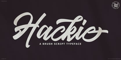 Introducing new latest from TebTipsudio, Hackie Script is a typeface with personality. You can use it as a logo, badge, insignia, packaging, headline, poster, etc The alternative characters in this font were divided into several OpenType features such as Stylistic Alternates, Stylistic Sets, and Ligature. The OpenType features can be accessed by using OpenType program such as Adobe Illustrator, Adobe Photoshop, and Adobe InDesign. Thank you!
 - Kelsey Script by Tebaltipis Studio,
$15.00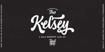 Introducing new latest from TebTipsudio, Kelsey is a script typeface with personality. You can use it as a logo, badge, insignia, packaging, headline, poster, etc The alternative characters in this font were divided into several OpenType features such as Stylistic Alternates, Stylistic Sets, and Ligature. The OpenType features can be accessed by using OpenType program such as Adobe Illustrator, Adobe Photoshop, and Adobe InDesign.
 - Hill Stone by Bal Studio,
$14.00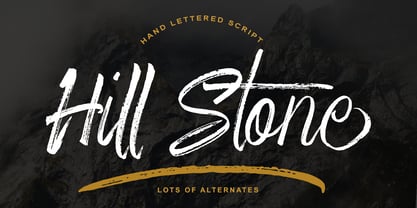 Hill Stone is a textured brush font, a contemporary approach to design, naturally handmade and with underscores. It also has alternatives and ligatures that make your design more attractive. Suitable for use in title design such as clothing, invitations, tittle books, stationery designs, quotes, branding,brand projects, logos, greeting cards, t-shirts, packaging designs, poster, product packaging, news, blogs, everything including personal charm and more.
 - Mango Swifter by Olivetype,
$18.00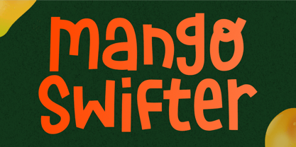 Mango Swifter is a fun and playful display font that's perfect for logotypes, headlines, and product packaging. It's bold and eye-catching, and it will add a touch of personality to any design. So what’s included : Basic Latin Uppercase and Lowercase Numbers, symbols, and punctuations Multilingual Support. PUA Encoded and fully accessible without additional design software Simple Installations Works on PC & Mac Thank You.
 - EFCO Songster by Ilham Herry,
$20.00 Inspired by the Vintage Song Sheet Cover from the 19th Century. Thick n thin with a serif typeface, Comes with 2 style All-caps (Regular and Line Shade) and is also available with pair font and ornament extras. OpenType features support stylistic alternate characters to give a unique personality to the typography composition. Suitable for display needs such as signage, poster, logo, label, headline, cover design, etc
 - Artukge Script by Tebaltipis Studio,
$15.00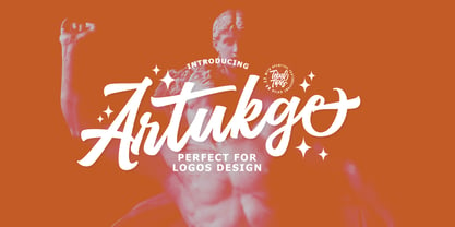 Introducing new latest from TebTipsudio, Artukge Script is a typeface with personality. You can use it as a logo, badge, insignia, packaging, headline, poster, etc The alternative characters in this font were divided into several OpenType features such as Stylistic Alternates, Stylistic Sets, and Ligature. The OpenType features can be accessed by using OpenType program such as Adobe Illustrator, Adobe Photoshop, and Adobe InDesign. Thank you!
 - Just Shemy by Typebae,
$15.00 Just Shemy is a captivating handwritten signature font with an elegant touch. With its thin, monoline style, this font brings forth the beauty of natural handwriting. Each ink stroke appears so authentic, making Just Shemy Font the perfect choice for projects that require a personal and creative touch. With its luxurious simplicity, this font will captivate the eye and provide unmatched grace to your designs.
 - Skriva by Letradora,
$16.00 Skriva is the handwriting we'd all like to have: neat and legible, still natural looking. It as a super complete character set with support for over 200 latin languages. It includes advanced OpenType features, such as random alternate characters, to make it look even more natural. Skriva has 4 variants: light, regular, bold & inky. Use Skriva wherever you need a personal touch on your texts.
 - Braisetto by Adam Ladd,
$25.00 Braisetto is a handwritten, signature family with five weights, multiple alternates, and natural ligatures. Inky and expressive yet readable and functional, this typeface is designed to look personal and be useful in a variety of applications like branding, packaging, products, cards, and more. Features include multiple stylistic alternates, automatic double-letter ligatures, automatic title-case ligatures, initial stroke alternates, ending flair alternates, five weights, and matching ornaments.
 - Mesclo by DSType,
$40.00 Mesclo is our personal take on the geometric typefaces genre. With mono-linear appearance, humanistic elements and subtle hints of Art Deco, Mesclo is a timeless typeface with dramatic oblique terminals and a welcoming, friendly roundness. The outstanding dynamic rhythm and legibility of the text contrasts with the inflexible geometry of the unusual complementary caps-only typefaces, specially developed to fulfil and enrich this type family.
 - Catchfire by Alan Smithee Studio,
$10.00 Warm and human, yet reliable and precise. Catchfire blends humanist proportions and geometric features. The result is a sans serif typeface with strong personality traits, but that can fulfil everyday needs. It is very legible due to its open counters. It boasts a large character-set, OpenType features, circled numbers, wide range of weights, cursive italics : everything needed to become your new companion for years to come!
 - Brillion by Subectype,
$15.00 Brillion is a casual, rounded handwritten font. Perfect for your personal branding and any awesome project such as logos, invitations, stationery, wedding designs, social media posts, advertisements, product packaging, product designs, labels, photography, watermarks, special events and much more ! Brillion comes in Regular & Italic style, with 100+ Ligatures and includes Multilingual support. If you have any questions please don't hesitate to drop me a message.
 - Vriegbe Script by Tebaltipis Studio,
$15.00 Introducing new latest from TebTipsudio, Vriegbe Script is a typeface with personality. You can use it as a logo, badge, insignia, packaging, headline, poster, etc The alternative characters in this font were divided into several OpenType features such as Stylistic Alternates, Stylistic Sets, and Ligature. The OpenType features can be accessed by using OpenType program such as Adobe Illustrator, Adobe Photoshop, and Adobe InDesign. Thank you!
 - Faulaz by Twinletter,
$13.00 Introducing "FAULAZ Font" - Where Handcrafted Elegance Meets Modern Design. FAULAZ Font is your passport to infuse a personal and distinctive touch into your creative projects. This font seamlessly blends the warmth of handwritten text with a contemporary aesthetic. What’s Included : File font All glyphs Iso Latin 1 Alternate, Ligature Simple installations PUA Encoded Characters – Fully accessible without additional design software. Fonts include Multilingual support
 - Switched On by Type Innovations,
$39.00 Switched On and Switched Off where two fonts developed by placing points on a pre-defined square grid template. The experiment was to explore all the variations possible by just using straight connecting lines on a grid. I stumbled on the final concept, almost accidentally, and was amazed by the numerous possibilities. Both designs where created to work together. By adjusting the stroke and inline proportions between the two fonts, I was able to achieve a good overall color balance between 'Switched On' (dark letters on a light background), and the 'Switched Off' design as a knockout treatment (light letters on a dark background). Used in this way, both fonts visually appear similar in overall weight and proportion. They harmonize well together. Used separately, they make for some interesting visual effects and headline treatments. The fonts are best used at large point sizes, but they are still legible in a variety of smaller sizes. I think that by experimenting with these two fonts one can achieve some stunning visual effects. Explore and have fun.
 - Magnirum Serif by Mans Greback,
$79.00 Magnirum Serif is a serif typeface with a medieval flair. Drawing inspiration from historic Roman typography and medieval design, Magnirum Serif is a timeless creation that exudes beauty and elegance. While its serifs and ornaments echo the intricacies of ancient manuscripts, the typeface is designed for modern legibility and regular usage. It combines the best of both worlds, offering a unique blend of historic charm and contemporary readability. Add symbol # after any letter to place a crown on top of it. Example: Cro#wn Magnirum Serif is built with advanced OpenType functionality and has a guaranteed top-notch quality, containing stylistic and contextual alternates, ligatures, and more features; all to give you full control and customizability. It has extensive lingual support, covering all Latin-based languages, and includes all the characters and symbols you'll ever need. Behind this captivating creation is Mans Greback. Renowned for his skill in marrying historical elements with modern utility, Greback has crafted Magnirum Serif to be a versatile yet nostalgic typeface. His portfolio showcases his ability to bring stories and emotions into the realm of type design.
 - Sandwich by Suitcase Type Foundry,
$85.00The all-caps display face Sandwich was inspired by historic, hand lettered sans serif alphabets with slightly sloping terminals, as found in showcard lettering and on billboards. Besides a number of alternate glyphs located in the lowercase area of the font, the typeface features about forty 'ligatures'. These are not ligatures in the traditional sense of the word, but short two- or three-letter combinations — mostly prepositions, conjunctions, articles and so on — in different languages, which are positioned vertically, not horizontally. Since the number of such pre-fabricated ligatures in a font is limited and cannot possibly cover all the desired combinations, a special algorithm programmed into the OpenType font permits the user to compose any two- or three-letter words, provided no accented characters are used. This is why Sandwich includes five versions of each letter. Using the full possibilities offered by the OpenType format, the automatic vertical aligning of glyphs is based on a combination of optional ligatures, style sets, and modified kerning. - Serpentine by Image Club,
$29.99Dick Jensen (USA) designed Serpentine, is a contemporary-looking display font, for the Visual Graphics Corporation in 1972. With the rise of digital typesetting and desktop publishing, this typeface quickly became both popular and ubiquitous. This dynamic, wide, boxy design is identifiable via tiny triangular swellings at the stroke endings - what might be called semi-serifs. Serpentine is available in six different font styles: Light, Light Oblique, Medium, Medium Oblique, Bold, and Bold Oblique. Serpentine" is a greenish rock that sometimes resembles a serpent's skin, and is often used as a decorative stone in architecture. Though this font doesn't seem at all snaky or sinuous, it does have an architectural, stone-like solidity. The subtle, almost non-existent curves and semi-serifs keep it from being too stern or cold. Although the underlying strokes of each weight are similar, the six members of the Serpentine font family all present their own individual personalities. Serpentine Light lends itself well to text for onscreen displays, for instance, while the numbers from typeface's heavier weights are seen around the world on soccer jerseys! Additionally, the oblique styles convey a streamlined sense of speed, furthermore lending Serpentine well to sport and athletic applications (especially the faster, high-speed varieties). Because of its 1970s pedigree, Serpentine has come to be known as a genuine "retro" face. This makes the typeface even more appropriate for display usage, in applications such as logo design, magazine headlines, and party flyers. If you like Serpentine, check out the following similar fonts in the Linotype portfolio: Copperplate Gothic (similar serifs) Eurostile (similar width) Princetown (another "athletic" font) Insignia (similar "techno" feeling)" - Serpentine by Linotype,
$29.00Dick Jensen (USA) designed Serpentine, is a contemporary-looking display font, for the Visual Graphics Corporation in 1972. With the rise of digital typesetting and desktop publishing, this typeface quickly became both popular and ubiquitous. This dynamic, wide, boxy design is identifiable via tiny triangular swellings at the stroke endings - what might be called semi-serifs. Serpentine is available in six different font styles: Light, Light Oblique, Medium, Medium Oblique, Bold, and Bold Oblique. Serpentine" is a greenish rock that sometimes resembles a serpent's skin, and is often used as a decorative stone in architecture. Though this font doesn't seem at all snaky or sinuous, it does have an architectural, stone-like solidity. The subtle, almost non-existent curves and semi-serifs keep it from being too stern or cold. Although the underlying strokes of each weight are similar, the six members of the Serpentine font family all present their own individual personalities. Serpentine Light lends itself well to text for onscreen displays, for instance, while the numbers from typeface's heavier weights are seen around the world on soccer jerseys! Additionally, the oblique styles convey a streamlined sense of speed, furthermore lending Serpentine well to sport and athletic applications (especially the faster, high-speed varieties). Because of its 1970s pedigree, Serpentine has come to be known as a genuine "retro" face. This makes the typeface even more appropriate for display usage, in applications such as logo design, magazine headlines, and party flyers. If you like Serpentine, check out the following similar fonts in the Linotype portfolio: Copperplate Gothic (similar serifs) Eurostile (similar width) Princetown (another "athletic" font) Insignia (similar "techno" feeling)" - 1512 Initials by GLC,
$20.00 This set of initial decorated letters is an entirely original creation, drawn inspired by Italian renaissance patterns. It contains two roman alphabets : one drawn in white on black background and the other in black on white. We have included a few fleurons and decorative elements. It can be used as variously as web-site titles, posters and flyers design, publishing texts looking like ancient ones, or greeting cards, all various sorts of presentations, as a very decorative, elegant and luxurious additional font... This font supports strong enlargements remaining very smart and fine. It's prefered height is about one inch equivalent to about four lines of characters. This font may be used with all blackletter fonts, but works especially well with 1543 Humane Jenson, 1557 Italique and 1742 Civilite, without any anachronism.
 - Breughel by Linotype,
$29.99Adrian Frutiger came up with this unusually purposeful and strong design in 1981 for Linotype. Early humanistic typefaces of the sixteenth century, especially Jenson, served as models for Breughel. The right sides of the stems are vertical and at right angles to the baseline while the left sides of the stem curve into the serifs, making the typeface look as though it slants to the right, and giving it a sense of movement and liveliness. The ductus of the broad-edged pen is reflected in the flow, rhythm, and texture of text set in Breughel, but at the same time this design has a regularity of form that is typographically solid. Breughel is an ideal typeface for the designer with skill and vision. Use it to create innovative publications, posters, and advertisements. - saxMono - Unknown license

- Girltalk by Scholtz Fonts,
$10.00 Cute, curly, & very "little missy", Girltalk was specially designed for the pre-teen & young-teen market. Its design was inspired by the kind of curly handwriting that junior school girls use for notes to each other, diary entries, autograph books etc. Pretty & feminine, with a large dose of cheek, Girltalk is a must for all marketing media aimed at the 7-14 age group: -- “girl style” stationery -- diary covers -- clothing hang-tags -- party invitations -- greeting cards -- book covers -- movie posters -- CD covers -- toy and game advertising media Girltalk can also be used for "big girls"! Great for hen parties, baby showers, pamper parties and other occasions that bring out the "girl in" women. Think pink, think hearts & flowers, think ribbons & bows, add Girltalk to the mix, and you have a winner! Girltalk has been carefully letterspaced and kerned. All upper and lower case characters, punctuation, numerals and accented characters are present.
 - Gineso Titling by insigne,
$19.00 Before the Great War, there were great posters. Posters of elegance and grandeur. Posters calling people to the pleasures of sunny southern France and to the perfections of northern Italy’s dolce vita. Le Havre, based on a poster by AM Cassandre, was one of my first typefaces that took inspiration from this genre. Now, the golden memories of years past are the inspiration for insigne design’s new Gineso Titling as well. Gineso revives the retro forms of past poster design with its newly crafted sense of humanity, which is amplified by a great variety of texture options. While the new forms are perfect for posters, this titling font is also ideal for bringing the charm of pre-war Southern Europe to a new bottle of wine, to fine foods and beverages, and to high-end logotypes. For the grandeur and elegance you need in your titling, look to Gineso Titling.
 - Rubrical by Ditatype,
$29.00 Introducing Rubrical, a script font that gives personalized feel to the design with a confident presence. This typeface is characterized by its substantial weight, giving your design a bold and impactful appearance. Rubrical maintains consistent proportions across all its letters, offering a sense of stability. It also adds a sense of warmth and personality. It has flowing and connected letterforms that are embellished with graceful swings that adorn select letters. These decorative elements, which can include ornate initials or elegant swinging flourishes, add a touch of sophistication and artistic flair to your text. They create a visual journey that is engaging, unique, and memorable. In addition, enjoy the features here. Features: Ligatures Stylistic Sets Swashes Multilingual Supports PUA Encoded Numerals and Punctuations Rubrical fits in headlines, logos, posters, flyers, branding materials, print media, editorial layouts, and many more designs. Find out more ways to use this font by taking a look at the font preview. Thanks for purchasing our fonts. Hopefully, you have a great time using our font. Feel free to contact us anytime for further information or when you have trouble with the font. Thanks a lot and happy designing.
 - Horizontes Script by Sudtipos,
$39.00 Horizontes Script is the result of Panco’s personal experimental calligraphy project. Designed with the goal of finding a balance between spontaneity, elegance and beauty, his first typography was born and inspired on the horizon´s blue line from the city he was born. Relaxed, energic and very natural. With different alternatives of proportion, a wide range of ligatures, initial letters, terminals, floritures, Horizontes Script comes in two weight for large and small formats. “Horizontes Script” results in an ideal font for titles and short texts that find something else to show more than just words. A casual and harmonious font with strong personality. Great for projects that need to connote class and style without being too formal. Ideal for design that need to transmit warmth and humanity feel to be applied on invitations, labels, poetry, songs or thoughts. Created by Panco Sassano, under the supervision of the experienced typographer Ale Paul – in a duo work - “Horizontes Script” is the latest typeface by Sudtipos.
 - Ontario Script by Factory738,
$15.00 Call me Ontario - A fashionable handwritten font with a personal touch. Ontario script is ideal for a variety of projects such as branding, logo design, wedding designs, social media posts, advertisements, product packaging, product designs, label, photography, watermark, invitation, stationery, and any other project that requires a handwritten touch. Ontario Script (Regular, Caps, and Tails) Basic Latin A-Z and a-z Numerals & Punctuation Stylistic Alternates Multilingual Support for ä ö ü Ä Ö Ü … Free updates and feature additions Thanks for looking, and I hope you enjoy it.
 - Nova Scotia by Factory738,
$15.00 Introducing Nova-Scotia - A charming handwritten font with a personalized touch. Nova-Scotia script is ideal for a variety of projects such as branding, logo design, wedding designs, social media posts, advertisements, product packaging, product designs, label, photography, watermark, invitation, stationery, and any other project that requires a handwritten touch. Nova-Scotia Script (Regular, Caps, and Tails) Basic Latin A-Z and a-z Numerals & Punctuation Stylistic Alternates Multilingual Support for ä ö ü Ä Ö Ü … Free updates and feature additions Thanks for looking, and I hope you enjoy it.
 - Venetian 301 by ParaType,
$30.00 Venetian 301 is the Bitstream version of the Centaur type family. Centaur was designed by the American book designer Bruce Rogers on the basis of Venetian typefaces of 1470 of Nicolas Jenson. Beautiful Italic based on a face by Ludovico degli Arrighi was developed by Frederic Warde who was an American calligrapher and typography researcher was added as Italic to Centaur. Adapted for mechanical composition by English Monotype in 1929. Its lettershapes owe much to pen-drawn letters of Italian humanist minuscule and cursive. This elegant humanist face is useful for the finest typography both for book text and display matter. Cyrillic version included small caps was developed for ParaType in 2003 by Dmitry Kirsanov.
 - Brookelyn by Arendxstudio,
$20.00 Brookelyn - Script Font with a natural & stylish flow. This collection of scripts is perfect for personal branding. this works well for many applications. Everything from personal branding & wedding invitations to advertising could benefit from this collection of signature font Features : • Character Set A-Z • Numerals & Punctuations (OpenType Standard) • Accents (Multilingual characters) • Ligature Multilingual Support : Afrikaans, Albanian, Asu, Basque, Bemba, Bena, Catalan, Chiga, Cornish, Danish, English, Estonian, Faroese, Filipino, Finnish, French, Friulian, Galician, German, Gusii, Icelandic, Indonesian, Irish, Italian, Kabuverdianu, Kalenjin, Kinyarwanda, Low German, Luo, Luxembourgish, Luyia, Machame, Makhuwa-Meetto, Makonde, Malagasy, Malay, Manx, Morisyen, North Ndebele, Norwegian Bokmål, Norwegian Nynorsk, Nyankole, Oromo, Portuguese, Romansh, Rombo, Rundi, Rwa, Samburu, Sango, Sangu, Scottish Gaelic, Sena, Shambala, Shona, Soga, Somali, Spanish, Swahili, Swedish, Swiss German, Taita, Teso, Vunjo, Zulu There it is! I really hope you enjoy it !
 - Southbound by Arendxstudio,
$18.00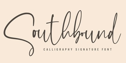 Southbound Font with a natural & stylish flow. This collection of scripts is perfect for personal branding. this works well for many applications. Everything from personal branding & wedding invitations to advertising could benefit from this collection of signature font Features : • Character Set A-Z • Numerals & Punctuations (OpenType Standard) • Accents (Multilingual characters) • Ligature Multilingual Support : Afrikaans, Albanian, Asu, Basque, Bemba, Bena, Catalan, Chiga, Cornish, Danish, English, Estonian, Faroese, Filipino, Finnish, French, Friulian, Galician, German, Gusii, Icelandic, Indonesian, Irish, Italian, Kabuverdianu, Kalenjin, Kinyarwanda, Low German, Luo, Luxembourgish, Luyia, Machame, Makhuwa-Meetto, Makonde, Malagasy, Malay, Manx, Morisyen, North Ndebele, Norwegian Bokmål, Norwegian Nynorsk, Nyankole, Oromo, Portuguese, Romansh, Rombo, Rundi, Rwa, Samburu, Sango, Sangu, Scottish Gaelic, Sena, Shambala, Shona, Soga, Somali, Spanish, Swahili, Swedish, Swiss German, Taita, Teso, Vunjo, Zulu There it is! I really hope you enjoy it
 - Amersfoort by Arendxstudio,
$16.00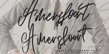 Amersfoort Calligraphy Font with a natural & stylish flow. This collection of scripts is perfect for personal branding. this works well for many applications. Everything from personal branding & wedding invitations to advertising could benefit from this collection of signature fonts Features : • Character Set A-Z • Numerals & Punctuations (OpenType Standard) • Accents (Multilingual characters) • Ligature Multilingual Support : Afrikaans, Albanian, Asu, Basque, Bemba, Bena, Catalan, Chiga, Cornish, Danish, English, Estonian, Faroese, Filipino, Finnish, French, Friulian, Galician, German, Gusii, Icelandic, Indonesian, Irish, Italian, Kabuverdianu, Kalenjin, Kinyarwanda, Low German, Luo, Luxembourgish, Luyia, Machame, Makhuwa-Meetto, Makonde, Malagasy, Malay, Manx, Morisyen, North Ndebele, Norwegian Bokmål, Norwegian Nynorsk, Nyankole, Oromo, Portuguese, Romansh, Rombo, Rundi, Rwa, Samburu, Sango, Sangu, Scottish Gaelic, Sena, Shambala, Shona, Soga, Somali, Spanish, Swahili, Swedish, Swiss German, Taita, Teso, Vunjo, Zulu There it is! I really hope you enjoy it
 - CAL Bodoni Terracina by California Type Foundry,
$47.00 Bodoni Terracina is a legible, fun-formal script face, with lots of curls. Sometimes script faces are hard to read. Sometimes being formal means that there’s no personality and there’s no fun. Enter Terracina: one of the masterpieces of font design. Some of the most personable italics ever carved. Includes powerful new features for: • Dates • Pricings • Addresses Not is only Terracina formal but fun, it’s also fun to use! In a program like Adobe Indesign or Illustrator, just highlight a word and see lots of fun options. Bodoni himself etched these symbols, and his fun-loving personality shines through. As a semi-script, it can go together with many script fonts, but it is more readable. When you need something equal parts elegant and whimsical, Terracina strikes a perfect balance to let the fun shine through, such as for holiday designs or fairytales. Terracina is a subheads font, but Bodoni also used it for paragraphs. So Terracina works well doing subhead paragraphs, especially when contrasting with the mood of the first font. And because of the swash variety, it works well for setting German and other European languages. CAL Bodoni Terracina is a member of our Origins Series. Origin Fonts are designed to be true to the original designer's intentions and fonts. Our Bodoni origin fonts ARE Bodoni fonts, not imitations or interpretations. They were drawn by Bodoni, our team just expanded it for modern use. For Terracina, Bodoni's original weight is the "Quasi-Lite" option, all other weights have been meticulously matched by the CAL Origins Team.
 - Sweet Sans by Sweet,
$59.00 The engraver’s sans serif—strikingly similar to drafting alphabets of the early 1900s—has been one of the most widely used stationer’s lettering styles since about 1900. Its open, simple forms offer legibility at very small sizes. While there are digital fonts based on this style (such as Burin Sans™ and Sackers Gothic™, among others), few offer the range of styles and weights possible, with the versatility designers perhaps expect from digital type families. Sweet Sans fills that void. The family is based on antique engraver’s lettering templates called “masterplates.” Professional stationers use a pantograph to manually transfer letters from these masterplates to a piece of copper or steel that is then etched to serve as a plate or die. This demanding technique is rare today given that most engravers now use a photographic process to make plates, where just about any font will do. But the lettering styles engravers popularized during the first half of the twentieth century—especially the engraver’s sans—are still quite familiar and appealing. Referencing various masterplates—which typically offer the alphabet, figures, an ampersand, and little else—Mark van Bronkhorst has drawn a comprehensive toolkit of nine weights, each offering upper- and lowercase forms, small caps, true italics, arbitrary fractions, and various figure sets designed to harmonize with text, small caps, and all-caps. The fonts are available as basic, Standard character sets, and as Pro character sets offering a variety of typographic features and full support for Western and Central European languages. Though rich in history, Sweet Sans is made for contemporary use. It is a handsome and functional tribute to the spirit of unsung craftsmanship. Burin Sans and Sackers Gothic are trademarks of Monotype Imaging.
 - Compatil Fact by Linotype,
$50.99Compatil is the first comprehensive type system which enables all typographical elements to be used to full effect in order to reproduce the message conveyed by text information. Four different type styles with a total of 16 weights including italics have been merged into a unique typographical network. There are now no limits to the font user's creativity. The system is a product of technical innovation and constitutes a new design approach which meets the highest aesthetic standards. For almost two years, a team of experts from Linotype has been working with initiator Professor Olaf Leu under the direction of Silja Bilz, Erik Faulhaber and Reinhard Haus to create the Compatil type system. Despite the Internet and TV, it is essential today to be able to absorb information quickly by being able to read it with ease. A fact that is becoming increasingly important both on-screen and on paper. It is the role of the font to increase legibility and to ensure typographically perfect results for text design work. The new Compatil type system meets all these needs. The Compatil is a part of the Platinum Collection. The following four different styles are available: Compatil Exquisit, Compatil Fact, Compatil Letter and Compatil Text. Compatil is available in various font formats: 16 separate OT Pro fonts including the small caps and Adobe Central European character set for OpenType-supporting applications like Adobe InDesign, or as 32 separate OpenType Com fonts for office communication, with the following special features: 1. Optimized display capabilities for computer screens eXcellent Screen Fonts (XSF-quality). 2. An extended, international character set, which supports 48 different languages for Microsoft Office applications like MS Word or as 64 PostScript fonts, which can be used in non-OpenType-supporting applications like Quark XPress. - Compatil Fact Paneuropean by Linotype,
$103.99Compatil is the first comprehensive type system which enables all typographical elements to be used to full effect in order to reproduce the message conveyed by text information. Four different type styles with a total of 16 weights including italics have been merged into a unique typographical network. There are now no limits to the font user's creativity. The system is a product of technical innovation and constitutes a new design approach which meets the highest aesthetic standards. For almost two years, a team of experts from Linotype has been working with initiator Professor Olaf Leu under the direction of Silja Bilz, Erik Faulhaber and Reinhard Haus to create the Compatil type system. Despite the Internet and TV, it is essential today to be able to absorb information quickly by being able to read it with ease. A fact that is becoming increasingly important both on-screen and on paper. It is the role of the font to increase legibility and to ensure typographically perfect results for text design work. The new Compatil type system meets all these needs. The Compatil is a part of the Platinum Collection. The following four different styles are available: Compatil Exquisit, Compatil Fact, Compatil Letter and Compatil Text. Compatil is available in various font formats: 16 separate OT Pro fonts including the small caps and Adobe Central European character set for OpenType-supporting applications like Adobe InDesign, or as 32 separate OpenType Com fonts for office communication, with the following special features: 1. Optimized display capabilities for computer screens eXcellent Screen Fonts (XSF-quality). 2. An extended, international character set, which supports 48 different languages for Microsoft Office applications like MS Word or as 64 PostScript fonts, which can be used in non-OpenType-supporting applications like Quark XPress. - Compatil Letter by Linotype,
$50.99Compatil is the first comprehensive type system which enables all typographical elements to be used to full effect in order to reproduce the message conveyed by text information. Four different type styles with a total of 16 weights including italics have been merged into a unique typographical network. There are now no limits to the font user's creativity. The system is a product of technical innovation and constitutes a new design approach which meets the highest aesthetic standards. For almost two years, a team of experts from Linotype has been working with initiator Professor Olaf Leu under the direction of Silja Bilz, Erik Faulhaber and Reinhard Haus to create the Compatil type system. Despite the Internet and TV, it is essential today to be able to absorb information quickly by being able to read it with ease. A fact that is becoming increasingly important both on-screen and on paper. It is the role of the font to increase legibility and to ensure typographically perfect results for text design work. The new Compatil type system meets all these needs. The Compatil is a part of the Platinum Collection. The following four different styles are available: Compatil Exquisit, Compatil Fact, Compatil Letter and Compatil Text. Compatil is available in various font formats: 16 separate OT Pro fonts including the small caps and Adobe Central European character set for OpenType-supporting applications like Adobe InDesign, or as 32 separate OpenType Com fonts for office communication, with the following special features: 1. Optimized display capabilities for computer screens eXcellent Screen Fonts (XSF-quality). 2. An extended, international character set, which supports 48 different languages for Microsoft Office applications like MS Word or as 64 PostScript fonts, which can be used in non-OpenType-supporting applications like Quark XPress. - Compatil Text by Linotype,
$50.99Compatil is the first comprehensive type system which enables all typographical elements to be used to full effect in order to reproduce the message conveyed by text information. Four different type styles with a total of 16 weights including italics have been merged into a unique typographical network. There are now no limits to the font user's creativity. The system is a product of technical innovation and constitutes a new design approach which meets the highest aesthetic standards. For almost two years, a team of experts from Linotype has been working with initiator Professor Olaf Leu under the direction of Silja Bilz, Erik Faulhaber and Reinhard Haus to create the Compatil type system. Despite the Internet and TV, it is essential today to be able to absorb information quickly by being able to read it with ease. A fact that is becoming increasingly important both on-screen and on paper. It is the role of the font to increase legibility and to ensure typographically perfect results for text design work. The new Compatil type system meets all these needs. The Compatil is a part of the Platinum Collection. The following four different styles are available: Compatil Exquisit, Compatil Fact, Compatil Letter and Compatil Text. Compatil is available in various font formats: 16 separate OT Pro fonts including the small caps and Adobe Central European character set for OpenType-supporting applications like Adobe InDesign, or as 32 separate OpenType Com fonts for office communication, with the following special features: 1. Optimized display capabilities for computer screens eXcellent Screen Fonts (XSF-quality). 2. An extended, international character set, which supports 48 different languages for Microsoft Office applications like MS Word or as 64 PostScript fonts, which can be used in non-OpenType-supporting applications like Quark XPress.
