10,000 search results
(0.056 seconds)
- Tom-Bombadill - Personal use only

- An Accidental Kiss - Unknown license

- Sans Culottes - Unknown license

- Ripple - Unknown license

- Spock by Los Andes,
$19.00 Spock has a neutral and clean structure but as we explore its OpenType features we will begin to discover a rich variety of alternates—even glyphs with pointed ears. All these combined elements provide a wide range of choices to meet different design needs. Each of the 4 sub-families consists of 6 weights and matching italics, making Spock a super family of 48 styles. The Pro family set contains 609 characters and it includes a generous number of alternates. The three other Essential sets are composed of alternative glyphs. Spock is specially suited for advertising as well as editorial and corporate design.
 - Lazy Daisy by Kern Club,
$10.00 Uppercase Character Set A-Z Numerals & Simple punctuation OTF file format
 - Semantica MF by Masterfont,
$59.00 Formal, yet with very high legibility even in small point sizes. Many weights gives you design alternatives
 - Mea Culpa by TypeSETit,
$24.95 One of the most elegant script styles found. This beautifully formal font is perfect for high society.
 - LD Astoria by Illustration Ink,
$3.00This stylish font has that ornamental curly look. It would be excellent for the formal scrapbook layout. - Galicia by Device,
$29.00 Galicia is a looser calligraphic serif that has unusual forms that are seen to good effect in characters like the lower case a. It is suggested for use where a more formal and classic yet still warm and calligraphic look is appropriate.
 - Trissino DT by DTP Types,
$49.00Named after Gian Giorgio Trissino (1478-1550) the Italian Renaissance humanist, poet, dramatist, diplomat and grammarian who was the first to explicitly distinguish I and J as seperate letter sounds. - Heritage Set by Katatrad,
$29.00 Heritage Set is a display font. It was designed specifically for display, headline, logotype, branding, and similar applications. Heritage Set has been designed to equipped with three different widths; Narrow, Normal and Wide, addition to expanding weights to support various usabilities ranging from ExtraLight, Light, Regular, Bold and ExtraBold. Which makes with a Tabular Lining features support the creativities of the designer from the Font Menu.
 - LineDrive by Ingrimayne Type,
$12.95 LineDrive was inspired by an obscure 19th century type design. It has no curved lines and what are normally circular elements in the lower-case letters are diamond-shaped. It might work best with only upper-case letters, which have a Victorian feel to them. In addition to the two weights of plain and bold, the family includes a shadowed version and an inline (or outlined) version.
 - Gopher by Adam Ladd,
$25.00 Gopher is a reverse contrast, geometric sans serif typeface in 3 optical sizes ranging — Text, Normal, and Display. With the most subtle contrast,Text works best in smaller type settings while Display is the most dramatic as the contrast has been pushed more to the extreme for an immediate visual impact. Gopher works great in a variety of settings for branding, advertising, posters, magazines, packaging, and more.
 - Commuters Sans by Dharma Type,
$19.99 Commuters Sans is a daily type. Classic but Modern. Very simple geometry and wide type with warm clearness. Useful for both body-text and titling by their minimal glyph shapes and slightly wide and eye-catching proportion. Consists of eight weights and their matching italics. Supporting almost all latin languages. All-caps text for one line or a few is as wonderful as normal mixed-case typesetting.
 - Gaude by Trustha,
$19.00 Gaude is a sans-serif typeface. Crafted with care, maximizing neatness in shape. With thickness balancing with negative space. Making it fitting when strung together into words, or sentences. Added with alternative glyphs, to make it more alive. Gaude comes with 3 widths, namely: normal, wide, and expanded. And also a soft version, making it 6 styles. Gaude is perfect for branding, titling, headline, and more.
 - Haarlem Nights NF by Nick's Fonts,
$10.00A 1920 Dutch poster for Public Placement Services by Johan Dijsktra provided the inspiration for this crisp geometric typeface. Instead of the normal underscore (_), this font features a set of parallel lines flush to the tops of the caps and small caps, which offers some intriguing design possibilities. Both versions of this font include the complete Unicode 1252 Latin and Unicode 1250 Central European character sets. - Cactus Flower SG by Spiece Graphics,
$39.00 Cactus majestically blooming in the desert is truly a wondrous event! As the landscape cools, nature blossoms into a beautiful rainbow of colors. These same harmonies and contours, plus a dash of ruggedness and legibility, help to make Cactus Flower Open a superb choice for display work. This cowboy boot style is an old Speedball favorite originated by lettering artist Ross F. George. It’s especially useful for creating distinctive headlines and titles where a Tuscan look is desired. The engraved appearance of the open style adds a delightful touch to this Old West typeface. A solid version is also available. You will find small caps, petite figures, and various alternates included for your convenience. Cactus Flower Open is also available in the OpenType format. Some new characters have been added to this OpenType version including stylistic alternates, discretionary f-ligatures, and initials. These advanced features work in current versions of Adobe Creative Suite InDesign, Creative Suite Illustrator, and Quark XPress. Check for OpenType advanced feature support in other applications as it gradually becomes available with upgrades.
 - Pekin by HiH,
$15.00 Pekin is an unusual design with an oriental flavor. It was originally designed by Ernst Lauschke and released by The Great Western Type Foundry of Chicago as “Dormer,” which is similar to the French verb ‘to sleep,’ not exactly a marketing triumph. Barnhart Bros. And Spindler (independently-operated subsidiary of ATF since 1911) bought Great Western in 1918. According to McGrew, AMERICAN METAL TYPEFACES of the TWENTIETH CENTURY, BB&S renamed the typeface prior printing their 1925 specimen book — guess they wanted something just a tad more exciting. Quirky, distinctive and fun. Pekin ML represents a major extension of the original release, with the following changes: 1. Added glyphs for the 1250 Central Europe, the 1252 Turkish and the 1257 Baltic Code Pages. Added glyphs to complete standard 1252 Western Europe Code Page. Special glyphs relocated and assigned Unicode codepoints, some in Private Use area. Total of 415 glyphs (compared to 218 glyphs in the original release). 2. 652 Kerning Pairs. Note: Ag, Aj and gj will cross unless kerned. Alternative A may also be used. 3. Added OpenType GSUB layout features: onum, salt, liga, dlig, hist, ornm and kern. 4. Revised vertical metrics for improved cross-platform line spacing. 5. Refined various glyph outlines, based on improved scans. 6. Added set of Tabular Numbers at cap height, based on original design; added Old-Style Numbers based on default design. 7. Added a bunch of alternative characters: 18 upper case letters, 10 lower case letters, 1 ampersand and 1 bullet. The alternate c is actually the original design, but I don't like it - easily confused with e. Alt E H M h m n r t are from the original design. I added the rest. 8. 7 Ligatures, 4 Ornaments, 18 Geometric Shapes, 6 Arrows and 12 Misc. Symbols. The zip package includes two versions of the font at no extra charge. There is an OTF version which is in Open PS (Post Script Type 1) format and a TTF version which is in Open TT (True Type)format. Use whichever works best for your applications.
 - Nurnberg by Vintage Voyage Design Supply,
$20.00 Nürnberg (Nuremberg in eng.) New blackletter-sans font family in modern look with contrasts elements in six widths. Impressive style with non-typical Blackletter uppercases as alternates and normal Sans as standard. In the company with good-looking lowercases and their alternates you can get outstanding result for your project. Six widths give you wide range of use. Massive Bold or Black will be really good in none-long magazine headlines, some logos or cafe/bar signs, menu's or coffeeshops. Medium or Regular is for normally (not giant) text blocks or any of accented texts. Light and Thin are good in big pt. Short word forms or numerals is just awesome.
 - FF Holmen by FontFont,
$41.99 Danish type designer Per Jørgensen created this serif FontFont in 2007. The family has 5 weights, ranging from Regular to Bold (including italics) and is ideally suited for book text, festive occasions as well as editorial and publishing. FF Holmen provides advanced typographical support with features such as ligatures, small capitals, case-sensitive forms, fractions, and super- and subscript characters. It comes with a complete range of figure set options – oldstyle and lining figures, each in tabular and proportional widths.
 - Tasty Chat by PizzaDude.dk,
$17.00 Something tasty for your design! Tasty Chat is designed to be super legible and with a natural and organic feeling to it. Besides multilingual support, the font has 4 different versions of each lowercase letter. These "contextual alternates" cycles as you type which makes the font more random and handmade looking. Add some of the doodles to your design to make it more spectacular - they were made with the same pen as the actual font, so they fit perfectly together!
 - Gilbertino by Keristyper Studio,
$14.00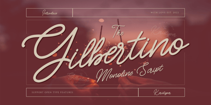 Gilbertino is casual script font With a clean stroke, super slanted, and fun character. This font is great for vintage designs, logos, labels, badges, posters, and more. Multilingual support: Afrikaans, Albanian, Catalan, Danish, Dutch, English, Estonian, French, Finnish, German, Icelandic, Indonesian, Italian, Malay, Norwegian, Portuguese, Spanish, Swedish, Zulu, and many more. What’s Included : Standard & Multilingual glyphs Ligature Works on PC & Mac Simple installations Accessible in Adobe Illustrator, Adobe Photoshop, Adobe InDesign, and even work on Microsoft Word. Hope you enjoy our font!
 - FF Polymorph by FontFont,
$41.99 German type designer Stefanie Schwarz created this display and sans FontFont in 2008. The family has 6 weights, and is ideally suited for advertising and packaging, festive occasions, editorial and publishing as well as poster and billboards. FF Polymorph provides advanced typographical support with features such as ligatures, alternate characters, case-sensitive forms, super- and subscript character, and stylistic alternates. It comes with a complete range of figure set options – oldstyle and lining figures, each in tabular and proportional widths.
 - FF Karo by FontFont,
$47.99 Canadian type designer Martin L'Allier created this display and blackletter FontFont in 2005. The family contains 3 weights and is ideally suited for advertising and packaging, festive occasions, editorial and publishing as well as poster and billboards. FF Karo provides advanced typographical support with features such as swashes, ligatures, case-sensitive forms, fractions, super- and subscript characters, and stylistic alternates. It comes with a complete range of figure set options – oldstyle and lining figures, each in tabular and proportional widths.
 - Lexis by Typedepot,
$29.00 You can Download All 36 Demo Fonts The Lexis font family is a sans serif “super” family consisting of two sub-families - Lextis & Lexis Alt. While the first one follows the humanist model, its alternative version Lexis Alt dives way deeper into the geometric aesthetic. It’s simple yet versatile, packing great amount of well balanced weights, extensive character set and numerous Opentype features. The Lexis typefamily comes in 9 weights plus their italics, two distinctive styles and support for over 200 languages.
 - FF Providence Sans by FontFont,
$93.99 American type designer Guy Jeffrey Nelson created this script FontFont in 1994. The family contains 2 weights: Regular and Bold and is ideally suited for advertising and packaging, festive occasions, poster and billboards as well as web and screen design. FF Providence Sans provides advanced typographical support with features such as ligatures, alternate characters, case-sensitive forms, and stylistic alternates. It comes with proportional lining figures. This FontFont is a member of the FF Providence super family, which also includes FF Providence.
 - FF Turmino by FontFont,
$41.99 German type designer Ole Schäfer created this sans FontFont in 2002. The family has 6 weights, ranging from Light to Black and is ideally suited for advertising and packaging, editorial and publishing as well as sports. FF Turmino provides advanced typographical support with features such as ligatures, alternate characters, case-sensitive forms, fractions, super- and subscript characters, and stylistic alternates. It comes with a complete range of figure set options – oldstyle and lining figures, each in tabular and proportional widths.
 - FF Dirty Four by FontFont,
$41.99 British type designer Neville Brody created this display FontFont in 1994. The font is ideally suited for advertising and packaging, music and nightlife as well as poster and billboards. FF Dirty Four provides advanced typographical support with features such as ligatures, alternate characters, and case-sensitive forms. It comes with proportional lining figures. This FontFont is a member of the FF Dirty super family, which also includes FF Dirty One, FF Dirty Seven, FF Dirty Six, and FF Dirty Three.
 - JAF Facit by Just Another Foundry,
$42.00 Facit is a contemporary sans serif text face. It is designed to be a highly legible and flexible font that does not draw the attention to itself. Instead of being original by itself it is the result of a careful examination of ancient as well as modern formal concepts. “It is by definition impossible to design an un-conventional typeface. Type is pure convention, this is why we can read each other’s written words”, says its designer Tim Ahrens. However, rather than generating an average, existing principles were consciously combined into a unique design solution: The word ‘Facit’, in its German version, means ‘conclusion’. The fonts are provided in OpenType format. Each font contains 720 glyphs. Technically, they follow the Adobe Pro fonts and provide the same glyph set and OpenType functionality. OpenType features include ligatures, true small capitals, superiors, inferiors, numerators and denominators. Every font contains old style and lining figures, both in a proportional and a tabular design. For some letters there alternate characters.
 - Much Ado by The Very Awkward,
$12.95 Much Ado is a quirky-yet-practical all-caps handwritten font family with just enough subtle variation between uppercase and lowercase letters to keep things interesting. It's pretty great on: Informative infographics Clever indie comics K-Pop cover band posters (and other types of posters) Invitations to cool parties for cool people Eye-catching Instagram posts Sliced bread ...or anything that needs a pinch of fun and a double dose of legibility. Whimsical but supremely readable, Much Ado is imperfectly perfect for both body and headers.
 - Fun Baking by Vozzy,
$10.00 Introducing a vintage look label font named Fun Baking. All available characters you can see at the screenshot. This font have 7 styles - Regular, Outline, Texture, Shine, Shine FX, Outline FX and Texture FX. This funny style font will good viewed on any retro design like poster, t-shirt, label, logo etc.
 - Race To Space by Vozzy,
$10.00 Introducing a vintage look label font named Race To Space. All available characters you can see at the screenshot. This font have 7 styles - Regular, Shadow, Texture, Shadow FX, Texture FX, Full and Aged. This funny style font will good viewed on any retro design like poster, t-shirt, label, logo etc.
 - Serca by Adam Ladd,
$25.00 Serca is a structured geometric sans serif font family with normal and condensed proportions. It is professional and precise, open and legible. The modern, clean design lends itself to being a workhorse for a variety of applications—branding, advertising, websites, mobile apps, logos, magazines, etc.—able to be used in both small body text and large headlines alike. The vast range of weights gives plenty of options to choose from.
 - HUTagada by Heummdesign,
$15.00 "Disco Pang Pang" is the Korean name for Tagada rides. It is a characteristic typeface that is good to use when you want to make use of a unique and bouncy feeling. Light and Extrabold are made with the thickness of normal typefaces, but Left and Right have strange shapes with stroke thicknesses that are biased to one side. Its unique shape can make a strong impression on people.
 - Brignell Slab by IB TYPE Inc.,
$40.00 BRIGNELL SLAB is an eight font family designed by Ian Brignell. Curvaceous and dynamic, this unique slab exudes honesty and personality. A slab serif characterized by a soft treatment where normally you would see vertical serifs. This feature allows for a smoother, less toothy, reading effect. Brignell Slab was born in 2008 and was inspired by the logo and custom font Ian designed for Naturalizer. Extended Latin set.
 - Utopian by Sudtipos,
$39.00 UTOPIAN is a color font family based on primary colors and pure geometric shapes, influenced by Bauhaus, DeStijl and Art Deco. Its pure shapes and basic colors are inspired by the beauty of simplicity of modular order and grid, creating a perfect environment where all these elements live in a perfect color harmony. In the other hand, DYSTOPIAN, the black and white family, represents a close sibling in appearance and structure, that carries an opposite meaning, with a darker look and feel. Both typefaces are, somehow, a reflection of the divided views and posible outcomes that the future times ahead yield before us. Package: Utopian/Dystopian comes in file with a pre-defined color palette. You can always change the colors converting the text to outlines. Technical info to use: The package contains a normal TTF/OTF set of fonts in Black and White and a colorfont in SVG-TTF format. To be able to use the color file you need to have installed Adobe Photoshop CC2017 or Adobe Illustrator CC2018. Not all the browsers support color fonts so please be sure to use them as graphics.
 - 1689 GLC Garamond Pro by GLC,
$42.00 This typeface family was inspired by a set of fonts, designed in the Garamond style, used for an edition of Remarques critiques sur les œuvres d’Horace by “D.A.E.P.”, published in Paris in 1689 by two different booksellers: Deny Thierry and Claude Barbin. We can see some differences in comparison with our “pure” Garamond (see our 1592 GLC Garamond), particularly in the lowercase of the Normal style and the uppercase of the Italic. Unfortunately, we know neither the name of the punchcutter, nor that of the printer. This complete font set contains small caps, fractions all the way up to 1999/1999, historical and standard ligatures, and all of the fleurons contained in the edition (Normal style only). The alphabet covers all Western, Eastern and Central European languages (including Celtic diacritics) and Turkish.
 - Sibre by 38-lineart,
$80.00 We present "Sibre," a flexible and dependable serif family font that is ideal for any design project. This font family offers a wide range of possibilities for headers, subheaders, body text, captions, and displays. A total of 16 fonts are available, including 7 regular weights, 7 italics. 1 regular varible and 1 italic variable The font "Sibre" has a flexible appearance and a distinctive, quirky, and memorable name. It can be either feminine or masculine, glamorous or elegant, or anything in between, depending on your design. A variety of uses are considered in the design of Soulkind. It works perfectly for both contemporary digital designs and classic print media like books and newspapers. Furthermore, this font family is multilingual and supports a variety of languages in Latin. All in all, the Sibre font family is adaptable, authoritative, and created to make your content stand out. It doesn't matter if you're designing a website, a brand identity, or anything else—Soulkind is the best option.
 - Howli by Adam Fathony,
$15.00 Introducing : Howli Playful fontpack with 7 Font Styles Howli are a combinations of fonts that fits with the playful concept. Purely created in a hand drawn to create a unique rough. An exploration of a playful theme with nice & cute look and you can combine within 7 style fonts from this FontPack! What's in this Pack : The **Boldest** on this pack are Howli layers, **3 Layered** fonts with *base, shadow and inline or hatch*. you can choose between inline or hatch for the Howli Layers. Howli Sans Serif Style comes with 3 Styles. Two of them are available for a Ligatures like I've shown on the display. Serif, A Dancing baseline serif gives you a freedom. Script, a Classic look of Script fonts Fun Script, a Cute and Fun Script. What's you'll get (10 Font Files) : Howli Layers Base.otf Howli Layers Hatch.otf Howli Layers Inline.otf Howli Layers Shadow.otf Howli Sans One.otf Howli Sans Two.otf Howli Sans Three.otf Howli Sans FunScript.otf Howli Sans Script.otf Howli Sans Serif.otf


