10,000 search results
(0.025 seconds)
- Ongunkan Karamanli Turkic Scrip by Runic World Tamgacı,
$50.00 The font I made based on the Greek alphabet used by the Karamanlı Turks, who are Orthodox Christians, by adapting it to Turkish, which I deduced by looking at the inscriptions and translations. In order to write in Turkish, Turkish special characters are loaded with letter combinations and sounds. But it can still be easily written in Greek.
 - Superme by Forberas Club,
$16.00 Superme, This is the new serif in town i mean in my font family. It's super ready for any crafter, event planner, or thirsty idea seeker for making your project or crafting material. It will smooth your presentation font, or your novel book font, and making any invitation card, greeting card, gift, decorative font, or your branding image.
 - Gamos by Letterara,
$12.00 Gamos comes from Greek which means marriage. Add some love in an instant. The font comes decorated with small embellishments, such as hearts. Making it the perfect font for Valentines Day designs, but also Christmas, Weddings, Anniversaries, Birthday cards, table numbers, header menus, display’s, logos, slider blogs, custom addresses, stamps, packaging, greeting cards, and much more!
 - Kingthings Christmas 2, designed by the creative font designer known as Kingthings, is a holiday-inspired typeface that embodies the spirit of Christmas through its unique and decorative design eleme...
- Hero If Plus by Ingo,
$12.00 A type of “handwriting” discovered by chance, extremely abstract On April 8, 1948 a certain Walter Plaga wrote a crude poem about a hero on a commemorative plaque. The very poor reproduction of the handwritten original, etched into a metal sheet, produced extremely abstract forms so that — even if unintentional — a script completely void of bowls was created. That which originally was the normal clumsy handwriting of a layman thus transformed into a pseudo-modern deconstructive typeface, which in the 21st century appears contemporary. The capital letters especially reflect the original: in part they show forms labeled incorrectly ”old German“ handwriting, which is actually Latin, in the letters A D G I J K L S V W X Z , whereas C H N O P R appear very modern. Truly a form of handwriting: without joining the letters, especially between the lower case characters, a silhouette effect is formed. To a great extent Hero is impressive due to its driven-to-the-limit abstraction and to a lesser extent by retaining an antiquated and nearly illegible effect.
 - BLT Balfour by Black Lab Type,
$12.00 BLT Balfour : Art Deco Revival Font Balfour is a modern Art Deco typeface revival. Built from historic references in architecture during this time period, Balfour exudes class and elegance, yet still honors the style with unapologetic bold geometric forms. Pay close attention to the letterforms B and R, and how their extreme x-heights play off of the elongated strokes of C, D and G. Unique features throughout the character set make it less predictable and more unique than any Art Deco typeface before it. The geometry of this typeface plays from one letter to the next. Fill and Outline styles work well in headlines, logos and large type. The Line style is effective at all sizes and can be used in combination with other styles to achieve visual hierarchy.
 - Coal Soul by LomoHiber,
$18.00 I'm so excited to present my Coal Soul typeface. It has been inspired by underground music video and hand drawn with Sharpie marker. Coal Soul has very unique minimalistic low poly letter form, 3 styles, and illustrations which will allow you to create really outstanding designs. It's perfect to use in logos, posters, music covers, clothes prints and other stuff which needs crazy visual style. Coal Soul Features: Uppercase font Full set of alternates for each letter and number to create a more realistic look Bonus wide alternates for letters "B, C, D, E, F, G, O, Q R" Wide language support (Western European, Central European South Eastern European) Carefully tuned kerning Extra illustrations font If you have some issues or questions, please let me know: lhfonts@gmail.com Hope you'll enjoy using Coal Soul!
 - Suffix by Obelisk Gestalt,
$34.00 Suffix Mono is a monospaced sans-serif family that offers an extensive range of weights and styles. Additionally, it provides numerous OpenType features, including 16 distinct stylistic sets for users to experiment with. The core concept behind Suffix Mono is to explore the distinctive textures often associated with monospace fonts, which are primarily characterized by their "fixed width" nature. Suffix Mono enhances these textures by introducing various stylistic features that enable users to replace closed glyph contours, such as those found in characters like 'f,' 'r,' 'i,' and 'j,' with more open and airy alternatives. Enabling these alternates results in an overall transformation of the textural appearance of Suffix Mono. Furthermore, Suffix Mono boasts one of the hallmark features of modern typefaces: extensive language support, encompassing nearly the entire Latin script.
 - My Script by Wiescher Design,
$39.50 MyScript is exactly that: my script; only this one is for everybody’s use! Originally I designed it as a Christmas present for my friends and clients; they liked it. So I thought other people might like it as well. I cleaned it up just enough so that it did not lose its character. And, of course, I made all glyphs so that it is really useful as an everyday, unpretentious script. And I added a small cap version and a swashes version to give you even more reason to use it. It turned out a really readable script. Your scribe, Gert Wiescher
 - Linotype Party Time by Linotype,
$29.99Linotype Party Time is part of the Take Type Library, chosen from the entries of the Linotype-sponsored International Digital Type Design Contests of 1994 and 1997. The typeface is the work of Bulgarian designer Christo Velikov and is composed exclusively of capital letters. Different components make up this cheeful, frolicking font: stripes, dots, triangles, arrows, a trumpet, a ribbon, and others. The characters of Linotype Party Time stand straight on the base line while those of Linotype Party Time Drunk take on the stance typical of this state. Linotype Party Time is perfect for anything which has to do with fun and should be used exclusively in larger point sizes to emphasize the details which make the figures so unique. - Emilio by Narrow Type,
$35.00 Emilio is a modern serif family available in 14 styles. It's an elegant typeface with friendly and warm personality which seeks a balance between traditional and modern. Emilio is inspired by the visuality of the 1980s and the typefaces that were widely used in advertising at the time, such as Times and Garamond. However, Emilio offers a contemporary take on the serif font family, adding new elements such as reductive, calligraphy-inspired details or the "K" and "R" legs shape. If you want a more traditional look, you can achieve it with the stylistic alternatives available. Of course, the typeface also provides standard and discretionary ligatures and many other Open Type features. In addition, it offers support for most Latin languages. The big headlines and titles are where Emilio shines the most, but due to large x-height and decent contrast will work for smaller text as well. Emilio is the ideal typeface for editorial design, posters, covers, branding and much more.
 - Pratfall by Jeff Levine,
$29.00 For 138 years, the Milton Bradley Company (of Springfield, Massachusetts) has been the leading producer of board games, toys and educational/instructional materials. The company was acquired by Hasbro in 1984. It was merged with the also-acquired Parker Brothers in 1991 and became Hasbro Games until both brand ID's were dropped in 2009. “The Moving Picture Game” was a 1920s-era board game created by Howard R. Garis (credited as ‘the author of the Uncle Wiggily game’) and capitalized on the still-new motion picture industry. On top of the storage box is the game’s name – hand lettered in a free-flowing Art Nouveau sans serif that more closely resembles the titles found within animated cartoons or in the ‘bubble letters’ a school child doodles on notebook paper. Recreated as a digital typeface, Pratfall JNL (named after the slips, trips and falls taken by silent era film comedians) is available in both regular and oblique versions.
 - Core Sans AR by S-Core,
$19.00 Core Sans AR Family is a rounded version of Core Sans A that is clean, simple and highly readable. It is a part of the Core Sans Series such as Core Sans N, Core Sans M, Core Sans E, Core Sans A, Core Sans D, Core Sans G, Core Sans R and Core Sans B. Letters in this type family are designed with genuine neo-grotesque and neutral shapes without any decorative distractions. The spaces between individual letter forms are precisely adjusted to create the perfect typesetting. Core Sans AR family consists of 8 weights (Thin, Extra Light, Light, Regular, Medium, Bold, Extra Bold, Heavy) with their corresponding italics. Core Sans AR contains complete Basic Latin, Cyrillic, Central European, Turkish, Baltic character sets. Each font includes proportional figures, tabular figures, numerators, denominators, superscript, scientific inferiors, subscript, fractions and case features. We highly recommend it for use in books, web pages, screen displays, and so on.
 - Vida Pro by Storm Type Foundry,
$55.00 The new typeface family Vida was specifically designed for Czech Television in the framework of a competition for a new logo in summer 2006. The drawing of each letter form differs finely in its logic, which is a feature invisible at first. It is constructed on a puristic base, but it doesn't reject the natural anomalies already known from ages of experience with latin alphabet. That's why e. g. upper left section of 'n' is constructed differently from that of 'r', similarly as 'd' doesn't repeat right-bottom ending after 'u', '9' is not inverted '6'. Such details improve reading in continuous text. The behavior of all weights is consistent on CRT, plasma or LCD screens due to monolinear design; the lightest weight doesn't fade, the darkest isn't blurred, all is legible and clear in smallest sizes. Stem connections and endings were adjusted to avoid undesirable optical darkening. The goal we desired was to achieve balance appearance in both electronic and printed form.
 - Al Bavistage Norm by Aluyeah Studio,
$150.00 Hallo Aluyeaholic! Introducing Bavistage, a broken smile typeface. Inspired by the vintage vibe of a girl's broken smile. It gives you past memories, disappointments and happiness at the same time. Coming with 3 styles, and each style has stunning 130+ alternatives, 30+ ligatures and it's super easy to use. Very suitable for magazine, headline, website, ads, product package and all type of design project you have. Features: OpenType support Multilingual support (15 languages) PUA Encoded Super Easy to Use alternates - It's OpenType support but you can easily call alternates character using special combination like A.2 R.3 h.5 etc. so you don't need special software. To get results like the preview just type B.4av.3is.2.tag.2e.3 You will receive: Al_Bavistage_Normal Al_Bavistage_Stamp Al_Bavistage_Vintage Thanks for checking out my font. I really hope you enjoy using it! If you have any questions I'd be more than happy to answer them, just send me a message!
 - Klint by Linotype,
$40.99 Type designer Hannes von Döhren created Klint. A sans serif typeface with a technical appearance and humanistic streak. The family includes five weights; each weight ships in three widths: condensed, regular, and extended. All of the 15 Klint variants have a companion Italic, rounding out family at 30 fonts. Klint's large x-height makes the design especially legible at small point sizes. In today's day and age, appliance manufacturers and/or companies in the mobile phone, computer hardware and software or Internet sectors are becoming ever more important. Klint fills the rising need for superfamilies with a technical feeling that are also legible in both text and display settings. Through conspicuous letters like R, K, k, or g, as well as the independent nature of its Italic, Klint exudes an ethos that separates it from the competition. Longer text passages in brochures, catalogs, or magazines would be well served by Klint's Light, Regular, and Medium weights. The heavier cuts are optimized for poster settings and headlines."
 - Peachi by My Creative Land,
$25.00 Peachi is a serif typeface loosely based on Morris Fuller Benton’s Souvenir forms and some other serif fonts designed in the early 1900s. It has a soft look - round corners, slightly curved legs of capital K, R, V and W; and lowercase k, v, w and y. Rather heavy ball terminals and a very large x-heigh make Peachi a perfect choice for designing titles, book covers, for branding, quotes design - basically any design that needs to make an impact and to be remembered. Peachi is released in 6 weights from Thin to Black and has stylistic alternates that make it even more versatile. While the default style follows Souvenir’s trend, the alternative style looks more modern. It’s totally up to you which style to choose for your design. To access all alternates and ligatures you’ll an OpenType aware application such as Adobe Suite or MSWord. March 2021 Update: more alternates and ligatures have been added!
 - Al Magensburg by Aluyeah Studio,
$99.00 Hallo alle! Magensburg is an ethnic arches inspired display font. This font was carefully crafted and inspired ethnic arches in the world. In general, it creates a luxurious and mysterious look in design. Coming to you with 160+ stunning alternate to create a perfectly mystical, beautiful, classy, elegant design. Use this font for your fashion brand, resort, cosmetics, invitations, wedding, branding, packaging, magazines, boutique, social media, restaurant, spa, greeting cards, headers, headline and many more. Features: OpenType support Multilingual support (15 languages) PUA Encoded Super Easy to Use alternates - It's OpenType support but you can easly call alternates character using special combination like A.2 R.4 h.8 etc so you dont need special software. To get results like the preview just type M.8ag.3en.3sb.6urg Thanks for checking out my font. I really hope you enjoy using it! If you have any questions I'd be more than happy to answer them, just send me a message!
 - Galano Classic by René Bieder,
$30.00 Galano Classic is the display companion of the Galano Grotesque family. Like the Grotesque family, it also pays tribute to the geometric shapes of Futura, Avant Garde, Avenir and the like. However, instead of that family’s modern interpretation of the geometric genre, Galano Classic prefers to stay in the past, a tendency characterized by a moderate x-height and details like the long stretched leg of uppercase “R”, as well as the traditional shaped lowercase “g”, to mention only a few details. Galano Classic, compared to Galano Grotesque, includes lots of redesigned glyphs and consequently adjusted kerning pairs, an extended number of alternative characters, ligatures and opentype features to match a great many design applications. It comes in 10 different weights with matching italics containing 555 glpyhs per font. Although Galano Classic was planned to be the display version of Galano Grotesque, it feels great in small sizes and long text passages, too.
 - Gabriel Bautista by Comicraft,
$29.00 Comix Gorilla GABRIEL BAUTISTA is the artist of John JG Roshell's CHARLEY LOVES ROBOTS series. His incredible watercolors graced the pages of ELEPHANTMEN #50. In some circles he is known as "Galvo" or "Gabo" and he has brought his brofu color skills to the pages THE SPIRIT, ALL STAR WESTERN and also illustrated JESUS CHRIST, IN THE NAME OF THE GUN. He is also the creator of comic battling site ENTERVOID.COM and indy press PULPOPRESS.COM. He loves his girl, his dog lulu and his font.
 - Honey Florist - Personal Use - Personal use only

- Milla Cilla - Personal Use - Personal use only

- Ivory Chill - Personal Use - Personal use only

- Tree Cheska by MC Creative,
$11.00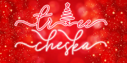 Tree Cheska monoline script font which natural movement and suitable for theme christmas and other. is perfect for branding projects, logo, wedding designs, social media posts, advertisements, product packaging, product designs, label, photography, watermark, invitation, stationery and any projects that need handwriting taste. What’s Included : Standard Glyphs Ligature & Swash Works on PC & Mac Simple installations Accessible in the Adobe Illustrator, Adobe Photoshop, Adobe InDesign, even work on Microsoft Word. PUA Encoded Characters – Fully accessible without additional design software. Fonts include multilingual support for; ä ö ü Ä Ö Ü ß ¿ ¡
 - Magista Winter by Agny Hasya Studio,
$12.00 Magista Winter Is a Fun Holiday Typeface With a Concept of the End of the Year Events Such as Christmas, New Year, and Winter. It Comes in 2 (Two) Styles (Regular & Slant) and Is Created With Some Alternate and Ligature. Featured with Uppercase and lowercase, Numeral and punctuation, Multilingual Support, and Opentype Features Perfect for Your Design Projects Like Advertising, Branding, Posters, Sale Signs, Product Designs, Special Events, Book Covers, Cards, Merchandise, Labels, Product Packaging, and More. Have Fun Creating and designing with Magista Winter Thank you! agnyhasyastudio
 - Holiday And Party Words by Outside the Line,
$19.00 Handwritten or printed holiday and party words for all your flyers and party invitations. Font includes Happy Birthday, Merry Christmas, Happy Holiday, New Year, Holidaze, Joy, Greetings, Ho, Ho, Ho, Fa, La, La, Glad Tidings, Jingle, Yule tide, Happy Kwanzaa, Happy Hanukkah, Easter, Valentine’s Day, 4th of July, Labor Day, Engagement, Wedding, Baby, Open House, Party, Shower and Event. Just add an icon from Party Doodles or Holiday Doodles or Holiday Doodles Too and you have a years worth of flyers!
 - Snow Blue by Girinesia,
$17.00 Hello guys... We proudly presenting our new font. It's name SNOW BLUE. SNOW BLUE is modern display font. SNOW BLUE is a bold decorative font perfect for your celebration party like Halloween, Chrismast or New Year. SNOW BLUE would perfect for Titles for kid`s book, scrapbook, logo, icon, phrases or quotes for winter greeting cards ( Halloween, Christmas or New Year holidays), photo overlay, short phrases, children’s book, gift shops tag, presentation in social media Pinterest, Instagram, Facebook or others.
 - Norberto by CastleType,
$59.00 Norberto, a CastleType original, is based on a Russian design from the late 19th century that in turn appears to be based on Bodoni. However, Norberto is a much warmer design than most Bodonis, with many soft touches such as very gentle curves from the serif at the top of B, D, P, and R; a jaunty cap on the ‘A’ (and Cyrillic ‘El’, ‘De’, etc); charmingly quaint numerals; hairline accents, and other subtleties that make it a wonderful addition to the Modern typefaces. In addition to several useful OpenType features, Norberto also offers extensive language support, including modern Greek and most languages that use the Cyrillic alphabet, as well as built-in keyboard support for Esperanto and Yoruba. Norberto now has a stencil version which combines the elegance of the original with the informality of a stencil cut. As one enthusiast says, "As a die-cut companion to his compact Norberto, Jason Castle's Norberto Stencil hits us right where we live with its svelte stature and sexy, Bodoni-esque bones." — Typedia
 - Syncopate Pro by Stiggy & Sands,
$29.00 The Syncopate Pro Family is a unicase design where the traditional lowercase x-height has been abandoned and a single uppercase height rules the design of all of the alpha and numeric glyphs. Some uppercase glyphs are copied to their lowercase slots, where other lowercase glyphs such as the a, e, and r, are scaled up to uppercase heights. This motif allows for a vast array of typesetting possibilities. A modern and stylish sans inspired by the many trendy sans serif typefaces that are prevalent today, the Syncopate Pro Family, primarily intended for display and headline use, also works well for limited text runs. The thin and regular weights and wide body impart a certain level of elegance, while the unicase approach keeps the look lively and fresh. The bold weight imparts a powerful substantiality, lending a strong corporate presence to any design. Opentype features include: - Stylistic Alternates for a collection of alternate Small Caps - Full set of Inferiors and Superiors for limitless fractions - Lining and Proportional figure sets
 - Mamirolle by The Ampersand Forest,
$20.00 Sometimes a sans serif just needs a sister. Meet Mamirolle! A geometric wedge-serif companion to Mimolette! (OR is Mimolette the sans serif companion to Mamirolle.... hmmmmm....) Mamirolle, like her sister, is great for text and display alike—she's super-readable AND super-legible, and her different weights lend themselves to creating clear contrast in your textual hierarchy! And she's got some nifty features, too! Mamirolle has a two-story a and g in the upright versions, but if you want a one-story a and g, just turn on Stylistic Set 01! Her italic is a true italic, not just an oblique. Want more playful cursive alternatives in the italic? Activate Stylistic Set 02, and you've got them in the A, E, K, Q, R, and k. She's got true small caps in all styles! She's got true fractions in all styles, as well as oldstyle (small cap) and lining numerals, in both tabular and proportional widths. Best of all, perhaps, Mamirolle was made with love, as always, by yer pals in the Ampersand Forest.
 - Hostilica by Heypentype,
$20.00 Hostilica is a semi-serif family designed by mixing classic serifs in the age of romanticism era with contemporary modern shape and curves. It gives a warm, friendly, and inviting feeling without losing a formality of text fonts. Every weight was designed carefully to provide a unique look while maintained the unity of the type family. A thin weight gives your content an elegant, luxurious design feel. While the regular weight, designed for body text, gives your content a warm and friendly design feel. The bold weight will make your headlines stand-out with its fat counters and curves. Therefore, Hostilica will accomodate all your design needs, from text to display, from catchy to luxury. The italics of each weight will spice up your design project especially with letter 'f,s,r,k, and y'. Those italic versions paired with alternate and discretional ligatures will add an organic feeling to your designs. The italic styles are designed by emulating a handwriting stroke, and will give a more personal feel while still maintained a formal sense.
 - Monten by Gatype,
$14.00 Monten is a script font whose letters are designed a bit bold, almost similar to the Sans Serif font. A great choice if you want to add a retro look to your designs. Perfect for titles, logos, or anything your creative brain can think of. This customizable font will look great on a variety of design ideas such as Christmas themes, valentines, posters, invitations, weddings, branding projects, social media posts, magazines, book covers and more! This will add a fun and friendly touch to any of your projects! This font is PUA encoded which means you can access all the glyphs and sweeps easily.
 - Budinger Oldstyle by The Ampersand Forest,
$20.00 The Ampersand Forest has its first book family! Budinger Oldstyle is elegant and approachable at the same time, with five different weights, making it a perfect choice for text or display in situations that require a hint of scholarship, fine arts, craft, erudition, and clarity. Budinger Oldstyle has the legibility of a Garalde (like those of Garamond, Manutius, et al.), with a whiff of Venetian revival (after the fashion of Schneidler & Goudy). The letters are arbitrary, with conventions like cupped serifs and leftward stress. It also has a higher x-height than might be expected, to give it an upright posture and openness in the counters. The italic is more compact, with more clearly calligraphic letterforms and conventions like Swash Caps. Its many features include OpenType alternates (a one-story a and g, and a K, R, and Q with elongated descenders), full and true small caps, both standard and discretionary ligatures, oldstyle and lining numerals, and Swash letterforms in the Italic (all capitals and descenders, plus the ascender of the d). Plus, the most adorable pudge of an ampersand you've ever seen!
 - Chuck Noon Script by Fontdation,
$20.00 After long time no script, finally we released our new Chuck Noon Script. A clean and bold script fonts that offers you a natural hand-lettering experience. Handcrafted and digitally checked with high attention to the details, we're a sucker for clean lines and crispy edges too, just like you. Available in two styles; Script and Brush, their dynamic letterforms work like magic, whether you go all caps or using it normally as a script. Suits best for logotype, poster/t-shirt designs, food/beverage labels, hipster quotes, greeting cards, wedding invitations, and many more.
 - Chika Tattoo by Otto Maurer,
$25.00 This Font is the Sisterfont of Chinotattoo. The different is the thorn in every letter! Chika Tattoo is best for all Tattooartists and Tattoofans.You can use it to make Tattooflashs for your Tattoostudio. Chika Tattoo is a typical Tattoostyle Font. The Chinostyle comes from the Gangs of the USA (with latin roots) They often have Chist-Symbols.
 - Armature Neue Sans by fontBoy,
$15.00 Armature Neue Sans is an extension of the original Armature Neue family released in 2010. Like Armature Neue, Armature Neue Sans consists of six weights with accompanying italics. Armature is one result of my interest in typefaces that are constructed, rather than drawn. Although it is basically a monoline design, there are subtle details throughout that compensate for a monoline’s evenness. As with all fontBoy fonts, there are dingbats hidden away in the dark recesses of the keyboard. When I first started designing this face in 1992, I called it Dino - I thought I would name all my fonts after famous pets, so the dingbats for Armature are dinosaurs. To access the alternate characters (closed counter B and R, and others) use Stylistic Set 1 or the glyphs palette in your OpenType-enabled application. Designed by Bob Aufuldish with editing and production by Psy/Ops.
 - Nami by Linotype,
$29.99Nami, the Japanese word for wave," is the latest collaboration between Adrian Frutiger and Linotype's Type Director, Akira Kobayashi. This typeface family is the most humanistic sans serif design ever to come from Adrian Frutiger, and it has an interesting twist: lapidar alternates that may be surfed through with the help of OpenType-savy applications. Adrian Frutiger began the design that would blossom into Nami during the 1980s. Although it would not be produced during the 20th century, it was quite forward thinking. The typeface included several seemingly avant garde alternates; these were "lapidary" versions of common letterforms. Revisiting the project in 2006, Akira Kobayashi reworked the concept into a working family of three typefaces. Each font contains 483 glyphs, including 11 alternates-two extra forms of the lowercase g, as well as new forms for a, e, h, l, m, n, r, t, and u." - Josefa Rounded Pro by Ingo,
$42.00 A sans serif without rough edges Josefa Rounded is a beautiful text typeface. It’s unostentatious forms and balanced narrow proportions along with the softened round edges make it to appear gentle and pleasing even in longer texts. modern very legible narrow proportions high x-height distinctive forms Dtermining for the personality of Josefa Rounded are also particular idiosyncratic letters. For instance B P and R is designed openly; the bars of E and F equal each other; lower case c and e are distinctly withdrawn in their lower zone; y is symmetrical. Short ascenders generate compact word images. Cap height is shorter than the ascenders, so capitals are only little higher than x-height. Josefa Rounded is provided in 7 weights including the corresponding italics. Tabular figures and proportional figures are available through the appropriate OpenType function as well as ligatures and discretionary ligatures.
 - Sign Panels JNL by Jeff Levine,
$29.00Alf R. Becker was a noted sign painter, designer and the creator of hundreds of unique alphabets which were published in the trade magazine Signs of the Times during the 1930s through the 1950s. Thanks to Tod Swormstedt of ST Media [and who is also the curator of the American Sign Museum in Cincinnati], Jeff Levine received some reference material on Becker's work. Becker displayed many of his type styles within decorative panels—a popular trend in the days when signs were hand-lettered. Using the reference material as a guide, Jeff has re-drawn twenty-six sign panels for adaptation to digital print work. While the designs in themselves are not thoroughly unique to Alf Becker, he has left behind some tangible examples of how sign painters embellished their lettering work. With the use of complementary colors and tones, these panels—joined with vintage lettering - classically recreate the warm and attractive advertising of years ago. - Core Sans B by S-Core,
$20.00 The Core Sans B Family is a part of the Core Sans Series, such as N, NR, N SC, M, E, A, D, G, R and BR. The family has very small x-heights and large ascenders(descenders) which give an elegant feeling in body text. It is a sans-serif family but it’s structure is similar to serif fonts, so you can make paragraphs beautiful with this font family. It is very legible and readable even in small size because of its open counters and distinctive shapes. This font family consists of 7 weights (Thin, Light, Regular, Medium, Bold, Heavy, Black) and Italics for each format. Core Sans B supports complete Basic Latin, Cyrillic, Central European, Turkish, Baltic character sets. Each font includes proportional figures, tabular figures, oldstyle figures, numerators, denominators, superscript, scientific inferiors, subscript, fractions and case features. We highly recommend it for use in books, web pages, screen displays, and so on.


