10,000 search results
(0.059 seconds)
- Restrain by Sohel Studio,
$16.00 Restrain is a Modern serif typeface Unique alternate , multilingual support with perfect kerning. its modern and minimal treatment, it makes a great starting point as well as an enhancement for your design. It is perfect for cosmetic brand, fashion promotion , modern advertising design, invitation card, art quote, home decoration , book/cover titles, special events, and much more. etc. Restrain Features: · Uppercase & Lowercase · Alternates & Ligatures · Numerals & Punctuation · Accented characters · Multilingual Support · Unicode PUA Encoded If you want the SVG version please contact me. While using this product, if you encounter any problem or spot something we may have missed, please don't hesitate to drop us a message. We'd love to hear your feedbacks in order to further fine-tune our products.
 - Schooner Script by Three Islands Press,
$39.00 I happened to mention to the proprietor of an antique barn near here that I'd be interested in any old typewriters she happened to come across. A conversation ensued, the proprietor withdrew into a back room, and she re-emerged with an old handwritten letter, dated 18 Sept. 1825 and spanning nearly three pages. The letter, penned by Samuel Clarke, a Princeton, Mass., pastor, sought donations for the victims of an accident at sea. I thought his script unique, stylistic, and definitely something worth digitizing, so I bought the old letter and took it home. Had to come up with several uppercase characters to round out the set, but the results seem good and proper. Full release has complete character set.
 - Eye Quirky by Sohel Studio,
$14.00 Eye Quirky is a Modern elegant serif typeface with Unique alternative , multilingual support with perfect kerning. This typeface is perfect for an elegant & luxury logo , classy editorial design, women's magazine, fashion brand , cosmetic brand, fashion promotion , modern advertising design, invitation card, art quote, home decoration , book/cover titles, special events, Tote bag, T-shirt, Advertising and much more. Eye Quirky Features: • Uppercase And Lowercase • Alternates And Ligatures • Numerals & Punctuation • Accented characters • Multilingual Support • Unicode PUA Encoded While using this product, if you encounter any problem or spot something we may have missed, please don't hesitate to drop us a message. We'd love to hear your feedbacks in order to further fine-tune our products. Thanks and have a wonderful day .
 - Classical Melody by Putracetol,
$28.00 Classical Melody - Vintage Display Font. Classical Melody is a family Sans Serif font designed with vintage handcrafted, Classical Melody is a tall and skinny font perfect for your home decor and display designs Classical Melody inspired by music design, Classical Melody is a vintage font that is perfect for story books, illustrations, comic books, t-shirts, posters, greeting cards, logos, branding, stickers, svg, crafting and all for display purposes. The alternative characters were divided into several Open Type features such as Swash, Stylistic Sets, Stylistic Alternates, Contextual Alternates, and Ligature. The Open Type features can be accessed by using Open Type savvy programs such as Adobe Illustrator, Adobe InDesign, Adobe Photoshop Corel Draw X version, And Microsoft Word. This font is also support multi language.
 - Retro Couture by Putracetol,
$20.00 Retro Couture - Vintage Bold Font. Retro Couture inspired by vintage poster design, Retro Couture is a family script font designed with carefully handcrafted, Retro Couture is a bold font perfect for your home decor and craft designs Retro Couture is a vintage font that is perfect for story books, illustrations, comic books, t-shirts, posters, greeting cards, logos, branding, stickers, svg, crafting and all for display purposes. The alternative characters were divided into several Open Type features such as Swash, Stylistic Sets, Stylistic Alternates, Contextual Alternates, and Ligature. The Open Type features can be accessed by using Open Type savvy programs such as Adobe Illustrator, Adobe InDesign, Adobe Photoshop Corel Draw X version, And Microsoft Word. Retro Couture is also support multi language.
 - Hobo Symbols Chaulk by SymbolMinded,
$29.99 During the period of the Great American Depression, “hobos” created a system of symbols to communicate and assist fellow travelers. These symbols would mark a home, farm, fence or other structure to indicate what to expect in the area. They would tip off travelers on how to find food, stay safe and what to avoid and more. In some areas of the USA, these symbols are still visible and have also become part of the American popular culture. These 96 symbols are accompanied by a pdf describing what the symbol was used to indicate. The meanings and symbols are by no means the complete list and there may be additional or alternative meanings. These are for casual use and not historical or anthropologically completely accurate.
 - TT Knickerbockers by TypeType,
$29.00 TT Knickerbockers useful links: Specimen PDF | Graphic presentation | Customization options About TT Knickerbockers: TT Knickerbockers is a contrasting pair of fonts that continues our project series dedicated to different cities. The new project is dedicated to New York with its multiculturalism, historicity, creativity, energy, and to its inhabitants. TT Knickerbockers Grotesk symbolizes the monumentality of New York expressed in both its traditional historic architecture and skyscrapers. Energy, constant movement and the round-the-clock life of New York—all this is reflected in our TT Knickerbockers Script. TT Knickerbockers Grotesk is a narrow contrast sans-serif with characteristic elements sending us back to the 19th century. There’s also a reference to antiqua fonts to be noticed in the font: where in traditional antiqua there would be serifs, TT Knickerbockers Grotesk features a straight stroke ending, and traditional drops (finals, tails and ears) are substituted with rounded strokes. In TT Knickerbockers Grotesk you will find unusual characters, stylistic alternatives and ligatures. The following OpenType features are implemented: ordn, case, frac, sups, sinf, numr, dnom, onum, tnum, pnum, liga, dlig, salt, ss01. TT Knickerbockers Script is a bright and at the same time a little restrained brushpen script with a slight touch of aristocracy. TT Knickerbockers Script consists of 967 characters and also contains a huge number of contextual alternatives and ligatures. For all lowercase and uppercase letters of basic Latin and Cyrillic alphabets we have drawn 236 swashes which, depending on the context, can appear both at the beginning and at the end of a letter. Do not forget to enable OpenType support and enjoy all the opportunities that the typeface provides and its built-in features: ordn, frac, case, sups, sinf, numr, dnom, onum, tnum, pnum, calt, swsh, liga. FOLLOW US: Instagram | Facebook | Website TT Knickerbockers language support: Acehnese, Afar, Albanian, Alsatian, Aragonese, Arumanian, Asu, Aymara, Banjar, Basque, Belarusian (cyr), Bemba, Bena, Betawi, Bislama, Boholano, Bosnian (cyr), Bosnian (lat), Breton, Bulgarian (cyr), Cebuano, Chamorro, Chiga, Colognian, Cornish, Corsican, Cree, Croatian, Czech, Danish, Embu, English, Erzya, Estonian, Faroese, Fijian, Filipino, Finnish, French, Friulian, Gaelic, Gagauz (lat), Galician, German, Gusii, Haitian Creole, Hawaiian, Hiri Motu, Hungarian, Icelandic, Ilocano, Indonesian, Innu-aimun, Interlingua, Irish, Italian, Javanese, Judaeo-Spanish, Judaeo-Spanish, Kalenjin, Karachay-Balkar (lat), Karaim (lat), Karakalpak (lat), Kashubian, Khasi, Khvarshi, Kinyarwanda, Kirundi, Kongo, Kumyk, Kurdish (lat), Ladin, Latvian, Laz, Leonese, Lithuanian, Luganda, Luo, Luxembourgish, Luyia, Macedonian, Machame, Makhuwa-Meetto, Makonde, Malay, Manx, Maori, Mauritian Creole, Minangkabau, Moldavian (lat), Montenegrin (lat), Mordvin-moksha, Morisyen, Nahuatl, Nauruan, Ndebele, Nias, Nogai, Norwegian, Nyankole, Occitan, Oromo, Palauan, Polish, Portuguese, Quechua, Rheto-Romance, Rohingya, Romanian, Romansh, Rombo, Rundi, Russian, Rusyn, Rwa, Salar, Samburu, Samoan, Sango, Sangu, Scots, Sena, Serbian (cyr), Serbian (lat), Seychellois Creole, Shambala, Shona, Slovak, Slovenian, Soga, Somali, Sorbian, Sotho, Spanish, Sundanese, Swahili, Swazi, Swedish, Swiss German, Swiss German, Tagalog, Tahitian, Taita, Tatar, Tetum, Tok Pisin, Tongan, Tsonga, Tswana, Turkish, Turkmen (lat), Ukrainian, Uyghur, Vepsian, Volapük, Võro, Vunjo, Xhosa, Zaza, Zulu.
 - Ma Braille by Echopraxium,
$5.00 The "Ma" in "Ma Braille" is used as a minimalist way to say "Negative Space". "Ma" in japanese arts is an "esthetical usage of emptiness". Thus this font explicits the negative space around visible braille dots in each glyph. A. Font user guide a.1. Lowercase glyphs { A..Z } In these glyphs, dots are represented as "black squares" while the negative space is displayed as 1 or 2 white filled polygons. a.2. Uppercase glyphs { a..z } In these glyphs, dots are represented as "white squares" while the negative space is displayed as 1 or 2 black filled polygons. a.3. Digits: they are just the same than a..j, but the "North US version" is also provided in ascii codes 0xE0..0xE4 (1..5) and 0xE7..0xEB (6..0). a.5. "Dashed Border": a.5.1. "Black dashed" border glyphs; { £, ¥, µ, Â, Ä, Ê, Ë, Î, Ï, Ô } a.5.2. "White dashed" border glyphs; { Ö, Õ, °, ô, ö, î, ï, û, u, õ } B. Posters Poster 1: "Font Logo" version 1, it displays "Ma Braille" text surrounded by the "black dashed border" glyphs. Poster 2: "Font Logo" version 2, it displays "MA" glyphs in big size and smaller "Braille" glyphs within "M" and within "A" as well. Poster 3: the classical pangram to test a font "The Quick Brown Fox jumps over the Lazy dog". Poster 4: Article 1 of the Human Rights: All human beings are born free and equal in dignity and rights. They are endowed with reason and conscience and should act towards one another in a spirit of brotherhood. Poster 5: the "Glyph set" (Border glyphs not included) with A..Z, a..z, digits and special characters.
 - Brava Sans by Rafael Jordan,
$30.00 Brava Sans (the naked & extended version of Brava Slab ) is a family of 8 weights, 2 widths and true italics. Designed for editorial purpose, it has a monolinear appearance with a humanist construction, open counters and a tall “x height” that give it a right personality for use in branding. Also Brava Sans has a lot of helpful features as a wide range cover of Latin languages, a lot of OpenType features, a new condensed width and two bolder and cooler weights that make Brava Sans a useful tool for the graphic designer. A full range of numerals (included old style figures, lining, numerators, denominators, superiors, subs, circled and black circled), small caps, forty ligatures (between standard & discretionary ligatures), a lowercase superior and inferior set and a stylistic set are some of the features that makes Brava Sans a solid choice.
 - Evening Initials JNL by Jeff Levine,
$29.00 Evening Initials JNL are based on a few random examples of some unusual Art Deco initials found within the pages of an old Dover clip art book. A complete set of letters was redrawn from scratch and are offered for your creative endeavors as a digital type font.
 - Airwave by A New Machine,
$19.00 Airwave is suitable for display and logo work. It comes in three faces and would work well for technical designs or for giving a fresh, modern look. It is an all cap font with a few (A, E, N, R) lower cap alternates and contains West European diacritics.
 - Hergon Grotesk by Katatrad,
$29.00 Straightforward tone resulting in a modernist, Hergon Grotesk is a family of modern sans-serif. This Typeface is characterized by Neo-Grotesque which gives it a strong character, perfectly suited for any visual communication application. The family has 10 fonts ranging from thin to extrabold with matching italics.
 - Cargi by Studio Principle Type,
$12.00 A condensed neo-grotesque typeface with a quirky personality. Cargi contains 9 weights, obliques and a variable version. Low contrast and clean forms create legibility at small sizes, but display uses are where the real character of Cargi comes out to play. 319 glyphs to support 100+ languages.
 - Movie Show JNL by Jeff Levine,
$29.00 A 1911 movie poster for a film called “How Bella Was Won” from the Edison studios had the name “Edison” hand lettered in a bold, spurred sans serif design. These few letters became the basis for Movie Show JNL, which is available in both regular and oblique versions.
 - Hilde Sharp by Chank,
$59.00OMG it's got a smiley face underscoring the exclamation point! What a sweet, charming handwriting font from the wrist of an 18-year-old Norwegian girl. A sassy skip and a flowery flair lift this particular marker font up a notch above the rest. Now available in OpenType format for your Personal or Commercial Use. - Bu Global by Butlerfontforge,
$18.00 While throned before your keys, under your drumming fingers awaits the most astounding standard computer typeface ever devised: BuGlobal. In addition to all the usual alphanumeric characters and symbols, this lone font lets you type more than 400 accented letters appearing in more than 80 English-variant languages worldwide, 70 common math and science symbols, and dozens of other useful characters —more than half a thousand all told— all within the digital parameters of one standard computer typeface, without needing any alternate keyboards or other clumsy digital luggage. Here is a sample: You can add any accent appearing in more than 80 English-variant languages used around the world to any letter appearing in all these languages simply by typing ANY letter then the accent. This includes more than 400 diacritic-laden letters in all —without needing to remember several keystrokes to type any of these letters as a few of them appear in standard computer typefaces. You can type more than 50 math/science symbols that do not appear in standard computer typefaces. These new symbols include several kinds of arrows plus constants, centerlines, dimensions, and graphs and scales that when retyped create continuous scales and graphs. Common symbols such as ballot boxes, rating stars, checkboxes, hearts, fancy fleurons, and similar motifs that do not appear in standard computer typefaces. Dozens of flashy arabesques like ========= [in BuGlobal these equal signs are kerned together so when you type them you create a continuous double line]. In this typeface more than 30 symbols that never appear twice in a row are kerned together so when you continuously type them you create all kinds of flashy arabesques that will make your typing more attractive. No other standard compute typeface allows you to do this. As for Beauty, BuGlobal’s characters are designed according to several axioms of ocular perception until each profile is as iconically simple as Shaker furniture. These axioms make BuGlobal’s letters easier to read compared to other typefaces, and a few of them are: Each letter should look much like the others but for one defining detail. The letters should be as similarly wide as possible. The letters’ midbars should be the same height and thickness. The higher the lowercase letters are compared to capital letters, the more legible and easily readable are their texts. BuGlobal has a typeface user’s guide, titled A Lovely Face, in which a description of each ocular axiom compares BuGlobal with Baskerville, Georgia, Palatino, and other commonly-used standard computer typefaces so you can quickly see why the other typefaces are inferior. You can download a pdf file of this typeface user’s guide, for free, at BuGlobal’s website, butlerfontforge.com, at any time so you can learn all about BuGlobal’s many amazingly new features before possibly buying it. BuGlobal’s plain letters are perfect for texts, its italics are gracefully emphatic, its bolds are ideal for titles and headers, and its arabesques are a fancy way to make your texts look dressy —all of which will add more shimmer to your semantic plumage. One good typeface is more useful than an infinity of poor ones. Robert Bringhurst
 - Aerle by Hackberry Font Foundry,
$24.95 My first font for 2009 was Aerle. It is a new dark sans serif font in my continuing objective of designing book fonts that I can really use. It made a little ripple in the industry, but more than that I found that I loved it with Aramus and Artimas — my latest book font family with the same proportions. In many ways, Aerle is a very different direction for me built on what I have learned on Aramus and other recent developments in my style. The concept came to me while using Bitstream's Mister Earl on a site online—though there is no direct reference. I wanted a more playful heavy sans with a much smaller x-height than I have been using lately, plus taller ascenders. As I was using Aerle, I constantly needed a light and bold version. The new direction I am taking is a result of a decision that my fonts, though I loved the character shapes, produced an even type color that is too dark or a little dense. Aerle was an attempt to get away from that look even though the letterspacing is quite tight. For Aerle Thin I pushed a little further in that direction and increased the letterspacing. The hand-drawn shapes vary a lot, many pushing the boundaries of the normal character. This gives a little looseness and helps the lightness in feel I am looking for. It will be interesting to see where this all goes. Most new type around the world is far too perfect for my taste. While the shapes are exquisite, the feel is not human but digital mechanical. I find myself wanting to draw fonts that feel human — as if a person crafted them. In most ways this is a normal font for me in that it has caps, lowercase, small caps with the appropriate figures for each case. These small caps were very small (x-height as is proper). So Aerle's small caps are a little oversize because they plugged up too bad at x-height size. The bold is halfway between. These size variations seem important and work well in the text. This font has all the OpenType features in the set for 2009. There are several ligatures for your fun and enjoyment: bb gg sh sp st ch ck ff fi fl ffi ffl ffy fj ft tt ty Wh Th and more. Like all of my fonts, there are: caps, lowercase, & small caps; proportional lining figures, proportional oldstyle figures, & small cap figures; plus numerators, denominators, superiors, inferiors, and a complete set of ordinals 1st through infinity. Enjoy!
 - Lawyer Gothic by ABSTRKT,
$25.00This font was designed for an identity project, but wasn't used, so now it's for sale. The idea was to develop something similar to Engraver's Gothic, but with a more informal and playful feel. - Trail Boss JNL by Jeff Levine,
$29.00 Trail Boss JNL emulates vintage wood type and was inspired by a few visual examples found online. The erratic widths of the letters are part of the intrinsic charm of this kind of lettering.
 - Champions by TypeDrift,
$15.00 Champions is our best-selling typeface that has been completely rebuilt, from the ground up. Now featuring special characters, alternate glyphs and a sans serif version. This is the font champions are made of.
 - Hymers JNL by Jeff Levine,
$29.00 Born on May 8, 1892 in Reno Nevada, Lewis Franklin (“Lew” ) Hymers left an indelible mark as a caricaturist, cartoonist and graphic artist. At the age of twenty [in 1912] he worked for the San Francisco Chronicle. During World War I he worked for the Washington Post. He even was employed for a time by Walt Disney as an animator - but most of his life was spent in either Tujunga, California or his birthplace of Reno, Nevada as a self-employed illustrator. Hymers inked a feature for the Nevada State Journal called “Seen About Town”, which was published during the 1930s and 1940s. In this panel, he caricaturized many of the familiar faces around Reno. He also designed signs, logos, post cards and numerous other commercial illustrations for clients, but what has endeared him to a number of fans was his vast library of stock cuts (the predecessor to paper and electronic clip art) which feature his humorous characters in various professions and life situations. So popular is his work amongst those “in the know” that a clip art book collection of over seven hundred of his drawings that was issued by Dover Publications [but long out of print] commands asking prices ranging from just under $15 to well over $100 for a single copy. Lew Hymers passed away on February 5, 1953 just a few months shy of his 61st birthday. Although his artwork depicts the 1930s and 1940s lifestyles, equipment and conveniences, more than sixty years after his death they stand up amazingly well as cheerful pieces of nostalgia. The twenty-seven images (and some variants) in Hymers JNL were painstakingly re-drawn from scans of one of his catalogs and is but just a tiny fraction of the hundreds upon hundreds of illustrations from the pen of this prolific artist.
 - SD Quainton by Sawdust,
$35.00 SD Quainton was created in 2016 by Jonathan Quainton the co-founder of graphic design studio Sawdust. With a harmonious blend of Didone and Bauhaus elements Quainton embarks on a fresh and innovative direction. Drawing inspiration from revered typefaces like Bodoni and Didot, SD Quainton evokes the same sense of awe that captivated its creator. Designed with specific contexts in mind, SD Quainton finds its perfect home in the realms of fashion, retail, and premium products, where its captivating charm can truly shine. Although ideally suited for eye-catching headlines and titles due to its delicate strokes, the possibilities of where this remarkable typeface may find its place are as limitless as the designer's imagination.
 - Cream Garlic by Sohel Studio,
$15.00 Cream Garlic is a Classy serif typeface Unique alternate , multilingual support with perfect kerning. This typeface is perfect for an elegant & luxury logo , classy editorial design, women's magazine, fashion brand , cosmetic brand, fashion promotion , modern advertising design, invitation card, art quote, home decoration , book/cover titles, special events, and much more. Cream Garlic Features: · Uppercase · Alternates · Numerals & Punctuation · Accented characters · Multilingual Support · Unicode PUA Encoded If you want the SVG version please contact me. While using this product, if you encounter any problem or spot something we may have missed, please don't hesitate to drop email. We'd love to hear your feedbacks in order to further fine-tune our products. Thanks and have a wonderful day .
 - Nurani by Allouse Studio,
$16.00 Nurani is a bold marker font that will bring an marker feel to your designs in need. Nurani come along with Stylistic Alternates, Underline Styles and Multi-Lingual support which will add cool impression. We highly recommend using a program that supports OpenType features and Glyphs panels like many of Adobe apps and Corel Draw, so you can see and access all Glyph variations. Nurani is perfect for any tittle, shope name or logo, this also very suitable on product packaging, branding project, magazine, social media, wedding, or just used to express words above the background. Enjoy the font, feel free to comment or feedback, send me PM or email if there are issues or queries. Thank you!
 - Inola by WildOnes,
$12.00 Inola Hand Lettered Font in modern calligraphy style. It resembles actual handwritten letters that can make a great font for branding, logo design, and graphic identities. Inola includes ligatures and stylistic alternates for some letters and floral symbols to include in your designs, find them all in the glyphs panel. Inola Hand Lettered Font is perfect for logo design, branding, art prints, wedding cards and invitations, packaging, business cards, greeting cards, posters, magazines, social media, home decors, stationary, blogs, and website design, and more. Inola Hand Lettered Font contains all uppercase and lowercase letters from A to Z and numbers from 0 to 9. Latin Extended letters are supported together with other bonus characters.
 - Goodbye Anjing by Allouse Studio,
$16.00 Goodbye Anjing is a Tall Handwritten Font that will give you an young and fun feeling. Goodbye Anjing come along with Multi-Lingual support which will add cool impression for your need. We highly recommend using a program that supports OpenType features and Glyphs panels like many of Adobe apps and Corel Draw, so you can see and access all Glyph variations. Goodbye Anjing is perfect for any tittle, shope name, lyric video or logo, this also very suitable on product packaging, branding project, magazine, social media, wedding, or just used to express words above the background. Enjoy the font, feel free to comment or feedback, send me PM or email if there are issues or queries. Thank you!
 - Stage Production JNL by Jeff Levine,
$29.00 A 1935 piece of sheet music entitled “(There’s A) Little Picture Playhouse in My Heart” had its movie-themed title hand lettered in a condensed Art Deco style with a few interesting character variations. The resulting digital type design is Stage Production JNL, which is available in both regular and oblique versions.
 - Galerie Simpson by chicken,
$17.00 An entirely strange, illogical and inconsistent font packed with inappropriate curlicues and appendages “translated and composed” from a few words on a crumbling fragment of Victorian sheet music. It was developed to form the logotype and display text of a manifesto for a creative collective working as artists, researchers, producers and agents.
 - Banks and Miles by K-Type,
$20.00 K-Type’s ‘Banks & Miles’ fonts are inspired by the geometric monoline lettering created for the British Post Office in 1970 by London design company Banks & Miles, a project initiated and supervised by partner John Miles, and which included ‘Double Line’ and ‘Single Line’ alphabets. The new digital typeface is a reworking and extension of both alphabets. Banks & Miles Double Line is provided in three weights – Light, Regular and Dark – variations achieved by adjusting the width of the inline. Banks & Miles Single Line develops the less used companion sans into a three weight family – Regular, Medium and Bold – each with an optically corrected oblique. Although the ‘Banks & Miles Double Line’ and ‘Banks & Miles Single Line’ fonts are based on the original Post Office letterforms, glyphs have been drawn from scratch and include numerous adjustments and impertinent alterations, such as narrowing the overly wide Z and shortening the leg of the K. Several disparities exist between the Post Office Double and Single Line styles, and K-Type has attempted to secure greater consistency between the two. For instance, a wide apex on the Double Line’s lowercase w is made pointed to match the uppercase W and the Single Line’s W/w. Also, the gently sloping hook of Single Line’s lowercase j is adopted for both families. The original Single Line’s R and k, which were incongruously simplified, are drawn in their more remarkable Double Line forms, and whilst the new Single Line fonts are modestly condensed where appropriate, rounded letters retain the essentially circular form of the Double Line. Many characters that were not part of the original project, such as @, ß, #, and currency symbols, have been designed afresh, and a full set of Latin Extended-A characters is included. The new fonts are a celebration of distinctive features like the delightful teardrop-shaped bowl of a,b,d,g,p and q, and a general level of elegance not always achieved by inline typefaces. The Post Office Double Line alphabet was used from the early 1970s, in different colours to denote the various parts of the Post Office business which included telecommunications, counter services and the Royal Mail. Even after the Post Office was split into separate businesses in the 1980s, Post Office Counters and Royal Mail continued use of the lettering, and a version can still be seen within the Royal Mail cruciform logo.
 - Public Figure by Hanoded,
$15.00 During the Covid pandemic, I noticed that a lot of public figures (politicians, actors, influencers and even kings and princesses) had to apologise for not following the social distance rules, the lockdown rules or the 'stay at home' rules. They threw parties, went on holidays abroad and - in general - made a nuisance of themselves. When I finished this font, I decided to call it Public Figure! Public Figure is quite a neat, handmade font. It doesn't stick to the rules (but does like to keep up appearances), likes to party (but manages to stay safe) and brightens up your work (without being too gaudy). Public Figure comes with two alternate sets for the lower case glyphs (that cycle as you type) and a massive amount of diacritics, including Vietnamese.
 - Alonzo by Fenotype,
$25.00 Alonzo is a modern cosmopolitan who speaks several languages fluently. Alonzo comes in six weights and two widths, as well as corresponding italics, making a total 24 styles. Alonzo is an elegant, simplistic, high-contrast sans that is at home in high-end fashion and cultural environments, as well as in the world of restaurants and nightclubs. While Alonzo Condensed is more illustrative and works best in display use, headlines, logotypes, labels and all that, Alonzo Regular works in a wider range of contexts, from body text to editorial and catalogs and more. Alonzo is equipped with several OpenType features such as oldstyle figures, small caps, Standard Ligatures, Superior and Inferior Figures. In addition Alonzo has Stylistic Alternate lowercase "a" with round Bowl. Me llamo Alonzo. Mucho gusto, piacere di conoscerti, nice to meet you!
 - Ambaghy by Colllab Studio,
$19.00 "Hi there, thank you for passing by. Colllab Studio is here. We crafted best collection of typefaces in a variety of styles to keep you covered for any project that comes your way! Ambaghy is a goofy font that's elevated by its posh, handwritten style. It will spice up your designs and add a unique feel to your design and it just might be the secret ingredient you've been missing. We've spent years honing our craft to create the most unique and original fonts like Ambaghy. We were inspired by the wild creativity that flows from our hands, and we want to share that inspiration with you. Ambaghy works great for logos and headlines, and also works well in text blocks of body copy. A Million Thanks Colllab Studio www.colllabstudio.com
 - Dismedia by Lee Mounsey,
$13.95 Dismedia: A Bold Display Typeface with a Subtle Retro Sci-Fi Aesthetic. While a lot of futuristic, cyberpunk and techno themed typefaces can often be over-the-top, unreadable or cheesy, Dismedia takes a more subtle approach with its design. Inspired by the wide futurist fonts of the 1970’s and 80’s, its rounded corners and bold linework was built to invoke the atmosphere of a future envisioned by the past. Whether on VHS covers in 1984; nightclub signs in 2084; or spaceship insignia in 2184, Dismedia will upgrade your design into a brand new era. [ Feature Set Includes: ] A Display Typeface A Bold Sans Serif with Rounded Corners 430+ Glyphs Ligatures & Stylistic Alternatives Extended Mathematics & Currency Symbols Language Support for 90+ Latin Languages Including: Afrikaans, English, French, Italian, Spanish & Swedish.
 - Franzi Variable by Wannatype,
$211.00 The new sans-serif Franzi typeface family – as neutral as can be, but at the same time individual and striking. Its unmistakable character lies in the detail, with no effect pushing itself to the fore. As a wide-running typeface with a relatively large x-height, the typeface family is perfectly suited to small text sizes but, with its elegant details, it leaves nothing to be desired in display applications either. Originally designed with constructed, often rectangular elements, Franzi has gradually been rounded during the development process and is now less hard in order to guarantee optimal legibility. Franzi Variable is designed alongside the italic and the weight axes. The italics are softly and elegantly drawn, while the upright characters appear much more severe. The design appeal reveals itself in the two-storey ‘a’ – a tribute to legibility in body copy; however, for those who prefer the geometric in applications, an alternative single-storey ‘a’ is also available. All styles have small caps, superscript and subscript lowercase letters, lining, non-lining and small caps figures, fractions as well as several ligatures, alternative fonts, symbols and arrows. The Latin uppercase letters are also available as discreet swash variants. In addition to the extended Latin alphabet, the typeface family also includes the complete Greek, Cyrillic and International Phonetic Alphabet IPA. Franzi was created as a further development of an order to produce a sign for a therapy practice in Vienna’s Franz-Hochedlinger-Gasse – hence the name, which is more common as an abbreviation for Franziska than as a diminutive for the male name Franz: Franzi is therefore a hybrid typeface name which has female tendencies.
 - Bitsumishi Pro v2 by CheapProFonts,
$10.00 A squarish uppercase font perfect for logos and short eye-catching headings. The lowercase contains some alternate letterforms - more specifically: uppercase have closed forms (I made a new A D and R), and lowercase have some open alternatives (new B E F P and T in addition to the A D and R). I noticed the two width version of the H and made similar normal and wide versions of J and L. Then I added lots of missing glyphs and all the diacritic letters, of course - and finally the family has been expanded to 7 weights AND corresponding Italics! Enjoy! ALL fonts from CheapProFonts have very extensive language support: They contain some unusual diacritic letters (some of which are contained in the Latin Extended-B Unicode block) supporting: Cornish, Filipino (Tagalog), Guarani, Luxembourgian, Malagasy, Romanian, Ulithian and Welsh. They also contain all glyphs in the Latin Extended-A Unicode block (which among others cover the Central European and Baltic areas) supporting: Afrikaans, Belarusian (Lacinka), Bosnian, Catalan, Chichewa, Croatian, Czech, Dutch, Esperanto, Greenlandic, Hungarian, Kashubian, Kurdish (Kurmanji), Latvian, Lithuanian, Maltese, Maori, Polish, Saami (Inari), Saami (North), Serbian (latin), Slovak(ian), Slovene, Sorbian (Lower), Sorbian (Upper), Turkish and Turkmen. And they of course contain all the usual "western" glyphs supporting: Albanian, Basque, Breton, Chamorro, Danish, Estonian, Faroese, Finnish, French, Frisian, Galican, German, Icelandic, Indonesian, Irish (Gaelic), Italian, Northern Sotho, Norwegian, Occitan, Portuguese, Rhaeto-Romance, Sami (Lule), Sami (South), Scots (Gaelic), Spanish, Swedish, Tswana, Walloon and Yapese.
 - FS Albert by Fontsmith,
$80.00 The x factor How do you make a font like FS Albert unique, distinctive? “When designing a font I try to question every letter,” says Jason Smith, “but all you need is a few that have an x factor. With FS Albert, they’re the lowercase ‘a’ and ‘g’ and the uppercase ‘I’ and ‘J’. “I remember a friend saying, ‘Why on earth have you designed the ‘a’ like that? Isn’t it too friendly for this kind of font?’ And, in a way, that’s what I wanted – honesty and warmth, because a lot of big brands at the time really needed to show a more human side.” Range of weights and styles FS Albert is a charismatic type: a warm, friendly sans serif face with a big personality. Open, strong and amenable, and available in a wide range of weights and styles, FS Albert suits almost every task you put it to. Fontsmith has crafted five finely-tuned upright Roman weights and four italic weights, as well as a special Narrow version to provide the best coverage and give headlines and text an easy-going character. The chunky kid “FS Albert was inspired by – and named after – my son, who was a bit of a chunky kid,” says Jason Smith. “I designed an extra bold weight because I always felt that the really big font heavy weights had the most personality. “I recently told Albert this story. He laughed, and forgave me for thinking he was a fat baby. He liked the big personality bit, though.” 1000s of glyphs Not content with a character set that covered Europe and the whole of the Western world, the studio decided to go further afield. There are now FS Albert character sets that cover western and eastern European languages, including those of Russia, as well as Cyrillic, Arabic and Greek scripts. In fact, the font now covers more than 100 languages, making it ideal for bringing a consistent typographic style to the communications of global brands.
 - FS Albert Paneuropean by Fontsmith,
$90.00The x factor How do you make a font like FS Albert unique, distinctive? “When designing a font I try to question every letter,” says Jason Smith, “but all you need is a few that have an x factor. With FS Albert, they’re the lowercase ‘a’ and ‘g’ and the uppercase ‘I’ and ‘J’. “I remember a friend saying, ‘Why on earth have you designed the ‘a’ like that? Isn’t it too friendly for this kind of font?’ And, in a way, that’s what I wanted – honesty and warmth, because a lot of big brands at the time really needed to show a more human side.” Range of weights and styles FS Albert is a charismatic type: a warm, friendly sans serif face with a big personality. Open, strong and amenable, and available in a wide range of weights and styles, FS Albert suits almost every task you put it to. Fontsmith has crafted five finely-tuned upright Roman weights and four italic weights, as well as a special Narrow version to provide the best coverage and give headlines and text an easy-going character. The chunky kid “FS Albert was inspired by – and named after – my son, who was a bit of a chunky kid,” says Jason Smith. “I designed an extra bold weight because I always felt that the really big font heavy weights had the most personality. “I recently told Albert this story. He laughed, and forgave me for thinking he was a fat baby. He liked the big personality bit, though.” 1000s of glyphs Not content with a character set that covered Europe and the whole of the Western world, the studio decided to go further afield. There are now FS Albert character sets that cover western and eastern European languages, including those of Russia, as well as Cyrillic, Arabic and Greek scripts. In fact, the font now covers more than 100 languages, making it ideal for bringing a consistent typographic style to the communications of global brands. - Room Shambles by Linecreative,
$16.00 Room Shambles is an Art Deco typeface .This includes multilingual capitalization, numbers and punctuation. Room Shambles Art Deco typeface is perfect for your up coming projects. Such as luxury logo and branding, classy editorial design, woman magazine, cosmetic brand, fashion promotional, art gallery branding, museum, historical of architectural, boutique branding, stationery design, blog design, modern advertising design, card invitation, art quote, home decor, book/cover title, special events and any more.
 - Goldwings by Supfonts,
$12.00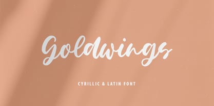 Goldwings will be perfect for wedding lettering, beautiful frame for your home, book covers, greeting cards, logos, marketing, magazines or anything that requires cute handwritten lettering :) Goldwings идеально подойдет для свадебного леттеринга, рамки для вашего дома, обложек книг, поздравительных открыток, логотипов, маркетинга, журналов или всего, что требует симпатичных рукописных надписей :) What's inside: Goldwings.otf Multilingual support Кириллица Cricut support If you have any questions, please contact me directly or in instagram @superdizigner
 - Sign Production JNL by Jeff Levine,
$29.00Sign Production JNL somewhat resembles Sign Kit JNL but there are some noticeable differences. The letters and numbers in Sign Production JNL are bolder, wider and have some slightly different character shapes. The common theme is that both fonts were designed from die-cut letters and numbers found in the Webway Sign Cabinet, manufactured by the Holes-Webway Company of St. Cloud, Minnesota until its demise in the 1980s.