10,000 search results
(0.044 seconds)
- Mrs Sheppards Pro by Sudtipos,
$45.00 The Charles Bluemlein Script Collection is an intriguing reminder of the heady days of hand lettering and calligraphy in the United States. From the early 1930s through World War II, there were about 200 professional hand letterers working in New York City alone. This occupation saw its demise with the advent of photo lettering, and after digital typography, became virtually extinct. The odd way in which the Bluemlein scripts were assembled and created - by collecting different signatures and then building complete alphabets from them - is a fascinating calligraphic adventure. Because the set of constructed designs looked nothing like the original signatures, fictitious names were assigned to the new script typefaces. The typeface styles were then showcased in Higgins Ink catalogs. Alejandro Paul and Sudtipos bring the Bluemlein scripts back to life in a set of expanded digital versions, reflecting the demands of today’s designer. Extreme care has been taken to render the original scripts authentically, keeping the fictitious names originally assigned to them by Bluemlein.
 - Herr Von Muellerhoff Pro by Sudtipos,
$45.00 The Charles Bluemlein Script Collection is an intriguing reminder of the heady days of hand lettering and calligraphy in the United States. From the early 1930s through World War II, there were about 200 professional hand letterers working in New York City alone. This occupation saw its demise with the advent of photo lettering, and after digital typography, became virtually extinct. The odd way in which the Bluemlein scripts were assembled and created - by collecting different signatures and then building complete alphabets from them - is a fascinating calligraphic adventure. Because the set of constructed designs looked nothing like the original signatures, fictitious names were assigned to the new script typefaces. The typeface styles were then showcased in Higgins Ink catalogs. Alejandro Paul and Sudtipos bring the Bluemlein scripts back to life in a set of expanded digital versions, reflecting the demands of today’s designer. Extreme care has been taken to render the original scripts authentically, keeping the fictitious names originally assigned to them by Bluemlein.
 - Mr Sheffield Pro by Sudtipos,
$45.00 The Charles Bluemlein Script Collection is an intriguing reminder of the heady days of hand lettering and calligraphy in the United States. From the early 1930s through World War II, there were about 200 professional hand letterers working in New York City alone. This occupation saw its demise with the advent of photo lettering, and after digital typography, became virtually extinct. The odd way in which the Bluemlein scripts were assembled and created - by collecting different signatures and then building complete alphabets from them - is a fascinating calligraphic adventure. Because the set of constructed designs looked nothing like the original signatures, fictitious names were assigned to the new script typefaces. The typeface styles were then showcased in Higgins Ink catalogs. Alejandro Paul and Sudtipos bring the Bluemlein scripts back to life in a set of expanded digital versions, reflecting the demands of today’s designer. Extreme care has been taken to render the original scripts authentically, keeping the fictitious names originally assigned to them by Bluemlein.
 - Miss Stephams Pro by Sudtipos,
$45.00 The Charles Bluemlein Script Collection is an intriguing reminder of the heady days of hand lettering and calligraphy in the United States. From the early 1930s through World War II, there were about 200 professional hand letterers working in New York City alone. This occupation saw its demise with the advent of photo lettering, and after digital typography, became virtually extinct. The odd way in which the Bluemlein scripts were assembled and created - by collecting different signatures and then building complete alphabets from them - is a fascinating calligraphic adventure. Because the set of constructed designs looked nothing like the original signatures, fictitious names were assigned to the new script typefaces. The typeface styles were then showcased in Higgins Ink catalogs. Alejandro Paul and Sudtipos bring the Bluemlein scripts back to life in a set of expanded digital versions, reflecting the demands of today’s designer. Extreme care has been taken to render the original scripts authentically, keeping the fictitious names originally assigned to them by Bluemlein.
 - Monsieur La Doulaise Pro by Sudtipos,
$45.00 The Charles Bluemlein Script Collection is an intriguing reminder of the heady days of hand lettering and calligraphy in the United States. From the early 1930s through World War II, there were about 200 professional hand letterers working in New York City alone. This occupation saw its demise with the advent of photo lettering, and after digital typography, became virtually extinct. The odd way in which the Bluemlein scripts were assembled and created - by collecting different signatures and then building complete alphabets from them - is a fascinating calligraphic adventure. Because the set of constructed designs looked nothing like the original signatures, fictitious names were assigned to the new script typefaces. The typeface styles were then showcased in Higgins Ink catalogs. Alejandro Paul and Sudtipos bring the Bluemlein scripts back to life in a set of expanded digital versions, reflecting the demands of today’s designer. Extreme care has been taken to render the original scripts authentically, keeping the fictitious names originally assigned to them by Bluemlein.
 - Mr Keningbeck Pro by Sudtipos,
$45.00 The Charles Bluemlein Script Collection is an intriguing reminder of the heady days of hand lettering and calligraphy in the United States. From the early 1930s through World War II, there were about 200 professional hand letterers working in New York City alone. This occupation saw its demise with the advent of photo lettering, and after digital typography, became virtually extinct. The odd way in which the Bluemlein scripts were assembled and created - by collecting different signatures and then building complete alphabets from them - is a fascinating calligraphic adventure. Because the set of constructed designs looked nothing like the original signatures, fictitious names were assigned to the new script typefaces. The typeface styles were then showcased in Higgins Ink catalogs. Alejandro Paul and Sudtipos bring the Bluemlein scripts back to life in a set of expanded digital versions, reflecting the demands of today’s designer. Extreme care has been taken to render the original scripts authentically, keeping the fictitious names originally assigned to them by Bluemlein.
 - Mr Donaldson Pro by Sudtipos,
$45.00 The Charles Bluemlein Script Collection is an intriguing reminder of the heady days of hand lettering and calligraphy in the United States. From the early 1930s through World War II, there were about 200 professional hand letterers working in New York City alone. This occupation saw its demise with the advent of photo lettering, and after digital typography, became virtually extinct. The odd way in which the Bluemlein scripts were assembled and created - by collecting different signatures and then building complete alphabets from them - is a fascinating calligraphic adventure. Because the set of constructed designs looked nothing like the original signatures, fictitious names were assigned to the new script typefaces. The typeface styles were then showcased in Higgins Ink catalogs. Alejandro Paul and Sudtipos bring the Bluemlein scripts back to life in a set of expanded digital versions, reflecting the demands of today’s designer. Extreme care has been taken to render the original scripts authentically, keeping the fictitious names originally assigned to them by Bluemlein.
 - Mr Canfields Pro by Sudtipos,
$45.00 The Charles Bluemlein Script Collection is an intriguing reminder of the heady days of hand lettering and calligraphy in the United States. From the early 1930s through World War II, there were about 200 professional hand letterers working in New York City alone. This occupation saw its demise with the advent of photo lettering, and after digital typography, became virtually extinct. The odd way in which the Bluemlein scripts were assembled and created - by collecting different signatures and then building complete alphabets from them - is a fascinating calligraphic adventure. Because the set of constructed designs looked nothing like the original signatures, fictitious names were assigned to the new script typefaces. The typeface styles were then showcased in Higgins Ink catalogs. Alejandro Paul and Sudtipos bring the Bluemlein scripts back to life in a set of expanded digital versions, reflecting the demands of today’s designer. Extreme care has been taken to render the original scripts authentically, keeping the fictitious names originally assigned to them by Bluemlein.
 - Mr Blaketon Pro by Sudtipos,
$45.00 The Charles Bluemlein Script Collection is an intriguing reminder of the heady days of hand lettering and calligraphy in the United States. From the early 1930s through World War II, there were about 200 professional hand letterers working in New York City alone. This occupation saw its demise with the advent of photo lettering, and after digital typography, became virtually extinct. The odd way in which the Bluemlein scripts were assembled and created - by collecting different signatures and then building complete alphabets from them - is a fascinating calligraphic adventure. Because the set of constructed designs looked nothing like the original signatures, fictitious names were assigned to the new script typefaces. The typeface styles were then showcased in Higgins Ink catalogs. Alejandro Paul and Sudtipos bring the Bluemlein scripts back to life in a set of expanded digital versions, reflecting the demands of today’s designer. Extreme care has been taken to render the original scripts authentically, keeping the fictitious names originally assigned to them by Bluemlein.
 - FF DIN Slab Variable by FontFont,
$419.99 FF DIN: the famous, faithful and first revival of DIN 1451. FF DIN originates in the lettering models from the German standard DIN 1451, and is considered the perfect standard typeface due to methodical and engineered design. FF DIN Slab is a robust compliment to the FF DIN family. Designed by Antonia Cornelius and Albert-Jan Pool, it offer designers tools to create greater rhythm and design depth. FF DIN Slab’s proportions have been meticulously aligned with its Sans origins, offering the perfect balance between positive and negative space. The serifs are assertive, sturdy and balanced, they are engineered to emphasis a strong horizontal flow through text, a grounded utility and assurance in headlines. The result of this attention to detail is a typeface that harmonizes beautifully with other FF DIN styles. Pushing font technology to its limits, FF DIN Slab is also available as a Variable font. Allowing creatives to design hyper specific variations which thrive in any design space, and even seamlessly animate movement from one state to the next. FF DIN Slab distinctively carries on its parent’s DNA, speaks the same native language — but with a strong peculiar dialect. It expands the DIN family worthily — independent but integrated — and opens totally new possibilities of uses with the whole DIN family.
 - FF DIN Slab by FontFont,
$50.99FF DIN: the famous, faithful and first revival of DIN 1451. FF DIN originates in the lettering models from the German standard DIN 1451, and is considered the perfect standard typeface due to methodical and engineered design. FF DIN Slab is a robust compliment to the FF DIN family. Designed by Antonia Cornelius and Albert-Jan Pool, it offer designers tools to create greater rhythm and design depth. FF DIN Slab’s proportions have been meticulously aligned with its Sans origins, offering the perfect balance between positive and negative space. The serifs are assertive, sturdy and balanced, they are engineered to emphasis a strong horizontal flow through text, a grounded utility and assurance in headlines. The result of this attention to detail is a typeface that harmonizes beautifully with other FF DIN styles. Pushing font technology to its limits, FF DIN Slab is also available as a Variable font. Allowing creatives to design hyper specific variations which thrive in any design space, and even seamlessly animate movement from one state to the next. FF DIN Slab distinctively carries on its parent’s DNA, speaks the same native language — but with a strong peculiar dialect. It expands the DIN family worthily — independent but integrated — and opens totally new possibilities of uses with the whole DIN family. - Crucifix by Canada Type,
$39.95In June of 2004, Canada Type released Crucifix, a condensed three-tiers typeface that tried to bridge the gap between traditional blackletter forms and the traditional European gothics. The main goal of Crucifix was to have as many as 4 different variations on each letter form, so the original release consisted of three fonts: a main font with a standard character set, a small caps set, and a unicase variation. Now Canada Type presents the next generation of this typeface: Crucifix 2.0 and Crucifix Pro. This new version takes advantage of both Unicode and OpenType technologies to make Crucifix as versatile as ever. The PostScript Type 1 and the True Type version boast extended Latin character set support, including Western, Eastern and Central European, Turkish and Baltic, as well as two non-Latin scripts: Cryillic and Greek. The OpenType version, Crucifix Pro, goes even further by including all of above in one font, along with proper automation to accommodate on-the-fly ligatures, small caps, numerators, denominators, some fractions and a ton of stylistic and contextual alternates - all programmed to work with the latest OpenType-enabled programs. Unique, stark, and with more than 900 characters, Crucifix has that clinical sharpness and special dramatic wonder to make it perfect for mystery, gothic, and horror design settings. - Schorel by insigne,
$29.00 Schorel commands the room and sets the audience at ease. This new Scotch Roman typeface from insigne is a confident personality with a tasteful amount of contrast. Cool, sharp, balanced, and contemporary, Schorel not only delivers well in longer texts, but can use its mass to meet the needs of subheadlines, callouts, and other similar projects. Scotch typefaces initially come from Scottish foundries, popular in the United States in the late 18th century. This beautiful genre of type grew in popularity through the Victorian era and most of the 20th century to make regular appearance in books, magazines, newspapers, and advertisements. Schorel itself, with its moderate contrast and organic design, features short ascenders and descenders and calligraphic italics. The design features a few ball terminals, but mostly touts its bracket serifs, which come to a sharp point. The typeface, ideal for medium to large sizes, is useful for both headlines and text, carefully created for both print and screen. This OpenType font supports most Latin-based languages. Schorel has nine weights and a true italic, and many special features such as small caps, fractions, old-style figures, and numerous extras complete each font. It’s every bit a delight to your reader’s eye.
 - Senlot Didone by insigne,
$35.00 Senlot Didone enchants with this fresh and cutting-edge sequel. It’s a modern interpretation of Senlot that says glamor and seduction. The typeface adds to the original high contrast sans serif with it’s modern high contrast shape, and features a new beauty with the distinctive sinuosity of contrasting forms. Senlot Didone is the sleek, serifed, high contrast follow-up to Senlot, and it's low contrast sequel, Senlot Sans. A serif typeface suitable for text and display work joined in 2019. Senlot Didone includes a wide range of OpenType features, including titling capitals, superscripts and subscripts, and oldstyle figures. Senlot Didone is composed of 3 widths: Condensed, Normal, and Extended, with 9 weights and their italics for a total of 54 fonts with more than 800 glyphs. Senlot Didone is a great display typeface for logos, branding, packaging, and advertising. With its broad palate of options, the font covers over 72 Latin-based languages. Dress your text in any of nine separate styles from Thin to Bold. With Senlot Didone, there's no need to compromise on another font with fewer features. Simple, elegant, and versatile, Senlot Didone now makes perfect more possible. Take the show by storm with this high contrast serif. The seductive figure of Senlot Didone is here to entice your viewer.
 - Once upon a time, in the bustling metropolis of Typography Town, there lived a unique and rather intriguing font named EU-Sym. This font wasn't your typical character in the neighborhood, like the bo...
- Sure! The New Alphabet font is an intriguing and avant-garde typeface with a fascinating history and purpose behind its design. Created in 1967 by Wim Crouwel, a notable figure in the Dutch graphic d...
- Messcara by SparkyType,
$19.00Drawn very small with a brush-tipped felt pen, Messcara has qualities of freedom, toughness, with a few girly loops thrown in for good measure. A true handwriting workhorse. - Cabrito Sans by insigne,
$24.99 It's time to kick off your shoes and feel the "sans" between your toes. Like Cabrito Inverto , its stress-reversing cousin, the new Cabrito Sans serves up something nice and cool in the heat of the project. A quick recap: the original Cabrito is an insigne Design slab serif produced for the kid's book The Clothes Letters Wear. It's been pretty well-received--even more than I expected. I promised to grow the family with a free-standing inverted style that could pair well with Cabrito. (See Cabrito Inverto.) Now, I'm rounding out the family with this well-crafted sans. And so now, Sans is where it's at. Strip away the serifs of Cabrito, and you have a laid back, rounded sans serif alternative served up over easy. This handwriting-inspired creation--like its relatives--is definitely not uptight about its forms (though not afraid to show them off a little). Cabrito Sans' whole pack of alternates is accessible in any OpenType-enabled program. This kiddo consists of a workforce of alternates, swashes, and alternate titling caps to give the font a little extra sweetener to its flavor. Also bundled are swash alternates, old style figures, and compact caps. Check out the interactive PDF brochure to test out each these options. This font family members also consists of the glyphs for 72 various languages. Cabrito Inverto and Cabrito do pair nicely with Cabrito Sans (in case you doubted). Use Sans--or all three of these amigos--to express friendliness on just about anything: food, candy, toys, cars (if you're feeling bold). Don't wait, though. Purchase Cabrito Sans today, and bring a one-of-a-kind look to whatever your computer's next design party is.
 - Goudy Fancy by Three Steps Ahead,
$-Goudy Fancy was originally released in the 1970s and was not previously available in digital form until revived by Josh Korwin in 2004. This OpenType revival features alternate glyphs, additional new glyphs, as well as automatic ligature substitution. - Poster Pen JNL by Jeff Levine,
$29.00 The bold round point pen lettering on the cover of the 1934 sheet music for “New England in the Rain” was the model and inspiration for Poster Pen JNL, which is available in both regular and oblique versions.
 - Stripes Pattern by Crumphand,
$20.00 Hello, here's the new fonts Stripes Pattern. Inspired by children book. The font is cute, good for your comic, brand, youtube, movie production etc. What's Included Inside The Fonts ? Uppercase Lowercase Symbols Numerals European Multilingual Thank you, Regards!
 - Colmcille by Monotype,
$29.99Colmcille was designed by a Gaelic scholar, typographer and printer, and first released by Monotype for composition casting in 1936. The design intention was to provide a Gaelic looking type which worked well as a roman text face. The digital version of the Colmcille font family has been made in collaboration with the designer's son, Dara O Lochlainn. A number of changes have been made, including a new set of figures and the addition of a bold weight. Although originally designed as a text face, Colmcille can be used for advertisements, flyers, in fact wherever a touch of Gaelic charm is required. - Showcase by Latinotype,
$40.00 Showcase, the new typeface of Daniel Hernandez and Paula Nazal is a handmade font consisting of a set of types that are composed of four styles, one script, one sans, a slab, sans mini and finally a set of ornaments and dingbats, all made to work together in the same language. It’s inspired by a pen that writes different typefaces and ornaments, and casually reaches into a harmonious family. Showcase is very easy to use and allows great versatility, can be used both in a magazine as a restaurant, through windows, cafes, and really anyway you can think of! Photography by Mauro Andrés
 - Katka by FlehaType,
$28.00 Katka is a informal playful typeface entirely cut-out of paper. With two stylistic variants for each letter it enables your text to appear hand-made. Three layers of the type family – Basic, Contour and Confetti – give its users plenty of opportunity for creativity. By making use of its dingbats and icons you can create distinctive user interfaces, social media campaigns or festive designs. Katka feels at home in branding projects, editorial use, children’s books and packaging.
 - Belle Jardin by Greater Albion Typefounders,
$18.00 Belle Jardin is an Art Deco inspired display family of three typefaces, offered in in-line engraved regular and demi bold forms as well as a solid bold form. It offers upper and lower case solid slab-built forms that create an immediate atmosphere of the streamline era of the thirties and are also at home in post-war revival inspired design work. The letterforms are solidly legible and ideal for cover and poster inspired design work.
 - Cristal Stitches by Johannes Krenner,
$5.99 Whether it's your grandparents birthday, „Almabtrieb“ (ceremonial driving cattle down from the alpine pastures) or Oktoberfest (ceremonial drinking of huge amounts of beer): create the homely feeling of embroidery with this font. It comes with a vast language support, open type features, stylistic alternatives, boxes and frames, various numeral sets ... DEUTSCH: Ob Alm-Abtrieb oder Oktoberfest: Erzeuge das heimelige Gefühl großelterlicher Stickereien mit diesem Font. Große Sprachvielfalt, Opentype-Features, stylistische Alternativen, Boxen und Rahmen, diverse Zahlensysteme …
 - Ariata by Monotype,
$50.99 Ariata™, from Malou Verlomme, is three typefaces in one. Like phases of the moon, they gracefully meld from one to the other. The “Text” weights are sturdy designs that perform as well in blocks of copy as they do in the occasional headline. The “Display” versions of Ariata are delicate but confident designs that shine in large sizes, while the “Stencil” typefaces are eye-catching and provocative. Each version is available in four weights, from a forthright regular to a robust black, making for a family that is comfortable taking on a wide variety of tasks. The individual designs can be combined with each other to create a distinctive, yet cohesive typographic statement, or stand on their own as confident communication tools. If you want a little more variety, Ariata’s solid glyphic shapes will serve as a dynamic counterpoint to just about any Humanistic sans. Space economical and distinctly original, Ariata easily creates commanding headlines, pull-quotes and subheads. Packaging, game branding, posters, book jackets and advertising design are all also within its comfort zone. While primarily intended for print applications, Ariata’s full-bodied x-heights, generous counters and clear apertures make for a design that is also at home in many digital environments. Verlomme is an award-winning Senior Type Designer at Monotype. He has a degree in graphic design from l'École Duperré in Paris, and an MA in Typeface Design from the University of Reading. He taught type design at several universities in Paris and still occasionally lectures and gives workshops. His typeface Camille has the honor of being part of the collection at France’s Centre National des Arts Plastiques (CNAP). Verlomme also designed Placard® Next, Madera™ and Johnston100, London’s new underground branding typeface. Click here to see all of https://www.monotype.com/studio/malou-verlomme Malou Verlomme’s typeface designs.
 - Twogether Rounded by Sudtipos,
$39.00 The new font family Twogether Rounded, designed by Raúl Plancarte and published by Sudtipos, is a Sans Serif style with a rounded appearance. The aim of its design is to establish connections with diverse audiences and create a positive "feel good" sensation. The rounded style of typography is currently appreciated for its friendly and fresh personality. It is in trend, and the internet and technology have welcomed it with open arms, giving it a new sense of purpose. The proof is in the way that brands such as Box, Cox, Gaia Online, Imgur, Instacart, Instagram, itv 4, Jio, Skype, Twitter, Viasat, Vimeo, and Zoom Video have incorporated it into their visual identities. In the case of Twogether Rounded, a technical design has been combined with avant-garde contrasts, while still maintaining an institutional feel. These modern and lively fonts allow for a personal touch to be the protagonist, making them perfect for a range of design applications. Twogether Rounded's design makes it the perfect font family for a variety of design applications, including UX/UI, apps, branding, editorial design, and more. Its versatility and modern style can adapt to different design needs, making it a valuable asset for any designer or creative professional.
 - GS Slim One by GalaStudio,
$15.00 We, GalaStudio (Lilia & Galina) represent the SlimOne Normal font from our MELTING FONTS collection. On typing in Google the words "to slim" you can see immediately that the most in demand on the subject is: "to slim in one month", "to slim tips", "to slim - what should I do". We are obsessed with the idea to lose weight. It means now to become more healthy, more fashionable, self-confident and successful. Font as an important element of environmental design reflects contemporary reality. We want to respond to this challenge in our font design. Thus, in our GalaStudio the MELTING FONTS series was born. The fonts of the SlimOne family have a concept of disappearing graphic elements. The letters of these fonts look like melting, dissolving into the space. INCLUDED: GS_SlimOne_Normal.otf GS_SlimOne_Normal.ttf Numbers, additional glyphs & basic punctuation are included. PERFECT FOR: using in books titles, textbooks, notebooks, different brochures and advertising, especially for kids, home-ware design, packaging design; magazines, posters and flyers titles; logos design, books design, fashion design, slogans etc. :) Multilingual support included for the languages based on Latin alphabet.
 - Flute by Typotheticals,
$5.00 Flute was a font that was released in 2006 now, in 2022, it has been updated to increase the number of faces, including a bold version.d.
 - Bentto by Twinletter,
$12.00 Our sans serif font, Named Bentto. This simple, dynamic and exotic themed font has a character that is suitable for you to use in formal and informal design themes, both feminine and masculine design characters. this font will look beautiful. This font is very suitable as text with displays for various kinds of branding, advertisements, posters, banners, packaging, news headlines, magazines, websites, logo design, banners, social media design and of course you can use a lot more.
 - Scansky by Satori TF,
$20.80 Scansky is a carefully crafted contemporary modern sans serif typeface. It comes with 28 fonts, regular and condensed sub-families, and matching italics. Scansky was designed to give a distinct, corporative look to your artwork, suited for signage, web, and corporate print material. It is equipped with an extended character set to support Central, Eastern and Western European languages. And the good news is that the SemiBold weights are free of charge so you can try it. :)
 - Dino Play by Stefani Letter,
$14.00 Dinoplay is a cute, new, fresh, and friendly display font. It embodies happiness and authenticity and is the perfect choice for any children activity or school project, but also It’s ideal for branding and decorate your projects. Add this chunky lettered font to your designs and notice how it makes them come alive! . This font is PUA encoded which means you can access all of the cute glyphs with ease! It also features a wealth of including ligatures.
 - Pantai Bali by DYSA Studio,
$19.00 Pantai Bali is a new organic siganture font. This another collection of script is perfect for your next branding project, excellent for your business. Pantai Bali have a natural edges, so this font gives an authentic handcrafted feel style. Pantai Bali is perfect choice for people looking for clean, modern, minimalist, elegant, beauty design styles. Suitable for almost any graphic designs such as logo, branding materials, business cards, gift cards, t-shirt, cover, thumbnail, print, poster, photography, quotes .etc
 - Lovely Melissa by Fontdroe,
$25.00 Lovely Melissa is a new variation of handmade script typeface. Complete your collections of script fonts. This typeface has been enriched with additional alternates characters for a total of 1,372 glyphs. Great for wedding invitations, product designs, and more. Go succeed and enjoy it! Main Features: Titling Alternate Stylistic Alternate Stylistic Set 01-09 Contextual Alternate Ligatures Discretionary ligature Contextual ligature Swash Variant Initial Form Medial Form Terminal Form Capital Space Numerator Proportional Lining Tabulator Oldstyle Superscript Subscript
 - Gladies by DYSA Studio,
$25.00 Gladies is a New Modern Serif Typeface. This another collection of Serif is perfect for your next branding project, excellent for your business. Gladies have a smooth edges, so this font gives an authentic handcrafted feel style. Gladies is perfect choice for people looking for clean, modern, minimalist, elegant, beauty design styles. Suitable for almost any graphic designs such as logo, branding materials, business cards, gift cards, t-shirt, cover, thumbnail, print, poster, photography, quotes .etc
 - Amealnia by Josstype,
$12.00 Amealnia Script is a new modern script font with an irregular baseline. Amealnia looks lovely on wedding invitations, thank you cards, quotes, greeting cards, logos, business cards and more. Perfect for using in ink or watercolor. Including initial and terminal letters, alternates, ligatures and multiple language support. To enable the OpenType Stylistic alternates, you need a program that supports OpenType features such as Adobe Illustrator CS, Adobe In design & CorelDraw X6-X7, Microsoft Word 2010 or later versions.
 - Laceria by DYSA Studio,
$19.00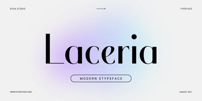 Laceria is a New Modern Serif Typeface. This another collection of Serif is perfect for your next branding project, excellent for your business. Laceria have a smooth edges, so this font gives an authentic handcrafted feel style. Laceria is perfect choice for people looking for clean, modern, minimalist, elegant, beauty design styles. Suitable for almost any graphic designs such as logo, branding materials, business cards, gift cards, t-shirt, cover, thumbnail, print, poster, photography, quotes .etc
 - Reffort by Locomotype,
$16.66 Reffort is a new sans serif with a slightly different look as its signature. Customization in certain parts of the letters allows visual changes to look more captivating. This font comes in regular style and its matching italic as well as two variable version. Each version has 7 different weights. Perfect for graphic design and any display use, Reffort can easily work for packaging design, web, signage, advertising, logotypes, even for long paragraphs like editorial design.
 - Marker O Type by O Type Foundry,
$15.00 Introducing, Marker O Type. Marker O Type is new signature font like a child's handwriting. The unique typeface brush also feels childish look similar like comic sans. Great for body text in comic book. A unique brush typeface with chill out. This font is perfectly made to be applied mainly in logos and various other formal forms such as invitations, labels, magazines, books, greeting / wedding cards, packaging, fashion, make up, stationery, novels, labels or any type of advertising purpose.