10,000 search results
(0.069 seconds)
- Porceleina by PizzaDude.dk,
$20.00 Porceleina is elegant, what more can I say? This handmade and handdrawn font comes with a heavy loadful of diacritics - and the Opentype contextual alternates makes sure that the font cycles between the six different...yes SIX different...versions of each letter from a-z! That's quite awesome, if you ask me!
 - Alt Fat by ALT,
$- Do you like fat fonts? Well here is a free one from me. Regular & Italic both free. Fat is a caps only font. Because of that if you type something with caps on, as you can see is typing in Greek I decide to make it like this since there no lowercase letters.
 - Renaissance Caps BA by Bannigan Artworks,
$19.95This is a revival font of a sixteenth century typeface. I kept this font as close as possible to the original letters, including the imperfections and irregularities, to preserve the look of antiquity. Some of the letters of the original sample were missing and had to be created from the available letters. - Toffee Display by Vástago Studio,
$20.00 Toffee Display is a sans serif project inspired on Gill sans, Helvetica and Eurotstile italics. This project is designed for food packaging, candies, commercial, and fast food. I recommend combining it with a light and calligraphy font to get absolute contrast. That is it, Thanks for buy it and work with it!
 - Uravika Classy by Dumadi,
$14.00 URAVIKA CLASSY is a font with colorful nuances in your designs. In this amazing font you can collaborate with projects such as t-shirt designs, logos, book designs, titles, advertisements, social media branding, event titles and others. I hope you have a nice day, keep your spirits up, greetings Toni Dzulham -Dumadistyle 2020
 - Ghoist by Canden Meutuah,
$20.00 is a fun and unique display font, a cool scary font for Halloween and other scary themed activities. Add this unique and spooky display font to any of your creative ideas and watch how it makes it stand out! Enjoy, I hope you are satisfied with the results of my font. thank you
 - Xspace by Artyway,
$14.00 I'm thrilled to present you a new futuristic typeface. Smooth humanistic forms and elongated proportions, modern trends dictate a new fashion in type design. Perfect for science research posters, modern futuristic logos, automotive type design and more. Check how it works and let me know, I am always glad to hear your opinion.
 - Shorthair by sizimon,
$25.00 Introducing our product Shorthair Signature! signature with which you can achieve a Cursive lettering feeling. It is slender, feminine and friendly. Shorthair Signature is perfect for fashion, e-commerce brands, trend blogs, or any business that wants to appear classy and chic. Shorthair Signature Includes: Uppercase, lowercase, numeral, punctuation & Symbol Stylistic alternates Stylistic Set01 - Stylistic Set02 Ligatures PUA Encoded Characters Fully accessible without additional design software. If you have any question please do not hesitate to contact me : info@sizimon.com. Thank You!
 - Varbee - Unknown license

- Bea by Autographis,
$39.50 Bea is my Racetrack-Script. I call it that, because it gives the impression of speed. No lingering around with this font. Zaaanggggg!!!
 - Alt Juk01 by ALT,
$30.00 Yet another experimental typeface. I love trying different things I’m very happy with the results here. See the whole presentation here: Behance,net
 - Droptune by Gleb Guralnyk,
$15.00 Introducing my new font named "Droptune". Dark riffs, strong rhythm, low frequencies - it's all about heavy music, and, I hope, about this typeface :)
 - Modum by The Northern Block,
$- A contemporary serif font family. The design takes influence from traditional serif forms to develop a precise, highly functional text face with a low contrast. Smooth radius details are blended with carefully drawn angles that give a crisp, distinctive aesthetic when used across body copy. Modum is a stylish modern day serif with great charm, harmony and practicality that is best suited for complex hierarchical projects, such as editorials, newspapers and text based books. Details include 8 weights and true italics, over 800 characters with alternative lowercase a, e, g and y. 7 variations of numerals, true small caps with accents, ligatures, manually edited kerning and Opentype features.
 - DF Pigtail by Dutchfonts,
$33.00 DF Pigtail is the result of a curious marriage of the 'free'-form of writing with the fixed (mono) space for each character of the typewriter typeface. In the early sixties of the last century, typewriter typography became popular as a Fluxus vocabulary. The Fluxus art movement (in fact a Dada like follow up) which encouraged a do it yourself aesthetic, and valued simplicity over complexity and anti commercialism over the conventional market-driven approach. I was educated in the mid seventies when this form of typography was still very popular and was even applied in corporate design. This particular letter has been used by my teacher Jan Begeer to compose his design assignments. Recently I rediscovered this type and was struck by its pigtail similarity and drew it my way.
 - Northern Monk by Kaer,
$19.00 Hi, guys! I like creating fonts with a story. Once me and my family were traveling and exploring the northern area of our region and came across an inscription carved on the wall of a monastery tower. It inspired me to create a full set of a multulingual font, but there is no lowercase letters. What's included? Only uppercase Multilingual support Numbers Symbols Punctuation Ligatures If Northern Monk is not ok, please check out my Celtic Spiral font https://www.myfonts.com/fonts/kaer/celtic-spiral/ I hope you enjoy this font. Follow my shop to receive updates of products and the very hottest news! If you have any question or issue, please contact me: kaer.pro@gmail.com Please request to add additional characters and glyphs if you need! Thank you!
 - Use Your Words by Joanne Marie,
$10.00 Here’s a different kind of font for the hand lettered look! Use Your Words is a catchwords font family consisting of 3 fonts: 1.) Use Your Words Circles 2.) Use Your Words Arrows 3.) Use Your Words Banners It’s all hand drawn and hand lettered in a monoline script font with a shadow effect to boot. This font will be perfect to include on designs such as mugs, t-shirts, bags, notebooks, inspirational quotes for the home and office, and more. There are 215 words (no more than 4 letters per word) in both upper and lowercase, plus numbers, ampersand, question and exclamation marks in all three styles. There are 444 glyphs per font. I love using this font in my hand lettering designs and I hope you will too!
 - Ioana by Octopi,
$20.00 Ioana is an inoffensive, slightly quirky, slightly fattened sans serif font. It has a full character set as well as ligatures, small caps, superiors, inferiors, numerators, denominators and auto-fractions. Ioana came about as a direct result of 3 previous, private commissions that were all based on an artists hand-writing. For Ioana, I wanted a more regimented (but not boring) sans serif that could be used for headlines, posters and flyers with larger body text. Ioana Lighter is an inoffensive, slightly quirky, slightly lighter sans serif font. It is the lighter weight of Ioana and has a full character set as well as ligatures, small caps, superiors, inferiors, numerators, denominators, old style figures and auto-fractions. These OpenType fonts have support for CE languages and I hope you like it.
 - Gallos by W Type Foundry,
$25.00 What comes to your mind if I say Architype, Geometric, Gaelic, and Uncial? An impossible combination of features? An unrealistic setup of tastes as weird as your music list? Or some part of a joke told by your favourite comedian? Just chill and stick to the idea that is possible. Gallos combines the conceptual historical elegance of the Uncials with the practical rationalism of the Geometric style. Moreover, this typeface is composed by two sub families: Gallos Uncial and Gallos Architype. The letters “M”, “N”, “W”, “a”, “m”, “n”, “r”, and “w” differ between these two models. The first one is related to both: The Uncial script aspect displaying the leaned “a” with a closed bowl, and the classical geometric style depicting more conventional uppercase and lowercase letters “m” and “n”. The Architype one is inspired by Paul Renner’s Architype model, thus the leaned “a” has an open counter, the “r” is composed by a stem and a dot, and the rest of the mentioned letters were built using square rational features. Both models are connected by classical Uncial features such as the curved stroke “e” and curved shaft “t”, and with Gaelic vibes which can be seen in uppercase and lowercase letters “K” and “X”. Also, the curved descender “g” and “y”, alongside the curved stem “z” connect really well with the rest of the system and provide more uniqueness to the Gallos type family. Without further ado, we say to you: let’s make Uncials popular again!
 - Mono Spec by Halbfett,
$30.00 Mono-Spec is a monospaced family of sans-serif type. At least in default settings, all characters across the typeface share a common width. That fixed setting is condensed, and the aesthetic style of Mono-Spec’s letterforms is very industrial. A sister family, called Mono-Spec Stencil, is also available. Its design strays away from the mechanical nature of Mono-Spec, and it channels the spirit of resistance and street culture. Mono-Spec ships in two different formats. Depending on your preference, you can install the typeface as a single Variable Font or use the family’s five static OpenType font files instead. Those weights run from Light through Bold. While the static-format fonts offer a good intermediary-step selection, users who install the Variable Font have vastly greater control over their text’s stroke width. The Mono-Spec Variable Font’s weight axis allows users to differentiate between almost 1,000 possible font weights. That enables you to fine-tune your text’s exact appearance on-screen or in print. Whatever format you choose, the Mono-Spec fonts are equipped with several OpenType features. The most striking of these can be activated via a Stylistic Set. That will replace several letters – like “B”, “E”, “F”, “H”, and “I” with double-width alternates. Those alternates take up as much space as two characters placed next to each other otherwise word. The effect of Mono-Spec’s double-width alternates is striking, and their use strikes a strong chord in any display typography applying them.
 - Juan Carlos by Homelessfonts,
$49.00 Homelessfonts is an initiative by the Arrels foundation to support, raise awareness and bring some dignity to the life of homeless people in Barcelona Spain. Each of the fonts was carefully digitized from the handwriting of different homeless people who agreed to participate in this initiative. A biography/story of each homeless person captures their story, to help raise awareness and bring some dignity to the life of homeless people. Monotype is pleased to donate all revenue from the sales of Homelessfonts to the Arrels foundation in support of their mission to provide the homeless people in Barcelona with a path to independence with accommodations, food, social and health care. Juan Carlos was born in Barcelona, Spain 46 years ago. Since the age of 17 – and during eleven years – he worked double shifts of eight hours every day in a factory. Excessive work and family problems debilitated his health and he lost his job. He then faced a dilemma: to spend unemployment benefits to pay for rent or for food. For a few years, he worked helping in the kitchens of different restaurants while he lived on a pension, until he was definitively left without work and ended up living in the street for 10 years. “In the street I tried to find rest in the ATMs of banks. I preferred to be alone, and if I ran into conflictive people, I looked for somewhere else” he explains. Living in the street he was the victim of an aggression. Since then, with the help of Arrels he moved into a pension. Today, Juan Carlos is a volunteer in the shower service of Arrels, the same showers he used during years. He also collaborates with the maintenance team, helps prepare hygienic and cleaning material, and participates in activities such as the theatre group and the football team.
 - Sabática - Personal use only

- Corbert Condensed by The Northern Block,
$- A condensed sans serif designed as an additional companion to the Corbert font family. Incorporating the key characteristics from the original family with influences drawn strongly from the Bauhaus and modernist era. This condensed version is 15% closer than the normal family improving economy of space across design layouts. Used in conjunction with the regular widths Corbert becomes a functional and versatile font system ideally suited for large complex design projects. Details include 9 weights with italics, 540 characters with alternative lowercase a, e and g, 5 variations of numerals, manually edited kerning and Opentype features.
 - Aurisha Script by Matra Creative,
$14.00 Aurisha - Handwritten Font is an brush script font based on the expression of real handwriting, lets you transform type into an exciting and beautiful piece of work. Hand-lettered look adds a real human touch to things and comes along with a lot of loving details. Aurisha- Handwritten Font has lots of alternates that gives you possibility to build your text almost like handwriting with all the charming imperfections and variations that a real handwriting has. Aurisha will work perfectly for fashion, e-commerce brands, trend blogs, wedding boutiques or any business that wants to appear upscale
 - Elastica by Resistenza,
$39.00 Elastica is a new handwritten type system created by Resistenza, it is based on humanistic sans serif fonts of early 20th century. Irregular handwritten strokes that gives a D.I.Y feeling perfect to get a close sense of communication. When using all caps, It features three different sets of capitals which combine together randomly, creating an elastic random effect with infinite combinations. OpenType features offers also the opportunity to use the three different capital sets separately. Its optimized legibility, simple structure and low contrast was made to perform excellently with e-books and mobile apps in mind. We recommend combining Elastica with ‘Beach Please’.
 - Fast Food by Breauhare,
$35.00 Fast Food is a font based on the former (and now revived) logo of a hamburger chain. It has that look of the 1970s & 1980s, yet also has a futuristic, alienesque, sci-fi look about it. It can be used for projects aimed at consumers waxing nostalgic for their good old days, or for movie posters or books about the great final frontier, and much more. There’s an alternate uppercase E & F, both of which are really stylin'! You may even develop such an appetite that you'll want to supersize your order! Digitized by John Bomparte.
 - Slimedunk by Mozatype,
$11.00 SLIMEDUNK is a sans serif display font, which contains 4 styles and It features a unique and modern sans serif. This font would be perfect for E-sport Logo, film posters, games, sports, and any project. It’s also perfect for that delicate look that you want in your invitations, poster Use this font for any crafting project that requires a personalized look! What’s Included : - Works on PC & Mac - Easy to use ( Installations ) - Compatibility Windows, Apple, Linux, Cricut, Silhouette, and Other cutting machines Thank you for purchasing this font. Please appreciate, if you like this. ENJOY it :)
 - Violitta by Arendxstudio,
$15.00 Violitta is an elegant minimalist signature handwritten font package with a personal charm. With a style that I feel is the first time being blended with a different brush so it has a natural hand. Violitta Regular contains upper and lower case letters, numbers and various complete signs. Violitta Minimalis includes alternative characters, with capital letters and small that is completely new.
 - Baby Boho by Bosstypestudio,
$12.00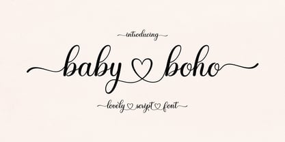 Introducing Baby Boho Baby Boho with a smooth handwriting style and very pretty and lovely. Baby Boho is perfect for branding projects, home appliance design, product packaging, use in business cards, invitation cards, etc. Just like a stylish text overlay to a wallpaper or anything that needs a touch of love. Thanks for checking! I really hope you enjoy it.
 - Raspberry Jam by CounterPoint Type Studio,
$29.99 A whimsical and fun calligraphy style font that is perfect for informal and fun occasions. The design was inspired by a series of scrapbooking style fonts that I have been exploring over the past couple of years. Inspired by a hand lettered sample in a lettering how to book. Contains language support for both Latin-based and most Eastern European languages.
 - Hey Magdison by Amelia Studio,
$12.00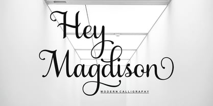 Introducing Hey Magdison Hey Magdison with a smooth handwriting style and very pretty and lovely. Hey Magdison is perfect for branding projects, home appliance design, product packaging, use in business cards, invitation cards, etc. Just like a stylish text overlay to a wallpaper or anything that needs a touch of love. Thanks for checking! I really hope you enjoy it.
 - Rigney by Solotype,
$19.95Bill Rigney, an old job printer in my home town, established his shop in 1896, closed it in 1900 to take a steady job, stored the equipment in a large shed, and reopened for business upon his retirement in 1950. What a find! A bonanza of old type! We became good friends and upon his death I bought the type. Bless you Bill. - Acceptable JNL by Jeff Levine,
$29.00 Acceptable JNL is a typeface modeled from hand lettering on a piece of 1940s sheet music, and has a distinctly casual, yet Art Deco flair. It's name can also be mischievous, for when you're asked "which font should I use for the job" you can answer "the Acceptable font". This may well start a dialogue reminiscent of Abbott and Costello's "Who's On First?"
 - Kids Rule by PizzaDude.dk,
$13.00 Sometimes you need a lot of text, and that text needs a little bit extra something. Something sweet for the eye, but still legible and not too funky. Maybe that's where Kids Rule comes in. It's a bouncy, but super-legible handmade comic font. It has a lot of attitude, and I have added 5 different versions of each letter!
 - Beach Fool by PizzaDude.dk,
$19.00 People might consider me a fool - they might even consider me a fool on the beach...because I take a swim in the ocean, even in the wintertime! Beach Fool is a simple but yet very strong headline font. It has its roots in both grafitti and comics, which makes it really powerful for graphical expressions that needs an extra punch!
 - Tenterhooks by Hanoded,
$15.00 I like the expression ‘being on tenterhooks’. Not that I’m on tenterhooks very often! Tenterhooks was made with a broken satay skewer (see poster 2 for the actual thing) and Chinese ink. It came out rather rough, but it does have a nice flow and a certain ‘wild elegance’. Comes with double letter ligatures and a whole bunch of diacritics.
 - Stay Golden by Rotterlab Studio,
$15.00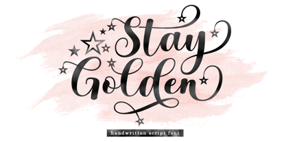 Introducing Stay Golden Script font in a smooth handwriting style and very pretty and classy. Stay Golden is perfect for branding projects, home appliance design, product packaging, use in business cards, invitation cards, etc. Simply as a stylish text overlay onto a background image or anything else that needs a touch of elegance. Thanks for checking! I really hope you enjoy it.
 - Forward Script by Bosstypestudio,
$14.00 Introducing Forward Script Forward Script with a smooth handwriting style and very pretty and lovely. Forward Script is perfect for branding projects, home appliance design, product packaging, use in business cards, invitation cards, etc. Just like a stylish text overlay to a wallpaper or anything that needs a touch of love. Thanks for checking! I really hope you enjoy it.
 - Colonial Press by Simeon out West,
$25.00 Colonial Press is a font based on serif typefaces designed by William Caslon I (1692-1766) and various revivals thereof. Caslon is cited to be the first original typeface of English origin, but some type historians point out the close similarity of Caslon's design to the Dutch Fell types, presumed to be the work of Dutch punchcutter Dirck Voskens. Colonial Press harkens to the look and feel of newspapers in Colonial North America around the mid 1700s without the rough edges commonly associated with colonial printing and many reconstructions. The rough quality of the American typeface is believed to be the result of oxidation from the exposure to seawater during the long voyage from England to the Americas. Colonial Press is a heavy font that retains some of the handcut quality of these fonts while smoothing out the irregularities that make many of these fonts so visually distracting at larger point sizes. For the italic version of this font, I chose to emulate the more ornate letterforms that I have encountered, giving the italic characters a more ornamental feel. Colonial Press comes with full punctuation and a 362 glyph character set for most Western European-based Latin alphabet languages. It is a font that is designed both for normal typing and for larger, decorative display.
 - Chalice by Canada Type,
$24.95Chalice is a new original Canada Type family inspired by two different engraving eras and locations: Medieval England and 19th century Russia. Chalice's construct is geometric at heart, though the wedge serifs and their contribution to the overall idiosyncrasies of the counterspace give it a spirit entirely different from usual geometric types. Chalice's personality is that of a knowledgeable advisor, clinical yet old-fashioned, aware yet unsurprised, secular yet serene, clear yet artistic, hungry yet redeemable. Chalice comes in 4 weights, light to black, that range in expression from a sobering wise whisper of confidence all the way to the bells and whistles of Judgment Day. Such flexibility in expression among the different weights of the same typeface of this kind is quite rare, and will be appreciated by discriminating graphic artists who require more than just another tombstone type. Chalice's character set comes fully loaded across all 4 weights. Two dozen alternates are built into the map, including unicase variations on the a and e, double-barred alternatives for A, E, F, H and S, and connecting versions of b, d, f, h and t. Such variety gives the user to subtly define the set type without overpowering it. Chalice comes in all popular font formats, and is available in single weights, as well as one complete affordable package. - Designer by Artyway,
$12.00 I suggest you to pay attention to the "Design" font. It's bold, with softened corners and some slope for dynamic effect. "Design" font has a unique charm and easy visual readability, so it's perfect for headlines, whether for sports events, automotive posters, logo or monograms designs.

