10,000 search results
(0.055 seconds)
- Amica Pro by Eclectotype,
$40.00 Welcome Amica Pro, a workhorse sans designed to give your branding a friendly, approachable look. What is it that makes a typeface friendly? Eclectotype undertook extensive research* in this and the results are in! To cut a long story short, friendliness in sans serif fonts can be summed up in two words – short and fat. Basically, think Danny DeVito in letter form. The shortness in Amica Pro is achieved (somewhat counterintuitively) by pushing up the x-height. This, coupled with short ascenders and descenders, gives the text a squat appearance. For the fatness, that's easy in the bolder weights, but how to carry this through to the lights? Here, the fatness equates to roundness, so the letterforms, even if the stroke weight is light, have a rotund appearance from the wideness and roundness of the circular glyphs. When thinking about friendliness, we think about inclusiveness. To this end, Amica Pro supports a super wide range of latin-based languages, as it uses Underware's Latin Plus character set, as well as extra support for Vietnamese. Amica Pro is best used for branding, logos, infographics etc. It will give your UI a friendlier feel, but that doesn't mean it's not serious. There are many useful typographic features, including alternates, numerous figure styles, automatic fractions and case-sensitive forms. The italics are carefully optically corrected "sloped romans" and as such they are the same width as their upright equivalent, so changing your copy to italics will not mess around with the spacing. *I looked at a few fonts and drew some lazy conclusions.
 - As an AI model, I cannot browse the internet or access new databases in real-time; my last update was in April 2023. As of my last update, "Recognition" by WhoAmI Design was not a widely recognized o...
- Alas, I can't access up-to-date databases or specific document collections to provide current or exclusive information on particular fonts including "GoodCityModern Plain" by Altsys Metamorphosis. Bu...
- Urban Tags by Tomatstudio,
$15.00 Inspired from tagging graffiti marker in the streets and my real experiences in graffiti scenes, Urban Tags comes with iconic rounded tip marker, this style often used by several graffiti artist around the world because the style is very unique, very fun to write in markers. Perfect if you want realistic Street art style or hip hop for your designs, poster, props etc. Because this is real graffiti fonts, "urban Tags" is different like other fonts, the space letter is shorter, for perfect result the Kerning you can adjust manually, because it's impossible to setting kerning like other regular fonts. I put extra glyphs for make the fonts looks more street art, use "åß∂ƒ©˙∆˚¬Ω≈ç" you can see in the preview.
 - Hazelnut Milk Tea by Fikryal,
$18.00 Introducing this very simple sans serif font that is Hazelnut Milk Tea font. I created this font with the inspiration of simplicity and it is very friendly to look at, with four versions, namely regular, italic, bold, bold italic. Very suitable to be applied in various aspects of design, Also it’s perfect for logo, branding, title, social media posts, advertisements, product packaging, product designs, label, photography, watermark, special event, magazine, web designs, etc. Features : Hazelnut Milk Tea Regular ( Uppercase, Lowercase ) Hazelnut Milk Tea Regular Italic ( Uppercase, Lowercase ) Hazelnut Milk Tea Bold ( Uppercase, Lowercase ) Hazelnut Milk Tea Bold Italic ( Uppercase, Lowercase ) Symbols multilingual support If you have any questions please don’t hesitate to contact me follow my Instagram: @fkryall Thank you
 - Elizabeth by ParaType,
$30.00 The hand composition typeface was developed at the Ossip Lehmann type foundry (St. Petersburg) in 1904-07 (after designs by Alexander Leo?). It was redeveloped at Polygraphmash in 1960s for slugcasting composition. Named after Russian Empress Elizabeth I (1709-61). Based on typefaces of George Revillon type foundry of 1840s, though some characters’ shapes were redrawn similar to Russian Academy of Sciences typefaces (mid-18th century). Sharp contrast, strong weight Modern Serif with archaic flavor. The typeface is useful in text and display composition, in fiction, historical, and art books, especially connected to the 18th or 19th centuries. It looks great in Russian classical literature such as Pushkin and Gogol works. The revised, improved and completed digital version was designed at ParaType in 2001 by Lyubov Kuznetsova.
 - Bradley Texting by Monotype,
$57.99Bradley Texting: a clear, friendly and easily legible calligraphy font, also suited to electronic devices With Bradley Texting, Richard Bradley has published another calligraphic typeface that recalls the style of Bradley Hand and Bradley Type. In this case, however, Bradley has advanced the style with clearer forms for display on electronic instruments and on other formats. Two other font families paved the way to the newly introduced Bradley Texting. In the mid-1990s, Bradley published Bradley Hand, with its rough contours. Since these coarse forms do not cut a good figure in the larger font sizes, Bradley Type followed, with smooth letters. During the development of Bradley Type, the idea for a further font came about ? one in the style of the two other calligraphic typefaces, but with simpler, easily legible forms and suited to electronic devices like mobile phones or tablets. The letters for Bradley Texting began with a marker on paper. Looking back, Bradley describes one of the biggest challenges as having the calm required to draw the relaxed-looking letters repeatedly while still making them fit the general style.The somewhat narrow and dynamically designed letters have round line ends, like those left by a felt-tipped pen. As a hand-written print font, the individual letters are not connected to one another. Nonetheless, they demonstrate the influence of a written font, such as the extended ends and the flowing transitions. Clear forms with open counters and a large x-height guarantee Bradley Texting good legibility in the smaller font sizes. Bradley Texting is also effective under more challenging conditions, such as on mobile phones, e-book readers or tablets; the fonts friendly and lively character comes through. With Regular, Semibold and Bold, Bradley Texting is adequately equipped for use as a headline or text font in various sizes. The selection of characters covers the Western European languages and German typographers will be happy to note the presence of the upper-case ß. Use the dynamic and clear forms of Bradley Texting anywhere you need a friendly character with a personal accent. Bradley Texting is persuasive in the print realm, in advertisements or on posters, as well as on electronic devices. - Portada by TypeTogether,
$35.00 For everyone wishing for a modern serif that’s as clear and readable as a sans in restrictive digital environments, meet Portada by Veronika Burian and José Scaglione. Sans serifs are commonly used on small screens to save space and carry a modern tone. Serifs may appear fickle and unsteady, pixel grids change from one product to another, and space is at a premium. Portada now provides a serif option for these restrictive digital environments, putting that old trope to rest. The screen has met its serif match. Portada was created from and for the digital world — from e-ink or harsh grids to Retina capability — making it one of the few serifs of its kind. Portada’s text and titling styles were engineered for superlative performance, making great use of sturdy serifs, wide proportions, ample x-height, clear interior negative space, and its subservient personality. After all, words always take priority in text. It’s not all business, though. Portada’s italics contain an artefact of calligraphy in which the directionality of the instrokes and the returning curves of the outstrokes give the family a little unexpected brio. Yet even the terminals are stopped short of flourished self-absorption to retain their digital clarity. When printed these details are downright comforting. Portada’s titling styles enact slight changes while reducing the individual width of each character and keeping the internal space clear. Titling italics have increased expressiveness across a few characters rather than maxing out the personality in each individual glyph. Digital magazines, newspapers, your favourite novel, and all forms of continuous screen reading benefit from Portada’s features. This family can also cover many of the needs developers have: user interface, showing data intensive apps on screen, even one-word directives and dialogs. And, as a free download, an exhaustive set of dark and light icons is included to maintain Portada’s consistent presence, whether as a word or an image. The complete Portada family (eight text styles, ten titling styles, and one icon set) is designed for extensive, clear screen use — a rare serif on equal footing with a sans.
 - Bree by TypeTogether,
$37.50 The Bree font family is a spry sans serif by Veronika Burian and José Scaglione that delivers a spirited look and feel for branding and headline usage. As an upright italic, Bree shows a pleasant mix of rather unobtrusive capitals with more vivid lowercase letters, giving text a lively appearance. Bree is clearly influenced by handwriting. As such, some of its most characteristic features are the single-story ‘a’, the cursive ‘e’, the outstroke curves of ‘v’ and ‘w’, the flourished ‘Q’, and the fluid shapes of ‘g’, ‘y’, and ‘z’. Alternates of these letters are available when a more neutral look is desired. Bree has a touch of cheekiness, a wide stance for each character, and an extra-large x-height. All this adds up to a big personality, so even when set in small text there is no skimming past the words Bree voices. In 2019, the Bree font family got a huge update. A few shapes were updated or added (the ‘k’ and German capital ‘ß’), two entirely new weights were added (Book and Book Italic), and spacing was perfected. More than that, Vietnamese support was added to Bree Latin, and the Bree Greek and Bree Cyrillic scripts were designed from scratch to parallel the Latin’s tone. Additionally, Bree was designed in variable font format for those who want complete control over the font’s appearance while simultaneously saving digital weight in the form of kilobytes and megabytes. Bree is in the perfect position for the next digital revolution. The complete Bree font family, along with our entire catalogue, has been optimised for today’s varied screen uses. Bree has been chosen for such wide-ranging uses as Breast Cancer Awareness Month in the US, the branding for the country of Peru, and numerous layouts including mobile apps, magazines, newspapers, and books. Awards – Tipos Latinos exhibition 2008 – Several best-of-the-year typeface lists of 2008 MyFonts Top 10 Fonts of 2008 Smashing Magazine: 60 Brilliant Typefaces For Corporate Design https://www.smashingmagazine.com/2008/03/60-brilliant-typefaces-for-corporate-design/ Die besten Schriften 2008 http://www.fontwerk.com/619/die-besten-schriften-2008/ – Selected for Typographica’s Best Typefaces of 2008 – Won Bronze for Original Typeface in the 2009 European Design Awards
 - Phorfeit BRK Pro by CheapProFonts,
$10.00 Part futuristic + part rounded = totally psychedelic. This font is perfect for that 70s hippie look. I have totally redrawn the outlines, and redesigned a couple of glyphs that were too "mechanical". the slanted version has a 20 degree slant, and this speedier variant of Phorfeit BRK Pro is ready for use (for those who use software where you cannot slant the upright version yourself). ALL fonts from CheapProFonts have very extensive language support: They contain some unusual diacritic letters (some of which are contained in the Latin Extended-B Unicode block) supporting: Cornish, Filipino (Tagalog), Guarani, Luxembourgian, Malagasy, Romanian, Ulithian and Welsh. They also contain all glyphs in the Latin Extended-A Unicode block (which among others cover the Central European and Baltic areas) supporting: Afrikaans, Belarusian (Lacinka), Bosnian, Catalan, Chichewa, Croatian, Czech, Dutch, Esperanto, Greenlandic, Hungarian, Kashubian, Kurdish (Kurmanji), Latvian, Lithuanian, Maltese, Maori, Polish, Saami (Inari), Saami (North), Serbian (latin), Slovak(ian), Slovene, Sorbian (Lower), Sorbian (Upper), Turkish and Turkmen. And they of course contain all the usual "western" glyphs supporting: Albanian, Basque, Breton, Chamorro, Danish, Estonian, Faroese, Finnish, French, Frisian, Galican, German, Icelandic, Indonesian, Irish (Gaelic), Italian, Northern Sotho, Norwegian, Occitan, Portuguese, Rhaeto-Romance, Sami (Lule), Sami (South), Scots (Gaelic), Spanish, Swedish, Tswana, Walloon and Yapese.
 - La storia by Abo Daniel,
$15.00 Introducing La storia - a fine tip signature font. Beautiful monoline signature, looking so classy and natural. There are 2 version, - Regular - Bold La storia is perfect for branding, photography, invitations, quotes, watermarks, advertisements, product designs, labels, and more that needs a natural sign feel. Includes number-punctuations and multilingual support. I created 89 ligatures to keep this font looks natural. at ct dt et ft gt ht it jt kt lt mt nt ot qt rt st tt ut vt wt xt zt an in un en on ar ir ur er or aa ant int unt ent ont att itt utt ett ott ii ee oo uu ff rr ss xx zz ll adl idl udl edl odl ald ild uld eld old art irt urt ert ort fl fh fb jl Fr Gr Hr Ir Kr Mr Nr Or Pr Tr Ur Vr Wr Dr space-r Titling and Ending Swash - Quick Access Add underscore 2x before or after a lowercase (you can see this on the presentation posters). For example a_ _ or _ _a Swash Lines make this font complete. Add underscore 2x before numbers from 1 to 9, you'll get 9 variations of swash line (as shown in the posters). For example _ _1 Thank You so Much!
 - Shahira Script by madjack.font,
$12.00 Shahira Script is a modern calligraphy design. Shahira is a girl's name meaning "Famous", "Known" and is of Arabic origin. This typeface is casual and beautiful with swash. Can be used for various purposes such as logos, product packaging, wedding invitations, branding, headlines, signage, labels, signatures, book covers, posters, quotes, and more. Shahira Script includes changes in OpenType language style, binders and international support for most Western languages. To activate the OpenType Stylistic alternative, you need a program that supports OpenType features such as Adobe Illustrator CS, Adobe Indesign & CorelDraw X6-X7, Microsoft Word 2010 or newer versions. How to access all alternative characters using Adobe Illustrator: https://www.youtube.com/watch?v=XzwjMkbB-wQ Shahira Script is coded with Unicode PUA, which allows full access to all additional characters without having special design software. Mac users can use Letter Books, and Windows users can use Character Maps to view and copy one of the additional characters to attach to your favorite text editor / application. How to access all alternative characters, using Windows Character Map with Photoshop: https://www.youtube.com/watch?v=Go9vacoYmBw If you need help or have questions, let me know. I am happy to help! Thank you and Happy Designing!
 - Syphon Spritz Pro by CheapProFonts,
$10.00 A free flowing and loose handwritten style, with the occasional double lines - and with quite elaborate and decorative initials. Feminine, but sloppy - an interesting combination. I have regularized the stroke thicknesses and modified a couple of the letterforms to make them less ambiguous. Some kerning and spacing completes the workover, together with our extensive language support. ALL fonts from CheapProFonts have very extensive language support: They contain some unusual diacritic letters (some of which are contained in the Latin Extended-B Unicode block) supporting: Cornish, Filipino (Tagalog), Guarani, Luxembourgian, Malagasy, Romanian, Ulithian and Welsh. They also contain all glyphs in the Latin Extended-A Unicode block (which among others cover the Central European and Baltic areas) supporting: Afrikaans, Belarusian (Lacinka), Bosnian, Catalan, Chichewa, Croatian, Czech, Dutch, Esperanto, Greenlandic, Hungarian, Kashubian, Kurdish (Kurmanji), Latvian, Lithuanian, Maltese, Maori, Polish, Saami (Inari), Saami (North), Serbian (latin), Slovak(ian), Slovene, Sorbian (Lower), Sorbian (Upper), Turkish and Turkmen. And they of course contain all the usual "western" glyphs supporting: Albanian, Basque, Breton, Chamorro, Danish, Estonian, Faroese, Finnish, French, Frisian, Galican, German, Icelandic, Indonesian, Irish (Gaelic), Italian, Northern Sotho, Norwegian, Occitan, Portuguese, Rhaeto-Romance, Sami (Lule), Sami (South), Scots (Gaelic), Spanish, Swedish, Tswana, Walloon and Yapese.
 - Mir by Juliasys,
$22.00 Мир is Mir. The Russian word Мир (Mir) means both World and Peace. The rendezvous of the two terms seems quite unique and utopistic today, but it is comforting to see that it was natural at some time deep down in Russian history. Bits of both meanings were going through my mind while I was designing this typeface. Mir’s character set is multiscript – Latin, Cyrillic and Greek – and extends to many parts of the linguistic world. In fact it covers more than 100 languages. Stylistic consistency between the language systems make typographic border crossings painless even where national borders are still closely guarded. And in regions where mathematics, physics or chemistry are to be expressed, a rich set of OpenType features lets Mir master also these situations. Serious things are best be said in a relaxed, unpretentious way. So Mir doesn’t put on a show. Mir has authority without being authoritarian, it is serious but not stern. It can explain difficult things and stay calm and down to earth at the same time. Mir Medium has another useful feature: It can be freely downloaded and used by anybody anywhere. You can test the Mir Family with free Mir Medium and get more styles when you need them. @juliasys
 - Marsh Mallow Pop Heart by Norio Kanisawa,
$40.00 MarshmallowPopHeart is a cute font that imagined a sweet marshmallow. Since hearts are mingled in various places such as voiced points and parts of kanji(chinese characters), it may be fun to look for it. Because the heart is missing, it is recommended for when you want to designing cute. I think whether it's good for contents for young ladies. Because it is a thick font, it may be good to use it for headlines and where you want to make it stand out. It corresponds to Hiragana · Katakana · Alphabet · Numerals · Symbols · Kanji(chinese characters). You can also write vertically. You can use it easily, because it contains JIS first · second level, and IBM extended Kanji(about 6700chinese characters). I think it's better to become a font that makes people who use or watch them fluffy and feel happy like when eating a pastel colorful sweet marshmallow. <「ましゅまろポップ ハート」紹介文> ぷにぷにの丸っこい甘いマシュマロをイメージしたかわいいフォントです。 濁点や漢字の一部など、色んな場所にハートが紛れ込んでいるので、探してみるのも楽しいかもしれません。 ハートが紛れ込んでいるので、かわいくデザインしたい場合などにオススメです。 若い女性向けコンテンツにもいいかと思います。 太めのフォントなので、見出しや目立たせたい所に使うのも良いかも知れません。 ひらがな・カタカナ・アルファベット・数字・記号類・漢字を収録、縦書きもできます。 漢字はJIS第一水準・第二水準・IBM拡張漢字に対応(約6700文字)してますので、使い勝手も良いかと思います。 パステルカラーのカラフルな甘いマシュマロを食べる時みたいに、使ったり見てくださる方がふわふわ幸せな気持ちになれるフォントになればいいなぁ…と思います。 <スタイルカテゴリー> ファンシー、装飾
 - Neutraface Condensed by House Industries,
$33.00 Richard J. Neutra became an icon of Modern architecture as an artistic visionary, social commentator and outspoken defender of the environment. He refined his unique approach to design, for which he coined the term biorealism, over half a century ago. Regarding humankind and its surroundings as two inseparable halves to a greater whole, Neutra created habitats with the welfare of man and nature as his utmost concern. His ideas of evolutionary growth and adaptability compelled House Industries to develop Neutraface Condensed, built upon the original typeface and driven by the enduring spirit of the revolutionary who inspired it. “I have tried to be a feeling observer of life in all its manifestations, not a cold rationalist.” House Industries adopted this precept of Neutra as the guiding principle when the foundry commissioned Christian Schwartz to draw Neutraface Condensed. Instead of being exactingly compressed, the new companion fonts were composed around a complementary structural framework in order to better reflect the sensibilities of their predecessor. The result is an individualistic design with a restrained exuberance that shuns stylistically ersatz imitation. This compact yet lively presence allows Neutraface Condensed to lend flexibility and economy to headlines without sacrificing the simplicity and charm of the original. Like all good subversives, House Industries hides in plain sight while amplifying the look, feel and style of the world’s most interesting brands, products and people. Based in Delaware, visually influencing the world.
 - Model by Lián Types,
$49.00 When designing a typeface, one has to be conscious of superfluous details. Although I am always tempted to add little personal touches, experience taught me that the phrase -less is more- is totally true. In Model, the letters (like models do) participated of a contest: An event in which models engage in competition against each other, often for a prize or similar incentive. The prize was staying in the font! yay! Tall, delicate, refined, the right amount of elegancy: These were some of the aspects to be chosen. Typographically speaking, these things were achieved thanks to a tall x-height (which leaded the font to be somehow condensed), a subtle contrast between thicks and thins, and just the right amount of decorative swirls. The result is a nice script that can be used in magazines, invitations, posters, book-covers and works very well when used over photographs. Get Model and let it be the star of the catwalk. STYLES Model Pro and Model Small Pro are the most complete styles of the font. Both have all the ligatures and decorative glyphs seen in posters above (OT programmed). Model Std One, Std Two and Std Three are reduced versions of Pro. This means they have less glyphs inside. TIP If you are planning to print the font in small sizes, it’s highly recommended to purchase Model Small Pro. Its thins are thicker so they will be better printed.
 - Soho by Monotype,
$29.99 Soho is the latest addition to the growing range of typefaces from Sebastian Lester. This grand opus of a project resulted in a typeface that comprises nine weights and five widths of precision engineered OpenType. 40 fonts, 32,668 characters and 24 OpenType features. Hot on the heels of the popular Neo Sans and Neo Tech range, and his first typeface release Scene, Soho represents three years of work by Lester. As a type designer I'm preoccupied with finding ways in which I can address modern problems like good legibility in modern media, and create fonts that work precisely and efficiently in the most technically demanding of corporate and publishing environments." Slab serif typefaces are enjoying something of a renaissance, offering versatility whether for corporate identity, product branding, text or display use. With 40 weights to choose from Soho gives designers endless possibilities from the ultra chic lines conveyed by the lighter weights to the rock solid statement made by the heavier weights. Soho is cross-platform compatible. The Pro version provides extended language support for Central European languages. Used in conjunction with software applications that support OpenType many useful features like "stylistic sets" can be leveraged -- in which a wide variety of alternative characters can be introduced at the click of a mouse button giving one font several "tones of voice" from conservative to cutting edge. The wide range of glyphs includes ligatures and small caps."
 - Stay Classy Font Duo by Nicky Laatz,
$17.00 Stay Classy! ...with the suave new Stay Classy Font Duo consisting of a sophisticated signature-style script, and an elegant, classy, all-caps serif font. With impeccably refined curves and silky smooth edges, the Stay Classy Font Duo is perfect for adding a classy, modern touch to your projects. Perfect for branding, weddings, social media, product design, stationery and advertising - Stay Classy is versatile enough to add that elegant element to just about any project where a special touch of class is required. THE SCRIPT : To make the script appear as natural as possible in your designs , I have included 2 sets of opentype stylistic lowercase alternates - one of which includes the elegant end letters. Words look more naturally finished off if end letters are formed with a subtle up-curve. Last but certainly not least, a large selection of 30 carefully styled character ligatures ( letter combinations ) have also been built in ( see previews above ) . For those after a more rustic, original look. THE SERIF : The Serif includes carefully constructed built-in opentype kerning pairs to ensure impeccable letter spacing throughout the font. Typically, in any all-caps serif font, there are certain letter pairs (such as OV AW AT AY AV WO and many more ) that often look incorrectly spaced when coupled together, due to their natural dimensions. Built-in opentype kerning pairs eliminate this issue - meaning perfectly balanced letter spacing no matter what you type.
 - NOW YOU SEE ME - Personal use only

- 13_Roshi - Personal use only

- Only Fools & Horses - Personal use only

- LIGHT EMITTING DIODES - Personal use only

- Calligraphy Double Pencil - Personal use only

- 13_Fletcher - Personal use only

- 13_Ghosts - Unknown license

- 13_Misa - Unknown license

- Akoya by Cocodesign,
$10.00 Akoya hand-drawn serif font , including Regular. This font is casual and beautiful with swash. Can be used for various purposes. such as logos, product packaging, wedding invitations, branding, headlines, signage, labels, signatures, book covers, posters, quotes, and more. the Akoya Serif includes a change in the OpenType language style, binding and international support for most Western languages. To activate the OpenType Stylistic alternative, you need a program that supports OpenType features such as Adobe Illustrator CS, Adobe Indesign & CorelDraw X6-X7, Microsoft Word 2010 or newer versions. How to access all alternative characters using Adobe Illustrator: https://www.youtube.com/watch?v=XzwjMkbB-wQ the Akoya Serif is coded with PUA Unicode, which allows full access to all additional characters without having to design special software. Mac users can use the Font Book, and Windows users can use Character Map to view and copy one of the additional characters to insert into your favorite text editor / application. How to access all alternative characters, using Windows Character Map with Photoshop: https://www.youtube.com/watch?v=Go9vacoYmBw If you need help or have questions, please let me know. I am happy to help :) Thank you & Congratulations on Designing!
 - FHA Condensed French by Fontry West,
$25.00 FHA Condensed French One could speculate that FHA Condensed French probably started life as wood type for displays, headlines and posters. The exaggerated sharp serifs and condensed forms were not uncommon for that period. At some point, sign painters picked up Condensed French added their own character. At the end of the nineteenth century, Frank H. Atkinson included Condensed French in his samples of lettering for his book, ”Sign Painting, A Complete Manual.” This book became one of the definitive guides for signwriting and hand lettering. In 1999, Mike Adkins digitized Condensed to add to our Atkinson collection. For its re-release, Condensed French has been updated with more language support, ligatures, and OpenType alternates. It has true vintage character but still plays well in more modern designs. A font for all seasons, the condensed forms and sharp serifs fit in every layout from wildwest days posters and creepy film credits to Christmas ads and Mother’s Day cards. While I can’t really see FHA Condensed French as the font for phone aps or video game text, it will provide impact to logos, branding, and product labeling.
 - Merriday by Romie Creative,
$12.00 Merriday Script is a modern calligraphy design. This font is casual and beautiful with swashes. Can be used for various purposes such as logos, product packaging, wedding invitations, branding, headlines, signage, labels, signatures, book covers, posters, quotes, and more. Merriday script includes changes to the OpenType language style, ligatures and international support for most Western languages. To activate the OpenType Stylistic alternative, you need a program that supports OpenType features such as Adobe Illustrator CS, Adobe Indesign & CorelDraw X6-X7, Microsoft Word 2010 or newer versions. How to access all alternative characters using Adobe Illustrator: https://www.youtube.com/watch?v=XzwjMkbB-wQ Merriday Script is coded with Unicode PUA, which allows full access to all additional characters without having to design special software. Mac users can use Letter Book, and Windows users can use Character Maps to view and copy any of the additional characters to be included in your favorite text editor / application. How to access all alternative characters, using Windows Character Map with Photoshop: https://www.youtube.com/watch?v=Go9vacoYmBw If you need help or have questions, let me know. I am happy to help.
 - VAG Rounded Next by Monotype,
$57.99 VAG Rounded Next brings a classic 1970s typeface up to date, keeping all of its easy going, approachable personality but adding some much-needed versatility and language support. Originally commissioned by Volkswagen, VAG Rounded remained in use by the company until the early 90s and has also been used by Apple, Skype and Myspace. Its enduring appeal lies in its appealingly rounded terminals, and its immediate, informal tone of voice. “When you look at the Volkswagen Beetle it has these curves that are timeless and legendary,” says Steve Matteson, who led the creation of VAG Rounded Next. “I think that's what stands out in this design – that friendly aesthetic, and the simple line and circle.” This new version offers 700 glyphs with pan European language support (including Greek and Cyrllic), as well as 10 weights of upright and italic styles. New display weights Shine and Rough – which create “chocolate popsicle” and “rust” effects – are begging to be used in branding, packaging and editorial projects, while the lighter weights are well suited for text. VAG Rounded Next Variables are font files which are featuring one axis and have a preset instance from Thin to Black.
 - Caldwell Script by madjack.font,
$15.00 Caldwell Script is a modern calligraphy design. This typeface is casual and beautiful with swash. It can be used for various purposes such as logos, product packaging, wedding invitations, branding, headlines, signage, labels, signatures, book covers, posters, quotes, and more. Caldwell Script includes changes in the OpenType language style, binders and international support for most Western languages. To enable alternative OpenType alternatives, you need a program that supports OpenType features such as Adobe Illustrator CS, Adobe Indesign & CorelDraw X6-X7, Microsoft Word 2010 or newer versions. How to access all alternative characters using Adobe Illustrator: https://www.youtube.com/watch?v=XzwjMkbB-wQ Caldwell Script is coded with Unicode PUA, which allows full access to all additional characters without having special design software. Mac users can use Letter Book, and Windows users can use Character Maps to view and copy any of the additional characters to attach to your favorite text editor/application. How to access all alternative characters, using Windows Character Map with Photoshop: https://www.youtube.com/watch?v=Go9vacoYmBw If you need help or have questions, let me know. I am happy to help. Thank you & Happy Designing!
 - Yosyita Script by Romie Creative,
$13.00 Yoshita Script is a modern calligraphy design, including Regular. This typeface is normal and beautiful with swashes. It can be used for various purposes, such as logos, product packaging, wedding invitations, branding, headlines, signage, labels, signatures, book covers, posters, quotes, and more. Yoshita Script includes OpenType features, binders, and international support for most Western languages. To activate the OpenType Stylistic alternative, you request a program that supports OpenType features such as Adobe Illustrator CS, Adobe Indesign & CorelDraw X6-X7, Microsoft Word 2010 or newer versions. How to access all alternative characters using Adobe Illustrator: https://www.youtube.com/watch?v=XzwjMkbB-wQ Yoshita Script is coded with Unicode PUA, which allows access to all additional characters without having to install special software. Mac users can use Letter Books, and Windows users can use Character Maps to view and use one of the additional characters to enter their favorite text editor / application. How to access all your alternative characters, use Windows Character Map with Photoshop: https://www.youtube.com/watch?v=Go9vacoYmBw If you need help or have questions, let me know. I am happy to help :) Thank you & Happy Designing!
 - Hello Jasmine by Natural Ink,
$12.00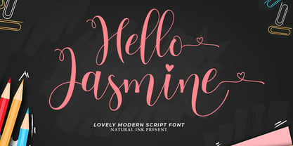 Hello Jasmine Script is a modern calligraphy design. This font is casual and beautiful with swash. Can be used for various purposes. such as logos, product packaging, wedding invitations, branding, headlines, signage, labels, signatures, book covers, posters, quotes, and more. Hello Jasmine Script includes OpenType features, ligatures and international support for most Western languages. To activate the OpenType Stylistic alternative, you need a program that supports OpenType features such as Adobe Illustrator CS, Adobe Indesign & CorelDraw X6-X7, Microsoft Word 2010 or newer versions. How to access all alternative characters using Adobe Illustrator: https://www.youtube.com/watch?v=XzwjMkbB-wQ Hello Jasmine Script is coded with PUA Unicode, which allows full access to all additional characters without having to design special software. Mac users can use the Font Book, and Windows users can use Character Map to view and copy one of the additional characters to insert into your favorite text editor / application. How to access all alternative characters, using Windows Character Map with Photoshop: https://www.youtube.com/watch?v=Go9vacoYmBw If you need help or have questions, please let me know. I am happy to help.
 - PTx Flowers by Pedro Teixeira,
$15.00 PTx Flowers Font Family 2 fonts: regular and silhouette each font - 6 glyphs TTF format Bear in mind that each glyph of the font PTx Flowers Regular is close to the maximum limit of points possible in ttf, which means that despite being tested in several programs, illustrator, photoshop, among others including word, some bugs may occur, depending on the rendering capability of the program you are working on. I found however that most of the time, that by the way the bugs, when tested, were only verified in word, that changing the size of the letter/glyph or even the zoom of the document, the letter/glyph was rendered correctly. These fonts have a very limited number of glyphs because, due to the glyphs having too many points, it can take some time to render. This will depend on the capacity of the machine's graphics card (computer, tablet, mobile phone). Hence a low number to take as little time as possible. See at work in word: https://youtu.be/PIMBlja2I5k See ar work in illustrator: https://youtu.be/RJp9X9TQ4so See at work in photoshop: https://youtu.be/yvrBmCJ80pc
 - Linotype Typo American by Linotype,
$29.99Mark Stanczyk designed Linotype Typo American in 1999. The font is an excellent revival of American style typewriter type. As most of us can remember from our childhood years, or through old stories and movies, everyone used to type with typewriters before the invention of computers. Unlike computers, most individual typewriters only had one typestyle, or font, to chose from. To make matters worse, the letters in a typewriter font would wear down with use. Over time, text typed out on a typewriter would look more and more corroded, old, and uneven. Stanczyk has captured exactly these features in this “revival” font! Also like most older typewriter styles, Linotype Typo American’s letters are all mono-spaced, i.e., the letter i is the same width as the letter w. Typewriter letters also all tended to be cast in the same size, around 12 points or so. When using typewriter-style fonts, it is best to keep setting your text in similar sizes. (Of course, you can set really large and fun headlines with Linotype Typo American, too; if anything the unevenness of the design will come even more across in these applications.) - Gebisha Script by Romie Creative,
$13.00 Gebisha Script is a modern calligraphy design, including Regular and Slant. This typeface is casual and beautiful with swash. It can be used for various purposes. such as logos, product packaging, wedding invitations, branding, headlines, signage, labels, signatures, book covers, posters, quotes, and more. Gebisha Script has an OpenType style replacement feature, binder and international support for most Western languages. To activate the OpenType Stylistic alternative, you need a program that supports OpenType features such as Adobe Illustrator CS, Adobe Indesign & CorelDraw X6-X7, Microsoft Word 2010 or newer versions. How to access all alternative characters using Adobe Illustrator: https://www.youtube.com/watch?v=XzwjMkbB-wQ Gebisha Script is coded with Unicode PUA, which allows full access to all additional characters without having special design software. Mac users can use the Font Book, and Windows users can use the Character Map to view and copy one of the additional characters to paste into your favorite text editor / application. How to access all alternative characters, using Windows Character Map with Photoshop: https://www.youtube.com/watch?v=Go9vacoYmBw If you need help or have questions, let me know. I am happy to help :) Thank you & Happy Designing!
 - Refresh by Scholtz Fonts,
$12.00 Refresh was inspired and partly based on handwritten text from advertisements for a popular cola-based soft drink from the 1950s. I designed the missing characters in the handwriting style of the original. The Refresh family comes in three styles: - Lite- possibly the most elegant of the three styles -- use at larger sizes for greater legibility; - Med -of intermediate weight - more legible than Lite; - Blak - for bolder statements and best readabilty. Refresh, with its three styles, is ideal for any display work needing a feminine, handwritten effect. Use it for product branding, book covers, invitations, greeting cards where you're looking for charm and movement. Refresh has not been designed to be used with capital letters placed next to one another: it is not advisable to use text in "ALL CAPS". The best effects for headings and subheads are obtained with an initial upper case letter followed by lower case characters. If you are using upper and lower case then it is not necessary to use kerning. Refresh contains over 250 characters - (upper and lower case characters, punctuation, numerals, symbols and accented characters are present). It has all the accented characters used in the major European languages.
 - Bitelover by Mercurial,
$10.00 Bitelover is an enchanting font duo brush script typeface with sans serif. clad in an exquisite accents, casual-chic, perfect for you who want a perfect and fabulous font! Suitable for many design projects such as logo design, branding, packaging, blog graphics, stylizing quotes, wedding stationery, art prints, collateral design, packaging, social media, and so on. I’ve truly enjoyed the process of creating this font collection and hope that it will bring some magic into your projects! Whats i get? Bitelover. OTF Bitelover Sans. OTF Whats Includes: Uppercase and Lowercase, Numbers and punctuation, Stylistic Alternate, Discretionary Ligatures, Multilingual Languages Support, Symbols and more. It's highly recommended to use it in opentype capable software - there are plenty out there nowadays as technology catches up with design. The Open Type features can be accessed by using Open Type savvy programs such as Adobe Illustrator, Adobe InDesign, Adobe Photoshop Corel Draw X version, And Microsoft Word. And this Font has given PUA unicode (specially coded fonts). so that all the alternate characters can easily be accessed in full by a craftsman or designer and also equipped with Multilingual support. So, let's get it! Thanks and enjoy your day ...!. :)
 - Brigland Script by Romie Creative,
$15.00 Brigland Script is a modern calligraphy font and includes beautiful swashes. It works well in various purposes such as logos, product packaging, wedding invitations, branding, headlines, signage, labels, signatures, book covers, posters, quotes and more. Brigland Script supports changing OpenType languages, binders and international support for most Western languages. To activate the OpenType Stylistic alternative, you request a program that supports OpenType features such as Adobe Illustrator CS, Adobe Indesign & CorelDraw X6-X7, Microsoft Word 2010 or newer versions. How to access all alternative characters using Adobe Illustrator: https://www.youtube.com/watch?v=XzwjMkbB-wQ Brigland Script is coded with Unicode PUA, which allows full access to all additional characters without having to install special software. Mac users can use the Font Book, and Windows users can use the Character Map to view and use one of the additional characters to paste into your favorite text editor / application. How to access all alternative characters, use Windows Character Map with Photoshop: https://www.youtube.com/watch?v=Go9vacoYmBw If you need help or have questions, please let me know. I am happy to help :) Thank you & Happy Designing!


