10,000 search results
(0.05 seconds)
- Kudos Kaps NF by Nick's Fonts,
$10.00Introducing a series of decorative initials with a twist: each font contains two complete alphabets, A-Z, and numerous border elements in the numeral and shift-numeral positions. Classic, ornate, quaint and exotic, these fonts are essential tools for adding style and charm to your next project. Kudos Kaps Five features Jakob Erbar’s eponymous Initials in the uppercase slots, and Aldo Novarese’s Fontasi in the lowercase AND numeral slots. The font also includes three complete eight-piece borders, a two-piece accent set, two single border elements and an elegant penman dingbat. - Bell by URW Type Foundry,
$35.99 Bell is a facsimile of the typeface cut originally for John Bell by Richard Austin in 1788~ using as a basis the matrices in the possession of Stephenson Blake & Co. Used in Bells newspaper~ The Oracle~ it was regarded by Stanley Morison as the first English Modern face. Although inspired by French punchcutters of the time~ with a vertical stress and fine hairlines~ Bell is less severe than the French models and is now classified as Transitional. Essentially a text face~ the Bell font family can be used for books~ magazines~ long articles~ etc.
 - Tangential SemiSerif by ArtyType,
$29.00 This variation in the Tangential series (see also the Standard & Rounded families) continues with the angles that give the typeface its name, however a semi-serif is applied wherever appropriate to create a more open, softer variant. The Tangential style I envisaged for the family is complemented by the prominent use of negative space throughout, most apparent on the drop shaped ‘o’ which is a key feature of the typeface and a letterform I'm particularly pleased with. Available in 2 weights, Regular & Bold, in both OpenType OTF & TrueType TTF formats.
 - Elfen Fraktur by FDI,
$25.00 Elfen-Fraktur is monolinear blackletter typeface, that was originally designed by M. Beck and published in 1919. This revival comes in two extended versions with a complete Latin 1 character set: Elfen-Fraktur A uses the original blackletter skeletons and is suitable for setting texts with traditional German typesetting and orthography rules. Elfen-Fraktur B includes modernized letter designs for a broader and more legible use in various languages. A free bonus is the set of 22 border elements called Elfen-Schmuck. Check out the type specimen PDF for more details and instructions.
 - Recording Artist JNL by Jeff Levine,
$29.00 When 45 RPM records were the norm for a teenager’s music collection in the 1950s and 1960s, many discs had their labels printed by letterpress. Some record companies utilized a bold, condensed typeface set in all caps for the song’s title and other pertinent information. The digital version of this font is called Recording Artist JNL, and is available in both regular and oblique versions. A companion font loosely based on this type design [but with more original characters and a slightly lighter weight] is Promotional Copy JNL.
 - Geometrico Sans by FSdesign-Salmina,
$39.00 Are you looking for a modern typeface? Geometrico. Round without Compromises. Now 12 Italic Styles added. Even more futuristic than the classical Bauhaus typeface Futura, “Geometrico” is a geometric typeface based on round shapes as suggested by its name. Designed without compromises, neither in form nor in function: Geometrico is ideal for logotypes, headlines and other modern typographic purposes. Would Paul Renner be delighted? Or would he turn around in the grave? Make your own opinion. Try Geometrico for free. Download a free trial version of Geometrico with a reduced character set. Check it out!
 - Marmitte by Supersemarletter,
$12.00 Marmitte is a modern, cute and quirky handwritten font. It has many special features including alternative glyphs and ligatures. Use it to add a special touch to your designs! Font Features : • Regular version • Character set A-Z in uppercase and lowercase • Ligatures in Lowercase and special • Alternates option • Numerals & Punctuation • Accented Characters • Multiple Languages Supported • Format File: OTF Recommended to use in Adobe Illustrator or Adobe Photoshop with opentype feature. If you have questions, just send me a message and I'm glad to help. Best Regards, Supersemar Letter
 - Madden by Typogama,
$19.00 Madden is a bold, single weight typeface designed for use in titles, editorial design, branding or any other setting that requires capturing attention. With a bold, rugged stroke, inspired by the wide brush used in hand made protest signs, this typeface exploits Opentype features to randomly replace letters set in a line of text, thereby simulating the erratic and irregular letterforms that could be create by a manual writing. Madden is designed to give you an expressive and impactful typeface that will grab attention and shout your message.
 - Klex Plus by Ingo,
$42.00 A calligraphic alphabet in bold/light brushstrokes Actually, a typeface like this one should be written with a wide brush; this one was written with a thick, pointed brush. Thus were created the round or misshapen ends of the stems, and the sometimes excessively pointed ends of the hairlines. For each character of KLEX, the large brush was dipped in the ink anew. Using this method, the forms turned out very soft, in spite of their geometrical rigidity. The individual characters are heavy, simple, and monumental, so that they are also suitable as initials.
 - F2F Al Retto by Linotype,
$29.99The Techno sound of the 1990s, a personal computer, a font creation software and some inspiration had been the sources to the F2F (Face2Face) font series. Alessio Leonardi and his friends had the demand to create new unusual faces that should be used in the leading german techno magazine "Frontpage". Even typeset in 6 point to nearly unreadability it was a pleasure for the kids to read and decrypt the messages. About Al Retto: "Al" means "Alessio Leonardi" and Retto "straight", but if you read it as an italian world means "in the a**". - Monotype Bernard by Monotype,
$40.99In the early years of the twentieth century a number of romans with a soft and slightly script like quality were evolved. Although they did not represent the future in terms of the major design influences that were to appear after the First World War, they were a break with the past, and were developed further in the nineteen twenties and thirties. Monotype Bernard Condensed is closely associated with this period, a condensed roman evoking an easy charm. The Monotype Bernard Condensed font offers many display applications where warmth and friendliness is required. - Amaral by Oliveira 37,
$26.00 Amaral is a family of 12 fonts with a contemporary design style, based on different historical models. The calligraphic influences are subtle, best noticed in italics. The result is a set of fonts that look more "constructed" than "written". Available in six weights of the Roman and Italic types, Amaral has a wide palette of glyphs. In addition to offering extensive support for Latin sets, among many OpenType resources, each font contains small caps and contextual ligatures, totaling more than 728 glyphs. Amaral is an option for editorial design projects and other related applications.
 - Chivertta by Eurotypo,
$38.00 Chivertta combines elements of casual and modern aesthetics. The font is inspired by a logo discovered on the streets of Buenos Aires. One of Chivertta’s distinctive features lies in its careful design and its wide repertoire of ligatures and stylistic alternatives. This extensive collection offers a wealth of options, allowing designers to enhance their creative output, imbuing their designs with a greater sense of authenticity and realism. In essence, Chivertta transcends convention, offering a powerful tool for designers and resulting in designs that come out with authenticity and contemporary style.
 - Nacho Script Pro by Vástago Studio,
$19.99 Nacho Script is a classic and casual typeface ideal for give to your design a confortable touch of traditional feeling, casual style and luxury looks. Is a script system of glyphs with a subtle modulations in it strokes, because it's inspired on the classic advertising from the golden age of ads in 1950; promptly in 1957. Was so amazing design it and create it for multiple uses like ads for food, drinks, traveling, commercial products, and personal things, and thats it. Enjoy it like we enjoy it creating it. Thanks for your buy.
 - Typist Slab Mono by VanderKeur,
$25.00 The typeface Typist originated during an extensive research on the origin and development of typewriter typestyles. The first commercially manufactured typewriter came on the market in 1878 by Remington. The typestyles on these machines were only possible in capitals, the combination of capitals and lowercase came available around the end of the nineteenth century. Apart from a few exceptions, most typestyles had a fixed letter width and a more or less unambiguous design that resembled a thread-like structure. A lot of this mechanical structure was due to the method the typestyles were produced. Looking at type-specimens for print before the first typewriters were good enough to came on the market we can see that in 1853 and in 1882 Bruce’s Type Foundry already had printing type that had a structure of the typewriter typestyles. Of course printing types were proportional designed as typewriter typestyles had a fixed width. So it is possible that except from the method of production for typewriter typestyles, the design of printing types were copied. In the design of the Typist, the purpose was – next to the monospace feature – to include some of the features of the early typewriter typestyles. Features such as the ball terminals and the remarkable design of the letter Q. This new typeface lacks the mechanical and cold look of the early typewriter typestyles. The Typist comes in six weights with matching italics in two versions. One that resembled the early typewriter typestyles (Typist Slab) and a version designed with coding programmers in mind (Typist Code).
 - Typist Code Mono by VanderKeur,
$25.00 The typeface Typist originated during an extensive research on the origin and development of typewriter typestyles. The first commercially manufactured typewriter came on the market in 1878 by Remington. The typestyles on these machines were only possible in capitals, the combination of capitals and lowercase came available around the end of the nineteenth century. Apart from a few exceptions, most typestyles had a fixed letter width and a more or less unambiguous design that resembled a thread-like structure. A lot of this mechanical structure was due to the method the typestyles were produced. Looking at type-specimens for print before the first typewriters were good enough to came on the market we can see that in 1853 and in 1882 Bruce’s Type Foundry already had printing type that had a structure of the typewriter typestyles. Of course printing types were proportional designed as typewriter typestyles had a fixed width. So it is possible that except from the method of production for typewriter typestyles, the design of printing types were copied. In the design of the Typist, the purpose was – next to the monospace feature – to include some of the features of the early typewriter typestyles. Features such as the ball terminals and the remarkable design of the letter Q. This new typeface laks the mechanical and cold look of the early typewriter typestyles. The Typist comes in six weights with matching italics in two versions. One that resembled the early typewriter typestyles (Typist Slab) and a version designed with coding programmers in mind (Typist Code).
 - LaFarge by Typetanic Fonts,
$39.00 LaFarge is a typeface primarily inspired by the historic mosaic titling capitals found in the New York City Subway, designed by architect Squire J. Vickers and his staff between 1915-1927. These elegant but industrial signs are characteristic of early-20th century American architectural lettering, and show an evolution of the classical Roman capitals to lower contrast, bolder serifs, and more regular character widths. The majority of this lettering still remains in subway stations today, and though elements of the style vary from sign to sign, many carry the unique features that are reflected in LaFarge: high-waisted crossbars with angled serifs, elegantly curved “R” leg, and distinctive trapezoidal serifs. LaFarge expands this style into a lower case, taking cues from contemporary typefaces like Bookman, Cheltenham, and Della Robbia. A number of typographic features are included, such as small caps, ordinal indicators / superscript letters, arrows, and a set of borders inspired by early subway tile. The result is a fashionable, architecturally-minded typeface that is just as at home on the façade of a grand public building as it is on packaging, magazines, or the web. LaFarge works well in both text and display settings, remaining readable at small sizes but showing off its elegant details in larger uses. LaFarge has received the Communication Arts Typography Award, the ADC Annual Merit Award, is included in the 2020 STA 100, and was part of designer Greg Shutters’ winning portfolio in the 2019 Type Directors Club Ascender Awards. You can download a PDF specimen of LaFarge, and also view a video of LaFarge in action.
 - Caslon Graphique by ITC,
$29.99 The Englishman William Caslon punchcut many roman, italic, and non-Latin typefaces from 1720 until his death in 1766. At that time most types were being imported to England from Dutch sources, so Caslon was influenced by the characteristics of Dutch types. He did, however, achieve a level of craft that enabled his recognition as the first great English punchcutter. Caslon's roman became so popular that it was known as the script of kings, although on the other side of the political spectrum (and the ocean), the Americans used it for their Declaration of Independence in 1776. The original Caslon specimen sheets and punches have long provided a fertile source for the range of types bearing his name. Identifying characteristics of most Caslons include a cap A with a scooped-out apex; a cap C with two full serifs; and in the italic, a swashed lowercase v and w. Caslon's types have achieved legendary status among printers and typographers, and are considered safe, solid, and dependable. Caslon Antique was designed by Berne Nadall and brought out by the American type foundry Barnhart Bros & Spindler in 1896 to 1898. It doesn't bear any resemblance to Caslon, but has the quaint crudeness of what people imagine type looked like in the eighteenth century. Use Caslon Antique for that old-timey" effect in graphic designs. It looks best in large sizes for titles or initials. Caslon Black was designed by David Farey in the 1990s, and consists of one relatively narrow and very black weight. It is intended exclusively for titles or headlines. Caslon Black has a hint of the original Caslon lurking in the shadows of its shapes, but has taken on its own robust expression. Caslon Graphique was designed by Leslie Usherwood in the 1980s. The basic forms are close to the original Caslon, but this version has wide heavy forms with very high contrast between the hairline thin strokes and the fat main strokes. This precisely drawn and stylized Caslon has verve; it's ideal for headlines or initials in large sizes."
 - Extra C by Tipastype,
$28.00 It is an Extra Condensed, Extra Light, Extra experimental and Extra display font. Extra C is a fun font that doesn't take itself too seriously. Ideal for those who need a font with great character and personality but at the same time a delicate touch in their graphic pieces. EXTRA C has 4 static weights in addition to a variable version.
 - Cursive Signa Script Variable by Pedro Teixeira,
$670.00 Cursive Signa Script Variable, quite possibly the first true cursive and signature variable font. It has 90 styles that range between weight, slant and alternates. It can be use in a lot of projects, like logos, end of a statement, pairing with a beautiful sans serif like Aleante, in a title, invites and so on. Designed by Pedro Alexandre Teixeira
 - Hennepin by Josh Grzybowski,
$24.99 Hennepin derives from a bridge, a street and a county that share the same name in Minneapolis, MN. It is a serif font comprised of three agile weights: regular, light, and extra light. The character set contains typical OpenType features in addition to small caps, and old style numbers, but most importantly, it embraces stylistic alternatives that unite and complete this font.
 - Cursive Signa Script by Pedro Teixeira,
$8.00 One of the rare, huge script, true cursive and signature family. It has 30 styles, that range between weight and slant, and with alternates. It can be use in a lot of projects, like logos, end of a statement, pairing with a beautiful sans serif like Aleante, in a title, invites and so on. Check how it work: https://youtu.be/HinnXZo5tzw
 - Redob by Product Type,
$18.00 The Redob Racing Font is a strong-looking font that gives your project a bold and sporty personality. This font was designed with attention to detail to make your design project stand out from the rest. A bold, masculine font that’s perfect for creating that “in your project” look. Comes in 6 different styles: Regular, Round & Italic, each with a slightly different feel.
 - Hat Doodles by Outside the Line,
$19.00 Hat Doodles… from silly to sophisticated, a collection of 30 women’s hats. From a Summer Garden Party to the Kentucky Derby there is a hat for all occasions. Hat Doodles is another clip art doodle font in the Outside the Line picture font collection. Also take a peek at Diva Doodles for more women’s fashions in the same casual style.
 - Rembullan by SSI.Scraps,
$18.00 The Rembullan family font is a beautiful script calligraphy. It has so many alternative characters in every style. It will change your design to be prominent and attractive. In Holiday style you will find a unique glyph that matches with cheer and joyful design. Happiness is Rembullan. There is also a beautiful torn paper template as a bonus. Download the paper template here .
 - Stay Golden by Rotterlab Studio,
$15.00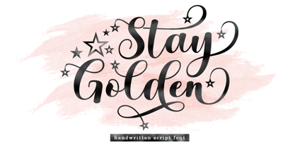 Introducing Stay Golden Script font in a smooth handwriting style and very pretty and classy. Stay Golden is perfect for branding projects, home appliance design, product packaging, use in business cards, invitation cards, etc. Simply as a stylish text overlay onto a background image or anything else that needs a touch of elegance. Thanks for checking! I really hope you enjoy it.
 - Sign Merchant JNL by Jeff Levine,
$29.00 There was a time in this country when many young people studied a trade via a correspondence course through the mail. While this method still exists, it's now more common to find students taking online classes. From an early-1960s course in sign painting comes Sign Merchant JNL, a classic brush stroke type design popularized on show cards and posters.
 - Rhomantics by BaronWNM,
$12.00 Rhomantics is a sans serif font that carries a classic style. Rhomantics font takes a simple form but still has a classic feel in its shape so it is easy to identify each character of the letter to make it easier for us to read. This font can be used in invoice designs, history book covers, branding, advertisements, business cards, etc.
 - Ciabatta by Sudtipos,
$39.00 Ciabatta is a luscious font made especially for packaging. Thanks to 5 weights, it can be used for all eventualities; powerful in headlines or as lettering, yet very legible in small texts. Its shapes are slightly narrow and based on classical italics but Ciabatta includes alternates with a double-storey ‘a’ and ‘g’ which offer a more formal appearance upright.
 - Grafiker by Hanoded,
$15.00 Grafiker means 'Graphic Designer' in German. This fat, colored, uneven font with a 1001 uses was loosely based on the work of designers Oskar Kokoschka (1886 - 1980) and Jean Carlu (1900 - 1997). The glyphs were hand-drawn with a 0.5 roller ball and colored in with Chinese ink, using a stiff brush. The result is a lively, rather unusual font.
 - Mary Read by Melli Diete,
$50.00 Mary Read is a modern handwritten Display Font, showing its fancy curves best in headlines as well as short texts. For typographic variety the typeface offers a range of features and extras. Give your texts a quite playful and handwritten note. Being chi chi is not a crime, don’t hesitate to pepper some sweetness in the midst of people’s attention.
 - Virus by Phat Phonts,
$20.00It began as a series of photographs of the rusty metal brand names on old tractors in a museum. When I scanned the photos and began to trace the letters, I found the rust and deterioration created a level of detail which gave my letters a psychotic anger which, as an art director in an advertising agency, I closely identified with. - Gorgeous Girl by Twinletter,
$12.00 Gorgeous Girl is our newest script font created with sweet and sweet hand strokes, with subtle touches and dramatic curves making this font unique. This bold calligraphy font is designed with a relaxed but elegant background, while still paying attention to the beauty of each letter, there are alternate options for lowercase letters, so that it automatically beautifies the visual appearance in your design project. besides that, this font also offers harmoniously beautiful abstract typography for your various design projects. This font is also perfect for wedding invitations, quote designs, for social media business designs, advertisements, trademarks, food and beverage promotion banners, text, posters, signatures, and any design that requires handwriting. This font is equipped with uppercase, lowercase, numbers, punctuation marks, swhases and several variations on each character including multi-language. ================================================== This font is best suited for open type friendly applications. How to get alternative glyphs from open type fonts: http://adobe.ly/1m1fn4Y PUA Character Code - Fully accessible without additional design software. we hope you enjoy this font. Feel free to send whatever message you want to convey.
 - Emynam Crew by Alit Design,
$23.00 Introducing the Emynam Crew: A Funky Retro Display Typeface Dear Design Enthusiasts, Are you ready to groove to the rhythm of creativity and nostalgia? Say hello to the Emynam Crew, the font that's bringing back the funky retro vibes of yesteryears with a modern twist. With its unique blend of style, flair, and a whopping 705 glyphs, this typeface is a must-have for anyone looking to make a statement. Key Features: Retro Vibes: Emynam Crew captures the essence of the 70s and 80s with its bold, funky letterforms. It's like a blast from the past, perfect for adding a touch of nostalgia to your designs. Ligatures and Alternatives: Dive into the world of creativity with multiple ligatures and alternative characters. Mix and match to create stunning, one-of-a-kind typographic compositions. PUA Multilingual Support: Emynam Crew is not just about style; it's about substance too. With PUA multilingual support, you can use this font to communicate in various languages, making it a versatile choice for global projects. Endless Possibilities: With 705 glyphs at your disposal, the possibilities are endless. Whether you're designing posters, album covers, branding materials, or anything else, Emynam Crew gives you the freedom to express your unique vision. Stylish Display: Make a bold statement with Emynam Crew as your headline or display font. Its eye-catching style ensures that your message won't go unnoticed. Perfect for Retro Revival: Whether you're working on a retro-themed project or just want to infuse a touch of nostalgia into your designs, Emynam Crew is your go-to choice. Easy to Use: Emynam Crew is designed with user-friendliness in mind. It's compatible with popular design software and is easy to install and use. Unleash your inner artist and let Emynam Crew transport your designs to a bygone era. Embrace the funk, the retro, and the style with this one-of-a-kind typeface. Don't miss out on this opportunity to own the Emynam Crew – a font that's all about style, character, and endless possibilities. Get ready to turn back the clock and add a touch of funky nostalgia to your next project. Order your Emynam Crew Typeface today and start designing with retro flair!
 - Jenson Classico by Linotype,
$29.99In 1458, Charles VII sent the Frenchman Nicolas Jenson to learn the craft of movable type in Mainz, the city where Gutenberg was working. Jenson was supposed to return to France with his newly learned skills, but instead he traveled to Italy, as did other itinerant printers of the time. From 1468 on, he was in Venice, where he flourished as a punchcutter, printer and publisher. He was probably the first non-German printer of movable type, and he produced about 150 editions. Though his punches have vanished, his books have not, and those produced from about 1470 until his death in 1480 have served as a source of inspiration for type designers over centuries. His Roman type is often called the first true Roman." Notable in almost all Jensonian Romans is the angled crossbar on the lowercase e, which is known as the "Venetian Oldstyle e." In the 1990s, Robert Slimbach designed his contemporary interpretation, Adobe Jenson™. It was first released by Adobe in 1996, and re-released in 2000 as a full-featured OpenType font with extended language support and many typographic refinements. A remarkable tour de force, Adobe Jenson provides flexibility for a complete range of text and display composition; it has huge character sets in specially designed optical sizes for captions, text, subheads, and display. The weight range includes light, regular, semibold, and bold. Jenson did not design an italic type to accompany his roman, so Slimbach used the italic types cut by Ludovico degli Arrighi in 1524-27 as his models for the italics in Adobe Jenson. Use this family for book and magazine composition, or for display work when the design calls for a sense of graciousness and dignity. - Varp by Kobuzan,
$25.00 Varp is a rather narrow 2-axis variable geometric typeface with slight reverse contrast inspired by utilitarian and technical design. In Slim and Tight styles, the reverse contrast is enhanced. Typeface is adjustable in width, as if by mechanical deformation of proportions, which is often found in technical and transport markings. The letterforms are based in part on the shapes of DIN fonts, with the deliberate addition of contrasting connections, sharp spurs and massive ink traps for sharpness. With the help of special spacing, selective kerning and adjusted letter width, the effect of a monospaced font is created with no obvious "holes" in the text set, while maintaining a special rhythm. In addition to the width, Varp is adjustable in tilt angle to an extreme 30 degrees and an intermediate 15 degrees in both directions. Features: – Total glyph set: 795 glyphs; – 15 styles (3 widths x 5 italics) + variable; – Support 210+ languages; – Latin Extended; – Cyrillic Basic + Bulgarian letters; – Greek. OpenType features: – Uppercase, lowercase; – Proportional, circled, tabular numerals, superiors, inferiors, fractions; – Punctuations and symbols; – Arrows; – Stylistic sets (ss01-ss04); – Ligatures; – Case-sensitive forms.
 - Rialto Piccolo dF by CAST,
$305.00 Rialto dF is a book face inspired by calligraphic tradition. Named after the famous bridge in Venice, it was conceived as a bridge between calligraphy and typography, roman and italic. It can also be thought of as an imaginary bridge between Italy and Austria, since it is the result of collaboration started in 1995 between the Austrian Lui Karner and Venetian Giovanni de Faccio. The letterforms of Rialto dF were drawn directly in digital format with a starting point deriving from humanistic letterforms memorized in the hearts, minds and the manual ability of its designers… As tradition demands, uppercase, numerals and punctuation are used in combination with italics – the same solution adopted by Francesco Griffo when he cut his first italic for the Virgil, the first of the octavo series printed and published in Venice by Aldus Manutius in 1501. Rialto dF comes in two optical weights: Piccolo, for up to 14 pt, and Grande for 16pt and above. Alternate characters and various dingbats are also provided and these are available through OpenType features developed by type designer and technician Karsten Luecke.
 - Bohemia by Linotype,
$29.99Argentinean designer Eduardo Manso created the Bohemia type family in 2003. Bohemia's cunning and elegant essence shows off refined letters that evoke the Transitional style typefaces like Baskerville, though most Baskerville-like designs tend not to be as curvaceous as Manso's! True to form, Bohemia shines in smaller text sizes, like 9 point and above, while still maintaining a unique character and spirit. Bohemia is a great alternative to better-known text faces. The critics have been raving. Bohemia came to Linotype via its fourth International Type Design Contest (ITDC) [Link] in 2003, where it received one of the three top awards. Under the name Argot, this typeface received a Certificate of Excellence in Type Design from the Type Directors Club of New York in 2004. Bohemia was also selected for inclusion in the 21st International Biennale of Graphic Design 2004 in Brno, Czech Republic, and was later named one of the most relevant works in the Bienal Letras Latinas 2004 exhibition, which traveled through Buenos Aires, San Paolo, Santiago, and Vera Cruz." - Retro Games by Hexa,
$0.80 Introducing HEXA’s second family-font, Retro Games Font. The RetroGames font is a witty reinterpretation of the fonts found in 90s 16-bit games that we enjoyed when we were young, presented as bitmap imaged fonts. It offers superior legibility and aesthetic sensibility compared to many other existing bitmap fonts. For instance, while most bitmap fonts create one stroke with 1 pixel or have various thicknesses in pixels, we have standardized it to a maximum of one stroke with 1-3 pixels, enhancing both legibility and aesthetic appeal. Since there are many similar bitmap fonts, we wanted to reinterpret it as a genre of its own. Our latest designed fonts HEXA, we noticed some shortcomings in legibility, and we aim to address those shortcomings in this bitmap font, Retro Games. Our RetroGames font, which brings back memories of our analog past, can be a valuable design element in many design works." ※ RetroGames is Latin-based and a completely crafted font that consists of 2 typefaces. Each typeface contains 195 sets of characters. This font family is in all-caps fonts. ※The font family includes 'Dropline' and 'Black.' 'Dropline' comes with a shadow effect, while 'Black' is designed without a shadow for simplicity." ※RetroGames is a monospaced fonts. So kerning is not applied.
 - Sacnoth by Intellecta Design,
$23.90 Sacnoth is a font inspired in the old knots celtic visual.