10,000 search results
(0.047 seconds)
- Caryn by Typodermic,
$11.95 Y’all, have you met Caryn? She’s a typeface that’s as friendly as a front porch conversation on a sunny day. With her short brush strokes and swooping flourishes, she’ll make your words sing with genuine warmth and charm. Caryn is like a cozy quilt or a hot apple pie, bringing a homemade touch to everything she touches. Whether you’re crafting a wedding invitation, designing a logo for your farm stand, or just writing a letter to a friend, she’ll help you express your message with a down-to-earth grace. And here’s the best part: Caryn doesn’t put on airs. She’s unassuming and approachable, like a neighbor who always has a smile and a kind word. You don’t need fancy design skills or a big budget to make Caryn work for you. She’ll fit right in with your homespun style and make you look like a pro. So if you want to add a touch of warmth and hospitality to your next project, give Caryn a try. She’s the perfect typeface to welcome your readers, customers, or loved ones with open arms. Most Latin-based European writing systems are supported, including the following languages. Afaan Oromo, Afar, Afrikaans, Albanian, Alsatian, Aromanian, Aymara, Bashkir (Latin), Basque, Belarusian (Latin), Bemba, Bikol, Bosnian, Breton, Cape Verdean, Creole, Catalan, Cebuano, Chamorro, Chavacano, Chichewa, Crimean Tatar (Latin), Croatian, Czech, Danish, Dawan, Dholuo, Dutch, English, Estonian, Faroese, Fijian, Filipino, Finnish, French, Frisian, Friulian, Gagauz (Latin), Galician, Ganda, Genoese, German, Greenlandic, Guadeloupean Creole, Haitian Creole, Hawaiian, Hiligaynon, Hungarian, Icelandic, Ilocano, Indonesian, Irish, Italian, Jamaican, Kaqchikel, Karakalpak (Latin), Kashubian, Kikongo, Kinyarwanda, Kirundi, Kurdish (Latin), Latvian, Lithuanian, Lombard, Low Saxon, Luxembourgish, Maasai, Makhuwa, Malay, Maltese, Māori, Moldovan, Montenegrin, Ndebele, Neapolitan, Norwegian, Novial, Occitan, Ossetian (Latin), Papiamento, Piedmontese, Polish, Portuguese, Quechua, Rarotongan, Romanian, Romansh, Sami, Sango, Saramaccan, Sardinian, Scottish Gaelic, Serbian (Latin), Shona, Sicilian, Silesian, Slovak, Slovenian, Somali, Sorbian, Sotho, Spanish, Swahili, Swazi, Swedish, Tagalog, Tahitian, Tetum, Tongan, Tshiluba, Tsonga, Tswana, Tumbuka, Turkish, Turkmen (Latin), Tuvaluan, Uzbek (Latin), Venetian, Vepsian, Võro, Walloon, Waray-Waray, Wayuu, Welsh, Wolof, Xhosa, Yapese, Zapotec Zulu and Zuni.
 - Letta Rillok Cyrillic by Ira Dvilyuk,
$19.00 The Letta Rillok Cyrillic font is a handwritten calligraphic signature script font paired with additional symbols font with extras. It is the font pair with will be the best option for branding, logos, wedding invitations, social media, packaging, business cards, DIY projects, social media, and many others. Letta Rillok Symbols is the font with 62 lovely hand-drawn flourishes and illustrations. Letta Rillok script Latin part contains a full set of uppercase letters and 3 full sets of lowercase letters, (standard, initial, and final forms with flourishes or teils. To make a needed form type a letter with a number such as a1, b1, c1...after that select the word and apply the Open Type Features in programs such as Adobe Illustrator, Photoshop, and others) And 53 ligatures can be used to create a handwritten calligraphy look. The Cyrillic part of the font contains uppercase letters and 3 complete sets of lowercase letters, (standard, initial, and final form. To make a needed form type a letter with a number such as a1, б1 в1... After that select the word and apply the Open Type Features in programmes such as Adobe Illustrator, Photoshop, and others) Letta Rillok Symbols is a font with over 36 hand-drawn elements, floral illustrations, and swashes and can help to make your design unique and matchless. Combine and merge swashes and illustrations to create your own designs and make borders, frames, dividers, logos, and more (just use A-Z or a-z and 0-9 keys in the included Letta Rillok Symbols font). A different symbol is assigned to each uppercase or lowercase standard character, so you do not need graphics software, just type the letter you need. Multilingual Support for 33 languages: Latin glyphs for Afrikaans, Albanian, Basque, Bosnian, Catalan, Danish, Dutch, English, Estonian, Faroese, Filipino, Finnish, French, Galician, Indonesian, Irish, Italian, Malay, Norwegian Bokmål, Portuguese, Slovenian, Spanish, Swahili, Swedish, Turkish, Welsh, Zulu. And Cyrillic glyphs support Russian, Belorussian, Bulgarian, Ukrainian, and Kazakh languages.
 - Ongunkan Kensington Runestone by Runic World Tamgacı,
$70.00 The Kensington Runestone is a rune-covered slab of brownstone that was claimed to have been discovered in central Minnesota in the United States in 1898. Olof Öhman, a Swedish immigrant, reported that he dug it out of a field in the largely rural town of Solem in Douglas County. It was then named after the nearest settlement, Kensington. The inscription claims to be a record left behind by Scandinavian explorers in the 14th century (internally dated to 1362). There has been a long-standing debate as to the stone's authenticity, but since the first scientific review in 1910, scientific consensus has classified it as a 19th-century hoax, and some critics have directly accused Öhman of fabricating it. there is community.
 - Bernhard Bold Condensed by Bitstream,
$29.99A freely drawn heading face prepared in 1912 by Lucian Bernhard for Bauer. The typeface enjoys a vogue in Europe. - Quirinus by Monotype,
$29.99Alessandro Butti designed the Quirinus font, released in 1939. Quirinus is a headline font with a strong contrast in strokes. - Yo Quiero Taquitos NF by Nick's Fonts,
$10.00The basic letterforms of this typeface were found in a lettering book, Rotalución Decorativa, published in Barcelona in the 1940s. Add a lowercase and a few flourishes suggested by a hand-painted sign seen at a neighborhood tavern on Staten Island, and you have a seriously fun face. To add even more spice, the font also contains alternate characters in the Logical Not, ASCII circumflex and tilde positions. It also contains a few alternate characters in the ASCII circumflex and tilde positions to perk things up. Both versions of the font contain characters to support all major European languages. - Prosper Rules by Nathatype,
$29.00 Prosper Rules is a distinguished serif font that exudes sophistication and refinement. With its timeless serifs and carefully crafted extended lines, this typeface brings an air of elegance to your designs. The defining feature of Prosper Rules lies in its extended lines, gracefully integrated into select letters. These extended lines add a touch of distinction and visual interest, elevating the font's overall composition. Each letter is meticulously designed to strike the perfect balance between tradition and modernity. Inspired by classic typographic elements, Prosper Rules captures the essence of timeless beauty. The serifs, with their subtle flares, provide a sense of stability and sophistication. The extended lines offer a contemporary twist, infusing the font with a touch of creativity and uniqueness. The uppercase letterforms of Prosper Rules are meticulously crafted, showcasing clean lines and well-balanced proportions. The extended lines, thoughtfully placed in specific letters, create a sense of flow and purpose. Features: Ligatures Stylistic Sets Multilingual Supports PUA Encoded Numerals and Punctuations Prosper Rules fits for headings, titles, logos, and any design project that seeks to make a refined and memorable statement. Whether you're working on editorial layouts, branding materials, invitations, or any project that demands a touch of sophistication, this font will lend a sense of timeless beauty. It is particularly well-suited for applications related to luxury, fashion, fine arts, and high-end products. Find out more ways to use this font by taking a look at the font preview. Thanks for purchasing our fonts. Hopefully, you have a great time using our font. Feel free to contact us anytime for further information or when you have trouble with the font. Thanks a lot and happy designing.
 - Cabrito Didone by insigne,
$- A graceful kid if ever you’ve seen one, Cabrito Didone joins the Cabrito family of fonts--a family designed to provide young infants with clear recognition of letter forms. The original letters were released as part of the children’s book about fonts, The Clothes Letters Wear. Now, this latest addition brings a new Didone flavor to the table. But don’t judge the book by its cover. While Didones can be stodgy in the way they deliver a sense of luxury, this stubborn goat of a Didone bucks the stodgy stereotypes with its high-contrast, carefree, flowing fun, taking a more calligraphic direction than most. Cabrito Didone joins structure and handwriting to create a flowing balance of both characteristics. It’s a unique combination of functional and friendly. Its 42 well-designed fonts give you plenty of easy-going, highly readable options to work with as you craft your design. The typeface has unique serifs that give the sense of ink pooling slightly at the points, drawn with a sharp nib. Cabrito Didone supports OpenType features and is packaged with upright obliques, alternates, ligatures, old-fashioned figures, and compact caps. Preview any and all of these features in the interactive PDF manual. The family member font also includes glyphs for 72 languages; over 600 glyphs per font await. Cabrito Didone is an excellent choice for websites as well as flyers and packaging. Like Cabrito, which is currently used by a number of visible brands, Cabrito Didone is also a great option for defining your brand. Grab a taste of the Cabrito Didone flavor--and those of the other Cabrito members: Sans, Semi and Inverto.
 - Violety Dreams by Nathatype,
$29.00 Violety Dreams is a serene and elegant serif font that will transport your designs to a realm of beauty and sophistication. With its timeless letterforms and delicate swinging strokes on select letters, this typeface evokes a sense of tranquility and grace. This serif uniqueness in its graceful swinging strokes, which adorn certain letters, adding a touch of whimsy and charm. These elegant extensions create a sense of movement and fluidity, capturing the essence of grace and elegance. Inspired by the ethereal nature of dreams and the delicate beauty of violet flowers, Violety Dreams embodies a sense of tranquility and enchantment. The serif letterforms are meticulously crafted to exude elegance and sophistication, while the swinging strokes add a unique touch of whimsicality. This font strikes a perfect balance between classic charm and imaginative flair. The letterforms are designed with precision and clarity, ensuring legibility and readability. Each letter retains its distinctive shape, while the swinging strokes create a visual interest and draw the eye. You can use it in big text sizes to be greatly legible and enjoy the available features here. Features: Stylistic Sets Multilingual Supports PUA Encoded Numerals and Punctuations Violety Dreams is well-suited for headings, titles, invitations, wedding stationery, luxury branding, editorial layouts, branding materials, and any design project that calls for an elegant and dreamy typography. Find out more ways to use this font by taking a look at the font preview. Thanks for purchasing our fonts. Hopefully, you have a great time using our font. Feel free to contact us anytime for further information or when you have trouble with the font. Thanks a lot and happy designing
 - Halogen by Positype,
$29.00 Who doesn't want or need an expansive contemporary extended sans that has a sense of style and swagger… what if it had a lowercase, small caps and various numeral options… how could you say no? This was the foundational argument I made for myself when I drew the initial alphabet on my birthday last year (something I do each year, draw a new font, kind of a fun OCD thing). I wanted to see a wide, utilitarian sans that had more to it than just a basic character set and didn't resemble standard geometric models. As I continued sketching, the letterforms were being influenced more by my 'lettering tendencies' than the normal mechanical trappings of drawing flat, wide letters. The letters have retained aspects of letters created by hand — stresses, modulation, naturally ending terminals. Truncation and quick clipping of strokes became antithetical to the letterforms I drew, so I continued this once I brought the design into the computer. I kept it precise and dependable, but made every attempt to keep a conscientiously crafted typeface and not let it devolve into a grid-based drone. As such, it works just as well looking back in time as much as it does assuming a lead role in a sci-fi movie. Halogen does deliver and opts not to take a short cut and provide an anemic offering of glyphs — a modern typeface offered today must provide more than just the basics and this one does — lowercase, smallcaps, old style numerals, tabular forms, stylistic and titling alternates, fractions, case-sensitive features, and even an alternate uppercase ordinal set is included. So go make cool print and digital things with it, now.
 - Polias Varia by Esintype,
$140.00 Polias Varia is an all-caps uniwidth variable weight typeface inspired by an ancient inscription carved on a monoblock stone in hybrid characters — between no-contrast linear sans to low-contrast flared serif. The inspiring inscription is the dedication by Alexander the Great, discovered in the Temple of Athena Polias in the ancient Ionian city of Priene. Stanley Morison mentioned this inscription in one of his lectures: “The distinctive feature of this inscription consists of a consistent thickening towards the ends of perpendiculars and horizontals.” … “We have not the right to say that the serif was invented for Alexander the Great’s inscription, only that this is its first datable appearance.” In Polias Varia, the letter proportions are almost identical to the original, but the stroke features have been reinterpreted and characterized. Serif-like nodes at the end of the strokes are subtle extensions that serve to accentuate rather than break its monoline elegance. With an analogy, they are not flowers, but like blooming buds. Polias Varia is a flared sans typeface which is closer to sans-serif forms on the spectrum between sans and serif. It’s especially light looking by design to convey rather thin and white typographic color of its original monumental look. It comes in eight weights and a variable font, scaled from Thin to Bold. It is multiplexed, so the weights do not affect text lengths. Light weights are closely based on the actual carving of the inscription. Thicker weights can be used on smaller typesettings to compensate for the weight difference of larger letters’ strokes, and to keeping the monoline appearance of the entire text block intact. This method can be used for any purpose, such as setting a hierarchy between the lines or to justify their lengths. Some of the original letterforms have been preserved and stylistic alternatives such as Ionic four-bar Sigma, dotted Theta, palm Y are provided as open type feature. Some of the other ancient forms, such as the three-bar Sigma (S), the pointed U, were also added for both the Greek and Latin scripts. Polias Varia is preferable for big type settings such as logos and headlines as a modern representation of perennial classical forms. Its a fine fit for product branding, movie posters, book covers, packaging materials, and more, which require an epic look to attracting attention with a distinctive elegance. Polias Varia can be considered for distinctiveness wherever Roman Capitals work. As a noun, Polias is one of the epithets of Athena / Minerva, and in this case referring to her role as the protector of the city of Priene. Polias (family) is one of the seven typeface designs in Esintype’s ancient scripts of Anatolia project, Tituli Anatolian series.
 - Maestro by Canada Type,
$24.95 Out of a lifelong inner struggle, Philip Bouwsma unleashes a masterpiece that reconciles classic calligraphy with type in a way never before attempted. Maestro takes its cue from the Italian chancery cursive of the early sixteenth century. By this time type ruled the publishing world, but official court documents were still presented in calligraphy, in a new formal style of the high Renaissance that was integrated with Roman letters and matched the refined order of type. The copybooks of Arrighi and others, printed from engraved wood blocks, spread the Italian cancellaresca across Europe, but the medium was too clumsy and the size too small to show what was really happening in the stroke. Arrighi and others also made metal fonts that pushed type in the direction of calligraphy, but again the medium did not support the superb artistry of these masters or sustain the vitality in their work. As the elegant sensitive moving stroke of the broad pen was reduced to a static outline, the human quality, the variety and the excitement of a living act were lost. Because the high level of skill could not be reproduced, the broad pen was largely replaced by the pointed tool. The modern italic handwriting revival is based on a simplified model and does not approach the level of this formal calligraphy with its relationship to the Roman forms. Maestro is the font that Arrighi and his colleagues would have made if they had had digital technology. Like the calligraphic system of the papal chancery on which it is modelled, it was not drawn as a single finished alphabet, but evolved from a confluence of script and Roman; the script is formalized by the Roman to stand proudly in a world of type. Maestro came together on screen over the course of several years, through many versions ranging widely in style, formality, width, slant, weight and other parameters. On one end of the spectrum, looking back to tradition it embodies the formal harmony of the Roman capitals and the minuscule which became the lower case. On the other it is a flowing script letter drawing on the spirit of later pointed pen and engravers scripts. As its original designers intended, it works with simple Roman capitals and serifs or swash capitals and baroque flourishes. The broad pen supplies weight and substance to the stroke which carries energy through tension in balanced s-curves. Above all it is meant to convey the life and motion of formal calligraphy as a worthy counterbalance to the stolid gravity of metal type. The Maestro family consists of forty fonts distributed over two weights. The OpenType version compresses the family considerably down to two fonts, regular and bold, each containing the entire character set of twenty fonts, for a total of more than 3350 characters per font. These include a wide variety of stylistic alternates, ligatures, beginning and ending letters, flourishes, borders, rules, and other extras. The Pro version also includes extended linguistic support for Latin-based scripts (Western, Central and Eastern European, Baltic, Turkish, Welsh/Celtic, Maltese) as well as Greek. For more thoughts on Maestro, its background and character sets, please read the PDF accompanying the family.
 - Roscha by Luhop Creative,
$14.00 Roscha is a fully reconsidered high contrast transitional serif, which is perfectly adapted to modern realities and requirements. When starting this project, we wanted to try to draw a modern serif with the precisely verified shapes, high contrast and detailed elaboration of each character. Roscha is perfect for use in magazines, in the fashion industry, in the branding of premium goods and services. Roscha is quite versatile and suitable for use both in headings and in text arrays. In addition, we have done manual hinting in the typeface, and now it can be used with a clear conscience in the web and applications.
 - Bookable Sans by Stiggy & Sands,
$24.00 A Sans Serif Family with a few unique relatives Our Bookable Sans Family was inspired by a lettering specimen from “Letters and Lettering” by Carlyle & Oring, but you'll find the inspiration has come a long way, baby. From its original reference of displaying a standard width and weight, to the two words showing a light narrow and a heavy wide, this friendly utilitarian display text face has grown to include three width families, with six weights from light to black each. The outliers of the family are Bookable Mondo: an uber heavyweight wide style exuding all brute power in an all-caps form, and Bookable Noir: a lightweight and narrow style with many unique alternate letterforms and ligatures that spoof film noir titling, but also goes off the rails having fun. Opentype features for the traditional families include: - Full set of Inferiors and Superiors for limitless fractions. - A small collection of f-based Ligatures. - Tabular & Proportional figure sets. - Ordinals. - Approx. 419 characters. Opentype features for Bookable Mondo include: - Full set of Inferiors and Superiors for limitless fractions. - Ordinals. - Approx. 391 characters. Opentype features for Bookable Noir include: - Full set of Inferiors and Superiors for limitless fractions. - Five Stylistic Alternate Sets. - Sixty-six unique ligatures. - Ordinals. - Approx. 701 characters.
 - Voguish by Redy Studio,
$19.00 Voguish – Sophisticated Calligraphy Are you looking for an outstanding and unique font? Do you want to add some fun and playfulness to your creations? Then this is the font that you need! Say hello to Voguish – the new, exclusive, and elegant font! Voguish is a sophisticated font ideally crafted to easily create amazing results with a minimum of fuss. Voguish is a perfectly balanced font with unique, stylish letter shapes that have been combined with a sophisticated contemporary touch. Being a perfectly multifunctional font, it is the ideal fit for new season designs. It’s perfect for all those luxurious projects or designs that you want to stand out from the crowd! Download it now and make all your dreams come true! It’s so unique and elegant in look, that it will be the talk of your town! Voguish features: A full set of upper & lowercase characters Numbers & punctuation Gorgeous ligatures A full set of alternate upper & lowercase characters Uppercase beginning swashes Lowercase ending swashes Lowercase alternates characters Multilingual symbols PUA Encoded Characters – Fully accessible without additional design software. Feel free to give me a message if you have a problem or question. Thank you so much for taking the time to look at one of our products.
 - Mister Earl by Bitstream,
$29.99Mister Earl, released by Bitstream in 1991, was designed by Jennifer Maestre. Inspiration came from a page in a ‘how-to’ book published in the 1930s. Later versions of Extra Light, Light and Bold were added by Jim Lyles, with the help of Wally Petty. Mister Earl is named in honor of Earl Biscoe, a Bitstream designer who retired in the mid-1980s because of illness. In the winter of 1994–1995, Richard Stetler accidentally left a copy of Mister Earl outside his Alaska home... In the spring, amazed to discover the unfortunate font was still just about alive, he decided to release the result to a wider public as Snow Cap. - Pleasantville JNL by Jeff Levine,
$29.00 Pleasantville JNL is a condensed slab serif font with angled corners emulating a popular style of lettering most prevalent in the 1920s. Modeled from Cornfield JNL (which in turn was based on a vintage popcorn box's logo), the letters were given a more standardized treatment in form and balance.
 - LU LU by Design by Pascal,
$20.00 A mono-weight, bifurcated serif typeface in all caps. Based off of an old classic French biscuit logo. This distinctive vintage display typeface can also evoke edgier sentiments when set in a moodier context, as well as making for a playful option when set in a soft colour palette.
 - Gerush by ZetDesign,
$15.00 Gerush is a font in the form of a fingerprint. This font is neatly crafted to present a formal yet memorable and unique feel. very suitable for brand identity and other uses. This font is made in a regular and light style with an italic style in each.
 - KG Summer Storm by Kimberly Geswein,
$5.00 An all-caps title font in a whimsical style. This font comes in 2 styles- a rough edged marker version and a smooth-edged clean version.
 - 70toxina by FSdesign-Salmina,
$39.00 70toxina. 70s & 80s combined. Both Seventies and Eighties celebrate their comeback in form of a revival, combined in a font. Let’s have a party with 70toxina!
 - Por Siempre Gótica - Personal use only

- Horror - Unknown license

- Damaged - Unknown license

- Movie Star - Unknown license

- Frequency Mod - Unknown license

- SquircleCirquare - Unknown license

- Victim - Unknown license

- Webcomic by Gassstype,
$22.00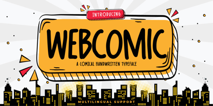 Webcomic - Comical Handwritten Typeface Font that will make your designs look modern, unique and fun. It’s perfect for labels, quotes, posters, DIY projects, branding, packaging, greeting cards, websites, photos, photography overlays, signs, window art, scrapbooking, tags and so much more!
 - Sweet Purple by Almarkha Type,
$29.00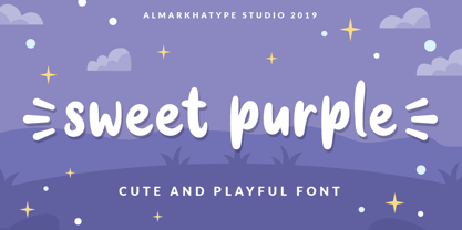 Sweet Purple – fun font that will make your design looks modern, unique and fun. Perfect for labels, quotes, posters, DIY projects, branding, packaging, greeting cards, websites, photos, photography, signs, window art, scrap booking, tags and so much more! Thank You
 - Healthiest by Gassstype,
$25.00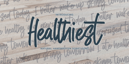 Healthiest - Natural Handwritten Script Font that will make your designs look modern, unique and fun. It’s perfect for labels, quotes, posters, DIY projects, branding, packaging, greeting cards, websites, photos, photography overlays, signs, window art, scrapbooking, tags and so much more!
 - Weekend Date JNL by Jeff Levine,
$29.00 Sheet music from 1910 with another one of those ridiculous thirteen word titles (“I Love My Steady but I’m Crazy for My “Once-in-a-While’”) had the lengthy verbiage hand lettered in a bold serif typeface with slightly spurred serifs. This has been recreated in a digital typeface with a much shorter name: Weekend Date JNL, which is available in both regular and oblique versions.
 - FeggoliteMono by Ingrimayne Type,
$6.95 FeggoliteMono is a decorative, monospaced typeface family with a small x-height and long descenders. Two styles (plain and bold but renamed in 2020 as light and regular) were created in 1994 and revised in 2010. In 2020 a bolder bold was added along with italics versions for each of the three weights. The design was an attempt to create a decorative typewriter font.
 - VLNL TpLlum by VetteLetters,
$35.00 TpLlum is a typeface designed by TwoPoints for a festival in Barcelona called ‘Montjuïc de Nit’. Llum means light in Catalan. In the Montjuïc de Nit project the font was used in white over a dark grey background, letting the light of a backlit poster shine through. For this purpose the typeface had to be very bright, which was made possible by its heavy cut.
 - Point Panther by Sarid Ezra,
$13.00 Introducing, A NEW POWERFUL BOLD FONTS WITH ALTERNATES, Point Panther! Point Panther is a headline font with super bold style that contains up to 6 Alternates each characters! You can make a unique branding with this fonts. this powerful bold fonts also included italic and outline style! This fonts suitable to use for poster, branding, merchandise, and any street art style! Also support multilingual. What will you get: Point Panther Regular (Regular, Italic ) Point Panther Bold (Bold, Bold Italic) Point Panther Outline Regular (Regular, Italic ) Point Panther Outline Bold (Bold, Bold Italic) How to access the alternates! If you use PS/AI you can see the tutorial in this : https://helpx.adobe.com/illustrator/using/special-characters.html You can use the PUA for software design that not support Opentype. For another questions, please send a mail to saridezra@gmail.com. Thank You!
 - TT Lakes Neue by TypeType,
$39.00 Introducing TT Lakes Neue in version 2.0! Please note that the TT Lakes font has been removed from platforms, but you can still order it by sending a request to the studio's commercial department: commercial@typetype.org We have released a continuation of the geometric sans serif inspired by Finnish functionalism. The new version provides more opportunities, because we not only increased the character set and improved the font technically, but also reworked its visual character. What changed? Font character. TT Lakes Neue 2.0 has become calmer, as we have removed the display details in the characters of the main set, making the font more versatile. New stylistic sets were created, thanks to which the nature of the font can be controlled, making it more expressive. Changed the forms of the characters "Кк", "ЖЖ", "Дд", "Лл", lowercase "b" and alternative "g". Added alternative forms for all types of the number "1", for the characters "Mm", "DD", "Ll". Added technological character sets, with which the font looks stylish and expressive. You may notice that in these sets, the forms of lowercase characters with arches (r, m, n) are changed, and there are gaps in the places of infusions and connections of all characters. Scope of application. The scope of TT Lakes Neue 2.0 have become even more diverse, because the sans serif has become more neutral in character and more functional. TT Lakes Neue 2.0 is the perfect font for the gaming industry. Suitable for game interfaces of different genres. Technological sets can be used in architectural projects, in the headlines of posters and magazines, on outdoor signs. The font is suitable for logo design, looks great in branding. Character set and technical characteristics. We have significantly improved the set of the font, increasing the number of characters from 736 to 921. The font has become more functional due to the updated technical stuffing and new features, of which there are now 36 instead of 24. Added characters of extended Latin, fractions, arrows. Created new kerning and hinting. Updated variable font. Added new OpenType features. The TT Lakes Neue font has 5 subfamilies: Compressed, Condensed, Regular, Extended, Expanded. In total, there are 91 styles in the font: 9 upright and 9 slanted in each subfamily and 1 variable font. Each style has 921 characters and 36 OpenType features.
 - Portada by TypeTogether,
$35.00 For everyone wishing for a modern serif that’s as clear and readable as a sans in restrictive digital environments, meet Portada by Veronika Burian and José Scaglione. Sans serifs are commonly used on small screens to save space and carry a modern tone. Serifs may appear fickle and unsteady, pixel grids change from one product to another, and space is at a premium. Portada now provides a serif option for these restrictive digital environments, putting that old trope to rest. The screen has met its serif match. Portada was created from and for the digital world — from e-ink or harsh grids to Retina capability — making it one of the few serifs of its kind. Portada’s text and titling styles were engineered for superlative performance, making great use of sturdy serifs, wide proportions, ample x-height, clear interior negative space, and its subservient personality. After all, words always take priority in text. It’s not all business, though. Portada’s italics contain an artefact of calligraphy in which the directionality of the instrokes and the returning curves of the outstrokes give the family a little unexpected brio. Yet even the terminals are stopped short of flourished self-absorption to retain their digital clarity. When printed these details are downright comforting. Portada’s titling styles enact slight changes while reducing the individual width of each character and keeping the internal space clear. Titling italics have increased expressiveness across a few characters rather than maxing out the personality in each individual glyph. Digital magazines, newspapers, your favourite novel, and all forms of continuous screen reading benefit from Portada’s features. This family can also cover many of the needs developers have: user interface, showing data intensive apps on screen, even one-word directives and dialogs. And, as a free download, an exhaustive set of dark and light icons is included to maintain Portada’s consistent presence, whether as a word or an image. The complete Portada family (eight text styles, ten titling styles, and one icon set) is designed for extensive, clear screen use — a rare serif on equal footing with a sans.
 - Alabaster Antique FJ by Frncojonastype,
$39.00 fj Alabaster Antique™ is a hybrid typefamily with a 10 styles inspired of the develop and exploration of “serif” since the first half in XIX century, envolves a special influence of the slab humanist typefaces, —with a calligraphy flavor in his Italic— with the goal to generate a contrast in to texts sheets. Has a three display versions based in the universe of “woodtypes” to deliver a “unity” in all typeset, like his versions fj Alabaster Antique™ Display, Engraved & Shaded. Include Small Caps, Swashes, Modern and OldStyles figures to decimal notation that envolve to fj Alabaster Antique™ in a ideal typeface for first and second lecture in the most of the visual communication pieces. • To exclusive licenses and to follow the develop of this project please visit frncojonas.com Learn about upcoming releases, work in progress and get to know us better! WB: frncojonas.com BE: beh.net/frncojonas TW: @frncojonas ING: @frnco.jonas
 - Nada Fraktur by Johan Elmehag,
$19.00 Nada Fraktur is a modern geometrical blackletter made to serve your hip intentions. Think hip-hop album sleeves, your local t-shirt print shop, and Tumblr-boy action. The goal with this typeface is to blend medieval aesthetic with sharp modern cuts. You could say that the font is sort of monospaced, but it is not. The typeface includes an extended character set to support Central and Eastern European as well as Western European Languages.
 - Vulnerable by Gian Studio,
$12.00 Vulnerable is an elegant script typeface inspired by a vintage type specimen I found some time ago at an art fair. Thin to thick contrasting lines and elegant curves make Beginta the perfect font for this type of logo and display purposes. Hope you enjoy it Feel free to contact me if you have any questions or concerns you may have and I will get back to you as soon as I can.


