10,000 search results
(0.044 seconds)
- Fluire by Lián Types,
$37.00 MAS AMOR POR FAVOR (1) (more love, please) Fluire means -to flow- in Italian and that’s what this font is all about. The story began when a friend of mine asked for a tattoo with the word -Fluir- (to flow in Spanish). She didn't want a tattoo full of swashes and swirls, like I'm used to doing, but something more fluent, soft and minimal. My very first attempts were more related to copperplate calligraphy but I wasn't even close: I discovered that I needed to forget a little bit about the classic contrast and speed of the engrosser's nib and started playing with a tiny flat metal nib. Letters started to flow, and I immediately thought of turning them into a font. Inspired by the tattoo I created and by other tattoos I saw, I started the journey of what would be a very fun process. The result is a very cute, almost monoline font with a wide range of uses. USES If not used for a tattoo (my first ‘target’), the font delivers amazing results in combination with Fluire Caps: These two need each other, they go together, they talk. I designed Fluire Caps Down and Fluire Caps Up so it’s easier to manage their colors. Also there’s Fluire Caps Down Lines, which has a decorative thin line to add yet another dimension. Use the fonts in magazines, book covers, posters, greeting cards, weddings, lettered walls, storefronts! TIPS Since the font is Open-Type programmed, I strongly recommend using it in applications that support that feature. Also, the font looks way better when -contextual alternates- are activated, but it’s your choice :) Try Fluire, and keep flowing. NOTES (1) The phrase alludes to maybe the most tattooed phrase in Latin America.
 - Areplos by Storm Type Foundry,
$53.00To design a text typeface "at the top with, at the bottom without" serifs was an idea which crossed my mind at the end of the sixties. I started from the fact that what one reads in the Latin alphabet is mainly the upper half of the letters, where good distinguishableness of the individual signs, and therefore, also good legibility, is aided by serifs. The first tests of the design, by which I checked up whether the basic principle could be used also for the then current technology of setting - for double-sign matrices -, were carried out in 1970. During the first half of the seventies I created first the basic design, then also the slanted Roman and the medium types. These drawings were not very successful. My greatest concern during this initial phase was the upper case A. I had to design it in such a way that the basic principle should be adhered to and the new alphabet, at the same time, should not look too complicated. The necessary prerequisite for a design of a new alphabet for double-sign matrices, i.e. to draw each letter of all the three fonts to the same width, did not agree with this typeface. What came to the greatest harm were the two styles used for emphasis: the italics even more than the medium type. That is why I fundamentally remodelled the basic design in 1980. In the course of this work I tried to forget about the previous technological limitations and to respect only the requirements then placed on typefaces intended for photosetting. As a matter of fact, this was not very difficult; this typeface was from the very beginning conceived in such a way as to have a large x-height of lower-case letters and upper serifs that could be joined without any problems in condensed setting. I gave much more thought to the proportional relations of the individual letters, the continuity of their outer and inner silhouettes, than to the requirements of their production. The greatest number of problems arose in the colour balancing of the individual signs, as it was necessary to achieve that the upper half of each letter should have a visual counterbalance in its lower, simpler half. Specifically, this meant to find the correct shape and degree of thickening of the lower parts of the letters. These had to counterbalance the upper parts of the letters emphasized by serifs, yet they should not look too romantic or decorative, for otherwise the typeface might lose its sober character. Also the shape, length and thickness of the upper serifs had to be resolved differently than in the previous design. In the seventies and at the beginning of the eighties a typeface conceived in this way, let alone one intended for setting of common texts in magazines and books, was to all intents and purposes an experiment with an uncertain end. At this time, before typographic postmodernism, it was not the custom to abandon in such typefaces the clear-cut formal categories, let alone to attempt to combine the serif and sans serif principles in a single design. I had already designed the basic, starting, alphabets of lower case and upper case letters with the intention to derive further styles from them, differing in colour and proportions. These fonts were not to serve merely for emphasis in the context of the basic design, but were to function, especially the bold versions, also as independent display alphabets. At this stage of my work it was, for a change, the upper case L that presented the greatest problem. Its lower left part had to counterbalance the symmetrical two-sided serif in the upper half of the letter. The ITC Company submitted this design to text tests, which, in their view, were successful. The director of this company Aaron Burns then invited me to add further styles, in order to create an entire, extensive typeface family. At that time, without the possibility to use a computer and given my other considerable workload, this was a task I could not manage. I tried to come back to this, by then already very large project, several times, but every time some other, at the moment very urgent, work diverted me from it. At the beginning of the nineties several alphabets appeared which were based on the same principle. It seemed to me that to continue working on my semi-finished designs was pointless. They were, therefore, abandoned until the spring of 2005, when František Štorm digitalized the basic design. František gave the typeface the working title Areplos and this name stuck. Then he made me add small capitals and the entire bold type, inducing me at the same time to consider what to do with the italics in order that they might be at least a little italic in character, and not merely slanted Roman alphabets, as was my original intention. In the course of the subsequent summer holidays, when the weather was bad, we met in his little cottage in South Bohemia, between two ponds, and resuscitated this more than twenty-five-years-old typeface. It was like this: We were drinking good tea, František worked on the computer, added accents and some remaining signs, inclined and interpolated, while I was looking over his shoulder. There is hardly any typeface that originated in a more harmonious setting. Solpera, summer 2005 I first encountered this typeface at the exhibition of Contemporary Czech Type Design in 1982. It was there, in the Portheim Summer Palace in Prague, that I, at the age of sixteen, decided to become a typographer. Having no knowledge about the technologies, the rules of construction of an alphabet or about cultural connections, I perceived Jan Solpera's typeface as the acme of excellence. Now, many years after, replete with experience of revitalization of typefaces of both living and deceased Czech type designers, I am able to compare their differing approaches. Jan Solpera put up a fight against the digital technology and exerted creative pressure to counteract my rather loose approach. Jan prepared dozens of fresh pencil drawings on thin sketching paper in which he elaborated in detail all the style-creating elements of the alphabet. I can say with full responsibility that I have never worked on anything as meticulous as the design of the Areplos typeface. I did not invent this name; it is the name of Jan Solpera's miniature publishing house, in which he issued for example an enchanting series of memoirs of a certain shopkeeper of Jindrichuv Hradec. The idea that the publishing house and the typeface might have the same name crossed my mind instinctively as a symbol of the original designation of Areplos - to serve for text setting. What you can see here originated in Trebon and in a cottage outside the village of Domanín - I even wanted to rename my firm to The Trebon Type Foundry. When mists enfold the pond and gloom pervades one's soul, the so-called typographic weather sets in - the time to sit, peer at the monitor and click the mouse, as also our students who were present would attest. Areplos is reminiscent of the essential inspirational period of a whole generation of Czech type designers - of the seventies and eighties, which were, however, at the same time the incubation period of my generation. I believe that this typeface will be received favourably, for it represents the better aspect of the eighties. Today, at the time when the infection by ITC typefaces has not been quite cured yet, it does absolutely no harm to remind ourselves of the high quality and timeless typefaces designed then in this country.In technical terms, this family consists of two times four OpenType designs, with five types of figures, ligatures and small capitals as well as an extensive assortment of both eastern and western diacritics. I can see as a basic text typeface of smaller periodicals and informative job-prints, a typeface usable for posters and programmes of various events, but also for corporate identity. Štorm, summer 2005 - Touch Me by Latinotype,
$69.00 Touch Me is a Script hand-drawn style typeface—designed by Coto Mendoza—resulting from polyrhythmic exploration, sign deconstruction and altered calligraphic contrast plays with watercolour brush. Coto has been using these experimental calligraphy techniques when creating the catchwords for Macarons, the Boho Family, Bikini Season Script and Matcha Script and so forth. Touch Me was inspired by a character in a story written by Coto while attending a literary workshop with Ina Groovie in Santiago de Chile. The character is a tribal girl who lives on an island in the Caribbean. She is heir of ancestral knowledge and possesses wild beauty, very passionate and sensual: intense, strong and free. These features are reflected in the polyrhythm of the typeface's curves: an irregular baseline, variable x-height, different lengths of initial and terminal strokes (that sometimes expand and sometimes shrink) and amount of brush pressure that generates changes in contrast within the characters. This way, when composing, signs with stroke contrast randomly alternate with monolinear ones and with signs of altered contrast, thanks to the typeface's OpenType programming. The family, with more than 3,000 glyphs, provides a number of alternative characters, swashes, ligatures, initial and terminal forms, in short, a vast ocean of choices! Touch Me is a spontaneous typeface with a fresh and unique personality. It is the perfect choice for short text in both print and digital formats. The family comes with a Script Regular version and a seductive Script Drop that you will enjoy a lot! The Extras set includes some catchwords, dingbats and ornaments that allows for endless composition options. The family also comes with a Caps version —designed by Luciano Vergara—in 2 styles: a funny and big-headed condensed Sans Grotesk display of inverted vertical proportion plus a Grotesk, neutral and slightly expressive Petite. Both versions, available in 6 weights, have been especially designed to create hierarchies when composing. This allows for balance between strokes of different weight when it comes to the Sans and Script fonts. Come and dare yourself! Touch Me! Thanks Alisa for sharing your amazing and beautiful picture with us.
 - Eleganto Sans by Ardyanatypes,
$10.00 A Fashionable Modern Sans Serif with special alternative letters and multilingual support for elegant, upscale, chic, and classy branding designs Look at that curve shape as a sexy hip and legs walk out! This character set makes your designs more brave, eccentric, and fascinating Comes out with 6 weight as your wish for any needs. y es tan perfecto! Superfit with your design moods as beauty care, boutique, fashion sale promotion, villas, restaurants, and much more where your design style goes by Of course, the ligatures will make it all double perfects, be ready! this is the time to have all that ELEGANTO style nos vemos, mi amor A guide to accessing all alternatives can be read at: http://adobe.ly/1m1fn4Y Features: A – Z Character Set a – z Characters set Numerals & Punctuations (OpenType Standard) Multilingual Thank you and have a nice day
 - Cadmium by AVP,
$- Cadmium has a comprehensive latin character set and many Opentype features to enhance text, including small capitals, case-sensitive forms, superscript and subscript. Plenty of numeral variants include old-style figures, lining figures and fractions. Default numerals are proportionally spaced. Alternative styles for a handful of key characters provide some useful variations where stylistic sets can be implemented. The fonts are presented as four width-based sub-families: Expanded, Normal, Condensed and Compressed. Each width has a matching range of six weights and italics (obliques). Regular and Bold weights are style-linked, together with their respective oblique forms. Each width differs in its basic construction but all fonts share the same vertical metrics and may be used in combination with each other. Letter spacing is optimised for text sizes but is tolerant of significant tracking changes. Cadmium is good for signage, publicity and packaging, screen credits and titling, general print and publication, as well as web and screen applications.
 - Hello Master by Alpha Bento,
$12.00 Hello Master Script Font DUO This type is a new modern script font with an irregular base line. Trendy and feminine style. Hello Master Script Font DUO looks beautiful in wedding invitations, thank you cards, quotes, greeting cards, logos, business cards, and more. Perfect for use in ink or watercolors. Including beginning and end letters, alternatives and support for many languages. To enable the OpenType Stylistic alternative, you need a program that supports OpenType features such as Adobe Illustrator CS, Adobe Indesign & CorelDraw X6-X7, Microsoft Word 2010 or newer versions. There are several additional ways to access alternatives / swashes, using Character Maps (Windows), Nexus Fonts (Windows), Font Books (Mac) or software programs such as PopChar (for Windows and Mac). How to access all alternative characters: - http://youtu.be/iptSFA7feQ0 - https://www.youtube.com/watch?v=Go9vacoYmBw Need help or have a question, let me know I am happy to help :) Thank you & Congratulations on Design! Best Regards, Alpha Bento
 - Dancin' Pixel by LomoHiber,
$19.00 Why is this typeface 'Dancin'? Because It consists of 3 styles each represents one frame of animation. And you can easily create a nice pixel typography animation using Dancin' Pixel. Animation preview: https://www.behance.net/gallery/85743031/Dancin-Pixel-animated-typeface How to make the animation and add a sharp corner stroke in Photoshop: https://youtu.be/ZbVFzvXwqkw If you are not interested in making animation, you can also use Dancin' Pixel as a regular font. I combined hand-drawn bold letters with pixel style, and it perfectly fits for stylish pixel game headers, prints, posters, websites, and anything connected with pixel art. The Frame Three is great for glitched pixel designs, it has distorted shapes. Dancin' Pixel Features: Pixelated letterforms 3 Styles each representing one frame of animation 3rd and 2nd frame may be used as glitched pixel typeface Wide language support (Western European, Central European South Eastern European) If you have some issues, questions, please let me know: lhfonts@gmail.com Hope you'll enjoy using Dancin' Pixel!
 - Ancient Astronaut by Comicraft,
$19.00 Are you in search of Ancient Astronauts? Extraterrestrial beings who came from the 12th planet to influence human cultures, technologies and religions? They're here! They visited our Earth prehistorically and they didn't just make contact with humans -- they gave birth to our entire race! Some believe they are a secret group of reptiloids who still control humanity! Their agents live amongst us disguised as George W. Bush, Queen Elizabeth II, Kris Kristofferson and Lady Gaga. It's true, we read it in Weekly World News. These ancient aliens established divine status over primitive men and compelled them to build Stonehenge, Pumapunku, the Moai of Easter Island, the Great Pyramid of Giza, and the ancient Baghdad electric batteries. After all, if you're stuck on Earth, you may as well have some big heads to look at and a source of power to jump start your flying saucer. And a font. Features: Three fonts (Regular, Bold & Alien) with alternate characters.
 - Hello Georgia Script by Bosstypestudio,
$14.00 Hello Georgia Script Font Duo + Extras is a new modern script font with an irregular base line. Trendy and feminine style. Hello Georgia Script looks beautiful in wedding invitations, thank you cards, quotes, greeting cards, logos, business cards, and more. Perfect for use in ink or watercolours. Including beginning and end letters, alternatives and support for many languages. To enable the OpenType Stylistic alternative, you need a program that supports OpenType features such as Adobe Illustrator CS, Adobe Indesign & CorelDraw X6-X7, Microsoft Word 2010 or newer versions. There are several additional ways to access alternatives / swashes, using Character Maps (Windows), Nexus Fonts (Windows), Font Books (Mac) or software programs such as PopChar (for Windows and Mac). How to access all alternative characters: https: //www.youtube.com/watch? v = Go9vacoYmBwhttps: //www.youtube.com/watch? v = XzwjMkbB-wQhttps: //www.yo ... need help or have a question, let me know I am happy to help :) Thank you & Congratulations on Design!
 - Basic Commercial by Linotype,
$57.99 Basic Commercial is a family of fonts based on historical designs from the hot metal type era. First appearing around 1900, these designs were created by type designers whose names have not been recorded, but whose skills cannot be overlooked. These typefaces were popular among groups and movements as diverse as the Bauhaus, Dadaism, and the masters of Swiss/International-Style typography. They influenced a variety of later grotesque fonts, such as Helvetica and Univers. Basic Commercial was distributed for many years in the United States under the name Standard Series. The typeface worked its way into many aspects of daily life and culture; for instance, it became the face chosen for use in the New York City subway system’s signage. The Basic Commercial family members have a clear and objective design. Their forms exhibit almost nothing unusual, but remain both lively and legible nonetheless. Perhaps for this reason, Basic Commercial’s design has been popular with graphic designers for decades.
 - Dez Now Sans by Dezcom,
$28.00 Dez Now Sans is a humanistic typeface family that was begun in 2005 by Chris Lozos of Dezcom. Since then, it has been nurtured, revised, and expanded to include 12 weights in both upright roman and true italics totaling 24 variations. This allows the user to choose the weights which best work for type-size, output device, and reproduction process. There is often a difference of opinion on what the best weight to use for normal text when setting type. The truth is, there is more than one answer. When you consider the size, weight, leading and set width—along with paper and ink specifications, you may find the need for several. The subject matter of the text with the specifics of the target audience, also increase the demand for expanding choices. Dez Now Sans was designed with several potential text weights to address any circumstance. Dez Now Sans gives you a full and varied toolbox of fonts to choose from.
 - Valiety by Din Studio,
$25.00 Valiety is a serif font family to better charm your designing experiences. It consists of eight different levels to add elegant, modern touches to your designs. Valiety has a continuity aspect produced from each small stroke in order to help the eyes smoothly move from one letter to another. Besides, the thickness differences are unnoticeable so that it leaves stable, legible impressions. With such flexibility, you can use it in either bigger- or smaller-sized texts. Include 8 different weight fonts : Valiety Hairline Valiety Thin Valiety Extra Light Valiety Light Valiety Regular Valiety Medium Valiety Semi Bold Valiety Bold Features: Multilingual Supports PUA Encoded Numerals and Punctuation Valiety is best for any design projects, such as posters, banners, logos, book covers, invitations, quotes, headings, printed products, merchandise, social media, etc. Find out more ways to use this font by taking a look at the font preview. Thank you for purchasing our font and happy designing.
 - Writable Story by Din Studio,
$29.00 Have you ever dreamed of belonging to an eye-catching design happily enjoyed by customers? Well, it is time to make your dream come true. Writable Story is a modern, handmade, aesthetic calligraphy font to fascinate your customers and increase your brandings. It is more than just a handwriting because each stroke expresses luxury and beauty. In addition to being visually esthetic, Writable Story is arranged to be eligible either in its bigger-sized or smaller-sized texts. Features: Ligatures Stylistic Set PUA Encoded Numerals and Punctuation Use Writable Story for various designs, such as posters, banners, logos, book covers, headings, printed products, merchandise, social media, and more. Find out more ways to use this font by taking a look at the font preview. Enjoy your experience with this font and feel free to contact us for further product information or trouble complaints. Thank you and wish you good luck with your designs.
 - Melon Script by Eurotypo,
$90.00 The melon (Cucumis melo) is an herbaceous plant monoecious trailing stems. It is known for its fruit, a berry summer season with a high water content and sweet taste. The Melon font, like the fruit in which has been inspired, is characterized by its organic shapes “soft” and heavy weight. Carefully traced and drawn by hand, offers the possibility to use linked or unlinked characters, and any combination of them, because the kerning pairs have been specifically regulated. Melon Script fonts are presented as family of four widths: Condensed, Regular, Expanded and Ultra-expanded. Each of them contains 623 glyphs, a full set of stylistic alternates, swashes, ligatures, ending letters, underlines and all diacritic signs support for Central European languages. We strongly recommend these fonts for use in packaging, web sites, advertising, magazines and logotypes. You may use these fonts when you must to generate visual impact with friendly seductive atmosphere and legibility.
 - Manzello by Tour De Force,
$35.00 To start with one personal fact: I really like to listen Rahsaan Roland Kirk. He was a multi-instrumentalist, real grandmaster and unique jazz virtuoso. The way he improvised and walked through variety of different music influences are admiring. One of things he liked is to modify instruments, so he modified soprano saxophone and got an instrument called manzello. When I was looking for good name for this typeface, it came on my mind that Manzello could be the perfect one. It has the symbolic background from the instrument and theoretically in my head, it's imagined as typeface that rely on stable classic examples, but graphically designed and modified to match modern standards. Manzello contains a dose of characteristics of display typefaces with terminals that aren't perfectly rounded, high contrast between stems and good balanced Italics with elements of fine calligraphy. It's a small font family, something what I was always looking for to have as first text solution in my web and graphic projects.
 - Hello Gorgeous Font Trio by Zane Studio,
$15.00 Gorgeous Script Font Trio is a new modern script font with an irregular base line. Trendy and feminine style. Gorgeous Script looks beautiful in wedding invitations, thank you cards, quotes, greeting cards, logos, business cards, and more. Perfect for use in ink or watercolors. Including beginning and end letters, alternatives and support for many languages. Files included: Gorgeous Script.OTF Gorgeous Script.TTF Gorgeous SANS.OTF Gorgeous SANS.TTF Gorgeous SERIF.OTF Gorgeous SERIF.TTF To enable the OpenType Stylistic alternative, you need a program that supports OpenType features such as Adobe Illustrator CS, Adobe Indesign & CorelDraw X6-X7, Microsoft Word 2010 or newer versions. There are several additional ways to access alternatives / swashes, using Character Maps (Windows), Nexus Fonts (Windows), Font Books (Mac) or software programs such as PopChar (for Windows and Mac). How to access all alternative characters: https: //www.youtube.com/watch? v = Go9vacoYmBwhttps: //www.youtube.com/watch? v = XzwjMkbB-wQhttps: //www.yo ... need help or have a question, let me know I am happy to help :) Thank you & Congratulations on Design!
 - Epines by Taznix Creative,
$17.00 Epines is a modern handwritten font, carefully handcrafted to become a true favorite. Its casual charm makes it appear wonderfully down-to-earth, readable and, ultimately, incredibly versatile. Epines will look outstanding in any context, whether it’s being used on busy backgrounds or as a standalone headline! Epines is perfect for branding projects, logo, wedding designs, social media posts, advertisements, product packaging, product designs, label, photography, watermark, invitation, stationery and any projects that need handwriting taste. What's Included : Bonus Swash Ai & Eps Standard glyphs Ligature Works on PC & Mac Simple installations Accessible in the Adobe Illustrator, Adobe Photoshop, Adobe InDesign, even work on Microsoft Word. PUA Encoded Characters - Fully accessible without additional design software. Fonts include multilingual support for; ä ö ü Ä Ö Ü ß ¿ ¡ Hope you enjoy with our font! Taznix
 - Medieval Sorcerer Ornamental - Unknown license

- DECRYPT 01 by Type Innovations,
$39.00 Say hello to Decrypt—a geometric typeface that features highly stylized capitals with sharp corners, circular forms and generous proportions. Specifically created for visual impact—use Decrypt when you want your words to stand out from the rest of the crowd. The concept is modern, futuristic and non-traditional. Perfect for display text, logos and headings. The development of Decrypt started in 1997, inspired by Alex Kaczun’s best selling grotesque font family called Contax Pro. Decrypt is specifically introduced here as a bold weight, but Alex plans to expand the design to include many weights, styles and alternative design treatments. Stay tuned! If you like Decrypt—check out all of Type Innovations fonts here.
 - Persepolis by Si47ash Fonts,
$19.00 Childish but heavyweight! A rounded bubbly heavy font that was designed for texts related to kids and children. With its melted and soft forms, it brings delight and makes your letters to be pleasant to be read. Apadana font support Persian, Arabic and also Basic Latin. A joyful choice for all the designers and creatives. Shahab Siavash, the designer has done more than 30 fonts and got featured on Behance, Microsoft, McGill University research website, Hackernoon, Fontself, FontsInUse,... Astaneh text and headline font which is one of his latest designs, already got professional typographers, lay-out and book designers' attention as well as some of the most recognizable publications in Arabic/Persian communities.
 - Nighty by Ahmad Jamaludin,
$17.00 Inspired by vintage magazine around 70s, so this font born for all of you, Nighty! Nighty is a display typeface that says we’re here to nostalgia! It brings back the 70s vibes with groovy, retro and unique typeface This font fits perfectly into those nostalgic moodboards and vintage logos. It come with 95 unique alternate and ligature that to give your any project to a unique vintage look, What's you get? Has 95 alternate and ligatures Unique letterforms Multilingual Works on PC & Mac Simple Installations Accessible in the Adobe Illustrator, Adobe Photoshop, Microsoft Word even work on Canva PUA Encoded Characters Fully accessible without additional design software. Drop any message if you any question, thanks Dharmas Studio
 - Cherritt by Greater Albion Typefounders,
$9.95 We think of Cherritt as a 'bullnosed' serif face, because of its rounded off serifs. What that phrase may not convey is the friendly, approachable nature of this large family of faces. The design was originally inspired by traditional draftsmens' hand-drawn serif lettering, but has been given a precise geometric flavor that suits it for work owing its inspiration to any era, from Victorian times through to the purely modern. They are ideal for headings and poster work, but also for setting small volumes of text. Four weights are included in the family, as well as wide, expanded and condensed forms, true small capitals and openface forms. All family members embody extensive OpenType features.
 - P22 FLW Midway by P22 Type Foundry,
$29.95 This font set is based on Frank Lloyd Wright's hand-lettering found on the Chicago Midway Gardens working drawings from 1913. This type of architectural lettering is a bit more casual than standard lettering found on most blueprints. It evokes the personality of Frank Lloyd Wright and complements the other fonts in the P22 FLW font series. Midway One and Midway Two can be used interchangeably to give a more naturalistic feeling of hand lettering. Midway Ornaments features over 100 decorative border elements that can be combined is many ways for surprising and effective decorative motifs. Midway One and Midway Two have been remastered and now contain over 400 characters including support for Western and Central European languages.
 - Sideroad by Melvastype,
$22.00 Sideroad is an intensive hand-drawn brush script font. It comes in two versions, Textured and Smooth. Textured version has this rough effect that comes when letters are drawn with pointed-brush on rugged surface. The Smooth version is, like the name says, smooth as silk with polished edges and properly drawn forms. Sideroad includes two sets of lower case letters to give variation and more imperfect hand-drawn effect. You can cycle these two sets by enabling Contextual Alternates OpenType feature. It also has set of lower cases without connector strokes. And a set of lower cases with end swashes. On top of these there are also a few underlines to give that final punch to your design.
 - Chieezy Burger by Arterfak Project,
$15.00 Say hello to Chieezy Burger! Yes, this font is tasty, created especially for food branding and food advertising. Inspired by visualization of tasty burgers, crunchy chips, and cheerful emotion of the people who enjoy foods, drawn become the playful alphabet, with natural strokes. Chieezy Burger is available in 4 styles: Regular, Distressed, Outline, and Shadow. You can make a playful typographic design without losing a delicious impression from the whole design. You can use the font individually or combine them as well. This layered font is also complete with OpenType features and multilingual support. PUA Encoded, so you can access the special characters without special application. Thank you for visiting, stay healthy!
 - Material by Rocket Type,
$20.00 Who made this mess! Material is quintessential paint brush font fun. A little bit grunge, little bit 80s chic. Material is rated R for adult content and violence, violence to the american alphabet. This font soars just like KITT in Knight Rider. Part virtuoso part New Kid On The Block. Feels like you’re painting those letters on yr’ own self! Anytime you need to make a little mess and really express yourself choose Material. This font will really give your designs some distressed authenticity. Material is great for billboards, t shirts or video productions. It’s full of smudgy love, it’s loud and is likely to offend but what better way to give your designs that highly sought after ‘edge’.
 - Simply Sweet by Nicky Laatz,
$18.00 Say hello to the SIMPLY SWEET Font Duo! - Two delicious new companion fonts that go together like milk and cookies. Flamboyant and curvaceous, the playful script includes a large selection of alternate characters to choose from as well as natural looking ligatures to add to the authenticity of the lettering. A collection of whimsical end and beginning swashes are also included to add a finishing touch or fill design space in your type designs. Complimenting it, is a cute little wonky all caps serif font , with double letter ligatures for a natural look. Simply Sweet Script makes custom lettering designs a dream thanks to all the little extra decorative options you can include for a pretty and unique customisation - swashes, endings, alternate letters and ligatures, all make her the prettiest little thing since tutus and tiaras.
 - Supa Mega Fantastic by Nicky Laatz,
$28.00 Say hello to Supa Mega Fantastic! A casual font duo consisting of a hand-lettered inky script and a casual inked all caps font. The Script comes with a multitude of additional characters as Opentype Alternates, to add a fancy flair to your words as you require. All uppercase characters have a fancy alternate, and all lowercase letters have a selection of alternates for you to select from to suit your wording best. You can have it plain, or fancy shmancy :) The Script comes in two variants - Regular and slightly thinner. The slightly thinner version is best suited to lighter type on darker backgrounds, and the slightly thicker version is better suited to darker type on lighter backgrounds. Perfect for typography based branding, quotes, packaging design, greeting cards, recipe books, cosmetic brands, retro vintage badge design, creative headers and so much more.
 - The Lucky by Masinong Studio,
$12.00 The Lucky combines a retro and hand-lettering style. I'm made it with a personal touch in every single curve. I hope this can inspiration to your work. It pairs perfectly with other fonts and contains a handy set of bonus swashes. It is ideal for logos, handwritten quotes, product packaging, headers, posters, merchandise, social media and greeting cards. Features: Basic Latin A-Z and a-z Numbers Symbols Stylistic Set Ligature PUA Encode Multilanguage Support To enable the OpenType Stylistic alternates, you need a program that supports OpenType features such as Adobe Illustrator CS, Adobe Indesign & CorelDraw X6-X7. There are additional ways to access alternates, using Character Map (Windows), Nexus Font (Windows), Font Book (Mac) or a software program such as PopChar (for Windows and Mac). If you have any question, don't hesitate to contact me by email masinong.studio@gmail.com :)
 - Rushing Nightshade by Figuree Studio,
$16.00 Rushing Nightshade is a natural bold script, inspired by a vintage aesthetic. Made in combination with hand lettering, it comes with dramatic movement and it’s great for any next creative project that needs a retro vibe or modern touch. Ideal for logos, handwritten quotes, product packaging, header, poster, merchandise, social media and greeting cards. Features - Basic Latin A-Z and a-z - Numbers - Symbols - Stylistic Alternate - Stylistic Set - PUA Encode - Multilanguage Support To enable the OpenType Stylistic alternates, you need a program that supports OpenType features such as Adobe Illustrator CS, Adobe Indesign & CorelDraw X6-X7. There are additional ways to access alternates, using Character Map (Windows), Nexus Font (Windows), Font Book (Mac) or a software program such as PopChar (for Windows and Mac). If you have any question, don't hesitate to contact me by email figuree.id@gmail.com
 - Speakeasy by Sudtipos,
$79.00 Speakeasy is a 5-font combo thematically built as a toolset for designing menus and liquor labels as well as coffees, restaurants and signs when the desire is to communicate with style. Originally put together to be used by the most famous speakeasy in Buenos Aires, this set contains a script, a minor (almost flat) wedge serif, a flare serif, a sans serif, and a bold Didone. The seed for the script was found in a German lettering book, and the other fonts reflect the familiar advertising and announcement styles of the early 20th century. The Speakeasy script comes with two different ways to connect the letterforms. Also included are many alternates, swashes, endings and flourishes — all accessible via OpenType features or glyph palettes. Speakeasy Modern and Speakeasy Flare are small cap fonts, and come with a few alternates. Speakeasy Sans and Speakeasy Gothic come with full sets of majuscules and minuscules, but contain small caps and a few alternates as well. A few rules and ornaments are also sprinkled throughout the set. This combination of fonts worked wonderfully for the project that called for it. Hopefully it will work just as well for your project.
 - Auristela Script by Shape Studio,
$12.00 Auristela is a new modern script calligraphy font with an irregular baseline. Auristela Script looks lovely on wedding invitations, thank you cards, quotes, greeting cards, logos, business cards and more. Perfect for using in ink or watercolour. Including initial and terminal letters, alternates, ligatures and multiple language support. To enable the OpenType Stylistic alternates, you need a program that supports OpenType features such as Adobe Illustrator CS, Adobe Indesign & CorelDraw X6-X7, Microsoft Word 2010 or later versions. There are additional ways to access alternates/swashes, using Character Map (Windows), Nexus Font (Windows), Font Book (Mac) or a software program such as PopChar (for Windows and Mac).Thanks so much for looking and please let me know if you have any questions
 - Caitlin Script by Shape Studio,
$12.00 Caitlin is a new modern script font with an irregular baseline. Caitlin Script looks lovely on wedding invitations, thank you cards, quotes, greeting cards, logos, business cards and more. Perfect for using in ink or watercolour. It includes initial and terminal letters, alternates, ligatures and multiple language support. To enable the OpenType Stylistic alternates, you need a program that supports OpenType features such as Adobe Illustrator CS, Adobe Indesign & CorelDraw X6-X7, Microsoft Word 2010 or later versions. There are additional ways to access alternates/swashes, using Character Map (Windows), Nexus Font (Windows), Font Book (Mac) or a software program such as PopChar (for Windows and Mac).Thanks so much for looking and please let me know if you have any questions.
 - Hont by Remedy667,
$18.00 Hont, the original Haunted Font is here. We've captured the essence of an old-school horror film and now you can use it to create awesome-looking titles for all your projects. With its chunky appearance, this font is perfect for vintage poster designs, t-shirt designs, logos, or anything that needs a hint of spooky. Hont is the ultimate Haunted Font that looks amazing on all projects. Inspired by classic mid-century horror films, it will give your projects just the right amount of classic horror. Features Doubles Elimination gives you a more natural look. Inspired by classic mid-century horror films. Includes a Remedy667 Font Catalog PDF, all your favorite fonts in one handy catalog. Possibly haunted, may possess you to create awesome work.
 - Maylafaisha Script by Shape Studio,
$12.00 Maylafaisha is a new modern script calligraphy font with an irregular baseline. Maylafaisha looks lovely on wedding invitations, thank you cards, quotes, greeting cards, logos, business cards and more. Perfect for using in ink or watercolour. Including initial and terminal letters, alternates, ligatures and multiple language support. To enable the OpenType Stylistic alternates, you need a program that supports OpenType features such as Adobe Illustrator CS, Adobe Indesign & CorelDraw X6-X7, Microsoft Word 2010 or later versions. There are additional ways to access alternates/swashes, using Character Map (Windows), Nexus Font (Windows), Font Book (Mac) or a software program such as PopChar (for Windows and Mac).Thanks so much for looking and please let me know if you have any questions
 - Kristalena Script by Shape Studio,
$12.00 Kristalena Script is a new modern calligraphy font with an irregular baseline. Being trendy and feminine, Kristalena Script will look lovely on wedding invitations, thank you cards, quotes, greeting cards, logos, business cards and more. Perfect for using in ink or watercolor. Including initial and terminal letters, alternates, ligatures and multiple language support. To enable the OpenType Stylistic alternates, you need a program that supports OpenType features such as Adobe Illustrator CS, Adobe Indesign & CorelDraw X6-X7, Microsoft Word 2010 or later versions. There are additional ways to access alternates/swashes, using Character Map (Windows), Nexus Font (Windows), Font Book (Mac) or a software program such as PopChar (for Windows and Mac). Thanks so much for looking and please let me know if you have any questions.
 - Restrain by Sohel Studio,
$16.00 Restrain is a Modern serif typeface Unique alternate , multilingual support with perfect kerning. its modern and minimal treatment, it makes a great starting point as well as an enhancement for your design. It is perfect for cosmetic brand, fashion promotion , modern advertising design, invitation card, art quote, home decoration , book/cover titles, special events, and much more. etc. Restrain Features: · Uppercase & Lowercase · Alternates & Ligatures · Numerals & Punctuation · Accented characters · Multilingual Support · Unicode PUA Encoded If you want the SVG version please contact me. While using this product, if you encounter any problem or spot something we may have missed, please don't hesitate to drop us a message. We'd love to hear your feedbacks in order to further fine-tune our products.
 - Banafsha Script by Shape Studio,
$12.00 Banafsha is a new modern script calligraphy font with an irregular baseline. Banafsha looks lovely on wedding invitations, thank you cards, quotes, greeting cards, logos, business cards and more. Perfect for using in ink or watercolour. Including initial and terminal letters, alternates, ligatures and multiple language support. To enable the OpenType Stylistic alternates, you need a program that supports OpenType features such as Adobe Illustrator CS, Adobe Indesign & CorelDraw X6-X7, Microsoft Word 2010 or later versions. There are additional ways to access alternates/swashes, using Character Map (Windows), Nexus Font (Windows), Font Book (Mac) or a software program such as PopChar (for Windows and Mac).Thanks so much for looking and please let me know if you have any questions.
 - Miskiani Script by Shape Studio,
$10.00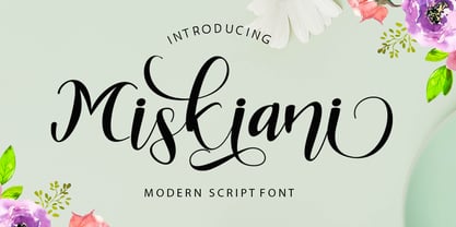 Miskiani is a new modern script calligraphy font with an irregular baseline. Miskiani Script looks lovely on wedding invitations, thank you cards, quotes, greeting cards, logos, business cards and more. Perfect for using in ink or watercolour. Including initial and terminal letters, alternates, ligatures and multiple language support. To enable the OpenType Stylistic alternates, you need a program that supports OpenType features such as Adobe Illustrator CS, Adobe Indesign & CorelDraw X6-X7, Microsoft Word 2010 or later versions. There are additional ways to access alternates/swashes, using Character Map (Windows), Nexus Font (Windows), Font Book (Mac) or a software program such as PopChar (for Windows and Mac).Thanks so much for looking and please let me know if you have any questions.
 - Regulation Signature by Shape Studio,
$9.00 Regulation Signature is a new modern script Handwritten font with an irregular baseline. Trendy and feminine style.Regulation Signature Script looks lovely on wedding invitations, thank you cards, quotes, greeting cards, logos, business cards and more. Perfect for using in ink or watercolour. Including initial and terminal letters, alternates, ligatures and multiple language support. To enable the OpenType Stylistic alternates, you need a program that supports OpenType features such as Adobe Illustrator CS, Adobe Indesign & CorelDraw X6-X7, Microsoft Word 2010 or later versions. There are additional ways to access alternates/swashes, using Character Map (Windows), Nexus Font (Windows), Font Book (Mac) or a software program such as PopChar (for Windows and Mac).Thanks so much for looking and please let me know if you have any questions
