10,000 search results
(0.048 seconds)
- Bion by Type Forward,
$38.00 Bion is a contemporary geometric sans serif with a down-to-earth attitude. It is distinguished by a high x-height, vertically cut terminals, and a minimal stroke contrast, giving it a distinctive, sharp look that is both timeless and universally appealing. Bion comes with 40 weights in a single variable file, ranging from Hairline to Black. We also included Upright, Italic, and Condensed variations to give you a fresh and diverse look for poster and title designs. Whatever message you want to get across, Bion has you covered - with support for 220 languages and 1,220 glyphs in total, as well as Extended Latin, Cyrillic and Greek scripts and an exhaustive list of typographic symbols. Our latest typeface also arrives packed full of OpenType features, including an alternative glyph set that will transform the way your text looks, giving it a more squarish appearance and offering additional visualization options. The Bion type family also includes an extensive set of standard and discretionary ligatures, tabular and small figures, fractions, and language localizations. These features work in static and variable fonts alike, providing a ready-made solution to all your advanced typographic needs. This functional, pragmatic typeface is clean and easily readable, making it an ideal choice for both print and on-screen media.
 - Voguish by Redy Studio,
$19.00 Voguish – Sophisticated Calligraphy Are you looking for an outstanding and unique font? Do you want to add some fun and playfulness to your creations? Then this is the font that you need! Say hello to Voguish – the new, exclusive, and elegant font! Voguish is a sophisticated font ideally crafted to easily create amazing results with a minimum of fuss. Voguish is a perfectly balanced font with unique, stylish letter shapes that have been combined with a sophisticated contemporary touch. Being a perfectly multifunctional font, it is the ideal fit for new season designs. It’s perfect for all those luxurious projects or designs that you want to stand out from the crowd! Download it now and make all your dreams come true! It’s so unique and elegant in look, that it will be the talk of your town! Voguish features: A full set of upper & lowercase characters Numbers & punctuation Gorgeous ligatures A full set of alternate upper & lowercase characters Uppercase beginning swashes Lowercase ending swashes Lowercase alternates characters Multilingual symbols PUA Encoded Characters – Fully accessible without additional design software. Feel free to give me a message if you have a problem or question. Thank you so much for taking the time to look at one of our products.
 - Pecos by BA Graphics,
$45.00Extreme look. - Miss - Unknown license

- Antique by Storm Type Foundry,
$26.00The concept of the Baroque Roman type face is something which is remote from us. Ungrateful theorists gave Baroque type faces the ill-sounding attribute "Transitional", as if the Baroque Roman type face wilfully diverted from the tradition and at the same time did not manage to mature. This "transition" was originally meant as an intermediate stage between the Aldine/Garamond Roman face of the Renaissance, and its modern counterpart, as represented by Bodoni or Didot. Otherwise there was also a "transition" from a slanted axis of the shadow to a perpendicular one. What a petty detail led to the pejorative designation of Baroque type faces! If a bookseller were to tell his customers that they are about to choose a book which is set in some sort of transitional type face, he would probably go bust. After all, a reader, for his money, would not put up with some typographical experimentation. He wants to read a book without losing his eyesight while doing so. Nevertheless, it was Baroque typography which gave the world the most legible type faces. In those days the craft of punch-cutting was gradually separating itself from that of book-printing, but also from publishing and bookselling. Previously all these activities could be performed by a single person. The punch-cutter, who at that time was already fully occupied with the production of letters, achieved better results than he would have achieved if his creative talents were to be diffused in a printing office or a bookseller's shop. Thus it was possible that for example the printer John Baskerville did not cut a single letter in his entire lifetime, for he used the services of the accomplished punch-cutter John Handy. It became the custom that one type founder supplied type to multiple printing offices, so that the same type faces appeared in various parts of the world. The type face was losing its national character. In the Renaissance period it is still quite easy to distinguish for example a French Roman type face from a Venetian one; in the Baroque period this could be achieved only with great difficulties. Imagination and variety of shapes, which so far have been reserved only to the fine arts, now come into play. Thanks to technological progress, book printers are now able to reproduce hairstrokes and imitate calligraphic type faces. Scripts and elaborate ornaments are no longer the privilege of copper-engravers. Also the appearance of the basic, body design is slowly undergoing a change. The Renaissance canonical stiffness is now replaced with colour and contrast. The page of the book is suddenly darker, its lay-out more varied and its lines more compact. For Baroque type designers made a simple, yet ingenious discovery - they enlarged the x-height and reduced the ascenders to the cap-height. The type face thus became seemingly larger, and hence more legible, but at the same time more economical in composition; the type area was increasing to the detriment of the margins. Paper was expensive, and the aim of all the publishers was, therefore, to sell as many ideas in as small a book block as possible. A narrowed, bold majuscule, designed for use on the title page, appeared for the first time in the Late Baroque period. Also the title page was laid out with the highest possible economy. It comprised as a rule the brief contents of the book and the address of the bookseller, i.e. roughly that which is now placed on the flaps and in the imprint lines. Bold upper-case letters in the first line dramatically give way to the more subtle italics, the third line is highlighted with vermilion; a few words set in lower-case letters are scattered in-between, and then vermilion appears again. Somewhere in the middle there is an ornament, a monogram or an engraving as a kind of climax of the drama, while at the foot of the title-page all this din is quietened by a line with the name of the printer and the year expressed in Roman numerals, set in 8-point body size. Every Baroque title-page could well pass muster as a striking poster. The pride of every book printer was the publication of a type specimen book - a typographical manual. Among these manuals the one published by Fournier stands out - also as regards the selection of the texts for the specimen type matter. It reveals the scope of knowledge and education of the master typographers of that period. The same Fournier established a system of typographical measurement which, revised by Didot, is still used today. Baskerville introduced the smoothing of paper by a hot steel roller, in order that he could print astonishingly sharp letters, etc. ... In other words - Baroque typography deserves anything else but the attribute "transitional". In the first half of the 18th century, besides persons whose names are prominent and well-known up to the present, as was Caslon, there were many type founders who did not manage to publish their manuals or forgot to become famous in some other way. They often imitated the type faces of their more experienced contemporaries, but many of them arrived at a quite strange, even weird originality, which ran completely outside the mainstream of typographical art. The prints from which we have drawn inspiration for these six digital designs come from Paris, Vienna and Prague, from the period around 1750. The transcription of letters in their intact form is our firm principle. Does it mean, therefore, that the task of the digital restorer is to copy meticulously the outline of the letter with all inadequacies of the particular imprint? No. The type face should not to evoke the rustic atmosphere of letterpress after printing, but to analyze the appearance of the punches before they are imprinted. It is also necessary to take account of the size of the type face and to avoid excessive enlargement or reduction. Let us keep in mind that every size requires its own design. The longer we work on the computer where a change in size is child's play, the more we are convinced that the appearance of a letter is tied to its proportions, and therefore, to a fixed size. We are also aware of the fact that the computer is a straightjacket of the type face and that the dictate of mathematical vectors effectively kills any hint of naturalness. That is why we strive to preserve in these six alphabets the numerous anomalies to which later no type designer ever returned due to their obvious eccentricity. Please accept this PostScript study as an attempt (possibly futile, possibly inspirational) to brush up the warm magic of Baroque prints. Hopefully it will give pleasure in today's modern type designer's nihilism. - Crypton by Type Innovations,
$39.00 Crypton is a modern geometric design by Alex Kaczun. It’s an alternate style variation based on his popular Contax Pro family of fonts. The look is clean, smart and sophisticated—the chiseled end strokes reflect the rage of the 1980s; lettering that represented something to do with electronics, computers and outer space. It’s a futuristic sans-serif exploration of shape and form. This display font is not intended for text use. It was designed specifically for display headlines, logotype, branding and similar applications. The entire font has an original look which is strong and dynamic—it can be widely used in publications and advertising. Crypton is a futuristic, techno-looking and expressive typeface with the appearance of machined-like parts—round geometric shapes and sharp edges. This attractive display comes in roman with lower case and lining figures. The large Pro font character set supports most Central European and many Eastern European languages.
 - Wavy Lines by Patria Ari,
$15.00 Introducing Wavy Lines – wave line font in uppercase and lowercase. This font can use to support your project to make design more beautiful. Wavy Lines suitable for book cover, merchandise, poster, title, quotes, and many more!
 - Zincand by Maulana Creative,
$12.00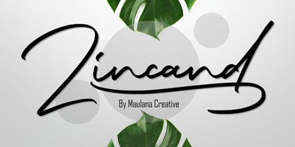 Zincand Modern Script Font Give your designs an authentic handcrafted feel. "Zincand Modern Script Font" is perfectly suited to signature, stationery, logo, typography quotes, magazine or book cover, website header, clothing, branding, packaging design and more.
 - Gentle Ghostly by Supfonts,
$19.00 Gentle Ghostly will be perfect for halloween lettering, beautiful frame for your home, book covers, greeting cards, logos, marketing, magazines or anything that requires cute handwritten lettering :) What's inside: - Gentle Ghostly Script - Multilingual support - Cricut support
 - Linja by Fenotype,
$14.95 Linja is an elegant ultra condensed font. It's best for display use in magazines, books & posters. Linja font was originally designed in 2002. Now it's been remade with the complete character set and six different versions.
 - Rolantha by Just Lett,
$13.00 Rolantha is script and handwritten font. This font is perfect for your all design project such as typography design, lettering design, logo type, book cover, poster, flyer, calligraphy, etc. Features: ~UPPERCASE ~lowercase ~Numeral & Puncuation ~Multilingual Accent
 - Constaniz by Maulana Creative,
$15.00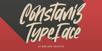 Give your designs an authentic handcrafted feel. "Constaniz Typeface" is perfectly suited to signature, stationery, logo, typography quotes, magazine or book cover, website header, clothing, branding, packaging design and more. Thanks for use this font ~ Maulana
 - Fluffy Tiger by Fat Hamster,
$20.00 Fluffy Tiger - Hand made brush font Soft & passionately handwritten by brush font perfect for statement, flyers, greeting and invitation cards, social media quotes, logo design, apparel design, label and packaging design, heading, scrapbooking, calendars, book covers.
 - The Carbs by Maulana Creative,
$14.00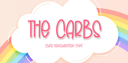 Give your designs an authentic handcrafted feel. �The Carbs� is perfectly suited to signature, stationery, logo, typography quotes, magazine or book cover, website header, clothing, branding, packaging design and more. Thanks for use this font ~ Maulana
 - Frostiest by Maulana Creative,
$12.00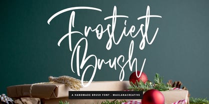 Give your designs an authentic handcrafted feel. "Frostiest Script" is perfectly suited to signature, stationery, logo, typography quotes, magazine or book cover, website header, clothing, branding, packaging design and more. Thanks for use this font ~ Maulana
 - Soul Harder by Maulana Creative,
$12.00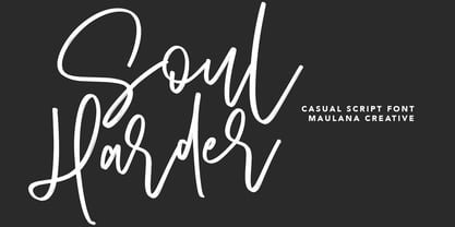 Give your designs an authentic handcrafted feel. "Soul Harder" is perfectly suited to signature, stationery, logo, typography quotes, magazine or book cover, website header, clothing, branding, packaging design and more. Thanks for use this font. MaulanaCreative
 - Sentilum by Maulana Creative,
$15.00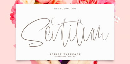 Give your designs an authentic handcrafted feel. Sentilum is perfectly suited to signature, stationery, logo, typography quotes, magazine or book cover, website header, clothing, branding, packaging design and more. This font includes: - Ligatures - Multi-lingual Support
 - Esok Pagi by Maulana Creative,
$14.00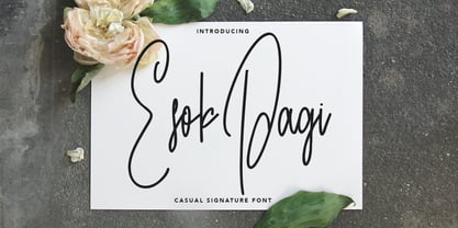 Give your designs an authentic handcrafted feel. "Esok Pagi" is perfectly suited to signature, stationery, logo, typography quotes, magazine or book cover, website header, clothing, branding, packaging design and more. Thanks for use this font. MaulanaCreative
 - Bottled Moon by Tour De Force,
$29.00 Bottled Moon is display serif typeface full of possibility. It is lively family containing Regular and Italic styles. By it's design, Bottled Moon took inspiration from vintage typefaces and their specific charm, with catchy details like curly terminals and gently curved sharp serifs. All characteristics of Bottled Moon together give combination with dose of calligraphy, working horse serif typeface and display OpenType features. Works pretty well in small sizes, keeping it's uniqueness and legibility. Whether you're looking for typeface for whiskey label, wedding invitation, restaurant branding or parfume package, Bottled Moon recommends itself with original Initials, shadowed Stylistic Set and pack of adjustable Borders together with classical Fractions.
 - Bradley Texting by Monotype,
$57.99Bradley Texting: a clear, friendly and easily legible calligraphy font, also suited to electronic devices With Bradley Texting, Richard Bradley has published another calligraphic typeface that recalls the style of Bradley Hand and Bradley Type. In this case, however, Bradley has advanced the style with clearer forms for display on electronic instruments and on other formats. Two other font families paved the way to the newly introduced Bradley Texting. In the mid-1990s, Bradley published Bradley Hand, with its rough contours. Since these coarse forms do not cut a good figure in the larger font sizes, Bradley Type followed, with smooth letters. During the development of Bradley Type, the idea for a further font came about ? one in the style of the two other calligraphic typefaces, but with simpler, easily legible forms and suited to electronic devices like mobile phones or tablets. The letters for Bradley Texting began with a marker on paper. Looking back, Bradley describes one of the biggest challenges as having the calm required to draw the relaxed-looking letters repeatedly while still making them fit the general style.The somewhat narrow and dynamically designed letters have round line ends, like those left by a felt-tipped pen. As a hand-written print font, the individual letters are not connected to one another. Nonetheless, they demonstrate the influence of a written font, such as the extended ends and the flowing transitions. Clear forms with open counters and a large x-height guarantee Bradley Texting good legibility in the smaller font sizes. Bradley Texting is also effective under more challenging conditions, such as on mobile phones, e-book readers or tablets; the fonts friendly and lively character comes through. With Regular, Semibold and Bold, Bradley Texting is adequately equipped for use as a headline or text font in various sizes. The selection of characters covers the Western European languages and German typographers will be happy to note the presence of the upper-case ß. Use the dynamic and clear forms of Bradley Texting anywhere you need a friendly character with a personal accent. Bradley Texting is persuasive in the print realm, in advertisements or on posters, as well as on electronic devices. - Trafit by Nathatype,
$29.00 Finding the right fonts for your projects is a challenge because improper fonts will deliver improper messages resulting in unprofessional appearances. Therefore, Trafit is here as your problem solver. This is Trafit, a perfect font to show luxury, class, and eternity. Trafit is an outstandingly designed stylish serif font. Its soft, clean lines and indentations show elegant impressions for your prominent designs. Its letter edges have hooks like the other serif fonts. The simple shapes and even sizes help to make it legible. Due to the great legibility, this font is applicable for any text sizes and length. In addition, you can enjoy the features available here. Features: Ligatures Multilingual Supports PUA Encoded Numerals and Punctuations Trafit fits best for various design projects, such as brandings, posters, banners, greeting cards, magazine covers, quotes, printed products, merchandise, social media, etc. Find out more ways to use this font by taking a look at the font preview. Thanks for purchasing our fonts. Hopefully, you have a great time using our font. Feel free to contact us anytime for further information or when you have trouble with the font. Thanks a lot and happy designing.
 - Average Joe by Typadelic,
$14.95 Based on a mid 20th century retro typestyle, Average Joe is anything but average! You might even find that it breaks the rules and is somewhat of a rebel. Because this font has such a bouncy style, I've created extra characters for ease of flow when you type. Try combining upper and lowercase letters for a really fun look!
 - Kandel 205 by Talbot Type,
$19.50 Kandel 205 is a geometric, tri-line, display and headline font available in a family of three weights. Its bold, graphic styling gives it great stand-out qualities and a highly individual look. It’s particularly well suited to bringing energy to designs, or for designs with a sporting theme. It’s also available with character variations as Kandel 105 .
 - Redsniper by Locomotype,
$15.00 Introducing Redsniper, a brand new font with a vintage look inspired by Victorian typography. Available in three styles with different variations including regular, inline and classic, making it easier to design a variety of typography. Redsniper is suitable for making label designs, posters, logotypes, signage etc. especially when you want a retro and old-fashioned design.
 - England Reality by Aldedesign,
$15.00 England Reality is a script font with awesome and classy taste, a natural touch, and many ligatures. We feel this font looks classy, readable, elegant, stylish, catchy and absolutely easy to use. This font is a great choice for a watermark on branding, design, wedding, photography, signature, logo design, album cover, business card, quotes, and many other design projects.
 - Caorgen by Zeenesia Studio,
$17.00 Introducint Caorgen Caorgen is a Condensed modern display font with serif style. It's modern and classic font with a unique and deference look . Perfect if you need a dose of fun in your project. Perfect for editorial projects, Logo design, web font, clothing branding, product packaging, magazine headers, or simply as a stylish text overlay to any background image.
 - Mikhaella by Stefani Letter,
$12.00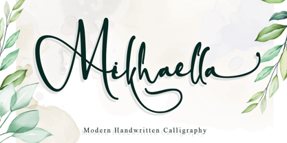 Mikhaella is a beautiful light handwritten font with a unique feel and looks stunning. It will add a luxury spark to any design project! This font is PUA encoded which means you can access all of the amazing glyphs and swashes with ease! It also features a wealth of special features including alternate glyphs and ligatures.
 - Riotous by Letterhend,
$19.00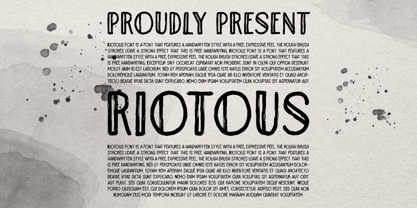 Introducing, Riotous Brush Font! Riotous is a font that features a handwritten style with a free and expressive feel. the rough brush strokes leave a strong effect to make your design looks more natural and unique! What will you get: Including number and symbol. Support Multi Language This font also support PUA Encoded! So, grab your own. Thank You!
 - Jaferon by Twinletter,
$17.00 Jaferon is a display font that comes with a stunning superhero style. Ready to take the lead in projects that call for a bold, bold touch and a bold look. What’s Included : File font All glyphs Iso Latin 1 Alternate, Ligature Simple installations PUA Encoded Characters – Fully accessible without additional design software. Fonts include Multilingual support
 - Wrought by Jon Cartagena,
$10.00 Wrought is a bold geometric display font by Jon Cartagena. It's purpose is to give a rugged, heavy feeling to your designs. Wrought is available in four weights: Thin, Light, Regular, and Bold. Each character is carefully designed to be vertically aligned at the center. This gives Wrought a unique flair, while promoting a harmonious look through each word.
 - Amerta by Eotype,
$9.00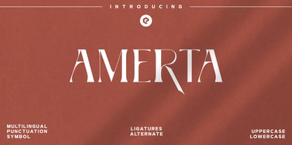 Amerta is a versatile, modern and unique serif font. Designed by Eotype Studio, It has a unique style with stylistic, alternates, ligatures and supports multilingual languages. Create unique & beautiful logotype, use it as an elegant solution for your next magazine layout, or choose Amerta for any graphics that require a bold look with a elegant flair.
 - Holier Than Thou by Comicraft,
$19.00 Look well, Fontlovers, we wouldst have words with thee! By Odin's beard, let the naysayers beware, for 'tis true, Thor doth speak --and shouldst speak -- Mighty Words! Yay there shall be a "Thee" and a "Thou" and a "Thy" and a "Smite!" Verily, 'tis understood that Elizabethan English dost suit the Gods of Asgard, mortals can never get enow.
 - ND Kapitel by NeueDeutsche,
$17.50 Experience the evolution of the humanist sans-serif style with this contemporary and classic font. Designed with a modern sensibility and clean, spurless letterforms, this font offers a fresh take on a time-honored tradition. Its refined curves and harmonious proportions create a sophisticated look that is perfect for branding, editorial design, and other professional projects.
 - Kornasoft by OJR Design,
$20.00 Kornasoft is a typeface with hard corners, straight lines and smooth curves. The typeface is influenced by dance, movement and music culture. Kornasoft is a combination of a simple looking font, yet with personality and edge to it. Kornasoft is mainly designed to be a display font, but it can also be used as quantity text.
 - Moki by FaceType,
$25.00 The seven ways of Moki. Moki comes in seven different styles: Base, Cut, Dust, Lean, Mono, Soft and Uni. Moki is a display expert – with a wide range of languages covered, the family offers a style for every purpose. You are a SciFi movie director and are looking for an alternative to the inevitable Eurostile? Now you have!
 - Crosseur by Eotype,
$9.00 Crosseur is a versatile, modern and unique condensed san serif font. Designed by Eotype Studio, It has a unique style with stylistic, alternates, ligatures and supports multilingual languages. Create unique & beautiful logotype, use it as an elegant solution for your next magazine layout, or choose Crosseur for any graphics that require a bold look with a unique.
 - Broman by Zeenesia Studio,
$17.00 NTRODUCING BROMAN!! BROMAN is a bold modern display font with serif style. It's modern and classic font with a unique and deference look . Perfect if you need a dose of fun in your project. Perfect for editorial projects, Logo design, web font, clothing branding, product packaging, magazine headers, or simply as a stylish text overlay to any background image.
 - Runaround Kid by Hanoded,
$15.00 I was listening to some old Smashing Pumpkins albums when I created this font. The name comes from a song called *** You (An Ode To No One). Runaround Kid is a hand painted typeface. I used Chinese ink and a cheap Chinese brush to create the inky look. Comes with double-letter ligatures and a whole bunch of diacritics.
 - Bionca by Zeenesia Studio,
$15.00 BIONCA is a bold modern display font with sans serif style. It's modern and classic font with a unique and deference look . Perfect if you need a dose of fun in your project. Perfect for editorial projects, Logo design, web font, clothing branding, product packaging, magazine headers, or simply as a stylish text overlay to any background image.
 - Arakne by Scriptorium,
$12.00While working on a font based on Spencerian Script (a popular late 19th century handwriting style) we did some experimenting with original designs which created the general feel of Spencerian and brought to mind the spidery handwriting of old ladies and Dickensian clerks. The result was Arakne, a spidery script font with a really striking look.
