10,000 search results
(0.041 seconds)
- Montague Script by Stephen Rapp,
$59.00 Montague Script takes its name from a small hilltown of western Massachusetts rich in culture and history. I lived in this beloved community for a number of years and it’s where I first began my study of calligraphy and lettering. While most brush scripts take their cue from mid-twentieth century samples, Montague Script is a fresh, contemporary alternative. It comes directly from lettering written with a #3 sable brush on smooth vellum and is digitized with the same sensibility a lettering artist writes with. Montague reflects a dynamic interplay between form and rhythm not usually associated with type. Words suggest a baseline, yet are not bound by it. Beginnings, endings, alternates and ligatures come in as needed while you type. Many more alternates are available in the glyph palette of most current graphic software. Exuberant swash versions of upper and lowercase letters, as well as ligatures can be accessed through both the type and glyph palettes. Montague Script is a natural for advertising, point of purchase displays, packaging and logo design, cards, invitations, journals and much more. You will be delighted at how well it can dress up a project and how easily it sets.
 - Italia by ITC,
$29.00Italia is the work of Colin Brignall, a refreshingly different serif typeface. At first glance, Italia might seem comparable to any other square serif typeface, but it has a distinctive pattern all its own. Italia can be used as either a display or text typeface and will give any text a unique look. - Stefano by Signs of Gold,
$25.00 Stefano is a meld of traditional Roman typeface design and calligraphic hand lettering. It is bold yet refined; elegant yet forceful. Stefano will enhance the urbane and elevate the prosaic.
 - Jartifisa by Agniardi,
$15.00 Jartafisa is a strong and playful script inspired by the natural beauty of flowers. Fall in love with its organic charm, and take any spring craft to the next level!
 - Blackshot by Rockboys Studio,
$27.00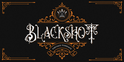 Blackshot is an incredibly unique and distinct blackletter font. It will add a unique touch to your designs. Use it for tattoo designs, logos, posters, book covers, albums and more!
 - Colo Pro by Fontfabric,
$30.00 Colo Pro is a custom font which is applicable for any type of graphic design - web, print, motion graphics, etc., and it is perfect for t-shirts and other items.
 - Lockon by ParaType,
$25.00 A decorative face with original swashes anf curls in its letterforms. For use in advertising and display matter. The face designed by Natalya Vasilyeva and licensed by ParaType in 2007.
 - Xandercode by Sipanji21,
$10.00 Xandercode is a bold and chunky lettered display font. Add this font to your creative ideas and notice how it will make them stand out! with spalsh vector bonus inside.
 - Bridgers by Fargun Studio,
$13.00 Bridges is a hand-painted uppercase brush font and includes swashes. Bridges works well for logos, name tags, handwritten quotes, product packaging, merchandise, social media, greeting cards and much more.
 - TOMO Zomba Pro by TOMO Fonts,
$20.00 ZOMBA! It's a retro-horror typeface that speak for itself. Ideal for big and strong messages. Kids gonna love it. Carefully hand crafted, includes almost all latin languages and cyrillic!
 - Huntly by Rockboys Studio,
$25.00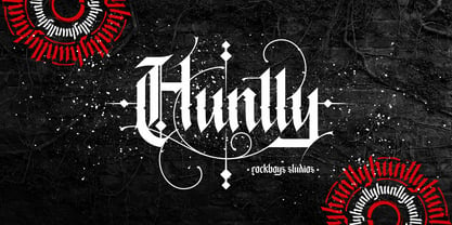 Huntly is an incredibly unique and distinct blackletter font. It will add a unique touch to your designs. Use it for tattoo designs, logos, posters, book covers, albums and more!
 - NOH Squadra by OhType!,
$30.00 SQUADRA is a serif typeface with more than 220 characters, framing a perfect union between typefaces of his style and unconventional shots from the calligraphic pen; Its strong and imposing appearance, the pronounced contrast between his strokes and changes in traditional aesthetics provide you with elegance and distinction to differentiate over other types of the same class. Easy modifiable and great graphic content to small and large format SQUADRA is able of generating a clear and direct message, suit almost any topic and perfect for use in posters, logos and editorial headlines. Infinitely versatile typeface that evokes both the beauty and finesse of the plants as power its thorns and its deadly poison.
 - Allrounder Grotesk by Identity Letters,
$40.00 A true workhorse. The only Grotesk you’ll ever need. Allrounder Grotesk is a neutral, powerful Neogrotesk member of the Allrounder superfamily. An unobtrusive teamplayer as well as an excellent soloist, this hard-working sans-serif typeface is ready for any task you’ll throw it at. A workhorse that lives up to its name, Allrounder Grotesk consists of ten weights ranging from a delicate Air to a powerful Black with 900+ glyphs per font. Each weight is accompanied by carefully hand-corrected italics. Allrounder Grotesk supports more than 200 Latin-based languages, containing the complete “LatinPlus” glyph set developed by Underware. It also provides you with plenty of OpenType features and additional goodies: small capitals, ten sets of figures, case-sensitive forms, ligatures, superiors, fractions and arrows. Equipped like this, you’ll be ready for any kind of sophisticated typesetting scenario you might encounter. With Allrounder Grotesk, you’ve got a sans that works great for body text, yet looks crisp and clean in headlines and display sizes. Whether annual reports, magazine and editorial layouts, nonfiction books, branding and packaging work, large-scale advertising, forms and contracts, or contemporary posters: Allrounder Grotesk is up for it. This multitalented font family was developed in a 2-year process by Moritz Kleinsorge. It was the first release of the Allrounder superfamily, a series of typefaces sharing the same color and horizontal metrics (cap height, small cap height and x-height): a typesetting system whose components match each other perfectly. Any other part of this design kit, e. g., Allrounder Antiqua or Allrounder Monument, may be easily combined with Allrounder Grotesk. Perfect Pairing: Allrounder Antiqua + Allrounder Grotesk Allrounder Antiqua is the ideal complement to Allrounder Grotesk. They both share common vertical metrics and a common color. This allows you to pair both typefaces within the same layout—even within the same paragraph—without creating visual disruption. Head over to the Family Page of Allrounder Antiqua to get more information about this typeface. Design Trick: Bilingual Design With the Allrounder Superfamily Combining Allrounder Grotesk with Allrounder Antiqua is an ideal approach for bilingual designs, wherein both languages get the same emphasis yet are distinguished with two different typefaces. It's also best practice to set headlines in a different typeface than the body text if they harmonize with each other. Allrounder Grotesk and Allrounder Antiqua provide you with the perfect pair for this purpose. In any kind of design, in any type of medium, working with Allrounder fonts is effortless. That’s why Allrounder got its name.
 - Vernacular Sans by jpFonts,
$19.95 The Vernacular trilogy was designed by Swiss designer Hans-Jürg Hunziker, who had worked for Adrian Frutiger in Paris for many years. Based on the concept of a transitional Linear Antiqua, he has developed a colorful bouquet of typefaces that contain the entire spectrum of typefaces for book design and corporate identity. Thanks to his "Swiss school" and his outstanding skills, he has succeeded in giving the typefaces a particularly noble and sympathetic expression. In addition to the Sans family, there is a Serif family and a Clarendon family, each of which, including the separately drawn italics, is equipped with 12 font weights that are finely tuned to one another. Each of the 3 font styles develops its own character, but thanks to a concept that brings the different font styles closer together, they also work well together and complement each other perfectly. Sans and Clarendon have a vertical axis and similar endings in contrast to the Serif, which has a traditional diagonal axis and horizontal endings. The straight stems and the proportions are used as an element to stress the closeness of the typeface-trilogy. They thus share a comon feature. All fonts contain tabular and proportional figures as well as old style figures. Small caps and small cap figures are also available in all fonts. In addition, some fonts have alternative characters available via style set, such as «g», which can be used to further vary the typeface. Vernacular offers all the options for well-kept typesetting for print and web - for small and large orders.
 - Vernacular Serif by jpFonts,
$19.95 The Vernacular trilogy was designed by Swiss designer Hans-Jürg Hunziker, who had worked for Adrian Frutiger in Paris for many years. Based on the concept of a transitional Linear Antiqua, he has developed a colorful bouquet of typefaces that contain the entire spectrum of typefaces for book design and corporate identity. Thanks to his "Swiss school" and his outstanding skills, he has succeeded in giving the typefaces a particularly noble and sympathetic expression. In addition to the Sans family, there is a Serif family and a Clarendon family, each of which, including the separately drawn italics, is equipped with 12 font weights that are finely tuned to one another. Each of the 3 font styles develops its own character, but thanks to a concept that brings the different font styles closer together, they also work well together and complement each other perfectly. Sans and Clarendon have a vertical axis and similar endings in contrast to the Serif, which has a traditional diagonal axis and horizontal endings. The straight stems and the proportions are used as an element to stress the closeness of the typeface-trilogy. They thus share a comon feature. All fonts contain tabular and proportional figures as well as old style figures. Small caps and small cap figures are also available in all fonts. In addition, some fonts have alternative characters available via style set, such as «g», which can be used to further vary the typeface. Vernacular offers all the options for well-kept typesetting for print and web - for small and large orders.
 - Vernacular Clarendon by jpFonts,
$19.95 The Vernacular trilogy was designed by Swiss designer Hans-Jürg Hunziker, who had worked for Adrian Frutiger in Paris for many years. Based on the concept of a transitional Linear Antiqua, he has developed a colorful bouquet of typefaces that contain the entire spectrum of typefaces for book design and corporate identity. Thanks to his "Swiss school" and his outstanding skills, he has succeeded in giving the typefaces a particularly noble and sympathetic expression. In addition to the Sans family, there is a Serif family and a Clarendon family, each of which, including the separately drawn italics, is equipped with 12 font weights that are finely tuned to one another. Each of the 3 font styles develops its own character, but thanks to a concept that brings the different font styles closer together, they also work well together and complement each other perfectly. Sans and Clarendon have a vertical axis and similar endings in contrast to the Serif, which has a traditional diagonal axis and horizontal endings. The straight stems and the proportions are used as an element to stress the closeness of the typeface-trilogy. They thus share a comon feature. All fonts contain tabular and proportional figures as well as old style figures. Small caps and small cap figures are also available in all fonts. In addition, some fonts have alternative characters available via style set, such as «g», which can be used to further vary the typeface. Vernacular offers all the options for well-kept typesetting for print and web - for small and large orders.
 - Cabrito by insigne,
$24.00 After my son was born, I found myself reading him a lot of books. A LOT of books. Some were good, some were great, but I found myself wanting to develop something using my skills and interests to make something that only I could make. In short, I realized my son needed to be indoctrinated—I mean, introduced into the wonderfully wild world of fonts. So, I set about to make a board book to teach about typography, called “The Clothes Letters Wear.” You can learn more about the book here. I’ve made the captivating illustrations bright and colorful, and the use of different letter forms makes for a fascinating read to delight ages young and young at heart. And, as an added bonus, this children’s book has a custom designed font. I’m always looking for an excuse to design a new font, and this book created the perfect alibi. Drum roll, please. I now give you … Cabrito (“little goat” en Español). This new serif typeface incorporates the latest research on typographic legibility for children, features to make it—well, extra legible. A little background: studies show that Bookman Old Style is one of the most readable typefaces, and as a consequence or perhaps the reason why, it is used thoroughly for children’s books. This font became my initial inspiration for the typeface. Then, I found more legibility research saying that (brace yourselves) Comic Sans is also very legible for beginning readers, much due to the large x-height and softer, easily recognizable forms. In addition, forms that are closer to handwriting also seem to be more legible. Once I threw all that into my cauldron and stewed it a bit, the result was a pleasantly rounded typeface that includes not-so-strictly geometric, handwriting-inspired forms for the b, d, p, and q. Es guapo! Cabrito’s slender weights are simple and fun, with extras that turn any “bah humbug” into a smile. Add lighter touches to your project with the typeface’s included sparkles or rainbows (not included). Splash a little more color on the page with the firmer look of the thicker weights. Cabrito’s upright variations across all weights are matched by optically altered italics, too, giving you even more variety with the font family. This modern typeface’s bundle of alternates can be accessed in any OpenType-enabled software. The fashionable options involve a significant team of alternates, swashes, and meticulously refined aspects with ball terminals and alternate titling caps to decorate the font. Also bundled are swash alternates, old style figures, and small caps. Peruse the PDF brochure to check out these options in motion. OpenType-enabled applications like the Adobe suite or Quark allows comprehensive control of ligatures and alternates. This font family also provides the glyphs to aid a variety of languages. Cabrito is a welcoming, everyday font family by Jeremy Dooley. Use it to convey warmth and friendliness on anything from candy and food packages to children’s toys, company IDs or run-of-the-mill promotional material. Cabrito’s unique appearance and high legibility make it equally at home in print as it is on a screen.
 - Anger & Wrath by Omaikraf Studio,
$10.00 Introducing "Anger Style": Unleash the Power of Emotion Are you ready to harness the raw energy of emotions and bring them to life in your designs? Look no further than "Anger Style," an electrifying and dynamic font that will leave a lasting impact on your audience. Designed by our team of expert font designers, "Anger Style" is a captivating blend of intensity, power, and expressiveness. Possible Design Uses: "Anger Style" is a font that excels in making a bold statement. Its commanding presence and fiery nature make it perfect for various design applications, including: Headlines and Titles: Grab your audience's attention and make a lasting impression with powerful headlines that demand to be noticed. Logos and Branding: Infuse your brand identity with passion and intensity, creating a memorable and distinct visual presence. Posters and Flyers: Advertise events, concerts, or special promotions with eye-catching designs that embody rebelliousness and energy. Book Covers: Create striking covers that captivate readers and convey the emotional depth of your story or message. Apparel and Merchandise: Add an edgy touch to your clothing designs, making a statement that resonates with your target audience. Unique Qualities: What sets "Anger Style" apart from other fonts is its ability to evoke a wide range of emotions, not just anger. It transcends its name, allowing you to express passion, determination, and rebellion through your designs. Its versatility lies in its bold strokes and sharp edges, which convey a sense of intensity and power. By choosing "Anger Style," you gain access to a font that embodies the very essence of raw human emotion. Font Pairing: "Anger Style" pairs exceptionally well with other fonts that complement its intensity and create harmonious combinations. Consider combining it with: "Bold Sans Serifs": The clean lines and strong presence of a bold sans serif font can enhance the impact of "Anger Style," creating a balanced and eye-catching composition. "Elegant Script Fonts": To add a touch of contrast and sophistication, pairing "Anger Style" with an elegant script font can create a visually engaging and dynamic design. Functional Aspects: "Anger Style" offers a range of functional aspects designed to enhance your creative possibilities: Styles: "Anger Style" is available in bold and regular styles, allowing you to emphasize different levels of intensity within your designs. Character Sets: The font includes an extensive character set, covering uppercase and lowercase letters, numbers, punctuation marks, and special characters. This ensures versatility and legibility across various design projects. Special Features: "Anger Style" includes stylistic alternates and ligatures, providing you with additional design options and allowing you to create a truly customized and unique look.
 - Duos Pro by Underware,
$50.00 Duos Pro, a script for illusionists, comes in 10 styles. Whatever style you pick: apply this speedy monolinear handwriting font in large sizes, because it is made for catching the attention. Take Duos Sharp, which comes with speedy strokes and sharp endings in light, regular and black weights. Or pick Duos Round, and its 3 styles with a softer voice and round endings. Some people call those endings “funky ball noses“, an odd but appropriate description. Round styles look more like round tip speedball lettering, but contrary to most speedball letterings they're written with a very high speed. Especially Duos Round Black is more cuddlesome than its sharper counterpart. For an even more intuitive feel, we added two more sets: Duos Brush & Duos Paint. Duos Brush combines monoline strokes with brush beginnings and endings, for that graphical, freshly lettered touch. A closer look will reveal how its brushed tails vary all the time. Duos Paint is made up out of rough & artistic painted strokes, with all its accompanying shortcomings. In contradiction to the finesses of lighter weights, Duos Paint Black scores in being the most nonchalant and impressionistic. Poésie brutale! As well as having the option to choose between (or mix) these 10 styles, Duos Pro has additional hidden functionalities. For example, every style has many alternate lettershapes and ligatures, offering various different results and lengths to display every single word. Or manually add one of the swashes for more emphasis. A bonus font, Duos Tools, includes tool icons, strokes and banners. If that ain’t enough, throw in some polysemic letters for smart, ambiguous communication if you like. Want to become a signpainter? Then be a signpainter. Always wanted to be an artist? This is your chance! Duos Pro boosts your look. Make your visual vocabulary as grandiose, dramatic, sensitive or picturesque as you want. But whatever you do, don't hesitate to apply Duos Pro “short & big”!
 - Blangkist by Picatype,
$12.00 Blangkist Script is a handwritten script font, based on the expression of the signature style that flows freely, friendly and organic. hand painted with love. Blangkist Script contains ligatures and alternates characters in Open Type Features. Perfect for brand projects, logos, product packaging, posters, invitations, greeting cards, news, blogs, everything including personal charm. Blangkist Script is coded with PUA Unicode, which allows full access to all the extra characters without having special designing software. Mac users can use Font Book , and Windows users can use Character Map to view and copy any of the extra characters to paste into your favorite text editor/app. Thanks so much for looking and please let me know if you have any questions.
 - Gobsmacked by Hanoded,
$15.00 Gobsmacked is a rather new English word. It has been around since 1959 and was used mostly around Liverpool at that time. The word means: ’astounded’, ‘flabbergasted’ (another nice word!) or ‘speechless’. Gob could be of French or Scottish Gaelic origin and means ‘mouth’. Gobsmacked font was created using a brush and black gouache. The result is a very eroded, very legible and quite unique brush font. I have created alternates for the lower case letters, plus two double letter ligatures (oo and ss). Use it for any design that needs a little brushwork; I am sure the result will leave you gobsmacked!
 - Broisther by Hanzel Space,
$25.00 Say hello Broisther, a handwritten script font inspired by handwriting with an aesthetic touch. Broisther is versatile enough for both web and print and can be used in a variety of projects such as stationery, packaging, apparel, wedding stationery, prints, quotes, social media graphics, planners, greeting cards, logos, branding, and much much more. The script includes a set of uppercase characters, numerals, symbols, two lowercase letter sets, and a total of 28 ligature. Full Set of standard alphabet and punctuation Extra set of ending swashed lowercase Handwritten ligatures Thanks so much for checking out my shop! Happy creating! Cheers!
 - Black Phantom by Aminmario Studio,
$20.00 Black Phantom font is a modern and elegant signature font with varying thickness and a charming gesture. This font is great for your creative projects such as watermark on photography, and perfect for logos & branding, photography, invitation, watermark, advertisements, product designs, stationery, wedding designs,label, product packaging, social media, movie titles, books titles, a short text even a long text letter and good for your secondary text font with sans or serif. And also for special events or anything that need handwritting taste. Don't hesitate if you have any questions. Thanks for checking out this font. I hope you enjoy it! AminMario
 - Daisy & Violette by Letterhend,
$18.00 Look the allure of Daisy & Violette, a mesmerizing serif font that blends modernity with classic refinement. With its thin serifs and captivating alternates adorned with graceful flourishes, this font is a true testament to elegance. Whether used for high-end packaging, editorial layouts, or upscale event invitations, Daisy & Violette brings an air of sophistication that will leave a lasting impression. Features : Uppercase & lowercase Numbers and punctuation Alternates & Ligatures Multilingual PUA encoded We highly recommend using a program that supports OpenType features and Glyphs panels like many of Adobe apps and Corel Draw, so you can see and access all Glyph variations.
 - Ice Cream by Positype,
$25.00 Ice Cream is the product of an abandoned typeface concept a non-connected script for food packaging. The original exemplars were so iconic, so inspiring, it demanded completion. Curvy with a huge dollop of fun, to be honest, and I wouldn’t have it any other way with this one. Influenced heavily by Kari and Juicy (and even the shameless copies of my originals, wink wink), Ice Cream’s recipe blends in some very simple elements that are unobtrusive and clean, perfect for packaging designs, children’s books, and anywhere a light-hearted scoop with a cherry on top is needed.
 - Sole Serif by CAST,
$45.00 Sole Serif is a newspaper face with features relating to book typography. Inspiration from Francesco Griffo’s romans was adapted to resist the rough usage typical of newspaper printing without any loss of quality. Sole Serif is available in an extensive range of cuts including extra bold and ultra thin. With its big x-height, short ascenders and a roundish and wide italic for text and titles, it has all the attributes of a newspaper face. Nonetheless, details like the inclined axis, calligraphic terminations, Renaissance proportions and a refined but slightly mannered design, all evoke the book rather than the daily paper.
 - Infield by BoxTube Labs,
$24.00 Infield is a modern and edgy athletic font family with four creative styles for added flexibility in your design workflow. It's perfect for sports logos, branding, posters, apparel design with its bold and confident appearance. The upper- and lowercase vintage characters of Infield Rough comes with different renders to add authenticity and a more natural look. Infield features a full Adobe Latin 1 character set, with support for most western languages including: Afrikaans, Basque, Breton, Catalan, Danish, Dutch, English, Finnish, French, Gaelic, German, Icelandic, Indonesian, Irish, Italian, Norwegian, Portuguese, Sami, Spanish, Swahili and Swedish. Infield Display is A-Z & 0-9 only.
 - Gang by Ani Dimitrova,
$39.00 Gang is a 2 - style display font family designed by Ani Dimitrova. Both weights contain a set of extended Latin and Cyrillic, as well as all sorts of open type features: standard ligatures, proportional figures, numerals, arrows, matching currency symbols, and fractions. In both styles, the font is well-suited for large headlines, word emphasis, and different types of advertising. The fonts' wide proportions make them a perfect choice for screen usage. This style palette offers a flexible range for display typography. The Gang type family is ideally suited for magazines, branding, posters, as well as web and screen design, and more.
 - Sankor by Twinletter,
$18.00 Introducing the Sankor display font. This font is perfect for any project that needs a modern twist on a classic design. It’s unique, stylish, and fun. Having a bold anatomical shape makes it beautiful and visually unique from most other fonts. Your project can be made more stunning by adding this font. What’s Included : Standard glyphs Iso Latin 1 Simple installations We highly recommend using a program that supports OpenType features and Glyphs panels like many Adobe apps and Corel Draw, so you can see and access all Glyph variations. PUA Encoded Characters – Fully accessible without additional design software. Fonts include Multilingual support
 - Gediya by Twinletter,
$12.00 Gediya is a san serif font family with a distinctive and appealing shape suitable for headlines and writing. This typeface is stunning in every way, making it ideal for any application that needs to wow. Gediya is an excellent solution for making a flyer, banner, or just some new text for your project. Begin utilizing this typeface in your wonderful project. of course, your various design projects will be perfect and extraordinary if you use this font because this font is equipped with a font family, both for titles and subtitles and sentence text, start using our fonts for your extraordinary projects.
 - Decavision by Swedish Columbia,
$1.99Decavision is a display font and is applicable for any type of graphic design, web & print, t-shirts, posters and logos. It’s not intended for text use or at small sizes. A font inspired by Division Of Laura Lee’s icon which was created by Shelby Cinca. The icon itself is inspired by early floppy disc copy-protection and Japanese fighting robot decals. Håkan Johansson picked up where the icon left off and created a corresponding font-family. The font focuses on simple shapes and the copy-protection tab detail to create a pleasing futurist display font. - Risoluto by Jawher Matmati,
$39.99 Risoluto is an italic font made to mimic the beautiful italic typefaces used in the 19th and 20th century by music publishers. It was based on an italic typeface found in a publication by Max Eschig from the 1950s. Hundreds of specimen for each glyph were studied and carefully drawn in a way to have a sharp rendering without losing any of the old charm. The oblique "g" is one of the characteristics of such old typefaces. Risoluto covers a large range of languages and symbols and offers stylistic alternates for numerals, contextual ligatures and music accidentals.
 - Sorca by Flawlessandco,
$9.00 Introducing "Sorca" - A Display Typeface Font. Dive into the world of sophistication and uniqueness with "Sorca," a captivating display typeface font that is adorned with wavy and distinctive letter details. There's some connected letters and some alternates that suitable for any graphic designs such as branding materials, t-shirt, print, business cards, logo, poster, t-shirt, photography, quotes .etc This font support for some multilingual. Also contains uppercase A-Z and lowercase a-z, alternate character, numbers 0-9, and some punctuation. If you need help, just write me! Thanks so much for checking out my shop!
 - Chanley by Flawlessandco,
$9.00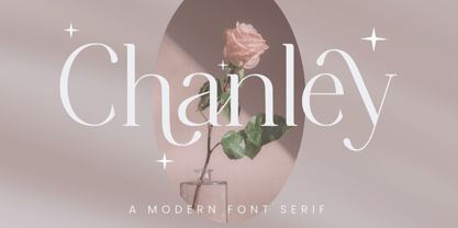 Chanley, a sleek and sophisticated modern serif font that is sure to make a statement. With its clean lines and contemporary design, Chanley strikes the perfect balance between elegance and versatility. An Original typeface that suitable for any graphic designs such as branding materials, t-shirt, print, business cards, logo, poster, t-shirt, photography, quotes .etc This font support for some multilingual. Modern Sweet Retro that contains uppercase A-Z and lowercase a-z, alternate character, numbers 0-9, and some punctuation. If you need help, just write me! Thanks so much for checking out my shop!
 - Dreamer by Fenotype,
$25.00 Dreamer is a soft and dreamy serif with serious vintage appeal. As Dreamer occupies the space with its large x-height and wide characters it’s effective for any display use where you need to communicate a friendly, fun and easy to approach feeling with a touch of charming nostalgia polished in modern days aesthetics. Dreamer is equipped with a large arsenal of OpenType features - Try Swash, Stylistic or Titling Alternates for less conventional letterforms. Keep Standard Ligatures and Contextual Alternates on to prevent certain letter combinations, such as ff and fi from colliding unintentionally. In total, Dreamer has more than 100 alternative characters.
 - Lupa Slim 1 by Melli Diete,
$50.00 Lupa Slim 1 – a warm and handsome family, giving texts a harmonic and pure, human atmosphere. Lupa's kind manners deliver clear and female qualities in Sans Serif environment. The family has a tiny handwritten touch. It can be used in any application, where feeling good and pleasant is necessity. This can be in daily business life, but also in kids surroundings, health, mood, spa, mothers, dads … Do spread some soft qualities! The 10 weights plus true Italics allow a fine tuning and include smallcaps, variable numbers, fractions, fleurons plus some other extras. Lupa Slim 1 is highly legible.
 - Ciroke by Hazztype,
$16.00 Ciroke is a distinctive modern blackletter typeface that seamlessly fuses the classic elegance of blackletter with the clean and contemporary aesthetics of sans serif fonts. This unique fusion results in a visually striking and versatile typeface that effortlessly bridges tradition and modernity. Ciroke is an ideal choice for projects that demand a modern yet timeless aesthetic. It works well in branding, editorial design, packaging, and any application where a balance between tradition and contemporary style is desired. The font's versatility ensures that it can be used across various design platforms, from digital screens to print media.
 - Galberta by IbraCreative,
$17.00 Galberta, a cutting-edge futuristic font, embodies the essence of tomorrow’s typography with its sleek and innovative design. Its geometric, sans-serif characters seamlessly blend bold, crisp lines and subtle curves, exuding a sense of modernity and minimalism. The font’s minimalist aesthetic is complemented by its distinct fusion of sharp angles and graceful arches, creating a visually captivating harmony. Galberta offers a dynamic and versatile typeface that can effortlessly elevate the aesthetics of any design, from sci-fi movie posters to forward-thinking digital interfaces, making it the embodiment of typographic innovation in the digital age.
 - Admire Gustavo by Balpirick,
$15.00 Admire Gustavo is a Handbrushed Font. Our handwritten font takes inspiration from the fluidity and uniqueness of human handwriting, ensuring that each letter carries a sense of character and charm. With its graceful curves and delicate strokes, this font adds an intimate and personal feel to your written words. Perfect for creating notes, memos, journal entries, or beautiful quote designs, our handwritten font elevates your messages with a sense of authenticity and warmth. It transforms your ordinary words into a beautiful composition, breathing life into your writing. - also multilingual support Enjoy the font! Feel free to comment or feedback! Thank you!
 - Brockies by Ronny Studio,
$19.00 Brockies is a sporty, strong, and elegant typeface, with a college style. Inspired by design styles that are currently popular, this is the answer to every need for ideas that you will pour in this modern era, with a thick and sturdy style in each letter as if this font has a soul in it. It excels on posters, social media, headlines, headlines, large format print - and anywhere else you want attention. Features : - Lowercase & Uppercase ( All Caps ) - numbers and punctuation - multilingual - Ligature - alternates - PUA encoded Please contact us if you have any questions. Enjoy Crafting and thanks for supporting us! :) Thank you