4,152 search results
(0.021 seconds)
- Tabaiba wild ffp - Personal use only

- Briana by Scratch Design,
$9.00 Briana is a realistic signature font, that comes in 2 styles (Monoline style & Brush pen style). Briana Font is perfect for you to create a realistic signature logo, so easy to use and you can combine it with the swashes to make your signature more natural. Briana font is also perfect for different projects such as logos & branding, invitation, quote text, stationery, wedding invitation designs, social media posts, advertisements, website & landing page, product packaging, product designs, label, photography, watermark, and more like special events. What are you waiting for? Download now Briana font and make your own Signature logo! Thank you for checking and visiting our store, and feel free to drop me a message if you had any questions! Visit our Instagram :) www.instagram.com/scratchdesignbali
 - Good Eatin Pro AOE by Astigmatic,
$24.95 A heavy weight - softened sans serif that is not only friendly, but easy on the eyes. Good Eatin was inspired by the title screen from the 1942 Warner Bros. cartoon titled, "Dog Tired". The original all capitals setting had a charming & quiet nature to it, which became even more pronounced when drawn out to include a lowercase set. Later expanded upon to include a Small Caps set, Good Eatin Pro achieves a wider, even more electric appeal. Loaded with personality, Good Eatin Pro is joyful and stands out without being an eyesore, and while being based on vintage lettering it has a contemporary feel.
 - ITC Digital Woodcuts by ITC,
$29.99ITC Digital Woodcuts font is the work of Timothy Donaldson. Although made on a computer, each character has the look of a block of wood with a character cut into it. The forms are made entirely of lines, typical of how the result would be if they were truly cut into wood. ITC Digital Woodcuts is a capital letter alphabet including both white letters on a black background and black letters on a whitish background which looks as though the bark of the piece of wood was chiseled away for the effect. Donaldson suggests alternating the black version with the white to create a three dimensional effect. - Recherche by Laura Worthington,
$29.00 Recherche means “studied refinement or elegance” and suits this typeface perfectly. Based on italic, calligraphic letterforms, its long, arking verticals and oval counters convey airy sophistication. Recherche is packed with swashy alternates, making it easy to create unique settings and wordmarks for menus, wine labels, wedding invitations, and more. It includes a full set of swash capital letters and 89 lowercase swashes. See what’s included! http://bit.ly/2bUYhqk *NOTE* Basic versions DO NOT include swashes, alternates or ornaments This font has been specially coded for access of all the swashes, alternates and ornaments without the need for professional design software! Info and instructions here: http://lauraworthingtontype.com/faqs/
 - FF Celeste Sans by FontFont,
$65.99 British type designer Chris Burke created this sans FontFont between 1994 and 2004. The family has 8 weights, ranging from Regular to Black (including italics) and is ideally suited for book text, editorial and publishing as well as logo, branding and creative industries. FF Celeste Sans provides advanced typographical support with features such as ligatures, small capitals, alternate characters, case-sensitive forms, fractions, and super- and subscript characters. It comes with a complete range of figure set options – oldstyle and lining figures, each in tabular and proportional widths. This FontFont is a member of the FF Celeste super family, which also includes FF Celeste and FF Celeste Small Text.
 - Modesto Open by Parkinson,
$20.00 Modesto Open is now a Chromatic Font Family. The old font Modesto Open has been improved, renamed Modesto Open Primary and joined by four new fonts that ornament and augment the Primary font in many different ways. All Caps. Modesto is a loose-knit group of Font Families based on a signpainting lettering style popular in the late-19th and early-20th centuries. It evolved from the lettering I used for the Ringling Bros. and Barnum & Bailey Circus Logo. The Modesto family was not planned. It just happened, a few fonts at a time over about fifteen years. In 2014 seven new Italic fonts and two Chromatic families were added.
 - Buffalo Bill by FontMesa,
$35.00 Buffalo Bill is a revival of an old favorite font that’s been around since 1888, the James Conner’s Sons foundry book of that same year is the oldest source I've seen for this old classic. If you're looking for the font used as the logo for Buffalo Bill’s Irma Hotel in Cody Wyoming please refer to the FontMesa Rough Riders font. New to the Buffalo Bill font is the lowercase and many other characters that go into making a complete type font by today’s standards. The Type 1 version is limited to the basic Latin and western European character sets while the Truetype and OpenType versions also include central and eastern European charcters. William F. (Buffalo Bill) Cody called America’s Greatest Showman was one of the United State’s first big celebrity entertainers known around the world, millions of people learned about the Old West through Buffalo Bill’s Wild West shows which traveled throughout the United States and Europe. William Cody, at age eleven, started work on a cattle drive and wagon train crossing the Great Plains many times, he further went on to fur trapping and gold mining then joined the Pony Express in 1860. After the Civil War Cody went on to work for the Army as a scout and hunter where he gained his nickname Buffalo Bill. In 1872 William Cody started his entertainment career on stage in Chicago along with Texas Jack who also worked as a scout, the Scouts of the Prarie was a great success and the following year it expanded to include Wild Bill Hickok and was eventually named The Buffalo Bill Combination. By 1882 Texas Jack and Wild Bill Hickok had left the show and Buffalo Bill conceived the idea for the traveling Wild West Show using real cowboys, cowgirls, sharpshooters and Indians plus live buffalo and elk. The Wild West shows began in 1883 and visited many cities throughout the United States. In 1887 writer Mark Twain convinced Cody to take the show overseas to Europe showing England, Germany and France a wonderful and adventuruos chapter of American history. The shows continued in the United States and in 1908 William Cody combined his show with Pawnees Bill’s, in 1913 the show ran into financial trouble and was seized by the Denver sheriff until a $20,000 debt (borrowed from investor Harry Tammen) could be paid, Bill couldn't pay the debt and the loan could not be extended so the assets were auctioned off. William Cody continued to work off his debt with Harry Tammen by giving performances at the Sell’s-Floto Circus through 1915 then performed for another two years with other Wild West shows. William F. Cody passed away in 1917 while visiting his sister in Denver and is buried on Lookout Mountain joined by his wife four years later. Close friend Johnny Baker, the unofficial foster son of William Cody, began the Buffalo Bill Memorial Museum in 1921, over the years millions of people have visited William Cody’s grave and museum making it one of the top visitor attractions in the Denver area. William F. Cody romantisized the West creating the Wild West love affair that many still have for it today through books and cinema.
 - AE Prosperity by Altered Ego,
$50.00 Well suited for headlines, packaging and display applications, AE Prosperity will be a robust and versatile addition to your script library. It’s purposefully designed to infer the visual connections of letters for a hand-lettered feel. Some characters will connect, and others will guide your eye to the next letter from, making it highly legible. In 1779, the schooner Prosperity sailed the high seas. Commissioned by a young continental congress, with 6 guns & at twenty tons, she sailed under a Letter of Marque for patriotism and profit. Look lively, because with contextual and alternate glyph sets (contextual glyphs, alternate lower case glyphs and an extended set of alternate capitals), this robust typeface is as inspiring as her namesake and adapts to whatever winds may blow. Prosperity is designed as a free-flowing script, for a spontaneous and historic aesthetic. Contextual glyphs include variations on tt (short and longbar), t longbar, ll, cc and other characters. Contextual features change ascender heights and descender styles. Alternate glyphs (set 1) include variations on b,d,f,g,h,l,o,p,r,s,t,y. Alternate capitals (set 2) include a complete set of alternate upper case letters. Most useful with Adobe® InDesign®, multiple variations of letter combinations can be achieved by selecting Contextual glyphs, and/or set 1 and set 2 from the Character Palette: OpenType: Stylistic Sets menu. Alternate glyphs and contextual characters will be available based on the OpenType support of your application. AE Prosperity™ is available exclusively in OpenType format.
 - Wilke Kursiv by Canada Type,
$24.95 Martin Wilke’s underrated yet influential deco classic from 1932 has both feet firmly planted in the high traditions of Western European calligraphy while carefully and subtly introducing some traits from the sweeping geometric/minimalist vision of the time. In a way, it was one of the representatives of the European anti-type typefaces of that era, when print media was searching for the elusive aesthetic balance between humanism and geometry. This typeface enjoyed some popularity in Germany for a few years, and went on to influence further type designs in Holland and Italy. After the second World War, the black hole that swallowed a big chunk of Europe’s print culture, new influences and technologies overtook the scene, and selective historical emphasis ensued, highlighting some of the era’s designs and overlooking others. Further selective picking in the digital era all but buried Wilke’s body of work - unfairly so, because he was just as important in German type history as Bernhard, Post, Schneidler, Tiemann and Trump. The original metal Wilke Kursiv came in one weight. This digital version goes a long way in expanding on that original offering. Now Wilke’s masterpiece comes in three weights, and with a full Pro treatment including swash caps, small capitals, five types of figures, automatic fractions, and plenty of other OpenType niceties. Each of the Wilke Kursiv Pro fonts comes with over 700 characters, and contains support for most Latin-based languages. Also available are three non-Pro fonts in each weight.
 - Rodrigues PERSONAL USE ONLY - Personal use only

- Manic - Personal use only

- Cute Daughter by Jamalodin,
$17.00 Cute Daughter is a beautiful serif font that is suitable for branding, wedding invitations, greeting cards, posters, name card, quotes, blog header, logo, fashion, apparel, letter, stationery and other projects. Come with Uppercase (2 style) & Lowercase (4 style), International Language & Symbols Support Punctuation & Number and PUA Unicode. Thanks for your visit.
 - Halvert by Din Studio,
$22.00 Halvert is an amazing display font. The font is suitable for any project like branding , lettering , tshirt print and many others. Included Files : Halvert Solid (OTF) Halvert Shadow (OTF) Havert Layered (OTF) Features: Accents (Multilingual characters) PUA encoded Numerals and Punctuation (OpenType Standard) Thanks for visiting and purchasing my font!
 - Panama by Din Studio,
$29.00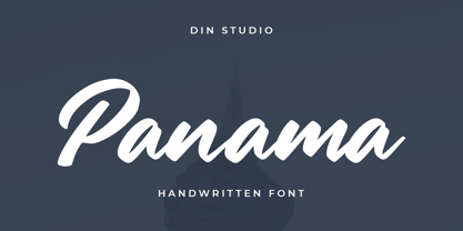 Panama is a modern handwritten font. It will make your design project more powerful and beautiful. The font is suitable for any project such as logos, branding and quotes.. Enjoy the Font! Features: Accents (Multilingual characters) PUA encoded Numerals and Punctuation (OpenType Standard) Thanks for visiting and purchasing my font!
 - Rennie Mackintosh Hillhouse by CRMFontCo,
$20.00Derived from the world famous Rennie Mackintosh Font, the Hillhouse version gives a 3D look to the genius of Charles Rennie Mackintosh. The "Hillhouse" name comes from one of Mackintosh's most famous architectural works - the Hill House in Helensburgh, Scotland. This stunning conceptual design can be visited from April to October. - Willson by Din Studio,
$29.00 Say hello to Willson - Clean Serif Font, Willson designed with a modern and clean style. It's suitable for branding, logo, printing and many other designs. Included: Willson (otf) Features: Accents (Multilingual characters) 6 Alternates 11 Ligatures PUA encoded Numerals and Punctuation (OpenType Standard) Thanks for visiting and purchasing my font!
 - Mertalion by Din Studio,
$29.00 Mertalion is a Vintage Serif Font. Create inspiring from the vintage logotype. the fonts are suitable for any vintage project like branding, vintage logotype, quote, and t-shirt print. Included : - Mertalion (OTF) Featured : - Accents (Multilingual characters) - PUA encoded - Numerals and Punctuation (OpenType Standard) Thanks for visiting and downloading my font!
 - Brevet by Solotype,
$19.95Authentic copy of the original, with a couple of minor changes to the caps, making them fit better. Although made for the American market by an American typefounder, we found this font in a York, England printshop when we went on a second visit to the famous DeLittle Wood Type factory. - Nagietha by Arterfak Project,
$26.00 Nagietha is a type of handwritten font with a dynamic & natural flow. This font is designed with original handwriting and gives it a personal touch. Carefully digitized by keeping the rough line still looks natural, romantic and personal. You can combine this font with many font styles such as serif, san-serif, oblique, italic, slab and etc. This font is specially made for personal branding but also works well for many applications. Perfect for logotype, labels, cosmetics, packaging, watermarks, quotes, apparel design, signature template, wedding invitation, food menu, doodle or any advertising needs. Nagietha is PUA Encoded, that allows you to access all of the alternates characters without any special software. You can simply access them by using Font Book (Mac) and Character Map (Win). TTF & OTF Format in a zip file featured : Uppercase Lowercase Numbers & symbols Accents Stylistic alternates Ligatures Swashes. Thank you for watching and stay safe everyone!
 - Maferic by Sealoung,
$25.00 Maferic is a combination font consisting of luxury three fonts. Which has uniqueness in each letter and helps you to make your design work look more special. This font is perfect for your designs such as logos, branding, fashion, business cards, social media, and of course many more. Maferic font ready with: Any options to get creative variations (combination of Regular, Italic, and Signature) 3 files format already: .otf .ttf . woff Preview as an inspiration that you can do with Maferic Signature font Ready with Lowercase and Uppercase characters Language Support; All three fonts support English, French, Italian, Spanish, Portuguese, German, Swedish, Norwegian, Danish, Dutch, Finnish, Indonesian, Malay, Hungarian, Polish, Turkish, Icelandic, Slovenian. That's it! I hope you enjoy it, and please don't hesitate to drop me a message if you have any issues or queries. Oh, and come and say hello over on Instagram! www.instagram.com/sealoungfonts
 - Kugelhopf JF by Jukebox Collection,
$32.99 Kugelhopf is a calligraphic style font with an old-world Blackletter feel to it. Full of charm and flair, this friendly script font will lend a sense of childlike magic to any design. Perfect for themes relating to holidays, fairy tales, storybooks and even Renaissance designs, Kugelhopf was inspired by a hand-lettered sample in an old book about sign painting. It can also be used for cards, invitations and scrapbooking as well! ‘Kugelhopf’ is a German & Austrian holiday yeast cake from which our modern western Bundt cake was derived. It has a particular shape that is said to be inspired by Turkish turbans. Jukebox fonts are available in OpenType format and downloadable packages contain both .otf and .ttf versions of the font. They are compatible on both Mac and Windows. All fonts contain basic OpenType features as well as support for Latin-based and most Eastern European languages.
 - Designer Notes Pro by FontFuel,
$12.00 Designer Notes Pro solves a design problem. When you are looking for that ‘handwritten’ look? Now you can typeset your handwritten notes using Designer Notes Pro. This font matches the look of a handwritten note, a diary entry, post-it note or sketchbook comment. The letter shapes are based on handwriting created using a Pilot Precise V5RTpen. There’s something special about how it puts ink on paper. This font falls in the script/handwriting font style. Designer Notes Pro Includes 4 versions: regular, italic, bold and bold italic. 4 font family includes Designer Notes Pro regular, italic, bold and bold italic -Mac & Win TrueType (.ttf) -Classification - script/handwriting -Each member of the this font family is a full Latin set of 228 characters/glyphs -Letters A-Z and a-z -Numerals 0-9 -Complete punctuation -Latin language glyphs -Mathematical symbols -Careful spacing and kerning
 - Moutyara by Dora Typefoundry,
$19.00 Moutyara – New Stylish Sans Serif Font with Fancy Curves. A very versatile font that works both large and small. With its angular shape, it is practical while maintaining elegance and boldness. Moutyara is perfect for logo design, magazine headlines, product packaging, branding projects, social media posts, advertisements, invitations, labels or whatever project you're working on. Create something beautiful today with Moutyara. Features: - All Caps Font with different uppercase and lowercase - Number & Symbol - Supported Languages - Alternates and Ligatures - PUA Encoded What is included: - Moutyara Regular (otf-ttf) We highly recommend using a program that supports OpenType features and Glyphs panels like Adobe apps and Corel Draw, so you can see and access all Glyph variations. This type of family has become the work of true love, making it as easy and fun as possible. I really hope you enjoy it! Thank you Enjoy the font and go get creative :)
 - Zimbara by Slex Studio,
$12.00 Zimbara script is calligraphy font with a classic style and a touch of elegance, inspired by the handwriting of ancient manuscripts. Carefully designed to work together in harmony that makes it very suitable for wedding media, book covers, greeting cards, logos, branding, business cards and certificates, even for any design work that requires a classic, formal or luxurious. Try Zimbara scrpit, enjoy the richness of OpenType features and let her fun and elegant excitement make you happy and enhance your creativity! You can use this font very easily. multilingual support and ligatures Your download will include OTF & TTF format files. If you do not have programs that support OpenType features like Adobe Illustrator and CorelDraw X Versions, you can access all alternative flying machines using Font Book (Mac) or Character Map (Windows): Do not forget to see, buy, like and share my other great products. Thank you for purchases.!
 - Monck by Putracetol,
$28.00 Introducing Monck, a modern display font that combines the best of modern typography and classic serif styles. With its sleek design and unique lettering options, Monck is perfect for a wide range of design projects. Whether you're creating logos, posters, quotes, or social media graphics, Monck offers a plethora of alternates and end swashes through its OpenType features. Monck comes with three different file formats - otf, ttf, and woff - making it compatible with various design software programs such as Adobe Illustrator CS, Adobe Photoshop CC, Adobe InDesign, and Corel Draw. This means you can easily access and utilize the alternate glyphs in Monck to create eye-catching lettering compositions. The OpenType features in Monck allow you to access uppercase and lowercase letters, as well as alternates and ligatures, giving you endless possibilities for creative combinations. Additionally, Monck supports multiple languages, making it a versatile choice for designers around the world. In your zip package, you'll find the Monck font files in otf, ttf, and woff formats, providing flexibility for different design projects. The font includes uppercase and lowercase letters, numerals, punctuation, and symbols, ensuring that you have all the tools you need to create stunning designs. Monck is a versatile font that can be used for various design purposes, such as logotypes, headings, covers, posters, product packaging, headers, merchandise, social media graphics, greeting cards, and more. Its modern and classic fusion style adds a unique and contemporary touch to your designs, making them stand out in any context. In summary, Monck is a modern display font that offers a wide range of alternates and ligatures through its OpenType features, making it a powerful tool for creative lettering compositions. With its multilingual support and compatibility with popular design software, Monck is a must-have font for any designer looking to add a touch of modernity and versatility to their projects. So why wait? Get Monck now and start creating stunning designs with ease!
 - Bright Bridge by Putracetol,
$28.00 Bright Bride - Beautiful Script Font Introducing Bright Bride, a stunning and elegant script font that exudes sophistication and beauty. This font was carefully crafted with the intention of adding a touch of glamour to any design project. Its clean lines and flowing curves create a sense of grace and charm, making it perfect for wedding invitations, branding projects, social media posts, and much more. For those seeking a romantic and feminine touch, Bright Bride is the perfect font choice. Its delicate strokes and intricate details add a level of elegance that is sure to catch the eye of any viewer. Pair it with soft pastels or classic black and white to create a stunning contrast that will make your designs stand out. One of the standout features of Bright Bride is its OpenType alternates and ligatures. These unique letter combinations add an extra level of creativity and customization to your designs. Plus, with full multilingual support, this font can be used for projects in a variety of languages. The Bright Bride font package includes three different file formats: OTF, TTF, and WOFF. This makes it easy to use the font across a variety of design software and platforms. Whether you're a professional graphic designer or a casual hobbyist, this font is sure to be a valuable addition to your design arsenal. If you're looking for a font that is both stunning and versatile, look no further than Bright Bride. Its unique combination of elegance and creativity make it a perfect fit for a wide range of projects. So why wait? Add Bright Bride to your font collection today and start creating designs that are truly unforgettable. In summary, Bright Bride is a beautiful and sophisticated script font with delicate strokes and intricate details. It comes with OpenType alternates and ligatures, multilingual support, and three different file formats: OTF, TTF, and WOFF. This font is perfect for wedding invitations, branding projects, social media posts, and more.
 - Stamm by Tychographica,
$79.00 Based on Element by Max Bittrof, Stamm takes the next step in adaptation to modern environment. Using it's own construction logic it makes the design far more consistent and considerably expands the character set, supporting hundreds of languages, including Vietnamese and extended Cyrillic. Generous amount of OpenType features allows various localization options, automatic fractions, super- and subscripts, oldstyle and tabular figures, small caps and ligatures to suit almost every need. There are 15 Stylistic Sets available to customize the font (some of them duplicate locl-features in case they're not supported by applications): ss01 (Traditional glyphs): changes modern shapes used by default to old-style forms; ss02 (Alternate historical glyphs): changes the shape of several characters to a more obscure historical form; ss03 (Catalan middle dot): replaces middle dot between two l's by Catalan variant for better spacing; ss04 (German ligatures): activates historical ch, ck and tz ligatures used in German blackletter typesetting; ss05 (Dutch IJ-acute): replaces j after i-acute with j-acute; ss06 (Marshallese cedilla): replaces commas under certain letters with cedillas; ss07 (Romanian/Moldovan comma): changes cedilla-glyphs to comma-glyphs; ss08 (Turkish i): replaces regular i with dotted Turkish variant; ss09 (Cyrillic alternates): changes several Cyrillic glyphs to alternate variants; ss10 (Bulgarian Cyrillic): activates Bulgarian shapes; ss11 (Serbo-Macedonian Cyrillic): activates Serbo-Macedonian shapes; ss12 (Double-story a): replaces default glyph with it's double-story variant; ss13 (Alternate asterisk): replaces default asterisk with 5-pointed shape; ss14 (Enclosed figures): replaces standard figures with enclosed variants; ss15 (Slashed zero): replaces default zero with slashed variant.
 - Keratine by Zetafonts,
$39.00 The letterforms that we now accept as the historical standard for printing latin alphabets were developed in Italy around the end of 1400. Deriving from Roman capitals and from italic handwriting, they soon replaced the blackletter letterforms that were used a few years before by Gutenberg for his first moveable types. Between these two typographical traditions there's an interesting and obscure middle ground of historical oddballs, like the Pannartz-Sweynheym Subiaco types, cut in Italy in 1462. Keratine is the result of Cosimo Lorenzo Pancini's exploration of that territory. Like our Kitsch by Francesco Canovaro it explores the impossible territory between antiqua and blackletter, not as a mere historical research, but rather as a way to re-discover and empower an unexpected and contemporary dynamism. Using contemporary digital aesthetics to combine the proportions of humanistic type with the gestural energy of Fraktur letterforms, Keratine develops a "digitally carved", quasi-pixelated appearance (clearly stressed in Keratine's italics) that allows an unexpected balance between small-size readability and display-size personality. Keratine also relies heavily on a variable identity as the letterforms change dynamically with weight, developing from a contrasted, text-oriented light range to more expressive and darker display range, for a total of 8 weights with italics. Open type features and glyph alternates further enrich the usage possibility of this typeface that embodies our contemporary swap culture by embracing the contradictory complexity at the crossroads between Gothic and Humanist styles, while playfully empathising with a digital, brutalist spirit.
 - Swarha by Gumpita Rahayu,
$18.00 Built in 1930 - 1935 by Dutch architect Wolff Schoemaker, the Swarha Islamic Building was originally used as a lodging for the honoured guest country and the journalists for Asia-Africa Conference in 1955. This building has an important role as one of Bandung historical art deco heritage, with the art deco typefaces styles on it's singage in this building, giving it a more classic west and east taste. Wolff Schoemaker was trying to combine the elements between eastern and western culture in design. One of his works was the Swarha Islamic Building in a circular design with rounded and high dynamic angle. Unfortunately the Swarha Islamic Building has been abandoned and and less attentioned by the local people itself to preserve this historic building. So I'm trying to raise the value of the historical heritage by creating this typefaces. This typefaces was inspired by the Swarha Building characteristic itself with its solid construction and dynamic, by adding classic taste on each characters. Available in two styles, Neue and Rounded represents the classic architectural Swarha Islamic Building styles with tropical Bandung Art Deco taste. This typeface is highly usable as a display type for your designs, and will fit with movie titles, magazines, your classic shops logo and signage designs, or you can use this typefaces as your web pages headlines. The characters of this typefaces are only in uppercase style, but it built with small caps on the lowercase featured, and additional Opentype Features were loaded, some stylistic alternates, accessible catchwords in the discretionary ligatures, and standard ligatures.
 - Mix Blimp by Mix Fonts,
$13.00 Introducing BLIMP – a fun, playful, and charming handwritten font. Ideal for adding a personal touch to your social media posts, quotes, packaging, digital crafts, greeting cards, marketing materials, and more. This font was created using an iPad Pro and Apple Pencil for a truly authentic, digital handwriting style. Don’t let boring fonts weigh you down – add some bounce to your designs with BLIMP. – Mix Blimp includes the following characters: ABCDEFGHIJKLMNOPQRSTUVWXYZ abcdefghijklmnopqrstuvwxyz 0123456789 !@$#%^&*()`~♥❤✿•· ÷×+−±≈=≠[]<>‹›:;'",.|/?{}<>“”‘’-–—_…©®™<>«»°¹²³¡¿₱¢€£¥§† ÁÀÂÄÃÅĂĀĄÆĆČÇÐÉÈÊËĖĒĘIÍÌÎÏĪĮŁŃÑÓÒÔÖÕØŌŐŒŚŠȘȚÚÙÛÜŰŪŲÝŸŹŽŻÞ áàâäãåăāąæćčçðéèêëėēęıíìîïīįłńñóòôöõøōőœśšșțúùûüűūųýÿźžżþß Alternates: ff ll tt zz
 - Almanor Peninsula by Subqi Studio,
$15.00 Introducing our new font, Almanor Peninsula . Not too shabby a name, right? A display logotype script, not too bold and not too thin either. This font has been created for your sporty display projects, whatever they may be. This font contains the basic script ligature 'tt' with some necessary alternates here and there. Plus some swash for the cherry on top. This font is PUA encoded already, so you can access all the glyphs with the basic character map apps. So have fun with this one !
 - Pinatas Marks by Piñata,
$12.00 Original Foundry: TypeType Original name: TT Marks The typeface Pinatas Marks is made in the style of the traditional American sign painting, which is the traditional art of painting on buildings, billboards and signage for the purpose of announcing or advertising of products, services, and activities. Font family Pinatas Marks consists of 32 fonts and has 8 different weights: Thin, ExtraLight, Light, Regular, Medium, Bold, ExtraBold, Black. Pinatas Marks is looking great on all the modern information media, ranging from small labels to entire text blocks.
 - Baked Milk by Struvictory.art,
$15.00 Baked Milk is a display font family with nostalgic motives. The font is created in a groovy retro style. Baked Milk includes Regular and Symbol Styles. The font is suitable for retro summer posters, menu and social media design, branding, event design etc. Baked Milk has extensive language support, it includes English, French, German, Italian, Spanish, Portuguese, Danish, Norwegian, Swedish, Finnish, Estonian, Turkish. Baked Milk font contains ligatures: aa, dd, ff, ft, hh, jj, kk, ll, mm, nn, oo, pp, rf, rr, rt, ss, tt, uu, Ti.
 - Loopy Lola by Mix Fonts,
$29.00 MIX LOOPY LOLA is a very fun, quirky, off-kilter all-uppercase handwritten font. This handdrawn typeface is perfect for social media graphics, edgy posters, and bold headlines. Match the font with some fun loopy doodled elements to give your art that added bit of cute. Character set to includes (standard alphabet, punctuation, extended, accented, ligatures): ABCDEFGHIJKLMNOPQRSTUVWXYZ abcdefghijklmnopqrstuvwxyz 0123456789 !@$#%^&*()`~♥❤✿•· ÷×+−±≈=≠≥≤[]:;'",.|/?{}“”‘’-–—_… ©®™«»°¹²³ªº¡¿₱¢€£¥½¼¾¶§№† ÁÀÂÄÃÅĂĀĄÆĆĈČÇÐĐÉÈÊËĖĒĘĜĤIÍÌÎÏĪĮĴŁŃÑŇ ÓÒÔÖÕØŌŐŒŔŘŚŜŠȘŤȚÚÙÛÜŮŰŪŲẀẂŴÝŶŸŹŽŻÞ áàâäãåăāąæćĉčçðđéèêëėēęĝĥıíìîïīįĵłńñň óòôöõøōőœŕřśŝšșťțúùûüůűūųẁẃŵýŷÿźžżþß LIGATURES: bb dd ff gg itt kk ll mm nn oo pp rr ss tt
 - Shangri La NF by Nick's Fonts,
$10.00An unusual handlettered alphabet from the 1922 chapbook Modern Show Card Writing, by Joseph Bertram Jowitt, provided the pattern for this whimsical face. Its letterforms, as well as its name, conjure up visions of faraway places, and is sure to add a unique charm to your next project. This font contains the complete Latin language character set (Unicode 1252) plus support for Central European (Unicode 1250) languages as well. - Shiver Me Timbers NF by Nick's Fonts,
$10.00Avast, me hearties! Here be a serious pirate font, based loosely on several of Victor Hammer’s uncial typefaces, designed between 1925 and 1953, and liberally weathered and corroded for that authentic barnacle-encrusted look. The bullet character is suitable for marking where the treasure is buried, and the section mark is a Jolly Roger. Both versions of the font include 1252 Latin, 1250 CE (with localization for Romanian and Moldovan). - Portland by Fenotype,
$25.00 Made you look? There’s a peculiar feel to the letters – achieved by the reversed contrast. Perfectly legible yet there’s something about the characters that makes them stand out. As Viktor Shklovsky once coined, ”Habitualization devours objects” – the everyday world becomes invisible until we are forced to see it otherwise. The Portland font family is a tool of choice when you want to effortlessly make your designs stand out.
 - Santini by Canada Type,
$25.00Santini began as an experiment in mixing historical art deco, art nouveau, arts and crafts, and to a lesser extent Bauhaus sources. Surprised at the pleasant outcome of the experiment, we expanded it to become three weights, and included some alternates within the fonts themselves. Santini is an excellent choice for art- and architecture-related design, where the message needs to be conveyed in a clear yet sturdy and modern fashion. - Kidnapped At Old Times by Intellecta Design,
$11.90 Kidnapped at Old Times, by Intellecta Design, is a collection of 35 fonts (and growing) of some of the most decorative caps we have ever carried. Decorative caps can capture the attention of anyone when used well. These caps are remarkably interesting and very detailed. So many to choose from - the entire family has over 2000 exotic, intrincate and historical letters. Easier to just order the whole family!


