10,000 search results
(0.057 seconds)
- Fangtasia is a unique and captivating font that immediately grabs attention with its distinctive character. Created by SpideRaY, a designer known for crafting fonts with personality and depth, Fangta...
- Silk Display by Luhop Creative,
$18.00 Silk Display is a serif retro and bold display font. This font is PUA encoded which means you can access all of the glyphs and alternates with ease! It would look great on headlines, magazines, logos, branding and so much more!
 - Estonia Nouveau Pro by TypeSETit,
$39.95 Estonia Nouveau is based on the calligraphic style found in the East European country of Estonia. The traditional lowercase forms are combined with the more non-traditional script uppercase alternates to give a truly up-to-date, yet traditional look.
 - C&lc Uncial Pro by Hackberry Font Foundry,
$24.95 This is a radically modernized uncial with many OpenType features and 415 characters: Caps, lower case, small caps, numerators, denominators, accents characters and so on. There are 21 ligatures. It is an experimental look at medieval writing for the 21st century.
 - Amoeba by SparkyType,
$19.00If you look into the past to see what was expected of us in the future, Amoeba is where we wanted to be by now. Amoeba is a constrained but quirky future font, designed on a computer by a human. - American Writer by Typadelic,
$19.00American Writer is suitable for many types of designs. It is meant to be used for body text and is very readable at small text sizes. It looks similar to the type you would see on blueprints or an architect's drawings. - Selenic by Paul Dersidan,
$23.00 Selenic is a solid typeface with a clean look, interesting texture and quick impact. Friendly but also aggressive it is best suited for massive headlines, fashion photography, album covers, logo design or any other typographical work on digital and print.
 - Nervatica by Tour De Force,
$25.00 Language is a must, please clean your book’s dust. If you move like a snail, you'll never end up on Yale. Teach your mind to rewind, never leave knowledge behind, what should be defined, is what you'll get as assigned.
 - Tidy Mom by Seemly Fonts,
$12.00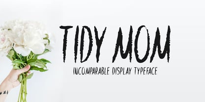 Tidy Mom is a unique display font. This font is a great choice for a wide variety of contexts! It looks stunning on thank you cards, quotes, greeting cards, logos, business cards, and every other design which needs a creative spark.
 - Camelleon by Balpirick,
$15.00 Camelleon is a monoline handwritten font. Its casual charm makes it appear wonderfully down-to-earth, readable and, ultimately, incredibly versatile. Camelleon will look outstanding in any context, whether it’s being used on busy backgrounds or as a standalone headline!
 - Timework by Seemly Fonts,
$14.00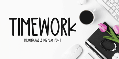 Timework is a unique display font. This font is a great choice for a wide variety of contexts! It looks stunning on thank you cards, quotes, greeting cards, logos, business cards, and every other design which needs a creative spark.
 - HT Pizzeria by Dharma Type,
$19.99 Ht Pizzeria is strong looking script for eye-catching part. Holiday Type Project offers retro hand drawing scripts. Inspired by retro script on shopfront lettering, wall paint advertisements in Italy around 1950s. Check out the script fonts from Holiday Type!
 - LD Buttercream by Illustration Ink,
$3.00LD Buttercream is such a great font...it mimics the look of a frosted remembrance on a birthday cake...but it's uses are so universal and fun, you'll find many ways to put this font to work in your clever creations! - The Reyden by onlyfontyouandme,
$15.00 The Reyden is a retro and bold display font. This font is PUA encoded which means you can access all of the glyphs and alternates with ease! It would look great on headlines, magazines, logos, branding and so much more!
 - Crimes Times Six by JSH creates,
$39.95 Crimes Times Six is a cool horror font, originally created with a chalk stick back in 2012, by Jonathan S Harris. The typeface design works very well in video games, movies and broadcasting, but also looks great on clothing and posters.
 - Nigo by Linecreative,
$16.00 Nigo is a stylish font It has both modern and retro look - clear, modern and fun, Perfect for make any project like header, quote, layout magazine and other. Even better if you use it on 60s and 70s design project
 - Blush And Bloom by Make Media Co,
$12.00 Introducing Blush & Bloom, a smooth, elegant typeface with 80 ligatures and alternates for an authentic hand-written feel. Blush & Bloom looks gorgeous on business cards, envelopes, logos, signage, greeting cards, wedding materials and packaging. And works beautifully with Cricut & Silhouette machines!
 - Gretel Script by Typejockeys,
$25.00 This quirky script is packed with features. Best of all: Optical sizes! The three style family is based on the writing of calligrapher Natascha Safarik. All glyphs were redrawn manually to produce vector shapes that look perfect in literally every size!
 - Baguette by Balpirick,
$15.00 Baguette is a natural hand-brushed font. It’s perfect for logos, greeting cards, invitations, stationery, social media posts and much more! Baguette will look outstanding in any context, whether it’s being used on busy backgrounds or as a standalone headline!
 - Christmas Bright by Sakha Design,
$14.00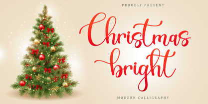 Christmas Bright is a warm, elegant and cozy handwritten font. it will look gorgeous on each of your festive designs or Christmas letters. This font is PUA encoded which means you can access all of the glyphs and swashes with ease!
 - French Stencil Sans JNL by Jeff Levine,
$29.00 French Stencil Sans JNL is another typeface based on vintage French tin/zinc stencils. Slightly rounded corners and a "hand-cut" look add an interesting and charming variation that breaks away from the "standard" design of other metal stencil sets.
 - Space Vacation by Vozzy,
$10.00 Introducing a vintage look label font named "Space Vacation". It includes two styles: Base and Full, plus two effect styles: Outline and Volume. This font will good viewed on any retro design like poster, t-shirt, label, logos and more.
 - Typewriter Olympia SM8 by Simeon out West,
$25.00 This font, based on old Olympia SM and SF typewriters from the 50’s and 60’s provides a nice clean, yet quirky look for your documents. Being a reproduction inspired by a typewriter, it works better at smaller sizes.
 - Tekanan by San Studio,
$10.00 Tekanan Typeface is an experiment and designed by Zainul Faozi. Tekanan Typeface looks futuristic and it's a great choice to use on your designs, such as a shop sign, poster, cover, headline, and more. Designer: Zainul Faozi Publisher: San Studio
 - Zahariel by Scriptorium,
$18.00Zahariel is a stylish script font based on samples of turn of the century calligraphy. It has a different, cleaner look in comparison with many of our other script fonts, and features alternate versions of many of the lower case characters. - AZ Grampa by Artist of Design,
$25.00 AZ Grampa font was inspired from old content type on vintage tins. This font utilizes an "old look" to the line work which is designed to have a "worn feel" to it. Ideal for use as content text in you design.
 - Lecture Hall JNL by Jeff Levine,
$29.00 Lecture Hall JNL is a reworking of Dance Hall JNL. By removing the Art Deco flairs and realigning the horizontal strokes in order to create a more traditional design, the font now takes on the look of a classic headline face.
 - Ignorant by Bogstav,
$14.00 Ignorant was actually drawn on a grid. But due to the loose strokes of the pen, Ignorant has a lively look. I was thinking products for kids, packaging, organic products or something alike that needs a slightly rough and handmade font!
 - Matteny Angels by Multype Studio,
$16.00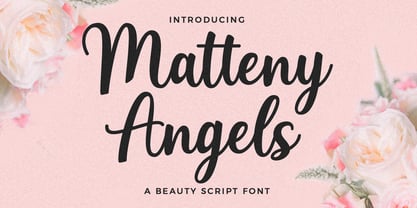 Matteny Angels is a beautiful and flowing script font. It looks stunning on wedding invitations, branding, thank you cards, watermark, fashion, quotes, greeting cards, logos, business cards and every other design which needs a handwritten touch. This font is PUA encoded.
 - Kelly Signature by Ake,
$15.00 Kelly Signature is a unique handwritten font. A little bit quirky, this font looks incredibly adept on a wide variety of contexts! This font is PUA encoded which means you can access all of the glyphs and swashes with ease!
 - Kitra 77 by LightHouse,
$49.00Kitra 77 was one of the studies to Hamuel Nine Five. Though at first glance we can find several similarities, a closer look will reveal a completely different font in color and proportion. Kitra 77 is an OpenType/TTF Unicode font. - Tropica Script by ITC,
$29.00Tropica Script was designed by Vince Whitlock, a casual, lighthearted script typeface. The initial capitals are complemented by a lowercase that connects by overlapping the linking elements on the bottom right of each letter, creating the look of true script. - Bodoni Unique by Monotype,
$29.99This Bodoni caps only font was an experiment from Dave Farey how tall such a Bodoni could be elongated in its design. It reminds to the look of a fence, but in large sizes it may fit on a narrow window. - Bakihara by Ekahermawan,
$20.00 Introducing Bakihara is an attractive blackletter family with a full set of uppercase and lowercase characters, alternates characters, ligatures characters, multilingual support, currency figures, numerals and punctuation. Bakihara comes with 4 weights from Thin to Bold that will support your creativity in creating perfect designs for various projects such as logo design, branding, posters, magazines, labels, merchandise, invitations, advertisements, tattoos, clothing, music events, and many more project with a Gothic theme. If you need support or more information about this item please contact me: ekahermawanputu@gmail.com Thank you very much I really hope you enjoy using it!
 - Bullgine by Letterhend,
$19.00 Introducing, Bullgine - A modern gothic blackletter typeface. This type of font perfectly made to be applied especially in logo, and the other various formal forms such as Logo, Clothing, Fashion, Headline, or any type of advertising purpose. Features : uppercase & lowercase numbers and punctuation stylistic alternate multilingual PUA encoded We highly recommend using a program that supports OpenType features and Glyphs panels like many of Adobe apps and Corel Draw, so you can see and access all Glyph variations. How to access opentype feature : letterhend.com/tutorials/using-opentype-feature-in-any-software/ Email us to letterhend@gmail.com if you need something! Happy Designing!
 - Jack Pirate by Mans Greback,
$59.00 Jack Pirate is a hand-drawn blackletter typeface, created by Måns Grebäck during 2019. It is a genuine medieval font with fraktur-inspired letter forms, Gothic decorations and a mysterious undertone. Use it for projects relating to the Middle Ages, or in modern contexts such as tattoo or storefront graphics. It contains an alternate alphabet, to be used as a stand-alone font or to give decoration and variation to the regular style. The font is multilingual and has an extensive range of glyphs; it supports all Latin-based European languages, contains numbers as well as all symbols and characters you'll ever need.
 - FS Untitled Variable by Fontsmith,
$319.99Developer-friendly The studio has developed a wide array of weights for FS Untitled – 12 in all, in roman and italic – with the intention of meeting every on-screen need. All recognisably part of a family, each weight brings a different edge or personality to headline or body copy. There’s more. Type on screen has a tendency to fill in or blow so for each weight, there’s the choice of two marginally different versions, allowing designers and developers to go up or down a touch in weight. They’re free to use the font at any size on any background colour without fear of causing optical obstacles. And to make life even easier for developers, the 12 weight pairs have each been designated with a number from 100 (Thin) to 750 (Bold), corresponding to the system used to denote font weight in CSS code. Selecting a weight is always light work. Easy on the pixels ‘It’s a digital-first world,’ says Jason Smith, ‘and I wanted to make something that was really functional for digital brands’. FS Untitled was made for modern screens. Its shapes and proportions, x-height and cap height were modelled around the pixel grids of even low-resolution displays. So there are no angles in the A, V and W, just gently curving strokes that fit, not fight, with the pixels, and reduce the dependency on font hinting. Forms are simplified and modular – there are no spurs on the r or d, for example – and the space between the dot of the i and its stem is larger than usual. The result is a clearer, more legible typeface – functional but with bags of character. Screen beginnings FS Untitled got its start on the box. Its roots lie in Fontsmith’s creation of the typeface for Channel 4’s rebrand in 2005: the classic, quirky, edgy C4 headline font, with its rounded square shapes (inspired by the classic cartoon TV shape of a squidgy rectangle), and a toned-down version for use in text, captions and content graphics. The studio has built on the characteristics that made the original face so pixel-friendly: its blend of almost-flat horizontals and verticals with just enough openness and curve at the corners to keep the font looking friendly. The curves of the o, c and e are classic Fontsmith – typical of the dedication its designers puts into sculpting letterforms. Look out for… FS Untitled wouldn’t be a Fontsmith typeface if it didn’t have its quirks, some warranted, some wanton. There’s the rounded junction at the base of the E, for example, and the strong, solid contours of the punctuation marks and numerals. Notice, too, the distinctive, open shape of the A, V, W, X and Y, created by strokes that start off straight before curving into their diagonal path. Some would call the look bow-legged; we’d call it big-hearted. - FS Untitled by Fontsmith,
$80.00 Developer-friendly The studio has developed a wide array of weights for FS Untitled – 12 in all, in roman and italic – with the intention of meeting every on-screen need. All recognisably part of a family, each weight brings a different edge or personality to headline or body copy. There’s more. Type on screen has a tendency to fill in or blow so for each weight, there’s the choice of two marginally different versions, allowing designers and developers to go up or down a touch in weight. They’re free to use the font at any size on any background colour without fear of causing optical obstacles. And to make life even easier for developers, the 12 weight pairs have each been designated with a number from 100 (Thin) to 750 (Bold), corresponding to the system used to denote font weight in CSS code. Selecting a weight is always light work. Easy on the pixels ‘It’s a digital-first world,’ says Jason Smith, ‘and I wanted to make something that was really functional for digital brands’. FS Untitled was made for modern screens. Its shapes and proportions, x-height and cap height were modelled around the pixel grids of even low-resolution displays. So there are no angles in the A, V and W, just gently curving strokes that fit, not fight, with the pixels, and reduce the dependency on font hinting. Forms are simplified and modular – there are no spurs on the r or d, for example – and the space between the dot of the i and its stem is larger than usual. The result is a clearer, more legible typeface – functional but with bags of character. Screen beginnings FS Untitled got its start on the box. Its roots lie in Fontsmith’s creation of the typeface for Channel 4’s rebrand in 2005: the classic, quirky, edgy C4 headline font, with its rounded square shapes (inspired by the classic cartoon TV shape of a squidgy rectangle), and a toned-down version for use in text, captions and content graphics. The studio has built on the characteristics that made the original face so pixel-friendly: its blend of almost-flat horizontals and verticals with just enough openness and curve at the corners to keep the font looking friendly. The curves of the o, c and e are classic Fontsmith – typical of the dedication its designers puts into sculpting letterforms. Look out for… FS Untitled wouldn’t be a Fontsmith typeface if it didn’t have its quirks, some warranted, some wanton. There’s the rounded junction at the base of the E, for example, and the strong, solid contours of the punctuation marks and numerals. Notice, too, the distinctive, open shape of the A, V, W, X and Y, created by strokes that start off straight before curving into their diagonal path. Some would call the look bow-legged; we’d call it big-hearted.
 - FS Clerkenwell by Fontsmith,
$80.00 A creative context 2003. Fontsmith was sharing a small, cold, whitewashed studio space in Northburgh Street, Clerkenwell. But things were on the up following prestigious custom type commissions for The Post Office and E4. “Slab serifs were on the brink of another revival, we could feel it,” says Jason Smith. “All we wanted to do was have a play with these slabs, go as far as we could within what was acceptable and readable.” “It wasn’t initially clear what was happening,” recalls Phil Garnham. “We were becoming very influenced by our surroundings, outside the studio space. We absorbed the essence and the designer grime of where we were.” Process Jason began by drawing stems on-screen. “The key aspect of the font is the upward bend of the leading shoulder serif, the way it kind of ramps up and then plummets back down the stem. “The regular and light characters are quite narrow – great for text but the bold is quite wide and chunky – better for headlines. I think ‘y’ is quite different for a slab design. We call it the Fontsmith ‘y’.” Promotion Fontsmith were determined to get FS Clerkenwell noticed. To launch the font, Ian Whalley, a designer friend of Fontsmith, captured words heard on the streets of Clerkenwell, set them in the new font and crafted a small book of typographic conversations. It was a first for Fontsmith. “I think that’s part of why this font has been so successful,” says Phil. “It really does embody the spirit of the area, as a special place for design, arts and crafts. And designers love that.” Contemporary twist FS Clerkenwell, based on influences in and around this part of London with a rich tradition of printing and design, mixes tradition with creation. Old-fashioned values meet new-school trends. Its quirky, contemporary character lends an edge to headlines, logotypes and any large-size text.
 - Congress by Monotype,
$29.99Congress from Adrian Williams was shown for the first time at the Association Typographique International Congress, which proved to be so popular in 1980 at Kiel; designed to present a style equally appealling in European languages. Many characters are more condensed than is usual, while others have had certain elements exagerated, bringing notice to new elements of certain letters. The concept being to bring an equality of importance to the whole, producing a collection of International characters working together in harmony on the page -- a common aim that Europeans wish of any Congress.