10,000 search results
(0.051 seconds)
- SK Primo by Shriftovik,
$16.00 SK Primo is a monumental geometric grotesque created to stand out. An unusual combination of smooth rounded contours and sharp square shapes creates a visual contrast that is noticeable. Carefully adjusted shape and attention to detail make this font a great help in the work of the designer. SK Primo is ideal for headlines, posters, banners, and text highlighting. Two styles, solid and outline, were developed to address all communication needs.
 - Energetica by Balpirick,
$15.00 Energetica is a Modern Handwritten Font. Energetica is a delicate, elegant and flowing handwritten font. It has beautiful and well balanced characters and as a result, it matches a wide pool of designs. Add it to your most creative ideas and notice how it makes them come alive! Energetica also multilingual support. Enjoy the font, feel free to comment or feedback, send me PM or email. Thank you!
 - Cantiqe by XdCreative,
$25.00 Cantiqe the rational serif with a circular/ball terminal and strong vertical contrast and fine horizontal hairlines, This makes Cantique a blend of elegant and beautiful. Cantiqe Incredibly versatile is perfect for fashion branding or editorial designs. this font fits a wide pool of designs, elevating them to the highest levels. Add this font to your favourite creative ideas and notice how it makes them come alive! Thank You _xdCreative
 - Klothilde by Fontroll,
$20.00 Klothilde is a handwriting font which came to life in one of my doodling sessions (I must admit I still doodle with pen and paper). The idea was to create a font which resembles writing with a quill on paper with exaggerated ball terminals. Sometimes there is too much ink which makes the letters fat and the strokes uneven. The paper soaks the ink resulting in blurred line crossings. The form gets blurry. On the other hand, when the quill runs out of ink the stroke gets thinner looking like the light version of Klothilde. In order to emulate the different looks, I created six fonts with a common skeleton but different appearance which can be altered seamlessly by using the Variable Fonts technology (e.g. in latest Adobe apps or CorelDRAW Graphics Suite) along the Weight and Blurred sliders. But even without, Klothilde can be used even in longer copy. Use it from 18 pt upwards, flush left with tight leading and intersecting ascenders and descenders. Due to extensive manual kerning, it gives your text an even colour. To my knowledge, Klothilde is one of the first script Variable fonts in different weights. No, Klothilde’s letters are not connecting. But I added a whole bunch of connecting ligatures which are simply activated by the ligature feature of your app. Even Microsoft Word can do that. Thus Klothilde comes to life, as it should be expected from a handwriting font. In order to add to variety there are additional glyphs for some critical initial and standalone letters. Repeating letter combinations like nn, mm or rr are avoided by replacing the second letter by an alternative form. All features are activated by the standard ligature feature. Ligatures are available for most European languages, some even in Cyrillic (some special Serbo-Croat letters included and accessible through localization or Style Set 08 features). Romanian comma-accent characters and ligatures are accessible through the OpenType locl feature. For the topping on the cake, I added an alternate ampersand (stylistic set 1) and asterisk (ss04), an alternate Cyrillic b (ss02) and t (ss03), a few fleurons, arrows and a skull (OpenType feature ornm), fractions (frac feature), circled numbers (ss06) and an interrobang (ss07) which result in exactly 900 glyphs in each of the six fonts. There should be enough to play with. Should you be missing a special character, do give me a hint.
 - Text Tile by Tetradtype,
$25.00 TextTile is a system of heavy sans titling faces which can be utilized to carry a repeating chromatic pattern across words and letters. It stands apart from other chromatic faces, where layered effects typically interact only within each letter and do not carry through from one letter to another. The pattern repetition across letters of varying widths is achieved through OpenType substitution, using conditional alternates for each successive letter to allow for a seamless appearance across words, regardless of letter combinations. Though the pattern exists on a strict grid and the letters' widths and spacing must be highly regular in order to preserve the pattern repeat, the letterforms themselves are not rigid; rather, they appear organic, lively. The initial release includes patterns inspired by a classic buffalo plaid, separated into its horizontal and vertical components to maximize the creative possibilities for layering one-, two-, three-, and even four-color plaid patterns. Kits are available to produce the plaid pattern in detail—with overlapping diagonal hatching fully visible—or as a simplified version in which transparency can be used to simulate plaid or to create a checkered or striped effect. The TextTile family of fonts is a flexible canvas for mixing and matching a broad array of patterns to create a unique look. Check back for more pattern releases and take a look at the online specimen to see what is possible with the current offerings. Usage Notes For best results use an OpenType aware program. Enabling Contextual Alternates will ensure pattern alignment. For patterns that are made up of vertical stripes or columns using the Stylistic Alternate/Stylistic Set 1 will shift the columns. Stylistic Set 2 will change 1-0 into blocks of patterns.
 - Commuter - Unknown license

- ITC Caslon No. 224 by ITC,
$40.99 The Englishman William Caslon (1672-1766) first cut his typeface Caslon in 1725. His major influences were the Dutch designers Christoffel van Dijcks and Dirck Voskens. The Caslon font was long known as the script of kings, although on the other side of the political spectrum, the Americans used it as well for their Declaration of Independence. The characteristics of the earlier Renaissance typefaces are only barely detectable. The serifs are finer and the axis of the curvature is almost or completely vertical. The overall impression which Caslon makes is serious, elegant and linear. Next to Baskerville, Caslon font is known as the embodiment of the English Baroque-Antiqua and has gone through numerous new interpretations, meaning that every Caslon is slightly different. ITC Caslon 224 was designed by Edward Benguiat and appeared with ITC in 1982. It is the text font which expanded upon the title font ITC Caslon 223. The alterations in the proportions of the letters make this Caslon 224 a noticeable departure from the original, but make the font overall more legible.
 - Slatz by CozyFonts,
$20.00 The Slatz Font Family is Vertical. It has a slender, consistent weight that is best used in limited, left to Right, space limitations as to maximize font height. Slatz font variations all have extremely clean edges and even the serif versions are crisply defined with a flat-pointed serif for an added unique character. The designed intent was for a tight kern, however evenly letterspacing these family members give a distinct personality and continues to command the negative space just as in tight kerned examples. The compatible relationship of these font family members, serif to sans serif, and regular to italic is seamless and the overall design coloring of words as sentences is well balanced and extremely legible. The Slatz Family fonts are matching members glyph to glyph yet there is a noticeable difference between the serif and sans serif members. The sans serif works in contemporary and vintage settings. The serif members work particularly well in vintage, period applications. The Bold and Drop versions of Slatz also fit the above descriptions and also work on their own.
 - ZT Yaglo by Khaiuns,
$16.00 ZT Yaglo is a dynamic and expressive display font, from the first impression you may have noticed that this font is a fishing rod-like concept, with a consistent rhythmic curve that gets sharper at the ends. The ZT Yaglo typeface is framed in a sans theme and added a serif feel to produce a bold, geometric typeface in all thicknesses. ZT Yaglo mixes a simple sans style for extra bold serif energy with the feel of calligraphic shapes. The thicker your choice of style, the more striking the flow of changes in shape becomes spiky. ZT Yaglo is a cool alternative for you to create branding projects, Logo designs, Apparel Branding, product packaging, magazine headers or just as a stylish text overlay onto any background image. ZT Yaglo has 9 Styles, 1 Free for Commercial, and one Variable font. each face has 457 glyphs. Includes Standard Ligature, and the "&" character has an alternate letter in each Weight. I hope you have fun using ZT Yaglo. Thanks for using this font ~ Khaiuns X zelowtype
 - Deception by Typodermic,
$11.95 Introducing Deception—the sub-pixel typeface that’s about to blow your mind! With ten captivating effects, this font is a must-have for anyone looking to create unique and eye-catching designs. Deception Array is the perfect choice for modern architectural themes, with wide blocks reminiscent of a digital VU meter. Deception Bars gives your text a mesmerizing look, like it’s being viewed through lenticular glass. Deception Blocks approximates the heavy JPEG degradation and pixel sharpening glitch effects that are all the rage right now. Looking for something flashy and prestigious? Try Deception Diamonds with a glow effect. Deception Lines can produce a grayscale effect or banding depending on resolution and rendering type, so keep experimenting to see what works best for you. Deception Particles echoes the look of impact printers or laser-etched sell-by dates, giving your text a vintage feel. Deception Plusses radiates positivity with its energetic design. Deception Process simulates grayscale LCD text or a thermal printer on the fritz, perfect for creating a unique and edgy look. Deception Scanline duplicates the appearance of television picture tube text rendering, ideal for recreating a videogame or retro computing vibe. And if you’re feeling daring, Deception System smacks of 1-bit dithering gone completely haywire! Each style of Deception is available in Regular and Bold, with OpenType fractions, numeric ordinals, and plenty of currency symbols included. So what are you waiting for? Try out Deception today and take your designs to the next level! Most Latin-based European writing systems are supported, including the following languages. Afaan Oromo, Afar, Afrikaans, Albanian, Alsatian, Aromanian, Aymara, Bashkir (Latin), Basque, Belarusian (Latin), Bemba, Bikol, Bosnian, Breton, Cape Verdean, Creole, Catalan, Cebuano, Chamorro, Chavacano, Chichewa, Crimean Tatar (Latin), Croatian, Czech, Danish, Dawan, Dholuo, Dutch, English, Estonian, Faroese, Fijian, Filipino, Finnish, French, Frisian, Friulian, Gagauz (Latin), Galician, Ganda, Genoese, German, Greenlandic, Guadeloupean Creole, Haitian Creole, Hawaiian, Hiligaynon, Hungarian, Icelandic, Ilocano, Indonesian, Irish, Italian, Jamaican, Kaqchikel, Karakalpak (Latin), Kashubian, Kikongo, Kinyarwanda, Kirundi, Kurdish (Latin), Latvian, Lithuanian, Lombard, Low Saxon, Luxembourgish, Maasai, Makhuwa, Malay, Maltese, Māori, Moldovan, Montenegrin, Ndebele, Neapolitan, Norwegian, Novial, Occitan, Ossetian (Latin), Papiamento, Piedmontese, Polish, Portuguese, Quechua, Rarotongan, Romanian, Romansh, Sami, Sango, Saramaccan, Sardinian, Scottish Gaelic, Serbian (Latin), Shona, Sicilian, Silesian, Slovak, Slovenian, Somali, Sorbian, Sotho, Spanish, Swahili, Swazi, Swedish, Tagalog, Tahitian, Tetum, Tongan, Tshiluba, Tsonga, Tswana, Tumbuka, Turkish, Turkmen (Latin), Tuvaluan, Uzbek (Latin), Venetian, Vepsian, Võro, Walloon, Waray-Waray, Wayuu, Welsh, Wolof, Xhosa, Yapese, Zapotec Zulu and Zuni.
 - Rolling Brush by Ditatype,
$29.00 Rolling Brush is a script font that gives handwriting appearance with original and personal brush details. This font is made beautifully so that the letters are connected to each other, creating a continuous and flowing look. Each letter is attached to the previous letter and continues to the next letter, creating beauty in writing unity. This font shows brush details on each letter. Brush strokes displays a rough, organic texture to the edges of the letters, adding dimension and visual life. These details give a unique impression to this script font. On the other hand, even though it has a rough border, this script still maintains a natural and elegant aesthetic touch. Some letters may have dramatic twists, while others are simpler. This flexible shape creates an expressive and creative look to the lettering. Because it is designed with a rough border, it would be better if you use this font at a large text size so it is more easy to read. Enjoy the various features available in this font as well. Features: Alternates Ligatures Multilingual Supports PUA Encoded Numerals and Punctuations Rolling Brush is suitable for any designs that want to convey a warm, personal and alluring impression. You can use this font in the design of greeting cards, invitations, logos, labels, and many other design projects that want to create uniqueness through a natural, handwritten touch. Find out more ways to use this font by taking a look at the font preview. Thanks for purchasing our fonts. Hopefully, you have a great time using our font. Feel free to contact us anytime for further information or when you have trouble with the font. Thanks a lot and happy designing.
 - Another Grotesk by Aleksandrs Golubovs,
$32.00 Another Grotesk is a contemporary typeface that was inspired by the early grotesques. Upon closer inspection you will notice the terminals of some of the characters are slightly turned inwards, this detail gives Another Grotesk its distinctive and friendly personality. Another Grotesk is functional and has been crafted with a great attention to detail. It is available in 9 weights and two optical sizes with matching italics which adds up to 36 styles. Another Grotesk Text family has been carefully redesigned some of the details were removed and simplified, x-height increased, and ink traps added, but preserved the overall look and feel of the display version, to ensure a greater legibility and clarity in running text. The extensive language support allows type setting in more than 200 languages across Latin, Cyrillic and Greek scripts. Another Grotesk also includes small caps and punctuation, tabular and old-style figures, as well as case sensitive feature and offers stylistic alternates for K, a, g, and y to fulfil any creative need of a designer.
 - Generis Slab by Linotype,
$29.00The idea for the Generis type system came to Erik Faulhaber while he was traveling in the USA. Seeing typefaces mixed together in a business district motivated him to create a new type system with interrelated forms. The first design scheme came about in 1997, following the space saving model of these American Gothics. Faulhaber then examined the demands of legibility and various communications media before finally developing the plan behind this type system. Generis’s design includes two individually designed styles; each of with is available with and without serifs, giving the type system four separate families. Each includes at least four basic weights: Light, Regular, Medium, and Bold. Further weights, small caps, old style figures, and true italics were added to each family where needed. The Generis type system is designed to meet both optical criteria and the highest possible measure of technical precision. Harmony, rhythm, legibility, and formal restraint make up the foreground. Generis combines aesthetic, technical, and economic advantages, which purposefully and efficiently cover the whole range of corporate communication needs. The unified basic form and the individual peculiarity of the styles lead to Generis’ systematic, total-package concept. The clear formal language of the Generis type system resides beneath the information, bringing appropriate typographic expression to high-level corporate identity systems, both in print and on screen. The condensed and aspiring nature of the letterforms allows for the efficient setting of body copy, and the economic use of the page. A range of accented characters allows text to be set in 48 Latin-based languages, offering maximal typographic free range. This previously unknown level of technical and design execution helps create higher quality typography in all areas of corporate communication. Optimal combinations within the type system: Generis Serif or Generis Slab with Generis Sans or Generis Simple. - Palmona Plus by Ingo,
$46.00 A rustic black letter from the 1930ies — with stylistic alternates. The high degree of abstraction of this typeface allows it to appear modern, even though its shapes clearly show an origin from Fraktur and Gothic. The letters present the effect of woodcarving or silhouette cuttings as they are defined exclusively with straight lines and sharp corners. By doing without any bowls, the typeface becomes a stylistic entity with a decorative effect. Palmona is especially appealing in combination with bold illustrations. Some of the characters of Palmona are available in one or more alternate forms which can be accessed manually or automatically. Use of these alternates is most easily operated with OpenType-Functions Standard-Ligatures and Discretional Ligatures in the user program. With Standard Ligatures activated, problematic letter compositions are substituted with appropriate ligatures. Likewise, in certain letter combinations the alternates are inserted. The Discretional Ligatures include additional alternatives. Configuration of the characters of the Palmona font is according to Unicode ISO 8859-1 (Latin1). Consequently all characters for all European languages with Latin type are covered — including Turkish, the Baltic languages, East European and Scandinavian languages. Congruent with the time of its origin and typical for black letter typefaces, Palmona also includes a long s as well as — uncommon but definitely reasonable — a capital ß. Both characters are automatically applied with the activation of Discretional Ligatures, and the associated ligatures appear automatically as well. When using ”long s,“ you must ensure the correct use of the rules for the Fraktur font: ”round s“ is always at the end of the word, also in compound words. For those of you who want to be even more correct, read the corresponding >> article in Wikipedia.
 - Generis Serif by Linotype,
$29.00The idea for the Generis type system came to Erik Faulhaber while he was traveling in the USA. Seeing typefaces mixed together in a business district motivated him to create a new type system with interrelated forms. The first design scheme came about in 1997, following the space saving model of these American Gothics. Faulhaber then examined the demands of legibility and various communications media before finally developing the plan behind this type system. Generis’s design includes two individually designed styles; each of with is available with and without serifs, giving the type system four separate families. Each includes at least four basic weights: Light, Regular, Medium, and Bold. Further weights, small caps, old style figures, and true italics were added to each family where needed. The Generis type system is designed to meet both optical criteria and the highest possible measure of technical precision. Harmony, rhythm, legibility, and formal restraint make up the foreground. Generis combines aesthetic, technical, and economic advantages, which purposefully and efficiently cover the whole range of corporate communication needs. The unified basic form and the individual peculiarity of the styles lead to Generis’ systematic, total-package concept. The clear formal language of the Generis type system resides beneath the information, bringing appropriate typographic expression to high-level corporate identity systems, both in print and on screen. The condensed and aspiring nature of the letterforms allows for the efficient setting of body copy, and the economic use of the page. A range of accented characters allows text to be set in 48 Latin-based languages, offering maximal typographic free range. This previously unknown level of technical and design execution helps create higher quality typography in all areas of corporate communication. Optimal combinations within the type system: Generis Serif or Generis Slab with Generis Sans or Generis Simple. - Generis Simple by Linotype,
$39.00The idea for the Generis type system came to Erik Faulhaber while he was traveling in the USA. Seeing typefaces mixed together in a business district motivated him to create a new type system with interrelated forms. The first design scheme came about in 1997, following the space saving model of these American Gothics. Faulhaber then examined the demands of legibility and various communications media before finally developing the plan behind this type system. Generis’s design includes two individually designed styles; each of with is available with and without serifs, giving the type system four separate families. Each includes at least four basic weights: Light, Regular, Medium, and Bold. Further weights, small caps, old style figures, and true italics were added to each family where needed. The Generis type system is designed to meet both optical criteria and the highest possible measure of technical precision. Harmony, rhythm, legibility, and formal restraint make up the foreground. Generis combines aesthetic, technical, and economic advantages, which purposefully and efficiently cover the whole range of corporate communication needs. The unified basic form and the individual peculiarity of the styles lead to Generis’ systematic, total-package concept. The clear formal language of the Generis type system resides beneath the information, bringing appropriate typographic expression to high-level corporate identity systems, both in print and on screen. The condensed and aspiring nature of the letterforms allows for the efficient setting of body copy, and the economic use of the page. A range of accented characters allows text to be set in 48 Latin-based languages, offering maximal typographic free range. This previously unknown level of technical and design execution helps create higher quality typography in all areas of corporate communication. Optimal combinations within the type system: Generis Serif or Generis Slab with Generis Sans or Generis Simple. - Generis Sans by Linotype,
$29.00The idea for the Generis type system came to Erik Faulhaber while he was traveling in the USA. Seeing typefaces mixed together in a business district motivated him to create a new type system with interrelated forms. The first design scheme came about in 1997, following the space saving model of these American Gothics. Faulhaber then examined the demands of legibility and various communications media before finally developing the plan behind this type system. Generis’s design includes two individually designed styles; each of with is available with and without serifs, giving the type system four separate families. Each includes at least four basic weights: Light, Regular, Medium, and Bold. Further weights, small caps, old style figures, and true italics were added to each family where needed. The Generis type system is designed to meet both optical criteria and the highest possible measure of technical precision. Harmony, rhythm, legibility, and formal restraint make up the foreground. Generis combines aesthetic, technical, and economic advantages, which purposefully and efficiently cover the whole range of corporate communication needs. The unified basic form and the individual peculiarity of the styles lead to Generis’ systematic, total-package concept. The clear formal language of the Generis type system resides beneath the information, bringing appropriate typographic expression to high-level corporate identity systems, both in print and on screen. The condensed and aspiring nature of the letterforms allows for the efficient setting of body copy, and the economic use of the page. A range of accented characters allows text to be set in 48 Latin-based languages, offering maximal typographic free range. This previously unknown level of technical and design execution helps create higher quality typography in all areas of corporate communication. Optimal combinations within the type system: Generis Serif or Generis Slab with Generis Sans or Generis Simple. - Coomeec by Linotype,
$29.99 Although Andi AW. Masry designed his Coomeec typeface with one eye on comic books, this is more than just another cartoon font. Even in our short profile of the font below, we're sure you'll find enough to be surprised by the calligraphic aesthetic and the wide range of potential uses of Coomeec. Typography had been one of Andy AW. Masry's hobbies before he turned professional in 2008 and formed his own agency in Jakarta in Indonesia. The former construction engineer had already spent many hours of his leisure time in following his pastimes of designing, photography and Latin typography. Fascinated by the close interaction between text and image in comic books, one of his first projects was the development of his font Coomeec™. The condensed letters of Coomeec seem to have more in common with a calligraphic brush typeface than a more conventional cartoon font. With the characteristic line forms of a brush font, the not unextensive variations in line thickness and numerous small embellishments to the glyphs, Coomeec can be used to enhance your projects with animated effects. You can achieve this not just in the larger font sizes; the font is also very legible in small sizes thanks to its large x-height. There are certain unusual letter forms, such as that of lowercase 'g', 's' and uppercase 'Y', that provide Coomeec with a touch of the exotic. As Coomeec has numerous character alternatives, you can use it not only to create diverse designs but also to ring the changes with the character of the text itself. There are variants for most lowercase letters, some of which exhibit only minor differences, such as the lack of a curlicue on the 'b', a modified downstroke on the 'h' and an elongated base for the 'k'. In the case of other letters, such as the 'q' and the 'r', there are significant disparities between variants. The uppercase characters are also available in a lively swash style with significantly extended terminals. Among the range of characters of Coomeec are oldstyle and lining figures designed for proportional and tabular setting. All alternatives are available in the form of the corresponding OpenType versions. Coomeec comes in two weights; Regular and Bold, each with its Italic version. The form of the slightly inclined Italic characters is identical to that of their upright counterparts with the exception of the lowercase 'f', which has an ascender in its Italic version. As an OpenType Pro font, the glyphs available for Coomeec ensure that it can be used to set not only western European but also central European texts. Coomeec is not just at home when used to set headlines. The excellent legibility of this individual and vibrant typeface means that it's also ideal for setting shorter texts. The various alternative letters provide the designer with the opportunity to vary the textual appearance, and to choose between creating a more formal or more light-hearted effect. Coomeec is not only available in an OpenType version but is also obtainable as a web font, so that you can employ its exotic features to good effect when creating internet pages.
 - The "Haunt AOE" font, developed by the creative minds at Astigmatic One Eye Typographic Institute, is a unique typeface that truly captures the essence of its namesake. Designed to evoke feelings of ...
- Obsessed by Zang-O-Fonts,
$25.00Eroded, skeletal and gaunt, Obsessed was one of Zang-O-Fonts first typefaces, and is loosely based on a couple of Art Deco faces. - PR Arco by PR Fonts,
$10.00 Arcs for framing curved lines of text, in a style common on Victorian posters and almanac covers, and still seen on modern food packaging.
 - Sheet Music JNL by Jeff Levine,
$29.00 Sheet Music JNL was based on lettering found on an old piece of 1930s-era sheet music being sold at a local rummage sale.
 - Bleeding Freaks is a font that resonates with the essence of horror, suspense, and a touch of macabre artistry. It's a font that belongs to the decorative or display category, crafted with the intent...
- MVB Verdigris Pro by MVB,
$79.00 Garalde: the word itself sounds antique and arcane to anyone who isn’t fresh out of design school, but the sort of typeface it describes is actually quite familiar to all of us. Despite its age—born fairly early in printing’s history—the style has fared well; Garaldes are still the typefaces of choice for books and other long reading. And so we continue to see text set in old favorites—Garamond, Sabon®, and their Venetian predecessor, Bembo®. Yet many new books don’t feel as handsome and readable as older books printed in the original, metal type. The problem is that digital type revivals are typically facsimiles of their metal predecessors, merely duplicating the letterforms rather than capturing the impression—both physical and emotional—that the typefaces once left on the page. MVB Verdigris is a Garalde text face for the digital age. Inspired by the work of 16th-century punchcutters Robert Granjon (roman) and Pierre Haultin (italic), Verdigris celebrates tradition but is not beholden to it. Created specifically to deliver good typographic color as text, Mark van Bronkhorst’s design meets the needs of today’s designer using today’s paper and press. And now, as a full-featured OpenType release, it’s optimized for the latest typesetting technologies too. With MVB Verdigris Pro Text, Van Bronkhorst has revisited the family, adding small caps to all weights and styles, extensive language support, and other typographic refinements. Among the features: • Support for most Latin-based languages, including those of Central and Eastern Europe. • Precision spacing and kerning by type editor Linnea Lundquist. The fonts practically set beautiful text by themselves. • Proportional and tabular figure sets, each with oldstyle and lining forms with currency symbols to match. • Ligatures to maintain even spacing while accommodating Verdigris’ elegant, sweeping glyphs. • Numerators and denominators for automatic fractions of any denomination. • Useful, straightforward dingbats including arrows, checkboxes, and square and round bullets in three sizes. • Alternative ‘zero’ and ‘one’ oldstyle figures for those who prefer more contemporary versions over the traditional forms. • An alternative uppercase Q with a more reserved tail. • An optional, roman “Caps” font providing mid-caps, useful for titling settings, and for those situations when caps seem too big and small caps seem too small. __________ Sabon is a trademark of Linotype Corp. Bembo is a trademark of the Monotype Corporation.
 - Kidprint by Monotype,
$50.99The Kidprint font is designed to look like a child´s printing. Kidprint is useful any time a playful or whimsical look is required. - Kidprint Paneuropean by Monotype,
$92.99The Kidprint font is designed to look like a child´s printing. Kidprint is useful any time a playful or whimsical look is required. - Patternistic by Joanne Marie,
$10.00 Follow me on Instagram for weekly FREEBIES @joannemarie_cm PATTERNISTIC is a cute and fun, all caps font for any hand lettering style projects. There are 2 fonts included in this family and the uppercase are different to the lowercase (one is solid and one is outline). Have Fun!
 - Fathoms PB by Pink Broccoli,
$14.00 A totally off-the-wall sans serif font based on the titling from one of ABC's Movie of the Week series from 1969 called Daughter of the Mind. Turn on Contextual Alternates to automatically alternate between Capitals and Lowercase as you type to really make the font dance!
 - Scratch Up by Hanoded,
$15.00 Scratch up started out by testing a brush pen I bought. I penned down two alphabets: one by pressing hard on the pen and one without pressure. The result is Scratch Up: a pair of roughish tall & thin fonts. Scratch up comes with all the diacritics you need.
 - Summer Program JNL by Jeff Levine,
$29.00 The WPA (Works Progress Administration) posters on file at the Library of Congress have been a treasure trove of classic hand-lettered type designs. Summer Program JNL is based on one such poster offering free arts and crafts classes in New York City sponsored by the Federal Art Project.
 - Geared Up - Unknown license

- Barbiela Script by Bosstypestudio,
$14.00 Barbiela Script is a modern calligraphy cute font, Can be used for various purposes. such as logos, product packaging, wedding invitations, branding, headlines, signage, labels, signatures, book covers, posters, modern, script, quotes and others.
 - Virile by Monotype,
$29.99The Virile and Virile Open fonts are late nineteenth-century typefaces in a rustic style. Use the Virile fonts to add charm to book covers and posters relating to natural history and decorative arts. - Friendly Christmas by Yoga Letter,
$18.00 "Friendly Christmas" is an elegant blackletter font. This font is equipped with uppercase, lowercase, numerals, punctuation, and multilingual support. Very suitable for Christmas, Halloween, invitations, book titles, posters, banners, stickers, tattoos, bras, and others.
 - Show Card Roman JNL by Jeff Levine,
$29.00 Art Nouveau serif capitals and numerals in the 1917 instructional book “A Roman Alphabet and How to Use It” were the inspiration for Show Card Roman JNL; available in both regular and oblique versions.
 - Hebrew Saphire Tanach by Samtype,
$189.00 Beautiful font, good for posters, books, and folders, Siddurim, Tehilim, and Tanakh. This is a complete font with all diacritic marks (Nikud and Taamim) and also Shevana, Kamatz Katan, Dagesh Chazak, and Holam chaser.
 - Revelry Deco JNL by Jeff Levine,
$29.00 The namesake for this type design was the dust jacket for the 1926 book “Revelry”. A classic Art Deco thick-and-thin design, Revelry Deco JNL is available in both regular and oblique versions.
 - See Saw by Jonahfonts,
$22.00 SeeSaw is a novelty bounced display font. Suitable for children's books, packaging and greeting cards as well as other creative possibilities. Pick and choose letter combinations between caps and lower case letters. Have Fun!
 - Headline Nouveau JNL by Jeff Levine,
$29.00 The hand lettered title for the 1890s book called “The Octopus” featured extra bold Art Nouveau lettering with rounded serifs. This is now available as Headline Nouveau JNL in both regular and oblique versions.
 - Chucklots by Maulana Creative,
$14.00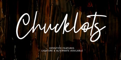 Give your designs an authentic brush handcrafted feel. "Chucklots Handwritten Script Font" is perfectly suited to signature, stationery, logo, typography quotes, magazine or book cover, website header, flyer, clothing, branding, packaging design and more.

