10,000 search results
(0.045 seconds)
- Mind Boogie by Bogstav,
$16.00 Get your feet on the dance floor, and make those funky moves that you do so well! Or, you could just use this handmade all-caps font and make your designs look like it is dancing! :) Yes, it's a handmade font - and I've added 6 different versions of each letter + multilingual support!
 - SA Tampico by Artcoast,
$9.00 Tampico Typeface is a new font with Rough version, which includes 80+ glyphs and alternative characters. The font looks great on various packages, goods with food. You can also use it to create logos, shortcuts and other design elements. Product Content: SA Tampico Rough SA Tampico Symbols Features: Accents (Multilingual characters) Stylistic Alternates
 - Katerlin by Muksal Creatives,
$12.00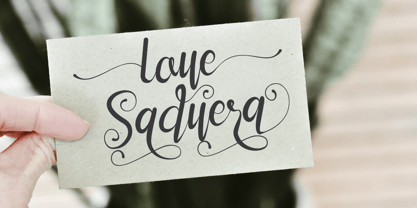 Katerlin is a handwritten font which feels incredibly elegant and flowing. It looks stunning on wedding invitations, thank you cards, quotes, greeting cards, logos, business cards and every other design which needs a handwritten touch. This font is PUA encoded which means you can access all of the glyphs and swashes with ease!
 - Wolesbro by Locomotype,
$10.00 Wolesbro is a brush font designed to give a natural handwriting look without forgetting readability for typography. Comes with two different brush styles; Wolesbro One and Wolesbro Two so you can more easily work with your design. OpenType features include: Ligatures for natural double letters and contextual alternates for casual terminal form.
 - Conundrum by Atom,
$14.00 Conundrum is a cool, rough brush font, quickly painted on paper, so it looks natural and organic. If you want a font character that is unique and different than others, Conundrum is worth a try. With this bold concept it would be suitable if used for movie titles, magazine titles, covers, posters, etc.
 - Orpheus by Scriptorium,
$18.00In response to many requests for Morpheus, an idea came to us. Why not make a font that looked a bit like Morpheus, but which had more attractive, more consistent character forms, was rendered cleanly and properly spaced and kerned? We took a look at Morpheus and decided to redo the concept from the ground up, replacing some of the amateurish characters, adding a bit of a Celtic look and feel, developing a set of alternate characters and making sure that the design elements were consistent from letter to letter. The result is Orpheus, a font which has the general look and feel of Morpheus, but is a much more complete and fully realized design. In addition, Orpheus is a fully developed font set, with not only regular and bold versions, but with a special customized italic style and a really neat looking heavy weight rough-outlined variant. - Asetin by Twinletter,
$12.00 With beautiful curves and minimalistic features, Asetin is a one-of-a-kind and powerful sans-serif typeface. This will offer your project a unique, fresh look that you won’t find anywhere else. Asetin gives an exciting touch to anything you wish to produce, from branding to creative endeavors like websites or eBooks, and beyond. With Asetin, you can add a touch of contemporary to any project. Its adaptable design makes it ideal for a variety of creative undertakings, so it’ll be a perfect fit for your next project. of course, your various design projects will be perfect and extraordinary if you use this font because this font is equipped with a font family, both for titles and subtitles and sentence text, start using our fonts for your extraordinary projects.
 - The Planeta by Aminmario Studio,
$20.00 Planeta Font, this font was created to look as close to a natural handwritten script as possible by including some alternates lowercase, ligature and underlines. Built in Opentype features, this script comes to life as if you were writing it yourself. Comes with regular and italic. Also support multilingual.Perfect for any awesome projects that need hand writing taste. It's highly recommended to use it in opentype capable software - there are plenty out there nowadays as technology catches up with design ... Other than Photoshop, Illustrator and Indesign, many standard simple programs now come with Opentype capabilities - even the most basic ones such as Apple's Text Edit, Pages, Keynote, iBooks Author, etc. Even Word has found ways to incorporate it. Thanks for checking out this font. I hope you enjoy it! AminMario
 - Millestone by Aminmario Studio,
$20.00 Millestone Font This font was created to look as close to a natural handwritten script as possible by including some alternates lowercase, ligature and underlines. Built in Opentype features, this script comes to life as if you were writing it yourself. Comes with regular and italic. Also support multilingual.Perfect for any awesome projects that need hand writing taste. It's highly recommended to use it in opentype capable software - there are plenty out there nowadays as technology catches up with design ... Other than Photoshop, Illustrator and Indesign, many standard simple programs now come with Opentype capabilities - even the most basic ones such as Apple's Text Edit, Pages, Keynote, iBooks Author, etc. Even Word has found ways to incorporate it. Thanks for checking out this font. I hope you enjoy it! AminMario
 - Use Your Words by Joanne Marie,
$10.00 Here’s a different kind of font for the hand lettered look! Use Your Words is a catchwords font family consisting of 3 fonts: 1.) Use Your Words Circles 2.) Use Your Words Arrows 3.) Use Your Words Banners It’s all hand drawn and hand lettered in a monoline script font with a shadow effect to boot. This font will be perfect to include on designs such as mugs, t-shirts, bags, notebooks, inspirational quotes for the home and office, and more. There are 215 words (no more than 4 letters per word) in both upper and lowercase, plus numbers, ampersand, question and exclamation marks in all three styles. There are 444 glyphs per font. I love using this font in my hand lettering designs and I hope you will too!
 - Square Beat by Hanoded,
$15.00 After a lot of time sitting at my desk, creating fonts and trying to figure out how my new software works, I really like to work out a bit. The only thing that I do not like is the music they play at the gym; it is usually a selection of poppy tunes that appeals to a large audience. But not to me. I prefer my death metal - and eighties music, as it brings back a lot of good memories. So, I bought myself some ear buds and installed a music streaming app on my phone. Yes, I know, I am probably the last person on earth who discovered streaming... One day, during a workout session, I listened to a list of eighties music and one song that I had forgotten about started playing: Rappers Delight by The Sugarhill Gang. When I started working on the font, I had to think about the song and named it Square Beat. Square Beat font, other than the name implies, is a rounded, handmade font, ideally suited for books and magazines aimed at a young audience, toy packaging or posters. It comes with great language support, including Vietnamese.
 - Carnival by House Industries,
$33.00 Unlike the modest fonts in your menu content with discreetly imparting information, Carnival is conspicuous by design. Deliberately engineered to attract eyeballs, the typeface’s unmistakable silhouette produces a dramatic visual texture that stands out in print, on screen, or in any environment where your message demands to be noticed. The steady yet vibrant rhythm created by its letterforms also makes Carnival ideal for fashioning alphabet patterns and graphic devices. Flaunting a lean slender body anchored by stout stroke endings, Carnival turns conventional typographic thinking on its head by inverting the relative thickness of its stems and serifs. This reverse-contrast approach stretches all the way back to the roots of modern advertising, when similar types became the favorite for posters, packaging, and loads of consumer products during the 1800s. The striking style prevailed well into the next century, as Harold Horman, co-founder of New York City-based Photo-Lettering. Inc., modernized a version for the company’s popular film-typesetting service in the early 1940s. Digitized and expanded by Dan Reynolds in 2013, Carnival had previously been used exclusively for House Industries projects. Now you can get in on the action, and use this stunning slice of type history anytime you want your work to turn heads. SUGGESTED USES Carnival’s unique character commands attention, making it the perfect voice for promotional pieces, editorial design, labels, packaging, posters, and any other application that needs to strike the right tone. Like all good subversives, House Industries hides in plain sight while amplifying the look, feel and style of the world’s most interesting brands, products and people. Based in Delaware, visually influencing the world.
 - Kiperman by Harbor Type,
$29.00 🏆 Selected for Tipos Latinos 9. 🏆 Selected for the 13th Biennial of Brazilian Graphic Design. 🏆 Hiii Typography 2018 Merit Award. Kiperman is a text typeface designed in honor of Henrique Leão Kiperman, founder of the publishing house Artmed, now Grupo A. Its forms are simple and straightforward, with no unnecessary embellishments that could disturb the reading. The fonts are slightly narrower than normal, which yields higher efficiency without compromising reading comfort. Besides that, its italics are not just a slanted version of the romans, but rather a separate drawing. With a slope of 8°, its calligraphic structure provides the right amount of emphasis when necessary. The Kiperman typeface works best when setting books, magazines, ebooks and websites. It will also work very well in branding and packaging projects where a sober typeface is needed. The inspiration for the design came from the personality of the honoree. Just as Henrique always wanted to stay away from spotlights, the Kiperman typeface was designed so that it would not call attention to itself or impose any obstacles in the understanding of the text. In this way, the fonts revere Henrique’s legacy by respecting and honoring the published content. Henrique Leão Kiperman began his career in 1958, selling medical books in travels through the interior of the Brazilian states of Paraná and Santa Catarina. In 1973, he opened a bookstore in downtown Porto Alegre, the Artes Médicas Sul, and a few years later edited his first book. Since then, his company has grown to become one of the most important publishers in Brazil in the area of scientific, technical and professional books, with more than 2400 active titles distributed among the McGraw Hill, Bookman, Artmed, Penso and Artes Médicas imprints. Henrique passed away in 2017 at the age of 79. The Kiperman type family has been commissioned by Grupo A and is available for licensing. This was the way found for the fonts to be read by more people, spreading some of his spirit around the world.
 - Preta by Lián Types,
$39.00 Preta, portuguese for a very pure kind of black, has its name very related to its concept: I wanted to make the fattest/darkest script ever. People who follow my work may notice its forms are very related to works of my past (1) but this time the challenge was to be very cautious with the white spaces between letters. Not only I followed some rules and ductus of the copperplate style of calligraphy but also I took a lot of inspiration in posters of the early Art Nouveau (specially in Alfred Roller of the Vienna Secession) where letters forms looked like black squares if not looked from a close distance. With Preta, I wanted to achieve that same idea of “darkness” and thanks to the always welcomed question -what if?- the font grew a lot. The result is a very fat font, that looks delicious. Due to possible customer needs, I designed Preta Small, so it can be used in smaller sizes. Preta Ao Sol (which literally means under the sun!) is a style with those lovely tiny details to give the sensation of bright. Preta Ao Sol Solo was made to be used as a layered font with Preta. Finally, Preta Capitals serves as a company for Preta. Hope you enjoy the font as much as I did when designing it: The fact that it’s full of alternates, swashes, ligatures and swirls makes it really pleasurable at the moment of using it. Give it a try and dance with Preta! TIPS For better results, use Preta with the ‘standard ligatures’ feature activated. NOTES (1) Beatle in 2014. Seventies in 2015.
 - Breton by Latinotype,
$29.00 Breton is a geometric slab serif typeface inspired by Boston. Breton has a strong personality and it is an ideal face for headings and branding design. Its most noticeable characteristic is a great difference of proportions between rounded characters (like "o", "c" or "e") and non-rounded ones (like "n", "m" or "z"). By combining them, you will be able to give your compositions a very unique rhythm. Each font style comprises 417 characters, which support more than 200 Latin-based languages, as you would expect from Latinotype fonts. Breton comes in 10 styles, from Hair to Black, and includes matching italics. Breton was designed by Daniel Hernández and Rodrigo Fuenzalida.
 - Garagin Rock by Rodrigo de Carvalho,
$14.50 Garagin Rock was developed from the studies for the title of a publication called Garagin in 1999. Its use is indicated for the titles on posters and stuff like that, but feel free to dare. Anyway, it really was not made for small sizes and is not a WebFont obviously, but again, feel free to dare. May you notice something odd in the baseline position, this is to keep leading with a defined size. But of course you can change it in any editing program. Being a heavy typeface, use in moderation... or not! Garagin Rock Lite is a version with a limited set of characters.
 - Super Banana by Asd Studio,
$12.00 Introducing the new font Super Banana, simple, natural, and cute handwritten font. This font suitable for use in a variety of design fields, such as event advertisements, product promotions, book titles, activity titles, logos, adventure, and others. Features: - Uppercase - Lowercase - Number & punctuations - Multilingual - Ligatures and alternates character - PUA encoded I highly recommend using a program that supports OpenType featuresand Glyphs panels such as Adobe Illustrator, Adobe Photoshop CC, Adobe InDesign, or CorelDraw, so you can see and access all Glyph variations. This font is encoded with Unicode PUA, which allows full access toall additional characters without having special design software. Mac users can use Font Book, and Windows users can use Character Map to view and copy one of the extra characters to paste into your favorite text editor / application.
 - Buddy by Hackberry Font Foundry,
$24.95 Buddy is the new companion sans for Contenu, the book font family designed for my book on font design design. Originally, I called it Compagnon, but that seemed to pompous. Then I called it Aide, but that was too formal and dry. It's a loose, free, easy to read sans, so when my wife suggested Buddy, it clicked. This is the 4-font Buddy family of Regular, Italic, Bold, & Bold Italic. I made a new, more limited feature set for these fonts due to their designed usage, but there are still small caps, small cap figures, oldstyle figures, numerators, and denominators. The bold is closer to a black, and the italics are only slightly slanted obliques. If you need a strong black in caps, use the small caps of the bold.
 - Sabon by Linotype,
$45.99 In the early 1960s, the German Master Printers’ Association requested that a new typeface be designed and produced in identical form on both Linotype and Monotype machines so that text and technical composition would match. Walter Cunz at Stempel responded by commissioning Jan Tschichold to design a new version of Claude Garamond’s serene and classical Roman. Its bold, and particularly its italic styles are limited by the requirements of Linotype casting machines, forcing the character widths of a given letter to match between styles, giving the italic its characteristic narrow f. The family’s name is taken from Jacques Sabon, who introduced Garamond’s Romans to Frankfurt. Sabon has long been a favorite of typographers for setting book text, due to its smooth texture, and in large part because Tschichold’s book typography remains world famous.
 - Figment by Scholtz Fonts,
$10.00 Like a figment of the imagination, this very readable font wafts across the page, leading the reader into a world of enchantment. Ethereal and fluid, it is reminiscent of sorcerer's spells written on ancient parchment. It manages, by the distortion of its characters, to transform a simple serif font into something quite different. Wavy outlines and an uneven baseline create an impression of fluidity and magic, while retaining the essential clarity of the classic serif body font. Use Figment for: -- Children's books -- Halloween advertising media -- book covers -- movie titles -- swing tickets -- posters Figment is available in two styles, Figment Regular and Figment Force (a wider and bolder style) The font has been professionally letterspaced and kerned. All upper and lower case characters, punctuation, numerals and accented characters are present.
 - Aliman by Cititype,
$9.00 Aliman is a simple and neat lettered handwritten font. Add this font to your creative ideas and notice how it will make them stand out! All Caps fonts.
 - Certificate by Scholtz Fonts,
$18.20 Elegant, fluid and romantic are but a few of the words that describe this beautiful font. Certificate is a perfect choice for awards, wedding invitations, greeting cards - in fact any products for which a sophisticated, contemporary yet formal look is sought. Certificate was designed for situations that require: - a classical, “award” like font (for certificates, invitations, formal notices etc); - a very legible font (particularly important for invitations to events such as weddings and formal occasions where details of the occasion are very important and should not be mis-read); Certificate is fully professional, carefully letterspaced and kerned. All upper and lower case characters, punctuation, numerals and accented characters are present.
 - Flyoika by Ingrimayne Type,
$9.00 Flyoika is a slab serif family with a fairly low x-height, long ascenders, and considerable contrast. The family has five weights, each with an italics and it can be used for either display or text. Flyoika was not designed to meet a particular need but rather out of curiosity. Years ago I had designed two slab serif families, FlyHigh and Euroika, that I recently noticed had a lot of similarities and I wondered what a blend of the two would look like. Several corresponding characters in the two families are considerably different and in cleaning up the results, I usually opted for simplicity. The name "Flyoika" reflects these origins.
 - Hatolie by Gilar Studio,
$16.00 Introducing New Font : Hatolie - Elegant And Luxuries Typeface Hatolie - Elegant And Luxuries Typeface will work perfectly for fashion, e-commerce brands, trend blogs, wedding boutiques or any business that wants to appear upscale and chic. Hatolie - Elegant And Luxuries Typeface also Suitable for Logo, greeting cards, quotes, posters, branding, name card, stationary, design title, blog header, art quote, typography, art, modern envelope lettering or book design, happening style like handdrawn design or watercolor design theme, craft design, any DIY project, book title, or any purpose to make your art/design project look pretty and trendy. Features : Uppercase & Lowercase Numerals & Punctuations (OpenType Standard) Accents/Multilingual characters PUA Encoded Check my other Font here : https://gilarstudio.com/ Give it a try! You will surely love it! Thanks and have a wonderful day, Gilar :)
 - Kingsbury Condensed SG by Spiece Graphics,
$39.00 This delicate condensed typeface evokes a distant 1930s style with its pointed and sloping capital letters. The splayed capital M gives the design a very a definite retro flavor. But deco quickly becomes modern day with the use of slab serifs. The thick body of Kingsbury Condensed is neatly anchored to long thin serifs giving the face an unusual and at the same time contemporary appearance. Great for book covers and large capital letter assignments where a modern revivalist look is appropriate. Kingsbury Condensed Book is also available in the OpenType Std format. Some new characters have been added to this OpenType version. Advanced features currently work in Adobe Creative Suite InDesign, Creative Suite Illustrator, and Quark XPress 7. Check for OpenType advanced feature support in other applications as it gradually becomes available with upgrades.
 - DS Rada_Double - Unknown license

- Allerlei Zierat by Intellecta Design,
$14.90 Ornaments family with four different sets plus a decorative capitals font from the rare, valuable and amazing Allerlei Zierat book from Schelter & Gieseck (1902). A research and free interpretation by Intellecta Design. This encyclopedic specimen book of the Leipzig, Germany type foundry and printing supply house J.G. Schelter & Giesecke features, as the title indicates, all kinds of decoration for supplying printing of every type. On the title page, the firm boasts winning grand prize in 1900 in Paris (presumably at the Exposition Universelle). It is hard to do justice in a short description to the variety of styles (traditional, Jugenstil, etc.) and categories (certificates, letterheads, borders, ornaments, exotic motifs, flowers, animals, silhouettes, menus, greeting cards, vignettes humorous and otherwise, images of bicyclists, occupational symbols, portraits, Classical figures, religious art, heraldry, ships, trains, athletes, etc., etc.) offered in this volume. Some of the examples are printed in color, most are in black-and-white. The Jugenstil cover of this copy shows minor wear and soiling. The plate of “Gust. Carlsson & Co., Stockholm” is attached to the front pastedown. A small fraction of pages show minor soiling, a pencil notation or a short closed tear. Two of the fold-outs at the back have a little more damage-one is missing a 1x2 inch piece along the margin, the other has a 3-inch closed tear and an edge which is crumpled. A rare specimen from the Intellecta rare books library.
 - Ourgrown by Yumna Type,
$12.00 Looking for an awesome font? Ourgrown is an awesome display font. It projects friendly, cute, and warm feel. The weight of characters makes this font easy to read and works equally well in header and body text. On the other hand, the shape curves, and shadow style brings a sense of cuteness. This font family also includes special illustrations that you can use as you wish. Features: Multilingual Supports Uppercase and lowercase PUA Encoded Numerals and Punctuation This font would looks great on your branding, logos, social media quotes, stickers, posters, wall art, merchandise, social media, and many more. Get more inspiration about how to use it by seeing the font preview. Thank you for purchasing our fonts. If you have any further questions, don't hesitate to contact us. Happy Designing.
 - Scratch Out by Pixesia Studio,
$23.00 Introducing Scratch Out - Urban Brush Font Scratch Out is an edgy and modern brush font that is perfect for adding a rough, urban look to your designs. The brush strokes give it a handmade, authentic feel that is perfect for streetwear brands, music album covers, posters, and more. With its bold and rough style, Scratch Out is sure to make a statement and catch the eye of your audience. This font is versatile and can be used for a wide range of projects where you want to create a raw and energetic look. FEATURES - Stylistic Alternates - Ligatures - PUA Encoded - Uppercase and Lowercase letters - Numbering and Punctuations - Multilingual Support - Works on PC or Mac - Simple Installation - Support Adobe Illustrator, Adobe Photoshop, Adobe InDesign, also works on Microsoft Word Hope you Like it. Thanks.
 - Fornire by Jehoo Creative,
$20.00 The Fornire family of typefaces grew out of a desire to provide a font that has a bold yet simple impression. For this reason, Anwar Patihan drew designs with a high foundation as letters based on humanist shapes and proportions. The letters are kept narrow to enhance the look, and the spacing between characters is narrowed for boldness. While the opentype Fornire feature has an alternate "A B E F P R" letter that looks very striking and easy to recognize, making the Fornire family very suitable for use on Posters, Cover designs, magazines, Banners, packaging designs, design considerations that he put into the Fornire family as well allowing it to perform well in a variety of other design environments. Fornier has a variety of weights ranging from Light, Regular, Medium, Bold
 - Omnibus by Linotype,
$29.99Omnibus is one of my absolute favourites. My intention was to design a typeface as easy to read as Baskerville, without being a copy of it. It is easy to see that I was influenced by Baskerville, e.g. in the open lowercase g. I had in mind to design a Baskerville with the looks of the Baskervilles used in earlier typesetting. I put aside those plans for a while (but fulfilled them later on) and dedicated myself to Omnibus. In both cases my aim was to achieve a typeface with darker looks than the most used Baskerville. The name has nothing to do with buses, it is Latin with the meaning of for all". It is also in the name of Omnibus Typografi. Omnibus was released in 1993. - Le Havre Width by insigne,
$- Le Havre Width is the loveable putty of fonts. Stretch it. Squish it. Squeeze it. Whichever way you play with it, you’re bound to find hours of fun ahead. This avant-garde typeface family has six distinct weights--each one including a set of four different widths. It’s randomized rhythm also includes selectable glyphs for customization, enabling you to bounce plenty of ideas around for diverse logotypes as well as for specific looks focused on a single width. Looking for even more fun with this geometric sans? Try adding in some of the alternate ligatures, or use the two different art deco styles included with the font. The all-around whimsical nature of Le Havre Width is perfect for toys, posters, T-shirts, cards, and anywhere else where fun is the name of the game.
 - Navigator by Andrew Footit,
$12.00 The Navigator family is inspired by the early explorers, the early sailors with their old-style tattoos and the cowboys in the old west. I mashed up these to styles to create the Navigator display family. It has a vintage feel with a more modern day approach. Use the regular styles to give your artwork a more clean look and feel or the rough styles to take on the more vintage old-style. This family is great for display use on posters, packaging, editorial and logos. It is created with the designer in mind to have some fun and mix up some great looking Upper / Lower case combinations. The Navigator hand font is an informal, rounded sans-serif that works perfectly with the Navigator display fonts to create beautiful logo and type lockups.
 - Real Magic by Nathatype,
$29.00 Ready to enhance your branding? Looking for that “something” that’ll make your audience go WOW and clients get on board immediately? Ready to enhance your branding? Looking for that “something” that’ll make your audience go WOW and clients get on board immediately? Real Magic-A Serif Font Real Magic designed primarily to bring out a modern and stylish view of what you make. This font contains upper & lowercase characters. Its light weights are well-suited for body text. Our font always includes Multilingual Support to make your branding reach a global audience. Inspire your audience, clients, or guests with this beautiful, statement font. Create gorgeous printed logos, standout branding, or beautiful t-shirts with this font. Features: Ligatures Alternates PUA Encoded Numerals and Punctuation Thank you for downloading premium fonts from Nathatype
 - Merisca by Pixesia Studio,
$23.00 Introducing Merisca - Modern Condensed Serif Font Merisca is a modern condensed serif font that is perfect for a wide range of design projects. The sleek and stylish design of this font is sure to add a touch of sophistication to your work, making it ideal for branding, packaging, and other design applications. Whether you are looking to create a minimalist and chic look or want to add some flair to your designs, Merisca is the perfect font choice. With its condensed serif style and modern aesthetic, Merisca is sure to enhance any design project. FEATURES - Stylistic Alternates - Ligatures - PUA Encoded - Uppercase and Lowercase letters - Numbering and Punctuations - Multilingual Support - Works on PC or Mac - Simple Installation - Support Adobe Illustrator, Adobe Photoshop, Adobe InDesign, also works on Microsoft Word Hope you Like it. Thanks.
 - Broughton by Ardian Nuvianto,
$18.00 Hello there Here is my new font Broughton. Broughton is consisting of a fashionable handbrush-style script make looks elegant, classy and touch of luxury and stylish. This font was created to look as close to a natural handwritten script as possible by including 9 ligatures. Broughton is perfect for brand design, barbershop logo, branding projects, logo, wedding designs, social media posts, advertisements, product packaging, product designs, label, photography, watermark, invitation, stationery and anything that you want. Here is that you get: Broughton font file More than 230 of glyphs 9 Standard Ligatures Works on PC & Mac Simple installations Supports multilinguage Accessible in the Adobe Illustrator, Adobe Photoshop, Adobe InDesign, even work on Microsoft Word. PUA Encoded Characters – Fully accessible without additional design software. Drop me message if you have any questions. Happy Creating Thanks
 - Ring by Ochakov,
$9.00 First of all, Ring font has a little story. It was created as an example for Typography Exhibition in Moscow. And the font was immediately awarded! 10 years later, I decided to continue working on it and improve this font. Ring - really circular typeface. I felt inspired by Bauhaus. I've always wanted to design something similar. Ring is a cool and geometric-styled font. Expertly designed to make your creation look out of this world, this font will look gorgeous on a variety of ideas. This font is ideal for writing web designs, business cards, or pretty much anything else that requires a unique touch. Ring font comes in 8 weights and 16 styles and this is just the beginning. The beginning of a further big font family called Ring!
 - Private Sans by ParaType,
$30.00 Private Sans is a three styles family of humanistic sans serif based on broad pen calligraphy. Its noticeable distinctions -- a vivid irregular nature which is not typical for usual Cyrillic text faces. Characters of the font have visible “inthasis”, soft terminals and slanted axis in internal ovals. The name of the font reflects an intention to design a typeface for personal messages. It can be used in blogs, e-mails, personal Web pages -- the places where author wants to show his personal attitude and invite visitors to enter his intimate space. It also usable for memoirs, autobiographies, interviews, and for those kind of literature that deals with feelings and emotional experience. The font family was designed by Olga Karpushina on the base of her graduate work of Type and Typography course in British Higher School of Art and Design. Released by ParaType in 2010.
 - Knoedel by PabType,
$12.00 Knoedel is a display typeface with three front-weights: light, regular and bold. Although a conjunction of different styles were a reference during the design process; the art deco style left a more noticeable influence in the final design. Knoedel, also has clear references to geometric and slab serif fonts. The design is intended to be applied on headlines or short text fragments. Knoedel offers full coverage for all languages using Latin alphabet: whole Europe, America, Oceania and on a big number of African and Asian countries. Besides the standard ligatures, Knoedel, additionally, has more than 200 discretionary ligatures and a generous number of borders and ornaments. Knödel (Knoedel) is a traditional dish from Austria and the southeast of Germany; made of dumplings of different ingredients usually boiled in salted water. It is not high-end cuisine but still, it accomplishes its aim of soothing hunger.
 - Sixties Stencil JNL by Jeff Levine,
$29.00 Probably one of the most unusual applications of a stencil took place in 1964 when Union Carbide [then-owner of the still-new line of "Glad" brand plastic wrap and storage bags] sponsored a $100,000 contest to match up a stencil of their logo in order to win a prize. The magazine ad told of how one thousand lucky participants would win $100 by simply taking a die-cut stencil of the brand name to the store and overlaying it on the logo printed on the food wrap box to see if it aligned perfectly. The hand-lettered title proclaiming "match the stencil and win" was done in a casual sans design and reflected the cheerfulness of many typestyles found in ads during the late 50s and early 60s.
