10,000 search results
(0.108 seconds)
- Kinglead by Almarkha Type,
$23.00 Kinglead – Fun Display Playful Sans full of charm . It will take any DIY-project to the next level! Kinglead is perfect for Craft , product packaging, product designs, label, branding projects, logo, wedding designs, social media posts, advertisements, watermark, invitation, stationery and any projects
 - Combust by Typefactory,
$14.00 Combust is a modern playful display font with fire. The font is thick so it can still be read even if there is a burning fire, suitable for various purposes, poster design, for video game or movie titles, or promotions on social media.
 - Berliman by ahweproject,
$11.00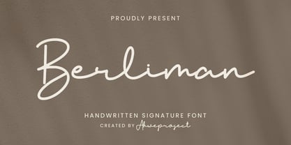 Berliman is a signature script typeface specially made with a natural handwritten style. It is perfect for branding projects, logos, wedding designs, social media posts, advertisements, product packaging, product designs, labels, photography, watermarks, invitations, stationery and any projects that need handwriting taste.
 - Pershal by insigne,
$29.00 Pershal is something of an oddball, and that's the point. Dynamic and fast, Pershal attracts interest. Its architecture evokes growth and progress. Inspired by the futuristic styles of the 1990s, Pershal started on an aircraft ride as a sketch on a napkin. I set the concept aside for almost a decade before I went back to play with the typeface. Pershal is planned to complement applications in consumer finance, technology firms or biotechnology. As such, it has a complete set of both tabular and proportional figures. For the lowercase, Pershal features a distinctive shape that emphasizes its x-height. Its horizontal movement is highlighted by some of its other features, such as its crossbars. To emphasize growth, acceleration and inventiveness, crossbars and other elements are cut at a dynamic angle. It's a sans serif without a lot of contrast. Another unique feature of this typeface is the vast number of OpenType alternates. If you prefer a more conventional appearance to your sans, with stylistic alternates, you have that option. Altogether, there are more than seven separate sets of stylistic alternates and about 250 alternates for characters. This enables you to mix-and-match and create your own personal typeface. For branding, this makes it very useful. For your next project that requires a dynamic and technological appearance, give Pershal a shot.
 - Apparel by Latinotype,
$35.00 Inspired by the MacFarland series in the 1912 ATF catalog, Apparel is a typeface that shares similar functional characteristics with Times New Roman and Caslon fonts yet it has its own personality: A great choice for high-impact design. Apparel is a contemporary, classy and fresh serif typeface with a laid-back attitude that best suits your design needs. Its medium-large x-height makes it ideal for headlines and brand identity design. Apparel also includes a version, with a greater contrast between thick and thin strokes, for use in even larger sizes. The font comes with italic styles which can be used individually or in combination with the upright variant. Moderately slanted italics are also available as OpenType Stylistic Alternates. Each font style supports more than 200 Latin-based languages, as you would expect from Latinotype fonts. Apparel also includes a basic Cyrillic set, old style & lining figures, fractions and alternates, among other OpenType features.
 - Pearly Smiles by RagamKata,
$16.00 "Pearly Smiles," a delightful handwritten font meticulously crafted with love and attention to detail. This font encapsulates the essence of joy and brings a touch of whimsy to your design projects. "Pearly Smiles" embodies the playful nature of handwritten script, with its charming curves and natural stroke variations. Every letter reflects the genuine warmth and sincerity of my personal handwriting, infusing your designs with a sense of individuality and happiness. With its elegant yet cheerful style, "Pearly Smiles" is versatile and perfect for a wide range of creative applications. Whether you're designing logos, branding materials, invitations, greeting cards, or any project that calls for a lighthearted and personal touch, this font will add a touch of enchantment and personality. The meticulously designed letterforms of "Pearly Smiles" ensure both legibility and artistic appeal. Its balanced proportions and thoughtfully crafted characters make it a pleasure to work with, whether on digital or printed mediums
 - Tecna Dark Up Triangle BNF by Descarflex,
$30.00 The Tecn@ Dark&Light Triangle Background Nomenclature Font family is differentiated by the direction of the triangle tip in the 4 cardinal points. The family were designed to head, enumerate, indicate or highlight writings or design plans, for this reason, the characters are available only in capital letters and some signs or symbols that can serve such purposes. A triangle or empty character is included so that the user can use it overlaying any character of his choice or to be used alone. What is Lorem Ipsum? Lorem Ipsum is simply dummy text of the printing and typesetting industry. Lorem Ipsum has been the industry's standard dummy text ever since the 1500s, when an unknown printer took a galley of type and scrambled it to make a type specimen book. It has survived not only five centuries, but also the leap into electronic typesetting, remaining essentially unchanged. It was popularised in the 1960s with the release of Letraset sheets containing Lorem Ipsum passages, and more recently with desktop publishing software like Aldus PageMaker including versions of Lorem Ipsum. Why do we use it? It is a long established fact that a reader will be distracted by the readable content of a page when looking at its layout. The point of using Lorem Ipsum is that it has a more-or-less normal distribution of letters, as opposed to using 'Content here, content here', making it look like readable English. Many desktop publishing packages and web page editors now use Lorem Ipsum as their default model text, and a search for 'lorem ipsum' will uncover many web sites still in their infancy. Various versions have evolved over the years, sometimes by accident, sometimes on purpose (injected humour and the like). Where does it come from? Contrary to popular belief, Lorem Ipsum is not simply random text. It has roots in a piece of classical Latin literature from 45 BC, making it over 2000 years old. Richard McClintock, a Latin professor at Hampden-Sydney College in Virginia, looked up one of the more obscure Latin words, consectetur, from a Lorem Ipsum passage, and going through the cites of the word in classical literature, discovered the undoubtable source. Lorem Ipsum comes from sections 1.10.32 and 1.10.33 of "de Finibus Bonorum et Malorum" (The Extremes of Good and Evil) by Cicero, written in 45 BC. This book is a treatise on the theory of ethics, very popular during the Renaissance. The first line of Lorem Ipsum, "Lorem ipsum dolor sit amet..", comes from a line in section 1.10.32. The standard chunk of Lorem Ipsum used since the 1500s is reproduced below for those interested. Sections 1.10.32 and 1.10.33 from "de Finibus Bonorum et Malorum" by Cicero are also reproduced in their exact original form, accompanied by English versions from the 1914 translation by H. Rackham. Where can I get some? There are many variations of passages of Lorem Ipsum available, but the majority have suffered alteration in some form, by injected humour, or randomised words which don't look even slightly believable. If you are going to use a passage of Lorem Ipsum, you need to be sure there isn't anything embarrassing hidden in the middle of text. All the Lorem Ipsum generators on the Internet tend to repeat predefined chunks as necessary, making this the first true generator on the Internet. It uses a dictionary of over 200 Latin words, combined with a handful of model sentence structures, to generate Lorem Ipsum which looks reasonable. The generated Lorem Ipsum is therefore always free from repetition, injected humour, or non-characteristic words etc.
 - Mon Nicolette by Sudtipos,
$49.00 This is a digital revival by Cristóbal Henestrosa based on an experimental typeface named Charter, designed – yet never fully accomplished – by the prominent William Addison Dwiggins. It is an upright italic, unconnected script typeface, whose main features are a pronounced contrast, condensed forms and exaggerated ascenders. While Dwiggins worked on this project from 1937 to 1955, he only completed the lowercase and a few other characters. However, it was used to set a specimen in 1942 and a short novel in 1946. The sources that Cristóbal used for Mon Nicolette were the original sketches by WAD as well as printing trails kept at the Boston Public Library, and a copy of the 1946 edition of The Song-Story of Aucassin and Nicolette. This gorgeous typeface can be used successfully in headlines, subheads and short passages of text from 12 points onwards, in applications such as fashion magazines, soft news, advertising, poetry, albums, and book covers. This project started ten years ago, while Cristóbal was studying the Type@Cooper Extended Program at New York City. A previous version was selected to be part of the Biennial Tipos Latinos 2018, and now Mon Nicolette is finally ready for commercial distribution with Sudtipos… and we are very proud of it! Festina lente.
 - Pressato by Resistenza,
$180.00 Pressato Font is a dynamic and innovative typeface meticulously crafted in collaboration with Pressato Coffee Bookshop in Torino. This unique font boasts three axes—weight, width, and slant—providing designers with unparalleled flexibility and control over their typographic compositions. With a total of 12 distinct fonts and a variable option, Pressato Font allows for a rich variety of styles, making it a versatile choice for a myriad of design applications. The font's flexibility in weight enables users to seamlessly transition from bold and impactful headlines to subtle and elegant body text, ensuring a cohesive and visually appealing design. The inclusion of width and slant axes further enhances the adaptability of Pressato Font. Designers can effortlessly customize the width of characters for a condensed or expanded look, while the slant axis adds a dynamic tilt, injecting personality and movement into the typography. Rooted in the aesthetics of Pressato Coffee Bookshop, this font exudes a contemporary and artistic vibe. Its variable nature opens up endless possibilities for creative expression, making it an ideal choice for branding, editorial design, and various other graphic projects. Pressato Font stands as a testament to the seamless integration of form and function, providing a sophisticated and engaging typographic solution for diverse design needs.
 - Caros by cretype,
$20.00 Caros Family is a modern sans-serif typeface that is clean, simple and highly readable. Letters in this type family are designed with geometric shapes without any decorative distractions. The spaces between individual letter forms are precisely adjusted to create the perfect typesetting. Caros is a versatile type family of 18 fonts. Caros family consists of 9 weights (Thin, ExtraLight, Light, Regular, Medium, Bold, ExtraBold, Heavy & Black) with their corresponding italics. The Open Type fonts contain complete Latin 1252, Cyrillic, Central European 1250, Turkish 1254 character sets. Each font includes proportional figures, tabular figures, numerators, denominators, superscript, scientific inferiors, subscript, fractions and case features. We highly recommend it for use in books, web pages, screen displays, and so on.
 - Stucco by Loshaj Foundry,
$20.00 Stucco is a construction material that is used as a decorative coating for walls, ceilings, exteriors, and as a sculptural and artistic material in architecture. Stucco can be applied on construction materials such as metal, concrete, cinderblock, or clay brick and adobe for decorative and structural purposes. In similar fashion, the Stucco font is designed to be a decorative piece and is intended to support a wide variety of mediums. The font is intended to be used as a header or headline font, but a creative designer will find other uses for it. The font contains 300+ glyphs which includes uppercase letters, lowercase alternates, numbers, symbols, accented characters for multiple language support.
 - M Gentle PRC by Monotype HK,
$523.99 The design concept of M Gentle is inspired by the aesthetics of ribbon gymnastics and the tenderness of orchids. The beauty of the two are combined in one typeface. Keeping the characters in right proportion and standard structure, its horizontal and vertical strokes (橫、豎) are generally straight. The linkage among dots (點), downstrokes and the ticks (剔) to the right represent a sense of movement and fill the typeface with liveliness and humanity. While M Gentle Light shows purity and softness, Medium and Bold fonts have their own personalities. They are all legible and suitable for a wide range of purposes, make the family a popular choice in the advertising industry.
 - Segaon Soft by cretype,
$20.00 This family is the rounded version of Segaon family. Segaon Soft Family is a humanist sans-serif typeface that is clean, simple and highly readable. The spaces between individual letter forms are precisely adjusted to create the perfect typesetting. Segaon is versatile type family of 18 fonts. Segaon family consists of 9 weights (Thin, ExtraLight, Light, Regular, Medium, Bold, ExtraBold, Heavy & Black) with their corresponding italics. The Open Type fonts contain complete Latin 1252, Cyrillic, Central European 1250, Turkish 1254 character sets. Each font includes old-style figures, proportional figures, tabular figures, numerators, denominators, superscript, scientific inferiors, subscript, fractions and case features. We highly recommend it for use in books, web pages, screen displays, and so on.
 - M Gentle HK by Monotype HK,
$523.99 The design concept of M Gentle is inspired by the aesthetics of ribbon gymnastics and the tenderness of orchids. The beauty of the two are combined in one typeface. Keeping the characters in right proportion and standard structure, its horizontal and vertical strokes (橫、豎) are generally straight. The linkage among dots (點), downstrokes and the ticks (剔) to the right represent a sense of movement and fill the typeface with liveliness and humanity. While M Gentle Light shows purity and softness, Medium and Bold fonts have their own personalities. They are all legible and suitable for a wide range of purposes, make the family a popular choice in the advertising industry.
 - Dreams Note PS by pentagonistudio,
$14.00 Dreams Note Is A Modern Family Font Serif Including 8 Font Style. Font Features : Dreams Note Thin Dreams Note Extra Light Dreams Note Light Dreams Note Regular Dreams Note Medium Dreams Note Semi Bold Dreams Note Bold Dreams Note Black SOFTWARE REQUIREMENTS : Fonts and alternate: No special software is required they may be used in any basic program /website app that allows standard fonts That's it, folks! You can go ahead and get cracking :) Follow My Shop For Upcoming Updates Including Additional Glyphs And Language Support. And Please Message Me If You Want Your Language Included or If There Are Any Features or Glyph Requests, Feel Free to Send me A Message. Have a Good Day!
 - ArTarumianIshkhan by Tarumian,
$40.00 Font ArTarumianIshkhan (Ishkhan from Arm. “Prince” was created as a modern stylization of Armenian medieval lapidary letters.
 - Getman by Dima Pole,
$25.00 Getman is a light Gothic typeface. It made all the rules and traditions of classic Gothic typeface, but it has lightweight shapes, making it easy to read and understood. Getman is based on the works of type masters 1910s. This font has all 104 European alphabets, all Slavic alphabets, OpenType features (ligatures, oldstyle numerals, fistorical forms, localized forms, fractions, ordinals and others). Getman has an historic beauty of the medieval Germanic national script. Glory to the Germans!
 - Okojo Pro by Wordshape,
$20.00 The Okojo Pro Complete family is a reworking of Wordshape’s immensely popular Okojo family of typefaces. It includes Okojo Pro, a semi-geometric sans serif, Okojo Slab Pro, a semi-geometric slab serif, Okojo Pro Display, a round-cornered sans serif variation, and Okojo Slab Pro Display, a round-cornered slab serif. The entire Okojo Pro family looks great at small or large sizes. The Okojo Pro family is designed for readability in long texts while simultaneously functioning as effective display type. Features of Okojo Pro Display: - all lowercase characters have an enlarged x-height, creating less optical dazzle than typefaces like Futura, Neutra or Avant Garde - more humanist numerals and punctuation for enhanced readability - complete Western, Central and Eastern European characters sets - radically improved spacing guaranteeing beautiful results in print and on screen for the Czech, English, Hungarian, Croatian, Esperanto, Maltese, Romanian, Turkish, Albanian, French, Portuguese, Spanish, Basque, Bulgarian, Finnish, Swedish, Norwegian languages The Okojo Pro Display family is influenced by the type designs of Paul Renner and Herb Lubalin, but smoothed over with more than a bit of Americana. Both work well on-screen as webfonts and in print as book type. Each is hinted with accuracy and kerned with precision.The lighter weights are slightly slimmer than the regular and bold weights to give the typeface more of a vertical feel, inviting readers' to rapidly read typeset text with a maximum of contrast and a minimum of optical distortion. Okojo: it’s a little bit country and a little bit rock’n’roll.
 - Arabesque by Scholtz Fonts,
$15.00 Arabesque is a romantic, ornamental font, in which intertwining, flowing lines and generous loops enhance the beauty of the basic shapes. Arabesque successfully combines legibility with a decorative, sumptuous style. In its European interpretation it was also called "Moresque". The font "Ability" was the origin of Arabesque, however, numerous, subtle changes set it apart. Arabesque, is characterised by a small x-height and relatively large ascenders and descenders (loops). The loops are created out of two or three delicate, intertwined lines that contrast with the much less expansive bowls and shapes of the lowercase letters. The capitals, more complex and composed of intertwined lines, echo the elegance of the loops on the lowercase letters. As a result of these changes "Arabesque" is both more readable, controlled and extravagant than "Ability". Suggestions for use: - wedding stationery - greeting cards - valentines day media - beauty products media - lingerie tags - women's magazine pages - classical music media - award certificates - magazine pages The font is fully professional: carefully letterspaced and kerned. It contains over 235 characters - (upper and lower case characters, punctuation, numerals, symbols and accented characters are present). It has all the accented characters used in the major European languages. Arabesque works well in Application packages such as Microsoft Word that do not support professional kerning.
 - Guadalupe by Rodrigo Navarro Bolado,
$32.00 Article to appear on the font family page: According to the Catholic faith, a well known náhuatl story called "Nican Mopohua" (translated as "Here it's narrate") about the Marianas apparitions on the Tepeyac's hill, to the north of the actual Mexico City. After four apparitions, La Virgen de Guadalupe (LVG) told Juan Diego (JD) that he must introduce himself to the first Bishop of Mexico. JD took in his "ayate" some roses (that aren't natives to Mexico's barren territories) and when he dropped them in front of the bishop, the image of LVG appeared in front of him with indigenous features. I’ve worked a lot in this font that appears to came out of nowhere, just like the image of LVG itself, the fact is that I started first sketching some flowers, because I wanted to do something related to this mexican story, so, taking some features from this flowers I started sketching some letters, for example “r” and “i” and the counter forms for some letters like “a” and “o” (that I didn’t use by the way) and the punctuation marks, all inspired by this leaf forms. Lighter weight coming soon! Hope you like it. Any comments: rodrigonabo@gmail.com
 - Asterx by Ingrimayne Type,
$7.95 In the 19th century typefaces with star-like serifs developed from the medieval type styles, retaining the sharp corners and peaks of some of the blackletter types but losing the flourishes on the upper-case letters. Asterx is in that tradition of star-footed typefaces, though it is not modeled on any particular one.
 - Monte Carlo Script NF by Nick's Fonts,
$10.00This elegant monoline script is based on a typeface called "Médicis" from a Deberny and Peignot catalog, circa 1920. Graceful but robust, it is equally suited for invitations, announcements and headlines. Both versions of this font contain the Unicode 1252 (Latin) and Unicode 1250 (Central European) character sets, with localization for Romanian and Moldovan. - Jacopo Mediaeval NF by Nick's Fonts,
$10.00This stately typeface takes its inspiration from Erbar Medieval, designed by Jakob Erbar for the Ludwig & Mayer foundry of Frankfurt am Main, released in 1914. Equally at home in headlines or text blocks, this face is both elegant and inviting. Both versions contain the complete Latin 1252, Central European 1250 and Turkish 1254 character sets. - Iron Lung - Personal use only

- Circoex / ANTIPIXEL.com.ar - Personal use only

- Romile by Nathatype,
$29.00 Looking for an elegant font? Romile is a elegant and bold serif font. It comes to be a single font all in uppercases. Thanks to the cursive and unique swirls at the end of some characters carries a sense of elegant looks. On the other hand, the weight of the font brings strength to any title or header you apply it to. Features: Stylistic Sets Ligatures Swashes Numerals and Punctuations PUA Encoded It can be used for many design projects, such as poster, logo, book cover, branding, heading, printed product, merchandise, quotes, social media campaign, etc. Get more inspiration about how to use it by seeing the font preview. Thank you for purchasing our fonts. Please don’t hesitate to contact us, if you have any further question or issues. We’re happy to help. Happy Designing.
 - Snacko by Eko Bimantara,
$22.00 Snacko is one dope display font. It’s got that casual vibe mixed with some 70s soft serif styles, and a playful italic angle that’ll make your designs move and groove! This font is perfect for titling, branding, logos, and all kinds of digital or printed materials. It’s fun and playful, so it’s perfect for designs that are targeted at a younger crowd or need a fresh and modern feel. Snacko’s funky, soft, and cool design makes it the bomb for all kinds of design fields, from advertising to packaging to social media graphics. It’s got a style that’s all its own and can make your designs pop and stand out from the crowd. This font only comes in one style, but don’t trip, it’s versatile and can be used in all kinds of ways. It’s approachable and friendly with a softness that’s off the hook, but also funky and expressive with a unique personality that can take your designs to the next level. Bottom line, Snacko is one creative and versatile font that’ll bring a playful and fun energy to all your designs. It’s got a unique style that’s perfect for any designer’s font collection, so don’t sleep on this one!
 - Sentcita by Scratch Design,
$10.00 Introducing Sentcita! It's a modern script font with a signature-style look. This font's highly recommended for you who want to make some designs with a natural signature style. Sentcita will work for invitation design, wedding design, posters, packaging, book cover title, quote, social media post, etc. Open your Opentype features while using the script font to use the ligatures and swashes, your text will look like a natural signature or handwriting as you type. Features: Stylistic Alternates & Ligatures Numerals & Punctuation Swashes Accented characters Multiple Languages Supported How to access alternates characters Open the glyphs panel: In Adobe Photoshop go to Window - glyphs In Adobe Illustrator go to Type - glyphs
 - Christmas Warmth by HandletterYean,
$14.00 This font is made special for the most wonderful time of the year, Christmas. Enjoy the warmth of Christmas with your family and friends by making a simple Christmas design using this font. It's casual style suitable for your various design needs like greeting cards, posters, invitations, social media posts, advertisements, product packaging, product designs, label, photography, watermark, special event, magazine, web design, etc. To access the alternate glyph, you need a program that supports Open-type features such as Adobe Illustrator CS, Adobe Photoshop CC, Adobe Indesign, and CorelDraw. More information about how to access alternate glyph, check out this link: http://goo.gl/ZT7PqK
 - Dirty Deo Hand Ink by TypoGraphicDesign,
$19.00 CONCEPT/CHARACTERISTICS Experimental analog handwritten style. Handwritten in ink in a conventional roll-on deodorant. The dirty, grimmy Grunge-Look and the sloppy, rough Handwritten-Look script character, gives the typeface a high recognition value and uniqueness. The motto is handmade, rough & experimental. APPLICATION AREA The rough, ink-like, handwritten look of the handmade font „dirty deo hand ink“ would look good at logos, display size for poster, flyer, comics and graphic novel lettering, headlines in magazines or websites, packaging, music covers or webbanner etc. TECHNICAL SPECIFICATIONS Headline Font | Display Font | Raw Trash Script Font „dirty deo hand ink“ OpenType Font with & 282 glyphs & 1 style (regular). Symbols and ligatures (with accents & €)
 - FS Blake by Fontsmith,
$80.00 Art deco The inspiration for FS Blake’s elegant, lightly geometric forms can be traced back to design of the 1930s; designer Emanuela Conidi was influenced by the typography of cool, European, art deco posters. FS Blake bears traits of the art deco style, from its thin weights to its heavy weights, giving a set of faces each with their own distinct character, but still with a strong family resemblance. Mechanical type Mechanical and organic shapes combine in FS Blake to create a harmonious whole of generous curves and cursive spikes. A strong, punchy contender in display sizes, it’s also got a gentle touch with small text in lighter weights. Lively, versatile and with plenty of character contrast between weights, the FS Blake family offers impact in whatever task it’s given.faces each with their own distinct character, but still with a strong family resemblance. Sketch book Great fonts still emerge from a combination of hand, paper and pencil. After filling her sketch book with ideas, Emanuela and Jason extracted the elements that both felt could work in a font. The process yielded a whole crop of starting points for future designs as well as a focus for FS Blake as a striking, characterful, almost industrial font.
 - Sweet doughnut by Abo Daniel,
$13.00 This font is so cute. Came with bold style, it is very eye catching. It is great for quotes, logo, branding, packaging, t shirt design, tote bag design, cutting, vinyl, silhouette, social media and another your craft project. Both uppercase and lowercase are match perfectly. You can combined them as you like. Features: Uppercase Lowercase Number & Punctuations International Accent PUA Encoded Hope you love it Grab it fast...
 - TT Octosquares by TypeType,
$35.00 TT Octosquares useful links: Specimen | Graphic presentation | Customization options TT Octosquares is a fresh, revised, expanded, and significantly improved version of our first commercial typeface TT Squares and its narrow version TT Squares Condensed. With all our love for the original font family, it felt there was a lack of functionality, character composition, features, and design freshness, which prompted us to the idea of a complete restart. Now TT Octosquares can be safely called a superfamily consisting of 4 widths (Compressed, Condensed, Standard, Expanded), 72 faces (18 in each width), and 1 incredible variable font in which variability works jointly on three axes. In addition to working on the contours themselves and their design, we completely revised the composition of the typeface. First, we added two completely new widths: Compressed and Expanded. Secondly, we increased the number of weights in each of the subfamilies—while in the old versions there were 5 weights, now in each of the subfamilies there are 9 weights. At the stage of working with the contours of characters, we revised the roundings, changed the forms of shoulder and stem crossings, added noticeable shelves at the letters, removed the sharpness from the triangular characters and cut off all sharp endings. From the very beginning of work on TT Octosquares, we planned to make a variable 3-axis version of it sewn into 1 font file. This means that by installing just one variable font file, you get access to three axial adjustment of the font: by thickness, width and inclination. Thanks to this flexibility in settings, you can always choose a custom combination of thickness, width or inclination that best suits your tasks. Due to the increased language support and the appearance of a bunch of useful OpenType features, the number of glyphs in the typeface has increased from 480 to 825 in each style. Now you can use stylistic alternates, standard and discretionary ligatures, or use old-style figures, numbers in circles and even slashed zeros in your design. Full list of features: aalt, mark, mkmk, ccmp, subs, sinf, sups, numr, dnom, frac, ordn, lnum, pnum, tnum, onum, case, zero, dlig, liga, salt, ss01, ss02, ss03, ss04, ss05, ss06, ss07, ss08, ss09, ss10, ss11, ss12, calt, locl. To use the variable font with three variable axes on Mac you will need MacOS 10.14 or higher. For other software and browsers, you can check the support status here: v-fonts.com/support/.
 - Benito by Hipfonts,
$9.00 Benito is a font that exudes elegance and sophistication. With its timeless design, it adds a touch of class to any project. The sleek, professional look of Benito makes it a perfect choice for high-end brands and upscale designs. Additionally, its multilingual support makes it versatile and accessible to a global audience. Whether used in print or digital media, Benito is a font that commands attention and leaves a lasting impression.
 - Ciutadella Slab by Emtype Foundry,
$69.00 The family keeps growing, Ciutadella Slab is the ‘serif’ counterpart of the popular Ciutadella font. The former alternate characters like 'a', 't' and '&' are now the default ones (and the former default characters are now the alternates), giving way for a typeface more suitable for texts. Thus, the new Ciutadella Slab is not only a great headline family, it will also work in texts of intermediate length and size. Especially appropriate for magazines, brochures or branding. This new addition provides even more versatility to the family started with Ciutadella and Ciutadella Rounded. It is available in Open Type format and includes Alternate Characters, Ligatures, Tabular Figures, Fractions, Numerators, Denominators, Superiors and Inferiors. It supports Central and Eastern European languages. As the sans version, the type family consists of 10 styles, 5 weights (Light, Regular, Medium, SemiBold and Bold) plus italics. For more details see the PDF.
 - Garibaldi by Harbor Type,
$50.00 🏆 Selected for Tipos Latinos 6. 🏆 Selected for the 12th Biennial of Brazilian Graphic Design. 🏆 Typographica Favorite Typefaces of 2015. Garibaldi is a text typeface based on humanist calligraphy. It has an organic look and feel, while preserves the traditional construction of roman typography. It all started with a desire to learn more about the origin of the strokes on humanist typefaces. To accomplish that, Garibaldi features a 20° axis, medium contrast based on translation and expansion, asymmetric serifs, and terminals related to the broad nib stroke. Garibaldi Regular was nominated for Tipos Latinos 2014. Since then, the family was expanded with more weights and matching italics, making it a solid choice for setting books, magazines and documents. Among many OpenType features, each font contains small caps, ligatures and contextual alternates, totalling more than 750 glyphs and supporting at least 80 languages.
 - Foretelling Script by Letterhend,
$17.00 Introducing, Foretelling Script. A condensed script typeface. A fun, playful and casual script made by natural hand writing. This type of font perfectly made to be applied especially in logo, and the other various formal forms such as invitations, labels, logos, magazines, books, greeting / wedding cards, packaging, fashion, make up, stationery, novels, labels or any type of advertising purpose. Available in 3 styles : Reguler, Rough and Stamps Features : uppercase & lowercase numbers and punctuation multilingual swashes and ligatures alternates PUA encoded We highly recommend using a program that supports OpenType features and Glyphs panels like many of Adobe apps and Corel Draw, so you can see and access all Glyph variations. How to access opentype feature : letterhend.com/tutorials/using-opentype-feature-in-any-software/ Email us to letterhend@gmail.com if you need something! Happy Designing!
 - Arkeo BT by Bitstream,
$50.99Arkeo BT is designer Brian Sooy's first typeface family published by Bitstream. Given very few design elements to work with, Brian has designed a bitmap font that is unique and very readable. There are three widths, Condensed, Regular and Extended. In our opinion, pixels never looked so good. Arkeo performs equally well on screen and as on paper. The OpenType versions include an extended character set featuring oldstyle figures, fractions and additional f-ligatures. Design was begun in late 2001 and completed in 2002. Sooy asked Bitstream to critique, which we did gladly. We also added additional characters for OpenType. This included alternate figure set, an extended set of fractions and additional f-ligatures. Sooy used preliminary versions for setting parts of the TypeCon 2002 material and website. - Series A Signage JNL by Jeff Levine,
$29.00 The basis for Series A Signage JNL is Highway Gothic; a type style design formally known as the FHWA Series. The font was developed by the United States Federal Highway Administration, and originally consisted of only capital letters and figures. Each Letter designation represented a character width from "A" (condensed) to "F" (wide). Due to poor visibility at high speeds, Series "A" was discontinued. At one point lower case characters were added to the various widths of the design, but this typeface revival is based on the original guidelines specified in the 1948 (reprinted 1952) book "Standard Alphabets for Highway Signs" [this was the original name for the FHWA series fonts preceding the eventual name change to Highway Gothic]. Unlike the original, Series A Signage JNL is available in both regular and oblique versions.
 - Nominee by TypeUnion,
$59.00 Nominee is a cinematic font family made up of 11 weights, 3 widths, and matching italics, that equates to a substantial 66 font styles that feel individually crafted but also part of a larger structured system. The versatile font styles range from an elegant Hairline to a dominant Heavy, Condensed to Extended, which creates such an extensive range of uses and applications, from web and apps to editorial and branding, and everything in between. The increased x-height gives the font more readability at smaller sizes and the contemporary shapes mean the font likes to be shown off at large sizes. The font features details such as case sensitive characters, numerators and denominators, and support for Central and Eastern European along with Western European languages and Basic Cyrillic.

