10,000 search results
(0.072 seconds)
- Vtg Stencil Marsh by astype,
$36.00 The Vtg Stencil fonts from astype are based on real world stencils from several countries. The Vtg Stencil Marsh design was derived from 1 inch stencils, cut by a Marsh R machine. Marsh produced stencil machines since 1922 and was one of the most important manufacturers for such marking machines. The design is part of the American industrial heritage. PDF Specimen
 - Avalon by Lipton Letter Design,
$25.00 Friedrich Neugebauer is known for the cutting power of his calligraphic invention. As a prisoner of war in Egypt, he wrote with toothpaste when all else failed. The irrepressible style of this Austrian artist inspired Richard Lipton to capture his calligraphy as a typeface. Avalon plays sweeping freedom in the capitals against the vital discipline of a lowercase relieved by alternative ascending characters.
 - Trump Mediaeval LT by Linotype,
$67.99 Trump Mediaeval is an Old Face font developed by Georg Trump between 1954 and 1962. All cuts have both normal and old style numbers and their robust characters make them suitable even for inferior paper. Light and legible, the open forms of the lower case letters allow this font to be legible in text with as small a point size as 5.
 - Lemonade Fabrica by Abo Daniel,
$15.00 introducing LEMONADE FABRICA -the quirky handwritten font- It is a beautiful quirky font that perfect for a lettering project like cutting vinyl, silhouettes, t-shirt design, mugs, advertisements, book covers, posters, business cards, social media, and more. The doodles make this font so perfect. Features: - Uppercase - Lowercase - Number & Punctuations - Multilingual - Doodles - PUA encoded Hope you love it Regards, Abo Daniel Studio
 - Technobaby JF by Jukebox Collection,
$32.99 Technobaby is a funky futuristic font done with modular letterforms. This typeface arose from playing around with the basic rounded rectangle shape. Jason wanted to see how many different letters he could create by simply changing the locations of the slots cut into the rectangles. Overall it lends the font a very cohesive and unique look. Get your "mod" on with Technobaby!
 - Maylane by Raditya Type,
$13.00 Maylane is a beautiful, loving elegant typeface. It is suitable for wedding invitation, quote, greeting and many more. “Maylane” includes the full set of upper and lower case letters, multilingual symbols, numbers, punctuation, stylistic set, and ligature. This font has a smooth texture, so it will be perfect for all types of printing techniques. You can do embroidery, laser cut, gold foil etc.
 - Hackone by skillyas studio,
$15.00 Hackone Tech Display is a cutting-edge font designed to elevate your digital projects. With its sleek and futuristic design, this font is perfect for tech-related content, software interfaces, and website headers. Hackone comes in four variations, regular, slice edge, and outline. and also equipped with italic oblique. To see More our work, you can visit our website: skillyasstudio.com
 - Hellebore by Harvester Type,
$15.00 Hellebore is a font inspired by the logo and the game Mortal Shell itself. The font conveys the medieval era, the spirit of cutting weapons and dark fantasy. It is sinister, dark, dark, Gothic, rough and sharp. Perfect for logos, headlines, posters, banners. The font is named after the plant of the same name. The name conveys the font's mood.
 - Letterpress Extras JNL by Jeff Levine,
$29.00 Letterpress Extras JNL gathers more re-drawn images from the rich trove of vintage letterpress cuts. There's plenty of pointing hands and decorative ornaments, a few cartoons and some assorted miscellany. Also included are images of dip pen nibs from an old catalog and a decorative border set. To access the pen points, use the shift key and type any numeral key.
 - Mindset by PintassilgoPrints,
$19.00 Meet Mindset, an open-minded versatile hand-drawn family. Its regular and slim cuts, both all-caps-with-alternates for that unique feel, fit countless purposes where a touch of hand-done is welcome. There’s yet a picture font with plenty of stylish graphic elements for added coolness. Give it a try and see for yourself. It's all in the mind, y'know.
 - Big Limbo BT by Bitstream,
$50.99This freeform exercise in typographic design echoes the looseness of early 1960's advertising. Brian breaks almost every typographic rule we can think of — but so what? The bold letterforms of Big Limbo are anything but stuck! - KG Girl On Fire by Kimberly Geswein,
$5.00 The cute handwriting of a teen girl.
 - Janda Scrapgirl Dots by Kimberly Geswein,
$5.00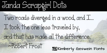 Cute scrapbooky handwriting with dots for character.
 - KG Already Home by Kimberly Geswein,
$5.00 A cute doodled outline typewriter style font.
 - Capo by Alias,
$60.00 The intention with Capo was to make a typeface with a pinched, angled connection between curves and verticals. We have explored this incised, cut motif previously on typefaces, most notably Noah, Sabre and Harbour. These have focussed more specifically on stone-cut forms. For Capo we wanted to mix the expressive quality of its ‘pinch’ idea with an overall aesthetic that could be applied to text rather than headline. So Capo has something of the function and warm, organic quality of Grotesque style typefaces. In Capo’s Bold and Black weights the sharpness of the letter shapes is more dramatic and emphasised, making for great effect for large-sized text. Why Capo? A capo is a device used on the neck of a stringed (typically fretted) instrument to shorten the playable length of the strings by pinching or clamping them in place, hence raising the pitch.
 - PF Bulletin Sans Pro by Parachute,
$79.00 This is a grotesque typeface which was derived from an older more simple version designed back in 2000. Bulletin Sans Pro is distinguished by its selective deep cuts which give this typeface a robust and contemporary look. These cuts become more apparent at larger sizes while they create a more subtle effect at smaller sizes. For intense titles try the black version. When space and legibility for long texts are critical, use the lighter versions. The family consists of 10 fonts—from black to light—including true italics. It supports 20 special OpenType features like small caps, fractions, ordinals, etc. and offers multilingual support for all European languages including Greek and Cyrillic. Finally, every font in this family has been completed with 270 copyright-free symbols, some of which have been proposed by several international organizations for packaging, public areas, environment, transportation, computers, fabric care and urban lifestyle.
 - Ravenheart by Hanoded,
$15.00 I like Ravens. In fact, I like them so much that I have a tattoo of a Haida raven! Ravenheart was more or less modelled on my Qilin font, but it is completely different. It is scary and inky, but it has a certain flair as well. A bit mystical, a bit evil, but I am sure you’ll find many uses for it. Comes with a fluttering of diacritics.
 - Mysterious by Hanoded,
$15.00 Mysterious is a bit of an unusual font. It looks old fashioned, but it comes with cool stylistic alternates, it could be a didone, but it is not (really), it looks formal, but it is rather scary. Mysterious was more or less based on the titling pages of 17th century atlases and my own twisted imagination. It comes with a whole bunch of ligatures and stylistic alternates, plus extensive language support.
 - Filmstrip BF by Bomparte's Fonts,
$29.00 Imagine words and letters, all caps, cut out of 35mm film. Then imagine Filmstrip BF —a font of film and movie-related catchphrases. They’re all ordered in more or less alphabetical order as seen in a glyph palette, beginning with “A”, which is accessible by typing a number (#) symbol. Numerals zero through nine, however, are mapped to their usual keyboard locations. For a better fit between numbers, be sure to enable the Ligature feature in an OpenType-capable application. All catchwords contained in this font are listed as shown, across the three posters in the slide carousel above. For future reference, you might select and copy all of the glyphs indicated below, paste into your application document, then convert them to Filmstrip BF. This would display all content. #$%&’()*+,./0123456789:;=>?@ABCDEFHIJKLNOPQRSTUVWXYZ[\]^_`abdefghijklmnopqrstuvwxyz{|}~ÄÅÇÉÑÖÜáàâäãåçéèêëíìîïñóòôöõúùûü†°¢£§•ß®©™´¨≠ÆØ∞±≤≥¥∂∑∏πªºæø¿¡¬√≈«»…ÀÃÕŒœ–—“”‘’÷ÿŸ⁄€‹›fifl‡·‚„‰ÂÊÁËÈÍÎÏÌÓÔÒÚÛÙıˆ˜¯˘˙˚¸˝˛ˇÐðŁ¹¼łŠš³¾² When used in a creative way, Filmstrip BF can be successfully incorporated into a variety of projects such as product packaging, logos, posters, signage, headlines and more.
 - Arzachel by CAST,
$45.00 Arzachel is a humanistic sanserif with a big x-height and a specific organic look. Its design is scientifically sharp and efficient in small type sizes as well as rugged and dramatic in headlines. Arzachel’s essential feeling comes from several features: all the letters are slightly sloped, stem terminations are flared at the top, and the terminals in letters a, c, e, f… are widening with the inside parts completely flat. The stroke contrast is low in the regular weight while it increases in the black; finally the capitals have an inscriptional flavor. Despite being a sanserif (thus a product of recent typography) Arzachel’s roots stretch back to the Renaissance tradition: Olocco took inspiration from some of the early and rather weird types cut in Venice in the 15th century. Arzachel was conceived during Olocco’s MA in Reading to provide a companion for his Zenon for use in small type sizes. But instead of expanding the Zenon family with optical sizes, the designer decided on a sans with its own personality rather than a sanserif version of Zenon with chopped-off serifs.
 - ITC Caslon No. 224 by ITC,
$40.99 The Englishman William Caslon (1672-1766) first cut his typeface Caslon in 1725. His major influences were the Dutch designers Christoffel van Dijcks and Dirck Voskens. The Caslon font was long known as the script of kings, although on the other side of the political spectrum, the Americans used it as well for their Declaration of Independence. The characteristics of the earlier Renaissance typefaces are only barely detectable. The serifs are finer and the axis of the curvature is almost or completely vertical. The overall impression which Caslon makes is serious, elegant and linear. Next to Baskerville, Caslon font is known as the embodiment of the English Baroque-Antiqua and has gone through numerous new interpretations, meaning that every Caslon is slightly different. ITC Caslon 224 was designed by Edward Benguiat and appeared with ITC in 1982. It is the text font which expanded upon the title font ITC Caslon 223. The alterations in the proportions of the letters make this Caslon 224 a noticeable departure from the original, but make the font overall more legible.
 - Fiasco Cursive Font by BeckMcCormick,
$14.00 Introducing Fiasco Script, a bouncy modern calligraphy font. Fiasco is a clean cursive font with a feminine aesthetic, making it a perfect choice for designing feminine logos & branding, cute paper products like wedding invitation suites, or for displaying headlines on your website. Fiasco can also be used for other print design like magazines and flyers or printed marketing materials. This font can also be used for digital marketing materials and social media items! Fiasco Script’s clean edge makes it a great candidate for craft projects on your Cricut or Silhouette machine; it cuts beautifully! Fiasco Script includes: - full upper + lowercase characters - numbers + punctuation - 2 ligatures — ox, tt - PUA-encoding Extensive Language Support: Western European, Central European, South Eastern European, South American, Oceanian, Vietnamese, Esperanto Fiasco Script can be used with graphic design programs such as Illustrator or Photoshop, word processing programs like Pages or Word, Design Space for Cricut, Silhouette, Procreate, Canva Pro, Glowforge, GoodNotes, & more. This font is an installable for desktop & laptop machines, as well as iPads or iPhones. See below for links to help with installation.
 - FS Renaissance by Monotype,
$52.99 FS Renaissance is a display stencil typeface by the Monotype Studio. A collaboration between lettering artist and designer Craig Back and Creative Type Director Pedro Arilla, the single style font explores the intersection between art and design. With artist and designer working hand in hand, each letter was crafted as a standalone piece of art, while working harmoniously together as a functioning typeface. The typeface is inspired by the Renaissance period symbolised by flourishing progress in the arts, sciences, learning, and philosophy. The typeface is not a traditional stencil design: the cuts are not rigid but interactions that are hand crafted between each element, emphasising the idea of a typeface as a piece of art or sculpture. Pedro Arilla’s aim was to take the core DNA of Craig's lettering and apply it to a typographic base with a solid internal consistency, balanced with an external elegance. Pedro and Craig worked closely together to make sure the original concept was not compromised and this is reflected in the finished design which strikes the perfect balance between functionality and art.
 - Gilam by Fontfabric,
$39.00 Gilam is a sans serif font with semi-condensed proportions. The typeface was based on the famous DIN but combines its popular neo-grotesque look with characteristics, such as the pointed edges in the “W” and “M” as well as the outward cut terminals, which gives a distinctive look to the modern geometric typeface. The complete set of 9 weights plus italics gives to designers the absolute freedom to create anything. Perfect layouts with blocks of text, headlines, motion graphics, logos, apps, and websites are just part of the intended usage of this versatile typeface. Features: • 765 glyphs in 18 styles; • Extended Latin, Cyrillic and Greek; • Geometric forms and low contrast; • Prominent x-height which makes it legible in a text; • Perfect for headlines and logos; • Suitable for web, print, motion graphics etc. • Semi-condensed proportion; • Advanced typographical support and OpenType features including case-sensitive forms, fractions, superscript and subscript characters, and stylistic alternates; • Complete set of figures - old style and lining figures, which come with proportional and tabular variation; Gilam means “joy of people” so that you can enjoy it!
 - Genteta by Typephases,
$25.00 In the tradition of the stock cuts that printing type foundries offered as metal, these spot illustrations remind you —for their look and technique— of vintage publications like victorian age newspapers and magazines. Similar to their counterparts in the Whimsies, Absurdies, Ombres, Bizarries and Whimsies series, the Genteta is another collection of little people in funny and absurd situations, recreated in black ink, from imagination and with no reference or models, and then carefully digitized. The Genteta trio of dingbats includes more than 150 new images. Their vectorial file format means you can use them at any size with no loss of quality. Every Genteta dingbat offers ready-made images for a variety of creative projects. They can be used as they come or easily customized in any graphics program. At small sizes they are ideal spot illustrations with a whimsical touch; at large sizes they can bring a whole page, a spread or even a big poster to life. Use them in creative projects including, but not limited to, flyers, brochures, book jackets and editorial illustration.
 - Battista by preussTYPE,
$29.00 The BATTISTA typeface stands in the long tradition of the designs developed by Giambattista Bodoni, who made his famous typefaces in the end of the eighteenth century. Similar designs can be found on various specimen books e.g. Alexander Wilson, John Bell, Edmund Fry and Alexander Thibaudeau. One of the best italics was available by Stephenson Blake & Co. foundry form Sheffield, England. In the end of the nineteenth century an unknown punch cutter at the German type foundry Schelter & Giesecke made an very bold cut of this Bodoni design. He brought both designs, the regular and the italic to an new level of harmony. Compared to the original Bodoni designs the new typeface was a lot bolder, which was well taken by the audience in this time. The BATTISTA typeface is an remarkable design, assembled of ultra bold and very fine shapes, but in all, the spirit of Bodonis design was well preserved. BATTISTA is a classic display design. The fine details are best shown on larger text sizes.
 - Yorklyn Stencil by House Industries,
$33.00 Yorklyn Stencil includes three fonts, each optimized for use at different size ranges. Grande has greater contrast and more delicate breaks designed to be used at larger sizes where finer details are more conspicuous. Medium and Petite are intended for smaller sizes where the breaks and contours must be more resilient. We embedded several OpenType layout features, including traditional fractions and nut fractions. We extensively tested Yorklyn Stencil in what might be the broadest range of media and conditions in the annals of Northwestern Delaware typefounding history. From the ceramic kilns of Heath Ceramics to our studio’s stucco facade, Yorklyn Stencil’s robust curves and deceptively delicate breaks will withstand a wide variety of harsh conditions with unprecedented aplomb. Whether you’re hand cutting a stencil to buzz your bespoke restaurant bar stools or simply looking for a practical yet illustrative display font, Yorklyn Stencil’s elegant efficacy will enhance any creative composition. Like all good subversives, House Industries hides in plain sight while amplifying the look, feel and style of the world’s most interesting brands, products and people. Based in Delaware, visually influencing the world.
 - Segment B Type by Kobuzan,
$19.99 Segment B is a powerful display type family with 18 styles inspired by condensed European grotesques of 19th-century with a reference to the first grotesques, which differ in the contrast of strokes, but with clear geometric proportions. In Black weights, the letterforms are inspired by the aggressive industrial graphic design of the 1960s and 70s. Both have 3 axes and are adjustable in weight, width and 10? italic. It is a typeface with narrow proportions, distinctive character, high-quality outline and lots of details. Characters have oblique cuts, sharp tails and highly visible ink traps. All this makes the font more aggressive and edgy. The huge x-height with short ascenders and descenders allows this typeface to be used in blocks with minimal line spacing. Features: – Total glyph set: 631 glyphs; – 18 styles (3 weights x 3 widths + italic); – Support 210+ languages; – Latin Extended; – Cyrillic Basic + Bulgarian letters; OpenType features: – Proportional numerals, tabular numerals, superiors, fractions; – Punctuations and symbols; – Arrows; – Stylistic alternates (ss01-ss05); – Ligatures; – Case-sensitive forms.
 - Mechline by Ditatype,
$29.00 Enter the future with Mechline, a visionary font that seamlessly blends futuristic aesthetics with artistic ingenuity. Mechline creates a cutting-edge look that pushes the boundaries of modern design. The characters in Mechline embody the essence of the future, with a weight that strikes the perfect balance between elegance and technological advancement. The artistic letter shapes evoke a sense of creativity, giving each character a distinct and avant-garde identity. Mechline's irregular outlines add an element of unpredictability, contributing to its futuristic allure. Enjoy the features here. Features: Stylistic Sets Multilingual Supports PUA Encoded Numerals and Punctuations Mechline fits in headlines, logos, posters, flyers, branding materials, greeting cards, print media, editorial layouts, and many more designs. Find out more ways to use this font by taking a look at the font preview. Thanks for purchasing our fonts. Hopefully, you have a great time using our font. Feel free to contact us anytime for further information or when you have trouble with the font. Thanks a lot and happy designing.
 - CA Yoshiro by Cape Arcona Type Foundry,
$30.00 Tomorrow’s Typeface Today Are you ready to take your science fiction, action, military films, shows or video games to the next level? Our family of fonts brings a touch of nostalgia and a dash of modernity to your titles and typography. The CA YOSHIRO “Wide” style bears a striking resemblance to the iconic Eurostile typefaces of the 1960s. It has an immediate sense of familiarity. But what sets it apart is its contemporary, fresh sci-fi design. It’s the perfect blend of classic and cutting-edge, delivering an unprecedented, unconsumed style that promises to captivate audiences like never before. The CA YOSHIRO “Normal” style can also be used for a variety of other projects that require a normal width and just need to show a light technical touch without immediately suggesting a sci-fi reference. In addition, CA Yoshiro has subtle similarities to the monospace fonts commonly used on computer displays and screens. These fonts are the foundation of written programming code and sequences, lending a distinctive character to the digital realm.
 - Remeeq by Twinletter,
$17.00 Introducing Remeeq, the futuristic font that will take your designs to the next level! With 53 alternate characters for uppercase letters and 49 ligatures, this font offers endless possibilities for creating unique and futuristic designs. The sleek and modern design of this font is perfect for those looking to create designs that are cutting-edge and ahead of their time. Whether you’re designing for a sci-fi movie poster or a tech startup, Remeeq is the font that will make your designs stand out from the crowd. Plus, with multilingual support, you can use this font for projects in any language. Upgrade your design project with Remeeq and impress your audience with your futuristic and innovative designs. What’s Included : - File font - All glyphs Iso Latin 1 - Alternate, Ligature - Simple installations - We highly recommend using a program that supports OpenType features and Glyphs panels like many Adobe apps and Corel Draw so that you can see and access all Glyph variations. - PUA Encoded Characters – Fully accessible without additional design software. - Fonts include Multilingual support
 - Strateen by IbraCreative,
$17.00 Strateen – a Futurism Sans Serif Font Strateen, a Futurism Sans Serif font, encapsulates the essence of contemporary design with its sleek and progressive aesthetic. Its clean, geometric lines and minimalistic strokes evoke a sense of modernity, making it ideal for projects that seek a futuristic and cutting-edge look. The typeface’s letterforms boast a harmonious balance between simplicity and sophistication, enhancing legibility while maintaining a distinctive personality. Strateen’s sans serif nature contributes to its versatility, enabling seamless integration across various mediums, from digital interfaces to print materials. The font’s forward-thinking design not only aligns with the visual trends of the future but also ensures a timeless appeal, making Strateen a compelling choice for those in pursuit of a dynamic and forward-looking typographic solution. Strateen is perfect for branding projects, logo, wedding designs, social media posts, advertisements, product packaging, product designs, label, photography, watermark, invitation, stationery, game, fashion and any projects. Fonts include multilingual support for; Afrikaans, Albanian, Czech, Danish, Dutch, English, Estonian, Finnish, French, German, Hungarian, Italian, Latvian, Lithuanian, Norwegian, Polish, Portuguese, Slovak, Slovenian, Spanish, Swedish.
 - Bernhardt Standard by Linotype,
$40.99Bernhardt Standard, which was designed in 2003 by Julius de Goede, is a flowing Bastarde script. Bastarde is one of the sub-categories of Blackletter typefaces. The term Blackletter refers to typefaces that have evolved out of Northern Europe’s medieval manuscript tradition. Often called gothic, or Old English, these letters are identifiable by the traces of the wide-nibbed pen stroke within their forms. Of all of the various sorts of Blackletter styles, Bastarde scripts are the most flowing, or Italic. The first Bastarde typefaces, cut in the late 1400s, were based on French handwriting styles, especially those styles popular in Burgundy. The flowing nature of Bernhardt Standard makes it similar to some other sorts of Blackletter typefaces as well. Bernhardt Standard, because of its handwritten roots, is also similar to Kurrent, a style of handwriting that was popular in Germany prior the 20th Century. Bernhardt Standard is a very calligraphic face, suitable for formal applications. This typeface would be an excellent choice for certificates or awards. The old style figures in the font allow for nice short settings of text as well. - Iridium by Linotype,
$29.99Iridium™ was designed by Adrian Frutiger in 1972 for Linotype. It is in the modern" style like Bodoni or Didot, in that it has the sparkle created by a high thick/thin contrast and a symmetrical distribution of weight. But the sometimes harsh and rigid texture of the modern style is tempered by Frutiger's graceful interpretation. Iridium itself is a very hard, brittle and strong metal; yet the Latin and Greek roots of the word mean rainbow, or iridescence. And indeed, this font is infused with a more lustrous and complex spirit than the average rather stark modern typeface - note the stems that gently taper from waist to serif, the nicely curved ovals of the round characters, and the slight bracketing of the serifs. Iridium was originally designed for phototypesetting, and Frutiger himself cut the final master photo-mask films by hand. This digital version has all the craftsmanship of that original and includes the roman, a true italic, and the bold weight. Iridium works particularly well for book and magazine text and headlines." - Haboro Sans by insigne,
$- Quit trudging through the thick with encumbering fonts, and spring to the front of the pack with the cutting edge sans serif, Haboro Sans. With nothing to clutter up your work, your editorial designs, websites, and software will be sharp and clear. While this hyperfamily is simple in character, it (like Haboro Slab and Haboro as well) provides you with plenty of options. Haboro Sans features simple geometric shapes to help you achieve that perfect effect wherever you use it. Enjoy the comforting reassurance that this multi-tool of a typeface family can work on most anything, including packaging, branding, web copy, and more. Take the simplicity of Haboro Sans a step farther with OpenType features, too. Haboro Sans contains special glyphs like Titling, Small Caps and Oldstyle figures that give your work just enough of a distinct touch. For even more options, use the entire Haboro hyperfamily to expand your capabilities. Put some simple class into your projects with the traditional look of Haboro Sans. Your layouts, websites, iPhone apps, advertising, and newspapers (to name just a few) will thank you.
 - Some's Style - Unknown license

- Maassslicer - Unknown license

- Ruina One by RodrigoTypo,
$25.00 Ruina One is a Rough and distressed font, but at the same time very gestural. It is especially great for youth and child graphics, but can be applied in many other domains too. Ruina One contains various ligatures.
 - Magic Bright Script by Typestory,
$10.00 Magic Bright is a stunning and comprehensive duo font (script and serif), ideal for giving your projects a branded but friendly feel. The two included styles can be combined together perfectly but are also beautiful on their own.
 - Hayseed by Typadelic,
$19.00Round and square, curly and straight are contradictory in terms but aptly describe this unclassifiable typeface from Typadelic. Readable at small sizes but meant for display purposes, Hayseed will fill the bill in a variety of design applications.

