10,000 search results
(0.045 seconds)
- HUTagada by Heummdesign,
$15.00 "Disco Pang Pang" is the Korean name for Tagada rides. It is a characteristic typeface that is good to use when you want to make use of a unique and bouncy feeling. Light and Extrabold are made with the thickness of normal typefaces, but Left and Right have strange shapes with stroke thicknesses that are biased to one side. Its unique shape can make a strong impression on people.
 - Artegra Sans by Artegra,
$29.00 Designed by Ceyhun Birinci from 2014-17, is a comprehensive typeface family with 162 fonts. It offers 9 weights with true italics in normal, condensed, and extended widths. Each font contains over 1500 glyphs and supports multilingual including Latin and Cyrillic. It includes various Opentype features like small caps, alternates, and more. The font also provides separate alternates and small caps versions for use in software without OpenType support.
 - Theridge by Asenbayu,
$9.00 Theridge is a multipurpose condensed font that comes in 3 weights: light, normal, and bold. Inspired by hiking trips and forest views, Theridge represents a sense of clean highland adventure. These fonts themed retro, adventure, urban, hipster, vintage but still modern. These fonts are great for creating desired projects like logos, posters, headlines, albums, quotes, apparel and more. These fonts are perfect for you who need clean condensed typeface! Thank you!
 - Akueila by Sensatype Studio,
$15.00 Akueila is a Luxury font that we created special for elegant, elegant, modern, wedding, branding needs, font that you can combine to get any variations and unique shapes easily just in seconds with choose alternates of them. What's Included: Character set A-Z Normal & Italic Style Numerals & Punctuation Accented Characters (West Europe) Stylistic Ligatures Works on PC & Mac Recommended using Adobe Illustrator or Adobe Photoshop. Wish you enjoy our font. :)
 - Brignell Slab by IB TYPE Inc.,
$40.00 BRIGNELL SLAB is an eight font family designed by Ian Brignell. Curvaceous and dynamic, this unique slab exudes honesty and personality. A slab serif characterized by a soft treatment where normally you would see vertical serifs. This feature allows for a smoother, less toothy, reading effect. Brignell Slab was born in 2008 and was inspired by the logo and custom font Ian designed for Naturalizer. Extended Latin set.
 - Friendly by Sensatype Studio,
$15.00 Brother is a High-Contrast font that we created special for elegant, luxury, modern, wedding, branding needs, font that you can combine to get any variations and unique shapes easily just in seconds with choose alternates of them. What's Included: Character set A-Z Normal & Italic Style Numerals & Punctuation Accented Characters (West Europe) Stylistic Ligatures Works on PC & Mac Recommended using Adobe Illustrator or Adobe Photoshop. Wish you enjoy our font. :)
 - Imperial Granum by Greater Albion Typefounders,
$18.00 Imperial Granum is designed primarily as a Roman Title and lettering face, combining formality and dignity with a delightful touch of 'Arts and Crafts' like hand drawn design. The regular form of Imperial Granum (which is inspired by a beautifully hand-lettered early 20th century food advertisement) offers two sizes of capitals, in order to provide true 'small-capitals' lettering. Similarly, the Ornamental form consists exclusively of capitals and is designed to be able to mix and match with the regular form. The miniscule form can, of course, be used in its own right, but is primarily intended to complement the regular and ornamental forms. All three faces are offered in regular and bold weights. Explore some Edwardian Arts and Crafts typographical fun today!
 - Aviano Contrast by insigne,
$22.00 The Aviano series returns, refined and sophisticated with an extended, high-contrast sans-serif family. Aviano Contrast is a contemporary typeface radiating with luxury. It's classic elegance makes it perfect for high-end applications such as cosmetic, jewelry or fashion brands. Aviano Contrast's extended forms give the face a smart look, and the curves are carefully honed to be sinuous and seductive. This high-contrast face is in a class of its own, composed in the style of a classic Didone but lacking the typical serifs. Aviano Contrast comes in six different weights and is packed with OpenType features. Need swash forms? Ball terminals? Art Deco alternates inspired by the inscriptions and signage of the '20s and '30s? Aviano Contrast includes 230 alternate characters. Twelve style sets are available, including four complete sets of art deco-inspired alternates, small forms, swash, titling and a wide array of other alternates to make your designs unique. As a complement to these characters, Aviano Contrast also includes 40 discretionary ligatures for artistic typographic compositions. Please see the informative .pdf brochure to see these features in action. OpenType capable applications such as Quark or the Adobe Creative suite can take full advantage of the automatically replacing ligatures and alternates. This family also includes the glyphs to support a wide range of languages. The rest of the Aviano series pairs very well with this face. These include Aviano, Aviano Serif, Aviano Sans, Aviano Didone, Aviano Flare, Aviano Future and Aviano Slab.
 - JAF Facit by Just Another Foundry,
$42.00 Facit is a contemporary sans serif text face. It is designed to be a highly legible and flexible font that does not draw the attention to itself. Instead of being original by itself it is the result of a careful examination of ancient as well as modern formal concepts. “It is by definition impossible to design an un-conventional typeface. Type is pure convention, this is why we can read each other’s written words”, says its designer Tim Ahrens. However, rather than generating an average, existing principles were consciously combined into a unique design solution: The word ‘Facit’, in its German version, means ‘conclusion’. The fonts are provided in OpenType format. Each font contains 720 glyphs. Technically, they follow the Adobe Pro fonts and provide the same glyph set and OpenType functionality. OpenType features include ligatures, true small capitals, superiors, inferiors, numerators and denominators. Every font contains old style and lining figures, both in a proportional and a tabular design. For some letters there alternate characters.
 - Handsome by Shinntype,
$50.00 Handsome was the first digital typeface to resemble nice, ordinary, fully cursive handwriting. Or neon. In 2005, Handsome Pro was one of the first script typefaces to utilize the OpenType format to simulate the natural quality of writing, by automatically substituting alternate contextual glyphs. The effect follows the conventional “joining rules” of calligraphy, which are a formalization of the way in which letter forms are modified in cursive handwriting for the sake of speed and efficiency—and also perhaps to make life more interesting. For the look of real handwriting, Handsome is most convincing at around 15 pts. At much smaller or larger sizes it works differently. At display size, the feel of the non-nib styles is very slick, more like a speedball Kauffman, owing to the smoothness of the finish. As script fonts go, Handsome has a relatively large x-height, which can be useful if you don't want the “writing” to look too small.
 - Nadhiratil Mahira by MonoLIne Calligraphy,
$21.00 Nadhiratil Mahira is interesting because the typeface is pleasing to the eye, clean, feminine, sensual, glamorous, simple and very easy to read, because there are many fancy letter connections. I also offer a number of decent stylistic alternatives for multiple letters. Classic styles are very suitable to be applied in various formal forms such as invitations, labels, restaurant menus, logos, fashion, make up, stationery, novels, magazines, books, greeting / wedding cards, packaging, labels or all kinds of advertising purposes. . . Nadhiratil Mahira has alternative characters, including support for multiple languages. With OpenType features with an alternative style and elegant binding. The OpenType feature does not work automatically, but you can access it manually and for the best results required for your creativity in combining these Glyph / Character variations. Font Features : * Lowercase beginning and ending swash * Uppercase beginning swash * Initials * International Language I heavily use programs that support OpenType features and the Glyphs panel such as Adobe Illustrator, Adobe Photoshop CC, Adobe InDesign, or CorelDraw, so that you can view and access all the variations of the Glyph. Nadhiratil Mahira is coded with Unicode PUA, which allows full access to all additional characters without having any special design software. Mac users Mac users, and Windows users can use Character Map to view and copy any of the additional characters to paste into your favorite editor / application. Please send a message if you have questions or problems, and don't hesitate to say hello on Instagram : @monolinecalligraphy Thank you & Happy Designing!
 - The Dagoda by Hrz Studio,
$17.00 The Dagoda is a calligraphy script font that comes with beautiful alternate characters. copper plate calligraphy alloy with handlettering style. Designed to convey stylish elegance. The Dagoda is attractive because it is subtle, clean, feminine, sensual, glamorous, simple and very easy to read. Classic style is very suitable to be applied in all types of formal work such as invitations, labels, menus, logos, fashion, make up, stationery, letterpress, romantic novels, magazines, books, greeting/wedding cards, packaging, labels. Dagoda features a glyph and alternate characters. including multiple language support. It features OpenType with character styling, binding, and stroke, allowing you to mix and match letter pairs to match your design. Files include: To enable the OpenType Stylistic alternative, you need a program that supports OpenType features such as Adobe Illustrator CS, Adobe Indesign & CorelDraw X6-X7, Microsoft Word 2010 or later. (Windows), Font Book (Mac) or a software program such as PopChar (for Windows and Mac). How to access all alternative characters using Adobe Illustrator: https://www.youtube.com/watch?v=XzwjMkbB-wQ How to use the font style set in Microsoft Word 2010 or later: https://www.youtube.com/watch?v=NVJlZQ3EZU0 There are additional ways to access alternatives/swashes, using Character Maps (Windows), Nexus Fonts (Windows) Font Book (Mac) or software programs such as PopChar (for Windows and Mac). How to access all alternative characters, using Windows Character Map with Photoshop: https://www.youtube.com/watch?v=Go9vacoYmBw If you need help or advice, please contact me. Thank you for your purchase!
 - Grethania Script by Romie Creative,
$12.00 Grethania Script is a calligraphic script font that comes with beautiful alternative characters. a mixture of copper plate calligraphy with handlettering style. Designed to convey the elegance of style. Grethania is interesting because it is smooth, clean, feminine, sensual, glamorous, simple and very easy to read. Classic style is very suitable to be applied in all types of formal work such as invitations, labels, menus, logos, fashion, make up, stationery, letterpress, romantic novels, magazines, books, greeting / wedding cards, packaging, labels. Grethania Script displays 310+ glyphs and 122 alternative characters. including multiple language support. With OpenType features with changes in style, binder and character swash, which allows you to mix and match pairs of letters to fit your design. To activate the OpenType Stylistic alternative, you need a program that supports OpenType features such as Adobe Illustrator CS, Adobe Indesign & CorelDraw X6-X7, Microsoft Word 2010 or newer versions. (Windows), Font Book (Mac) or software programs such as PopChar (for Windows and Mac). How to access all alternative characters using Adobe Illustrator: https://www.youtube.com/watch?v=XzwjMkbB-wQ How to use font styles that are set in Microsoft Word 2010 or later: https://www.youtube.com/watch?v=NVJlZQ3EZU0 There are additional ways to access alternatives / swash, using Character Maps (Windows), Nexus Fonts (Windows) Font Book (Mac) or software programs such as PopChar (for Windows and Mac). How to access all alternative characters, using Windows Character Map with Photoshop: https://www.youtube.com/watch?v=Go9vacoYmBw
 - Hatelliya by MonoLIne Calligraphy,
$23.00 Hatelliya Script Font is interesting because the typeface is pleasing to the eye, clean, feminine, sensual, glamorous, simple and very easy to read, because there are many fancy letter connections. I also offer a number of decent stylistic alternatives for multiple letters. Classic styles are very suitable to be applied in various formal forms such as invitations, labels, restaurant menus, logos, fashion, make up, stationery, novels, magazines, books, greeting / wedding cards, packaging, labels or all kinds of advertising purposes. . . Hatelliya has alternative characters, including support for multiple languages. With OpenType features with an alternative style and elegant binding. The OpenType feature does not work automatically, but you can access it manually and for the best results required for your creativity in combining these Glyph / Character variations. Font Features : * Lowercase beginning and ending swash * Uppercase beginning swash * Initials * Intenational Language I heavily use programs that support OpenType features and the Glyphs panel such as Adobe Illustrator, Adobe Photoshop CC, Adobe InDesign, or CorelDraw, so that you can view and access all the variations of the Glyph. Hatelliya Font is coded with Unicode PUA, which allows full access to all additional characters without having any special design software. Mac users Mac users, and Windows users can use Character Map to view and copy any of the additional characters to paste into your favorite editor / application. Please send a message if you have questions or problems, and don't hesitate to say hello on Instagram : Thank You & Happy Designing!
 - Greenhorn by Juraj Chrastina,
$29.00 Greenhorn is a hand-traced comic type for headlines. Funky, irregular and smiling. The first inspiration comes from the unique lettering of a classic czech cartoonist.
 - Augereau by Abrams Legacy,
$52.00Named for Antoine Augereau, teacher of Claude Garamond, this much admired rendition of the classic Garamond typeface was created by George Abrams and released in 1997. - Ole by Fly Fonts,
$15.00Ole is a retro jazz inspired font with clean lines and a classic style. Use it big to fully appreciate the extreme nature of its design. - Rancher JNL by Jeff Levine,
$29.00 Rancher JNL was inspired by classic wood type. This wide, slab serif typeface is reminiscent of wanted posters, broadsides and other printed matter from the 1800s.
 - Bronco Valley by Variatype,
$12.00 Bronco Valley is designed with vintage style or you can say “American Rodeo” for classic look branding, logotype, poster design, t-shirt design, and much more.
 - Texarkana JNL by Jeff Levine,
$29.00 Texarkana JNL is based on classic condensed wood type from the 1800s, and is embellished with stars on the top and bottom for a decorative look.
 - Mud Creek JNL by Jeff Levine,
$29.00 Mud Creek JNL is based on Tuscan Egyptian – a classic wood type with a decidedly Western feel, and is available in both regular and oblique versions
 - Lingerhend by Lemonthe,
$15.00 Lingerhend is a classic handwritten script font. It’s the perfect font for wedding invitations, stationery, photography, social media posts, product packaging, greeting cards, and much more!
 - Copperplate New by Caron twice,
$39.00 Imagine America in the 1930s. A gangster flick with Al Capone, a crime novel featuring Philip Marlowe. Our hero in a fedora sits in a classy bar, orders a double bourbon, lights a cigar and eyes the evening paper. He turns the pages, reading about a bank heist over on Third Avenue, a scandal involving a baseball player, a small ad for a general practitioner and a large spread about a famous law firm. What do the bottle of booze and the majestic facade of the bank have in common? The elegant baseball uniform and trustworthy attorneys? - Copperplate Gothic - When Frederick William Goudy created his legendary typeface in 1901, it went on to literally become the symbol of early 20th century America. Tiny serifs, characteristically broad letterforms, and particularly bold titles decorated calling cards at 6-point size, enormous bronze-cast logos, newspaper headlines, restaurant menus and more. This was the golden age of Copperplate, lasting up until the arrival of die neue Typografie and monospaced grotesques in the 1960s. Then the typeface almost completely disappeared. It made a partial comeback with the advent of the personal computer; digitizations of varying quality appeared, and one version even became a standard font in Adobe programs. This may have played a role in Copperplate later being used in DIY projects and amateur designs, which harmed its reputation. Copperplate New has been created to revive the faded glory of the original design. Formally, the new typeface expands the existing weight and proportional extremes. The slight serifs are reduced even further, making the typeface sans-like at smaller point sizes and improving readability. In contrast, at large point sizes it retains all of its original character. Decorative inline & shadow styles have been added and both have been created in all five proportions, making it easy to adapt the typesetting to the format you need. Despite these changes and innovations, Copperplate New remains true to Goudy’s original design and represents a snazzy way to evoke a golden era in American culture. Specimen: http://carontwice.com/files/specimen_Copperplate_New.pdf
 - Glade by Dear Alison,
$24.00 My latest typeface is a formal, copperplate script named Glade. Beginning as a project for a client who wanted several widths of a formal script style, the project never saw fruition. However, it did get me excited about the idea of a width family of steel nib scripts, ranging from extra narrow to extra wide, and the result is the Glade family. To give Glade a minor modern makeover from the original intent, the lowercase has been scaled up, and the Capitals scaled down for a more friendly personality. The character set has been expanded, and OpenType support has been added for unlimited fractions, ordinals, superiors and inferiors. So if you have the need for a formal connecting script, but are short on space, try Glade Narrow or Glade Extra Narrow. If space is not an issue, then the Regular, Wide or the generously gracious Extra Wide should do nicely. And if you get the whole family, well then you are set for anything that comes your way.
 - Piepie by Dharma Type,
$24.99 Piepie is very heavy typeface for titlings and captions. OpenType Format (.otf) with 461 glyphs! Super mini ascenders and descenders! Ultra big x-height! Fatty weight yet Sharpy sharp detail! Bring it on Retina display! OpenType alternates for K, R and Y! Mac Roman ✓ Windows 1252 ✓ Adobe Latin 1 ✓ Adobe Latin 2 Almost all Adobe Latin 3 Almost all
 - Harsey by Letterhend,
$16.00 Introducing, Harsey Type Toolbox. One of our best-designed product that we ever created. This product consist of many styles such as script, sans, serif, and also includes dingbats, catchwords and badges all comes in font format. What makes this product even more special is you can use and combine all these fonts perfectly matched altogether.
 - Aquatory Serif by Gleb Guralnyk,
$14.00 Hi, presenting a classic style font Aquatory Serif. It's a decorative classic style typeface with lots of ligatures and thin high contrast shape. A descent advantage of this font is a set of 75 ligatures for small letters. Aquatory Serif font supports most of the european languages and also has ukrainian cyrillic characters. *Make sure that "Standard Ligatures" feature is supported & enabled in your software. Also please consider that this feature is available only for english alphabet.
 - Civons by Genetype,
$23.00 Introducing Civons Serif Display Font A perfect fusion of classic charm and modern allure. Ideal for branding and editorial projects, it effortlessly combines traditional serifs with a contemporary touch, radiating sophistication and uniqueness. So why stop at classic and boring serif fonts when you can add fun and uniqueness with this serif display font? give it a try and you'll love it! Enjoy the font, feel free to comment or feedback, send me PM or email. Thank you!
 - Decondor by Alit Design,
$12.00 Introducing DECONDOR Typeface DECONDOR font family consists of 14 families, from Thin to Heavy style fonts. The elegant modern font creates a unique design and is sure to steal the eye of the design target audience. Besides being unique, the DECONDOR font also has a luxury simple character that makes the design charming and classic luxurious. These a fonts are perfect for designs with the concept of elegant, luxury, romance, fashion, classic royal and so on.
 - Pinehills by Fikryal,
$18.00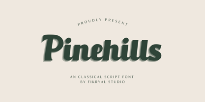 Pinehills – Font is a classical script font. With a classic style that can make your design look simple, elegant, and also bold, this font it’s perfect for logo, branding, title, social media posts, advertisements, product packaging, product designs, label, photography, watermark, special event, magazine, web design, vintage design, etc. Features : Pinehills( Uppercase, Lowercase ) Stylistic alternate Ligatures Multilingual Support If you have any questions please don’t hesitate to contact me. follow my Instagram: @fkryall Thank you 🙂
 - Carisma by CastleType,
$59.00 If you're in need of a sophisticated sans serif font, look no further than type designer Jason Castle’s Carisma (Paul Shaw in HOW magazine). Carisma, a CastleType Original, combines the elegance of classic capitals, the simplicity of clean-cut, geometric lowercase letters and the warmth of sensuous curves, subtle contrasts and sensitively tapered terminals, making it the perfect typeface for an understated, modern, sophisticated look. Available in two styles: Carisma Classic (the original), and Carisma Gothic, plus Carisma Inline.
 - Angustina by Diego Massaro,
$30.00 Angustina is an elegant display typeface, it takes inspiration from classic letter styles. I chose the font name after reading the classic Italian novel “The Tartar Steppe”. I was inspired by the sickly, stoic and mysterious man who differs for his willingness to stay at Fort Bastiani. Angustina conveys distress and stinging sensation with extreme contrasts between thick and thin strokes and exasperated serifs. The alternate of hairline and bracketed serifs gives Angustina a modern and military appearance.
 - Athlete by Talbot Type,
$12.00 Athlete is a highly legible, geometric text and display font. Inspired by classic sans-serifs Futura and Gill Sans, this elegantly minimal typeface blends traits of these twentieth century classics and is available in a comprehensive family of six weights. It includes old style non-aligning (lower case) numbers, both proportional and tabular, as well as accented characters for Central European languages. A versatile, contemporary sans-serif, Athlete is suitable for more-or-less any text or display purpose.
 - Sardo by SD Fonts,
$34.00 Not serif, nor sans, partly soft, partly crude, but highly individual. Sardo comes with a vivid slanted look resulting from the contrast of its common classic stroke difference and straight thin serifs, adding a rigid component to its appearance. Thus Sardo shows a strong character projecting a huge amount of individuality. A new display font made to draw attention where classic serifs and sans serifs appear just dull. So please meet Sardo, a cosy wild cat showing Sharpe claws.
 - Breve Title by DSType,
$50.00 Breve was designed for use in editorial projects. Simple but with enough personality to stand by is own, in a quest for a more forceful and contemporary appearance. All the fonts in Breve superfamily, share the same exact structure, both in terms of anatomy and functionality. The Text versions provide a softer and warm feel to the typographic palette and is intended for use in much longer passages of text, while the Title versions are distinguished by non-descending letterforms, making the titles and headlines much more uniform and interesting. The News version is more classic, with ball terminals and classic proportions, while the Display is, somehow, the set of fonts we had to design: extra-black, ultra-contrasted, proud-display fonts.
 - Mixa by Fontfabric,
$29.00 Neo-grotesque Sans Serif mixed with the classical handwritten Script in slanted geometric shapes - that’s the way Mixa was born. Those two faces of the new font family makes it as much as unique and recognizable. When you’re using the Capitals only nobody will suspect that there is script hidden in the lowercase. That’s why all eight weights can be combined perfectly with wide list of classical Sans Serif, Slab Serif and Serif typefaces. The font offers wide range of ligatures to ensure smooth readability and beautiful letter combinations. The decorative swashes in some of the Capitals presented as a stylistic sets give unique touch in any design. Mixa has it’s own style and personality, but without lacking of legibility.
 - Breve News by DSType,
$50.00 Breve was designed for use in editorial projects. Simple but with enough personality to stand by is own, in a quest for a more forceful and contemporary appearance. All the fonts in Breve superfamily, share the same exact structure, both in terms of anatomy and functionality. The Text versions provide a softer and warm feel to the typographic palette and is intended for use in much longer passages of text, while the Title versions are distinguished by non-descending letterforms, making the titles and headlines much more uniform and interesting. The News version is more classic, with ball terminals and classic proportions, while the Display is, somehow, the set of fonts we had to design: extra-black, ultra-contrasted, proud-display fonts.
 - Skyward by Carmel Type Co.,
$19.00 Robust, towering, and geometrically refined, Skyward is a surefire classic cocktail of equal parts utility and elegance. This typeface carries a set of over 300 glyphs across 8 distinct faces. With Deco-era sensibilities and a touch of modern refinement + an all new alternative set of characters, Skyward is exceedingly effective in a diverse spectrum of situations. Skyward is the perfect selection for modern, chic, luxury products and packaging as well as bold ad campaigns, window signage, magazine headlines or the classic branding project. Skyward works best as display text. 12 styles Sans-Serif, Serif, and Rounded styles Select Stylistic alternates Upper & lowercase Numerals & punctuation 330+ glyphs per style Supports 75+ Latin based languages OTF files Designed by Jason Carne
 - Breve Text by DSType,
$50.00 Breve was designed for use in editorial projects. Simple but with enough personality to stand by is own, in a quest for a more forceful and contemporary appearance. All the fonts in Breve superfamily, share the same exact structure, both in terms of anatomy and functionality. The Text versions provide a softer and warm feel to the typographic palette and is intended for use in much longer passages of text, while the Title versions are distinguished by non-descending letterforms, making the titles and headlines much more uniform and interesting. The News version is more classic, with ball terminals and classic proportions, while the Display is, somehow, the set of fonts we had to design: extra-black, ultra-contrasted, proud-display fonts.
 - Breve Sans Text by DSType,
$50.00 Breve was designed for use in editorial projects. Simple but with enough personality to stand by is own, in a quest for a more forceful and contemporary appearance. All the fonts in Breve superfamily, share the same exact structure, both in terms of anatomy and functionality. The Text versions provide a softer and warm feel to the typographic palette and is intended for use in much longer passages of text, while the Title versions are distinguished by non-descending letterforms, making the titles and headlines much more uniform and interesting. The News version is more classic, with ball terminals and classic proportions, while the Display is, somehow, the set of fonts we had to design: extra-black, ultra-contrasted, proud-display fonts.