10,000 search results
(0.311 seconds)
- Chopper by Canada Type,
$24.95 In 1972, VGC released two typefaces by designer friends Dick Jensen and Harry Villhardt. Jensen’s was called Serpentine, and Villhardt’s was called Venture. Even though both faces had the same elements and a somewhat similar construct, one of them became very popular and chased the other away from the spotlight. Serpentine went on to become the James Bond font, the Pepsi and every other soda pop font, the everything font, all the way through the glories of digital lala-land where it was hacked, imitated and overused by hundreds of designers. But the only advantage it really had over Venture was being a 4-style family, including the bold italic that made it all the rage, as opposed to Venture’s lone upright style. One must wonder how differently things would have played if a Venture Italic was around back then. Chopper is Canada Type’s revival of Venture, that underdog of 1972. This time around it comes with a roman, an italic, and corresponding biform styles to make it a much more attractive and refreshing alternative to Serpentine. Chopper comes in all popular formats, boasts extended language support, and contains a ton of alternate characters sprinkled throughout the character map.
 - Cal Carolingian Minuscule by Posterizer KG,
$16.00 Calligrapher Carolingian Minuscule Font is one of the calligraphic group of fonts called “21 alphabets for Calligraphers“. All graphemes are taken from calligraphic pages written in traditional Carolingian Minuscule calligraphic style. This font is ideal for calligraphic sketches or for imitation of ancient manuscripts. It contains all the Latin glyphs.
 - Cal Carolingian Gothic by Posterizer KG,
$16.00 Calligrapher Carolingian Gothic Font is one of the calligraphic group of fonts called “21 alphabets for Calligraphers“. All graphemes are taken from calligraphic pages written in traditional Carolingian Gothic calligraphic style. This font is ideal for calligraphic sketches or for imitation of ancient manuscripts. It contains all the Latin glyphs.
 - Eksellena by Typehand Studio,
$16.00 Eksellena is a blackletter font desiged in a modern style, minimalist and still classic look. this font is designed in 3 Style, each style have italic. That Style is Regular, Textured and Outline. Ekselllena creation idea was inspired by books, blackletter font and various feeds on instagram, This font is perfect for use as a poster design, branding, logos, apparel design, tattooo or other design needs. Eksellena modern blackletter font containing uppercase and lowercase, plus numerals and a full range of punctuation. There are alternate stylystic version and ligature. To access these, simply turn on 'Stylistic Alternates' or access them via a Glyphs panel.
 - Finest Romance by Din Studio,
$25.00 Be a trendsetter and get prominent with the best style from the Finest Romance. Finest Romance is a duo font from mixtures of serif and script fonts. This harmonic duo font work hand in hand to produce marvelous designs because it expresses modernity, elegance and a little romance. Additionally, the geometric serif font’s letters are simple and consistent for a great legibility purpose. On the other hand, the script font’s letters are designed to be similar to a handwriting by adding more variations to the letters with curves and final swinging wipes. You can use this font together or separately based on your necessity. With this font’s amazing features, you can enhance your design products. Features: Stylistic Sets Ligatures Multilingual Supports PUA Encoded Numerals and Punctuations Finest Romance fits for various design projects, such as posters, banners, logos, magazine covers, quotes, name cards, invitations, headings, printed products, merchandise, social media, etc. Find out more ways to use this font by taking a look at the font preview. Hopefully, you have a great experience using our font. Feel free to contact us if you require more information when you are dealing with a problem. Thank you. Happy designing.
 - Majolica by Hanoded,
$15.00 If you've ever visited Spain or Portugal, you would have seen some beautiful Majolica (glazed tile) murals - often signage for long forgotten bakeries, butchers and clothing shops from the interbellum. Majolica font was named in honor of the artists who created these gorgeous glazed displays. Majolica font is an all caps, sans serif typeface with a 'streamlined' look. It comes with all diacritics.
 - Oxya by Nantia.co,
$24.00 OXYA Cyrillic Greek Handcrafted Font is a handwritten, multilingual display font. Of course, with this typeface you have access to Greek, Cyrillic and Extended Latin set of characters. With this fun font, you can achieve on the spot a real handmade aesthetic for your projects. The authentic handwritten style of this typeface is perfect for your modern graphic design needs. In addition, this messy handwriting font is the perfect addition for baby shower invitations or any craft project. Similarly, you can use it on Instagram quote posts or any other social media content. Not to mention that designing restaurant menus or any natural organic product packaging has never been easier with the help of the OXYA Handcrafted Font. Again, if you are a crafting aficionado this is the ideal scrapbooking font to have in your collection! Made with love with a fountain pen.
 - Linotype Seven by Linotype,
$29.99Linotype Seven is part of the Take Type Library, chosen from the contestants of Linotype’s International Digital Type Design Contests of 1994 and 1997. This prize-winning font was designed by the German artist Christian Vornehm. The font looks as though hastily drawn with a wide, bristly brush, as though the scribe was in a hurry. Linotype Seven is loaded with energy and spontaneity. It is intended exclusively for short headlines in larger point sizes. - Albertina by Monotype,
$29.99Albertina was a typeface ahead of its time. It was in the early 1960s when designer Chris Brand, an accomplished calligrapher, aspired to draw a typeface based on the principles of calligraphy. Unfortunately, typesetting machines of that era put many restrictions on designers. Characters had to be drawn within a very coarse grid, which also defined their spacing. Technological limitations meant that italic designs often had to share the same character widths as the romans. Designers were forced to draw italic faces much wider and with more open spacing than what would be typical in calligraphic lettering or hand-set type. Not surprisingly, production of the first Albertina fonts went very slowly. Brand would submit his character drawings, and the Monotype Drawing Office would modify them to be compatible with the company's typesetting equipment. The new drawings would then be sent back to Brand for approval or rework. Most were reworked. The process took so long, in fact, that by the time the face was completed it was once again out of phase with the times: instead of being released as metal type for the Monotype composing machines it had been tailored for, Albertina debuted as phototype fonts for the Monophoto typesetter. The design's first use was for a catalog of the work of Stanley Morison, exhibited at the Albertina Library in Brussels in 1966. Sales of the design were not remarkable. With the advent of digital type technology, Albertina's story took a far happier turn. Frank E. Blokland, of the Dutch Type Library, used Brand's original, uncompromised drawings as the foundation of a digital revival. The Monophoto version had taken a considerable battering from the limitations of Monotype's unit system," recalls Blokland, "but there was no need for me to incorporate these restrictions in the digital version." With the full backing of Monotype and original designer Brand looking over Blokland's shoulder, a new design for Albertina emerged, displaying all the grace and verve of Brand's original drawings. The basic family drawn by Brand also grew into three weights, each with an italic complement and a suite of small caps and old style figures." - Garbancera by Rodrigo Navarro Bolado,
$30.00 Gothic fraktur inspired design, I wanted to resemble old german calligraphy but making it very geometric, so I used an isometric reticle during sketching. This is a display font, created for BIG sizes, non textual. I recommend it for branding, poster, logos or titles. Its very experimental -- it exists within the limits of legible and illegible reading. I choose the name “Garbancera” because gothic calligraphy has issues that are linked with dark, gloomy, lugubrious things or fear feelings, culturally in Mexico. I related this with death and for mexicans, death is something we celebrate and give us joy and happiness, annoying, the most representative Mexican characters, one of those is “La Calavera Garbancera” or better known as “La Catrina”, a clothes skeleton with only a hat. It was drawn this way to make a critic to all Mexicans at that time, that were poor but they wanted to represent a high lifestyle, “those that where to the bones, but with a French hat with ostrich feathers”. La Catrina was created by José Guadalupe Posada, a Mexican lithographer but also a newspaper illustrator. I think this is a beautiful font that can lead to great results, just use it wisely.
 - Carnero Variable by Monotype,
$209.99Carnero™ is a feisty hybrid of precise geometry and calligraphic flair; a design that walks that fine line between being sensible and a standout. In an increasingly monotone typographic landscape – Carnero has a unique pulse that moves the reader along with a new energy. Carnero gives life to simple utility with kinetic letter shapes, open apertures, and generous counters Drawn by Steve Matteson for the Monotype Studio, Carnero’s versatility is its strength. From digital ads and applications to packaging and branding, Carnero is comfortable and contemporary. The lightest and boldest weights create inviting headlines, while the middle weights read well for body copy. Used together, they build a lively brand and a clear hierarchy. Matteson infused Carnero with a modernist exterior resting on a 10th century calligraphic foundation. Delightful flourishes on the capital R and K, and lowercase a, k and l, give the design a distinctive demeanor; while the alternate italic swash caps are a saucy nod to the scribes. The result is a design that is warm, approachable – and a bit lighthearted. Matteson describes Carnero as, “transcending the static posture of the geometric sans genre.” The Carnero family is a compact collection of six distinct weights, ranging from an engaging light to an authoritative black, each with an italic counterpart. Its extended Latin character set ensures worry-free localization for eastern/western European languages. This is a design that will prove its value many times over. Matteson has drawn over 80 distinctive typeface families for major corporations, branding firms and retail sales. His passions for the outdoors and performing music balances an intense focus on work – and subtly finds its way into typefaces like Carnero. Matteson has designed custom fonts for three generations of the Microsoft Xbox® game console, the original core fonts for the Android® mobile-phone platform, in addition to branding typefaces for Toyota®, Rocket Mortgage®, and Google®. He also drew the Kootenay™ family, Monotype’s proprietary branding typeface. Matteson’s retail designs range from the elegant and utilitarian Open Serif™ (a companion to Google’s Open Sans), to a growing series of Frederic Goudy revivals. Carnero Variables are font files which are featuring one axis and have a preset instance from Light to Black. - Carnero by Monotype,
$50.99 Carnero™ is a feisty hybrid of precise geometry and calligraphic flair; a design that walks that fine line between being sensible and a standout. In an increasingly monotone typographic landscape – Carnero has a unique pulse that moves the reader along with a new energy. Carnero gives life to simple utility with kinetic letter shapes, open apertures, and generous counters. Drawn by Steve Matteson for the Monotype Studio, Carnero’s versatility is its strength. From digital ads and applications to packaging and branding, Carnero is comfortable and contemporary. The lightest and boldest weights create inviting headlines, while the middle weights read well for body copy. Used together, they build a lively brand and a clear hierarchy. Matteson infused Carnero with a modernist exterior resting on a 10th century calligraphic foundation. Delightful flourishes on the capital R and K, and lowercase a, k and l, give the design a distinctive demeanor; while the alternate italic swash caps are a saucy nod to the scribes. The result is a design that is warm, approachable – and a bit lighthearted. Matteson describes Carnero as, “transcending the static posture of the geometric sans genre.” The Carnero family is a compact collection of six distinct weights, ranging from an engaging light to an authoritative black, each with an italic counterpart. Its extended Latin character set ensures worry-free localization for eastern/western European languages. This is a design that will prove its value many times over. Matteson has drawn over 80 distinctive typeface families for major corporations, branding firms and retail sales. His passions for the outdoors and performing music balances an intense focus on work – and subtly finds its way into typefaces like Carnero. Matteson has designed custom fonts for three generations of the Microsoft Xbox® game console, the original core fonts for the Android® mobile-phone platform, in addition to branding typefaces for Toyota®, Rocket Mortgage®, and Google®. He also drew the Kootenay™ family, Monotype’s proprietary branding typeface. Matteson’s retail designs range from the elegant and utilitarian Open Serif™ (a companion to Google’s Open Sans), to a growing series of Frederic Goudy revivals. Carnero Variables are font files which are featuring one axis and have a preset instance from Light to Black.
 - Gelion by Halbfett,
$30.00 Gelion is a large family of geometric sans serif fonts. It ships both as two Variable Fonts or as 16 traditional fonts. Those static fonts span eight different weights, ranging from Extralight to Black. Each has an upright and an italic font on offer. The italics are carefully crafted, with an 8° slope. Gelion is inspired by 20th-century geometric sans serifs and classic neo-grotesque designs from the late 19th century and the middle of the 20th century. Its forms remain true to the gracefully geometric look of its classic predecessors, which will surely tick off any client’s long list of branding requirements. Letters in all of Gelion’s weights are drawn with virtually monolinear strokes. Its lowercase letters have a tall x-height. Yet, that still leaves enough room for the fonts’ diacritical marks. Gelion’s default “a” and “g” each have single-storey forms by default. The dots on the ‘i’, ‘j’, and diacritics are round, as are the punctuation marks. Gelion is an excellent choice for both corporate design and editorial design projects, thanks to its range of weights and its legibility in text. The fonts include a lot of ligatures, some monochromatic emoji, a set of arrows, lovely Roman Numerals, and more. Thanks to Gelion’s stylistic alternates, if a project comes up where you do not need a geometric vibe, you can activate Stylistic Set 1. That will replace many of the fonts’ letters with more humanistic-sans alternates, giving your text the feeling of a whole other type design with just one click. Last but not least, the descending “f” available in Gelion’s italics is a nice typographic trait.
 - Gracela by Yukita Creative,
$14.00 Introducing the Gracella font in the Elegant Sans Serif style. A versatile font that can be used for both formal and casual. Gracela is a regular style font, not too thin nor too thick, and very suitable for the needs of logos, branding, websites, Features. - Supports all languages in the world (37) - Versatile Single Font. - One font for all needs. Make sure you test out the fonts using one of our examples before making any purchases to know what you're getting yourself into. Thank you for taking care when choosing fonts!
 - Minehead by Hanoded,
$15.00 As a family, we love to go camping. We have a big Norwegian tunnel tent (4 season - with room for a wood stove), some really warm down sleeping bags and a primitive field kitchen. Even though our camping trips are usually devoid of luxury, the kids love them! We always choose campsites that are close to nature, like a national park or in the mountains. A couple of years ago, we toured the southern part of England and one of our camping stops was in Exmoor National Park. Minehead is a small coastal town, not far from where we camped, so I named this font after a fond memory! Minehead is a handmade display font. It was loosely based on Haettenschweiler. Use it for your packaging, your tourist information leaflets and your book covers. And do visit Minehead one day!
 - Wastern by Say Studio,
$12.00 About the Product Introducing "Wastern" - A brand new bold display typeface with both modern and vintage curves. Modern or Vintage. If you are going Vintage Retro : Access your OpenType features to access the large selection of alternate letters and ligatures, select the letters you like from the large variety to get the vintage look you are after. Vary between a light and heavy vintage look based on how many letters you alter. Due to alternates , Wastern is a very versatile font, covering a wide range project types, from bold magazine imagery , to wedding invitations, to branding, poster design and so much more. What's you get? Wastern Italic Unique letterforms Works on PC & Mac Simple Installations Accessible in the Adobe Illustrator, Adobe Photoshop, Microsoft Word even work on Canva! PUA Encoded Characters Fully accessible without additional design software. Language Support : Danish, English, Finnish, French, German, Italian, Luxembourgish, Norwegian Portuguese, Spanish, Swedish, Swiss German. Let me know if you any question:) Have a wonderful Day Say Studio
 - Aptifer Slab by Linotype,
$39.00 Aptifer Sans and Aptifer Slab are two 21st century typeface families created by Mårten Thavenius. Each family has seven weights, in roman and italic respectively, making 28 font styles in total. A heritage from two design traditions can be seen in Aptifer. One is the robust American gothic typefaces, like M. F. Benton’s, from around 1900. This is combined with the openness and legibility that comes from the humanist tradition. The sans serif part of the family, Aptifer Sans, is designed without excessive details disturbing the reading. Its sibling Aptifer Slab with its wedge slab serifs is more eye-catching but still suited for text settings. The italics fit well into the text flow of the roman. They are a bit narrower than the roman and have cursive characteristics. Both Aptifer Sans and Aptifer Slab are highly legible typefaces and can be used both in print and on screen. Featured in: Best Fonts for PowerPoints
 - Misket by Altay,
$9.00 Misket is a display typeface designed by Altay Dagistan. The glyphs were drawn one by one by hand, using traditional calligraphy methods. The font features a modulation called “reversed contrast”. Instead of the stems being thicker than the horizontals like in most typefaces, the contrast is reversed so, the stems are much thinner than the horizontals.
 - Boomerang - Unknown license

- Temet Nosce by Artisticandunique,
$25.00 Temet Nosce - Serif font family - Multilingual - 6 Styles Temet Nosce Serif font family help you develop your creative projects with its 6 styles and multilingual supports. It was inspired by the famous saying from ancient Greek mythology. The characters that make up its structure were influenced by the carved letters in the old stone inscriptions. According to ancient Greek and Roman authors, there were three maxims prominently inscribed upon the Temple of Apollo at Delphi: "know thyself", "nothing too much" and "give a pledge and trouble is at hand". Their exact location is uncertain; they are variously stated to have been on the wall of the pronaos (forecourt), on a column, on a doorpost, on the temple front, or on the propylaea (gateway). The date of their inscription is also unknown, but they were present at least as early as the 5th century BC. Although the temple was destroyed and rebuilt several times over the years, the maxims appear to have persisted into the Roman era (1st century AD), at which time, according to Pliny the Elder, they were written in letters of gold. This font comes with uppercase, lowercase, punctuation, symbols and numbers, ligatures and multilingual supports. Ideal for books and magazines, editorials, headlines, websites, logos, branding, advertising and more. This font family can meet your needs in all creative projects, modern and classic. With this font you can create your unique designs. Have a good time.
 - Ata Rounded by Bülent Yüksel,
$19.00 My son’s name is Ata Caner Yüksel. After building this character, I wanted to honor him by using his name for this font. I think it fully reflects the character I created in my mind. Ata Rounded, only one of the four other deep end with rounded corners consist of sharpened flat plate. Matched to one another and are optimized for screen. The family, with eight weights plus matching italics, was designed by Bülent Yüksel in 2016. Ideally suited for advertising and packaging, editorial and publishing, logo, branding and creative industries, poster and billboards, small text, way-finding, and signage, as well as web and screen design. ATA provides advanced typographical support for Latin-based languages. Case-sensitive forms, classes and features, small caps from letter cases, fractions, superior, inferior, denominator, numerator, old-style figures, stylistic alternates; just one touch easy In all graphic programs. You can enjoy using it.
 - Jackloft by Mofr24,
$11.00 Introducing Jackloft, the ultimate display font for all your design needs! With its energetic and bold brush textured style, Jackloft is perfect for advertising, headlines, posters, thumbnails, and much more. What makes Jackloft unique is its ability to stand out in any design while still maintaining legibility. This font includes a full set of uppercase and lowercase letters, numbers, and punctuation marks. It pairs well with sans-serif fonts for a modern look or can be paired with other brush script fonts for a cohesive design. The design concept behind Jackloft was to create a font that could convey a sense of energy and excitement while still being readable. The brush textured style gives the font a handcrafted feel, making it perfect for designs that require a personal touch. Jackloft is not a revival or based on a historical design. Instead, it was created to fill a gap in the market for a display font that was both bold and legible. So, whether you're designing a poster or creating a social media graphic, Jackloft has got you covered!
 - VLNL Irish Stew by VetteLetters,
$35.00 Obviously the Irish Stew font finds its origin in Ireland. During a vacation in West Ireland Donald® fell in love with the famous local dish. In fact, he loved Irish stew so much he couldn't wait to create a font dedicated to the stew from Ballymaloe. He found the inspiration for this font on an old shop front sign somewhere in Dublin. The sign only contained a few characters, but the stew had given him more than enough energy and inspiration to complete the whole alphabet!
 - Holy Midnight by Subectype,
$15.00 Holy Midningt is a handwritten brush font. This font imparts a casual and natural appearance brush style. This font can convey a range of moods, from relaxed and friendly to artistic and eccentric. Making your message or artwork visually engaging and deeper in its impact. Holy Midnight is ideal for logos, quotes, product packaging, or anything which needs a typographic turbo-boost.
 - Starlight Alaska by Subectype,
$15.00 Starlight Alaska is a handwritten brush script font. This font imparts a casual and natural appearance brush style. This font can convey a range of moods, from relaxed and friendly to artistic and eccentric. Making your message or artwork visually engaging and deeper in its impact. Starlight Alaska is ideal for logos, quotes, product packaging, or anything which needs a typographic turbo-boost.
 - Leo by Canada Type,
$29.95 Leo is an economic magazine and book face meant for use in sizes suitable for immersive reading, with different cuts optimized for different body copy size ranges, like footnotes and legal text. Designed with the explicit intent of relaying information without calling attention to itself, this typeface places itself squarely on the "function" side of the eternal debate about form versus content. The roman Leo fonts were built with as little ornamentation as possible, with wedge serifs, a high x-height and a skeleton somehwat rooted in the designers' reflections on the modern, post-war Dutch archetype. Rather than follow traditional models with entirely different forms, contracted widths and steep slants, the Leo italics deliver naturally subtle emphasis in reading by closely relating to the forms, stance and rhythm of their roman counterparts. The 12 Leo fonts contain over 700 glyphs each, and include support for the vast majority of Latin languages. Included OpenType features are built-in small caps, lining and oldstyle figures in both proportional and tabular sets, superiors, numerators, denominators inferiors, ordinals, automatic fractions, ligatures, and optional long descenders for optimal counterspace management in book and magazine text layout. For more information on Leo's character set, features and some print tests, please consult the PDF in the gallery section of this page.
 - Starting Color by Sensatype Studio,
$15.00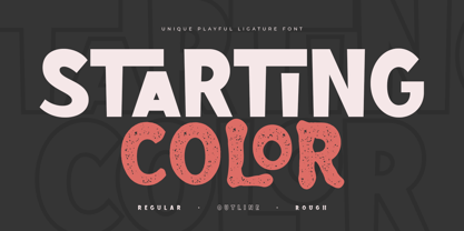 Starting Color is A Modern Playful and Unique Ligature Font. This font specially crafted for your design projects such as urban poster, unique design, modern for t-shirt designs, product packaging, merchandise, and so many more with easy to use but unique results are so playful. Enjoy to Design any your needs with unique, urban, and playful feel. What will you get: Starting Color Font (Regular, Outline, Rough) All Characters (from A to Z) Numbers and Punctuation Works on PC & Mac Simple installations PUA Encoded Thanks and have a wonderful day. :)
 - Caravan by Linotype,
$29.99Caravan was designed in 1938 by William Addison Dwiggins and consists of a variety of ornaments. He based the forms of the ornaments on the same lines and curves found in his font Electra. He wanted printers and designers to have the chance to combine the two fonts for a more attractive or outstanding overall picture. Caravan is particularly popular for advertisements in newspapers. Caravan can be easily mixed with other fonts designed by Dwiggins. - DeLouisville - 100% free

- Dinky Rink NF by Nick's Fonts,
$10.00Handlettering on a 1934 WPA poster promoting skating in Central Park provided the pattern for the uppercase letters of this typeface, while the lowercase letters take their inspiration from Paul Renner’s Steile Futura. The result is a warm, friendly face that is both quaint and modern. Available in Roman and Italic versions. Both versions of the font include 1252 Latin, 1250 CE (with localization for Romanian and Moldovan). - Hyper Brush by Bisou,
$9.00 Hyperartism is an artistic movement born in La Chaux-de-Fonds (Switzerland) which advocates free and uninhibited creation, in all forms, for everyone. HyperBrush was originally created for the new collective's logo and is the perfect cross between the corrosive spirit, the assumed nonchalance and the natural class of Hyperartists' works. HyperBrush is the ideal font for anyone who wants to add a touch of fantasy to a soft design, or a bit of seriousness to a completely crazy project. Its quirky, edgy and clean look is just as suitable for a festival poster as it is for a DIY shop sign, for the title of a trashy short movie or else for a toilet door sign in a hipster lounge bar. With HyperBrush, it's easy to put more hyper into any project!
 - Lesser Arcana NF by Nick's Fonts,
$10.00The uppercase letters of this magical, mystical face is based on various alchemical symbols used from the thirteenth through the sixteenth century; the lowercase letters are based on those found on a 1935 poster, signed simply “Strekalovsky.” Ideal for adding a little pocus to your hocus, or cadabra to your abra. Both versions of the font include 1252 Latin, 1250 CE (with localization for Romanian and Moldovan). - Chez Moustache by PintassilgoPrints,
$29.00 Based on Irma La Douce film opening titles, Chez Moustache is a very eye-catching display font loaded with cool special effects. It is a unicase typeface with 2 versions for each letter, each easily accessible through upper and lower case keys. To prevent double letters from displaying the same glyph, just type the alternate glyph, or use the neat OpenType feature to make things even easier: just turn on the contextual alternates in any OpenType aware program and it's all done before you can say Jack Robinson. Did you push the stylistic alternates button instead of the contextual one? Voilà, so you've got a pocketful of flowers! There's a complete set of sweet stylistic alternates to instantly flourish your way. And it's not over yet: check out the cool initial and terminal forms for that extra twist. Pick your choices with a glyphs palette or just turn on the OpenType swash feature. Now go ahead, there's a lot to do Chez Moustache. But that's another story...
 - Giuconda by Sealoung,
$25.00 Giuconda is an elegant and modern sans font. This font provides a cleaner, more geometric look, preserving the essence and structure of an early 20th century sans classic font but with a fresh, clean and contemporary look. Giuconda consists of two subfamilies of 8 weights, ranging from Thin to Heavy, with matching italics, giving a total of 16 fonts. Giuconda is the perfect font for publishing, titles, books, magazines, and corporate designs. Its Alt version is ideal for logo types, branding, packaging, and use on the web and TV. The family contains a 355 character set that supports 207 different languages.
 - P22 Rodin by P22 Type Foundry,
$24.95 The great French sculptor August Rodin was strongly inspired by the Italian sculptor, painter and poet Michelangelo. Created in association with the Philadelphia Museum of Art, this font set is a tribute to the achievements of both extraordinary artists.
 - P22 Michelangelo by P22 Type Foundry,
$24.95The great French sculptor August Rodin was strongly inspired by the Italian sculptor, painter and poet Michelangelo. Created in association with the Philadelphia Museum of Art, this font set is a tribute to the achievements of both extraordinary artists. - Futurum Parqez by Parquillian Design,
$19.00 Futurum Parqez is the first collaborative font for Parquillian Design. The idea for this font first came to the creator, Jose V Lopez, almost 40 years ago. A couple years ago he shared his concepts and we were gradually able to collaborate on editing the designs and turn them into a working font. The philosophy behind the font is to use a standardized frame format and the fewest strokes possible, while maintaining legibility, to create an original minimalist and modern style.
 - Relaxy by HIRO.std,
$11.00 Relaxy is a Brush Handwritten Script. This font describes about funny, dynamic, informal, humanist, easy going, and will bring a good combination for your works. FEATURES - 3 alternates Uppercase and Lowercase letters - Numbering and Punctuations - Multilingual Support - Works on PC or Mac - Simple Installation - PUA Encoded Characters USE Relaxy works great in any poster, book, magazine, typeface, quotes, print, social media posts, e-book , and any projects that need semi casual and informal taste.
 - Sentic Display by HeadFirst,
$19.90 Designed by Morice Kastoun Sentic Display, s a san-serif font based on geometric patterns with humanist elements. Sentic Display incorporates rounded intersecting forms. The font exploits the common affective patterns associated with natural language, and the patterns associated with text and speech. The name sentic was instigated and named by Austrian neuroscientist Manfred Clynes. Which is the study of waveforms of touch, emotion, and music.
 - Clean Fragile by Nathatype,
$29.00 Have you been looking for a sans serif font? Do you dream of creating headings that stand out and inspire modern and artistic? Wait no more, we will give you the best choice. Clean Fragile-A Sans Serif Font Clean Fragile is a gorgeous sans serif font, designed with the modern vibe. This font is perfect for anything adventurous, and direct. Every stroke, and curve was created to entice happiness and elegance. A real head-turner for your presentation, designs, website illustrations, and much more. Clean Fragile includes Multilingual Support to make your branding reach a global audience. Inspire your audience, clients, or guests with this beautiful, statement font. Features: Ligatures Stylistic Sets Swashes PUA Encoded Numerals and Punctuation Thank you for downloading premium fonts from Nathatype

