10,000 search results
(0.043 seconds)
- Asterx by Ingrimayne Type,
$7.95 In the 19th century typefaces with star-like serifs developed from the medieval type styles, retaining the sharp corners and peaks of some of the blackletter types but losing the flourishes on the upper-case letters. Asterx is in that tradition of star-footed typefaces, though it is not modeled on any particular one.
 - Alio Text by R9 Type+Design,
$35.00 Alio™ Text is the workhorse of the Alio family . It works beautifully as display type, body copy and anything in between. We redesigned Alio Text with taller x-height, more pronounced accents, and wider letter spacing than its siblings, Alio Pro. We also cut down from 6 weights/12 styles to 4 weights/8 styles. All of these is to ensure the legibility and readability and to maximize the weight contrast at small sizes. Whether your designs call for all caps, title case, sentence case or all lowercase, Alio Text has got you covered with the case-sensitive punctuations. No more baseline shift all your punctuations. Alio Text supports most Latin-based languages and even the Chinese Pin-Yin. This typeface also packs with Open-Type features similar to Alio Pro. For examples, both recognize fractions vs. dates; Both features several alternate positions for the legal symbols (3 in Alio Text; 5 in Alio Pro). If you’re looking for a go-to, versatile typeface for most occasions, Alio Text is for you. (4 weights/8 font styles, 500+ glyphs each).
 - P22 Floriat by IHOF,
$24.95 Rich curvilinear borders and corner pieces, based on organic forms, for use as individual ornaments or as repeat units in the creation of complex shapes and patterns.
 - Akoyster by Koval TF,
$19.00 Akoyster is a fusion of cyberpunk visual culture & contemporary calligraphy with broad nib pen. It's ideal for eyecatching bald statements. Enjoy wiered shapes and create new future.
 - Martian Grotesk by Martian Fonts,
$35.00 Martian Grotesk is a large typeface family originally designed for the screen which consists of a variable font with 2 axes of variation and 63 styles: Condensed to Ultra Wide, Thin to Ultra Black. Aesthetics The font style is characterized by some brutality and assertiveness. Overhanging terminals, a closed aperture, and an almost complete lack of contrast lead to this effect. Additionally, some elements of the letters are especially enlarged. This font gives any text the impression of being a “signature” style. Nevertheless, we still maintain the golden mean between its rebellious nature and readability. Perfect for web development We created Martian Grotesk for the web and digital project world. When laying out web pages, frontend developers are constantly faced with the fact that uneven metrics do not allow text to be evenly placed on some design element, for example, on a button. Instead, they have to compensate in some way, like making the top padding smaller and the bottom padding larger in CSS. This little deal really hurts. Also, if your project adheres to design system principles, you might be unable to stand a lack of systematic approach when working with fonts. We researched and calculated vertical metrics and set them up in a way that guarantees equal space above the cap height and under the baseline. This enables the text labels to be evenly placed on buttons, inputs, lists, and forms. In addition, we found a proper ratio of the letter heights, so, with commonly used font sizes—10, 15, and 20 pixels—the glyph heights stick to the pixel grid. As a result, the letter shapes become sharper, which reduces the load on the reader's eyes and simply looks much better. The typeface also comes equipped with OpenType and TrueType hinting, and Martian Grotesk appears legible on most platforms, even when being rendered in small sizes. When coupled together, all the above features make Martian Grotesk a reasonable choice for any user interface design. Roadmap Martian Grotesk right now is a work-in-progress product. The font is completely ready for professional use, however, many great features are still ahead! For example, support for Extended Cyrillic characters, and italics. Pricing Purchasing an early version of the font presents the opportunity to get it at a very attractive price! That’s because with every new version, costs will go up to reflect the additional value that comes with every release. But after purchasing Martian Grotesk, all its future updates are included for free!
 - Mentolope by IbraCreative,
$17.00 Mentolope, a casual handwritten script font, embodies an effortless blend of informality and charm, offering a versatile typographic experience. Its fluid strokes and gentle curves give each character a relaxed and organic appearance, reminiscent of handwritten notes shared between friends. Whether used for personal projects, invitations, or informal branding, Mentolope adds a touch of warmth and authenticity to any design. The font’s natural flow and approachable style create a laid-back atmosphere, making it perfect for conveying a sense of friendliness and approachability. With Mentolope, every word becomes a handwritten expression, bringing a personal and welcoming touch to your creative endeavors. Mentolope is perfect for branding projects, logo, wedding designs, social media posts, advertisements, product packaging, product designs, label, photography, watermark, invitation, stationery, game, fashion and any projects. Fonts include multilingual support for; Afrikaans, Albanian, Czech, Danish, Dutch, English, Estonian, Finnish, French, German, Hungarian, Italian, Latvian, Lithuanian, Norwegian, Polish, Portuguese, Slovak, Slovenian, Spanish, Swedish.
 - FS Split Sans by Fontsmith,
$80.00 Quirky and irregular FS Split is no ordinary typeface. Its irregular proportions make it unique, with round letters appearing wide, and straight letters narrow. Other quirks include its eclectic crossbars – the uppercase ‘A’ has an unusually low bar, while the bar on ‘G’ is particularly long. The uppercase has many interesting features in fact, including large counters, closed terminals on certain letters like ‘J’, and a cap-height that lines up with ascenders. The lowercase also holds surprises – the dots on ‘i’ and ‘j’ are unusually large, and some characters, such as ‘g’, feature double-storey counters. An extreme but stylish italic The italic versions of FS Split Sans and Serif are particularly striking. While similar in style to their upright, Roman versions, they take on a larger-than-usual 18-degree angle, making the forward-slant more dramatic. Although the main purpose of any italic is to help words and phrases stand out, this unique execution helps to make the italic variants of FS Split stylish fonts in their own right – they would work brilliantly on magazine covers, in titles and headlines, pull quotes, and even used commercially in logos and corporate branding. Serif and sans: a split personality FS Split Sans and Serif have their differences but also their similarities, contrasting and complementing each other perfectly. This ‘love hate’ relationship inspired the name of the typeface family, and means the two variants provide a versatile, typographic palette for use in graphics and branding. While its proportions are similar to the sans, the serif has a bigger contrast between its weights of bold, regular and light, bracketed serifs, and different styles of terminals, some being straight and others ball-shaped. FS Split Sans has more subtlety and simplicity, with a smaller weight contrast, less flamboyant terminals, and more consistent counter sizes. The two variants are distinct yet alike, so can be used successfully either in isolation or together.
 - FS Split Serif by Fontsmith,
$80.00 Quirky and irregular FS Split is no ordinary typeface. Its irregular proportions make it unique, with round letters appearing wide, and straight letters narrow. Other quirks include its eclectic crossbars – the uppercase ‘A’ has an unusually low bar, while the bar on ‘G’ is particularly long. The uppercase has many interesting features in fact, including large counters, closed terminals on certain letters like ‘J’, and a cap-height that lines up with ascenders. The lowercase also holds surprises – the dots on ‘i’ and ‘j’ are unusually large, and some characters, such as ‘g’, feature double-storey counters. An extreme but stylish italic The italic versions of FS Split Sans and Serif are particularly striking. While similar in style to their upright, Roman versions, they take on a larger-than-usual 18-degree angle, making the forward-slant more dramatic. Although the main purpose of any italic is to help words and phrases stand out, this unique execution helps to make the italic variants of FS Split stylish fonts in their own right – they would work brilliantly on magazine covers, in titles and headlines, pull quotes, and even used commercially in logos and corporate branding. Serif and sans: a split personality FS Split Sans and Serif have their differences but also their similarities, contrasting and complementing each other perfectly. This ‘love hate’ relationship inspired the name of the typeface family, and means the two variants provide a versatile, typographic palette for use in graphics and branding. While its proportions are similar to the sans, the serif has a bigger contrast between its weights of bold, regular and light, bracketed serifs, and different styles of terminals, some being straight and others ball-shaped. FS Split Sans has more subtlety and simplicity, with a smaller weight contrast, less flamboyant terminals, and more consistent counter sizes. The two variants are distinct yet alike, so can be used successfully either in isolation or together.
 - Close Together by Ingrimayne Type,
$9.00 Close Together was designed to alternate convex and concave letter sets, with convex letters on the upper-case keys and concave shapes on the lower-case keys. The OpenType feature of contextual alternatives (calt) does this automatically. Individually some of the letter shapes are strange and unsightly. They have the shapes that they have so that they fit snuggly with adjacent letters. The family has three weights: regular, bold, and extrabold. The letter spacing is set very tight and the user may want to loosen it by altering characters spacing. (Either the convex or concave set the letters can be used alone if the character spacing is adjusted.) The typeface has four OpenType stylistic sets of alternates, one for numbers and the others for letters D, T, and Y.
 - Raw Street Wall by Volcano Type,
$25.00 The typeface Raw Street Wall is designed for the Typo Graphic Design font foundry from 2011–2017 by Manuel Viergutz. A playful display type for headlines with a street-art graffiti-style by hand. Rough-look plus state-of-the-art automatic generated OpenType-features (like contextual alternates (calt)). 567 glyphs with extras like emoticons/icons, arrows, dingbats, symbols, geomatric shapes, catchwords and many alternative letters. Multilingual support with 27 languages. Have fun with this font & try the DEMO-FONT (with reduced glyph-set) FOR FREE! Example of use It’s your turn … for example everywhere where it makes sense. Maybe for use in magazines, posters, headlines and advertisement, plus as webfont for decorative headlines. Technical Specifications ■ Font Name: Raw Street Wall ■ Font Weights: Regular + DEMO (with reduced glyph-set) ■ Font Category: Display for headline size ■ Font Format: .otf (OpenType Font for Mac + Win) + .ttf (TrueType Font) ■ Glyph Set: 567 glyphs ■ Language Support: 27: Afrikaans, Albanian, Catalan, Croatian, Czech, Danish, Dutch, English, Estonian, Finnish, French, German, Hungarian, Italian, Latvian, Lithuanian, Maltese, Norwegian, Polish, Portugese, Romanian, Slovak, Slovenian, Spanisch, Swedish, Turkish, Zulu ■ Specials: Extras like emoticons/icons, arrows, dingbats, symbols, geomatric shapes, catchwords and many alternative letters plus OpenType-Features. ■ Design Date: 2011–2017 ■ Type Designer: Manuel Viergutz ■ License: Desktop license, Web license, App license, eBook license, Server license
 - Sentimental Feeling by Wing's Art Studio,
$18.00 A Nostalgic Signature Font for Christmas Sentimental Feeling is a script font that aims to capture the festive magic of Christmas with a retro design inspired by 1950s magazine editorials, classic movies and real hand-written signatures. It's a warm design that evokes Christmases of old, with a smooth brush-like flow and subtle human imperfections. It's equally at home singing carols, sharing Xmas Eve stories or serving cocktails at your New Years party. This happy holiday font comes with a complete set of uppercase and lowercase characters, plus numerals, punctuation, language support, symbols, alternatives, custom ligatures, underlines and a selection of festive clipart (including everything you might need to re-create the examples seen in my visuals). Add it to your toolbox and create the perfect Christmas designs, such as gifts and stationery products, ads, titles and much more!
 - Vintage Culture by Mega Type,
$20.00 Introducing Vintage Culture - a modern classic serif with a modern and classy style. Vintage Culture is a unique, fun, and versatile serif font with 192 alternatives and 42 ligatures to spice up any design you love. Vintage Culture is built with OpenType features and includes ligatures, alternatives, numbers, punctuation, and also supports other languages. Vintage Culture is a versatile serif font that works in both large and small sizes. This font is suitable for a wide variety of projects such as: headlines, logos, labels, branding projects, magazines, homeware designs, product packaging, mugs, quotes, posters, and more. Feature · All Uppercase and Lowercase · Numbers & Symbols · Supported Languages · Substitutes and Binders · PUA Encoded Have fun using Vintage Culture!!! I really hope you enjoy it! Feel free to follow, like and share. Thank you so much for checking out my shop!
 - Typewriter 1950 Tech Mono by TypoGraphicDesign,
$29.00 The typeface Typewriter 1950 Tech Mono is designed for the Typo Graphic Design font foundry in 2017 by Manuel Viergutz. A display slab serif type for headlines. Based on an old typewriter machine from 1950. Plus state-of-the-art OpenType-features like contextual alternates (calt), decorative ligatures e. g. type the word “LOVE” for ❤ and the word “SMILE” for ☺ and Versal Eszett (German Capital Sharp S). For use in magazines, posters, headlines and advertisement, plus as webfont for decorative headlines. Character Set: Latin Extended (Adobe Latin 3). 1490 glyphs with 5× A–Z, 5× a–z, 5× 0–9 and 290+ extra icons like arrows, dingbats, symbols, geomatric shapes, catchwords and many alternative letters. Have fun with this font & use the DEMO-FONT (with reduced glyph-set) FOR FREE! How To Use – OpenType-Features ■ In Adobe Photoshop and Adobe InDesign, font feature controls are within the Character panel sub-menu → OpenType → Discretionary Ligatures … Checked features are applied/on. Unchecked features are off. ■ In Adobe Illustrator, font feature controls are within the OpenType panel. Icons at the bottom of the panel are button controls. Darker ‘pressed’ buttons are applied/on. ■ Additionally in Adobe InDesign and Adobe Illustrator, alternate glyphs can manually be inserted into a text frame by using the glyphs panel. The panel can be opened by selecting Window from the menu bar → Type → Glyphs. Or use sign-overview of your operating system. ■ For a overview of OpenType-Feature compatibility for common applications, follow the myfonts-help http://www.myfonts.com/help/#looks-different ■ Font Name: Typewriter 1950 Tech Mono ■ Font Weights: Regular + Negative + Black + Mono + Icons + DEMO (with reduced glyph-set) ■ Font Category: Slab Serif Display for Headline Size ■ Font Format:.otf (OpenType Font for Mac + Win) + .ttf (TrueType Font) ■ Glyph Set: 1490 glyphs ■ Language Support: 28+ for Latin Extended (Adobe Latin 3). Afrikaans, Albanian, Catalan, Croatian, Czech, Danish, Dutch, English, Estonian, Finnish, French, German, Hungarian, Icelandic, Italian, Latvian, Lithuanian, Maltese, Norwegian, Polish, Portugese, Romanian, Slovak, Slovenian, Spanisch, Swedish, Turkish, Zulu ■ Specials: 290+ decorative extras like icons for arrows, dingbats, emojis, symbols, geometric shapes, catchwords + German Capital Eszett. ■ Open Type Features: Kerning (kern), Stylistic Set 1 (ss01) … Stylistic Set 6 (ss06), Ornaments (ornm), Titling (titl), Localized Forms (locl), Subscript (subs) Superscript (sups), Ordinals (ordn), Oldstyle Figures (onum), Lining Figures (lnum), Fractions (frac), Denominators (dnom), Numerators (numr), Standard Ligatures (liga), Contextual Alternates (calt) e. g. Stylistic Set-Loop and Decorative Ligatures (dlig) e. g. type the word “LOVE” for ❤ or “SMILE” for ☺ ■ Design Date: 2017–2018 ■ Type Designer: Manuel Viergutz
 - HT Osteria by Dharma Type,
$19.99 HT Osteria is a monoline script, but you don’t feel it monotonous because of distinctive shapes of the characters. HT Osteria is suitable for signage, package, and posters or any other kind of display use. Holiday Type Project offers retro hand drawing scripts. Inspired by retro script on shopfront lettering, wall paint advertisements in Italy around 1950s. Check out the script fonts from Holiday Type!
 - Mistoni by Gatype,
$15.00 Mistoni An elegant font designed when in a creative mood and perfect shape, inspired by the bold, natural look of serifs so beautiful for today's fashion. bold, balanced and varied, born for luxury and beauty. including uppercase letters, numbers, and various kinds of punctuation Mistoni is perfect for invitations, logos & branding, photography, advertising, watermarks, social media posts, product packaging, product designs, labels, wedding designs, stationery.
 - Lovato by Philatype,
$35.00 Lovato is a family of five fonts, perfect for branding applications, books, or poster designs that require a clear, sharp, stylish tone. The styles range from an elegant, delicate light weight up to a brazen, commanding black weight. This original Latin-serif family, designed by Kosal Sen, has primarily a geometric construction, with hints of details inspired by inscriptional lettering, all coalescing to fit a contemporary palette.
 - HU Handwrite by Heummdesign,
$15.00 It is a handwriting-style font for body text that emphasizes gentleness and solidity by using less curvature and making use of a straight feel. The handwriting feeling is emphasized through the style that makes use of the natural bending and stroke order. Softness was added in the shape of a gentle curve, and perspective was applied by setting a vanishing point in the lower left corner.
 - Café Brasil by Sofia Mohr,
$39.00 Café Brasil is a font designed to represent coffee, especially for use in packaging, brand titles, logos and menus. Based on the shape of a coffee bean, Café Brasil has delicate details and ligatures that represent the liquid, foam and steam of a good cup of coffee. In March 2014, Café Brasil was chosen to be part of the main exhibition at the “Tipos Latinos 2014”.
 - MeM by 26+,
$40.00 MeM is an eccentric experimental type system created by Elena Schädel and Jakob Runge in 2012. It produces many personalities, each individual and emotive. You will never know which of the alternating letters is going to occur next. Basically, at the heart of it all is MeM: four different weights and letter shapes melded together into one powerful font and shuffled with the sleek usability of OpenType.
 - Hazelle by Heypentype,
$20.00 Hazelle is a typeface suitable for elegant, upscale, classic, luxury editorial content as well as headlines, sub-headings, and logo designs. It can enhance the tone of your messages when used in headlines, and it also gives a unique character when used in logo designs. This updated version comes with variable fonts version and more discretional ligatures and new alternate despite a major glyph shape improvements.
 - Summer Glasses by Arendxstudio,
$15.00 Summer Glasses - Cool Handwritten with sharp and beautiful letters that create fonts that are modern, trendy and elegant. Came with opentype features such stylistic alternates, stylistic sets & ligatures good for logotype, poster, badge, book cover, tshirt design, packaging and any more. Features : • Character Set A-Z • Numerals & Punctuations (OpenType Standard) • Accents (Multilingual characters) • Ligature • Alternate There it is! I really hope you enjoy it
 - Hello Walter by Fonts of Chaos,
$14.00 Hello Walter is a nice and clean typography I made for my little boy Walter. The story behind is I want to create a bold font with less holes and funny shapes. More naive but still serious with a lot of glyphs easy to use in many language cyrilic included. Perfect for web and print, for making logos or children book and app. Have lot of fun.
 - PR Sprucewood 01 by PR Fonts,
$5.00 This font is a collection of sketched spruce trees. Some are filled outlines, some are bare trunks and branches, and some are rough squiggles. Each can be used individually to suggest a tree, and the different shapes can be layered in different colors, to suggest texture, or snow cover. There is also a glyph of a mountain range, for a horizon behind your forest.
 - Board Deluxe by Katatrad,
$29.00Display block letters inspired by train station LED board. Board Deluxe is a humanist version of previously release Board based on bitmap diamond cells pixel font. Original Board (released by T.26) provided rounded corners diamond shape cells deliver surprisingly nice texture when use in extra large size. Board Deluxe gives you solid headline letters that spell out the midpoint between Digital and OldStyle. - Hilton Serif by Juraj Chrastina,
$39.00 There is something special about thin fonts. On one side there is the sensitive, charming and warm touch, on other side they are uncompromising, thoroughgoing. Here the contrast can't hide the clear shapes. Hilton Serif and Hilton Sans are a pair of highly legible, subtle and elegant sans-serif and semi-serif display faces. The quality of spacing and kerning are ensured by Igino Marini.
 - Sacred Geo by John Moore Type Foundry,
$29.90 Sacred Geo is a Dingbat font, containing the basic principles of geometry, perpendiculars, bisections, partitions of angles, curves joints aligned and asymmetric, thus the construction of the main spirals, construction of polygons as a square, rhombus, pentagon, hexagon, octagon and how to combine them into ornamental shapes. Discover the magical world of sacred geometry. Winner in the TL2012 International Biennial of LatinAmerican Typography, Tipos Latinos.
 - Inkster by Typadelic,
$19.00Inkster breaks all the rules. The serifs vary from letter to letter, if they have any serifs at all. The upper and lower case letters intermingle and the contrasting characters bounce all over the baseline. Loosely based on the character shapes of Frisco, I developed a tightly spaced calligraphic version and called it Inkster. Use this artistic font when youre looking for a distinctive style! - Dictio by Letterhead Studio-VV,
$24.99 A unique display font with lots of beautiful alternate characters that you can combine to get attractive final lettering with nice and dynamic shapes just in seconds! Dictio will work great in many design forms, for example, Magazines, postcards, logos, Wedding projects, and many more. The idea for the letters came from the typographic examples from the beginning of the century, magazines and book covers.
 - Lizie Slab by Poul Allan Studio,
$26.00 Lizie Slab is a slab serif, where the geometric construction is inspired by the 1930s design icons De Stijl, Gerrit Rietveld and others. Lizie Slab is designed for both print and digital use, and you will find it ideal for packaging, poster design, catalogs and exhibition design. The font supports a wide range of languages. This OpenType contains features such as fractions, proportional and tabular shapes.
 - Chocoladine by Sign Studio,
$12.00 Chocoladine is inspired by the fern leaves that curl and grow at the tips. In capital letters the shape will appear. This font is also in the retro category which is still popular today. Casual, warm, sweet that's about it. It is suitable for printing t-shirts, mugs, book covers, invitation, product branding, packaging, advertising, retro logos and many more. Thank you, I hope you enjoy it.
 - Okay A by Okaycat,
$24.95 Okay-A lets you make 3D letters that look to be fastened down with screws. Inspired by the angular futuristic shapes of Japanese Katakana letters, this angular font is bold and square. Okay-A lets you easily make multicolour logos or signs as the styles can be overlaid. It features extended characters, containing West European diacritics & ligatures, making it suitable for international environments & publications.
 - Stay ALive by Storictype,
$17.00 Stay Alive Typeface is Inspired by victorian style, poster, sign painter, 1800s bring classic touch on this decade, which is combining modern and classic typography with some awesome features that have a strong shapes so it will create more attention for people to look more closely. You can use this font for various purposes.such as logo, t-shirt, posters, lable, letterhead, book cover, and many more.
 - Hilton Sans by Juraj Chrastina,
$39.00 There is something special about thin fonts. On one side there is the sensitive, charming and warm touch, on other side they are uncompromising, thoroughgoing. Here the contrast can't hide the clear shapes. Hilton Sans and Hilton Serif is a pair of highly legible, subtle and elegant sans-serif and semi-serif display faces. The quality of spacing and kerning ensured by Igino Marini.
 - Swung Note by PintassilgoPrints,
$35.00 Swung Note is a groovy and dynamic font, packed with more than three hundred smart interlocking pairs that do their magic powered by OpenType programming. Since the letters assume different shapes in the many different ligatures, the compositions look truly handcrafted. Swung Note is definitely a great – and quite playful – tool for creating amazing custom-lettered looking designs, while keeping the groove going. Swing-along!
 - Bintaro by Rhd Studio,
$24.00 BINTARO is a clean and powerful serif font with a bold, rounded shape. It comes with two regular styles, and outline. BINTARO is a good choice for a variety of projects such as logos & branding, invitations, stationery, social media posts, clothing, advertising, product packaging, product design, labels, photography, watermarks, special events or whatever. WHAT IS INCLUDED: Multilingual support Alternatives A, B, E, F, P, R PUA Encoded
 - Nobodi by Wilton Foundry,
$29.00This Bodoni-like font sets out to slightly square off rounded shapes, adding a very slight curve to the join from the square serif and stem, and minimizing and softening the pronounced bulbs found in Bodoni. There are hints of Walbaum and Melior but the overall effect is a more subtle, and interesting letterform that is friendly, fresh and contemporary. Ideal for corporate communications, ads and magazines. - Seattle Weather by Arendxstudio,
$16.00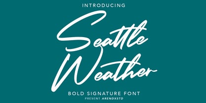 Seattle Weather was inspired by urban script fonts. The sharp and beautiful letter forms create glyphs that are modern, trendy and elegant. Seattle Weather comes with OpenType features such stylistic alternates, stylistic sets and ligatures and is great for logotypes, posters, badges, book covers, tshirt design, packaging and many more. Features : • Character Set A-Z • Numerals & Punctuations (OpenType Standard) • Accents (Multilingual characters) • Ligatures • Alternates
 - Malebu by Macrotipo,
$39.00 Malebu is a sans serif font that was created based on grotesque and humanist models with certain geometric features. It is clear, simple, gentle and friendly, and can be used in text sizes. It is easy to read in long texts, magazines, books and the like. The rounded shape makes it friendly and fluent. A short x-height is functional and adds economy without losing consistency.
 - Balcony Seats JNL by Jeff Levine,
$29.00Balcony Seats JNL is a different take on Jeff Levine's Aisle Seats JNL. The original font was modeled from Redikut die-cut cardboard letters - used in the 1940's and 1950's for display and show card work). Although the basic letter shapes are similar, the horizontal stroke weights have been narrowed, providing a type variation with a classic Art Deco "thick and thin" look. - Cursed Parade by Senekaligrafika,
$12.00 "Cursed Parade" Has hard strokes and a signature styles that speak to instant scared sensations,it was inspired by horror and thriller movie “IT”. "Cursed Parade" will help you to create special and touching typographical design for your horror and dark projects, for branding, labeling, clothing, movie title, album cover, logos and many more. It is really universal and modern font. The owner of endless possibilities!