10,000 search results
(0.069 seconds)
- Aventena by Mokatype Studio,
$24.00Aventena is display sans, inspired by blackletter basic writing system. There is a lot of twist from the basic form, that makes Aventena look simple and yet legible. So you can explore, combine, and create designs such as posters, headlines, interfaces, merch, etc. This is single-weight font only, this font is better used for headlines. If you need a multi-weight of this font, just tell us! What's you get : Standard glyphs Ligatures (Opentype features) Web Font International Accent Works on PC & Mac Simple installations Accessible in Adobe Illustrator, Adobe Photoshop, Adobe InDesign, and even work on Microsoft Word. PUA Encoded Characters - Fully accessible without additional design software. Fonts include multilingual support Image used: All photographs/pictures/vectors used in the preview are not included, they are intended for illustration only. Thank You - Esta Pro by DSType,
$26.00The multi award winning ESTA is back, renewed and improved in OpenType format. Now named Esta Pro, is available in Regular, Italic, Bold, Bold Italic, Display and Swashes. Includes plenty of features, like SmallCaps, Alternates, Ligatures and CE characters. - Oops by Posterizer KG,
$22.00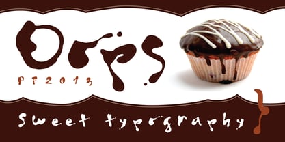 The initial idea for the Oops font, was to create graphemes, and by using them it could imitate a mark of a spilled liquid-stain. In an attempt to make the most convincing effect, those graphemes were written on glass. The final appearance of the graphemes, mostly remain in their basic form, and have the characteristic of a liquid, like fluidity in motion. This manuscript is expressive, but that does not affect the readability of the letters. The generated font was created by using Photoshop, Illustrator and a little bit of interventions in Font Lab. Font Oops is updated and edited version of an old version of the Art decor font, which had just basic letters. Today, Oops font contains Latin and Cyrillic letters, and it can be ideal for use in subjects like a paintball, art, expression, ink, water...
 - Throll by Skiiller Studio,
$18.00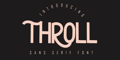 THROLL Modern sans serif font. It has a elegant, classy look and modern. It’s a great font for fashion, apparel projects, signature, album cover, logo, branding, magazine, social media, & advertisements. What's include: Stylistic alternate PUA Encoded Characters - Fully accessible without additional design software. Basic Latin Language Support (AÀÁÂÃÄÅCÇDÐEÈÉÊËIÌÍÎÏÑOØÒÓÔÕÖUÙÜÚÛWYÝŸÆß )
 - Wulf Utility by Device,
$29.00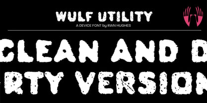 Wulf Utility is a heavily degraded font that evokes information in a utilitarian manner without any pretence to elegance, fuss or refinement. Gruff and direct, it is about as basic as a font can be. The Dirty version can be layered over the Rough version for two-tone effects.
 - Klopers by Sarid Ezra,
$15.00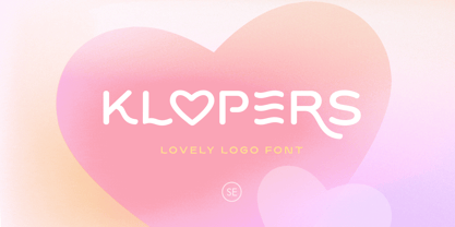 Klopers is a lovely and minimalist logo font with unique shape that will make your logo and design looks more minimal yet modern. With the unique characteristic lowercase, this font can make your logo even more stunning. You can use this font for any purpose, especially to make logotype. You can mix and match the uppercase and lowercase to make your logo more advanced. Klopers also comes with love shape that replace the "o". This font also comes with number, symbol, and multilingual support!
 - Melt by Flavortype,
$24.00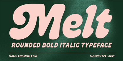 Introducing "Melt," a captivating and versatile font that seamlessly blends boldness with soft, rounded curves, exuding an irresistible charm. This font is a harmonious fusion of cursive elegance, bold confidence, and modern trends, making it perfect for eye-catching headlines that demand attention. The Melt font family is thoughtfully crafted with three distinct selection font files, ensuring a range of creative possibilities: Melt Italic (Full Features): The italic variation of Melt boasts full features, providing a dynamic and playful touch to your designs. With its stylish slant and graceful curves, Melt Italic is ideal for adding a touch of sophistication to headlines, posters, and other creative projects. Melt Swashes: Elevate your designs with the Melt Swashes font file, where uppercase letters are replaced with delightful swashes. These swashes add a whimsical and artistic flair to your text, creating a unique and expressive visual impact. Perfect for adding a touch of creativity to logos, branding, and more. Melt Swashes Alt: For those seeking alternative swashes for uppercase letters, Melt Swashes Alt offers a distinct set of alternative swash designs. This variation provides even more versatility and customization options, allowing you to tailor your typography to suit the specific aesthetic of your project. Whether you're designing for a trendy website, playful branding, or vibrant marketing materials, Melt's bold, cursive, and rounded style, coupled with its three font file options, ensures that you have the perfect tool to make a lasting impression. Embrace the charm of Melt and let your headlines stand out with a delightful blend of modernity and cuteness.
 - Vsop by VP Creative Shop,
$15.00 Introducing VSOP - Elegant typeface. 70 font styles included VSOP is elegant and timeless typeface loaded with 70 font styles (narrowest, narrower, narrow, regular, wide) 87 languages support, alternate and ligature glyphs to make you typography truly unique! Language Support : Afrikaans, Albanian, Asu, Basque, Bemba, Bena, Breton, Chiga, Colognian, Cornish, Czech, Danish, Dutch, Embu, English, Estonian, Faroese, Filipino, Finnish, French, Friulian, Galician, Ganda, German, Gusi,i Hungarian, Indonesian, Irish, Italian, Jola-Fonyi, Kabuverdianu, Kalenjin, Kamba, Kikuyu, Kinyarwanda, Latvian, Lithuanian, Lower Sorbian, Luo, Luxembourgish, Luyia, Machame, Makhuwa-Meetto, Makonde, Malagasy, Maltese, Manx, Meru, Morisyen, North Ndebele, Norwegian, Bokmål, Norwegian, Nynorsk, Nyankole, Oromo, Polish, Portuguese, Quechua, Romanian, Romansh, Rombo, Rundi, Rwa, Samburu, Sango, Sangu, Scottish, Gaelic, Sena, Shambala, Shona, Slovak, Soga, Somali, Spanish, Swahili, Swedish, Swiss, German, Taita, Teso, Turkish, Upper, Sorbian, Uzbek (Latin), Volapük, Vunjo, Walser, Welsh, Western Frisian, Zulu FEATURES Uppercase, lowercase, numeral, punctuation & Symbol ligature glyphs alternates Narrowest - regular, italic with 7 weights Narrower - regular, italic with 7 weights Narrow - regular, italic with 7 weights Regular - regular, italic with 7 weights Wide - regular, italic and styled with 7 weights Multilingual support - 87 languages No special software is required to type out the standard characters of the Typeface. How to access alternate glyphs? To access alternate glyphs in Adobe InDesign or Illustrator, choose Window Type & Tables Glyphs In Photoshop, choose Window Glyphs. In the panel that opens, click the Show menu and choose Alternates for Selection. Double-click an alternate's thumbnail to swap them out. Feel free to contact me if you have any questions! Mock ups and backgrounds used are not included. Thank you! Enjoy!
 - Mantika Sans Paneuropean by Linotype,
$67.99With its well-defined characters that are readily legible even in the small font sizes, Mantika Sans by Jürgen Weltin is ideal for typesetting. The elaborately designed and highly individual set of italics enhances the attractiveness of the font.Jürgen Weltin developed the Mantika™ Sans sans serif font using older designs for an serif font as his inspiration. Nothing more than the merest suggestion of the original serifs has survived. Bevelled line endings and the slight variation in thickness of verticals, in particular, provide Mantika Sans with a very dynamic character that evokes manuscript. Short ascenders and descenders give the font a compact appearance that is also underscored by its condensed proportions. Weltin has achieved his aim of producing a typeface with excellent legibility even in small sizes not just by means of the x-height, which is tall in comparison with the capital letters, but also by using clearly defined and well differentiated designs for critical letters, such as i", "I" and "l". Lower case "i", for example, has a serif while the "l" has a curved base.In addition to uppercase numerals, Mantika Sans also has lowercase or old style numerals that have been designed so that they can be used in both tabular and proportional settings. The uppercase numerals are slightly shorter than the uppercase letters, ensuring that the latter can be sympathetically incorporated within continuous text.The Mantika Sans italics are very unusual. They are inclined at only 4.5° (the usual angle for italics is 10 - 12°) and so appear to be almost upright. In addition, they also have quite distinctive forms. The overall effect calls attention to their curvilinear, manuscript character, enhances contrasts and further emphasizes the terminals. Weltin explains: "Within the variety of forms of the italics there are many contrasting terminal elements that create dynamism. The result is a diversity of interaction between the rounded and angular forms". Mantika Sans Italic thus has all the features of a display typeface, but can also be happily used on its own to set longer text passages. Mantika Sans is available in two weights; Regular and Bold, both of which have corresponding italics sets. Mantika Sans has been designed so that the widths of the four related cuts are identical, meaning that a change of font within a single layout will have no effect on justification. In addition, the members of the Mantika Informal font family, designed by Jürgen Weltin in 2010, also have the same thickness. Other font families having weights with equal thickness can be found in the "Linotype Office Alliance series".The Mantika Sans character sets are paneuropean. There are characters for setting texts in Eastern European languages, Greek and Cyrillic. There is also a range of special symbols, including right-angled brackets, subscript and superscript lower case letters, together with numerals, arrows and many different bullet points.As a vibrant and highly legible text font, Mantika Sans has a broad spectrum of potential applications. Its unusual italics are not just perfect for use in display text. The fact that it has only four cuts means that Mantika Sans is particularly suitable for office use or for the setting of business reports. Its excellent legibility even in the small font sizes also makes it ideal as a text for electronic reading devices; this also applies to Mantika Informal.At the 3rd International Eastern Type Design Competition Granshan 2010, Mantika Sans was awarded in the category Greek text typefaces." - Mantika Sans by Linotype,
$50.99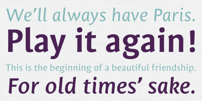 With its well-defined characters that are readily legible even in the small font sizes, Mantika Sans by Jürgen Weltin is ideal for typesetting. The elaborately designed and highly individual set of italics enhances the attractiveness of the font.Jürgen Weltin developed the Mantika™ Sans sans serif font using older designs for an serif font as his inspiration. Nothing more than the merest suggestion of the original serifs has survived. Bevelled line endings and the slight variation in thickness of verticals, in particular, provide Mantika Sans with a very dynamic character that evokes manuscript. Short ascenders and descenders give the font a compact appearance that is also underscored by its condensed proportions. Weltin has achieved his aim of producing a typeface with excellent legibility even in small sizes not just by means of the x-height, which is tall in comparison with the capital letters, but also by using clearly defined and well differentiated designs for critical letters, such as i", "I" and "l". Lower case "i", for example, has a serif while the "l" has a curved base.In addition to uppercase numerals, Mantika Sans also has lowercase or old style numerals that have been designed so that they can be used in both tabular and proportional settings. The uppercase numerals are slightly shorter than the uppercase letters, ensuring that the latter can be sympathetically incorporated within continuous text.The Mantika Sans italics are very unusual. They are inclined at only 4.5° (the usual angle for italics is 10 - 12°) and so appear to be almost upright. In addition, they also have quite distinctive forms. The overall effect calls attention to their curvilinear, manuscript character, enhances contrasts and further emphasizes the terminals. Weltin explains: "Within the variety of forms of the italics there are many contrasting terminal elements that create dynamism. The result is a diversity of interaction between the rounded and angular forms". Mantika Sans Italic thus has all the features of a display typeface, but can also be happily used on its own to set longer text passages. Mantika Sans is available in two weights; Regular and Bold, both of which have corresponding italics sets. Mantika Sans has been designed so that the widths of the four related cuts are identical, meaning that a change of font within a single layout will have no effect on justification. In addition, the members of the Mantika Informal font family, designed by Jürgen Weltin in 2010, also have the same thickness. Other font families having weights with equal thickness can be found in the "Linotype Office Alliance series".The Mantika Sans character sets are paneuropean. There are characters for setting texts in Eastern European languages, Greek and Cyrillic. There is also a range of special symbols, including right-angled brackets, subscript and superscript lower case letters, together with numerals, arrows and many different bullet points.As a vibrant and highly legible text font, Mantika Sans has a broad spectrum of potential applications. Its unusual italics are not just perfect for use in display text. The fact that it has only four cuts means that Mantika Sans is particularly suitable for office use or for the setting of business reports. Its excellent legibility even in the small font sizes also makes it ideal as a text for electronic reading devices; this also applies to Mantika Informal.At the 3rd International Eastern Type Design Competition Granshan 2010, Mantika Sans was awarded in the category Greek text typefaces."
 - Violia by HandletterYean,
$10.00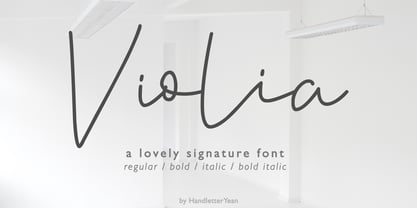 Violia from HandletterYean is a simple, elegant and authentic signature font with a contemporary feel. It will add a sophisticated spark to any design idea. This font is suitable for your creative work on greeting cards, branding materials, business cards, quotes, posters, wedding cards, logo design, blog design, stationery, marketing, magazines and more! What’s included: 1. Violia (OTF) 2. Style in this font include: Regular, Bold, Italic, Bold italic 3. Works both on Mac & PC 4. Simple installations 5. Accessible in the Adobe Illustrator, Adobe Photoshop, Adobe InDesign, CorelDraw, even work on Microsoft Word. 6. Support multilingual; ä ö ü Ä Ö Ü ß ¿ ¡ To access the alternate glyphs, you need a program that supports OpenType features such as Adobe Illustrator CS, Adobe Photoshop CC, Adobe Indesign and CorelDraw. More information about how to access alternate glyphs, check out this link ( http://goo.gl/ZT7PqK )
 - Petunia by Great Lakes Lettering,
$40.00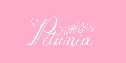 Petunia is a calligraphy style font designed by New York based calligrapher Eliza Gwendalyn . Her modern copperplate script has been a style she has been developing throughout her career. Her angelic flourishes and bouncy style are widely influenced by Eliza’s favorite childhood character Alice in Wonderland falling down the rabbit hole. She pairs her elegant script with a traditional sans serif and serif which is based on Eliza’s everyday handwriting. The name ‘Petunia' acquired from her childhood nickname her parents called her which was only fitting to choose as the name of her font that was derived from her childhood fantasies. Widely known in the wedding industry, she curated this font family for industry professionals with a versatile array of styles: a script, a bold script, sans serif, sans serif italic, serif, serif italic, and specially calligraphy words & ornaments making this a total package for all types of designers.
 - Scientist Castle by DLetters Studio,
$13.00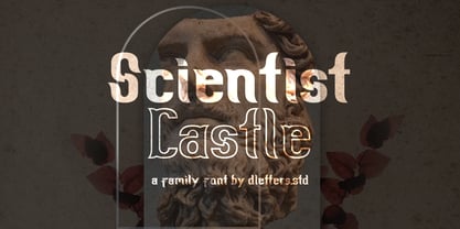 Scientist Castle Family Slab Serif Font Is A Great Font For any project! Available in 4 styles that you can use for various purposes, as a combination or separation according to the design style. Complete with OpenType features, which allow you to give a more calligraphic look! There are regular, Italic, Outline, and Outline Italic styles and very easy to use. Scientist Castle Family Slab Serif Font is a great choice for Projects you like branding, design, wedding, photography, Magazine, logo designs, album, covers Book, business cards, quotes, and projects other designs. What’s Included : – S-Alt – Works on Win, Mac – Simple installations – Accessible in Adobe Illustrator, Adobe Photoshop, Adobe InDesign, even work on Microsoft Word. – PUA Encoded Characters – Fully accessible without additional design software. Thanks for your support, please kindly send us a message for any question about our product. Hope you like it.
 - 1805 Jaeck Map by GLC,
$42.00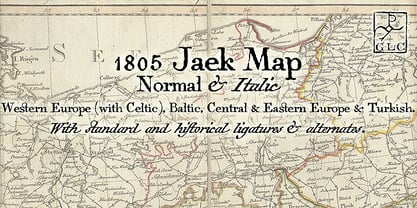 This font is mainly inspired from the engraved characters of a German Map depicting Germany's roads and parts of surrounding lands, edited in Berlin probably in the end of 1700's. The engraver was Carl Jaeck or Jaek (1763-1808). The Map was bought by the French napoleonic general Louis Pierre Delosme (1768-1828) probably during the Napolenic campaign against Germany, circa 1805 or at least 1806, his sole staying in Germany. The font (with two styles, Normal and Italic)is containing standard ligatures and a few alternative characters. It is a "small eye" or "Small x-eight" font, as the Maps' characters are most often very small (some Italic lower cases of the map are 1mm hight, upper cases 2mm) The standard English characters set is completed with accented or specific characters for Western (Including Celtic) and Central European, Baltic, Eastern Europe and Turkish languages.
 - Donaire It Black - Personal use only

- PR Hallow Doodles 01 by PR Fonts,
$10.00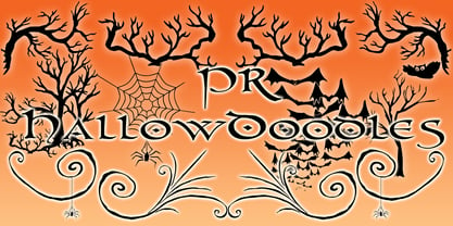 This font is a collection of ornaments and drawings suitable for Halloween themed materials. There are bats, singly and in swarms, owls, dead trees, spiders and webs, as well as calligraphic ornaments with a decidedly creepy bent. Most of the characters in this font were drawn on a napkin with a felt marker, and the resulting ragged texture was very suitable to the Halloween subject matter. Where the same stroke is repeated in one glyph, the contours have been edited to minimize obvious repetition. Use it for your Halloween party invitations and posters. Combines well with: PR Bramble Wood 1, PR Bramble Wood 2, PR Hallow Doodles 02, PR Cauldron, PR Swirlies 01, PR Swirlies 05.
 - Banana by Dharma Type,
$19.99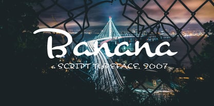 This font is a modern urban script. Very impressive because of its heavy and rounded shape. Upright stems and wide width of their shape gives easy and slow impression. There is one more script designed by in the same concept. -Nothing -Banana
 - Chipen by 38-lineart,
$14.00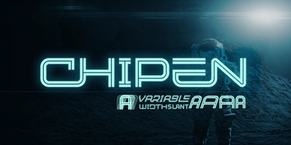 I am pleased to present you an excellent futuristic font "Chipen" in unique graphic style! This font consists of regular, expanded, regular italic and expanded italic, these 4 fonts are encapsulated in one variable. With one font variable, this will cover 4 styles and cover all the weights between regular and expanded. If you are used to working with variable fonts it will give you more weight options, if you have never tried this variable font it will be an amazing new experience for you, take a look at this video snippet: https://youtu.be/jgqNPGeoVjc Chipen comes in bold and with a “RoundCube” cut, this is perfect for modern, Sci-Fi, and technology themes. Coupled with the stripe in the middle of the makes it appear more sporty. Not only that, this stripe can also display "Eighties" if you package it in a retro concept. Another strength of this font is the lowercase ligature, we present a lot of ligatures and one of them might be suitable for your logo brand. Finally, this font is a dynamic font with a variable concept capable of covering more 'weight', unique to appearing in various eras, exploring the world of retro and even science and fiction.
 - Postmark Display by Milan Pleva,
$22.00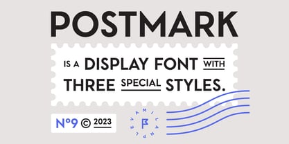 Postmark Display is a clean geometric display font with one basic and three special styles: Postmark Display Postmark Display Style 1 Postmark Display Style 2 Postmark Display Style 3 Special styles were created to complement the main font and to differentiate words or sentences. Postmark Display is ideal for headlines, headers, logos, labels, packaging, magazines, invitations, etc. FEATURES Basic latin alphabet A-Z Three special styles (each with 50 basic glyphs) 56 Accented characters Numbers, Punctuation, Currency, Symbols, Math symbols & Diacritics Old style figures LANGUAGE SUPPORT Latin 1 + Latin 2 Western Europe and Americas: Afrikaans, Basque, Catalan, Danish, Dutch, English, Faroese, Finnish, French, Galician, German, Icelandic, Irish, Italian, Norwegian, Portuguese, Spanish and Swedish. Latin-written Slavic and Central European languages: Czech, German, Hungarian, Polish, Romanian, Croatian, Slovak, Slovene. Enjoy Postmark Display!
 - Mermaid Monogram by MonogramBros,
$12.00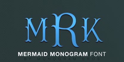 Mermaid Monogram Font is a perfect shaped monogram font consisting of 52 letters. With just a single font file you will be able to create beautiful monograms in just a matter of minutes after the purchase! Mermaid Monogram Font comes with font file in OTF format.
 - Initial Monogram by MonogramBros,
$12.00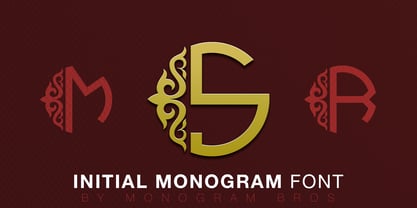 Initial Monogram Font is a perfect shaped monogram font consisting of 26 letters. With just a single font file you will be able to create beautiful monograms in just a matter of minutes after the purchase! Initial Monogram Font comes with font file in OTF format.
 - Verdana Pro by Microsoft,
$40.00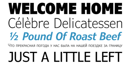 The Verdana typeface family was designed specifically to address the challenges of on-screen display. Verdana was originally designed by world-renowned type designer Matthew Carter, and tuned for screen display by the leading TrueType hinting expert, Tom Rickner. The Verdana fonts are unique examples of type designed specifically for the computer screen.The Verdana family received a major update in 2011 as a collaboration between The Font Bureau, Monotype Imaging and Matthew Carter. The original Verdana family included only four fonts: regular, italic, bold and bold italic. The new and expanded Verdana Pro family contains 20 fonts in total. The Verdana Pro and Verdana Pro Condensed families each contain 10 fonts: Light, Regular, Semibold, Bold and Black (each with matching italic styles).Verdana exhibits characteristics derived from the pixel rather than the pen, the brush or the chisel. The balance between straight, curve and diagonal were meticulously tuned to ensure that the pixel patterns at small sizes are pleasing, clear and legible. Commonly confused characters, such as the lowercase i j l, the uppercase I J L and the number 1, have been carefully drawn for maximum individuality - an important characteristic of fonts designed for on-screen use. Another reason for the legibility of the Verdana fonts on the screen is their generous width and spacing.Designed by David Berlow and David Johnathan Ross of the Font Bureau, with typographic consultation by Matthew Carter, the new Verdana Pro includes a variety of advanced typographic features including true small capitals, ligatures, fractions, old style figures, lining tabular figures and lining proportional figures. An OpenType-savvy application is required to access these typographic features. The expanded weights and completely new condensed range of fonts provide designers with an expanded palette of typographic options for use in print and on-screen, in both small text sizes and headlines.
 - Hennepin by Josh Grzybowski,
$24.99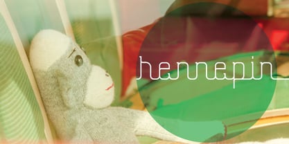 Hennepin derives from a bridge, a street and a county that share the same name in Minneapolis, MN. It is a serif font comprised of three agile weights: regular, light, and extra light. The character set contains typical OpenType features in addition to small caps, and old style numbers, but most importantly, it embraces stylistic alternatives that unite and complete this font.
 - Luminaire by Muksal Creatives,
$17.00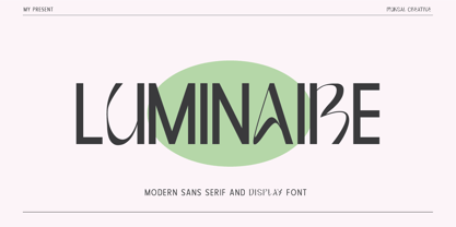 Luminaire is an intriguing and modern sans serif font. With its clean and minimalist characteristics, Luminaire exudes a professional and contemporary impression when used in designs. One of the captivating features of Luminaire is its alternate style, specifically the display style. This unique feature allows users to combine two different styles within a single word, creating a distinct and eye-catching visual appearance. In display mode, Luminaire offers experimental and striking variations of letterforms. Certain characters exhibit alternative shapes with artistic touches, such as curved lines or changes in the basic structure of the letters. This grants greater design flexibility and makes words written in Luminaire font stand out. Luminaire also maintains the essential aspects of clarity and legibility expected from a sans serif font. When used in longer texts or paragraphs, this font remains easy to read and provides a professional and well-organized appearance.Overall, Luminaire is an appealing sans serif font with a modern style and a unique alternate style feature. It can add artistic touches and uniqueness to your designs while preserving the important aspects of clarity and legibility.
 - SS Vortax by Sharkshock,
$100.00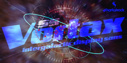 SS Vortax is a space-age themed display sans featuring broad strokes and tight spacing. This close relative of Galaxus features imposing Capitals with some sharp slants in the Italic version. It’s designed to cover horizontal blocks effortlessly. Most characters have curves on the exterior with right angles on the interior. This dynamic contrast makes it a great choice for a video game/app, toy packaging, or sports logo. SS Vortax is equipped with European accents for international support. Please check glyph maps for all supported characters.
 - Tabac Big Glam by Suitcase Type Foundry,
$39.00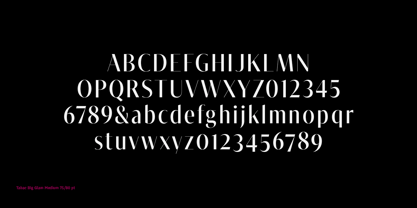 Tabac Big Glam probably stretches the Tabac super-family’s boundaries the furthest. While it’s based on the serif version, it achieves an especially surgical cleanliness and extremely sharp typesetting by completely letting the serifs go. Despite this, the text isn’t boring for a moment — the angled cut of the stems on b, d, h, k, l, the open loop on g or the rounded variant of the italic y, which can be called by turning on the stylistic set, reliably banishes any suspicions of the letters’ monotony.
 - Narevik by ParaType,
$30.00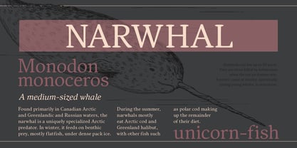 Narevik consists of 7 styles -- 4 uprights (including black) and 3 italics. It’s a type of dynamic low contrast design with slightly rounded triangle serifs and drops which conveys to it a certain peculiarity. The vertical strokes have gentle intasis that brings additional softness to the shapes. The family was created by Armenian designer Manvel Shmavonyan and got its name after his daughters Nare and Arevik. It can be used in text composition as well as in display matters. Released by ParaType in 2011.
 - Gazpacho by Monotype,
$29.00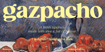 Gazpacho is inspired by the serif typefaces used in editorial media in the 70s and 80s. The morphology of the letterforms makes this typeface ideal for display purposes like logos and big, bold headlines. Also, thanks to its large x-height it works perfectly on headlines with tight leading. On the other hand, its high contrast and very simple and recognisable shapes makes it highly readable, so it works on small, long texts as well. It comes in 7 different weights and 2 styles (Standard & Italic).
 - Hecate by Océane Moutot,
$32.90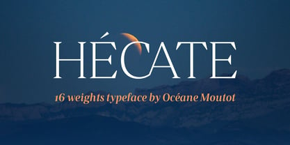 Hécate is a contemporary serif typeface designed with sharp serifs, smooth and dynamic lines and high contrast. Inspired by the Garalde style with its tilted axis, Hécate brings uniqueness and modernity to this more traditional style. Its large variety of glyphs, including accents, old-style numbers and ligatures will give you freedom for all of your projects. It offers a large choice of uses such as magazine, branding, edition and so on. Hécate is available in 16 styles from thin to black, in roman and italic.
 - Castine by Three Islands Press,
$29.00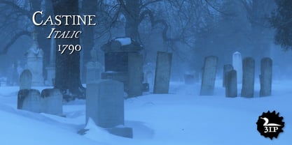 There's a cemetery in Castine, Maine, a lovely coastal town perhaps best known for Maine Maritime Academy and a surviving crop of stately old American elms, with headstones dating back into the 18th century -- the standard old headstone shape, often topped by winged skulls. Thanks to a local historical society volunteer, I got my hands on a couple rubbings; these show a particular style of stonecarving that proved captivating to the point of typeface design. Castine has a full character set in both roman and italic styles.
 - Fixga by Formatype Foundry,
$24.00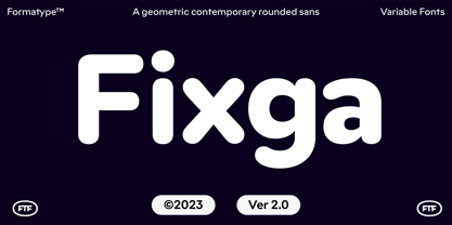 Behance Fixiga is a Modern rounded geometric sans with experiment forms to make powerful visual, a combining with the rounded and some sharp cutting edges. Fixga family comes with 8 weights, from ExtraLight to Black upright Italic, In addition Fixga also support OpenType alternate characters, Alternate SS.01 is offer with typewriter look and SS.02 is offer with neutral look with single storey "a" and "g" Fixga also support several OpenType features include: ligatures, tabular figures, fractions, and language support for extended Latin Icons and symbols.
 - Maletha Collection Signature by Yoga Letter,
$13.00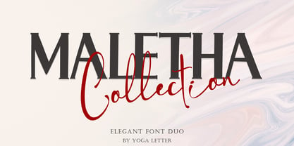 "Maletha Collection" is a font duo that combines elegant serif fonts and beautiful signature fonts. This font is very nice and can be used for all kinds of your work. "Maletha Collection" is perfect for making banners, posters, prints, logos, stickers, social media, weddings, promotions, decorations, portraits, presentations, and others. This font is very complete, because it is equipped with basic characters, uppercase, lowercase, multilingual support, numeral and punctuation.
 - Dragonflight Pro by Fontforecast,
$29.00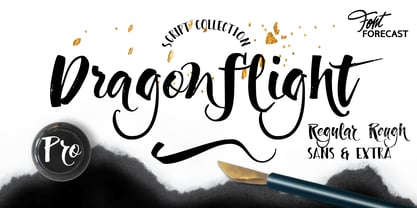 Dragonflight Pro is a script collection of four modern calligraphy fonts. Each glyph was hand-drawn with a brass folded pen dipped in ink. The tip of the folded pen resembles the shape of a dragonfly’s wing, hence the name. By tilting the pen variations in line width are made. This produces fun, expressive letters with a spontaneous personality. The regular and rough version of Dragonflight Pro have alternate glyphs that can either be accessed by the swashes feature, stylistic set 1, or the glyphs panel, depending on the application you are using. There are lots of discretionary ligatures that offer even more variation. By typing _1 to _10 you can access bonus swashes that are part of Dragonflight Pro Regular and Rough. Both fonts have 567 glyphs. Dragonflight Pro Sans is an all caps font with 402 glyphs, also hand-drawn with the folded pen, that compliments the other styles perfectly. Dragonflight Pro Extra offers an additional 117 swashes, doodles and ink splatters. With Discretionary Ligatures activated you can type an underscore in front of a letter and (when available) this gives you the rough version of the glyph.
 - Vampire by Otto Maurer,
$17.00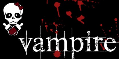 Inspired by a famous vampire movie. This font is based on the character shapes of Free Serif, a sample font bundled with FontLab applications; it is quite similar to Times Roman.
 - Magnetica by Galaxa,
$10.00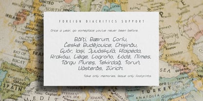 Magnetica font family combines design simplicity of modern sans serifs with a futuristic feel based on semi-rounded concept. Its fluent lines can bring unusual spark to logo designs, headlines, magazine designs, quotes, documentaries, advertisements or similar projects. This font, especially its Italic variation, will find its use also in larger text blocks where simplicity, clean lines and well applied kerning is a must. Create something spectacular with Magnetica.
 - Kuunari Rounded by Melvastype,
$16.00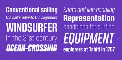 Kuunari Rounded is the rounded version of Kuunari. it is a structured square sans type family of 42 fonts. It has three widths and seven weights in both upright and italic versions. The base form is a round-cornered rectangle, and this form constructs the glyphs throughout the fonts. Kuunari Rounded is a straightforward sans serif. It doesn't make any fuss about itself; it just does the job proudly and confidently.
 - JetJaneMono by Ingrimayne Type,
$9.00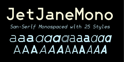 JetJaneMono is a large family of sans-serif faces which are monospaced. It is very plain (plain=plane=jet). The font family has two widths and three weights, with each upright style paired with an italics style. These twelve fonts are then duplicated with another set in which small caps replace the lower-case letters. The typeface was created in 1994 and in 2021 the condensed widths were added.
 - Cerkiymo by Hishand Studio,
$15.00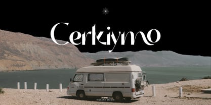 The strokes of the Cerkiymo font dance gracefully across the page, exuding an air of elegance and freshness. With its delicate curves and refined lines, the Cerkiymo font lends an elegant touch to any design, breathing a fresh sense of sophistication into each word. Perfect for logos, branding, invitations, stationery, wedding designs, social media posts, and much more. Complete with ligatures alternates regular italic hollow icon kerning multilingual support
 - NorB Cobalt by NorFonts,
$35.00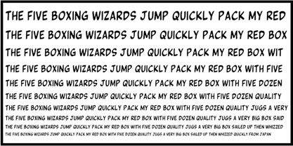 NorB Cobalt is a fat handwritten text font and can use this font with any word processing program for text and display use, print and web projects, apps and ePub, comic books, graphic identities, branding, editorial, advertising, scrapbooking, cards and invitations and any casual lettering purpose… or even just for fun! NorB Cobalt comes with 8 weights, each with their matching italics and in a Light, Normal and Expanded version.
 - Jolly Good Proper Serif by Letradora,
$-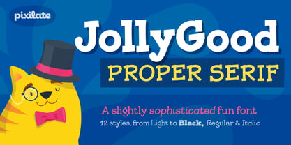 What do you get if you mix a proper serif typeface with cartoony fun? JollyGood Proper Serif! A whimsical font legible enough to work in longer texts, it’s perfect for childrens’ books and magazines.. It is a complete complete family with 6 weights in regular and italic (12 fonts in total). It has an amazing character set, with support for most european languages, as well as alternates and ligatures.
