10,000 search results
(0.208 seconds)
- Bloom Lover by Reyrey Blue Std,
$14.00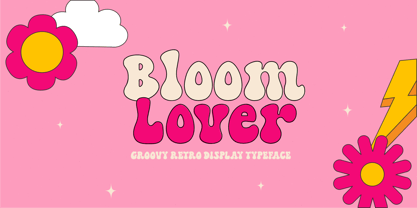 Introducing Bloom Lover Typeface. Bloom Lover is a modern, bold and playful display font with retro and groovy style concept. This font comes in 2 styles, Regular and Outline version. This font is perfect for all of your retro designs, procreate designs, social media, shirts, stickers, branding, logos, prints, Cricut projects, svg designs and and other design what you want. Features : · All Uppercase and Lowercase · Number & Symbol · Supported Languages · Alternates and Ligatures · PUA Encoded Hope you enjoy with our font!
 - Hollenbeck JNL by Jeff Levine,
$29.00Hollenbeck JNL is the Art Deco, all-caps cousin of Jeff Levine's Hallandale JNL typeface. This version utilizes the thick-and-thin stroke weights so popular during the Art Deco era, while retaining the look of hand-lettered copy. Best suited at larger point sizes, this font is a nice alternative to the over-used display faces reminiscent of that time period. - The Florest by BlackLotus,
$10.00 The Florest is a display type font inspired by the beauty of nature on florest island, Indonesia. The Florest has a characteristic impression of nature that will beautifully translate into a wide variety of design ideas. Include : The Florest Reguler (with Alternate) The Florest Outline (with Alternate) The Florest Deco (with Alternate) The Florest Deco Outline (with Alternate) The Florest Dingbats Swash
 - Astor by Lab-Dot,
$24.99 New Eurostile! A redesigned Eurostile font, Astor font, was created inspired of one of most used fonts in the world. Idea was to make new, contemporary design of old Eurostile font which was created 1962. by designer Aldo Novarese. Main characteristics and features of Astor font are: beautiful design and contemporary font. May be used like display font, cargo font, OCR font. Most of glyphs have same thickness and high modularity in combining 2 or more glyphs. Good for architect’s projects, labeling, making environmental typography installations, for use of some interior or exterior designs, furniture designs etc.
 - Arabesque by Scholtz Fonts,
$15.00 Arabesque is a romantic, ornamental font, in which intertwining, flowing lines and generous loops enhance the beauty of the basic shapes. Arabesque successfully combines legibility with a decorative, sumptuous style. In its European interpretation it was also called "Moresque". The font "Ability" was the origin of Arabesque, however, numerous, subtle changes set it apart. Arabesque, is characterised by a small x-height and relatively large ascenders and descenders (loops). The loops are created out of two or three delicate, intertwined lines that contrast with the much less expansive bowls and shapes of the lowercase letters. The capitals, more complex and composed of intertwined lines, echo the elegance of the loops on the lowercase letters. As a result of these changes "Arabesque" is both more readable, controlled and extravagant than "Ability". Suggestions for use: - wedding stationery - greeting cards - valentines day media - beauty products media - lingerie tags - women's magazine pages - classical music media - award certificates - magazine pages The font is fully professional: carefully letterspaced and kerned. It contains over 235 characters - (upper and lower case characters, punctuation, numerals, symbols and accented characters are present). It has all the accented characters used in the major European languages. Arabesque works well in Application packages such as Microsoft Word that do not support professional kerning.
 - Kelson by Armasen,
$- The Kelson font family is a Armasen project completed for a graphic design agency in Brazil. The agency had a typeface, but the kerning, spacing, and related features were corrupted or otherwise not working very well. The Armasen team improved the qualities, refined the shapes, and enhanced the font features. Armasen is a group of hard-working, young Brazilian students and type designers focused on creating and developing professional quality typefaces with a distinctive and unique personality. The team is very pleased with the final result and is happy to share the efforts of their work as a FREE FONT for you to enjoy! [edited by John Alexander (jga30328 at gmail dot com) a very appreciative user and admirer of the Armasen team]
 - Golden Style by Sensatype Studio,
$15.00 Golden is a Modern Luxury Elegant Sans Serif Font with Sharp shape make your design look classy and elegant A new SansSerif Font that we created special for Headline, Title and more stand out typography needs, with extra ligature that will add your variations. It's so perfect to add your style and headline overview. And specially for Golden font, we crafted for unique style and modern feels so enjoy to create any project that will show your main idea out. Golden Modern Luxury Elegant Sans Serif Font ready with: Any options to get creative variations (combination of Ligature Characters) Preview as a inspirations that you can do with Golden font Ready with All characters Wish you enjoy our font. :)
 - Solution by Sensatype Studio,
$15.00 Solution is a Modern Fashion Sans Serif Font with Sharp shape make your design look classy and elegant A new San Serif Font that we created special for Headline, Title and more stand out typography needs, with beauty characters that will add your variations. It's so perfect to add your style and headline overview. And specially for Fashion font, we crafted for unique style and modern feels so enjoy to create any project that will show your main idea out. Solution Modern Fashion Sans Serif Font ready with: Any options to get creative variations Preview as a inspirations that you can do with Solution font Ready with All characters Wish you enjoy our font. :)
 - Spooky Hollow by Forberas Club,
$16.00 ntroducing Spooky Hollow by Forberas, yet playful but still serious. You can use this as decorative material for your upcoming project.
 - Pumpkin Hunter by Forberas Club,
$16.00 Introducing Pumpkin Hunter by Forberas, yet playful but still serious. You can use this as decorative material for your upcoming project.
 - Stencil Designs JNL by Jeff Levine,
$29.00 Stencil Designs JNL collects twenty-six decorative designs from various vintage sources for use as spot embellishments, borders and corner pieces.
 - Mia Mano by Kate Brankin,
$32.00 Based on designer's own handwriting, Mia Mano is a decorative display typeface ideal for headlines, logos, magazines, posters and short text.
 - Botaky by Alit Design,
$9.00 Introducing BOTAKY Romellast fontduo Unique and fantastic duo fonts combined or they stand alone. BOTAKY font family which consists of 10 families, from Thin to Black style. The funky, swaying font creates a unique design and is sure to take the eye off the design target audience. Apart from being unique, the BOTAKY font also has a luxury simple character that makes the design charming. The Romellast font is a signature script that has cool strokes. The line shape from Romellast is inspired by the brushes on Instagram when creating stories. This brush is very cool and is often used by netizens who are not designers or designers. In addition, Romellast has an altenate ligature that looks natural and not stiff. There are 2 styles of the Romellast font, namely the Thin style which is thinner and the regular style which is thicker, so you have several options to suit your taste. Combining the two BOTAKY and Romellast fonts will create a design that is charming, unique, elegant and cool. you can see from the design preview. These two fonts are perfect for designs with the concept of elegant, luxury, romance, fashion and so on.
 - Poeta Color by Tarallo Design,
$14.99 Poeta Color is an ornamental font for making patterns and decorating text. It contains floral and nature motifs. The symbols are versatile enough for simple decoration or thematic seasonal and holiday moods. Designers can use Poeta to make unique lines, fields, borders, or ornamentation within or around text. Try replacing a basic straight line with repeated symbols. Make a background to add visual interest to a design. Use the forms to decorate a chapter title or to mark the end of a magazine article. Replace a letter in a word with a symbol to create a memorable statement. This font began with sketches of patterns seen in ceramic tiles around Sicily. It is named Poeta because Sicily is an island rich in poetry traditions. Below is some helpful technical information. Using this font is simple. Install it and type. Symbols will appear instead of letters. Choose the precise symbols through a software’s glyph palette. Use the type/character menu controls to vary the spacing and density of patterns. All fonts are vector-based, OpenType, and fully scalable. Six of the fonts have different color or grey combinations. One of the fonts (solid) is a standard font. The font previews on this website will only display the font in black. See the slides to get an idea of the colors. Be assured that the colors are present in the files and will appear when loaded on the computer. The colors that are in each font: Primary: red, yellow, blue Secondary: orange, green, purple Tertiary: red-orange, yellow-orange, yellow-green, blue-green, blue-violet, red-violet Diverse: many different warm and cool colors Grey: three different greys from light to dark Gradient: a greyscale gradient Solid: standard font and can be colored normally Software that supports color SVG fonts: Photoshop, since 2017 llustrator, since 2018 InDesign, since 2019 QuarkXPress, since 2018 Pixelmator Sketch
 - Yanone Kaffeesatz - Unknown license

- Thinkthin by Gassstype,
$27.00 Hello Everyone, introduce our new product Font Thinkthin This Is Display Thin Font.This is a Textured Natural Style and classy style with a clear style and dramatic movement. That is has charming, authentic and relaxed characteristic more natural look to your text. You can activate 2 Ligatures and 42 Alternate glyphs OpenType panel.
 - Greature by Uncurve,
$18.00 Greature Typeface Come with more 400 glyphs, 2 style ( Regular and Shine ) including Stylistic sets, Ligatures, Contextual Alternates and some extras font for helping your design. Greature is inspired by Tattoo art, Typografi design, Sign Painters, Lettering, Vintage art and Ephemera Perfect looking for Label, Poster, Logotype, Letterhead, Titles, Branding, Packaging, Typography etc.
 - Klender by Prioritype,
$17.00 Introducing. Klender: The modern and retro styled fonts have some additional alternative characters that make them beautiful. With these 2 styles you can apply them to your branding designs, business cards, posters, social media posts, merchandise and more. Features: Uppercase, Lowercase, Numeral, Punctuation, Multilingual, Alternates & PUA Encoded. Obtained file format: Otf & Ttf. Thanks :)
 - Setir Paghoni by Attract Studio,
$20.00 Setir Paghoni is a modern serif font that uses unique ligatures to connect letters smoothly. Setir Paghoni comes with matching slanted trim. Perfect for adding a unique touch to wordmark logos, fashion headlines, editorial designs, branding projects, magazine titles and more. Included: 2 Weights (Roman & Oblique) PUA Encoded Ligatures Opentype Feature Multilanguange.
 - Kettering 205 by Talbot Type,
$12.99 Kettering 205 is a geometric slab-serif with Art Deco influences, such as lowered crossbars on many characters, and a crossed W. It includes old style non-aligning (lower case) numbers, both proportional and tabular as well as accented characters for Central European languages. It’s a highly individual looking font, but retains good legibility coupled with striking looks as a display font. The Kettering 205 family comprises of six weights and is closely related to Kettering 105, its less Deco flavoured cousin.
 - Bungehuis by Hanoded,
$15.00 Bungehuis font was modeled on the lettering found on an Amsterdam art deco building from 1931. This building on the Spuistraat, also called "Het Bungehuis", used to house offices, but is now part of the University of Amsterdam. In 2015 it had its brief moment of fame, when students, demanding more democracy at the University, occupied it. Bungehuis is a heavy art deco font and would look great on posters and in headlines. It comes with a rather democratic range of diacritics.
 - Rustler Barter by Showup! Typefoundry,
$20.00 RustlerBarter is an elegant display font inspired by the Art Deco era. It perfectly represents vintage aesthetics in a modern and minimalist way. The font includes special uppercase letters, alternate characters, and beautiful ligatures. Furthermore, the font is perfect for elegant logo design, packaging or invitation cards.
 - Bonitto by Omotu,
$18.00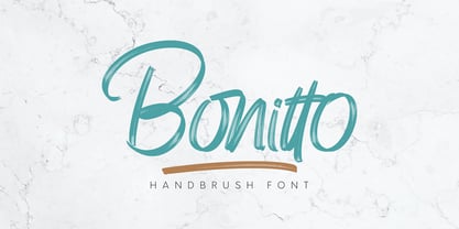 Bonitto is a handwritten script font with 2 styles, Regular and Slant. Bonitto is suitable for branding, logotype, apparel, t-shirts, hoodies, product packaging, quotes, flyers, posters, advertising and more. What's Included? 1. Uppercase and lowercase characters 2. Multilingual support. 3. Numerals, punctuations, and ligatures 4. Accessible in the Adobe Illustrator Glyphs panel, or under Stylistic Alternates in the Adobe Photoshop OpenType menu, Adobe InDesign, Corel Draw, even work on Microsoft Word. Please message me if you're unsure of any language support. Thanks for looking, and I hope you enjoy it! Please don't hesitate to drop me a message if you have any issues or queries. Omotu Studio
 - Chips Snack by Omotu,
$16.00 Chips Snack! A hand-written font with 2 styles, regular (brush texture) and solid. Chips Snack is perfect for short typography, logotype, apparel, T-shirt, Hoodie, product packaging, quotes, flyer, poster. Whats Include? 1. Uppercase and lowercase characters 2. Supports international languages 3. Numerals, punctuations 4. Accessible in the Adobe Illustrator Glyphs panel, or under Stylistic Alternates in the Adobe Photoshop OpenType menu, Adobe InDesign, Corel Draw, even work on Microsoft Word 5. Multilingual support Please message me if you're unsure of any language support. Thanks for looking, and I hope you enjoy it! Please don't hesitate to drop me a message if you have any issues or queries.
 - Swirly by Trim Studio,
$12.00 Swirly is a cute handwritten font to share happy, loving, and cheerful vibes and moments in life like Easter, Valentine, Christmas, and for many other occasions.
 - Postmark Display by Milan Pleva,
$22.00 Postmark Display is a clean geometric display font with one basic and three special styles: Postmark Display Postmark Display Style 1 Postmark Display Style 2 Postmark Display Style 3 Special styles were created to complement the main font and to differentiate words or sentences. Postmark Display is ideal for headlines, headers, logos, labels, packaging, magazines, invitations, etc. FEATURES Basic latin alphabet A-Z Three special styles (each with 50 basic glyphs) 56 Accented characters Numbers, Punctuation, Currency, Symbols, Math symbols & Diacritics Old style figures LANGUAGE SUPPORT Latin 1 + Latin 2 Western Europe and Americas: Afrikaans, Basque, Catalan, Danish, Dutch, English, Faroese, Finnish, French, Galician, German, Icelandic, Irish, Italian, Norwegian, Portuguese, Spanish and Swedish. Latin-written Slavic and Central European languages: Czech, German, Hungarian, Polish, Romanian, Croatian, Slovak, Slovene. Enjoy Postmark Display!
 - Pushkin by ParaType,
$25.00 Designed for ParaType in 1999-2004 by Gennady Fridman. The Pushkin type family is based on the autographs of Alexander Pushkin, the eminent Russian poet (1799-1837). Alternative letters typical for Pushkin's hand are included. There are several variants of Pushkin's hand. Pushkin Script in 2 styles was based on the manuscripts of 1815 and covers Western and Russian character sets. Pushkin One was developed on the basis of thoroughly written documents. Pushkin Two imitates small but nevertheless rather legible hand. Pushkin Three in 2 weights was created on the basis of the autographs distinguished by sprawling hand. Pushkin One, Two and Three series covers just the Russian character set. This set of Russian fonts was amended by Pushkin French font that is based on French writings and covers Western character set.
 - Aphrodite Slim by Typesenses,
$57.00 Aphrodite Slim Pro is not just a lighter version of its sister Aphrodite Pro. Aphrodite Slim Pro has duplicated the quantity of characters of its partner, and that means more than 500 new glyphs, reaching a total of more than 1000. More delicate and meticulous, Aphrodite Slim Pro is once more a new typography with deep calligraphic ideals: We immersed ourselves into the world of each calligraphy ductus and each calligraphy masters by studying from decoration to lettering books. This was the key for the logic of Aphrodite Slim’s behavior. The new concept of Aphrodite Slim Pro was to join diverse styles of calligraphy in one in order to achieve an autonomous expressiveness, in fact, this is what calligraphy aims to, and we agreed to bring those ideals to the world of typography: It is justifiable to be inspired in hundred-year-old calligraphies, but it is even better if the results you obtain have a plus. A personal plus. During the creation process we were wondering whether it was possible to mix certain strokes of such rigid styles as uncial, (Li·n’s favourite style), with strokes of the copperplate, (Sav’s favourite style), and also to take and mix cualities of cancelleresca cursiva, formata and moderna; finally giving our creation a roman-transition italic look. So Aphrodite Slim takes ideals and aspects from those formal styles, following its own logic though, and emphasizing the fact of being a decorative typography. Calligraphy masters of our past are who we are in debt with. They are the cause we have lovely letters now. They have been spontaneous at the moment of creation, what differs from the type-designers of nowadays, whose spontaneity is more limited. Digital faces that we are used to see these days are a result of long hours of optical adjustments, grids, macros and inspirations of other existing typography, but without personal contributions. Aphrodite Slim wants to refute this. Its mission is to rescue de spontaneity of the artesanal lettering in order to obtain unique words; those which only calligraphy masters of our past or lettering artists of our present could give us. We have worked hard to achieve this, making Aphrodite the most universal font we could: It was necessary to study the most common words, focalizing more in the ones referring to “sensitivity”, of four of the most spoken languages in the world. Aphrodite Slim has an enormous quantity of decorative characters and special ligatures for phrases and words in English, French, Spanish and German. (See English, Français, Español, Deutsch PDF in the gallery section). We promise there is no existing type that decorates/ligates glyphs and words like Aphrodite Slim does: It is the first time a font like this really considers its purpose. -The way glyphs are ligated is insane- : Aphrodite Slim rescues some ideals of persons like Jan van den Velde (Italian cancilleresca writing of XVI Century) who understands ascenders and descenders as possibilities to beautify the lines of writing with curved strokes that seem to be dancing above and below of the words. This master also creates ascenders and descenders even where they are not necessary, on letters that do not actually need them: Aphrodite Slim takes this ideal. The font counts with a wide range of glyphs that seem not to be satisfied with its more primitive form and prefer to extreme their parts to be decorative. It also existed masters of calligraphy like José de Casanova of XVII Century, who, with a magnificant skill and a really personal mark, had the particularity of ligating words that were actually separated with spaces. This is another innovative feature in Aphrodite Slim. An investigation of the most common beginnings and endings words of the English language was done. Having that feature activated (discretionary ligatures), common words will start to ligate or to be decorated even when they are separated by spaces. Impossible to forget Francesco Periccioli of XVII Century and our experience us designers to face with works of him: His letters, that today are included in the group of cancellerescas modernas, have been a direct inspiration to the oldstyle figures and historical forms variables in Aphrodite Slim. Giovanni Antonio Tagliente (XVI Century) and his particular way of making tails and diagonals longer than usual, qualities that our creation reflects too. Finally, our adventures in Biblioteca Nacional and Barrio San Telmo, Buenos Aires, were essential for us to make Aphrodite Slim more complete and interesting: Sav did an excellent work when studying how the decorative miscellanea and swirls of early XX century were. She also investigated what particularities made those roman titling characters look antique so she could rescue some ideals for the oldstyle figures and historical forms variables. This also leaded her to create the ornaments variable in Aphrodite Slim. We are really proud of presenting Aphrodite Slim Pro, a typography that was the result of days and nights of working hard, because we do love what we do; and we are glad we are living in a present that gives us the possibility to spread this kind of art, because that is the way we consider our job: Aphrodite Slim Pro is Art. Hope you can appreciate the enormous work this type has. Features. Aphrodite Slim Pro is the most complete variable. It includes more than 1000 glyphs. Thanks to the Open-Type programming, it counts with a easy way to change/alternate glyphs if the application in which the font is used supports this. The variables contained in Aphrodite Slim Pro are also offered separately. Aphrodite Slim Text: It is the variable for lines and paragraphs. Thus it is the least ornamental and the most accurate to achieve a satisfying legibility. It has the Standard Ligatures feature in order to improve the possible conflicts some glyphs could have by others. Aphrodite Slim Contextual: It is the one that makes emphasis in decorating. It has the particularity of ligating/decorating words of common use in English, French, Spanish and German. It also has the quality of ligating common beginnings and endings of the common words in English. Aphrodite Slim Stylistic: With similar features of Slim Contextual. It includes a set of decorative numbers for a display use. Aphrodite Slim Swash: This one has special beginnings and endings to decorate words. Aphrodite Slim Endings: It makes words look as a signature. Aphrodite Slim Historical: It adds an antique look to the written word. It also has the special historical ligature function. Aphrodite Slim Titling: This one is the most decorative. Its copperplate inspired ornaments give words a special color, in order to handle the quantity of decoration, it comes with the standard ligature feature, which has the most common ligatures plus others that make decorative swirls not to be conflictive. Aphrodite Slim Ornaments: A set of 52 ornaments. Aphrodite Slim Pro includes all this features plus the Stylistic Set 1; Stylistic Set 2 and the possibility of Slashed Zero. We recommend you to check out the gallery in order to see all these features in action.
 - PopUps - Unknown license

- Tailgates by Ditatype,
$29.00 Introducing Tailgates, a script font that exudes a robust and inviting charm. This typeface showcases a substantial weight, offering your text a bold and captivating presence. Tailgates is characterized by its rounded letterforms, contributing to a friendly and approachable aesthetic. With consistent proportions and a relatively high contrast, it achieves a dynamic and eye-catching design. What sets Tailgates apart are the captivating swinging ends that adorn select letters. These elegant flourishes add a sense of whimsy and grace to your text, creating a visual experience that is both lively and engaging. The combination of round shapes and these decorative elements adds a unique touch to your designs. In addition, enjoy the features here. Features: Ligatures Stylistic Sets Swashes Multilingual Supports PUA Encoded Numerals and Punctuations Tailgates fits in headlines, logos, posters, flyers, branding materials, print media, editorial layouts, and many more designs. Find out more ways to use this font by taking a look at the font preview. Thanks for purchasing our fonts. Hopefully, you have a great time using our font. Feel free to contact us anytime for further information or when you have trouble with the font. Thanks a lot and happy designing.
 - Anisette Std Petite by Typofonderie,
$59.00 Geometric font inspired by shop signs in 4 styles Anisette has sprouted as a way to test some ideas of designs. It has started with a simple line construction (not outlines as usual) that can be easily expanded and condensed in its width in Illustrator. Subsequently, this principle of multiple widths and extreme weights permitted to Jean François Porchez to have a better understanding with the limitations associated with the use of MultipleMaster to create intermediate font weights. Anisette built around the idea of two widths capitals can be described as a geometric sanserif typeface influenced by the 30s and the Art Deco movement. Its design relies on multiple sources, from Banjo through Cassandre posters, but especially lettering of Paul Iribe. In France, at that time, the Art Deco spirit is mainly capitals. Gérard Blanchard has pointed to Jean Francois that Art Nouveau typefaces designed by Bellery-Desfontaines was featured before the Banjo with this principle of two widths capitals. The complementarity between the two typefaces are these wide capitals mixed with narrow capitals for the Anisette while the Anisette Petite – in its latest version proposes capitals on a square proportions, intermediate between the two others sets. Of course, the Anisette Petite fonts also includes lowercases too. Anisette Petite, a geometric font inspired by shop signs in 4 styles So, when Jean François Porchez has decided to create lowercases the story became more complicated. His stylistic references couldn’t be restricted anymore to the French Art-déco period but to the shop signs present in our cities throughout the twentieth century. These signs, lettering pieces aren’t the typical foundry typefaces. Simply because the influences of these painted letters are different, not directly connected to foundry roots which generally follow typography history. The outcome is a palette of slightly strange shapes, without strictly not following geometrical, mechanical and historical principles such as those that typically appear in typefaces marketed by foundries. As an example, the Anisette Petite r starts with a small and visible sort of apex that no other similar glyphs such as n or m feature, but present at the end of the l and y. The famous g loop is actually inspired by Chancery scripts, which has nothing to do with the lettering. The goal is of course to mix forms without direct reports, in order to properly celebrate this lettering spirit. This is why the e almost finishes horizontally as the Rotis – and the top a which must logically follow this principle and is drawn more round-curly. This weird choice seemed so odd to its designer that he shared his doubts and asked for advise to Jeremy Tankard who immediately was reassuring: “Oddly, your new top a is fine, it brings roundness to the typeface, when the previous pushes towards Anisette Petite to unwanted austerity.” The Anisette Petite, since its early days, is a mixture of non-consistent but charming shapes. Anisette, an Art Déco typeface Anisette Petite Club des directeurs artistiques, 46e palmarès Bukva:raz 2001
 - Decade - Unknown license

- Fanzine - Unknown license

- Abduction2002 - Unknown license

- MontereyPopsicle - Unknown license

- Ajile - Unknown license

- Abecedarian - Unknown license

- Incantation - Unknown license

- Desastra-Bold - Unknown license

- Dummyboy - Unknown license


