10,000 search results
(0.067 seconds)
- The Auratype by Auratype Studio,
$9.00 Hai Folks! The Auratype is retro and classic typeface who inspired by the 60s - 80s designs with more unique explored style like swosh and alternate character. This font made from manual sketch with many many scratch then finished to font. Make your designs project with this font and extras illustration to give more superb. This font also suitable to design like logo, sticker, tees design, banner, poster, sign, display design, packaging and more superb designs! Enyoy with our product and feel free contact us for support! Features : Full set of Upper & Lowercase Character Number & Punctuation Swosh Alternate Extras Illustration Multilingual Language PUA encoded Opentype Features _________ ▼To using the feature OpenType Stylistic alternate (including swosh), you must use program that supports OpenType such as Adobe Illustrator CS, Adobe Indesign, Corel Draw X6-X7 and Microsoft Office 2010 or later versions. Additional way to access alternate/swoshes are using Character Map (Windows), Nexus Font (Windows), Font Book (Mac), or more program which has Pop Character. ▼For more information about accessing alternative, you can see on this link : http://adobe.ly/1m1fn4Y ✌ Get in touch with author https://www.instagram.com/wahyudwi.cc/ https://www.instagram.com/auratype/ https://www.behance.net/fontsfighters ❤ Thank you for purchasing our product and supporting us! We hope this font can be part of your designs project. If you have other queries, questions or issues, just feel free and have fun to contact us directly. We are glad if we can help you more! If you are happy with our product, please put your star into our design reviews, it was so fantastic moment for us. Thanks! :)
 - Fresh Paint by Graffiti Fonts,
$29.99 Super fresh paintbrush style lettering with a definite graffiti slant. Reverse italic and highly detailed these hand-made letters, splats, swipes, numbers and symbols give an energetic human feel to your custom text. This font is an all-caps style with no real lowercase letters however the single font actually contains 3 full alphabets (78 individual letters) so you can mix and match to create endless unique letter combinations. Fresh Paint also includes several highly detailed paint splatters, brush strokes and swipes to use along with your custom lettering. All glyphs are created from hand made, painted letters, all splatters and strokes are made from real specimens & have sufficient detail to work even at very large sizes.
 - Olivetta by Los Andes,
$29.00 Olivetta—an ironic sans. Its name is inspired by Antique Olive typeface. These two fonts share a few common design features but Olivetta is more in tune with the spontaneous, ironic style of today's typefaces. Olivetta illustrates the power of words as images. The high contrast between thick and thin strokes of the lowercase letterforms gives visual strength to the font. The stroke contrast increases as the weights get heavier. Olivetta comes in 10 weights with matching italics and each style contains more than 400 glyphs which include alternates. The lightest weights work well in subtle headlines while the heaviest ones are perfect for posters, short texts, branding and editorial design. The intermediate weights are ideal for continuous reading.
 - Bream by Hackberry Font Foundry,
$24.95 This is the display version of Librum. Librum means “book” in Latin, which I thought was appropriate. Bream is Latin for proclaim—appropriate for display work. The fonts are very close to Librum-Book and Librum-Italic, with the same OpenType features. The glyphs are modified a bit to make them a little more elegant, but that’s not very noticeable. Mainly, the letterspacing and kerning is tighter and more carefully fit to large point sizes. As for classification, I like oldstyle, Venetian, geralde, English oldstyle. There’s discrete modulation, slanted crossbars, full brackets serifs of medium thickness and sharp cut ends. For a great deal, see Librum Book Design Group, for a package containing all fifteen fonts!
 - Giotto Handwriting - Personal use only

- Abril Titling by TypeTogether,
$35.00 Abril is an extension of the Abril typographic system that was engineered as a response to a very specific requirement from the editorial design community: a low contrast typeface for head- lines. Given its broad range of styles though, Abril deserves to be considered a separate font family on its own. Based on the original text styles of Abril, the letter shapes are sturdy, very legible, and deliver a newsy and trustworthy feel. The accented editorial style of the Scotch Roman finds continuity in this new type family, but some of the details have been ironed out for improved performance in headline, both in print and on screen. The family is conceived as four series of different widths, with four weights in each series plus matching italics, a total of 32 fonts. This wide range of styles allows for setting titles at almost any size. The wider series are aimed for smaller point sizes while the con- densed weights can deliver a striking and cohesive appearance as front cover headlines. Abril was designed as a versatile tool for those graphic and web designers looking for a workhorse with high impact. It is also an excellent companion for the rest of the Abril type family: Abril Titling and Abril Narrow.
 - Religan by Dora Typefoundry,
$17.00 The new Religan serif font is luxurious and elegant which will bring a unique style and trendy look to your designs. This modern serif relogan has several on-trend ligature binders and special characters to make it look more unique in all design projects and work perfectly to pair with other fonts. It's perfect for logotypes, branding, wedding monograms and invitations, blog headlines and more. Here we prepare some fasteners: ab ar an am ah ara ap ti tr st tu tt ct et ff ty ffi fu ft fj fy th tm tn in im ir it ta ri er eh em en ch cr ra ng li eb cb fr ck fb fh fk jj gi and more.. Religan also includes the full set: Uppercase and lowercase Multilingual symbol Number Punctuation This type of family has become a work of true love, making it as easy and enjoyable as possible. I really hope you enjoy it! I can't wait to see what you do with Religan! Feel free to use the #Dora Typefoundry tag and # Religan Modern Serif Font to show what you've done. If you have any questions, you can contact us by email: doratypefoundry@gmail.com Thank You!
 - Calaveras by Design is Culture,
$29.00 In August of 2009, I was commissioned by Zoo York, a New York City based skateboard company, to visit Buenos Aires to study and document street typography. As soon as my taxi driver took the bustling street Entre Ríos, it was clear that the city and I were going to be good friends. Many of the independently owned businesses on Entre Ríos are adorned with handmade signage. These signs are painted in a style called Fileteado which is a century-old Argentinian type of lettering and floral ornamentation. Nowadays, Fileteado is still a prominent part of the city’s landscape, coloring the façades of restaurants, bars and coffee shops. Calaveras and Diablitos are two new typefaces that were inspired by Fileteado. Stylistically, the fonts are a return to a rhythmic and playful sensibility reminiscent of Vitrina and Cuba, two fonts that I designed in 1996. Along with dynamism and dance, these new fonts incorporate a rigor and functionality essential to labelling any font a ‘workhorse.’ The names Calaveras and Diablitos, came from the name of a song by the infamous Buenos Aires rock band, Los Fabulosos Cadillacs. —Pablo A. Medina
 - Diablitos by Design is Culture,
$29.00 In August of 2009, I was commissioned by Zoo York, a New York City based skateboard company, to visit Buenos Aires to study and document street typography. As soon as my taxi driver took the bustling street Entre Ríos, it was clear that the city and I were going to be good friends. Many of the independently owned businesses on Entre Ríos are adorned with handmade signage. These signs are painted in a style called Fileteado which is a century-old Argentinian type of lettering and floral ornamentation. Nowadays, Fileteado is still a prominent part of the city’s landscape, coloring the façades of restaurants, bars and coffee shops. Calaveras and Diablitos are two new typefaces that were inspired by Fileteado. Stylistically, the fonts are a return to a rhythmic and playful sensibility reminiscent of Vitrina and Cuba, two fonts that I designed in 1996. Along with dynamism and dance, these new fonts incorporate a rigor and functionality essential to labelling any font a ‘workhorse.’ The names Calaveras and Diablitos, came from the name of a song by the infamous Buenos Aires rock band, Los Fabulosos Cadillacs. —Pablo A. Medina
 - Voyager Mono by Anton Kokoshka,
$29.00 Voyager Mono is a geometric monospaced grotesque family. It has two width styles - Voyager Mono (630em) and Voyager Mono Cond (580em). Available in 7 weights plus matching italics and alternate styles without slope with italic letters "a" and "g". Particular attention was paid to the problematic letters for monospaced fonts - "m" and "w". The optimal solution was found so that all signs looked good even in black style. Voyager Mono is perfect for the brand design, advertising, logo, gaming and packaging.
 - Deroma by Yahya Type,
$20.00 Deroma - is an editorial serif font (regular and italic) It beautifully combines a vintage look with a modern flair. Deroma will be perfect for many projects: logo, wedding designs, social media posts, advertisements, product packaging, product designs, label, photography, watermark, invitation, or whatever project you’re working on. WHAT’S INCLUDED? Deroma Regular (uppercase & lowercase) Deroma Italic (uppercase & lowercase) Numbers & punctuation Ligature & Huge Stylistic alternate Multilingual support. Still got a question? Send me a message and I’ll be happy to answer! qura.yahya@gmail.com
 - Nachel Victoria by HandletterYean,
$10.00 Nachel Victoria is a simple, yet aesthetically beautiful typeface. It has a modern script look which can be used for business cards, logos, packaging, branding, magazines, quotes, and much more! What's included: 1. Nachel Victoria (OTF) 2. Style in this font include: Regular, Bold, Italic, and Bold italic 3. Works on Mac & PC 4. Simple installations 5. Accessible in the Adobe Illustrator, Adobe Photoshop, Adobe InDesign, CorelDraw, even work on Microsoft Word. 6. Support multilingual; ä ö ü Ä Ö Ü ß ¿ ¡
 - Bunuelo Clean Pro by Buntype,
$39.00 A contemporary, clear and minimalistic font with a friendly and smooth appearance. Bunuelo™ Clean is based on a squarish form, all edges are slightly rounded and spurs are completely absent. In addition, the endings of terminals follow the curvature. This gives the glyphs a very smooth, friendly and a little bit bubbly look - especially in the bolder styles because the smoothing increases with the weight. Together with the minimalistic and clear letterforms, Bunuelo™ Clean has become a very distinct, strong character. Bunuelo™ Clean ships with 8 upright and 7 real italic styles from an unusually thin Hair to a pretty fat Heavy weight. It provides a bunch of professional typographic features like stylistic alternates, ligatures, Small Capitals, 9 sets of figures, slashed zeros, support for at least 58 languages and much more. Each professional style contains up to than 870 Characters. BunueloClean Specimen PDF
 - Distant Galaxy Condensed - Unknown license

- Magnivera by Eko Bimantara,
$24.00 Magnivera is a display serif font family. inspired from oldstyle serif with a high contrast letterforms, the characteristic of the typeface is flamboyant and fit for fashion theme. Magnivera consist of 4 styles from regular to heavy with matching italics.
 - Woebegone by Hanoded,
$10.00 Woebegone is a cute little handmade font. I started off by drawing the glyphs with a Pilot pen, then added some strokes with a Japanese brush pen. Woebegone comes in Regular and Italic and has all the accents you need.
 - Moris by Katatrad,
$29.00 Moris™ is a family of modern sans serif typeface with simple and condensed proportions. Moris is recommended for publication, screen and Corporate use. This new font family includes nine weights with true italics, numeric tabular function and Opentype features.
 - Vicenza by Almarkha Type,
$29.00 Introducing Vicenza – Elegant Serif a Luxury serif font with a stylish touch inspired by the famous minimalist logo and Vicenza has 2 regular and Italic styles is perfect for the purposes of designing templates, brochures, videos, advertising branding, logos and more.
 - Franie by That That Creative,
$50.00 Franie is a variable geometric sans serif font family with 72 styles. Fully customize the width, weight and italic angle. This modern clean typeface is perfect for contemporary layouts for print, magazines, posters, web, social media, branding logos, or whatever.
 - Mercenary by Miller Type Foundry,
$35.99 Mercenary is a geometric font family made up of seven weights with italics. Great for almost any use, Mercenary is a versatile workhorse typeface. Mercenary has a neutral feel, allowing it to be used on numerous projects across different platforms.
 - PlainPensle by Ingrimayne Type,
$14.95 As its name suggests, PlainPensle is a handwriting font that emulates printing and writing with a pencil or ballpoint pen. The plain and bold styles have hand printing that is ordinary and nondescript. The italics and bolditalics contain simple handwritten cursive.
 - Verger Book by David Engelby Foundry,
$25.00 The font Verger Book is the little brother of Verger . It’s a sturdy serif antiqua and your companion in legible and solid typographic design. Verger Book has several expressive and distinctive styles, especially in the design of its italic versions.
 - Nautikka by Sea Types,
$25.00 Nautikka was designed from the waves of the sea is a sans serif, elegant and functional for editorial design, visual identities or digital applications. With 685 glyphs, 5 weights and variations in italics is a versatile font with great legibility.
 - Antartida Rounded Essential by Los Andes,
$18.00 Antartida Rounded Essential is a sans serif with rounded terminals. Its simple, kind of neutral feeling is functional, clean and minimal; its rounded terminals make it friendly and warm. It is a family of 4 fonts: 2 weights and their italics.
 - Trovoada Mono by SullivanStudio,
$25.00 Trovoada Mono is a monospaced font for use in print (but also looks great on display). Hand-drawing glyph by glyph, my intention was to get that old manual typewriter look, with uneven inks, but with a totally up-to-date, emotional and admittedly humorous attitude. Trovoada Mono borrows from classics like Courier and Letter Gothic, reinventing serifs here and there. The result is a font that is both familiar and unusual. As I love Greek typography, I made sure to include a full polytonic alphabet, in the same vintage spirit: the text looks very legible and matches the Latin characters. The font has no kerning, obviously, and no ligatures (this is a typewriter, my friend!), but it has important OpenType features: fractions, subscripts/superscripts, slashed zero and stylistic alternatives for some characters. The italics are 11 degrees, which brings a strong personality. Some characters have true italics, giving the text an overall texture different from the upright type. All that is missing is that nervous typewriter noise. Enjoy!
 - Riyadhus Sholihin by Mokatype Studio,
$22.00 Hello Introducing, Riyadhus Sholihin - Our fresh new collection of modern display fonts inspired by Italic handwritten calligraphy with strong and unique character suitable for designing logos, templates, brochures, videos, advertising branding, and more. Riyadhus Sholihin font with challenging Arabic nuances and equipped with alternates and swashes. very suitable for headlines, typography, Poster, magazines, brochures, packaging, Websites, and much more for your design needs, making your designs looks like Islamic nuances. What's Included: + Standard glyphs + Alternates and swashes + Web Font + International Accent + Works on PC and Mac + Simple installations accessible in Adobe Illustrator, Adobe Photoshop, Adobe InDesign, and even works on Microsoft Word. PUA Encoded Characters: Fully accessible without additional design software. Fonts include multilingual support. + Image used: All photographs/pictures/vectors used in the preview are not included, they are intended for illustration purposes only. Thank you
 - Cavita Rounded by Underground,
$9.90 Cavita Rounded typeface is a mix between both grotesque and calligraphic models: regulars have a rough grotesque spirit, while the italics where inspired in calligraphic gestures. All of these details are reinforced with an inverted modulation (horizontals strokes are thicker than usual). The italics seem to move away from the traditional concept of type system, but work very well alongside. This typeface has very particular shapes and rhythm, itís different and identifiable from the rest, making it a very good option to use on any piece of design. Cavita Rounded is designed as an upgrade Cavita.
 - Lucifer Sans by Daniel Brokstad,
$29.00 Lucifer Sans is a modern sans serif font rooted in Scandinavian geometry and minimalism, mixed with a healthy dose of black metal and irreverent attitude. Harsh vertical cuts and angles throughout the font creates a very strict and hard look, that can either be amplified or loosened up through its stylistic sets. Lucifer Sans family contains 162 font, 9 different weights and width, plus italics. In addition there are 3 different stylistic sets. This creates substantially diverse set of characters for contrasting against another and makes it a versatile font for different formats. Style 01 takes on an almost hand drawn style, while Style 02 enhances the geometric aspects of the font further. Style 03 uses only the rounded letter 01 without the hand drawn variations.
 - Tabac Big by Suitcase Type Foundry,
$39.00 Tabac Big can satisfy all expressionists desiring idiosyncratic colouring in setting because it provides black weights. But at the same time it offers solutions for orthodox environmentalists who like to save ink and toner — all the fragile hair styles are intended just for them. Less clearly-defined typographers can then choose from the six other weights, from Thin through Light, Regular, Medium, Semibold and Bold, including true italics. Tabac Big is a first and universal choice where we look for pronounced display type as a complement to text type. Its modern drawing, made up of precise arcs, sharp lines and seemingly simple segments, gives a clear and unmistakeable impression every time. And yet the typeface knows how to intrigue — especially in shaping the italics, which fully expresses the typeface’s unique details, such as its large bulbous instrokes and outstrokes and heavy wedge serifs.
 - Diamend by Craft Supply Co,
$15.00 Diamend is an elegant sans-serif font that merges modernity with sophistication. Its sleek lines and refined aura are ideal for infusing projects with a touch of timeless class. Elevate your designs with Diamend's exquisite charm and open the door to a world of creative possibilities. This typeface is ideal for greeting card, packaging, brand identity, poster, or any purpose to make your design project look eye catching and trendy. Feel free to play with this typeface!
 - Hunitek by Gatype,
$15.00 The Hunitek Display is stylish with extreme cuts, sharp corners and interactive straps. Characters that seem solid are spread across each replacement letter, with different styles and maximum personality. Bold character separation and considered binding standards create a type that is sturdy, modern and attractive. suitable for logos, emblems, magazines, quotes etc. Hunitek is a modern Display font, each letter is carefully crafted to make your text look unique. Feel free to message me if you have any questions!
 - Bitumen by Hanoded,
$12.00 Bitumen is a sticky, black, and highly viscous liquid form of petroleum. When I created this font, it reminded me a bit of asphalt, hence the name. Bitumen is a handmade font based on Schmallfette Grotesk by Walter Haettenschweiler and Haettenschweiler font. The font was made with a Japanese brush pen, hence the bold lines. Bitumen comes in two styles: the regular, fat display font and a lighter version - both with italics.
 - Gutreks by Maulana Creative,
$15.00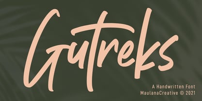 Gutreks is a handwritten feel font. With marker stroke, italic and fun character with a bit of ligatures. To give you an extra creative work. Gutreks font support multilingual more than 100+ language. This font is good for logo design, Social media, Movie Titles, Books Titles, a short text even a long text letter and good for your secondary text font with sans or serif. Make a stunning work with Gutreks font. Cheers, MaulanaCreative
 - Middle Thread by Maculinc,
$15.00 Middle Thread is a Script Font with a retro style. Soft curves are combined with high-contrast glyphs, conveying an attractive retro and vintage quality. This font consists of 4 Middle Thread Fonts Regular, Extrude, Swash and Swash Extrude, with many unique ligatures and alternatives provided. Great in layout design for quotes or body copy, best used as a display for posters, headings, logos, branding, magazines, product packaging, and a wide variety of things. Mix Regular and Swash to create a unique and very beautiful look, especially when you add the Extrude feature of the font, it really adds uniqueness and interest by looking even more amazing. What do you get: Middle Three Regular, Swash, Extrude and Swash Extrude OTF, this font is accessible in Adobe Illustrator, Adobe Photoshop, Adobe InDesign, it even works in Microsoft Word. Fully Encoded Characters are accessible without additional design software. Fonts include multilingual support. Images used : All photos/images/vectors used in the preview are excluded, for illustration purposes only. (www.vecteezy.com) Feel free to follow, like and share. thank you very much for checking my store!
 - Haigrast Serif by Mans Greback,
$59.00 Haigrast Serif is a font that combines classic and modern design elements to create a look that is both tasteful and fashion-forward. This serif font is regular but with a very modern feel, making it the perfect choice for designers looking to add a touch of sophistication to their work. The sharp, crisp lines and swash alternates in addition to the decorative letterings add a unique touch, making Haigrast Serif a versatile font that can be used in a variety of projects. Whether you're creating a stylish magazine layout, a cool fashion logo, or a balanced design piece, Haigrast Serif is the perfect font to make your work stand out. Designed by Mans Greback in 2023, this font is the perfect choice for designers who want to make a bold statement in their design work. The Haigrast Script family consists of six high-quality fonts: Regular, Italic, Bold, Bold Italic, Black and Black Italic The font is built with advanced OpenType functionality and has a guaranteed top-notch quality, containing stylistic and contextual alternates, ligatures and more features; all to give you full control and customizability. It has extensive lingual support, covering all Latin-based languages, from Northern Europe to South Africa, from America to South-East Asia. It contains all characters and symbols you'll ever need, including all punctuation and numbers.
 - P22 Hedonic by IHOF,
$24.95This 12-font family employs several unique features including a 2-part Chisel set which allows for the look of stone incised lettering. Hedonic has just a hint of a slab serif and even that is used so sparingly that it almost feels like a sans serif font. Its design does appear to be painfully simple but there are many interesting features including a selection of weights, small caps with old style numerals and display weights that make it very useful. And legible. Old style numerals are included with the small caps and italics. Also for display purposes are two "Chisel" fonts. Used together, set one on top of the other, they create a stylish 3D effect—ideal for logos and headlines or anything that needs a strong graphic punch. Hedonic may not be as eccentric as many fonts out there, but overall it is clean and legible with a few extra flourishes to stand out from the crowd! - Merona Island by Krismagraph,
$19.00 Merona Island is a Modern Ligature Serif Font. Its soft curves mixed with high contrast glyphs, give it a feminine and masculine quality. It comes with 107 unique ligatures and 45 alternates. Great in layout design for quotes or body copy, best used as a display for headings, logos, branding, magazines, product packaging, and invitations. Accessible in Adobe Illustrator, Adobe Photoshop, Adobe InDesign, and even work on Microsoft Word. PUA Encoded Characters – Fully accessible without additional design software. Fonts include multilingual support. Image used: All photographs/pictures/vectors used in the preview are not included, they are intended for illustration only. Feel free to follow, like, and share. Thanks so much for checking out my shop!
 - Madera by Monotype,
$57.99 Malou Verlomme designed Madera with graphic designers in mind – drawing on his decade of experience designing bespoke type to create a versatile, easy-to-use geometric sans serif that ticks off a long list of branding requirements. Its sharp apexes add some flavour to the design, which offers an honest, trustworthy tone of voice – but with a twist. “The design doesn’t go out of its way to attract attention, but is still very solid,” explains Verlomme. “It still has a fair amount of warmth and personality, in a very understated manner. If you’re a large corporation, with a typeface being used in many different environments, you want something that’s easy to use but can sustain such a large amount of visibility.” The Madera typeface family has 32 fonts: Upright, Condensed and Italics. Each typeface contains over 650 glyphs with extensive Western, Central and Eastern European language support. It also supports OpenType typographic features like alternatives, ligatures and fractions. Madera Variables are font files which are featuring two axis and have a preset instance from Hairline to Extra Black.
 - Habita Scenic by Mans Greback,
$59.00 Habita Scenic is the heavy and beautiful serif font that adds a touch of femininity and class to any project. Designed by Mans Greback in 2023, this font features high contrast and retro style, making it the perfect choice for designers looking to add a touch of cool to their work. With its beautiful swash letters, Habita Scenic is perfect for logos, headlines, and other creative projects. This font's classic and elegant design makes it an ideal choice for high-end brands and premium products. If you're looking for a font that exudes sophistication and timeless style, look no further than Habita Scenic. Use underscore _ anywhere to make a swash. Example: Love_Passion The Habita Scenic family consists of four high-quality fonts: Regular, Italic, Bold and Bold Italic The font is built with advanced OpenType functionality and has a guaranteed top-notch quality, containing stylistic and contextual alternates, ligatures and more features; all to give you full control and customizability. It has extensive lingual support, covering all Latin-based languages, from Northern Europe to South Africa, from America to South-East Asia. It contains all characters and symbols you'll ever need, including all punctuation and numbers.
 - Mantonico by Pepper Type,
$39.00 Mantonico is a soft and friendly serif type family with low x-height. Its slightly wide proportions and prominent terminals create a peculiar texture suitable for long reading. The style range encompasses 8 weights with corresponding italics. The italics themselves are designed for a specifically soft, almost fluid feel. The typeface features rich language support including Cyrillic and a wide range of OpenType options such as small capitals, numerous sets of digits and over 300 swashed characters.

