10,000 search results
(0.047 seconds)
- Somuch Fabrica by Allouse Studio,
$16.00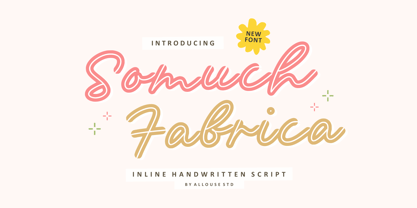 A Inline Handwritten Script. Somuch Fabrica is perfect for any titles, logo, product packaging, branding project, megazine, social media, wedding, or just used to express words above the background. Somuch Fabrica also come with Multi-Lingual Support. Enjoy the font, feel free to comment or feedback, send me PM or email. Thank You!
 - Welanger Kesley by madeDeduk,
$16.00 Introducing Welanger Kesley is a Display Sans, use this font for any branding, product packaging, invitation, quotes, label, poster, logo etc. Feature Uppercase & Lowercase Number & Symbol International Glyphs Multilingual support Alternative Ligature Feel free to drop us a message any time and follow my shop for upcoming updates Hope you enjoy it.
 - The Acres by Set Sail Studios,
$20.00 Introducing The Acres Font Duo - A luxury Sans & Serif all-caps font duo. Take away the painstaking search for the perfect font pair, as these typographic partners were made for each other. The Acres Serif is a wide, high contrast serif font, designed with high-end looking branding in mind. The Acres Sans is a simple, elegant sans font, designed to compliment the serif font as secondary text. Accessing Ligatures & Extras • The Acres Serif Also contains 33 specially designed ligatures (double and triple letter combinations), to give you extra customisability. These Standard Ligatures should switch automatically when using OpenType capable software. The font is all-caps, however the ligatures will only switch when typing in capitals (i.e. turning off caps-lock gives you a quick way of turning off ligatures). There are also raised small-caps for A,E,I,O,U, these can be accessed by turning on 'Stylistic Alternates', and simply typing each letter in capitals. All special characters can also be manually inputted via a Glyphs panel. Language Support • Both fonts the following languages; English, French, Italian, Spanish, Portuguese, German, Swedish, Norwegian, Danish, Dutch, Finnish, Indonesian, Malay, Hungarian, Polish, Croatian, Turkish, Romanian, Czech, Latvian, Lithuanian, Slovak, Slovenian
 - Miguity by Nathatype,
$29.00 Miguity is a display serif font in thick volumes designed to leave professional, formal, lovely impressions. This font’s character is the hook on the final corners of each letter. Plus, some of the letters show swinging wipes on their edges. It surely eases the eyes to explore the text to add its readability. Features: Ligatures Stylistic Sets Multilingual Supports PUA Encoded Numerals and Punctuations You can use Miguity on various designs, for example the posters, banners, logos, magazine covers, quotes, name cards, headings, printed products, merchandises: social media, and so on. Find out how to use this font by watching the font preview. Hopefully you have great experience using this font. Feel free to contact us if you require more information when you are experiencing a problem. Thank you. Happy designing.
 - Amiga by Volcano Type,
$19.00 The Amiga is a family of home computers originally developed by Amiga Corporation as an advanced game console. Development on the Amiga began in 1982. Commodore International introduced the machine to the market in 1985, after having bought Amiga Corp. The machine was ahead of its time, sporting a custom chipset with advanced graphics and sound capabilities, and a sophisticated multitasking operating system.
 - AT Move Nath! by André Toet Design,
$75.00 NATH !* Is a peculiar typeface. It’s design came by the fascination of Optical Illusions and 3D on a flat surface, like with Holborn and Powerplay. The typeface is named after a girlfriend of André Toet. *Made in the UK, 1974, London (Central School of Art & Design). (Redesigned 2013 by André Toet / Jasper Terra). Concept/Art Direction/Design: André Toet © 2017
 - Lippy Sans by Thinkdust,
$10.00 Lippy Sans is a brand new typeface designed to give a 100% lipstick feel. The reason the lipstick feel is so authentic is because the original sketches were actually drawn in lipstick, taken into illustrator, retraced and then edited carefully in fontlab. If you're after a lipstick typeface with an authentic feel, then Lippy Sans is the one for you.
 - Candombe Pro by Sudtipos,
$45.00 Prolific calligrapher Angel Koziupa and designer Alejandro Paul charm us once again with an imaginative typeface. Named after the Afro-Uruguayan drum-based rhythm, Camdombe conveys both a upbeat spirit and youthful joy. Its unique forms dance with each other, complementing their wild, brush-lettered origins. This inherent spontaneity makes it an ideal choice for signage, titles, and greeting cards.
 - Pony Tale Pro by Jonahfonts,
$45.00 Pony Tale Pro is a handwritten unconnected script face in eight styles: Light, Regular, Bold and Outline with Italics and Small-Caps. Very suitable for Packaging, Greeting cards, Magazines, Posters and Advertising Ads. A space after any lower-case glyph will produce the word terminal, invoking the OpenType/CONTEXTUAL ALTERNATIVE variant. (Opentype variants may only be accessible via Opentype-Aware applications.)
 - DeVinne by Linotype,
$29.99 DeVinne Ornamental is a display typeface from the famous Parisian typefoundry Deberny & Peignot, developed around 1900. Its style has become synonymous with the Art Noveau period, which was raging internationally when DeVinne Ornamental's letters were first drawn. The typeface is named after the renowned American printer Theodore Low DeVinne (1828-1914). Optimal uses for DeVinne Ornamental include headlines in magazines and newsletters.
 - Unnerving JNL by Jeff Levine,
$29.00 Unnerving JNL is a distorted/distressed version of Adhesive Serif Letters JNL (of which the original design was modeled after some vintage gummed letters used for signage). This new variant evokes a feeling of apprehension, dread or fear and can be applied to any project with a spooky or sinister theme. Unnerving JNL is available in both regular and oblique versions.
 - Bodoni Egyptian Pro by Shinntype,
$59.00 Beneath the dominant signifier of identity, a surprising dimension of Bodoni is revealed—its core architecture, stripped of the famous high contrast cloak. Further subverting typographic norms, a monoline of even width (in all but the heaviest weights) here describes capitals, lower case, and serifs. And yet a certain quaintness is evident; this is, after all, both deconstruction and historical fiction.
 - Linotype Markin by Linotype,
$29.99 Markin is named after the writing utensil with which it looks like it was drawn, the marker. Its even strokes display characteristics similar to those of a sans serif typeface, but the stroke endings with their typical handwritten look give Markin a personal touch. Extremely versatile, it is the perfect choice for any work where individuality and spontaneity are the emphasis.
 - Iowan Old Style by ParaType,
$30.00 Iowan Old Style was designed for Bitstream in 1990 by noted sign painter John Downer. Iowan Old Style is a hardy contemporary text design modeled after earlier revivals of Jenson and Griffo typefaces but with a larger x-height, tighter letterfit, and reproportioned capitals. Cyrillic letters were designed by Natalia Vasilyeva in 2016. Iowan Old Style Cyrillic was released by Paratype in 2017.
 - Eurydome by Emboss,
$30.00 Eurydome is one of Jupiter's many moons, and was named after Eurydome, the mother of the Graces in Greek mythology. Eurydome was inspired by the Grotesque face Venus, with an additional flair added to the lowercase a, b, d and g. Eurydome was designed to complement any display face that may be used in your project. Add grace to your layout, with Eurydome.
 - Olde Megrat NF by Nick's Fonts,
$10.00This rough-hewn offering is patterned after Antikva Margaret, designed by Zoltán Nagy for VGC in the mid-60s. Its energetic and, at times, eccentric letterforms make this face a perfect choice for headlines and subheads that will be noticed. Both versions include the complete Latin 1252, Central European 1250 and Turkish 1254 character sets, as well as localization for Moldovan and Romanian. - Kandidat by Fontroll,
$30.00 Imagine being printer in the early nineteenth century, your stock isn’t the finest, your lead characters are worn out: Voilá Kandidat Rough. But wait, Kandidat isn’t the usual scan-an-old-book,-put-the-glyphs-in-a-font-and-you’re-done-font. Kandidat Rough has a variety of whopping 14 alternates for most characters. Our algorithm changes the letters automatically. All you have to do is turn on Contextual Alternates in your layout app. The algorithm is the best we’ve seen so far, and it’s so good that even same words appear in different forms. And should by coincidence words have the same glyphs, just assign a different Style Set to the first letter, and all other letters in the word will change as well (well, it depends a bit on your software). The mechanism isn’t perfect and maybe we stretched OpenType capabilities a bit over the top, but we yet haven’t seen any better routine for switching letters on the fly. Is it worth to mention that Kandidat Rough not only speaks English, but also German, French, Spanish, Dutch, Danish, Norwegian, Swedish, Croatian, Turkish and most likely some other languages? Maybe. To be sure whether your language is supported, this is the typeset of all letters: ABCDEFGHIJKLMNOPQRSTUVWXYZÀÁÂÃÄÅÆÇÈÉÊËÌÍÎÏÑÒÓÔÕÖØÙÚÛÜÝĆČĐĞ݌ފŸŽ abcdefghijklmnopqrstuvwxyzàáâãäåæçèéêëìíîïñòóôõöøùúûüýÿćčđğıœşšž Apart from that we also included the following punctuation and currency symbols: !"#$%&'()*+,-./:;?@[\]_{|}¡©«®°±¶·»¿×–—‘’‚“”„†•…‹›⁄≠☞ €¢$£¥ This sums up to nearly 3000 glyphs per font, and we have three of them: Regular, Italic and Bold. All neatly kerned. All in all a great repertoire for even the most demanding book or advert jobs with a look of old times. And now imagine you are sick of the rugged print experience Kandidat Rough delivers: go for Kandidat. This is our Scotch-ish ancestor the Rough version was made from. A sturdy, friendly, round, warm friend from the beginning of the nineteenth century. A bit dark, maybe. You will like it. Kandidat has the aforementioned type set plus complete Baltics, Eastern Europe and Cyrillic. Plus a couple of gimmicks like fleurons, stars, circled numbers, arrows, and, and, and… Kandidat Regular additionally has small caps for Latin based scripts (not Cyrillic). The spick and span Kandidat font set also consists of Regular, Italic and Bold cuts. The bold cut is on the very bold side and can nicely be used for headings, whereas Italic is a great companion for Regular. It took us some time and trouble to finish this project, but after all we are very proud of our little feat and hope you will enjoy Kandidat as much as we do. Enjoy!
 - !CRASS ROOTS OFL - Unknown license

- Last Dance by Wing's Art Studio,
$10.00 Last Dance: Redux - The 80s Feel-Good Script Font - Updated! Welcome to Last Dance: Redux, a new and improved version of my popular brush-script font inspired by 80s movie posters, VHS covers and Friday nights at the video store! This hand-drawn script aims to capture the feel-good vibes of movie blockbusters that won our teenage imaginations, while serving as the go-to font for recreating this unique and nostalgic period. The original Last Dance font features a gritty, hand-drawn texture that looks equally at home on an aerobics competition poster or steamy urban thriller - making great titles that look distinctly cinematic. Last Dance: Redux takes that original design and strips it back to it’s bare essentials resulting in a clean, uniform look that improves letter flow and readability. It’s also much lighter on system resources making it the preferred choice when using extensively across print and web projects. Both versions come with upper and lowercase characters along with punctuation, numerals and language support, plus two full sets of alternatives and a selection of underlines. Check out the visuals to see it in action!
 - Rohyt Geometric by Typesketchbook,
$55.00 Rohyt Geometric is an altered modified from the form of the original Rohyt typeface. Designed to be more Corporate, the font family has flat terminals that harmonizes with sharp corners. With all of these features, “Rohyt Geometric” is a prominent, eye-catching and unique typeface. It comes with 8 weights with slim option in order to suit for a multifunctional usage, especially for cooperative work, such as website, magazine, editorial, publishing, as well as packaging.
 - Hyperloopa2104 by Andrew Tomson,
$10.00 Hello, friends! I recently bought myself an old game console, the SEGA Mega Drive 2. For a long time I couldn't understand why, when I was a kid, it seemed incredible to play it. Nowadays there are a lot of games with stunning graphics and realism, but still there is something warm and light in old games. Maybe it's just a memory of a carefree childhood. After playing it, I decided to create this font so that everyone could do something in the style of old games that an army of designers and programmers hadn't worked on yet. Good luck and love to you!
 - Script Typewriter Rough by Jeremia Adatte,
$19.00 Script Typewriter Rough from Jeremia Adatte Studio is the very first complete cursive typewriter font ever made after the original 1960 Smith-Corona Electra 210 typewriter that comes with a unique script typeface design. It’s loaded with more than 270 ligatures to avoid letter texture repetition in a word (switch Discretionary Ligatures on) and is extremely detailed to imitate the subtle letterpress effect you get with a real typewriter. During the typewriting era, only a few models came with this rare type style that was created to imitate hand-lettering to add more personality in a correspondence. You can send letters around the world in more than 80 languages!
 - Botanical Scribe by Three Islands Press,
$39.00 The Raphael of Flowers is what they called Pierre-Joseph Redouté a couple hundred years ago. The Belgian native became famous in France, where he painted floral watercolors for both Marie Antoinnette and Empress Josephine. But what cemented his legacy was his perfection of a stipple engraving technique that brought his art to the masses. Botanical Scribe is modeled after the neat, cursive hand-inscribed legends on these antique prints. Because it simulates handlettering, the font retains a warm, organic quality not seen in fancy modern scripts while remaining both elegant and legible. (Its many ligatures lends to this authenticity.) Good for formal invitations or historical simulations.
 - Mistral by URW Type Foundry,
$89.99 Named after the strong cold winds on Southern France, the Mistral font family is another original creation displaying the panache of the French graphic artist Roger Excoffon. Mistral is an informal script in which all letters link up in vigorous strokes. First issued in 1953, its brush-like stems look spontaneous and fresh. The descenders are fairly long and the whole alphabet has a distinctive and unforgettable effect on the page. Mistral is a good complement to sans serif typefaces. Mistral is a trademark of Heidelberger Druckmaschinen AG, which may be registered in certain jurisdictions, exclusively licensed through Linotype Library GmbH, a wholly owned subsidiary of Heidelberger Druckmaschinen AG.
 - Lisboa by Vanarchiv,
$35.00 This humanist sans-serif typeface was exhaustively designed, full-featured typeface family that reveals its character and distinctiveness in complex text. It features a large complement of ligatures, lining and old-style figures, expert characters, dingbats (arrows, brackets, and symbols for both Regular weights). In the original Lisboa Pro the forms of the letters are humanist, with hooked headterminals, the characters contains medium contrast with a left-angled stress on the strokes. After ten years from the first version publication, this new version (0.2) is available with Latin (Western, Central Europe) and Cyrillic alphabets. It was selected by Our Favorite Fonts of 2005 (Typographica).
 - Lisboa Sans by Vanarchiv,
$35.00 This humanist sans-serif typeface was exhaustively designed, full-featured typeface family that reveals its character and distinctiveness in complex settings. It features a large complement of ligatures, lining and old-style figures, expert characters, dingbats (arrows, brackets, and symbols for both Regular weights). Lisboa Sans lacks the hook-head terminals, but its structure and proportions are the same. The simplicity of the sans weight created very strong readability at small sizes. After ten years from the first version publication, this new version (0.2) is available with Latin (Western, Central Europe) and Cyrillic alphabets. It was selected by Our Favorite Fonts of 2005 (Typographica).
 - Saussa by Linotype,
$29.99Patricia Pothin-Roesch's Saussa typeface began life as brush-lettered artwork for fruit salad packaging in France. After the key letters had been painted, Patricia Pothin-Roesch switched to digital tools to create the final font. True to its roots, Saussa is a real advertising face, perfect for point-of-purchase displays. Even its name is consistent with its intended area of application: Saussa sounds a lot like the word “sauce.” Saussa is an informal script; its outstrokes function almost like serifs, and the capitals have a lowercase structure. The feelings this typeface conveys are due to the hand of its creator, Patricia Pothin-Roesch, an experienced brush-letterer. - Jet Jane by Ingrimayne Type,
$7.00 JetJane is a geometric sans-serif family. The family has two widths and each width has nine weights. Each of these 18 fonts comes with an accompanying italics version, giving the family a total of 36 members. JetJane, like other geometric sans faces, is plain, unadorned, and highly legible. It is derived from JetJaneMono, a monospaced sans-serif face. This development is unusual because one expects the monospaced variants to be created after the proportional variant, if a monospaced variant is even produced. This development history results in some distinctive differences between JetJane and two other geometric sans faces from IngrimayneType, AndrewAndreas and Yassitf.
 - Volupia by DSType,
$19.00I started designing Volupia in 2004 and the main goal was to create a very casual font with some characteristics than we can find in some old commercial advertisements. After designing the basic character set I decided to go OpenType because it would allow me to go deep into the script, correcting the balance of the spaces and the kerning, along with the possibility to create Ligatures and Swashes. The result is a typeface ideal for use in very big sizes. Volupia includes Small Caps, Ligatures, Fractions, CE Characters, Swashes and Alternates. The ligatures and the ending swashes allow the user to make the text more calligraphic and personal. - Bodoni Classic Pro by Wiescher Design,
$49.50 This is my new, completely worked over and fine-tuned Bodoni Classic for Europe (no Greek and Cyrillic). I have added a set of elegant Swashes (B) and 2 alternating uppercase swirly Initials (C) as well as two lowercase end-letters (D). The fonts A and B have extensive kerning, which the initials (C) don't need, they are aligned to replace the standard capital letter. The lowercase end-letters (D) are aligned to replace the standard lowercase letters, so you might need to add a blank after the swirl. For good measure I throw in an extra set of swings for 1 Dollar (E). Your Bodoni maniac, Gert Wiescher
 - Altmann Grotesk by Ateljé Altmann,
$50.00 Altman Grotesk was initially planned as an internal studio typeface for the graphic design studio Ateljé Altmann based in Stockholm, Sweden. After thoroughly researching both classic and contemporary sans serif typefaces, the aim for Altmann Grotesk was set at joining unobtrusiveness yet distinctiveness in one look. As a result, the sans serif successfully embraces a polarizing image of minimalism and uniqueness. During the design process of Altmann Grotesk, it soon became clear that it had the potential to be more than a studio typeface—which ultimately led to a sans serif font family with five distinctive weights that are perfected to fit every possible typography use case.
 - Scriptek by ITC,
$29.99 Scriptek was created by British designer David Quai in 1992, based on the constructivist forms which became popular after the First World War with the progressing industrialization in Moskow. Typefaces such as Scriptek were often used in the propaganda of totalitarian political systems and can still be seen on monuments like the central train station in Milan or political posters of the 1930s and 40s. The robust Scriptek has strong serifs in the upper left and lower right of characters and this, together with the diagonal strokes of many lower case letters, gives the font a dynamic feel. Scriptek is best used for headlines and display.
 - Whitenow by Proportional Lime,
$15.99 In the year 1528 Pierre Attaignant led a revolution in music printing. His method of once-press moveable type, greatly simplifying the original 3 impression process developed by Petrucci, remained in use till near the end of the 17th century. The method could only realize one line of music per staff, and the introduction of barlines as a common means of aligning multiple staves brought this method to a close after nearly two centuries of use. This font is meant to allow the printing of music using that method with the notation of that era. It is largely based on an exemplar printed by Snodham of London.
 - FS Lola by Fontsmith,
$80.00 L-O-L-A Like the subject of the Kinks’ song, FS Lola is a little bit of both – a font with a rare combination of masculine and feminine. The font was inspired by the song, which itself was inspired by the night the Kinks’ manager spent dancing drunkenly in a Soho club with a beautiful woman... Or so he’d thought, until her stubble started to show halfway through the evening. Masculine/feminin Phil Garnham’s experience in designing FS Lola was similar to the one related by Ray Davies. Setting out to create a sans serif font, he realised along the way that he was actually dealing with a semi-serif. He went with it, though, and produced a font with the best masculine and feminine qualities: hard edges and corners tempered by shapes of softness and generosity, the outcome of what Phil calls an “organic” design process. “Initially, my designs were very graphic and hard but not very distinctive. By printing and redrawing the letters in pencil I achieved a softer and friendlier alphabet with a strong personality.” Broad Lola, as you’d expect, is very broad-minded. Available in five weights with italics – and fluent in central European languages – FS Lola offers a confident combination of feminine softness and male steeliness to any kind of design. As the song says, “It’s a mixed-up, muddled-up, shook-up world... except for Lola.
 - Beardstown by Swell Type,
$15.00 Beardstown is solid, hardworking & no-nonsense. It may be a little gritty & rough around the edges, but it can also be open, warm and welcoming. Beardstown is a little Midwestern town on a river with a town square where you can buy comic books from a spinner rack at the front of the drugstore and read 'em with a root beer float from the soda counter in the back. The Beardstown font is perfect for t-shirts, sports graphics, beer cans, trading cards, carnival posters and record albums. But that’s it. I mean, you could use it on foofy hipster stuff like organic produce, vegan meat substitutes, electric car accessories or mountain bike parts, but you risk Beardstown coming over there to kick your butt. Features: three versions of each letter and two versions of each number automatically rotate for authentic print texture thirteen catchwords (like "and" "of" "for" & "the") accessible in Discretionary Ligatures support for 223 languages including Western & Central Europe, Vietnamese & Cyrillic
 - Boho by Latinotype,
$39.00 Boho is inspired by a bohemian girl who is a free soul and creative spirit. She is a city girl, but she loves spending a lot of time outdoors and being close to nature. She loves art and going to the antiques and organic food markets. She is a wild and free spirit who knows no bounds. Boho is Coto Mendoza’s first Script font family, which is based on gestual calligraphy with Cola pen. A first exposure to gestual strokes applied to font design can be seen in her previous work, Macarons. Boho consists of 4 subfamilies: Script, Line, Sans and Serif. Each subfamily comes in 4 weights: Regular, Bold, Italic and Bold Italic. Script and Line versions include a teardrop terminal variant. Dingbats and ornaments are also included. Boho. Love and creative spirit!
 - Strak by Kustomtype,
$25.00 Strak is a font that was born out of admiration for the work of E. Vermeulen, a Belgian artist known for his tight, precise line and an unseen masterpiece that is spread around the world. He has published and exhibited his work in London, Liverpool, Angoulême, New York, Geneva, Amsterdam, Lyon and Turku (in Finland) and he even signed for the New York Times. Based on a few characters, a complete font was composed by Kustomtype. After a few sketches, Strak came to life. The name Strak, in this case, refers to the slender, beautiful woman with the correct waistlines and proportions. The font is designed this way; it is completely hand-drawn, digitized and can be used in all modern and graphic media. Strak is available in 8 different styles, has class and will make many people's mouth water when they see it on your designs. Do you want quality and style? Then Strak is the font-perfect solution!
 - Sign Letters JNL by Jeff Levine,
$29.00 A few scant examples of some condensed Roman style water-applied decals inspired Sign Letters JNL. The decals were once part of the gold and black "Signmaker" letters and numbers once manufactured by the Duro Decal Company of Chicago and were sold through hardware and variety stores across the country. The condensed letters (which were eight inches in height) did not sell as well as Duro's mainstay sizes of 1/2 inch to 3-1/2 inches and were discontinued long before the rest of the line was supplanted by self-adhesive lettering.
 - HWT Geometric by Hamilton Wood Type Collection,
$24.94 This late 19th century design conjures up early 20th century Dutch DeStijl lettering with a mostly strict adherence to right angles and minimal stroke modulation. Geometric began its life as a metal typeface from the Central Type Foundry, circa 1884. Soon after, this design was officially licensed to Morgans & Wilcox and was shown in their 1890 catalog in Regular, Light and Condensed Light variations. After acquiring Morgans & Wilcox, Hamilton Manufacturing offered Geometric Light Face Condensed as their own No 3020 and the Geometric Light Face as No 3021. HWT Geometric has been expanded digitally to include a Regular Condensed version. A heavier wood type specimen was found from an unknown manufacturer and digitized as it was found, resulting in the HWT Geometric Shopworn and Shopworn Inked variations. These digital versions all include a full Western and Central European character set of over 380 glyphs.
 - Fleischmann Gotisch PT by preussTYPE,
$29.00 Johann Michael Fleischmann was born June 15th, 1707 in Wöhrd near Nuremberg. After attending Latinschool he started an apprenticeship as punchcutter in the crafts enterprise of Konstantin Hartwig in Nuremberg, which ought to last six years. For his extraordinary talent Fleischmann completed his apprenticeship after four and a half years, which was very unusual. 1727 his years of travel (very common in these days) began, during which he perfected his handcraft by working in different enterprises as journeyman. First location was Frankfurt/Main where he worked for nearly a year at the renowned type foundery of Luther and Egenolff. Passing Mainz he continued to Holland, where he arrived in November 1728 and stayed till he died in 1768. In Amsterdam he worked for several type founderies, among others some weeks for Izaak van der Putte; in The Hague for Hermanus Uytwerf. Between 1729 and 1732 he created several exquisite alphabets for Uytwerf, which were published under his own name (after his move to Holland Fleischmann abandoned the second n in his name), apparently following the stream of the time. After the two years with Uytwerf, Fleischmann returned to Amsterdam, where he established his own buiseness as punchcutter; following an advice of the bookkeeper and printer from Basel Rudolf Wetstein he opened his own type foundery 1732, which he sold in 1735 to Wetstein for financial reasons. In the following Fleischmann created several types and matrices exclusively for Wetstein. In 1743 after the type foundery was sold by Wetstein’s son Hendrik Floris to the upcoming enterprise of Izaak and Johannes Enschedé, Fleischmann worked as independent punchcutter mostly for this house in Haarlem. Recognizing his exceptional skills soon Fleischmann was consigned to cutting the difficult small-sized font types. The corresponding titling alphabets were mostly done by Jaques-Francois Rosart, who also cut the main part of the ornaments and borders used in the font examples of Enschedé. Fleischmann created for Enschedé numerous fonts. The font example published 1768 by Enschedé contains 3 titling alphabets, 16 antiquacuts, 14 italic cuts, 13 textura- and 2 scriptcuts, 2 greek typesets (upper cases and ligatures), 1 arabic, 1 malayan and 7 armenian font systems, 5 sets of musicnotes and the poliphonian musicnotesystem by Fleischmann. In total he brought into being about 100 alphabets - the fruits of fourty years of creative work as a punchcutter. Fleischmann died May 27th, 1768 at the age of 61. For a long time he was thought one of the leading punchcutters in Europe. A tragedy, that his creating fell into the turning of baroque to classicism. The following generations could not take much pleasure in his imaginative fonts, which were more connected to the sensuous baroque than to the bare rationalism of the upcoming industrialisation. Unfortunately therefore his masterpieces did not survive the 19th century and person and work of Fleischmann sank into oblivion. The impressive re-interpretation of the Fleischmann Antiqua and the corresponding italics by Erhard Kaiser from Leipzig, which were done for the Dutch Type Library from 1993 to 1997, snatched Fleischmann away from being forgotten by history. Therefore we want to place strong emphasis on this beautiful font. Fleischman Gotisch The other fonts by Fleischmann are only known to a small circle of connoisseurs and enthusiasts. So far they are not available in adequat quality for modern systems. Same applies the "Fleischman Gotisch", which has been made available cross platform to modern typeset-systems as CFF Open Type font through the presented sample. The Fleischman Gotisch has been proved to be one of the fonts, on which Fleischmann spent a good deal of his best effort; this font simply was near to his heart. Between 1744 and 1762 he created 13 different sizes of this font. All follow the same principles of forms, but their richness of details has been adapted to the particular sizes. In later times the font was modified more or less sensitive by various type founderies; letters were added, changed to current taste or replaced by others; so that nowadays a unique and binding mastercopy of this font is missing. Likewise the name of the font underwent several changes. Fleischmann himself probably never named his font, as he did with none of his fonts. By Enschedé this textura was named Nederduits, later on Nederduitsch. When the font was offered by the german type foundery Flinsch in Frankfurt/Main, the more convenient name of Fleischmann-Gotisch was chosen. In his "Masterbook of the font" and his "Abstract about the Et-character" Jan Tschichold refered to it as "Duyts" again. To honour the genious of Johann Michael Fleischmann we decided to name the writing "Fleischmann Gotisch PT" (unhyphenated). Developing the digital Fleischman Gotisch I decided not to use one of the thirteen sizes as binding mastercopy, but corresponding to the typical ductus of the font to re-create an independent use of forms strongly based on Fleischmann´s language of forms. All ascenders and descenders were standardised. Some characters, identified as added later on, were eliminated (especially the round lower case-R and several versions of longs- respectively f-ligatures) and others were adjusted to the principles of Fleischmann. Where indicated the diverse characters were integrated as alternative. They can be selected in the corresponding menu. All for the correct german black letter necessary longs and other ligatures were generated. Through the according integration into the feature-code about 85% of all ligatures in the type can be generated automatically. Problematic combinations (Fl, Fk, Fh, ll, lh, lk, lb) were created as ligatures and are likewise constructed automatically. A historically interesting letter is the "round r", which was already designated by Fleischmann; it is used after preceding round letters. Likewise interesting is the inventive form of the &-character, which is mentioned by Tschichold in his corresponding abstract. Nevertheless despite all interpretation it was very important to me to maintain the utmost fidelity to the original. With this digital version of a phantastic texturfont of the late baroque I hope to contribute to a blossoming of interest for this genious master of his kind: Johann Michel Fleischmann. OpenType features: - Unicode (ISO 10646-2) - contains 520 glyphes - Basic Latin - Latin-1 Supplement - Latin Extended-A - Latin Extended-B - Central European Glyhps - Ornaments - Fractions - Standard ligatures - Discretionary ligatures - Historical ligatures - Kerning-Table
