10,000 search results
(0.06 seconds)
- Stonefloral by Allouse Studio,
$16.00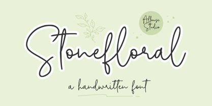 Proudly Presenting, Stonefloral A Handwritten Font. Stonefloral is perfect for any titles, logo, product packaging, branding project, megazine, social media, wedding, or just used to express words above the background. Stonefloral also come with Multi-Lingual Support. Enjoy the font, feel free to comment or feedback, send me PM or email. Thank You!
 - Bankai by Allouse Studio,
$16.00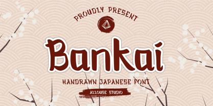 Bankai a Handdrawn Japanese Font. Bankai is perfect for any tittles, logo, product packaging, branding project, megazine, social media, wedding, or just used to express words above the background. Bankai also come with Multi-Lingual Support. Enjoy the font, feel free to comment or feedback, send me PM or email. Thank You!
 - Fiery Art by Hatftype,
$15.00 A graffiti display font with free style font that has the characteristics of street art that shows freedom and is filled with unique characters. Feature : * Symbol * Number * Punctuation * Multilingual support * Support in Mac and Windows OS * Support in design application (photoshop, illustrator, and more) * Upper Case I really hope you enjoy it.
 - Youth Richfield by Allouse Studio,
$16.00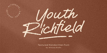 Proudly Presenting, Youth Richfield a Textured Handwritten Font. Youth Richfield is perfect for product packaging, branding project, megazine, social media, wedding, or just used to express words above the background. Youth Richfield also come with MultiLingual Support. Enjoy the font, feel free to comment or feedback, send me PM or email. Thank You!
 - Milan Midnight by Hatftype,
$15.00 A graffiti display font with free style font that has the characteristics of street art that shows freedom and is filled with unique characters. Feature : * Symbol * Number * Punctuation * Multilingual support * Support in Mac and Windows OS * Support in design applications (photoshop, illustrator, and more) - All Caps I really hope you enjoy it.
 - Moresticks by Allouse Studio,
$16.00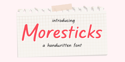 Proudly Presenting, Moresticks A Handwritten Font. Moresticks is perfect for any titles, logo, product packaging, branding project, megazine, social media, wedding, or just used to express words above the background. Moresticks also come with Multi-Lingual Support. Enjoy the font, feel free to comment or feedback, send me PM or email. Thank You!
 - Herojuana by Allouse Studio,
$16.00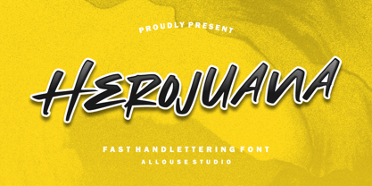 Herojuana a Fast Handlettering Font. Herojuana is perfect for any tittles, logo, product packaging, branding project, megazine, social media, wedding, or just used to express words above the background. Herojuana also come with Multi-Lingual Support. Enjoy the font, feel free to comment or feedback, send me PM or email. Thank you!
 - Adelaique by Allouse Studio,
$16.00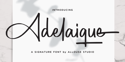 Proudly Presenting, Adelaique A Signature Font. Adelaique is perfect for any titles, logo, product packaging, branding project, megazine, social media, wedding, or just used to express words above the background. Adelaique also come with Multi-Lingual Support. Enjoy the font, feel free to comment or feedback, send me PM or email. Thank You!
 - Uhudscript by Allouse Studio,
$16.00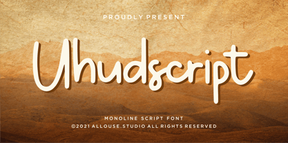 Uhudscript a Monoline Script Font. Uhudscript is perfect for any titles, logo, product packaging, branding project, megazine, social media, wedding, or just used to express words above the background. Uhudscript also come with Multi-Lingual Support. Enjoy the font, feel free to comment or feedback, send me PM or email. Thank You!
 - Todorra Pellito by madeDeduk,
$12.00 Todorra Pellito is a cute font with a matching script and regular and will makes this font suitable for your any project design. Feature Uppercase & Lowercase Number & Symbol International Glyphs Multilingual support ligature Feel free to drop us a message any time and follow my shop for upcoming updates Hope you enjoy it.
 - Painters Display by limitype,
$20.00 Painters Display is a font with a brutal style but still modern and fun, inspired by paint splashes and scratches, suitable for your fun, free and cool designs, This font can be applied at large sizes for optimal results such as headlines, posters, banners, etc. Painters display available with Allcaps, Symbol & Number
 - Mickeybow by Allouse Studio,
$16.00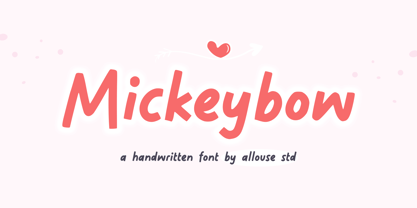 Proudly Presenting, Mickeybow A Handwritten Font. Mickeybow is perfect for any titles, logo, product packaging, branding project, megazine, social media, wedding, or just used to express words above the background. Mickeybow also come with Multi-Lingual Support. Enjoy the font, feel free to comment or feedback, send me PM or email. Thank You!
 - Milespink by Allouse Studio,
$16.00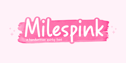 Proudly Presenting, Milespink A Quirky Handwritten Font Milespink is perfect for any titles, logo, product packaging, branding project, megazine, social media, wedding, or just used to express words above the background. Milespink come with Multi-Lingual Support. Enjoy the font, feel free to comment or feedback, send me PM or email. Thank You!
 - Brodychild by Allouse Studio,
$16.00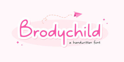 Proudly Presenting, Brodychild A Handwritten Font. Brodychild is perfect for any titles, logo, product packaging, branding project, megazine, social media, wedding, or just used to express words above the background. Brodychild also come with Multi-Lingual Support. Enjoy the font, feel free to comment or feedback, send me PM or email. Thank You!
 - Shallifronthe by Allouse Studio,
$16.00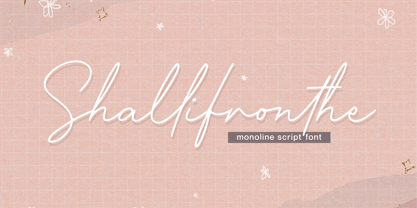 Proudly Presenting, Shallifronthe A Monoline Script Font. Shallifronthe is perfect any titles, logo, product packaging, branding project, magazine, social media, wedding, or just used to express words above the background. Shallifronthe also come with Multi-Lingual Support. Enjoy the font, feel free to comment or feedback, send me PM or email. Thank You!
 - Clothingside by Qwrtype Foundry,
$14.00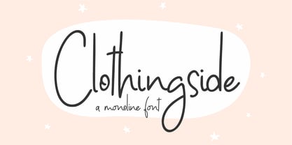 Proudly Present, Clothingside Clothingside is a Lovely Handwritten Font Clothingside perfect for product packaging, branding project, megazine, social media, wedding, or just used to express words above the background. Clothingside also come with Multi-Lingual Support. Enjoy the font, feel free to comment or feedback, send me PM or email. Thank you!
 - Orleymore by Allouse Studio,
$16.00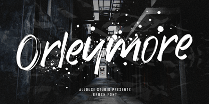 Proudly Presenting, Orleymore a Cool Brush Font. Orleymore is perfect for any titles, logo, product packaging, branding project, megazine, social media, wedding, or just used to express words above the background. Orleymore come with Multi-Lingual Support. Enjoy the font, feel free to comment or feedback, send me PM or email. Thank You!
 - Amorfatti by Allouse Studio,
$16.00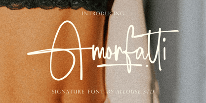 Proudly Presenting, Amorfatti A Signature Font. Amorfatti is perfect for any titles, logo, product packaging, branding project, megazine, social media, wedding, or just used to express words above the background. Amorfatti also come with Multi-Lingual Support. Enjoy the font, feel free to comment or feedback, send me PM or email. Thank You!
 - Joynoted by Allouse Studio,
$16.00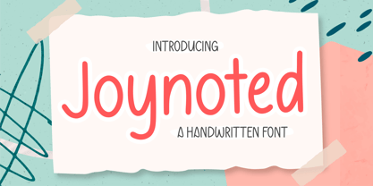 Proudly Presenting, Joynoted a Handwritten Font Joynoted is perfect for any titles, logo, product packaging, branding project, megazine, social media, wedding, or just used to express words above the background. Joynoted also come with Multi-Lingual Support. Enjoy the font, feel free to comment or feedback, send me PM or email. Thank You!
 - Moonlily by Allouse Studio,
$16.00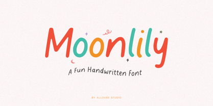 Moonlily a Fun Handwritten Font. Moonlily is perfect for any titles, logo, product packaging, branding project, megazine, social media, wedding, or just used to express words above the background. Moonlily also come with Multi-Lingual Support. Enjoy the font, feel free to comment or feedback, send me PM or email. Thank You!
 - Garyford by Martype co,
$20.00 GARYFORD VINTAGE SERIF FONT --- Garyford is a Serif font designed with carefully handcrafted. Also suitable for branding, T-shirt, Classic Design, Logotype, and any project. Comes with a tons of ligature and alternates make your life more than comofortable, easier to design and free stress. Multilingual Support, support many different languages 20+ .
 - Westbum by Allouse Studio,
$16.00 Proudly Presenting, Westbum A Bold Handbrush Font. Westbum is perfect for any titles, logo, product packaging, branding project, megazine, social media, wedding, or just used to express words above the background. Westbum also come with Multi-Lingual Support. Enjoy the font, feel free to comment or feedback, send me PM or email.
 - Timegoing by Allouse Studio,
$16.00 Proudly Presenting, Timegoing a Graffiti Street Font. Timegoing is perfect for any titles, logo, product packaging, branding project, megazine, social media, wedding, or just used to express words above the background. Timegoing come with Multi-Lingual Support. Enjoy the font, feel free to comment or feedback, send me PM or email. Thank You!
 - Knuckleball by Bebop Font Foundry,
$25.00 Knuckleball is a wonky, octagonal sans-serif typeface produced by Bebop Font Foundry in 2023. The font shares its name with the elusive knuckleball - a baseball term for a pitch that is thrown without spin. The throw is erratic and unpredictable due to the airflow over the motionless seams. The strange and unexpected letterforms of the font represent the pitch's movement. Knuckleball is ideal for logos, branding, and merchandise.
 - Mrs Bathhurst by Nick's Fonts,
$10.00One in the series of fonts celebrating the halcyon days of handlettering. Mrs. Bathhurst is based on an alphabet from 1916, prepared by Fred G. Cooper. Warm, endearing, and a little quirky, Mrs. B will brighten up any occasion. Both versions of this font contain the complete Unicode Latin A character complement, with support for the Afrikaans, Albanian, Basque, Bosnian, Breton, Catalan, Croatian, Czech, Danish, Dutch, English, Esperanto, Estonian, Faroese, Fijian, Finnish, Flemish, French, Frisian, German, Greenlandic, Hawaiian, Hungarian, Icelandic, Indonesian, Irish, Italian, Latin, Latvian, Lithuanian, Malay, Maltese, Maori, Moldavan, Norwegian, Polish, Portuguese, Provençal, Rhaeto-Romanic, Romanian, Romany, Sámi, Samoan, Scottish Gaelic, Serbian, Slovak, Slovenian, Spanish, Swahili, Swedish, Tagalog, Turkish and Welsh languages, as well as discretionary ligatures and extended fractions. - Matahari Sans by Studio Sun,
$36.00 Matahari (English : Sun) is the power source of life. The symbol of power and energy that synergies with other part of daily lives. It is one of the most fundamental thing us humans need, just like communication. And like Matahari itself, words are powerful enough to make a living. Referring to Grotesque Font and influenced by the works of Eric Gill, Matahari Typeface is available in 3 widths and 7 weights, also in Oblique version in each font. The font uses oldstyle and transitional letters (double-story ‘a’ and ‘g’). It has a humanist gesture, the thickness of the font is semi-monolinear where the horizontal and vertical size is almost equal, making the font reach its maximum optical readability even in small sizes. The font anatomy refers to the basic geometric square-sized of the letter ‘M’, while the letters of S/C/G/c/e have uneven curve shape which give the sense of humanist and flexibility. This typeface is ideal for various design needs, from Printing to On-Screen/Digital Reading, from Brand Identity, Posters, Caption, Headline, to Body Text. With the numbers of widths available, the font can be used for all kinds of purposes (Label, Signage, Packaging, Website, etc). Supported well over 75+ languages, including Greek & Cyrillic, Matahari Typeface will give you an excellent way in aesthetic communication and message-delivering.
 - Grinko by Grontype,
$14.00 Grinko is a new unique decorative san serif font, created with bold and equal stroke all around with sharp edges that provide strong and straight feeling. This font extend some ligature and alternative glyphs to give you optional choices in creating typography projects. Grinko font is perfect for branding design, logotype, logo tagline, flyer header, magazine title, or even short quote for layouting ideas. Grinko features:
 - Yanice by Viaction Type.Co,
$20.00 Yanice is a semi-condensed sans serif font that has a strong and subtle character. Perfect for modern & industrial themed designs. Yanice is available in 4 styles that you can use according to your needs. Get the Yanice font now at a great price to speed up your work. Feature Font : Standard Ligature Multilingual Support Symbol & Punctuation I hope you enjoy and thank you. Viaction Type
 - Hidetoshy by Zamjump,
$13.00 Hidetoshy is a free-spirited brush font that's perfect for adding a very imperfect handwritten touch to your projects! Great for styling quotes, creating beautiful logos, album cover designs, magazines, signage, social media, blog posts, packaging, and much more! Fresh, fun, free-spirited hydetoshy + handmade with lots of love for your beautiful projects. • Hidetoshy Brush Fonts - Uppercase, lowercase, numbers, symbols, punctuation and multilingual support. • Multilingual Support - Multilingual Support is included for the following languages: English, Cornish, Danish, Dutch, Estonian, Faroe, Filipino, Finnish, French, Friulian, Galician, German, Swiss German, Gusii, Icelandic, Indonesian, Irish, Italian, Kabuverdianu, Kalenjin, Kinyarwanda, Luo, Luxembourg, Malay, Norwegian Bokmål, Norwegian Nynorsk, Portuguese, Romansh, Scottish Gaelic, Spanish, Swedish. Enjoy!
 - Hostrange by Ditatype,
$29.00 Hostrange is a captivating handwritten font that brings a touch of authenticity and personality to your designs. With its brush-style letterforms and varying brush stroke thicknesses, this typeface captures the essence of handcrafted charm. The special feature of this handwriting lies in its dynamic brush stroke variations, where each letter showcases a range of thicknesses. This adds a sense of organic movement and visual interest to the font, mimicking the natural variations found in hand-drawn brush calligraphy. The result is a font that feels alive and full of character. The brush strokes create a natural and flowing appearance, as if they were crafted by hand with a brush. The varying thicknesses add depth and dimension, enhancing the font's authenticity and handcrafted feel. The letterforms of Hostrange strike a balance between legibility and artistic expression. While each letter maintains its distinctive shape, the varying brush stroke thicknesses bring a sense of uniqueness to each character. Features: Alternates Ligatures Multilingual Supports PUA Encoded Numerals and Punctuations Hostrange fits in headlines, logos, posters, invitations, packaging, branding materials, or any project that calls for a handwritten aesthetic. Find out more ways to use this font by taking a look at the font preview. Thanks for purchasing our fonts. Hopefully, you have a great time using our font. Feel free to contact us anytime for further information or when you have trouble with the font. Thanks a lot and happy designing.
 - Hollistic by Gatype,
$14.00 Hollistic is a sweet, versatile, unique and flexible handwritten font. Warm, jovial and compromise. This font will turn any of your project ideas into anything true works of art! This font is PUA encoded which means you can access all of the glyphs and swashes with ease! These fonts include: OTF files. Displayed fonts: Uppercase, Lowercase, Numbers, Symbols, Accents, Styles, Swashes and Ligatures also Multilingual Support Enjoy the font, feel free to comment or feedback, send me a PM or email. Thank You!
 - Radiant Kingdom by Timurtype,
$14.00 Introduced by Timurtype Studio! Radiant Kingdom is a Quotable Handwritten Font This font enhances your words with a font that is not just handwritten but also a charming masterpiece. Each stroke weaves a story of intrigue, making each quote a journey through the art of expression. Quotable and irresistible – let your writing leave an indelible mark. Radiant Kingdom Font also supports multilingualism. Enhance your designs with our original fonts, feel free to comment or provide feedback, Enjoy the fonts 😊 Thank You
 - Bully Pulpit Plain NF by Nick's Fonts,
$10.00 This engaging headline face is based on a rather pudgy typeface named “Bullion Shadow”, which was originally released somewhere on the cusp between the hippie and disco eras, and was equally at home in both. Now available in shaded and plain. Both versions of this font support the Latin 1252, Central European 1250, Turkish 1254 and Baltic 1257 codepages.
 - Poster Linear by Jehansyah,
$9.00 Poster Linear Natural sans serif font is simple but looks very futuristic and very stylish, it adds to your confidence to make your designs look bolder and modern. Perfect for stickers, media posts, social media statuses, magazines, books, covers, game covers, banners, wall magazines, sports shades, and more, plus a few families you can incorporate into your designs.
 - Record Store Stencil by Ian Farnam,
$10.00 Record Store Stencil is based on classic stencil lettering from the first half of the 20th century. The font features Upper and lowercase, small caps, in upright, italic, and backslant. The font's multipart letterforms are ideal for color application. Available are two color variations, Black with Red accents and Blue with Red accents, with cycling activated through contextual alternates.
 - Outspace Fighter by Ditatype,
$29.00 Outspace Fighter is an electrifying game-themed display font designed in uppercase, capturing the essence of futuristic space battles. This font is made in boxy shapes with sharp corners, evoking a sense of strength and precision. Each uppercase letter is meticulously crafted to exude a futuristic aesthetic, mirroring the angular and geometric forms found in the vast expanse of outer space. This design choice gives the font a sleek and modern appeal, perfect for conveying the intensity of space battles. With low-contrast letters, this font places emphasis on the overall form and structure of the font. The subtle differences in stroke width create a balanced and unified visual experience. This design choice ensures legibility while maintaining a cohesive and visually appealing composition, allowing your audience to effortlessly engage with your game-themed designs. You can also enjoy the available features here. Features: Stylistic Sets Multilingual Supports PUA Encoded Numerals and Punctuations Outspace Fighter fits in headlines, logos, posters, titles, branding materials, print media, editorial layouts, website headers, and any other projects. Find out more ways to use this font by taking a look at the font preview. Thanks for purchasing our fonts. Hopefully, you have a great time using our font. Feel free to contact us anytime for further information or when you have trouble with the font. Thanks a lot and happy designing.
 - Thurbrooke by Greater Albion Typefounders,
$18.50 Thurbrooke is an early 20th century inspired display family, offering two sizes of Roman capitals. Five typefaces are offered in the Thurbrooke family. The Regular face is shaded in horizontally engraved lines and suggests something of vintage advertising captions. A reversed 'Reverso' face, transposing black and white space is offered, as is a 'Black' face with solid letterforms. The remaining two faces are a bit more specialised. Thurbrooke 'Banner' is the latest in our popular line of masthead or cartouche faces-very impressive for banner headings. Thurbrooke Initials is a set of initial capitals, which blend in perfectly with Thurbrooke Reverso, or which also make splendid drop capitals. Why not explore some (or all) of the elements of the Thurbrooke family today, and introduce some early 20th century inspired colour to your work?
 - Salome by Canada Type,
$24.95 Salome is a revival, normalization and elaborate expansion of a 1972 film face called Cantini. The original film type, released by a tiny independent outfit called Letter Graphics, looked like it was hand drawn with little consideration for consistency in essential lettering flow measurements, like angles, stroke widths, and vertical metrics. All these issues have been resolved in this digital version, and the original character set, including the whole lot of alternates, was entirely redrawn and expanded to include even more alternates and many useful ligatures, as well as extended support for Latin-based languages. Combining elements of early 20th century art nouveau with common 1960s and 1970s signage and poster lettering flair, Salome uses curls and curves to wave its fantastic shapes in a most hypnotic dance. Salome simply cannot be unseen. Just like its namesake, the female seduction icon, it does not hesitate to put all of its natural beauty and energy on display in order to get what it wants. Salome comes in all popular font formats. The OpenType version, Salome Pro, combines the main font with the alternates one, and contains convenient features for push-button alternation and ligature substitution in supporting software programs.
 - Macahe by Rômulo Gobira,
$10.00 Macahe is a modern slab serif with dynamic and irregular shapes. It comes with 7 weights, 3 widths and matching (true) italics. The typeface was inspired and name after the city I was born (Macaé-RJ, Brazil), turning the mixture between nature/beach life and the chaotic urban growth into typography. The options (weight, width and true italics) make the font useful both for web and print in multiple occasions; think websites, posters, logos, signage, packaging and etc. Macahe covers multiple languages, including a wide range of Latin and some Cyrillic languages. It also includes a full range of numerals (included old style figures, numerators, denominators), small caps, standard & discretionary ligatures and stylistic alternates. Those features and variations make Macahe a useful tool for any graphic designer.
 - Big Sur by Mysterylab,
$11.00 Big Sur is a six-width slab serif font family with a unique look. At first glance, it is clearly in the tradition of old west style alphabets, with its chunky top and bottom strokes and serifs. But it also features a whimsical vibe in the curvy and pointed flourishes, the wavy baseline, and the swash terminals on many of the glyphs. It's a true standout with unique identifiers, and is bound to grab the eye as something new and different; yet it's traditional enough to establish a solid Western or vintage Americana style. Great for rodeo, county or state fairs, saloons, pubs & taverns, cowboy gear, and even vintage psychedelic posters.