10,000 search results
(0.269 seconds)
- Tea Dance by Studio K,
$45.00 If you think nostalgia isn't what it used to be, this will change your mind. A ritzy new font family from Studio K that will transport you back to the era of afternoon tea dances performed to the strains of the Palm Court Orchestra or the Bath Pump Room Quartet: a celebration of the golden age of dance from Busby Berkeley to Fred Astaire and Ginger Rogers. Enjoy!
 - Elisabetha by Unitype Studio,
$29.00 Introducing the "Elizabeth Font" – an exquisite typographical masterpiece that gracefully bridges the realms of modernity and classic elegance. With each letter crafted as if by the stroke of a calligrapher's quill, this font exudes an air of refined sophistication that captivates the eye and enchants the mind. This font comes with a lot of language support, this font is perfect for you. Thanks for purchase and I hope you enjoy it!
 - Pastel Palooza by Putracetol,
$20.00 Pastel Palooza - Quirky Easter Display Font, a delightful and playful typeface designed with the joyous spirit of Easter in mind. This fun and decorative font captures the essence of the holiday, making it the perfect choice for Easter-themed projects. Crafted with care, Pastel Palooza features a total of 10 font variations within the typeface, each reflecting the whimsical elements of the season - from eggs and bunnies to flowers and carrots.
 - Petite Fleur by Wiescher Design,
$39.50 Petite Fleur is a combination of engraved, flowery embellishments and the Capitals of my redesigned Royal Romain (Romain du Roi), the exclusive font of King Louis XIV. It is best used as initials only, but can be mixed with Royal Romain. On the keys for ≥ and ≤ I designed two filler embellishments and the ciphers 0-9 are embellished as well. Enjoy! Your designer of beautiful fonts, Gert Wiescher
 - Gloriana by Scriptorium,
$12.00Gloriana is based on hand lettered titles from an old fairy tale book. The illustrator isn't credited, and we had to create and modify a lot of characters, but we preserved the interesting personality of the original lettering. In creating Gloriana the popularity of Folkard was kept very much in mind, so it has some of the same features, including special flourished characters accessed with the option/alt key. - Brigitte Eigner by Creativework Studio,
$14.00 Brigitte Eigner is a beautiful handwritten font with a natural feel. Fall in love with its authentic feel and use it to create gorgeous wedding invitations, beautiful stationary art, eye-catching social media posts, and cute greeting cards.
 - Marcellia by Rockboys Studio,
$23.00 The Athallia is a lovely calligraphy font. It comes with amazing alternates and is a mixture from copperplate calligraphy with hand-lettering styles. It was designed to covey elegance and has an attractive, smooth, clean, feminine, sensual style.
 - Summer Vibrant by Sakha Design,
$10.00 Summer Vibrant is an exquisite handwritten font, masterfully designed to become a true favorite. It maintains its classy calligraphic influences while feeling contemporary and fresh. Fall in love with it and bring your projects to the highest levels!
 - Gracelyn by Sipanji21,
$10.00 Gracelyn is a whimsical script font with a relaxed theme, featuring a lovely style. No matter the topic, this font will be an incredibly asset to your fonts’ library, as it has the potential to elevate any creation.
 - Christmas Memories by Ake,
$12.00 Christmas Memories is a beautiful, well balanced and stylish script font. It is defined by smooth curves and is perfect for fashion branding or editorial designs. Add it confidently to your projects, and you will love the results.
 - Honey Island by Sakha Design,
$10.00 Honey Island is an exquisite handwritten font, masterfully designed to become a true favorite. It maintains its classy calligraphic influences while feeling contemporary and fresh. Fall in love with it and bring your projects to the !highest levels
 - Gheamarker by Sipanji21,
$15.00 Gheamarker is a Natural Handwritten font with a relaxed theme, featuring a lovely style. No matter the topic, this font will be an incredibly asset to your fonts’ library, as it has the potential to elevate any creation.
 - Sonita by HansCo,
$15.00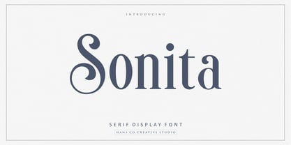 Sonita is an elegant serif display font designed with lovely circle tails to create a classy feeling. It perfectly represents a classic yet modern style. This font is perfect for elegant logo design, packaging or invitation cards. Enjoy!
 - Run Child by Figuree Studio,
$18.00 Say hello to Run Child font. Made with love and joy. Comic look, so it will make your design more beautiful, cute, fun and colorful. Features: Character Set Numerals and Punctuation (OpenType Standard) Accents (Multilingual characters) PUA Encode
 - Yellow Sunflower by Nissa Nana,
$26.00 Yellow Sunflower is an exquisite handwritten font, masterfully designed to become a true favorite. It maintains its classy calligraphic influences while feeling contemporary and fresh. Fall in love with it and bring your projects to the highest levels!
 - Fairy by Cocodesign,
$10.00 Fairy is an exquisite handwritten script font, masterfully designed to become a true favorite. It maintains its classy calligraphic influences while feeling contemporary and fresh. Fall in love with it and bring your projects to the highest levels!
 - Brillia Calligraphy by AEN Creative Studio,
$12.00 Brillia is a sweet modern calligraphy, soft hand-lettered handwritten font. Fall in love with its authentic feel and use it to create gorgeous wedding invitations, beautiful stationary art, eye-catching social media posts, and cute greeting cards.
 - Wonderful Today by Subectype,
$16.00 Wonderful Today is a Whimsical Display font, described by a Cute style touch, perfect for your favorite projects. Fall in love with its incredibly distinct and timeless style and use it to create spectacular designs! Thank You, Subectype
 - Valiety by Din Studio,
$25.00 Valiety is a serif font family to better charm your designing experiences. It consists of eight different levels to add elegant, modern touches to your designs. Valiety has a continuity aspect produced from each small stroke in order to help the eyes smoothly move from one letter to another. Besides, the thickness differences are unnoticeable so that it leaves stable, legible impressions. With such flexibility, you can use it in either bigger- or smaller-sized texts. Include 8 different weight fonts : Valiety Hairline Valiety Thin Valiety Extra Light Valiety Light Valiety Regular Valiety Medium Valiety Semi Bold Valiety Bold Features: Multilingual Supports PUA Encoded Numerals and Punctuation Valiety is best for any design projects, such as posters, banners, logos, book covers, invitations, quotes, headings, printed products, merchandise, social media, etc. Find out more ways to use this font by taking a look at the font preview. Thank you for purchasing our font and happy designing.
 - Candu by Dora Typefoundry,
$17.00 Candu is a strong bold sans serif, with solid lines, paired with bold yet soft rounding. Opium will turn any creative idea into your true work of art! It's perfect for logotypes, signage, branding, apparel, posters, social media, headlines, titles, large format prints and more. FEATURES: 4 Font weight Uppercase & Lowercase Alternative Numbers & Punctuation Characters with accents Supports Multiple Languages This type of family has been the work of real love, making it as easy and enjoyable as possible. I really hope you enjoy it!
 - Brandon Printed by HVD Fonts,
$25.00 Brandon Printed is based on the famous Brandon Grotesque typeface. It has an eroded, printed look with variations of every letter by using different styles. With several different styles like a shadowed version, an inline version and a double printed version you can create a lot of lovely combinations. The Brandon Printed package also contains a set with 95 Extras like arrows, catchwords, stars, emblems numbers & lines. Brandon Printed has a high level of detail, so it may process more slowly in some applications.
 - Castine by Three Islands Press,
$29.00 There's a cemetery in Castine, Maine, a lovely coastal town perhaps best known for Maine Maritime Academy and a surviving crop of stately old American elms, with headstones dating back into the 18th century -- the standard old headstone shape, often topped by winged skulls. Thanks to a local historical society volunteer, I got my hands on a couple rubbings; these show a particular style of stonecarving that proved captivating to the point of typeface design. Castine has a full character set in both roman and italic styles.
 - Chatterbox by Comicraft,
$49.00 Have you seen that new font from Comicraft it's lovely isn't it all soft and spongy it fair warms the cockles of me heart Mrs Robinson at number forty three she has one she got it down at the store on the corner you know the Indian convenience open all night my Albert gets his Heineken down there late of an evening and you know what I saw all manner of strange people down there last week super heroes I think they were Blimey!
 - Spring LP by LetterPerfect,
$39.00 Spring is a lively contemporary script that designer Garrett Boge modeled after his own brush lettering. It was released in 1988 at the launch of LetterPerfect's font collection, and has seen increasing use in advertising, packaging, and point-of-display promotions.
 - Magisk Time by Bogstav,
$11.00 This is my roughly handprinted typewrite-ish font. It has all the cool and classic moves of the traditional typewriter look, but with a more rough attitude due to the contextual alternates (which offer 6 different versions of each letter!)
 - Blue Point by Solotype,
$19.95We began with the Victorian font Dotted, so-called because the counters of many of the letters contained a dot. We knocked out the dots, added a lowercase, and voila! a more useful type than the original without losing its charm. - Gik by Serebryakov,
$39.00 Gik is sans serif font family with modular aesthetic and the elegance of contemporary typography. Its compositional and plastic solution combines echoes of (de)constructivism, brutalism, de Stijl and other manifestations of 20th century antiquity + techniques characteristic of italics. But this does not make the font old-fashioned — on the contrary, it helps to understand how to use it. Gik is a product of the metamodernism era — it is on the border between modernist enthusiasm and postmodernist mockery, between simplicity and awareness, wholeness and cleavage, clarity and ambiguity — a kind of conceptual oxymoron. Looking at Gik, you could imagine it at Fashion Week, if there was one for typography. Gik has a message for both the designer and the viewer, it stimulates the imagination, it is the anthology of all fonts of the future.
 - Caplosy by Craft Supply Co,
$20.00 Caplosy – Trippy Font is a font that transcends the boundaries of conventional typography, drawing inspiration from the mesmerizing world of psychedelia. Its letterforms twist and twirl in a captivating dance, inviting you to explore a typographic realm that’s equal parts strange and spellbinding. This font is your passport to the extraordinary, a choice that says “ordinary” is simply not an option. Whether you’re designing album covers, posters, or any creative endeavor that craves a mind-bending twist, Caplosy adds a touch of mystique and magic. Its unconventional, serpentine design transports viewers into a realm of altered perception, where the typography itself becomes a hypnotic journey. Caplosy is like a wormhole into a trippy, surreal dimension within the world of fonts. It’s the ideal choice for projects that want to challenge reality, creating a visually tantalizing, thought-provoking experience that’s nothing short of an artistic adventure. Choose Caplosy when you’re ready to take your design on a mind-bending trip through the extraordinary.
 - Yes Dear by HiH,
$8.00 Yes Dear is a hopefully humorous acknowledgement that men and women communicate differently — one of those Mars-Venus things. Women tend to talk about their feelings. Men hide in the cave. It sounds funny, but it can have serious consequences in people’s lives and their relationships. T. D. Jakes deals with the subject effectively in his DVD, He-Motions. We guys need to find our way out of the cave. Our women need to recognize what is going on and gently help us emerge from the cave. Men and women were certainly never meant to be identical, but it would be useful if we could learn to communicate our feelings in more healthy and effective ways. Yes Dear has a full character set, including accented caps. Two empty frames are provided at positions 135 & 137. The Gallery includes a PDF file showing some text and the full character set and a JPG looking out from the cave. A lot going on outside the cave. Be sure and take a look.
 - Cedi by Typogama,
$25.99 The Cedi Typeface is a single weight display font that is based on the fluid handwritten style of a work colleague. This design is a fast flowing script that is both lively and original yet equally legible due to it's defined letterforms and open forms. Despite working well in a regular format, during the design process I started to look at ligatures as a solution for solving some problematic combinations. However, this small implementation soon got vastly expanded as I started to focus on the rythm of the letterforms and how best to convey the hand drawn feature in the design. A common problem in most script fonts is the repeating letterforms that would be particularily un-natural for this manual typeface, therefore hinting at it's digital source. The ligature concept soon evolved into over 2400 ligatures, trying to cover all repeating glyphs as well as finding more harmious combiations. This design was created for use in short text settings and use at large point sizes suiting titles, screen use or logo designs.
 - exotica - Unknown license

- Ziggy Zoe - Unknown license

- Space Up Yer Life - Unknown license

- Mimbie by Cultivated Mind,
$20.00 A quirky handwritten headline font with doodley artwork by Cultivated Mind. This font collection includes three weights (Regular, SemiBold, and Bold).
 - Stampact by Spark Creative,
$39.00 This is a woodblock, printed, distressed, 'stamped' kinda font. It jumps all over the place, with no respect for the baseline.
 - Affair by Sudtipos,
$99.00 Type designers are crazy people. Not crazy in the sense that they think we are Napoleon, but in the sense that the sky can be falling, wars tearing the world apart, disasters splitting the very ground we walk on, plagues circling continents to pick victims randomly, yet we will still perform our ever optimistic task of making some little spot of the world more appealing to the human eye. We ought to be proud of ourselves, I believe. Optimism is hard to come by these days. Regardless of our own personal reasons for doing what we do, the very thing we do is in itself an act of optimism and belief in the inherent beauty that exists within humanity. As recently as ten years ago, I wouldn't have been able to choose the amazing obscure profession I now have, wouldn't have been able to be humbled by the history that falls into my hands and slides in front of my eyes every day, wouldn't have been able to live and work across previously impenetrable cultural lines as I do now, and wouldn't have been able to raise my glass of Malbeck wine to toast every type designer who was before me, is with me, and will be after me. As recently as ten years ago, I wouldn't have been able to mean these words as I wrote them: It’s a small world. Yes, it is a small world, and a wonderfully complex one too. With so much information drowning our senses by the minute, it has become difficult to find clear meaning in almost anything. Something throughout the day is bound to make us feel even smaller in this small world. Most of us find comfort in a routine. Some of us find extended families. But in the end we are all Eleanor Rigbys, lonely on the inside and waiting for a miracle to come. If a miracle can make the world small, another one can perhaps give us meaning. And sometimes a miracle happens for a split second, then gets buried until a crazy type designer finds it. I was on my honeymoon in New York City when I first stumbled upon the letters that eventually started this Affair. A simple, content tourist walking down the streets formerly unknown to me except through pop music and film references. Browsing the shops of the city that made Bob Dylan, Lou Reed, and a thousand other artists. Trying to chase away the tourist mentality, wondering what it would be like to actually live in the city of a billion tiny lights. Tourists don't go to libraries in foreign cities. So I walked into one. Two hours later I wasn't in New York anymore. I wasn't anywhere substantial. I was the crazy type designer at the apex of insanity. La La Land, alphabet heaven, curves and twirls and loops and swashes, ribbons and bows and naked letters. I'm probably not the very first person on this planet to be seduced into starting an Affair while on his honeymoon, but it is something to tease my better half about once in a while. To this day I can't decide if I actually found the worn book, or if the book itself called for me. Its spine was nothing special, sitting on a shelf, tightly flanked by similar spines on either side. Yet it was the only one I picked off that shelf. And I looked at only one page in it before walking to the photocopier and cheating it with an Argentine coin, since I didn't have the American quarter it wanted. That was the beginning. I am now writing this after the Affair is over. And it was an Affair to remember, to pull a phrase. Right now, long after I have drawn and digitized and tested this alphabet, and long after I saw what some of this generation’s type designers saw in it, I have the luxury to speculate on what Affair really is, what made me begin and finish it, what cultural expressions it has, and so on. But in all honesty it wasn't like that. Much like in my Ministry Script experience, I was a driven man, a lover walking the ledge, an infatuated student following the instructions of his teacher while seeing her as a perfect angel. I am not exaggerating when I say that the letters themselves told me how to extend them. I was exploited by an alphabet, and it felt great. Unlike my experience with Ministry Script, where the objective was to push the technology to its limits, this Affair felt like the most natural and casual sequence of processions in the world – my hand following the grid, the grid following what my hand had already done – a circle of creation contained in one square computer cell, then doing it all over again. By contrast, it was the lousiest feeling in the world when I finally reached the conclusion that the Affair was done. What would I do now? Would any commitment I make from now on constitute a betrayal of these past precious months? I'm largely over all that now, of course. I like to think I'm a better man now because of the experience. Affair is an enormous, intricately calligraphic OpenType font based on a 9x9 photocopy of a page from a 1950s lettering book. In any calligraphic font, the global parameters for developing the characters are usually quite volatile and hard to pin down, but in this case it was particularly difficult because the photocopy was too gray and the letters were of different sizes, very intertwined and scan-impossible. So finishing the first few characters in order to establish the global rhythm was quite a long process, after which the work became a unique soothing, numbing routine by which I will always remember this Affair. The result of all the work, at least to the eyes of this crazy designer, is 1950s American lettering with a very Argentine wrapper. My Affair is infused with the spirit of filete, dulce de leche, yerba mate, and Carlos Gardel. Upon finishing the font I was fortunate enough that a few of my colleagues, great type designers and probably much saner than I am, agreed to show me how they envision my Affair in action. The beauty they showed me makes me feel small and yearn for the world to be even smaller now – at least small enough so that my international colleagues and I can meet and exchange stories over a good parrilla. These people, whose kindness is very deserving of my gratitude, and whose beautiful art is very deserving of your appreciation, are in no particular order: Corey Holms, Mariano Lopez Hiriart, Xavier Dupré, Alejandro Ros, Rebecca Alaccari, Laura Meseguer, Neil Summerour, Eduardo Manso, and the Doma group. You can see how they envisioned using Affair in the section of this booklet entitled A Foreign Affair. The rest of this booklet contains all the obligatory technical details that should come with a font this massive. I hope this Affair can bring you as much peace and satisfaction as it brought me, and I hope it can help your imagination soar like mine did when I was doing my duty for beauty.
 - Shameless by Positype,
$79.00 I will spare you the long-winded description this time and all of the motivations and witty innuendoes. Quite frankly, I forgot about creating this typeface and it sat on my hard drive for almost a year. Luckily, my daughter Isobel saw the initial drawings one day and ask me about those pretty letters and I remembered… yep, that happened. That said, time made this a better typeface… with fresh eyes and time, much was redrawn, retooled and expanded to something I truly enjoy playing with. Shameless makes extensive use of Contextual alternates to create a proper ebb and flow from letter to letter. Interestingly, there are only a handful of ligatures… instead many special combinations are accounted for solely by relying on Contextual Alts. Mix in Stylistic Alts, Swashes, responsive Titling Alts, numerous Style Sets, etc and you can have a lot of fun. I created 2 versions. A ‘Standard’ version that has 2200+ characters and a ‘Deluxe’ version that has 2400+ characters and an interesting caveat… I plan on expanding the Deluxe version any time I have an idea to add to the typeface… and as such, buyers will receive all of those updates at no charge (with updates going directly to the distributors). You get what you pay for… no insane discounts. Oh, and if you are wondering… Shameless is based on my handwriting using Kuretake Zig CocoIro pens. I love these pens.
 - Bluebottle by Greater Albion Typefounders,
$14.50 Bluebottle is a lively fun family of typefaces, a boisterous fun design, BLuebottle brings a distinctive cheerful character where ever it's used. Use Bluebottle to bring life and fun wherever you will.
 - Linotype Dinosaures by Linotype,
$29.99This font is a must for dinosaur lovers, as it brings back to life a variety of these huge reptiles. Besides figures of complete dinosaurs there are also a number of 'portraits' and poses. A creative combination of dinosaur figures allows the depiction of various situations, fighting, eating, etc. Have fun! - Soliloquous by Comicraft,
$49.00 Talking to yourself out loud? Jabbering? Muttering? Wittering away on some flight of fancy? Why not? Why wait to get compliments from someone else? If you deserve them, pat yourself on the back, give yourself a good pep talk! Create a dialogue with yourself so that you can hear what you're thinking! Whether you’re living on your own or living with others, you’re always living with yourself and you can always be there FOR yourself with a cheerful word of wisdom or two hundred. So, help yourself yourself with Soliloquous! You won't feel alone without it. But please, remember to be respectful and try not to hurt your own feelings. And shut up when you hear yourself tell yourself that’s enough. See the families related to Soliloquous: Monologous .


