10,000 search results
(0.054 seconds)
- Pea Alesa - Unknown license

- Pea Courtney - Personal use only

- Bosque Line by Asenbayu,
$15.00 Bosque Line is a condensed display font that has an attractive appearance that brings you to a modern urban feel. Inspired by the long exposure of tree trunks in forest, Bosque line letters are designed with tall and clean shapes. Alternate and ligature features are available to make your work more attractive. It's perfect for your projects such as: posters, logos, book covers, social media posts and many more. Thank you!
 - Shelflife by Aah Yes,
$6.95 Shelflife is a display typeface with some extras under the lid. It features all the Standard Open-Type features you'd expect, like Class Kerning and Ligatures, plus some other useful additions and of course accented characters for most European languages and others. In essence it's an easy-to-read headline font with clean lines and a bit of character. There's an outline version that can be layered with the standard version to give the shadow effect seen in the accompanying graphics, simplicity itself to do. There's boxed headlines for SALE, SPECIAL, DISCOUNT (20 in total) all ready-made, plus some which can be tilted at an angle, and done automatically - just easily typed in; easy-to-do bullet numbers; a choice of square or rounded dots on j,ffi, and so on in Stylistic Alternatives; and shorter alternatives for U and N with accents. Details are included in the zip files. The zip file will contain both the OTF and TTF versions of the font. Install only one version, either the OTF or TTF, but not both - otherwise you will get all sorts of incompatibility issues and problems.
 - Lumios Marker by My Creative Land,
$29.99 Lumios is a freehand casual marker script that was created using Pilot Sign Pen. It has both extended Latin and basic Cyrillic support that is enhanced with oodles of ligatures (latin as well as cyrillic) and alternates. As a compliment to the script I also created Lumios Design Elements font that can be useful in brand design, greeting cards design etc. Both fonts were carefully traced by hand and have clean edges, hence they are safe to use in all graphic design software (including but not limited to Adobe Suite, Silhouette and Cricut Design, Affinity Designer etc) as well as on websites. The script is fully unicode mapped. To use it in Silhouette and similar applications that do not support OpenType features (yet), you may need to use your default Mac/Windows software such as Font Book or Character Map to select alternates you need. Lumios Marker is a perfect companion to Lumios Typewriter, sharing the same soft curves and clean letter edges.
 - Nakilla by Nurrontype,
$14.00 Hello, i'm Nakilla, a contrast, yet beautiful display serif font. In some vocal both in uppercase and lowercase, my designer made some tweak alternate to give me modern feeling, along with ligature, it would make your next project outstanding. You can see me in action, kindly swipe my preview image. I can be headline, i can be body, my Uppercase lookin cool right ? Modern, classic and minimalist. I'm ready for your next project, buy me now. Peace out!, Nakilla.
 - Elegancia Romantica - Personal use only

- Xanas Wedding by Pedro Teixeira,
$9.00 This font family has derived from a lettering creation for my wedding stationery. One of the most significant momentos for me and my wife Xana (hence the font name - Xanas Wedding). I hope this typography can give a touch of informal elegance and discreet beauty to your projects. There can be multiple applications, since this font is flexible enough to appear as a custom text or a variable, organic, handwritten work. Designed by Pedro Alexandre Teixeira
 - Beau's Varsity by Beau Williamson,
$4.99 I designed this font a few years ago to address a direct problem. My work demanded small paragraphs of text to be screenprinted in a varsity font style. The house varsity was rather uneven and created small blobs of ink at sharp angles when printed. I designed Beau's Varsity to address both of these problems. The new font eliminated the blobbing, and I like to think my original design is a step up in evenness from the other options.
 - Pineapple Daydream by Hanoded,
$15.00 I bought a pineapple the other day, because my kids really like pineapples. Ok, ok, it may not sound like something special to you - but keep in mind that pineapples in Holland are an expensive fruit. We mostly get the canned ones (which I don’t like too much). Anyway, when I was slicing up the pineapple, I thought I should name a font after this bizarre, but tasty, fruit. And so I did. Pineapple Daydream is a handmade serif. I am not sure how to classify it, but I am sure you’ll figure that out. Comes with a plantation of diacritics.
 - Roller Hesoon by TypeClassHeroes,
$16.00 Retro and refined you can explore and combine creating rhythm for comfortable reading. Roller Hesoon supports more than 100 Latin-based languages and has extensive Cyrillic and Greek support for languages like Russian, Bulgarian, Ukrainian, and many more. Feature Uppercase & Lowercase Number & Symbol International Glyphs Multilingual support Alternative Ligature Cyrillic & Greek Feel free to drop us a message any time and follow my shop for upcoming updates. Hope you enjoy it.
 - NailsNStaples by Ingrimayne Type,
$14.95 In NailsNStaples the letters are made up of nails and staples. (The staples are not the staples one uses to join paper, but the kind one hammers into wood.) It is not often that one needs a typeface made of nails and staples, but if one does, there is a font for that.
 - Quant by Hoftype,
$49.00 Quant is a contrasted typeface with a fresh and well-reasoned appearance. It owes allegiance to classical structure but is a free design and does not refer to any historical model. Although it has strong qualities as a reading type, its distinct and powerful ductus makes it superb for headlines and in display sizes. Quant is well-equipped for ambitious typography. The Quant family consists of 8 styles, comes in OpenType format with extended language support for more than 40 languages. All weights contain small caps, proportional lining figures, tabular lining figures, proportional old style figures, lining old style figures, matching currency symbols, fraction and scientific numerals.
 - Areplos by Storm Type Foundry,
$53.00To design a text typeface "at the top with, at the bottom without" serifs was an idea which crossed my mind at the end of the sixties. I started from the fact that what one reads in the Latin alphabet is mainly the upper half of the letters, where good distinguishableness of the individual signs, and therefore, also good legibility, is aided by serifs. The first tests of the design, by which I checked up whether the basic principle could be used also for the then current technology of setting - for double-sign matrices -, were carried out in 1970. During the first half of the seventies I created first the basic design, then also the slanted Roman and the medium types. These drawings were not very successful. My greatest concern during this initial phase was the upper case A. I had to design it in such a way that the basic principle should be adhered to and the new alphabet, at the same time, should not look too complicated. The necessary prerequisite for a design of a new alphabet for double-sign matrices, i.e. to draw each letter of all the three fonts to the same width, did not agree with this typeface. What came to the greatest harm were the two styles used for emphasis: the italics even more than the medium type. That is why I fundamentally remodelled the basic design in 1980. In the course of this work I tried to forget about the previous technological limitations and to respect only the requirements then placed on typefaces intended for photosetting. As a matter of fact, this was not very difficult; this typeface was from the very beginning conceived in such a way as to have a large x-height of lower-case letters and upper serifs that could be joined without any problems in condensed setting. I gave much more thought to the proportional relations of the individual letters, the continuity of their outer and inner silhouettes, than to the requirements of their production. The greatest number of problems arose in the colour balancing of the individual signs, as it was necessary to achieve that the upper half of each letter should have a visual counterbalance in its lower, simpler half. Specifically, this meant to find the correct shape and degree of thickening of the lower parts of the letters. These had to counterbalance the upper parts of the letters emphasized by serifs, yet they should not look too romantic or decorative, for otherwise the typeface might lose its sober character. Also the shape, length and thickness of the upper serifs had to be resolved differently than in the previous design. In the seventies and at the beginning of the eighties a typeface conceived in this way, let alone one intended for setting of common texts in magazines and books, was to all intents and purposes an experiment with an uncertain end. At this time, before typographic postmodernism, it was not the custom to abandon in such typefaces the clear-cut formal categories, let alone to attempt to combine the serif and sans serif principles in a single design. I had already designed the basic, starting, alphabets of lower case and upper case letters with the intention to derive further styles from them, differing in colour and proportions. These fonts were not to serve merely for emphasis in the context of the basic design, but were to function, especially the bold versions, also as independent display alphabets. At this stage of my work it was, for a change, the upper case L that presented the greatest problem. Its lower left part had to counterbalance the symmetrical two-sided serif in the upper half of the letter. The ITC Company submitted this design to text tests, which, in their view, were successful. The director of this company Aaron Burns then invited me to add further styles, in order to create an entire, extensive typeface family. At that time, without the possibility to use a computer and given my other considerable workload, this was a task I could not manage. I tried to come back to this, by then already very large project, several times, but every time some other, at the moment very urgent, work diverted me from it. At the beginning of the nineties several alphabets appeared which were based on the same principle. It seemed to me that to continue working on my semi-finished designs was pointless. They were, therefore, abandoned until the spring of 2005, when František Štorm digitalized the basic design. František gave the typeface the working title Areplos and this name stuck. Then he made me add small capitals and the entire bold type, inducing me at the same time to consider what to do with the italics in order that they might be at least a little italic in character, and not merely slanted Roman alphabets, as was my original intention. In the course of the subsequent summer holidays, when the weather was bad, we met in his little cottage in South Bohemia, between two ponds, and resuscitated this more than twenty-five-years-old typeface. It was like this: We were drinking good tea, František worked on the computer, added accents and some remaining signs, inclined and interpolated, while I was looking over his shoulder. There is hardly any typeface that originated in a more harmonious setting. Solpera, summer 2005 I first encountered this typeface at the exhibition of Contemporary Czech Type Design in 1982. It was there, in the Portheim Summer Palace in Prague, that I, at the age of sixteen, decided to become a typographer. Having no knowledge about the technologies, the rules of construction of an alphabet or about cultural connections, I perceived Jan Solpera's typeface as the acme of excellence. Now, many years after, replete with experience of revitalization of typefaces of both living and deceased Czech type designers, I am able to compare their differing approaches. Jan Solpera put up a fight against the digital technology and exerted creative pressure to counteract my rather loose approach. Jan prepared dozens of fresh pencil drawings on thin sketching paper in which he elaborated in detail all the style-creating elements of the alphabet. I can say with full responsibility that I have never worked on anything as meticulous as the design of the Areplos typeface. I did not invent this name; it is the name of Jan Solpera's miniature publishing house, in which he issued for example an enchanting series of memoirs of a certain shopkeeper of Jindrichuv Hradec. The idea that the publishing house and the typeface might have the same name crossed my mind instinctively as a symbol of the original designation of Areplos - to serve for text setting. What you can see here originated in Trebon and in a cottage outside the village of Domanín - I even wanted to rename my firm to The Trebon Type Foundry. When mists enfold the pond and gloom pervades one's soul, the so-called typographic weather sets in - the time to sit, peer at the monitor and click the mouse, as also our students who were present would attest. Areplos is reminiscent of the essential inspirational period of a whole generation of Czech type designers - of the seventies and eighties, which were, however, at the same time the incubation period of my generation. I believe that this typeface will be received favourably, for it represents the better aspect of the eighties. Today, at the time when the infection by ITC typefaces has not been quite cured yet, it does absolutely no harm to remind ourselves of the high quality and timeless typefaces designed then in this country.In technical terms, this family consists of two times four OpenType designs, with five types of figures, ligatures and small capitals as well as an extensive assortment of both eastern and western diacritics. I can see as a basic text typeface of smaller periodicals and informative job-prints, a typeface usable for posters and programmes of various events, but also for corporate identity. Štorm, summer 2005 - Abort Mission by PizzaDude.dk,
$12.00 This is the kind of letters I drew in school back in the 1980ies. I would never have guessed that I would do the same thing like 40 years later! I remember making a simple space game for my VIC-20 computer, and I needed some "data letters" (as I called it) - as far as I can remember, this is close to what I made 40-like years ago. Also, I was inspired by the well known series "Stranger Things" - you know, all that 80ies theme stuff took me down memory lane! :) Anyway, all the letters are handdrawn, using a squared paper as guide - at it may look simple, but it took me quite some time to finish this font (hence the name!)
 - Signatires by Din Studio,
$29.00 Are you looking for a unique signature font to show your style? We have the right signature font for you. This is the Signatires, our signature font to help you create a visually amazing signature. This font is carefully designed to express elegant, dazzling characters which also helps you deliver your messages easily. Signatires’ contrast is high with swinging end wipes. Furthermore, its legibility is so great that it is suitable to apply for any text sizes. You can enjoy the available features here as well. Features: Stylistic Sets Ligatures Multilingual Supports PUA Encoded Numerals and Punctuations Signatires fits best for various design projects, such as brandings, posters, banners, greeting cards, magazine covers, quotes, printed products, merchandise, social media, etc. Find out more ways to use this font by taking a look at the font preview. Thanks for purchasing our fonts. Hopefully, you have a great time using our font. Feel free to contact us anytime for further information or when you have trouble with the font. Thanks a lot and happy designing.
 - Schramberg by Runsell Type,
$19.00 Schramberg is a new typeface inspired by vintage labels and combining with modern design. This font come with sans serif. Schramberg features with stylistic alternate, contextual alternate and stylistic set. This font come with script and match your vintage design, t-shirt, logo, labels, badges, posters and etc. To access the alternate glyphs, you need a program that supports OpenType features such as Adobe Illustrator CS, Adobe Photoshop CC, Adobe Indesign and Corel Draw. If you have any question please do not hesitate to contact me. Happy creating! Runsell Studio - Magelang - Indonesia
 - Public Figure by Hanoded,
$15.00 During the Covid pandemic, I noticed that a lot of public figures (politicians, actors, influencers and even kings and princesses) had to apologise for not following the social distance rules, the lockdown rules or the 'stay at home' rules. They threw parties, went on holidays abroad and - in general - made a nuisance of themselves. When I finished this font, I decided to call it Public Figure! Public Figure is quite a neat, handmade font. It doesn't stick to the rules (but does like to keep up appearances), likes to party (but manages to stay safe) and brightens up your work (without being too gaudy). Public Figure comes with two alternate sets for the lower case glyphs (that cycle as you type) and a massive amount of diacritics, including Vietnamese.
 - Ongunkan Greek Hollow Script by Runic World Tamgacı,
$75.00 I added the hollow model of the font he developed by taking an example from the ancient Greek inscriptions found in Turkey to my fonts. Use it in good works.
 - Adieu by Hackberry Font Foundry,
$24.95 Adieu is an old-fashioned display font traced and modified from a group of Victorian fonts. It is very stylized, but it is very attractive to many of my clients.
 - Quiet Night by PizzaDude.dk,
$20.00 Quiet Night is my scribbled art deco font. Despite it's slightly jumpy and rough apperance, the font is super legible - even at smaller sizes. Comes with ligatures for double letters.
 - Soft Time by PizzaDude.dk,
$18.00 Soft Time is an updated and cleaner version of my popular font Soft Lime. Soft Time has kept the bold and happy look that came with Soft Lime.Caps only fonts
 - Blowfish by Robert Petrick,
$19.95 Blowfish is an easy to set, easy to read, font. It is one of my most popular fonts. Good for anything, Print & Digital Media Bold Headlines, Product & Pagkaging, Websites etc.
 - Morven by Flawlessandco,
$9.00 Morven is a modern serif font with a classic and elegant typeface. This versatile font is perfect for a variety of design projects, from branding and advertising to editorial layouts and more. An Original typeface that suitable for any graphic designs such as branding materials, t-shirt, print, business cards, logo, poster, t-shirt, photography, quotes .etc This font support for some multilingual. Modern Sweet Retro that contains uppercase A-Z and lowercase a-z, alternate character, numbers 0-9, and some punctuation. If you need help, just write me! Thanks so much for checking out my shop!
 - Marvina by Flawlessandco,
$9.00 Marvina is a handwritten Script Font that made with a classy style in each character, this style gives a feel of elegant font type. There's some connected letters and some alternates that suitable for any graphic designs such as branding materials, t-shirt, print, business cards, logo, poster, t-shirt, photography, quotes .etc This font support for some multilingual. Also contains uppercase A-Z and lowercase a-z, alternate character, numbers 0-9, and some punctuation. for more license, you can check in flawlessand.co If you need help, just write me! Thanks so much for checking out my shop!
 - Sagira by Flawlessandco,
$9.00 Introducing "Sagira" - A Retro Display Font. Travel back in time with "Sagira," a nostalgic retro display font that pays homage to the past, complete with charming wavy line details that evoke a sense of vintage flair. There's some connected letters and some alternates that suitable for any graphic designs such as branding materials, t-shirt, print, business cards, logo, poster, t-shirt, photography, quotes .etc This font support for some multilingual. Also contains uppercase A-Z and lowercase a-z, alternate character, numbers 0-9, and some punctuation. If you need help, just write me! Thanks so much for checking out my shop!
 - Maure by Flawlessandco,
$9.00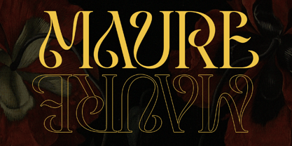 Introducing "Maure" - A Modern Display Font. Embrace the modern era of design with "Maure," a sleek and contemporary display font that adds a touch of sophistication to your projects. There's some connected letters and some alternates that suitable for any graphic designs such as branding materials, t-shirt, print, business cards, logo, poster, t-shirt, photography, quotes .etc This font support for some multilingual. Also contains uppercase A-Z and lowercase a-z, alternate character, numbers 0-9, and some punctuation. If you need help, just write me! Thanks so much for checking out my shop!
 - The Kallyne by Flawlessandco,
$9.00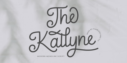 Introducing "The Kallyne" - A Modern Monoline Script Font. Experience the fusion of modern simplicity and timeless style with "The Kallyne," a contemporary monoline script font that adds a touch of elegance and versatility to your designs. There's some connected letters and some alternates that suitable for any graphic designs such as branding materials, t-shirt, print, business cards, logo, poster, t-shirt, photography, quotes .etc This font support for some multilingual. Also contains uppercase A-Z and lowercase a-z, alternate character, numbers 0-9, and some punctuation. If you need help, just write me! Thanks so much for checking out my shop!
 - Sorca by Flawlessandco,
$9.00 Introducing "Sorca" - A Display Typeface Font. Dive into the world of sophistication and uniqueness with "Sorca," a captivating display typeface font that is adorned with wavy and distinctive letter details. There's some connected letters and some alternates that suitable for any graphic designs such as branding materials, t-shirt, print, business cards, logo, poster, t-shirt, photography, quotes .etc This font support for some multilingual. Also contains uppercase A-Z and lowercase a-z, alternate character, numbers 0-9, and some punctuation. If you need help, just write me! Thanks so much for checking out my shop!
 - Magllin by Flawlessandco,
$9.00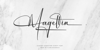 Introducing "Magllin" - An Elegant Signature Script Font. Unlock the allure of elegance and sophistication with "Magllin," an exquisite signature script font that adds a touch of grace and style to your designs. There's some connected letters and some alternates that suitable for any graphic designs such as branding materials, t-shirt, print, business cards, logo, poster, t-shirt, photography, quotes .etc This font support for some multilingual. Also contains uppercase A-Z and lowercase a-z, alternate character, numbers 0-9, and some punctuation. If you need help, just write me! Thanks so much for checking out my shop!
 - The Clamour by Flawlessandco,
$9.00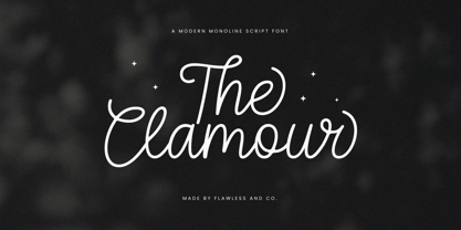 Introducing "The Clamour" - A Modern Monoline Script Font. Embrace contemporary elegance and versatility with "The Clamour," a modern monoline script font that adds a touch of sophistication and fluidity to your designs. There's some connected letters and some alternates that suitable for any graphic designs such as branding materials, t-shirt, print, business cards, logo, poster, t-shirt, photography, quotes .etc This font support for some multilingual. Also contains uppercase A-Z and lowercase a-z, alternate character, numbers 0-9, and some punctuation. If you need help, just write me! Thanks so much for checking out my shop!
 - Salva by Flawlessandco,
$9.00 Introducing "Salva" - An Elegant Display Font. Prepare to be captivated by the distinctive allure of "Salva," an elegant display font that weaves waves into every line of its letters, redefining elegance with its truly unique design. There's some connected letters and some alternates that suitable for any graphic designs such as branding materials, t-shirt, print, business cards, logo, poster, t-shirt, photography, quotes .etc This font support for some multilingual. Also contains uppercase A-Z and lowercase a-z, alternate character, numbers 0-9, and some punctuation. If you need help, just write me! Thanks so much for checking out my shop!
 - Draken Dream by Flawlessandco,
$9.00 Introducing "Draken Dream" - A Modern Elegant Sans Duo Font. Experience the epitome of modern elegance with "Draken Dream," a striking sans-serif font duo that seamlessly marries sophistication with contemporary design. There's some connected letters and some alternates that suitable for any graphic designs such as branding materials, t-shirt, print, business cards, logo, poster, t-shirt, photography, quotes .etc This font support for some multilingual. Also contains uppercase A-Z and lowercase a-z, alternate character, numbers 0-9, and some punctuation. If you need help, just write me! Thanks so much for checking out my shop
 - Antheia by Flawlessandco,
$9.00 Introducing "Antheia" - An Elegant Signature Font. Experience the epitome of elegance and sophistication with "Antheia," a graceful signature font that adds a touch of timeless beauty to your designs. There's some connected letters and some alternates that suitable for any graphic designs such as branding materials, t-shirt, print, business cards, logo, poster, t-shirt, photography, quotes .etc This font support for some multilingual. Also contains uppercase A-Z and lowercase a-z, alternate character, numbers 0-9, and some punctuation. If you need help, just write me! Thanks so much for checking out my shop!
 - Dirty Steven by Flawlessandco,
$9.00 Introducing "Dirty Seven" - A Retro Serif Font. Step into the nostalgia of yesteryear with "Dirty Seven," a retro serif font that pays homage to the timeless charm of vintage typography. There's some connected letters and some alternates that suitable for any graphic designs such as branding materials, t-shirt, print, business cards, logo, poster, t-shirt, photography, quotes, etc. This font support for some multilingual. Also contains uppercase A-Z and lowercase a-z, alternate character, numbers 0-9, and some punctuation. If you need help, just write me! Thanks so much for checking out my shop!
 - Ilyra by Flawlessandco,
$9.00 Introducing "Ilyra" - A Modern Calligraphy Script Font. Step into the world of modern elegance with "Ilyra," a sophisticated calligraphy script font that seamlessly blends classic charm with contemporary flair. There's some connected letters and some alternates that suitable for any graphic designs such as branding materials, t-shirt, print, business cards, logo, poster, t-shirt, photography, quotes .etc This font support for some multilingual. Also contains uppercase A-Z and lowercase a-z, alternate character, numbers 0-9, and some punctuation. If you need help, just write me! Thanks so much for checking out my shop!
 - Linearmente - Personal use only

- SF Nizar by Sultan Fonts,
$19.99 In July 2014, using my light pen, I completed the work in designing the font - Nizar, which was named in honor of the great poet Nizar Qabbani who inspired millions through poetry and prose. The font depends mainly on the characteristics of the traditional Ruq'ah handwriting, but the spirit of the letters tend to embrace the distinguished style that we knew of the poet in his hand-written poetry books. Due to the fact that I could not find all the alphabets in the great poet's handwriting, I adopted the method of measurement and prediction for structure of the missing letters, Which resulted in a new style of the Ruq'ah Typeface; a closer look at the font highlights the common characteristics of all the usual Ruq'ah writings, which are the height of the character "Alef" and spaces and formation on the line, the contextual replacement and convergence of when a letter meets another, closed and open letters, letters coming down from the baseline, and the forms of dots. That been said, hidden touches in the details of Nizar Typeface can be observed, the characters are all dependent on one pen stroke thickness, and are attracted to the baseline as much as possible when vertically and horizontally formed, and the distance between words and lines grows leading to creating both an aesthetic and typographical touch distinguishing this font from the conventional Ruq'ah – which can be found in some of my previous Ruq'ah projects. It is important to mention that after the completion of the Arabic characters and punctuation, I began drawing the Latin alphabets, punctuation and necessary symbols. I cannot fail to also note that the Arabic characters include the Persian, and the Urdu characters. This Typeface is fit to be used in lengthy texts, especially in literary works, artistic print, and diverse visual display, giving the design striking features, modernity and distinction. Sultan Mohammed Saeed
 - ASTYPE Ornaments Accolades C by astype,
$40.00 Accolades C and C2 share the same main ornaments but differ in finishing. Accolades C uses pearls and diamonds, C2 does not. Accolades CX is an additional fitting set of borders. All fonts are available in two variations. A clean one and a distressed, grungy version (old). The layout samples from the PDF-specimen are included in the font packages and stored in InDesign CS3 format. Mostly all of the featured fonts of the specimen are available on MyFonts, too. Have a look at Secca Art Std, Secca Saloon Std, Gracia, Battista and Prillwitz.
 - Cardboard by deFUNKT,
$35.00This font was actually designed by trying to teach my helper-monkey, Philip, to cut Helvetica out of a piece of cardboard.


