10,000 search results
(0.059 seconds)
- DR Lineart by Dmitry Rastvortsev,
$29.98 Display type-family in op-art style with Latin, Greek and Cyrillic scripts support. Award: The Best Of Ukrainian Design in Typestyle and typography 2016.
 - Redwinger by Ditatype,
$29.00 Redwinger is a captivating display font designed with a games theme, featuring different proportions of letters and sharp, uneven borders. This font showcases different proportions in its letterforms, adding a sense of variety and excitement to the font. Each uppercase letter has its own distinct width and height, creating a visually engaging composition. This design choice adds a playful and dynamic element to the font, reflecting the diversity and unpredictability of the gaming world. The sharp and uneven borders of Redwinger enhance its edgy and adventurous aesthetic. The jagged edges and irregular shapes give the font a distinctive and daring look, evoking a sense of action and intensity. This unique feature adds a touch of excitement and captures the spirit of gaming. For the best legibility you can use it in the bigger text. Enjoy the available features here. Features: Stylistic Sets Multilingual Supports PUA Encoded Numerals and Punctuations Redwinger fits in headlines, logos, posters, titles, branding materials, print media, editorial layouts, website headers, and any other projects that aim to transport players into thrilling virtual worlds. Find out more ways to use this font by taking a look at the font preview. Thanks for purchasing our fonts. Hopefully, you have a great time using our font. Feel free to contact us anytime for further information or when you have trouble with the font. Thanks a lot and happy designing.
 - Eponymous by Monotype,
$25.99 Eponymous is an Egyptian-style typeface with chunky, scalloped serifs. It is available in five weights in both roman and italic. I have always loved slab serif type and have created Eponymous to fulfil a yearning for a versatile, stylish and contemporary slab face. A key design characteristic is the implementation of scalloped serifs which, to me, imbues the typeface with a distinctive personality. Make use of the Open Type features that are part of Eponymous. For a start, you can implement some stylistic alternates, so, if the main characters don’t quite suit your concept, try activating Stylistic Set 1. There’s also a full set of small caps included. You can mix and match these characters with regular lowercase to create some interesting unicase typography. Of course, all characters have complementing diacritics, enabling multi-language support. Key features: Eponymous is is an Egyptian-style typeface with chunky, scalloped serifs 5 weights in roman and italic: Light | Regular | Medium | Bold | Black Full set of small caps with diacritics and figures 30+ alternate characters Full European character set 650+ glyphs per font Eponymous was redrawn and re-spaced to a higher standard in April 2021 (v2.0).
 - Open Serif by Matteson Typographics,
$19.95 OPEN SERIF - answering the question “what font pairs well with Open Sans?”. Designed by Steve Matteson for extraordinary legibility and comfortable reading on screen and in print. Open Interpretation: Not quite Veronese – not quite Egyptian. A dash of panache in an otherwise sturdy serif typeface. Open Serif is an elegant text and display typeface family. Open Interiors: Visually open and legible at text sizes just like its cousin Open Sans. Open Serif reads smoothly but has an energetic texture. The chancery style italic contrasts nicely to the roman in a full bodied nod to Italian Renaissance forms. Open Type: Open Serif is full of OpenType features including Small Capitals for the Roman, Italic Swash Capitals and Old Style Figures for both. Open Translation: Supporting all the languages available in Open Sans, Open Serif completes the translation capabilities of international companies. Extended text is more pleasant to read in a serif typeface so go global with a unified typeface family! Open Face: Open Serif Titling is an elegant companion to round out the family. These ‘open-face' capital letters are ideal for initial letters, mastheads, titles and decoration.
 - Rodia by Monotype,
$25.00 Rodia is an Oddball Geometric Sans Typeface consisting of nine weights in both roman and oblique. It’s a geometric sans with a twist that’s perfect for branding and identity projects – it will also give your body text a unique voice. Inspiration came from the iconic “RADIO” signage that was once in place at 5041, Pico Boulevard, Los Angeles in 1985 (documented at https://tinyurl.com/y2krt2ox). With its distinctive leg, the /R/ provides a personality trait to define the style of the character set. You can clearly see how this characteristic separates Rodia from other geometric sans families – the /k/v/w/x/y/K/R/V/W/X/Y/ glyphs all display the distinctive ‘feet’ and ‘hands’ as terminals to legs and arms. Then there is the /A/ with its triangular crossbar – this triangular motif has been used to embellish alternates in Stylistic Set 1 for /A/E/F/G/H/Q/S/ glyphs. These will add another layer of versatility for your typographic projects. Rodia features an extensive character set covering all Latin European languages. Key features: 9 weights in Roman and Oblique Full European character set (Latin only) 400+ glyphs per font.
 - Sinkwitz Gotisch by preussTYPE,
$29.00 Sinkwitz Gotisch is a new release of the font of the same name originally designed by Paul Sinkwitz in 1942. The Sinkwitz Gotisch was 1942 by Schriftguss AG Dresden font cast first cast and later supplied by the East German firm VEB Typoart. Paul Sinkwitz (1899-1981) has created them. This font displays not the characteristics of a chunky Gothic, which have influenced the image of national socialism. Paul Sinkwitz was a painter, graphic artist, wood engraver, was interested in religious topics, which he had presented in numerous graphics. But also his interpretation of his Gothic font is modern, without having the font this is ugly. In addition to the GOTISCH he created Roman Uppercase letters, which perfectly harmonize with the lowercase letters. This extra font is called BASTARD. The digital version of Sinkwitz is a beneficial addition to a Gothic with calligraphic character and should be in any historically interested graphic design.
 - Revolution Gothic P by Dharma Type,
$19.99 Revolution Gothic P font family is designed based on Revolution Gothic and a distressed offshoot from the original. Revolution Gothic is an arranged and extended version of PAG Revolucion released from Prop-A-Ganda type foundry in 2008. The original font is inspired by retro propaganda posters and wallpainting in Cuba from the 60s to 80s. And the original PAG Revolucion is the most popular font from Prop-A-Ganda. The glyphs that damaged by printing the original had been tweaked by hand work with great care to be looked like natural damaged effect. This Revolution Gothic P family contains basic Roman, Italic, Bold and it’s Italic to suit a wide range of your creative works and it will be one of the most powerful solutions for printing and web.
 - P22 Numismatic by IHOF,
$24.95 This set of letters and ornaments is loosely based on on a typeface that was offered by the DeVinne Press at the turn of the century. We can speculate from its name that this type was used as a display font to try to equate the look of letters on 15th and 16th century heraldic cartouches, seals, stamps, medals and other inscriptional lettering. The sample was digitized with an “antiqued” outline to further enhance this ancient inscriptional theme. The letters were then grouped in the font with the more traditional Roman letters as the capitals and the Lombardic forms as the miniscules. The original type sample contained some unusual 15th century inscriptional numbers which have been included as extras in the font so the user the has the option to create an authentic looking design.
 - Novin Shadow by Naghi Naghachian,
$105.00 Novin-Shadow is an outline Font with Shadow. It is based on Novin font family but as a separate headline font with Arabic and Latin characters. It is a typeface that gives the typographer and other graphic artists the possibility to use modern headline. It enables, moreover, the use of this typeface for decorative headlines and is suitable for manipulations in both vector-based and pixel-based graphic programs. Typographies in countries worldwide, whose alphabets derive from the Roman and Arabic, are dependent on such innovations in order to meet the increasing demands of modern communication. This typeface implies at the same time an enrichment of the possibilities for typographical design, which in turn increases the delight in such design. It gives me great pleasure to present this new typeface to my creative colleagues worldwide.
 - Augsburg Initials by Kaer,
$18.00 Hey! I'm happy to introduce to you my new initial's set. These drop caps I found in the "Introductorium in astronomiam" manuscript. It was printed in Augsburg in 1489 by Erhard Ratdolt. I've added some lost letters and assembled a full alphabet. Augsburg is a medieval gothic style font. Set of dim colored and monochrome grunge style emblems. Engraved initial drop caps. Perfect for vintage premium identity, Middle Ages posters, luxury packaging. If you want dark and strong medieval style concepts, please try it. --- *You can use color fonts in PS since CC 2017, AI since CC 2018, ID since CC 2019, macOS 10.14 Mojave* *Please note that the Canva & Corel doesn't support color fonts!* --- Please feel free to request any help you need: kaer.pro@gmail.com Best, Roman. Thank you!
 - Parochus by Kaer,
$24.00 Hello! Inspiration for this beautiful script font I found in “A Source of Solace in Illness” (Trost Bronn der Kranchhen) book, published in the middle of 17th century. There was an entire on the back of the top cover: Joannes Auanger Parochus Sinchingae 1808”. That's why I named my font family Parochus. In the Catholic Church, a parish is a community of the faithful within a particular church, whose pastoral care has been entrusted to a parish priest (Latin: parochus). There are original and regular style fonts. Also, I’ve added some modern symbols. With this set, you can precisely imitate medieval style text. I designed a full uppercase and lowercase set with Multilingual support and ligatures. You'll found ß, &, Š, ę and many other beautiful glyphs. Best, Roman.
 - Diamante Robusto by César Modesto,
$- Diamante Robusto Font is my new font, where all the letters came out of this strange shape created without intention of being the inspiration for this new font.
 - Wagma by Phoenix Group,
$13.00 Wagma is a handwritten font with an organic and adult theme, this font has an untidy shape and looks messy to emphasize the human side of the font.
 - Hexagraph by Red One Graph,
$12.00 Thanks for checking out Hexagraph Font! This is my first font and type face in foundry world. Hexagraph inspired by geometrical form of hexagon shape, produces a series of letters that have a sci-fi - technological impression. This font is very unique in that it is entirely an extension of the hexagon shape. You can use this font for magazine cover, game support graphic elements, tech product advertisements, or whatever.
 - Aure Wye by Aure Font Design,
$23.00 Aure Wye wraps a carefree dispassion with the dignity of tradition. The precise engraving and organic finials of these decorative serif forms engage the reader with a subtext of elegance. Wye brings an unpretentious grace to titles and drop-caps and provides dignity to astrological expressions and chartwheels. In Regular, Wye presents a formal presence; in Italic, Wye offers a more romantic feel. Its small-caps add a stately variety to Wye's typographic textures. Wye is an original design developed by Aurora Isaac. After more than a decade in development, 2018 marks the first release of the CJ and KB glyphsets, now available in regular and italic. The CJ glyphset is a full text font supporting a variety of European languages. A matching set of small-caps complements the extended lowercase and uppercase glyphsets. Supporting glyphs include standard ligatures, four variations of the ampersand, and check-mark and happy-face with their companions x-mark and grumpy-face. Numbers are available in lining, oldstyle, and small versions, with numerators and denominators for forming fractions. Companion glyphs include Roman numerals, specialized glyphs for indicating ordinals, and a variety of mathematical symbols and operators. The CJ glyphset also includes an extended set of glyphs for typesetting Western Astrology. These glyphs are also available separately in the KB glyphset: a symbol font re-coded to allow easy keyboard access for the most commonly used glyphs. Aure Wye will stand up as a text font, but for extended text, try pairing Wye with its close cousin, Aure Declare. Used in titles and drop-caps, Wye will provide a striking elegance that will blend well with the serifed forms of Declare. Give Aure Wye a trial run! You may discover a permanent place for this font family in your typographic palette. AureFontDesign.com
 - Legan by PeGGO Fonts,
$39.00 Legan, created by PeGGO Fonts, is a typeface with a large number of glyphs. The uppercase letters follow the classical Trajan pattern. It is designed with several geometrical proportions such as root five, divine proportion (Golden Ratio), regular square, and others, just like the Greek Trajan letters used on Trajan’s Column. The major innovation is a lowercase that is designed in accordance with the same Trajan rules. My concern for the global community is reflected by the large number of diacritics I have provided, first on the basic alphabet, then on extended latin languages, as well as ones for Cyrillic and Greek. Because it is OpenType, there are various setup possibilities including traditional ligatures, as well as various alternates. Altogether you will find this a very playful, fashionable, and elegant typeface.
 - Volage Display by Cecilia Gérard Type,
$16.00 Introducing Volage, a clean, elegant yet flighty display serif. Inspired by french literature masterpiece "Dangerous Liaisons" by Pierre Choderlos de Laclos, Volage is a drama typeface with stunning alternates. Sharp shapes marry tails and ligatures, which are chasing each other without never really meeting...
 - Anselm Sans by Storm Type Foundry,
$63.00One of the good practices of today’s type foundries is that they release their type families as systems including both serif and sans serif type. Usually, the sources of inspiration need to be well tried with time and practice, since production of a type family is such a laborious and complex process. From the beginning, it needs to be clear that the result will be suited for universal use. Such systems, complete with the broad, multi-lingual variations permitted by the OpenType format, have become the elementary, default instrument of visual communication. Non-Latin scripts are useful for a wide scope of academic publications, for packaging and corporate systems alike. And what about outdoor advertisement designated for markets in developing countries? Cyrillics and Greek have become an integral part of our OpenType font systems. Maybe you noticed that the sans serif cuts have richer variety of the light – black scale. This is due to the fact that sans serif families tend to be less susceptible to deformities in form, and thus they are able to retain their original character throughout the full range of weights. On the other hand, the nature of serifed, contrasted cuts does not permit such extremes without sacrificing their characteristic features. Both weights were drawn by hand, only the Medium cut has been interpolated. Anselm Ten is a unique family of four cuts, slightly strengthened and adjusted for the setting in sizes around 10 pt and smaller, as its name indicates. The ancestry of Anselm goes back to Jannon, a slightly modified Old Style Roman. I drew Serapion back in 1997, so its spirit is youthful, a bit frisky, and it is charmed by romantic, playful details. Anselm succeeds it after ten years of evolution, it is a sober, reliable laborer, immune to all eccentricities. The most significant difference between Sebastian/Serapion and Anselm is the raised x-height of lowercase, which makes it ideal for applications in extensive texts. Our goal was to create an all-round type family, equally suitable for poetry, magazines, books, posters, and information systems. - Anselm Serif by Storm Type Foundry,
$63.00 One of the good practices of today’s type foundries is that they release their type families as systems including both serif and sans serif type. Usually, the sources of inspiration need to be well tried with time and practice, since production of a type family is such a laborious and complex process. From the beginning, it needs to be clear that the result will be suited for universal use. Such systems, complete with the broad, multi-lingual variations permitted by the OpenType format, have become the elementary, default instrument of visual communication. Non-Latin scripts are useful for a wide scope of academic publications, for packaging and corporate systems alike. And what about outdoor advertisement designated for markets in developing countries? Cyrillics and Greek have become an integral part of our OpenType font systems. Maybe you noticed that the sans serif cuts have richer variety of the light – black scale. This is due to the fact that sans serif families tend to be less susceptible to deformities in form, and thus they are able to retain their original character throughout the full range of weights. On the other hand, the nature of serifed, contrasted cuts does not permit such extremes without sacrificing their characteristic features. Both weights were drawn by hand, only the Medium cut has been interpolated. Anselm Ten is a unique family of four cuts, slightly strengthened and adjusted for the setting in sizes around 10 pt and smaller, as its name indicates. The ancestry of Anselm goes back to Jannon , a slightly modified Old Style Roman. I drew Serapion back in 1997, so its spirit is youthful, a bit frisky, and it is charmed by romantic, playful details. Anselm succeeds it after ten years of evolution, it is a sober, reliable laborer, immune to all eccentricities. The most significant difference between Sebastian/Serapion and Anselm is the raised x-height of lowercase, which makes it ideal for applications in extensive texts. Our goal was to create an all-round type family, equally suitable for poetry, magazines, books, posters, and information systems.
 - Hibernica by SIAS,
$39.90 Hibernica is a new genuine Irish sans in the classical modern style. With Hibernica it is possible to express Irishness in an up-to-date fashion rather than the traditionalist way. The design of Hibernica is based on my Lapidaria family. With Lapidaria it shares the classic appearance and coolness, stroke pattern, proportions and dimensions. Therefore Hibernica and Lapidaria are a perfect couple for bilingual text editing, e.g. Irish–English (not to forget the Greek parts of Lapidaria!). All fonts contain the full set of dotted ḃ ċ ḋ ḟ ġ ṁ ṗ ṡ ṫ in upper- and lowercase and an additional set of a dozen celtic ornaments. Hibernica also ows its “Minor-Medior” concept to Lapidaria, that is a special uncial-style variant set for lowercase letters. Choose from the six Hibernica fonts which suits your needs best! The Minor fonts are performing elegantly even in longer text bodies, whereas the Medior sorts offer a brillant and entirely new typographic look for headings and captions. Use Hibernica for outstanding designs – for a contemporary Irish understatement in typography. Wether you’re designing menus or shop signs, banners or ads, wether you do textwork upon historic topics or create T-shirts for St Patrick’s day – Hibernica is your new friend! For more new wonderful Irish fonts look at Ardagh and Andron Gaeilge!
 - Fisterra by TipoType,
$39.00 Fisterra Morte and Fisterra Fora: one typeface, two perspectives. The duality between the calm and the intensity with which we can face with each situation. Informal, serif and display in two flavors: Morte has the softness and the humanism of its voluptuous curves; Fora, the precision and accuracy of its sharp angles. They share a single skeleton of condensed uppercase letters, with expanded nuances in some alternate characters and ligatures.
 - Cardinal Script by FadeLine Studio,
$12.00 This is a beautiful handmade script font made with neat and clean. This font that will make your designs even more fun! With a style like this, this font will be suitable in use for logo's, branding projects, homeware designs, product packaging, mugs, quotes, posters, shopping bags, logo's, t-shirts, book covers, name card, invitation cards, greeting cards, and all your other lovely projects.
 - Haberdines by Gassstype,
$23.00 Hello Everyone, introduce our new product font Haberdiness, inspired from Punk Music and street culture, recreated for modern branding. You can use and enjoy this Font for anything from promotional material and poster quotes, to product packaging, merchandise and branding projects And this font perfect for logo, packaging, magazine, sport, poster, apparel, title, social media post, ad banner, book cover, poster quotes, greeting cards and advertising.
 - Kiti Cuties by Dikas Studio,
$15.00 Hi, i want to introduce my newest font Kiti Cuties. Kiti Cuties is a playful sans serif font, Kiti Cuties is a allcaps font with 4 variations letter in lowercase e,h,o,u that makes your design looks more cheerfull. Kiti cuties is made to help you create a kids and fun theme design such as birthday card, baby shower card, greeting card and many more.
 - Brighton vintage by Dealita Studio,
$18.00 Brighton Vintage is a stylish font that is both retro and bold font. Its thick curves give a 70s groovy vibe with the serifs bringing it slightly back to traditional. This font is perfectly made to be applied especially in logos, and other various formal forms such as invitations, labels, logos, magazines, books, greeting/wedding cards, packaging, fashion, makeup, stationery, novels, labels, or any advertising purpose.
 - Rumblekill by Invasi Studio,
$19.00 Rumblekill is a blackletter font in the retro style. Elegant and rounded, it adds a bold touch to your projects and will inspire you to create something unique and modern. This font is also equipped with alternative characters, Ligatures, and multi-language support. Rumblekill Font is ideal for headings, flyers, greeting cards, product packaging, book covers, printed quotes, logotype, apparel design, and album covers.
 - Hello Cattia by JprintStudio,
$15.00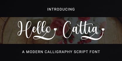 Hello Cattia is a cute and casual handwritten font with a very friendly feel. Whether you’re looking for fonts to make beautiful wedding invitations, beautiful artwork, interesting social media posts, and funny greeting cards. Hello Cattia also has several alternative letters that can make your project look modern, luxurious and classy. This font will turn any creative idea into a true work of art!
 - Katieya by Gatype,
$14.00 Katieya is a handwritten font set. Great for logos, name tags, handwritten quotes, product packaging, merchandise, social media & greeting cards. It saves a lot of time in designing a product. This font will add a fun and friendly touch to any of your projects! This font is PUA coded which means you can easily access all the glyphs and strokes and much more. Have fun using Katieya.
 - Romantica Story by Zeenesia Studio,
$14.00 Romantica Story Script Font is a monoline script font with much fiture. It comes in uppercase, lowercase, ligature, stylistic alternate, swash, and support multilingual. Romantica Story font is perfect for logos, branding, greeting cards, quotes, packaging, posters, advertising, name card, website, design title, blog header, art quote, typography, invitations, apparel, photography, wedding stationary, labels, and every other design which needs an unique and luxurious touch.
 - Benedetta by Designova,
$23.00 Benedetta is a beautiful and lovely handwritten font for luxury / signature / branding / logotype / personal invites / greeting cards / promotional graphics. Benedetta is completely handmade with perfection and aesthetics at its level best. Advanced Kerning & Essential Ligatures: We have performed advanced, in-depth kerning to make sure the font looks amazing on all possible letter combinations. The font includes extended language support including Western European & Central European sets.
 - Cattie by Aisyah,
$12.00 Cattie is a decorative font that features cat decorations. The font is cute and playful, with cat illustrations integrated into each character. It's perfect for adding a fun touch to your designs, such as greeting cards, posters, or children's books. The font is versatile and can be used for various projects, from lighthearted to more serious ones, and can add a unique touch to any design.
 - Lingkari Heart by Bhadalstudio,
$18.00 Lingkari Heart is a new vintage handwritten font. This font is perfect to be applied especially in logos, packaging, headlines, posters, t-shirt/apparel, greeting cards, wedding invitations, and other project. As you can see at the previews, this font has unique swashes that allows you to create beautiful lettering in a snap. Lingkari Heart has many stylistic set alternates that you can choose from.
 - Astopher by HansCo,
$15.00 Astopher was inspired by urban script fonts. With its modern script style, this font will be suitable for various projects, for example: quotes, blog titles, branding, logos, fashion, invitations, greeting cards, posters, business cards, clothing, letters, stationery, and more. This one should make your designs instantly professional and amazingly! Be a perfect professional in a minute and start creating with this font today! Enjoy!
 - My Beautiful Story by Putracetol,
$28.00 Introducing a beautiful stylish handwritten font called "My Beautiful Story". This font has been designed from recreate natural handwritten text include 119 custom ligature and beautiful swash, its help you to make great lettering. My Beautiful Story best uses for signature, wedding, invitation, heading, cover, poster, logos, quotes, product packaging, header, merchandise, social media & greeting cards and many more. This font is also support multi language.
 - Sweet Gracia by JprintStudio,
$14.00 Sweet Gracia is a beautiful monoline font with movement and grace. Although simple, Sweet Gracia is stunning as a display, and can give your headlines a clean and modern look and feel. Whether you’re looking for fonts to make beautiful wedding invitations, beautiful artwork, interesting social media posts, and funny greeting cards, this font will turn any creative idea into a true work of art!
 - The Perfect Match by Nicky Laatz,
$20.00 Say hello to "The Perfect Match" Font set! 4 lovingly hand-drawn fonts made to complement each other perfectly in your type designs. Perfect for quote designs, quaint logos, clever packaging, sign boards, greeting cards, merchandise designs and so much more! Also included is 2 extra 'Dingbat' fonts - packed full of cute little hand doodle extras - to really make your designs come together beautifully!
 - Kimetsu by Canden Meutuah,
$20.00 This Fonts are perfect for: logos, branding, wedding invitations, business cards, greeting cards, posters, magazines, social media, proliferate fonts, planner prints and websites. Get creative with their unique fun, and use them to brighten up any craft project! Get this font now and boost your creativity with it! If you have any questions, before or after your purchase, don't hesitate to contact us. Thank You
 - Christmas Rockstar by Letterara,
$12.00 Christmas Rockstar is a handwritten font with a dry brush texture with rough details. This font has been designed to suit a variety of projects such as business branding, Instagram quotes, Christmas greeting, Poster, blog headers, fashion apparel, sports communities, film, photography, hobbies, and much more. This font is PUA encoded which means you can access all of the glyphs and swashes with ease!
 - Hojlund by Mevstory Studio,
$30.00 Hojlund Brush Font, a modern and stylish font style influenced by urban style and branded goods that can be used in a wide variety of ways by Lettercorner Studio Hojlund font is ideal for branding, photo overlays, watermark, typography, greeting cards, posters, business card, branding projects, social media posts, magazines, book covers, invitations, weddings, photography, fashion, apparel, letter, stationery, or any tasks that need a signature taste.
 - Laguna Vintage by Aiyari,
$25.00 Introducing Laguna Font Collection. Inspired from American motor inn signs and vintage restaurant signs in 50s-70s. Laguna comes with open type features such stylistic alternates, stylistic sets, contextual alternates & ligatures. Also available in variable font format. Laguna Font Collection is best uses for headings, Logo type, quotes, apparel design, invitations, flyer, poster, greeting cards, product packaging, book cover, printed quotes, cover album, movie, etc