10,000 search results
(0.06 seconds)
- Halibu by Sensatype Studio,
$15.00 Malibu font is a well-balanced contemporary font with a fancy, playful, unique, and versatile vintage serif with 165+ alternates that you can combine to get curves and beautiful shapes easily just in seconds. It is a display font with moderate contrast that perfect for branding projects, logo, wedding designs, social media posts, advertisements, product packaging, product designs, label, photography, watermark, invitation, stationery, and any projects, it makes with a high level of legibility. What's Included: Character set A-Z Uppercase & Lowercase Numerals & Punctuation Accented Characters (West Europe) Ligature & Huge Stylistic alternate Works on PC & Mac Recommended using Adobe Illustrator or Adobe Photoshop. Wish you enjoy our font. :)
 - Road Race Extra by Craft Supply Co,
$19.00 Road Race Extra Font Family includes 4 Style Fonts. It can be used to create almost all types of design projects like print materials. Just use your imagination and some graphic design set in Extras, your project will become more alive and look great than ever with one of the Road Race Extra font. You want to make a greeting card or a package design, or even a brand identity, craft design, any DIY project, book title, wedding font, pop vintage design, retro design or any purpose to make your art / design project look pretty and trendy? Feel free to play with all the patterns and shape!
 - Gemini Style by Sensatype Studio,
$15.00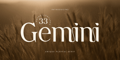 A serif that we created special for unique branding needs, with extra ligature and alternates in unique shape will be ready to add value of your brand. It so nice to leverage designer or product owner that need solutions to make their design look more modern and playful. And specially for this font, We prepared any ligatures, and any alternate characters to help you create unlimited variations for your creative needs. Gemini serif font ready with: Any options to get creative variations (combination of Alternate and Ligatures) Preview as a inspirations that you can do with Gemini font Ready with Lowercase and Uppercase characters Wish you enjoy our font. :)
 - Rosane by Sensatype Studio,
$15.00 A new Sans serif that we created special for branding needs, with extra ligature in unique shape add value of your brand. It so nice to leverage designer or product owner that need solutions to make their design look more stylish and modern. And specially for satisfy font, We prepared any ligatures, and any alternate characters to help you create unlimited variations for your creative needs. Satisfy sans serif font ready with: Any options to get creative variations (combination of Alternate and Ligatures) Preview as a inspirations that you can do with Satisfy font Ready with Lowercase and Uppercase characters Wish you enjoy our font!
 - Cordon Bleu by Pen Culture,
$17.00 Proudly present our newest font called “Cordon Bleu” Cordon bleu is a modern and elegant serif font that comes with more than 50 alternate. With alternates that have an elegant shape, this font will be very suitable for various needs such as branding, logo design, magazines, posters, Instagram feeds and of course there are many more that you can explore with this font. I really hope you enjoy it – please do let me know what you think, comments & likes are always hugely welcomed and appreciated. More importantly, please don’t hesitate to drop me a message if you have any issues or queries. Thank you
 - Road Race by Craft Supply Co,
$19.00 Road Race Font Family includes 4 Style Fonts. It can be used to create almost all types of design projects like print materials. Just use your imagination and some graphic design set in Extras, your project will become more alive and look great than ever with one of the Road Race font. You want to make a greeting card or a package design, or even a brand identity, craft design, any DIY project, book title, wedding font, pop vintage design, retro design or any purpose to make your art / design project look pretty and trendy? Feel free to play with all the patterns and shape!
 - Golane by Craft Supply Co,
$20.00 Introduction to Golane Introducing Golane, a Geometric Sans Serif font, it exemplifies a sleek, modern design. Firstly, its geometric styling enhances visual appeal. Importantly, this font is perfect for lengthy texts, offering remarkable readability. Additionally, its simplicity appeals to a broad audience, from novices to seasoned professionals. Design and Aesthetics Focusing on design, Golane is deeply rooted in geometric principles. Each character is meticulously crafted, ensuring a balanced and harmonious appearance. Furthermore, its clean lines and shapes exude a contemporary vibe. Consequently, the font masterfully combines form and function, making it highly versatile for diverse applications. User-Friendly Features Regarding user experience, Golane stands out for its user-friendly qualities. It’s notably easy to read, which greatly enhances the legibility of extended texts. Moreover, the font’s adaptability is evident, as it fits seamlessly in various contexts. Whether used in print or digital formats, Golane consistently maintains its clarity and effectiveness.
 - Just You by MC Creative,
$10.00 Just You is an elegant calligraphy and natural script style. Just You Modern Calligraphy is perfect for wedding designs, shared moments, branding projects, logos, social media posts, advertisements, product packaging, product design, labels, photography, watermarks, invitations, stationery, and any project that requires a handwritten feel. What’s Included : · Standard glyphs · Ligature · Works on PC & Mac · Simple installations · Accessible in the Adobe Illustrator, Adobe Photoshop, Adobe InDesign, even work on Microsoft Word. · PUA Encoded Characters – Fully accessible without additional design software. · Fonts include multilingual support for; ä ö ü Ä Ö Ü ß ¿ ¡
 - Approach Mono by Emtype Foundry,
$69.00Approach Mono is the fixed width version of Approach. A utilitarian low contrast font, a bit mechanical but plenty of character. This version shares its main features with the original one, but it has a more prominent and visible punctuation. The more obvious use of a mono would be in tables, programming code or “in progress texts”, but not just that. Approach Mono can be used in the modern communication, bringing an aseptic voice to brochures, advertising, identities and any other piece of communication. For more details see the PDF. - Clear Prairie Dawn by Quadrat,
$25.00Clear Prairie Dawn is an original humanist sans serif family based on the designer's own printing. Designed for use as a text face, as a humanist sans it shares some of the characteristics you might notice in other such faces as Optima, Gill Sans or Stone Sans. The italic is a designed italic, rather than merely a slanted roman, and incorporates many of the ideas that the designer found too lively for the roman fonts. The complete CPD package consists of three weights with italics, and a set of original ornaments. - Undulate by Ingrimayne Type,
$10.00 Undulate was designed as an alternating-letter font in which two sets of characters alternate. The alternating is done automatically in applications that support the OpenType feature contextual alternatives (calt). Some individual characters look strange in isolation but they fit into a wave-like pattern in which shapes that bulge up alternate with shapes that bulge down. Undulate has monospaced and monoline letters. The letter spacing is very tight to accentuate the ripple pattern. The family includes an outline style that can be used in a layer above the regular style to add color. Undulate was not designed for any particular use but as a challenge to fit letters into a particular geometric shape. The unusual patterns that a result are eye-catching and may be useful for advertising or signage and in other places where one wants attention-grabbing lettering.
 - Mackay by René Bieder,
$39.00 Mackay is a powerful transitional serif in 6 weights plus matching italics, designed for screen and print. The eccentric serifs on uppercase letters like E, F, L and T are inspired by Alexander Kay’s “Ronaldson” from 1884, working as the starting point for the family. The lowercase letters follow the traditional Antiqua model with attributes tracing back to drawings from the early 20th century. The “grotesk” lowercase a, as well as the sharp lowercase s, derived from the closed shapes of uppercase letters like C, G or S, create a compact and bold appearance while a large x-height and small descenders add a modern look. In favor of a dynamic and elegant impression, the design of the italic cuts come with a strong calligraphic influence. This results in completely new shapes for letters like lowercase a or g, ensuring a smooth integration into their surrounding letters while maintaining a distinctive appearance when combining with romans. The family comes with a variety of opentype features like case sensitive shapes, old style figures, fractions, ordinals and many more. Additional attention was given to the standard and discretionary ligatures, extending the structure of the basic glyphs with elegantly designed letter combinations for g/i, i/t or s/t. According to their dynamic architecture, the italic weights are equipped with additional initial swash characters to subtle accentuate the calligraphic roots. As a result of a high stroke contrast the family works great in paragraphs with medium to large font sizes like headlines, short paragraphs or logos. With its 12 cuts, the family meets all requirements on high quality typography.
 - San Jose by Graffiti Fonts,
$19.99 The San Jose type family provides an array of variants representing a simplified, bay area slant on traditional Chicano American street scripts. The styles in this set can be used in all caps for the most authentic appearance or in a more typographically traditional small caps format. This set also includes latin supplement support and a robust character set in six styles. 3 Stroke variants: Regular, Rough & Bold each have a leaned back, traditional slant variant.
 - FF Atma Serif by FontFont,
$72.99 American type designer Alan Dague-Greene created this serif FontFont in 2001. The family has 8 weights, ranging from Book to Black (including italics) and is ideally suited for book text and editorial and publishing. FF Atma Serif provides advanced typographical support with features such as ligatures, small capitals, petite capitals, alternate characters, case-sensitive forms, and fractions. It comes with a complete range of figure set options – oldstyle and lining figures, each in tabular and proportional widths.
 - Jolly Roger by Red Rooster Collection,
$45.00 Steve Jackaman has refined and optimized Jolly Roger for digital release. The original design was created in 1970 by the legendary American type designer Phil Martin, founder and creator of the Alphabet Innovations and TypeSpectra type collections. Although quirky, playful and highly unusual, Phil describes Jolly Roger as his personal favorite out of his entire library of over 400 typefaces. We are proud and humbled to reintroduce the design in honor of our good friend and colleague.
 - ITC Korigan by ITC,
$40.99ITC Korigan is a work of French designer Thierry Puyfoulhoux, an uncial typeface which he wanted to offer as an alternative to Victor Hammer's American Uncial, which remains for him the uncial character of reference." The roundness of an uncial gives it the look of pearls on a string, as Hammer said, and ITC Korigan is true to its heritage in this respect. Despite the roundness, however, the forms remain familiar and legible to the modern eye." - ITC Stylus by ITC,
$29.99ITC Stylus is the work of American designer Dennis Pasternak, who based its forms on those of freehand architectural lettering from historical and contemporary sources. Pasternak points out that while the typeface emulates hand lettering, no pencil drawings or scanned art were used in its creation. The letters bounce slightly across the baseline, giving the typeface the look of true handwriting. ITC Stylus emanates warmth when used for extended text and a fresh quality in display sizes. - Goudy National by Matteson Typographics,
$19.95 Frederic Goudy designed National Old Style Roman in 1916. It is loosely based on a logo he lettered for the National Biscuit Company in 1901. Steve Matteson expanded on Goudy’s original by designing a bold, semibold and matching italics. While much of Goudy’s work is strongly influenced by Venetian types of the 15th and 16th centuries - this design has a truly American quality about it. The design is useful for text or headlines that captures a sense of Americana.
 - Manufactory JNL by Jeff Levine,
$29.00 Manufactory JNL and its oblique counterpart were re-drawn from examples of a now-antique typeface used within many advertisements found throughout the pages of The American Stationer magazine, circa 1879. The term ‘manufactory’ was popular during this era; the word being a more archaic form of ‘factory’. There is a bit of Western flavor to this type design, as the spurred serifs and the top and bottom strokes are heavier than the vertical and mid-point stroke weights.
 - Hotel Suite JNL by Jeff Levine,
$29.00 This is a digital reinterpretation of Walter Huxley's 1935 evergreen "Huxley Vertical", which was originally cast for American Type Founders. A timeless classic which has been in use since the Art Deco era, this version is known as Hotel Suite JNL. As in the original metal type, alternates for A,K,M,R,W and Y are available and can be found on their respective lower case keys. Hotel Suite JNL is available in both regular and oblique versions.
 - TT Ricordi by TypeType,
$49.00 TT Ricordi useful links: Specimen | Graphic presentation | Customization options The TT Ricordi font family is a collection of three display heading serifs designed to significantly diversify the traditional font palette. Each font from the TT Ricordi family was drawn by a separate designer and has its own story. With that, all three fonts are close in thickness and similar in their character compositions and are featured in the uppercase set and the small capitals set, which replaces lowercase characters. The fonts have the broad support of Latin languages and support basic Cyrillic. The project originates from the pre-coronavirus tourist trips to Italy, during which our art director Yulia Gonina has accumulated many photographs of historical inscriptions and tablets. Many of these inscriptions had interesting character or unusual character shapes. We wanted to work with them, to try to reinterpret them, and, if possible, make them ultramodern and accessible to the modern font user. The fonts from the TT Ricordi typeface turned out to be quite display and contemporary, but at the same time, they retained subtle references to historic inscriptions. The fonts fit perfectly both on the covers of book classics and in glossy magazine layouts. They can also be used in posters and packaging, or as the main expressive element of company branding. In addition, all three serifs from the TT Ricordi font family go well with functional sans-serifs such as TT Norms Pro or TT Commons. TT Ricordi Nobili is a display serif with a rich Roman ancestry and contemporary world views. It stands out from the crowd with its subtlety and elegance. The font was drawn by Anna Tikhonova and was inspired by an inscription carved into the stone floor of a cathedral in Florence. Because people walked over the inscription, some of the letters got thinner and worn out over time. It is this feeling of disappearing or flickering elements that we wanted to capture and implement in the project. The TT Ricordi Nobili has high contrast, even though the font itself is quite thin. The serifs in the font are not massive at all, but at the same time, they are display serifs. There is a certain tension in TT Ricordi Nobili, and the viewer perceives this tension. We can say that behind the external classic facade lies a rather modern plot. The font has a large set of discrete ligatures which allow to create interesting combinations and expand the capabilities of the font. There are 709 glyphs in the TT Ricordi Nobili font, and a whole set of useful features, such as: aalt, ccmp, locl, numr, ordn, tnum, pnum, case, dlig, ss01, ss02, ss06, ss07, ss08, ss09, ss10, calt. TT Ricordi Todi is a wide serif with a classic base and a contemporary nature. The font turned out to be refined yet sharp, and in places even pushy and aggressive. The font was drawn by Yulia Gonina, and the project was based on plaques with engraved street names from the small Italian town of Todi. The main challenge was to decipher the characteristic features of the signs and emphasize them in a modern way. In addition, it was necessary to draw a Cyrillic alphabet that would not be inferior to the Latin alphabet in its expressiveness. The TT Ricordi Todi has fairly wide character proportions, and there is practically no contrast in them. The main feature of the font is the combination of smooth round shapes with deliberately squared shapes. In addition, the font is characterized by crisp and sharp character details, exaggerated ascenders and descenders, and muted contrast. Among the interesting font peculiarities, you can choose between the characteristic long descenders and ascenders and their more tempered versions, you can find a stylistic set with triangular dots, alternative versions of the EF characters and two letter ? shapes, round and squared. There are 876 glyphs in the TT Ricordi Todi font, and a whole set of useful features, such as: aalt, ccmp, locl, numr, ordn, tnum, pnum, case, dlig, salt, ss01, ss02, ss03, ss04, ss05, ss06, ss07, ss08, ss09, ss10, calt. TT Ricordi Fulmini is a fashionable contemporary serif firmly holding on to its historic roots. The font turned out to be like a thistle flower: bright and catchy, but still subtle and delicate. TT Ricordi Fulmini was drawn by Marina Khodak, and the initial inspiration for the project was the inscription on the altar from the National Gallery of Umbria in Perugia. As the font was pulled into “contemporaneity”, it was completely transformed and revealed its new side. The main catchy detail in the TT Ricordi Fulmini is the aggressive and rather sharp diagonal serifs. In addition, in the process of working on the font, several graphic solutions emerged, for example, the mono-serifs and the very calligraphic connections of diagonal strokes with their historic spirit. We wanted to keep them, and thus 4 thematic stylistic sets appeared in the font, thanks to which we can greatly change the perception of TT Ricordi Fulmini. In addition, the font has a set of interesting discrete ligatures. There are 793 glyphs in the TT Ricordi Fulmini font, and a whole set of useful features, such as: aalt, ccmp, locl, numr, ordn, tnum, pnum, case, dlig, ss01, ss02, ss03, ss04, ss05, ss06, ss07, ss08, ss09, ss10, calt. TT Ricordi supports more than 180+ languages, such as: Acehnese, Afar, Albanian+, Aleut (lat), Alsatian, Aragonese, Arumanian+, Asu, Aymara, Azerbaijani +, Banjar, Basque +, Belarusian (lat), Bemba, Bena, Betawi, Bislama+, Boholano+, Chamorro+, Chichewa, Chiga, Colognian+, Cornish, Corsican +, Cree, Croatian, Czech+, Danish, Dutch+, Embu, English+, Esperanto, Estonian+, Faroese+, Fijian, Filipino+, Finnish, French, Frisian, Friulian+, Gaelic, Gagauz (lat), Galician+, Ganda, German+, Gusii, Haitianm, Creole, Hawaiian, Hiri Motu, Hungarian+, Icelandic+, Ilocano, Indonesian+, Innu-aimun, Interlingua, Irish, Italian+, Javanese, Jola-Fonyi, Judaeo-Spanish, Kabuverdianu, Kalenjin, Karachay-Balkar (lat), Karaim (lat), Karakalpak (lat), Karelian, Kashubian, Kazakh (lat), Khasi, Kinyarwanda, Kirundi, Kongo, Kurdish (lat), Ladin, Latvian, Leonese, Lithuanian, Livvi-Karelian, Luba-Kasai, Ludic, Luganda+, Luo, Luxembourgish+, Luyia, Machame, Makhuwa-Meetto, Makonde, Malagasy, Malay+, Maltese, Manx, Maori, Marshallese, Mauritian Creole, Minangkabau+, Moldavian (lat), Montenegrin (lat), Morisyen, Nahuatl, Nauruan, Ndebele, Nias, Norwegian, Nyankole, Occitan, Oromo, Palauan, Polish+, Portuguese+, Quechua+, Rheto-Romance, Rohingya, Romanian +, Romansh+, Rombo, Rundi, Rwa, Salar, Samburu, Samoan, Sango, Sangu, Sasak, Scots, Sena, Serbian (lat)+, Seychellois Creole, Shambala, Shona, Silesian, Slovak+, Slovenian+, Soga, Somali, Sorbian, Sotho+, Spanish+, Sundanese, Swahili, Swazi, Swedish+, Swiss German +, Tagalog+, Tahitian, Taita, Talysh (lat), Tatar+, Teso, Tetum, Tok Pisin, Tongan+, Tsakhur (Azerbaijan), Tsonga, Tswana +, Turkish+, Turkmen (lat), Uyghur, Valencian+, Vastese, Vepsian, Volapük, Võro, Vunjo, Walloon, Welsh+, Wolof, Xhosa, Zaza, Zulu+, Belarusian (cyr), Bosnian (cyr), Bulgarian (cyr), Erzya, Karachay-Balkar (cyr), Khvarshi, Kumyk, Macedonian+, Montenegrin (cyr), Mordvin-moksha, Nogai, Russian+, Rusyn, Serbian (cyr)+, Ukrainian.
 - Ciseaux Matisse by Harald Geisler,
$65.74 Ciseaux Matisse was inspired by the exhibition Drawing With Scissors, which I visited at the Kunsthalle Schirn in my hometown of Frankfurt am Main in 2003 and the book Jazz published in 1947 by Henri Matisse. Admittedly, before that time I wasn’t a fan of Matisse’s work, neither his late nor the early work. That definitely changed after the exhibition. While his motifs have been overused on postcards and mouspads, in front of the originals you forget those tiny pictures. Some of the works were massive—larger than 24ft. By cutting directly into the color Matisse created shapes with strong dynamics. Years later, in 2007, I used that inspiration to cut an exclusive font for a newspaper that I designed at that time (see Gallery Pictures). Later I developed that font into the four styles featured here. The cut-out style is a paper cutout; boxed is the paper background. Both linear and boxed linear have no curved outlines, so they are more aggressive. As drawing with scissors implies, all characters are cut by hand. With only uppercase letters, this font is designed for editorial use: headlines, slogans in ads, or musical usage in posters and flyers that need the little touch of the jazz scissors. In special cases the lowercase letters contain alternate shapes to the uppercase forms.
 - "American Participants" by Ray Larabie is a striking font that embodies a dynamic blend of classic Americana with a modern twist. Created by the renowned Canadian typographer, this font is characteri...
- Kawara by Twinletter,
$15.00 Kawara, our newest font, is now available. We produced this display font with a Japanese theme or an Asian font to fulfill the needs of your project with a Japanese theme, but it’s impossible to use an authentic Japanese font because not everyone understands Japanese letters, therefore we present this font as an intermediate alternative. To make your project gorgeous, strong, and bold, we produced this font with the most unique shape imaginable. So, what are you waiting for? Use this font to realize your ambition of having a wonderful project. Logotypes, food banners, branding, brochure, posters, movie titles, book titles, quotes, and more may all benefit from this font. Of course, using this font in your various design projects will make them excellent and outstanding; many viewers are drawn to the striking and unusual graphic display. Start utilizing this typeface in your projects to make them stand out.
 - Mythring by Ditatype,
$29.00 Myhtring is a spine-chilling display font that will cast a spell of fear on your designs. Designed in uppercase and with a bold weight, this typeface demands attention and exudes an aura of darkness and mystery. Each letter is meticulously crafted with details resembling menacing plant roots with sharp edges, adding an eerie and sinister touch to the font. With its bold weight and uppercase design, this font creates a powerful and impactful presence. The root-like details in each letter of Myhtring give the font an organic and unsettling appearance, as if the letters are entangled with malevolent and ancient roots. These haunting details add a sense of otherworldly energy and create an atmosphere of foreboding and suspense. The combination of bold weight and sharp-edged root details gives this font a sinister and enigmatic look, evoking images of dark and sinister forces lurking in the shadows. The letters seem to possess an aura of malevolence, making it an ideal choice for projects that delve into the horror and the supernatural. For the best legibility you can use this font in the bigger text sizes. Enjoy the available features here. Features: Alternates Multilingual Supports PUA Encoded Numerals and Punctuations Mythring fits in headlines, logos, movie posters, flyers, invitations, branding materials, print media, editorial layouts, headers, and any horror-themed project. Find out more ways to use this font by taking a look at the font preview. Thanks for purchasing our fonts. Hopefully, you have a great time using our font. Feel free to contact us anytime for further information or when you have trouble with the font. Thanks a lot and happy designing.
 - Trump Script by Canada Type,
$29.95 One of the earliest fonts published by Canada Type was Tiger Script, Phil Rutter's digitization of Jaguar, Georg Trump's 1967 wild calligraphic brush face. In 2010, when the font was revisited for an update, it was shown that it too light for applications under 24 pt, and too irregular for applications over 64 pt. So the face was redigitized from scratch. This new digitization brings a more seamless contour and a much steadier stroke, and much better outlines for use at both extremes of scaling. Language support was also greatly expanded, and many alternates and ligatures were added to the redigitized character set. The name was also changed to Trump Script, to better reflect the origins of the design. Trump Script is a master calligrapher's hand producing very uncommon jolts and bursts of sharpness. It showcases some of the most suprising letter forms ever drawn, like the very unique treatments of B, K, W, Y and Z. In the lowercase one can see the cattiest g ever made, and some of the wildest shapes in the f, j, p, y and z. Trump Script comes in all popular formats. The TrueType and PostScript packages are comprised of two fonts. The OpenType version, Trump Script Pro, combines both fonts into one, and includes features for intelligent substitution in software that supports advanced typography. Language support includes Western, Central and Eastern European character sets, as well as Baltic, Esperanto, Maltese, Turkish, and Celtic/Welsh languages.
 - DynaGrotesk by Storm Type Foundry,
$55.00 The most exciting new feature of DynaGotesk is the Vintage Italics stylistic set, which activates the decorative forms. It includes the looped "w", curved ascenders and descenders of many lowercase letters. These can significantly change the feel of a poster or invitation. DynaGrotesk may look like a revival of an old typeface, but it is not. It uses only some historical reminiscences, sharp edges and curved shapes, but it’s completely original design aimed at ease of use. The bigger the size, the more evident and pronounced are the spicy details. In smaller and even smallest sizes it’s appearance is qieter, very well suited even for long portions of text. DynaGrotesk was created in 1995 with the use of Multiple Master interpolation. But the MM fonts never achieved the desired application in industry, so designers returned back to single fonts. Over the following decades, the font was modified several times as an old house, and the present re-animation includes the Variable font format. Since its first release in the mid-nineties, it is widely used in all areas of graphic industry from small publishing to international corporate identity. The warm character of DynaGrotesk derives from early sans-serif typefaces, those which appeared before Helvetica. All 60 styles contain common OTF features like Small Caps, various sorts of figures, ligatures, Cyrillics, Greek, and full Latin diacritics. Perfect for branding systems and corporate identities, lettering, as well as cultural posters and catalogs.
 - Originator by TEKNIKE,
$39.00 Originator is a display modular monospace font. The typeface has a distinct technical geometry using sharp angled corners. "Originator" name is derived from Latin and means 'one who first creates or initiates something into existence.' Originator is recommended for display work, branding, logos, technical writing, team sports, aerospace, aviation, automotive, racing, fashion, cinema, architecture, invitations, posters and headings.
 - Mono Amono NF by Nick's Fonts,
$10.00Here’s a techno typeface with a difference. Its monoline stroke and sharp terminals are softened by rounded corners, and its perceptual monospaced widths have been subtly altered and strategically kerned to improve the visual flow. This font contains the complete Latin language character set (Unicode 1252) plus support for Central European (Unicode 1250) languages as well. - La Gateau by RagamKata,
$14.00 La gateau, a classic, elegant yet stylish serif font that will make your project even more stunning. A graceful typeface, with a perfect shape and ligatures will make your design look majestic. This typeface is a perfect for a luxury logo, classy editorial designs, fashion brand and promotion, and much more. Spread your aural with La geteau.
 - Forwardback LL by Leftover Lasagne,
$25.00 Forwardback is a clean and friendly typeface with a large compliment of European characters. Its round & bouncing letters impart a smooth handwritten feel. The font features auto-ligatures for duplicate letters, plus a hefty set of graphical elements & shapes which can be accessed by convenient keyboard shortcuts (a lowercase letter directly followed by a number from 0-9).
 - Taurus Sense by Hatftype,
$17.00 Is a blackletter typeface font that is inspired by gothic and horror style because it's shape is very unique and is perfect for any project that you will use with this theme. Features : Symbol Number Multilingual support Uppercase & Lowercase Support in Mac and Windows OS Support in design application (photoshop, illustrator, and more) I really hope you enjoy it.
 - Bully Pulpit Plain NF by Nick's Fonts,
$10.00 This engaging headline face is based on a rather pudgy typeface named “Bullion Shadow”, which was originally released somewhere on the cusp between the hippie and disco eras, and was equally at home in both. Now available in shaded and plain. Both versions of this font support the Latin 1252, Central European 1250, Turkish 1254 and Baltic 1257 codepages.
 - Klop by Invasi Studio,
$19.00 Klop is a display typeface with a bloated and fat appearance. Combining this with round corners and a natural shape, Klop has a quirky and endearing appearance. You can use alternative glyphs to create a different appearance for your design. The Klop font is ideal for branding projects or packaging that need a modern and playful feel.
 - 2 Mass J1808 by Kosinsky,
$30.00 2Mass J1808 is an experimental modern sans serif typeface. Open geometric shapes combined with futuristic style and wide letters make the text he typed quite attractive. Perfect for creating modern branding, logos, website design and many other ideas. Supports extended Latin, Cyrillic and OpenType functions. The font was developed in 2018-2020. Type designer Igor Kosinsky.
 - Dingers by Sarid Ezra,
$15.00 Dingers is a sans-serif based typeface with fancy rounded shape that will make your design looks hi-tech and trendy. This font can be used for a variety of purposes, including logotype, sci-fi movie posters, and for branding. To make your logo stand out, mix and match uppercase and lowercase letters. This typeface is also multilingual.
 - Samosata NF by Nick's Fonts,
$10.00Samosata NF is based on Lucian Bernhard’s eponymous Gothic, but it employs all of the alternate characters seldom seen today. The result is an elegant, classical typeface with subtle Art Deco shadings. Available in two weights, all versions of this font include the Unicode 1250 Central European character set in addition to the standard Unicode 1252 Latin set. - Bonega by Locomotype,
$16.00 Bonega is a display font inspired by classic typography on ancient stone inscriptions. Consist of 4 weight (light, regular, bold, black) with each matching italics. With sharp and manly characteristics, Bonega family is suitable for powerful headlines, logotypes, beautiful signs, posters and more. Contains more than 400 glyphs including stylistic sets that make your typographic design more attractive.
 - Bovino by Eko Bimantara,
$21.00 Bovino is a display serif font family. It was formed in a strong and sharp characters. The moderate x height and high contrast strokes make it attractive for titles and large size usage. Bovino contain more than 400 glyphs which covered broad latin languages, its consist of 9 styles from thin to black with each matching italics.
 - Mawoot by Brainware Graphic,
$12.00 Mawoot is a geometric display font. This design has a strong technological feel and modern playful shapes, it will suit any project you can think of. Mawoot comes with many OpenType features, and with broad multilingual support covering many Latin-based languages. Mawoot is a nice fit for many design projects, for example logo, branding, posters, etc.