10,000 search results
(0.059 seconds)
- Redotika by Ali Hamidi,
$21.00 Redotika is a versatile script font that has many alternatives for lowercase letters. This type of font is best used for logos, apparel designs, merchandise and whatever designs you need in the future.
 - Beautiful Agatha by Yoga Letter,
$30.00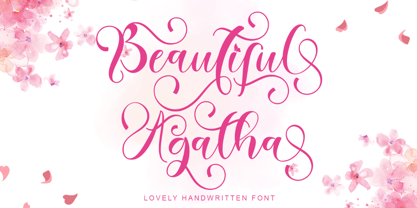 "Beautiful Agatha" is the best beautiful handwritten font. This font comes with uppercase, lowercase, ligature, swash, alternate, punctuation, and multilingual support. very suitable for weddings, engagements, invitations, Christmas, Valentine's, spring, summer, autumn, etc.
 - Minami by Andrey Font Design,
$9.00 Minami is a trendy handwritten font featuring a neat style. This gentle font will look gorgeous on various design ideas. It will add a joyful and romantic touch to each of your projects!
 - Lonestar Western by FontMesa,
$25.00Lonestar Western is a revival of the old classic slab serif font named Hellenic which was very popular in the middle to late 1800s. While watching an old western movie the opening credits caught my attention, it was the Hellenic font with spurs added which gave it a more western look. - Mermaid NY by DP Fonts,
$49.95 MermaidNY font was created from an illustration I did in college for a NYC restaurant. The combination of sea and city come together and are represented with my illustrations of mermaids and urban buildings. This is a base font for what can be amazing invitations, textiles or anything you can imagine.
 - Le Major by Calamar,
$18.00 Le Major is my new elegant serif font that will bring in your projects a touch of luxury and style. It's perfect match for logotypes, branding, wedding monograms and invitations, blog headlines and much more. Flip through all the previews and get inspired like I was while creating this font.
 - Willson by Din Studio,
$29.00 Say hello to Willson - Clean Serif Font, Willson designed with a modern and clean style. It's suitable for branding, logo, printing and many other designs. Included: Willson (otf) Features: Accents (Multilingual characters) 6 Alternates 11 Ligatures PUA encoded Numerals and Punctuation (OpenType Standard) Thanks for visiting and purchasing my font!
 - Mister B by Bogstav,
$17.00 Mister B is my go on a handmade organic font. The letters are clumsy, with the width and height somewhat off here and there. Nevertheless, the result is a naive and charming font, which is suitable for most things that has to do with kids toys, organic products or comics.
 - Seasonal Drift by Hanoded,
$15.00 Seasonal Drift is a brush font that I made using one of my father in law's Chinese brushes and ink. For some reason this font reminded me of the ocean, like waves and currents and driftwood. Seasonal Drift comes with a healthy dose of language support and some cool discretionary ligatures.
 - Blitz Condensed by Wiescher Design,
$20.00 A very glitzy Blitz! Blitz-Condensed is an addition to my normal Blitz family. Both are topheavy fonts and are meant to be used together. The font gets a special shine because of this effect. And it stays readable despite its special design. Your designer of surprising typefaces, Gert Wiescher
 - Noki by ActiveSphere,
$30.00 The new release is called Noki. A font family Ideal for flyers, label, logos, magazine, product branding, corporate branding, signage, posters and certainly in advertising. Check it out !
 - Hugnesh by Ditatype,
$29.00 Introducing Hugnesh Font. Hugnesh font is a monoline display font. Create from our talented font designer. The design of typeface will make your design more beautiful and inspiring. This font will suitable for any project, like branding, print template, logo and etc. Includes : Hugnesh (OTF) Features : Multilingual Support Beautiful Ligature PUA encoded Stylistics Set Numerals and Punctuation (OpenType Standard) Full Support Thanks for visiting and purchasing my font!
 - Antique Heritage by Din Studio,
$20.00 Dreaming to make remarkable projects? Wanna travel your audiences or costumers to aged world? Then, this is the path that you looking for. Introducing Antique Heritage- A Monoline Script Font This font is best to add antiques to your projects that have vintage styles and shapes can help bring to a fine new level. Also, to increase a real sense of timelessness. Use it for headings, logos, business cards, printed quotes, invitations of all sorts, cards, packaging, and your website or social media branding. Our font always includes Multilingual option to make your branding globally recognised. Features: Standard Ligatures Stylistic Sets Swashes Multilingual Support (91 languages) PUA Encoded Numerals and Punctuation Thank you for downloading premium fonts from Din Studio
 - Circulo by MMD Fonts,
$6.29 Bound to rules, unbound in the usage. Hyper geometric, and minimal contrast. Circulo V1 is based on a font project I originally started because of a client I had. I wanted to create a display and text font for their product design brand, which is all about reducing the amount of necessary materials and production steps. Before I started the course at tipo-g it was called -“REDUCE“ and was more or less finished. The concept was based on the name. How far can letter shapes be reduced to their core geometric concepts and still be identified as letters? But in a way, it lacked a unique approach and was just a generic geometric Sans Serif with a lack of finesse. There was already a glimpse of characteristics visible which would later define Circulo V1. The high focus on geometric shapes was not of the same severity, and the angle on the stems was less intense. Those, as I call them, fake serifs turned out to be a significant factor in legibility and the characteristic of the font. Besides those changes and improvements, I decided to implicate a new feature to the concept, a condensed style. I quickly realised that it is impossible to keep my perfect circles and half-circles in this style without breaking my rules for the font. This „problem“ turned out to be the most crucial feature of the condensed set. Circular-based Letters will ignore the rules and boundaries of the condensed style and stay as they are. This feature allows the user to create a unique rhythm in their texts, and if you use the variable font, you can decide how intense this rhythm will be. In this situation, the user can choose which letters are allowed to keep their shapes and which will be put in their condensed corset. All, some or none of them, you decide.
 - Wolfsblood by Monotype,
$29.99 Wolfsblood is a new display face by Jim Ford, adapted from hand-lettered logos spawned by punk rock bands like The Misfits and Bad Brains. The style can be traced back further to Hollywood and the explosion of low-budget exploitation, horror and sci-fi films, which also had an influence in punk rock. Wolfsblood captures this bizarre dark-spirited lettering which has become a staple in the designer‘s work for bands and posters. The Wolfsblood font has an expanded character set with borders, dingbats (yes, Bats!), and contextual ligatures programmed to give the typeface a random appearance by default. As with some of Jim‘s other typographic experiments, Wolfsblood encourages the designer to play with upper and lowercase, and mixed-case settings, to replicate the decisions that a lettering artist might make. Wolfsblood is great for logos, posters, headlines and short bits of text, and will add a fun, aggressive energy to your dark and other-worldly creations.
 - Fluid by Paulo Goode,
$20.00 This frivolous 6-font typeface was inspired by playing with my food one evening. I began to wonder what it would be like to draw a typeface with a pipette and liquid... the result is Fluid. A key feature are the contextual alternates that substitute an alternate second glyph when typing double letters, this gives a more natural feel to the resulting text. It’s a fun typeface from my back catalogue that was originally released in June 2018. Enjoy playing!
 - Art School by AVP,
$25.00 Faithfully reproduced from my father’s design drawings made at The Municipal School of Arts and Crafts, Wolverhampton in 1939. Strong nostalgic influences of Art Nouveau and Art Deco. What caught my eye was the consistency with which each particular character was formed: every ‘R’ like every other, every ‘S’ the same. Tight letter spacing and loose word spacing characterised his titling but he didn’t trust himself to print without first ruling guidelines, a hint of which remain in this font.
 - Singa by madeDeduk,
$14.00 Introducing Singa is a three distinct classic casual family comes with 9 variable weight to get more stunning. Use this font family for any branding, product packaging, invitation, quotes, t-shirt, label, poster, logo etc. Character Set Uppercase & Lowercase Number & Symbol International Glyphs Alternative & Ligatures Multilingual support Feel free to shoot me on email at: dedukvic@gmail.com any time and follow my shop for upcoming updates And find more previews on my Instagram here : https://www.instagram.com/acekelgondolayu/?hl=en Hope you enjoy it.
 - Bluenote Demi by Wiescher Design,
$39.50 Bluenote is a font based on Franklin Gothic condensed. In the 60s and 70s the record label Blue Note published all those classic jazz records of my youth. Someone at their arts department cut letters to ribbons and designed wonderful record covers with those fragmented glyphs. I recently had a look at my music collection and rediscovered these letters. Being a hard-working type designer I couldn't resist the challenge, here is the result from your dilligent designer Gert Wiescher
 - Jackpot by Funk King,
$5.00 Jackpot is a font-bat of a slot machine for all your gaming needs.
 - Sinadey by Craft Supply Co,
$20.00 Introducing Sinadey – Cute Sans Serif Adorable Simplicity Sinadey – Cute Sans Serif is the epitome of adorable simplicity, offering a charming sans serif font with a crisp shape. Crisp Elegance What sets Sinadey apart is its crisp elegance. It’s the ideal choice when you need a cute sans serif font that still maintains sharp and well-defined characters. Playful Charm Sinadey’s playful charm adds a delightful touch to your designs, making it perfect for a wide range of creative projects. Versatile Application This font’s versatility shines through, ensuring that it can be used in various design contexts, from invitations to logos and more. In Conclusion In summary, Sinadey – Cute Sans Serif is your go-to when you desire a cute sans serif font with crisp, well-defined shapes. Its adorable simplicity, crisp elegance, and playful charm make it versatile and suitable for a diverse array of design projects, ensuring that your content remains engaging and inviting to all readers.
 - Wolfgang by Aronetiv,
$9.99 The typeface is influenced by early Italian-French serifs such as Garamond, Jenson, Griffo. The font has clear serifs and slightly sharp shapes. It has a modern character. The font has a uniform texture typical for this type of serif. This font family is well suited for the decoration of solemn and graceful materials. The font has a nice and appropriate italics. Wolfgang is legible and easy to read at small sizes. The font family contains 6 styles The font is equipped with a Variable file. Supports languages ??of central Europe Contains old style figures There are several alternates in the font The font has more than 1000 kerning pairs
 - Mode Style by Motokiwo,
$10.00 Fashion is about style, pairing the right one with the best one. Let me introduce Mode Style, best paired font between Sans Serif and Handwritten Script. It's suitable for logo, display purpose, or something else that needs elegant style. YOU'LL GET: 1. Mode Style Sans, an elegant Sans Serif font with medium wide characters. This is All Caps font with large range of punctuation and multilingual support. 2. Mode Style Script, a classy thin Handwritten Script font with natural pen stroke feel. Comes with ligature make this font more close to the real handwritten, also support multilingual and already PUA Encoded.
 - Viable Logic by Twinletter,
$12.00 Viable Logic font, has a neat and clean character new face sans serif fonts, in response to the need for innovative and new designs, for that this sans serif font family has different characters namely bold, thin and regular. This font is simple yet neat and elegant, the design of this typeface gives it a clean, modern look and a unique style to help give it a captivating look when you use it. This font is perfect for strong text with displays for a wide variety of branding, advertising, posters, banners, packaging, news headlines, magazines, websites, logo design, and more.
 - Halena by Sakha Design,
$12.00 Halena is a modern and adaptable sans serif font. Suitable to a wide variety of designs due to its neat and simple style, this font has the potential to become your favorite go-to font, no matter the occasion!
 - Salminah by Letterafandi Studio,
$14.00 Salminah is a fashionable and thin lettered script font. Suitable to a wide variety of designs due to its neat and simple style, this font has the potential to become your favorite go-to font, no matter the occasion!
 - Qareluna by Typebae,
$12.00 Qareluna is a beautiful and elegant sans serif font. Suitable to a wide variety of designs due to its neat and simple style, this font has the potential to become your favorite go-to font, no matter the occasion!
 - Samman by Eyad Al-Samman,
$- Samman is a Kufic simple Arabic typeface. It can be used to decorate public signs in streets, airports, hospitals, schools, malls, hotels, mosques, and other public places. My family's surname is "Samman" which stands for the person who sells fat especially the one produced by cows ("Samn" in Arabic). Consequently, "Samman" Typeface was designed for eternizing the memory of my family. The main characteristic of "Samman" Typeface is the leaf-shaped style for some of its Arabic characters such as "Dad", "Sad", "Faa", "Meem" and others. The distinguishing artistic design of its "Haa" character adds a unique feature to this typeface especially when connected with other characters. The shape of the characters' "dot", "dots", and "point" is innovative; a triangle with a semi-circle shape. "Samman" Typeface is suitable for books' covers, advertisement light boards, and titles in magazines and newspapers. Its characters' modern Kufic styles give the typeface more distinction when it is used also in posters, greeting cards, covers, exhibitions' signboards and external or internal walls of malls or metro's exits and entrances. It can also be used in titles for Arabic news and advertisements appeared in different Arabic and foreign satellite channels.
 - Zushboy by PizzaDude.dk,
$20.00Zushboy is a ragged verion of my own tagging style (even though it has been years and years since I did a thing like that!). The font is spaced tight in order to copycat a real homeboy's handwriting! Yo! - Engineer by GRIN3 (Nowak),
$15.00 Engineer is a new, completely redesigned and improved version of my font TechnicznaPomoc, which was released for the first time in 2001. Language support includes Western, Central and Eastern European character sets, as well as Baltic and Turkish languages.
 - Dexterous by Gerald Gallo,
$20.00 Dexterous is my interpretation of an antique typeface. The font includes upper and lowercase alphabets with alternate "E F L M S T" characters and alternate "c e m s" characters, numbers, punctuation, accented characters, symbols, and miscellaneous characters.
 - Preto Serif OT Std by DizajnDesign,
$50.00 Preto is an extensive type family, which explores the function of serifs on readability and legibility. Preto consist of three subfamilies: Sans, Semi and Serif. Preto is designed for multilingual typesetting. All of the subfamilies have equal gray value but different texture which can be use to differentiate languages. Preto sub-families have two text weights and two bold styles (Regular -> Bold, Medium -> Black). Every weight has a companion Italic style as well. The serif version has been designed to work best at small point sizes (around 8, 9 points). You will not achieve calm, boring or invisible look of your text with Preto Serif. Its long, spiky and sharp serifs contribute to give the typeface a distinct and energetic character. It is very suitable for magazines, corporate identity, brochures or other print materials where a typeface for continuous reading is required. The ligatures in Preto Serif are very special. You can set them in different tracking values and spacing will increase/decrease consistently in the ligatures as well. Alternative characters in the font files allow you to change the feeling of the text from typical to more special (J, Q, g , &). Each font contains a full set of small caps and many alternative characters for complex typesetting.
 - Preto Serif by DizajnDesign,
$24.00 Preto is an extensive type family, which explores the function of serifs on readability and legibility. Preto consist of three subfamilies: Sans, Semi and Serif. Preto is designed for multilingual typesetting. All of the subfamilies have equal gray value but different texture which can be use to differentiate languages. Preto sub-families have two text weights and two bold styles (Regular -> Bold, Medium -> Black). Every weight has a companion Italic style as well. The serif version has been designed to work best at small point sizes (around 8, 9 points). You will not achieve calm, boring or invisible look of your text with Preto Serif. Its long, spiky and sharp serifs contribute to give the typeface a distinct and energetic character. It is very suitable for magazines, corporate identity, brochures or other print materials where a typeface for continuous reading is required. The ligatures in Preto Serif are very special. You can set them in different tracking values and spacing will increase/decrease consistently in the ligatures as well. Alternative characters in the font files allow you to change the feeling of the text from typical to more special (J, Q, g , &). Each font contains a full set of small caps and many alternative characters for complex typesetting.
 - KG Behind These Hazel Eyes by Kimberly Geswein,
$5.00 Perfect for teachers, this font has enough glyphs to cover 80+ languages and extra math symbols! It is neat and legible for early readers!
 - KG True Colors by Kimberly Geswein,
$5.00 This teacher-friendly polka-dotted font is perfect for kids and teachers. It is fun but still perfectly neat and legible for little readers.
 - Ant Serif by LNP Fonts,
$9.99 Ant Serif is a font that can be used for advertising, logo creation, webfonts and more. The font comes in two styles, Regular and Italic and has all the characters in the Latin Basic, Additional and Extended scripts. The font's design came from my love of Marvel's Ant-Man and the Wasp logo. The typeface used, which was custom, was of interest for me, so I decided to create it as a font. It's not a perfect font, but I have put work to make sure it looked as decent as possible. Hope you'll enjoy it!
 - Rough The Type by Tour De Force,
$15.00 Dusan "Dustin" Jelesijevic wanted to make a font that would be "scary" and "serious" at the same time. Wanna-be-horror and punk-rock-out-of-beers typeface's style invites all interest minors and adults to use this fonts for miscellaneous rebel-yeah situations. For example, if you like to protest in a public against Tour De Force font foundry, please write transparencies using this font, it will hurt us bad. Just don't hack our site with message written in Rough the Type. If you write with West European characters, love being nerdy and to kick some schmucks in the brain, Rough the Type is at your service. And remember - I know what font you used last summer!!!
 - HS Almohandis by Hiba Studio,
$59.00 HS Almohandis is an Arabic display typeface. It is useful for book titles and graphic projects where a contemporary, streamlined look is desired. The font is based on the simple lines of modern and simplified Kufi calligraphy, that support Arabic, Persian and Urdu. This font was created in the beginning as regular weight with the font HS Alhandasi in 2007 for use in technical and engineering company. The company tends to follow the geometrical shape with equal dimensions in both vertical and horizontal storks. There is also a tendency to make all characters to be similar to oval shape with the impression that they are all geometrical and clear. I followed that with Bold weight in 2011. The difference between this font and HS Almohandis is that its characters have a sharp baseline.
 - Blamtastic 3d Comic Display by Sipanji21,
$15.00 "Blamtastic" is a 3D display font designed with a comic theme and sharp characters. This font offers three distinct styles: solid, inner shadow, and outline. Fonts with multiple styles like this are ideal for creating depth and visual interest in text. The solid style provides a bold and straightforward appearance, while the inner shadow style adds depth by giving the characters a three-dimensional effect. The outline style outlines the characters, emphasizing their shape against the background. With its comic-inspired theme, sharp characters, and various styles, "Blamtastic" is suitable for a wide range of design projects that require a playful and attention-grabbing typographic style. It can be used effectively in comic books, posters, titles, or any design where a bold, dynamic, and multi-dimensional font is needed to create an impactful visual presence.
 - Chilling Atmosphere by PizzaDude.dk,
$20.00 Chilling Atmosphere is inspired by classic horror movies and is super useful to for your creepy postcards, flyers, clothing or perhaps packaging. I've added 6 different versions of each letter, to make your creepy text stand even more out!