10,000 search results
(0.025 seconds)
- Beton by Linotype,
$29.99The Bauer Typefoundry first released the Beton family of types in 1936. Created by the German type designer Heinrich Jost, the present digital version of the Beton family consists of six slab serif typefaces. First developed during the early 1800s, by the 1930s slab serif faces had become one of many stock styles of type developed by foundries all over the world. Because of their distance from pen-drawn forms and their industrial appearance, they were seen as “modern” typefaces. (Their serifs kept them from being too modern.) The first slab serif typefaces were outgrowths of didone style text faces (e.g., Walbaum). As newspapers and advertising grew in importance in the western world (especially in “Wild West” America), type founders and printers began to create bigger, bolder typefaces, which would set large headlines apart from text, and each other. Through display tactics, businesses and industry could begin to visually differentiate their products from one another. This craze eventually led to the development of monster sized wood type, among other things. By the 20th Century, the typographic establishment had begun to tame, categorize, and codify 19th Century type styles. It was in the wake of this environment that Jost developed Beton. The Beton family is a type “family” in a pre-1950s sense of the word. Although six styles of type are available, only four of them fit in logical progression with each other (Beton Light, Beton Demi Bold, Beton Bold, and Beton Extra Bold). The other two members of the family, Beton Bold Condensed and Beton Bold Compressed, are more like distant cousins. They function better as single headlines to text set in Beton Light or Beton Demi Bold, of as companions to totally separate typefaces. - SF Article by Sultan Fonts,
$40.00 About Sf Article font family: Sf Article is An Arabic and Latin typeface for desktop applications ,for websites, and for digital ads. The main types of Sf Article font family weight are regular and bold. The regular weight is perfect for reading, it is helpful during long reads, Bold Sf Article styles are designed to draw attention to short phrases. The Sf Article font family is characterized by short heights and dynamic stretching of letters through the paragraph, where the space In the line is automatically filled. In Sf Article font family, we have developed two italic fonts: regular and bold, to help with the diversity of stylistic expression in the Article, document and research work. Sf Article typeface comes with many OpenType features including stylistic sets. Designer: Sultan Maqtari Design date: 2021 Publisher: Sultan Fonts
 - Grund by SIAS,
$29.90 GRUND is a new fontographic adaption of a remarkable 1920s epigraphical find in the city of Leipsic. This old well-known European trade fair hotspot struggled with a severe shortage of exhibition space around 1920. The solution was to dig deeper into the matter – literally – and 1924 the world’s first underground trade fair exhibition hall was opened right under the city’s central market square. After several changes of use during the past decades the sophisticated Art Deco entrance structure (architect: Otto Droge) was re-opened in December 2013 as a gateway to a new subway rail track. – The original brass lettering of the UNTERGRUNDMESSHALLE MARKT has been retrieved – and served as the inspiration for this new and unique font. If you’d like to see more exceptional Art Deco type, have a look at my Arthur series. __________________________________________________________________________________________
 - Bremer Presse by Schraube,
$29.00 As most successful German private press, «Bremer Presse» has strongly influenced German book art. It was founded 1911 in Bremen to print and produce books in perfection. The role model of the press’ typeface was the english Doves Press. Willy Wiegand drew three versions of the «Bremer Presse» antiqua font, starting with the regular weight in 16 pt and adding later the regular weights in 11 and 12 pt. The revival of this beautiful font is based on the 12 pt weight. During the design process, the focus was laid on finding the elegance and strength of original prints. As it was designed to print books, the typeface is optimally used for texts. And with the revival’s new weights «medium» and «bold» and OpenType features like ligatures or old style figures, you can design sophisticatedly typographical compositions.
 - Lontara by Triden Works,
$21.00 PREFACE Lontara typeface shape is originally created by freehand technique, without modify other exist digital typeface. It purely inspired by traditional Lontara manuscript, South Sulawesi. Lontara typeface is dedicated for originality of Indonesian Cultural. ORIGINS The La Galigo that written in traditional Lontara script is widely believed by people Buginese as a bible of sacred and should not be read without a certain ritual preceded.It tells the story of hundreds of descendants of the gods who live at a time for 6 (six), hereditary generation, the various kingdoms in South Sulawesi and the surrounding islands. The Lontara script is an Brahmic script traditionally used for the Bugis language, Makassarese language, and Mandar languages of Sulawesi in modern Indonesia. It is also known as the Buginese script. It was largely replaced by the Latin alphabet during the period of Dutch colonization.
 - Brandon Grotesque by HVD Fonts,
$40.00 Brandon Grotesque is a sans serif type family of six weights plus matching italics. It was designed by Hannes von Döhren in 2009/10. Influenced by the geometric-style sans serif faces that were popular during the 1920s and 30s, the fonts are based on geometric forms that have been optically corrected for better legibility. Brandon Grotesque has a functional look with a warm touch. While the thin and the black weights are great performers in display sizes the light, regular and medium weights are well suited to longer texts. The small x-height and the restrained forms lend it a distinctive elegance. Brandon Grotesque is equipped for complex, professional typography. The OpenType fonts have an extended character set to support Central and Eastern European as well as Western European languages. Brandon Grotesque won the TDC2 Award, 2011.
 - Bayer Sans by Victory Type,
$20.00Bayer Sans, is based on the typography of the Austrian-born artist Herbert Bayer. Bayer worked as a teacher and graphic designer at the Bauhaus, a revolutionary German art school, during the 20's. His specialty was commercial art and he had many "radical" views on typography and its interaction with society. Bayer felt that written language should be merely a graphic version of spoken language. Thus, he advocated a single alphabet without majuscules and miniscules. Bayer's designs are simple, geometric letterforms that lend themselves to lowercase form. This font, based on the typography of Bayer and his students at the Bauhaus Werkstatt (studio), was digitally modeled by Noah Rothschild. Bayer Sans features a complete character set including European characters, alternate letters with adjusted widths and designs and ligatures. Included are the "f" characters and a special linked double-o. - Walls by Piñata,
$8.00 What do you use to write a price tag at a store or to design a wall menu in a cafe? What to choose – a marker or chalk? Now it makes no more sense to be torn apart by the choice – use both techniques for your design. Walls fontfamily allows to perfectly combine an eco-friendly style with contemporary motives. Walls fontfamily supports over 70 languages and consists of 10 typefaces in 5 popular weights (Thin, Light, Regular, Bold, Black). Initially we wanted to create a font that would imitate an inscription made by a square tip marker which is usually used to write price tags at supermarkets, shops and cafes. During the working process we've decided to extend the conceptual boundaries of the Walls fontfamily and added 5 rough typefaces that imitate the style of ecologic chalk writing
 - Lacosta by Mans Greback,
$59.00 Lacosta is a decorative script typeface, drawn and created by Måns Grebäck during 2020. Perfect for company or product logotypes, or any typographic art that requires that classic custom look. Included in the family is the Lacosta Line typeface, a swash underlined variation of the original font. In addition to being a beautiful, ornamental lettering, it also has a lot of decorative and swash options: Use the symbols [ ] { } _ to create connections, swashes and decorations. Example: Extra[ Sweet] The font contains multiple OpenType functions, and is filled with alternates; stylistic alternates to give extra personality, and contextual alternates to make the letters flow with one another smoothly -- just as a custom logo. Lacosta has a very extensive lingual support, covering all European Latin scripts. The font contains all characters you'll ever need, including all punctuation and numbers.
 - Toy Decals JNL by Jeff Levine,
$29.00 For decades, cereal companies have included premiums [promotional gifts] inside their packages, printed on the cartons or to send for with a special coupon and redemption instructions. During the 1940s, Pep cereal [a long-discontinued Kellogg's brand] offered a series of water-applied decals within its boxes. Most likely made by the Meyercord Company (one of America's largest transfer decal manufacturers at the time), one decal in particular had an alphabet in gold letters with black outlines. (One can only presume the marketing strategy was to have kids bug their parents to buy more Pep cereal if the child needed more than one letter of the alphabet for his or her initials!) Those decal letters have inspired a digital version as the outline character font Toy Decals JNL, which is available in regular oblique, solid and solid oblique styles.
 - Robur by Canada Type,
$24.95 It shouldn't be a surprise to anyone that these letter shapes are familiar. They have the unmistakable color and weight of Cooper Black, Oswald Cooper's most famous typeface from 1921. What should be a surprise is that these letters are actually from George Auriol's Robur Noir (or Robur Black), published in France circa 1909 by the Peignot foundry as a bolder, solid counterpart to its popular Auriol typeface (1901). This face precedes Cooper Black by a dozen of years and a whole Great War. Cooper Black has always been a bit of a strange typographical apparition to anyone who tried to explain its original purpose, instant popularity in the 1920s, and major revival in the late 1960s. BB&S and Oswald Cooper PR aside, it is quite evident that the majority of Cooper Black's forms did not evolve from Cooper Old Style, as its originators claimed. And the claim that it collected various Art Nouveau elements is of course too ambiguous to be questioned. But when compared with Robur Noir, the "elements" in question can hardly be debated. The chronology of this "machine age" ad face in metal is amusing and stands as somewhat of a general index of post-Great War global industrial competition: - 1901: Peignot releases Auriol, based on the handwriting of George Auriol (the "quintessential Art Nouveau designer," according to Steven Heller and Louise Fili), and it becomes very popular. - 1909-1912: Peignot releases the Robur family of faces. The eight styles released are Robur Noir and its italic, a condensed version called Robur Noir Allongée (Elongated) and its italic, an outline version called Clair De Lune and its condensed/elongated, a lined/striped version called Robur Tigre, and its condensed/elongated counterpart. - 1914 to 1918: World War One uses up economies on both sides of the Atlantic, claims Georges Peignot with a bullet to the forehead, and non-war industry stalls for 4 years. - 1921: BB&S releases Cooper Black with a lot of hype to hungry publishing, manufacturing and advertising industries. - 1924: Robert Middleton releases Ludlow Black. - 1924: The Stevens Shanks foundry, the British successor to the Figgins legacy, releases its own exact copies of Robur Noir and Robur Noir Allongée, alongside a lined version called Royal Lining. - 1925: Oswald Cooper releases his Cooper Black Condensed, with similar math to Robur Noir Allongée (20% reduction in width and vectical stroke). - 1925: Monotype releases Frederick Goudy's Goudy Heavy, an "answer to Cooper Black". Type historians gravely note it as the "teacher steals from his student" scandal. Goudy Heavy Condensed follows a few years later. - 1928: Linotype releases Chauncey Griffith's Pabst Extra Bold. The condensed counterpart is released in 1931. When type production technologies changed and it was time to retool the old faces for the Typositor age, Cooper Black was a frontrunning candidate, while Robur Noir was all but erased from history. This was mostly due to its commercial revival by flourishing and media-driven music and advertising industries. By the late 1960s variations and spinoffs of Cooper Black were in every typesetting catalog. In the early- to mid-1970s, VGC, wanting to capitalize on the Art Nouveau onslaught, published an uncredited exact copy of Robur Black under the name Skylark. But that also went with the dust of history and PR when digital tech came around, and Cooper Black was once again a prime retooling candidate. The "old fellows stole all of our best ideas" indeed. So almost a hundred years after its initial fizz, Robur is here in digital form, to reclaim its rightful position as the inspiration for, and the best alternative to, Cooper Black. Given that its forms date back to the turn of the century, a time when foundry output had a closer relationship to calligraphic and humanist craft, its shapes are truer to brush strokes and much more idiosyncratic than Cooper Black in their totality's construct. Robur and Robur Italic come in all popular font formats. Language support includes Western, Central and Eastern European character sets, as well as Baltic, Esperanto, Maltese, Turkish, and Celtic/Welsh languages. A range of complementary f-ligatures and a few alternates letters are included within the fonts.
 - Quake Cyr - Unknown license

- Bride Style by Just Font You,
$18.00 Bride Style, A sweet beautiful delicate script font. Inspired from the wedding modern calligraphy style but presented in a fashion editorial way. Perfectly fit for branding, logo, wedding things, greeting cards, fashion, lookbook, moodboard, presentation, imagine the luxury, beautiful, stylish, and casual in the same time.
 - Beba by Eurotypo,
$28.00 Beba is based on geometric structures, where the same formal characteristics are applied to as many letters as possible. It is a sans-serif monoline typeface. It has a modern, clean and minimalist image; ideal to use for advertising, printed or digital graphics and signage system design.
 - Days Like This by Pesic,
$19.00 This font is inspired by Van Morrison’s song named “Days like this”. Contains all Latin glyphs and more than 400 characters with ornaments. It is decorative, very modern and useful for logos, T-shirt designs, packaging design, posters, billboards, magazines, covers, etc. Contains regular and italic.
 - Rough Letterline by Blankids,
$25.00 Introducing of our new product the name is Rough Letterline Authentic Brush Font. Rough Letterline inspired by brush calligraphy style this font is a fun theme very good for display, tshirt design, craft, quote sign, logotype and etc FEATURES : Uppercase Lowercase Number Punctuation Multilingual PUA Encode Opentype
 - Makalu by Juraj Chrastina,
$29.00 Makalu is a funny flower font inspired by the lovely drawings of the famous illustrator Zdeněk Miler (best known for his small mole). His flowers are at the same time cartoony and realistic. Enjoy this choice of 27 original and distinctive illustrations while creating your designs.
 - Umoya by Scholtz Fonts,
$19.00 Umoya is a modern and fluid African font. Its name means 'spirit' in the Zulu language and it is also the word used for 'air'. It is best used for an ethereal, magical look with tribal undertones. The font is fully professional: carefully letterspaced and kerned.
 - Headline by Monotype,
$29.99 Headline Bold is a sans serif face in the nineteenth century English Grotesque tradition. The Headline Bold font is based on types from the Stephenson Blake type foundry called Grotesque no. 9. A bold and compact font, its name gives a strong indication of its primary use.
 - Romantic Heart by Blankids,
$25.00 Introducing of our new product the name is Romantic Heart Script Font. Romantic Heart inspired by bouncy script style this font is a fun theme very good for display, tshirt design, craft, quote sign, logotype and etc FEATURES : Uppercase Lowercase Number Punctuation Multilingual PUA Encode Opentype
 - Alessyia by Umbra95,
$15.00 Alessyia is a classic style typeface font. This font has classic but at the same time a fresh look. "Alessia family" includes 3 font types: Regular ( Classic and elegant with straight geometric lines ) Grunge ( Dirty and messy ) Retro ( Hand drawn brush font with an uneven texture )
 - Thomson by Linecreative,
$16.00 Thomson is is an Condensed font with a modern look, It's Perfect for branding, logo design, shirts, name card, magazin layout,headers, or oven large scale artwork Thomson offers you: - Upper and Lowercase characters (All Caps) - Stylistic alternates - Numbers and Punctuation - Multilingual Support (Latin Western Europe)
 - King of August by Tour De Force,
$25.00 King of August is single weight script font. Simple, elegant, designed letters with power to fit and lead any project. It is ideal for product names, labels, packages, King of August works well in titles and shorter paragraphs as well. Comes with Swashes as OpenType feature.
 - Mochita Display by Sign Studio,
$15.00 Mochita Display is indeed a font made to give a fun, funny and cute impression. Even so, it still maintains good detail and balances the negative space. This font would be perfect for logo designs, titles, product names, labeling, or anything with a fun design theme.
 - Passenger Train JNL by Jeff Levine,
$29.00 A 1940s travel poster for the Florida East Coast Railway (which then carried passengers but is now a freight line) had the railroad’s name hand lettered in a bold Art Deco sans. This inspired Passenger Train JNL, which is available in both regular and oblique versions.
 - Koehler Sans JNL by Jeff Levine,
$29.00Koehler Sans JNL was inspired by a set of cardboard sign kit letters made by the Koehler Sign Company of Missouri (presumably) in the late 1940s or early 1950s. Not much is known about them, other than the letters looked interesting enough to turn into a font. - Bondie by Craft Supply Co,
$17.00 Bondie – Condensed Sans Serif is an Elegant Condensed sans serif with solid font files. it is based on the compact solid font, by combining a variety of styles. Suitable for Logo, greeting cards, quotes, posters, branding, name card, stationary, design title, blog header, art quote, typography
 - Dynamic Block by Biroakakarati,
$11.00 This is a block font style really dynamic. The blocks have a good harmony between them, every letter have the same width, this is comfortable when work on poster or on a big text. The rounded final of letter give a dynamic effect than a square final.
 - Bondy Quirky by Blankids,
$23.00 Introducing of our new product the name is Bondy Quirky Playful Font. Bondy Quirky inspired by Quirky Handwritten style this font is a fun theme very good for display, tshirt design, craft, quote sign, logotype and etc FEATURES : Uppercase Lowercase Number Punctuation Multilingual PUA Encode Opentype
 - Bestan by Konstantine Studio,
$17.00 Bestan is inspired by the typography of the ship's steel containers and industrial-based business branding. Added a slight touch of futuristic vibes to make Bestan appears as a fresh game-changer, either for corporation purpose and also modern urban vibes to your visual graphic design stuff.
 - Original Taste by Arttype7,
$12.00 I hope you are very happy today. we want to introduce our newest font, which we named `` Original Taste font ''. This font is a very bold bold cript font and has cool alternets and swashes. original taste font. This font has a taste, old, modern and unique.
 - Craptoy by PizzaDude.dk,
$20.00Craptoy is a grunge Open Type font - full of different auto ligatures! That means you can write words like beer, letter, bubble, success (just to name a few) without having the double letter repeating itself! (You will need to use OpenType supporting applications to use the autoligatures). - Normandy Isle JNL by Jeff Levine,
$29.00 Normandy Isle JNL is a condensed sanserif typeface built off of the basic design of an old wood type, but augmented with thick and thin lines to create a whole different look. The font itself is named after a community in the North end of Miami Beach.
 - Gladiate by Solotype,
$19.95This was a favorite of job printers in late Victorian times. They used it on cards and stationery, as well as small handbills. It was made in a range of sizes from 10 point to 36 point. Good for places where you really don't want to shout. - Fedot by Oleg Stepanov,
$20.00 Fedot is a hand-drawn font, based on shapes of early cyrillic scripts (so-called "ustav" and "poluustav"). Lowercase typesetting with its variable letter heights is more brisk and authentic, and uppercase is more equable and neutral. Some of letters are the same in lowercase and uppercase.
 - Origin Tech by Ronin Design,
$15.00 Origin Tech is a modern typeface inspired from technologies, this display font have a beginning and ending alternate and also have some swashes will make your design perfect. Origin Tech designed for modern project theme, perfect for game/app design, logo design, poster, advertising and many more
 - Bummill by Awanstudio,
$16.00 Bummill signature font allows you to create stunning and easy hand-lettering in an instant. Ideal for the logo, quotes, wedding, product label/packaging, fashion, letter, advertising, invitation, poster, merchandise, greeting cards, etc. This font came along with lots of ligatures option for more natural looks.
 - Shocked Up by Typefactory,
$14.00 Shocked Up is a cute and fancy display font. It embodies playfulness and authenticity and is the perfect choice for any children activity, game font, party invitation, or school project. Add this chunky lettered font to your designs and notice how it makes them come alive!
 - Wallflowers II by Laura Worthington,
$19.00 Create borders, wallpaper, or repeating patterns using Wallflower II’s unique hand drawn wallpaper tiles and accompanying icons. Wallflowers II are easy to use for borders or wallpaper: simply type the same letter consecutively (i.e., aaa) and the pattern will emerge. See what’s included! http://bit.ly/2bGXbnC
 - Ageoline by Blankids,
$17.00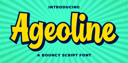 Introducing of our new product the name is Ageoline a Bouncy Script Font. Ageoline inspired by bouncy lettering style this font is a fun theme very good for display, tshirt design, craft, quote sign, logotype and etc FEATURES : Uppercase Lowercase Number Punctuation Multilingual PUA Encode Opentype
