10,000 search results
(0.023 seconds)
- Absalon by Michael Nordstrom Kjaer,
$39.00 Absalon has square letter shapes. It has some characteristics semi-sharp and semi-rounded corners and it has a relatively tall x-height for legible text. To create the perfect typesetting the spaces between individual letter forms has been precisely adjusted. The Absalon font family is perfect for the web as well as for print, for display as well as longer text, for motion graphics, on the side of a van, t-shirts, logotypes and so on. The font family consist of 5 weights or 10 styles and it has 410 glyphs. A total of more than 4000 glyphs. The styles are: Light, Light Italic, Regular, Italic, Medium, Medium Italic, Bold, Bold Italic, Extra Bold & Extra Bold Italic. It has OpenType features such as automatic fractions, subscript, superscript, numerators, denomerators, ordinals and the “f” ligature set. Absalon has extended language support (most Latin-based scripts are supported). The name of the font family is Absalon and it is a reference to a Danish bishop in the middle ages. He was a key figure in the founding of Copenhagen, the Capital of Denmark.
 - Sunstone by Supfonts,
$17.00 Sunstone Cyrillic & Latin font Sunstone it is a chic script font with exquisite accents and full Cyrillic support. It is perfect for branding, wedding invitations and invitation cards and many more It includes a full set of gorgeous uppercase and lowercase letters, numbers, a large selection of punctuation marks, and ligatures. Sunstone - это милый шрифт с изысканными акцентами и полной поддержкой кириллицы. Он идеально подходит для брендинга, свадебных приглашений и пригласительных билетов и многого другого Test it out below to see how it could look for your next project! Includes: Regular Script Latin languages support Cyrillic languages support Uppercase and lowercase Numbers and punctuation Ligatures Check out my blog: https://www.instagram.com/zloillev pinterest.com/dmitriychirkov7 Enjoy
 - YLab Variable by Par Défaut,
$40.00 yLab is geometric typeface compose of 10 fonts (5 weights and oblique declination) Perfect for titles and text, yLab supports many languages (Latin pro..). 11 OpenType Features (Alternative; Fraction; Numerator; Denominator; Superior; Inferior; Tabular figure; Ordinals; Discretionary Ligature; Stylistic Set; Case Sensitive Forms). • Ordinal feature includes the Latin alphabet (Uppercase & Lowercase). • Five Stylistic set for “a”, “g”, "i" and "l", includes accents. • Discretionary Ligature includes “AE”, “IJ”, “OE”, available in lowercase. • Contextual Alternate includes ligatures for arrows : <- -> ^| v| <-> v^| Add parentheses around period, numbers or arrows, add n or d for numerator, denominator. Add n, d or +, for numerator, denominator or case arrows. All Case sensitive characters become after the uppercase and number.
 - Departura by Nasir Udin,
$20.00 Departura is a sans-serif family inspired by art deco travel posters in early 20th century, fused with modern & geometric touch. It comes in 18 styles, 9 weights and its matching italics. With those style variatons, Departura offers many possibilities to be applied in many graphic or editorial projects.The modernized retro-look makes this family great to presents any contents related to travel, history & culture in the present/modern way. Also thanks to the extended latin character set so that Departura supports 200+ latin-based languages plus Cyrillic (including the Bulgarian and Serbian characters). P.s.: The Bold Italic & ExtraLight styles are free to download, so you can use them for any projects free of charge.
 - 2009 Primitive by GLC,
$38.00 This is not an historically accurate font but rather one intended capture the spirit of ancient Roman manual type. It was inspired by various patterns used in documents and books created by Latin scribes between the second and fourth centuries. They used either calamus and ink on papyrus, or a pointed metal stick on wax tablets. We have created the font for contemporary use; distinguishing between U and V, I and J, which had no meaning for ancient Latin scribes, and adding thorn, Oslash, Lslash, W, Y and common accented characters that did not exist at the time. A lot of titlings and contextual alternates complete the set. Available only in TTF and OTF format.
 - Gasoline Alley NF by Nick's Fonts,
$10.00 A casual and fun-loving font based on the work of showcard artist Albanis Ashmun Kelly, from his 1911 book “Expert Sign Painter,” and named for a long-running comic strip. Both versions of this font contain the complete Unicode Latin A character complement, with support for the Afrikaans, Albanian, Basque, Bosnian, Breton, Catalan, Croatian, Czech, Danish, Dutch, English, Esperanto, Estonian, Faroese, Fijian, Finnish, Flemish, French, Frisian, German, Greenlandic, Hawaiian, Hungarian, Icelandic, Indonesian, Irish, Italian, Latin, Latvian, Lithuanian, Malay, Maltese, Maori, Moldavan, Norwegian, Polish, Portuguese, Provençal, Rhaeto-Romanic, Romanian, Romany, Sámi, Samoan, Scottish Gaelic, Serbian, Slovak, Slovenian, Spanish, Swahili, Swedish, Tagalog, Turkish and Welsh languages, as well as discretionary ligatures and extended fractions.
 - R21 hSq by 103cia,
$10.00 R21-h sq is stand for "Ratio 2:1 in horizontal square"; a comparison in making a glyph typography, horizontally in the form of a square. R21-h sq font consists of bold-retro typeface with its own unique funky style. Suitable for app design, games, toys character face, storybook covers, logos, advertisements, branding, poster, or anything that needs a daring and fresh typography. Font include: R21-hSq-Latin (+extended) font R21-hSq-Cyrillic font R21-hSq-Greek font* * Additional Light font for Greek only. All styles include Latin standards (except for free/demo version). The glyph 6, 8, 9, x, O, Q and X on display are for commercial version (the free/demo version are different).
 - Mak Variable by Tkachenko design,
$211.00 Mak is a display font with a Ukrainian feeling inspired by Ukrainian music. Customize weight and contrast to the smallest value to your needs with a variable version of Mak. This is a big update of the first free two styles of Mak (SemiBold High & Black High) that were created in 2019 and become widespread among free display fonts. The big update wasn't been only adding more weights and contrasts but also changing a lot of glyphs and adding new ones. Now Mak supports all Latin-based languages and European Cyrillic. Experiments with historical forms, contrasts, and daring shapes to create a new image of Ukrainian Cyrillic and Latin based on it.
 - Snoopy Snails NF by Nick's Fonts,
$10.00Duck! There’s a cream pie headed your way! This wild and wacky face is based on the title card lettering for the original Soupy Sales TV show, a lasting testament to my misspent youth. Both versions of this font contain the complete Unicode Latin A character complement, with support for the Afrikaans, Albanian, Basque, Bosnian, Breton, Catalan, Croatian, Czech, Danish, Dutch, English, Esperanto, Estonian, Faroese, Fijian, Finnish, Flemish, French, Frisian, German, Greenlandic, Hawaiian, Hungarian, Icelandic, Indonesian, Irish, Italian, Latin, Latvian, Lithuanian, Malay, Maltese, Maori, Moldavan, Norwegian, Polish, Portuguese, Provençal, Rhaeto-Romanic, Romanian, Romany, Sámi, Samoan, Scottish Gaelic, Serbian, Slovak, Slovenian, Spanish, Swahili, Swedish, Tagalog, Turkish and Welsh languages, as well as discretionary ligatures and extended fractions. - Bream by Hackberry Font Foundry,
$24.95 This is the display version of Librum. Librum means “book” in Latin, which I thought was appropriate. Bream is Latin for proclaim—appropriate for display work. The fonts are very close to Librum-Book and Librum-Italic, with the same OpenType features. The glyphs are modified a bit to make them a little more elegant, but that’s not very noticeable. Mainly, the letterspacing and kerning is tighter and more carefully fit to large point sizes. As for classification, I like oldstyle, Venetian, geralde, English oldstyle. There’s discrete modulation, slanted crossbars, full brackets serifs of medium thickness and sharp cut ends. For a great deal, see Librum Book Design Group, for a package containing all fifteen fonts!
 - Smooth Buggaloo by URW Type Foundry,
$39.99 Just like my previous typefaces, my new one, Smooth Buggaloo, also finds its roots in music. The Boogaloo was a popular music style in the 60s, a mixture of Latin and Rock and Roll music. Later Salsa took over this genre. Latin music represents a vibrant, lively and an uncontrollable need to move. In Smooth Buggaloo, you will recognize a swing, flair and a hint of seduction. But despite its vibrancy it can also be understood as a serious, simple and clean typeface. The characters vary between a handwritten and a designed look. Smooth Buggaloo is very suitable for any graphic purpose, like logo- and poster design and it can also be used for longer texts.
 - YLab by Par Défaut,
$30.00 yLab is geometric typeface compose of 10 fonts (5 weights and oblique declination) Perfect for titles and text, yLab supports many languages (Latin pro..). 11 OpenType Features (Alternative; Fraction; Numerator; Denominator; Superior; Inferior; Tabular figure; Ordinals; Discretionary Ligature; Stylistic Set; Case Sensitive Forms). • Ordinal feature includes the Latin alphabet (Uppercase & Lowercase). • Five Stylistic set for “a”, “g”, "i" and "l", includes accents. • Discretionary Ligature includes “AE”, “IJ”, “OE”, available in lowercase. • Contextual Alternate includes ligatures for arrows : <- -> ^| v| <-> v^| Add parentheses around period, numbers or arrows, add n or d for numerator, denominator. Add n, d or +, for numerator, denominator or case arrows. All Case sensitive characters become after the uppercase and number.
 - Mrs Eaves by Emigre,
$125.00 This typeface is named after Sarah Eaves, the woman who became John Baskerville’s wife. As Baskerville was setting up his printing and type business, Mrs. Eaves moved in with him as a live-in housekeeper, eventually becoming his wife after the death of her first husband, Mr. Eaves. Like the widows of Caslon, Bodoni, and the daughters of Fournier, Sarah similarly completed the printing of the unfinished volumes that John Baskerville left upon his death.
 - Natural Horizon by Mevstory Studio,
$25.00 Natural Horizon is a typeface that has a vintage, bold, clean, simple look. The basic shape of this typeface arranged side by side with simple, unique joints and accents. Perfect for logo, brand and apparel projects. Gatka Typeface Include : Letters Alternates Numeral Multilingual Support We highly recommend using a program that supports OpenType features and Glyphs panels like many of Adobe apps and Corel Draw, so you can see and access all Glyph variations.
 - Regave by Wahyu and Sani Co.,
$25.00 Introducing Regave, a typeface inspired by Danish style lettering based off the work of Knud Valdemar Engelhardt (1882–1931) who designed the street signs for the Copenhagen suburb of Gentofte. The Engelhardt's design was loosely based on the lettering of two Danish architects of the time: Thorvald Bindesbøll (designer of the Carlsberg logo) and Anton Rosen. The signs were so successful that they’re still in use today. The most noticeable characteristic of Danish style are: a flat apex of the A the widening of diagonal terminals a double-storey g with its loop terminating before it forms the bottom most stroke (Erik Spiekermann coined this a Danish g) a single-story g with a stumpy tail a K with an almost laterally moved crotch, connected to the stem by an extra horizontal stroke widened diagonal connecting strokes forming flat apex or baseline strokes Regave comes in 11 weights from Thin to ExtraBlack with matching italics and also available in Variable Font format for more flexibility in weight selection. This family also equipped with useful OpenType features such as Ordinals, Superscripts, Subscripts, Stylistic Alternates, Stylistic Sets, Proportional Lining, Standard Ligatures, Fractions, Numerators & Denominators. Each font has 490+ glyphs which covers Western & Eastern Europe, and other Latin based languages – over 200 languages supported! Regave will be suitable for many creative projects. This masculine, strong and unique typeface will be suitable for logos, posters, presentations, headlines, lettering, branding, quotes, titles, magazines, headings, web banners, mobile applications, art quotes, advertising, packaging design, book title, and more!
 - Kremlin II Pro by CheapProFonts,
$10.00 Most uppercase letters of these constructivist fonts are made to look like cyrillic letters, so by carefully interspersing those you can set your text and headlines with it and make it look Russian! To a native Russian this of course looks very silly indeed, so to make amends for toying with their letters I have also included a full proper and genuine cyrillic character set. So these are the first CheapProFonts fonts to support languages using the cyrillic script in addition to the usual 65 latin-based languages. Check out Kremlin Pro for a version with different designs for these glyphs: ¡ ¿ 0 3 6 9 K k M m N n R r V v X x ? ! ALL fonts from CheapProFonts have very extensive language support: They contain some unusual diacritic letters (some of which are contained in the Latin Extended-B Unicode block) supporting: Cornish, Filipino (Tagalog), Guarani, Luxembourgian, Malagasy, Romanian, Ulithian and Welsh. They also contain all glyphs in the Latin Extended-A Unicode block (which among others cover the Central European and Baltic areas) supporting: Afrikaans, Belarusian (Lacinka), Bosnian, Catalan, Chichewa, Croatian, Czech, Dutch, Esperanto, Greenlandic, Hungarian, Kashubian, Kurdish (Kurmanji), Latvian, Lithuanian, Maltese, Maori, Polish, Saami (Inari), Saami (North), Serbian (latin), Slovak(ian), Slovene, Sorbian (Lower), Sorbian (Upper), Turkish and Turkmen. And they of course contain all the usual "western" glyphs supporting: Albanian, Basque, Breton, Chamorro, Danish, Estonian, Faroese, Finnish, French, Frisian, Galican, German, Icelandic, Indonesian, Irish (Gaelic), Italian, Northern Sotho, Norwegian, Occitan, Portuguese, Rhaeto-Romance, Sami (Lule), Sami (South), Scots (Gaelic), Spanish, Swedish, Tswana, Walloon and Yapese.
 - Kremlin Pro by CheapProFonts,
$10.00 Most uppercase letters of these constructivist fonts are made to look like cyrillic letters, so by carefully interspersing those you can set your text and headlines with it and make it look Russian! To a native Russian this of course looks very silly indeed, so to make amends for toying with their letters I have also included a full proper and genuine cyrillic character set. So these are the first CheapProFonts fonts to support languages using the cyrillic script in addition to the usual 65 latin-based languages. Check out Kremlin II Pro for a version with different designs for these glyphs: ¡ ¿ 0 3 6 9 K k M m N n R r V v X x ? ! ALL fonts from CheapProFonts have very extensive language support: They contain some unusual diacritic letters (some of which are contained in the Latin Extended-B Unicode block) supporting: Cornish, Filipino (Tagalog), Guarani, Luxembourgian, Malagasy, Romanian, Ulithian and Welsh. They also contain all glyphs in the Latin Extended-A Unicode block (which among others cover the Central European and Baltic areas) supporting: Afrikaans, Belarusian (Lacinka), Bosnian, Catalan, Chichewa, Croatian, Czech, Dutch, Esperanto, Greenlandic, Hungarian, Kashubian, Kurdish (Kurmanji), Latvian, Lithuanian, Maltese, Maori, Polish, Saami (Inari), Saami (North), Serbian (latin), Slovak(ian), Slovene, Sorbian (Lower), Sorbian (Upper), Turkish and Turkmen. And they of course contain all the usual "western" glyphs supporting: Albanian, Basque, Breton, Chamorro, Danish, Estonian, Faroese, Finnish, French, Frisian, Galican, German, Icelandic, Indonesian, Irish (Gaelic), Italian, Northern Sotho, Norwegian, Occitan, Portuguese, Rhaeto-Romance, Sami (Lule), Sami (South), Scots (Gaelic), Spanish, Swedish, Tswana, Walloon and Yapese.
 - Liebfraumilch by Yanone,
$25.00 Liebfraumilch is a vivid handwriting script that relies on the OpenType features Contextual Alternates, Discretionary Ligatures and Stylistic Alternates, which are available only in OpenType-aware applications such as the Adobe Creative Suite or Quark Xpress. Liebfraumilch or Liebfrau(en)milch is a style of semi-sweet white German wine which may be produced in the regions Rheinhessen, Palatinate, Rheingau and Nahe. The name is a German word literally meaning "Beloved lady's milk". The original German spelling of the word is Liebfrauenmilch, given to the wine produced from the vineyards of the Liebfrauenkirche or Church of Our Lady in the Rhineland-Palatinate city of Worms since the 18th century. The spelling Liebfraumilch is more common on labels of exported wine. (Wikipedia)
 - H74 Kobra by Hydro74,
$25.00 Kobra Kai Biker Club is a unique tattoo inspired serif with a latino edge to it.
 - Gryffensee by Catharsis Fonts,
$30.00 Gryffensee is designed to be the Futura of blackletter, combining the time-honored gravity and relentlessness of the Gothic script with the clean, contemporary freshness of the geometric sans. Built from a tightly controlled inventory of lines, arcs, sharp cuts, and OpenType features, Gryffensee was born and raised in the digital age, yet retains the powerful charisma and human warmth of its mediaeval blackletter ancestors. As a result, it excels in a wide range of display settings, logotypes, and short text. Unlike most conventional blackletters, it even handles all-caps usage with grace, and includes an extensive Cyrillic character set (in the Pro version). Apart from a generous range of automatic ligatures and contextual alternates, Gryffensee offers stylistic alternates that allow users to customize its appearance to their tastes. The capital letters |AGHIKZ| come in alternate cuts that trade traditional shapes for increased legibility, while the letter |s| appears in three cuts, each with a unique, distinct flavor. All these options are accessible through OpenType stylistic sets in the main Latin font, Gryffensee Eins. For easy use in applications without OpenType support, we provide two additional Latin fonts (Gryffensee Zwei and Drei) in which these options replace the default cuts. Finally, Gryffensee Pro offers all the functionality of Gryffensee Eins, plus Cyrillic support. My intention to devise a contemporary geometric blackletter was inspired by four hand-painted letters, |ABCD|, in Sasha Prood�s online portfolio. I later found out that he had, in turn, taken those letters from an existing font, Bastard, by Jonathan Barnbrook. Luckily, by that time my project had taken on a life of its own. Gryffensee is an original design that bears only the most superficial resemblance to Bastard. Gryffensee is a mediaeval spelling of the lake Greifensee near which I grew up. It is pronounced [?gri?f?n?se?], or "GRIEF-un-say" in English approximation. This font is dedicated to Simone.
 - Phone Pro by Tamar Fonts,
$50.00 "Relation Between Typology and Type Design" 'PRISTINE'; this font is—neither beautiful nor ugly, neither vigorous nor weak, neither traditional nor modern, neither serif nor sans serif, neither script nor printable, neither a text font nor a display font—it is rather all of the above, which makes it a more versatile typographic tool—[handwritten] characters that are well-suited for a wide variety of applications—from editorial design, [friendly] greeting cards... to branding, advertising, publicity and digital. Each glyph design combines its unique shapes and stylish ink-traps with parabolic curves. Each glyph design has been treated as an 'individual character'—the way I would treat a breathing, living, vulnerable and courteous human being; looking after each and every character as if it was my only child — bringing to light the authenticity and uniqueness of each individual, as well as my objective to bring about peace and harmony between them all as a whole. Designed with the intention of harmonizing between four scripts — Latin, Cyrillic, Greek and Hebrew; the whole family has a comprehensive set of characters—in addition to the Latin letters, the Phone typeface also has a full set of characters for Vietnamese, partially extended Cyrillic, Greek and Hebrew (sold separately). The t_t ligature is something unique to Phone, as well as the t_z ligature, among others and extras. A distinctive trait of the Phone typeface, is a high x-height combined with relatively short ascenders. The Phone typeface is in a way evoking the feeling of some Gaelic font and of the [Egyptian] Papyrus font (by Chris Costello, though, not being based on neither of those), having an exotic and an exquisite look, under the category of "Soft Fonts & Friendly Faces". Copyright Tamar Fonts/Hillel Glueck 2021 ALL RIGHTS RESERVED Any unauthorized distribution of my work is strictly prohibited, and will be prosecuted; do the right thing, and do not participate in the piracy of my typefaces; if you appreciate my work, then please pay for it and help me prosper — thank you!
 - Gill Sans Nova by Monotype,
$61.99 The Gill Sans® Nova typeface, by Monotype Studio designer George Ryan, expands the much-loved Gill Sans family from 18 to 43 fonts and features a coordinated range of roman and condensed designs. Several new display fonts are available, including a suite of six inline weights, shadowed outline fonts that were never digitized and Gill Sans Nova Deco that was previously withdrawn from the Monotype library. A variety of OpenType® features are supported that make it possible to include experimental characters from different points in Gill Sans’s long history, including pointed diagonals on ‘A’, ‘V’ and ‘W’ and alternatives for ‘b’, ‘d’, ‘p’ and ‘q.’ Proportional figures are also available as an alternative to the tabular designs. The Gill Sans Nova family has a large character set that supports Latin, Greek and Cyrillic languages. The display weights support Latin only. “Gill Sans was fast to strike a chord with people after its initial 1928 release and quickly became popular,” explains Ryan. “It’s been adapted for every publishing technology, from mechanical typesetting to digital imaging – always receiving the best treatment from Monotype in each iteration. This is especially true with all that we’ve added to the new series, while still retaining the familiarity of Gill Sans. My goal was to ensure clarity across digital environments, add missing weights, and bring more personality to the family with new display fonts, as well as Gill-inspired alternate characters.” The Gill Sans Nova typeface family is part of the new Eric Gill Series, drawing on Monotype's heritage to remaster and expand and revitalize Eric Gill’s body of work, with more weights, more characters and more languages to meet a wide range of design requirements. The Series also brings to life new elements inspired by some of Gill’s unreleased work, recently discovered in Monotype’s archive of original typeface drawings, designer correspondence and documents from the last century.
 - Antypica by Anfound Type,
$33.00 Antypica is a soft and friendly slab-serif font that draws inspiration from typewriter styles. This font is designed to be easily legible in both small and large sizes, making it a great option for various applications. Its simple yet timeless design with a modern twist makes it perfect for use in a wide range of design projects. This includes package design, ad campaigns, brand identities, movie titles, poster art, booklets, and even classified documents. With an impressive 790 glyph count, Antypica supports Basic Latin and Latin Extended-A. OpenType features further enhance typography by providing Small Caps and Small Numbers, Lining Figures, Oldstyle Figures, Superscripts, and Subscripts, Fractions, Tabular Lining Figures, Tabular Oldstyle Figures, Ligatures, and Contextual Alternates to prevent some unwanted letter pair collisions. Additionally, Stylistic Sets offer Stylistic Alternate Lowercase a, Alternate Cap T, Alternate Dollar Sign, and Slanted Hyphen to add calligraphic quality to text blocks, while the Special Set offers unique glyphs like Bitcoin and Interrobang. Antypica is highly versatile and can be used in many design applications. Small Caps and Small Numbers can be used creatively to create more visually engaging typography, and the optimized underline effect can be used to enhance the design. To access the Special Set in OpenType features, select it from the OpenType menu. To add special additional marks, type following in your text field. • For the Exclam-Comma mark, type ” ,! ” (comma+exclam) • For the Question-Comma mark, type ” ,? ” (comma+question) • For the Bitcoin mark, simply type " bitcoin " (not case sensitive). • For the alternate (Cap Height) Registered mark, type " registered " (not case sensitive). • For the Published mark, type " published " (not case sensitive). The font also has a small caps version of the Published Mark. • For the Numero mark, type " N° " (N + degree) (case sensitive). • For the Interrobang, type " bang " (not case sensitive). • For Price marking, type ” ,– ” (comma + one of these: hyphen, en dash, em dash). • For Dot(s) Pattern glyph, type " dots " (not case sensitive). • For Line(s) Pattern glyph, type " lines " (not case sensitive).
 - Nawin Arabic Ltn by Letterjuice,
$107.00 Nawin is an informal Arabic typeface inspired by handwriting. The idea behind this design is to create a type family attractive and ownable for children but at the same time a design that keeps excellent letter recognition for reading. Handwriting has been a great source of inspiration in this particular typeface. By emulating the movements of the pen, we have obtained letter shapes that express spontaneity. A bright group of letters create a lively and beautiful paragraph of text. To get closer to handwriting and the variety of letter shapes that we draw while writing, this typeface offers a large number of alternative characters, which differ slightly from the default ones. Because we have programed the «Contextual Alternate» feature in the fonts, these alternate characters appear automatically as you set a text on your computer. For instance, in the Arabic variability on vertical proportions between letters Alef and initial Lam, create movement in text and avoid the cold mechanical feel of repetition. In the case of the Latin a part from having an entire alternate basic alphabet, there are also different letterforms for characters with diacritics, this way variability becomes even greater. Nawin is quirky and elegant at the same time. Letter recognition is relevant when reading continuous text. For this reason, in the Arabic, we have added another contextual alternate feature with alternate characters that help to avoid confusion when letters with similar or the same shape repeat inside one word. This is the case of medial «beh and Yeh» repeated three times continuously in the same word. The alternate characters change in shape and length, facilitating distinction to the reader. Since this typeface is inspired by handwriting and the free movement of the hand while writing, we considered ligatures a good asset for this design. The Arabic has a wide range of ligatures that enhance movement and fluidity in text making look text alive, while the Latin achieves this same effect via contextual alternates.
 - Phone Pro Hebrew by Tamar Fonts,
$30.00 Note: the 'Phone Pro Hebrew' typeface, includes just the Hebrew characters of the comprehensive "Phone Pro" family font, sold separately [on this MyFonts site], so they are economical for those interested just in the Hebrew Characters. And regarding the “Phone Pro” project in general, this is what I wrote: 'PRISTINE'; this font is—neither beautiful nor ugly, neither vigorous nor weak, neither traditional nor modern, neither serif nor sans serif, neither script nor printable, neither a text font nor a display font—it is rather all of the above, which makes it a more versatile typographic tool—[handwritten] characters that are well-suited for a wide variety of applications—from editorial design, [friendly] greeting cards... to branding, advertising, publicity and digital. Each glyph design combines its unique shapes and stylish ink-traps with parabolic curves. Each glyph design has been treated as an 'individual character'—the way I would treat a breathing, living, vulnerable and courteous human being; looking after each and every character as if it was my only child — bringing to light the authenticity and uniqueness of each individual, as well as my objective to bring about peace and harmony between them all as a whole. Designed with the intention of harmonizing between four scripts — Latin, Cyrillic, Greek and Hebrew; the whole family has a comprehensive set of characters—in addition to the Latin letters, the Phone typeface also has a full set of characters for Vietnamese, partially extended Cyrillic, Greek and Hebrew (sold separately). The t_t ligature is something unique to Phone, as well as the t_z ligature, among others and extras. A distinctive trait of the Phone typeface, is a high x-height combined with relatively short ascenders. The Phone typeface is in a way evoking the feeling of some Gaelic font and of the [Egyptian] Papyrus font (by Chris Costello, though, not being based on neither of those), having an exotic and an exquisite look, under the category of "Soft Fonts & Friendly Faces".
 - Days Like This by Pesic,
$19.00 This font is inspired by Van Morrison’s song named “Days like this”. Contains all Latin glyphs and more than 400 characters with ornaments. It is decorative, very modern and useful for logos, T-shirt designs, packaging design, posters, billboards, magazines, covers, etc. Contains regular and italic.
 - Gulim by Microsoft Corporation,
$129.00Gulim™ features plain strokes similar to sans serif designs, and works well for on-screen display such as user interfaces. This Gulim font file is 5.2 MB in size. Gulim is a trademark of Microsoft Corporation. Gulim Character Set: Latin 1, Korean code page 949 - Posterizer KG Rough by Posterizer KG,
$30.00 Posterizer KG Rough is basically a hand-printed texture version of the Egyptian Slab Serif font Posterizer KG that already exists. Posterizer Kg Rough looks good on substrates with a rustic texture like wood, metal, textile, rough paper. It contains all the Latin and Cyrillic glyphs.
 - Margarita Ville NF by Nick's Fonts,
$10.00A whimsical monoline slab-serif font with understated elegance, based on lettering from an old ad discovered by a friend in Spain. Both versions of this font contain the complete Unicode 1252 (Latin) and Unicode 1250 (Central European) character sets, with localization for Romanian and Moldovan. - Oo Boodlio Doo NF by Nick's Fonts,
$10.00Bongo drums at the ready! Freeman Craw's archetypal beatnik typeface Ad Lib provided the inspiration for this indubitably eccentric excursion in coolsville typography. Both versions of the font include complete Latin 1252, Central European 1250 and Turkish 1524 character sets, with localization for Moldovan, Romanian and Turkish. - Thomson by Linecreative,
$16.00 Thomson is is an Condensed font with a modern look, It's Perfect for branding, logo design, shirts, name card, magazin layout,headers, or oven large scale artwork Thomson offers you: - Upper and Lowercase characters (All Caps) - Stylistic alternates - Numbers and Punctuation - Multilingual Support (Latin Western Europe)
 - Loose Jeans by Epiclinez,
$18.00 Loose Jeans is a fun, playful, and quirky display font. It has a modern yet whimsical style an it will undoubtedly immerse your designs into a magical world. So what's included : Basic Latin A-Z & a-z Numbers, symbols, and punctuations Accented Characters : ÀÁÂÃÄÅÆÇÈÉÊËÌÍÎÏÑÒÓÔÕÖØŒŠÙÚÛÜŸÝŽàáâãäåæçèéêëìíîïñòóôõöøœšùúûüýÿžß Thank you
 - Bothas Ruhm NF by Nick's Fonts,
$10.00 This font features the seldom-seen alternate characters for Blockschrift, one of the pioneering Swiss-style grotesks, released by the Genzsch & Heyse foundry of Hamburg in 1897. Both flavors of this font feature the 1252 Latin, 1250 Central European, 1254 Turkish and 1257 Baltic character sets.
 - Ski Alpin NF by Nick's Fonts,
$10.00 A Swiss travel poster from 1927 offered the pattern for this idiosyncratic Art Deco face. Use it and add a little personality and charm to your next project. Both versions of this font support the Latin 1262, Central European 1250, Turkish 1254 and Baltic 1257 codepages.
 - Raspberry Script by Mans Greback,
$59.00 Raspberry Script is a tall and characteristic script typeface. It supports hundred of Latin languages, and has several ligatures to maximize the letters' flow. The font is designed and created by Noah Kinard and Måns Grebäck. Also check out its sister fonts: Blueberry Script and Strawberry Script.
 - SK Falcon by Salih Kizilkaya,
$14.99 SK Falcon is a geometric semi-serif font. Inspired by the anatomy of mechanical structures, it was designed by Salih Kızılkaya in 2020 in accordance with modern design needs. SK Falcon contains 24 fonts and a total of 11,232 glyphs. Offers full support for Latin letters.
 - Sophisticated Lady NF by Nick's Fonts,
$10.00Legendary lettering artist Alf Becker called his original offering “Aristocrat”; this version is a little less pretentious, but still suitably snooty. Graceful and elegant, but with a few amusing turns. Both versions of this font contain the complete Latin 1252 and Central European 1250 character sets. - Dream Earth by Epiclinez,
$18.00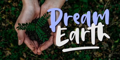 Dream Earth is a cool, brushed, and relaxed handwritten font. This font is suitable for designs such as t-shirts, sportswear, logos, advertisements, clothing, and more So what's included : Basic Latin A-Z & a-z Numbers, symbols, and punctuations Ligatures and swashes Accented Characters : ÀÁÂÃÄÅÆÇÈÉÊËÌÍÎÏÑÒÓÔÕÖØŒŠÙÚÛÜŸÝŽàáâãäåæçèéêëìíîïñòóôõöøœšùúûüýÿžß Thank you
 - Fd Neueral by Fortunes Co,
$- Neueral is a semi-round and geometric sans serif font, with flexibility and modern every glyphs, neutral font variable so it is very functional in making logo designs, article, wayfinding, system fonts, branding, business cards and many others. There are 18 fonts including Latin simple ligatures
 - Washington Square NF by Nick's Fonts,
$10.00A titling font, combining caps inspired by the work of lettering artist Samuel Welo, and a lowercase based on the work of Lucian Bernhard. Both versions of this font contain the Unicode 1252 (Latin) and Unicode 1250 (Central European) character sets, with localization for Romanian and Moldovan.