10,000 search results
(0.087 seconds)
- Les Folies JNL by Jeff Levine,
$29.00An early 20th-Century French lettering book displayed at an online image sharing site stood out with a hand-lettered version of a classic Victorian font. The lettering - a spur serif top and a split serif (or "Western-style") bottom is the basis for Jeff Levine's Les Folies JNL. All of the nuances and idiosyncracies of hand-lettering are left intact. - Fresh Spring by Putracetol,
$24.00 Fresh Spring - 8 Quirky Spring Font. Fresh Spring is a unique plant font with 7 different versions of the font, the difference between each version is in the shape of the plant decoration. This font is basically soft and fun, coupled with plant embellishments, various shapes and options, will make this font suitable for any project you are working on, especially those with the theme of love, plants, children, babies, weddings, etc. In addition, this font is also suitable for invitation cards, greeting cards, logos, branding, posters, crafting, stickers, social media, packaging, headers, merchandise and others. The alternative characters were divided into several Open Type features such as Swash, Stylistic Sets, Stylistic Alternates, Contextual Alternates, and Ligature. The Open Type features can be accessed by using Open Type savvy programs such as Adobe Illustrator, Adobe InDesign, Adobe Photoshop Corel Draw X version, And Microsoft Word. This font also supports multiple languages.
 - ITC Minska by ITC,
$29.99ITC Minska is the work of Carl Crossgrove, who used a combination of upper and lower case shapes together to create new letter forms. Crossgrove created unconventional yet immediately recognizable variations in two different alphabets, which cannot quite be classifed as upper and lower case in themselves. With opulant curves and sharp angles, ITC Minska projects an unorthodox energy which is ideal for unusual effects and display settings. - Bandera by AndrijType,
$21.00 This square serif typeface is a real workhorse. It is a modern tool for text design: extremely legible and well shaped. Bandera has six weights with original italics. It catches attention in headlines of posters and magazines or makes reading comfortable in plain texts. Bandera shares main proportions with sans serif Osnova Pro typefamily so ideally can pair it. It has Bandera Text and Bandera Display sister families as well. Please check also Pro version for pan-european support (full Latin-Greek-Cyrillic). Bandera is Spanish for ‘flag’. And Bandera is a symbol of Ukrainian fighting for freedom for many years.
 - Hogar Slab by Latinotype,
$39.00 Hogar Slab, based on the Hogar typeface, is the result of combining a script and a slab serif into a single type system. The system has a monolinear style composed of a slab serif and a script slab serif version that share similar proportions, weight interpolations and details. Hogar Slab is basically a slab serif with script gestures and a script with slab serif shapes. In order to make the system more complete, I included an italic version, which represents a transition between both main styles. Additionally, I developed a set of patterns including some furniture designs by well-known architects.
 - Divan Arabic by Naghi Naghachian,
$64.00 Divan Arabic is a new creation of Naghi Naghashian. Divan Arabic is a modern Sans Serif Headline font. This innovation is a contribution to modernisation of Arabic typography, gives the font design of Arabic letters real typographic arrangement und provides more typographic flexibility. Divan Arabic supports Arabic, Persian and Urdu. The highest degree of calligraphic grace and the clarity of geometric typography. This typeface offers a fine balance between calligraphic tradition and the Sans Serif aesthetic common in Latin typography. Divan Arabic design fulfills the following needs: A. Explicitly crafted for use in electronic media fulfills the demands of electronic communication. B. Suitability for multiple applications. Gives the widest potential acceptability. C. An attractive typographic image. Divan Arabic was developed for multiple languages and writing conventions. Divan Arabic supports Arabic, Persian and Urdu. D. The highest degree of calligraphic grace and the clarity of geometric typography. This typeface offers a fine balance between calligraphic tradition and the Sans Serif common in Latin typography.
 - Megatropolis by Just My Type,
$35.00 Introducing Megatropolis : intellectual, architectural, urban and urbane. What started as an idea where the counters would be letters (3 scribbled glyphs on a piece of scrap paper), has grown into a mighty font family of eight stackable fonts. First came Megatropolis itself, a Deco font within a Deco font; Double Deco, you might say. In Illustrator, you can deconstruct it to make solid letters, outline letters or just the inset letters on their own, and you can stack them how you wish. Or you can get the whole Megatropolis family with Black , Outline , Inset , Smog , Shade and Shade with Inset and keep them all separate stackable, editable fonts. In addition, there’s Megatropolis Benday (available in TT only), with its fabulous stackable comic dots. Megatropolis is a typographer’s playground.
 - Hillary Dream by Arendxstudio,
$14.00 Introducing a new font called Hillary Dream - Handwritten Font inspired by urban fonts with sharp and beautiful letters that create fonts that are modern, trendy and elegant. Hillary Dream came with opentype features such stylistic alternates, stylistic sets & ligatures good for logotype, poster, badge, book cover, tshirt design, packaging and any more. Features : • Character Set A-Z • Numerals & Punctuations (OpenType Standard) • Accents (Multilingual characters) • Ligature
 - Broone by Asenbayu,
$15.00 Broone is a stunning versatile decorative display font. The proportion of wavy shapes with serif outlines can add a youthful and natural touch to any design project. You can use this font in modern and retro designs. This font is suitable for attractive packaging label designs, unique desired logos, poster designs, fashions and much more. This font contains standard glyph, alternates, ligatures, symbol, punctuation and multilingual supports.
 - Kagok by Twinletter,
$15.00 Introducing Kagok Blackletter font Kagok is typography designed with a classic blackletter font style, resulting in a bold and unique anatomical shape. Kagok is a strong and vintage font inspired by the classic Victorian typeface style combined with a strong style so that it looks bold in your projects. This font is perfect for use on projects that need a futuristic, vintage, and elegant style.
 - Soothing by Twinletter,
$14.00 Soothing is a signature font created in elegant modern handwriting, with a natural and stylish flow. This font has the perfect shape for your personal branding and business casual designs. This font is perfect for business cards, photography studios, signatures, interior designs, names of models, coffee late, traveling, weddings, cosmetics, jewelry. Start using this font to add an authentic and heartfelt vibe to any design project
 - Comet Hotspur by Putracetol,
$28.00 Comet Hotspur - Display Typeface Font is a bold and distinctive font that seamlessly blends modern and retro aesthetics. With its unique character shapes, bold strokes, and alternative letterforms, this font offers a captivating typographic solution. The font exudes a retro bold and vintage vibe while maintaining a fresh and contemporary edge. Whether you're creating logos, branding materials, titles, posters, film graphics, cards, quotes, or landing page titles.
 - Heroline by Graptail,
$15.00 Introducing Heroline, a retro-inspired font that evokes the 1950s to 90s nostalgia. This font is perfect for creating vintage-themed designs and giving it a touch of nostalgia and personality. Heroline features a soft, solid design with curved corners and a unique letter shape. This font also includes a variety of alternative characters and ligatures, allowing you to create many different looks with the same font.
 - Griaste by Twinletter,
$18.00 Griaste Groovy is a cool, quirky, and fun font that can be used in many ways in your special projects. It has high contrast between thin and thick lines and shapes, which makes it beautiful and visually unique from many existing fonts. This font has alternate and ligature features to add a quirky feel to your project. Maximize your design by using this font right now.
 - Svarge by Scratch Design,
$9.00 Introducing our new font Svargé A Modern Elegant Sans Serif Font Svargé is a Modern Elegant Classic font with beautiful shape on each character, come with special alternative glyphs, and has multilingual support. Svargé it's a very versatile font that works great in large and small sizes with any background colors. Svargé is perfect for Magazine Headlines, Branding Projects, Logo design, Clothing & Fashion Branding, and Product Packaging.
 - Planet Benson 2 - Unknown license

- Lhont Down by Alit Design,
$15.00 Introducing Lhont Down Typeface The Lhont Down font is designed with a serif font concept that has a decorative display style. Irregular dynamic shapes but impressively bold and unique make the font "Lhont Down" different and steal attention. The "Lhont Down" font has 2 font styles, namely decorative ones with irregular shapes with standard or normal font styles. Can be combined so that the designed design has a different rhythm. The lhon Down font is perfect for serious or non-serious design concepts, also suitable for classic retro designs, fashion, pop designs and so on. Serif typefaces such as "Lhont Down" are very easy to apply to any design, especially those with an retro and classic concept, besides that this font is very easy to use both in design and non-design programs because everything changes and glyphs are supported by Unicode (PUA). The "Lhont Down"contains 692 glyphs with many unique and interesting alternative options.
 - Pandtos by dayflash,
$31.99 Pandtos is a clear sans serif typeface based on geometric shapes. Precise lines and accurate curves are the main characteristics of this fresh and modern font family. While unique letterforms constitute Pandtos’ distinctive appearance, extended widths, tall x-heights and clear shapes provide good legibility and nice readability even at smaller sizes. With its contemporary feel, Pandtos is suitable for almost any type of analogue and digital application. The Pandtos font family includes unique letterforms, exclusive ligatures and extensive OpenType features. Pandtos comes in four weights with matching italics.
 - Snippity Snap by Hanoded,
$15.00 Snippity Snap is a font made up of glyphs I cut out from black paper with some household scissors, then pasted onto white paper. When I was cutting out the shapes, my children asked me what I was doing, and when I told them, they thought it was pretty cool and started cutting out shapes from paper themselves. The result is a house filled with paper cuttings, which I keep finding everywhere - even in my bed. Snippity Snap is a very nice font for ads, book covers, packaging and children's books. Enjoy!
 - SK Clumster Sans by Shriftovik,
$32.00 SK Clumster Sans is an extravagant multilingual geometric grotesque, developed under the impression of the unique and exciting aesthetics of font design. Its structure is enlivened by an innovative combination of geometric and organic shapes that transform the familiar letter pattern. SK Clumster Sans creates a unique visual impression through a combination of shapes, a large symbolic and weights set, in addition to lively and dynamic angles and lines. The font is suitable for creating original design works that reflect the creative potential of the author and his bold experiments in the field of design.
 - Go by Canada Type,
$24.95 Five years into the 21st century and the promise of nanotechnology, high-end popular culture design seems to thrive on combining opposites and drawing a fine line between traditionally contradictory ideas. This is seen in modern society's usual cultural frontrunners - like consumer electronics, fashion items, music packaging and publications, where it is evident that traditionally complex marketing statements of fashionability and lifestyle are attempted with simple minimalism. But at the typographic end of this realm, the creative majority still uses old faces that help the modern statement only in passing. Some of the more adventurous creative professionals actively seek new elements to emphasize contemporary impact in their modern design. To those adventurous types (pun intended), Canada Type presents this new face called Go. It is very much a child of the new millennium, inspired by the unmistakable minimalist style of modern 21st century corporate logos, recent design shifts in electronic music and club-marketing collateral, and disc jockeys who have enthusiasm, energy, precision and total control of each and every vibration traveling from mixer to speakers. Go is an original modern techno-lounge face that offers the eyes pleasing collages of friendly minimal forms that give the words an impression of simplicity and depth at once. This is a font that prides itself on its precise grouping of elements and just enough original creativity in combining those elements. The precision builds the sharp edge sought for modern statements, while the creativity keeps the message rejuvenated, clear and interesting. Go's character set consists of a versatile and unexpected, yet mild mix of the uppercase and lowercase forms, with multiple variations on the majority of the letters. The e being a vertical mirror of G is only the first of the pleasant surprises. More than 30 alternates are inside the font. All the accented characters in Go have been meticulously (perhaps obsessively) drawn to be unusual for logos and short statements. Take a look at the character map and be ready for a space-age surprise. To borrow a Star Trek cliché, this font can Go where no font has gone before.
 - Mishega by Mega Type,
$12.00 Mishega Script is modern calligraphy font, including Regular. This font is casual and pretty with swashes. Can used for various purposes. such as logo, product packaging, wedding invitations, branding, headlines, signage, labels, signature, book covers, posters, quotes and more. Feature: · All Uppercase and Lowercase · Alternates and Ligatures · Numbers & Symbols · Supported Languages · Substitutes and Binders · PUA Encoded Have fun using Mishega!!! I really hope you enjoy it! Feel free to follow, like and share. Thank you so much for checking out my shop!
 - Corner C by CarnokyType,
$20.00 Corner C is a part of Corner type family. This subfamily is designed with rounded shapes in the corners. The concept of the typeface Corner is based on variation of corner shapes in font characters, from what is also its name derived. The basis is a bitmap modular principle, to which by simple addition of “the missing pixels” in corners of the characters ( Corner A ) to the shape of diagonal ( Corner B ), curvature (Corner C), or inversion curvature ( Corner D ), three more font variations are created. The basic monolinear bitmap weight is supplemented by two more extreme thicknesses – hairline and fat weight. The character set supports the complete Latin, while the x-height of lowercase is drawn at the same height as in the uppercase characters. Corner is a strong display typeface, which allows you to easily experiment and to combine it with its mutual font variations.
 - Corner D by CarnokyType,
$20.00 Corner D is a part of Corner type family. This subfamily is designed with inverse rounded shapes in the corners. The concept of the typeface Corner is based on variation of corner shapes in font characters, from what is also its name derived. The basis is a bitmap modular principle, to which by simple addition of “the missing pixels” in corners of the characters ( Corner A ) to the shape of diagonal ( Corner B ), curvature ( Corner C ), or inversion curvature (Corner D), three more font variations are created. The basic monolinear bitmap weight is supplemented by two more extreme thicknesses – hairline and fat weight. The character set supports the complete Latin, while the x-height of lowercase is drawn at the same height as in the uppercase characters. Corner is a strong display typeface, which allows you to easily experiment and to combine it with its mutual font variations.
 - Corner A by CarnokyType,
$20.00 Corner A is a part of Corner type family. This subfamily is designed with square shapes in the corners. The concept of the typeface Corner is based on variation of corner shapes in font characters, from what is also its name derived. The basis is a bitmap modular principle, to which by simple addition of “the missing pixels” in corners of the characters (Corner A) to the shape of diagonal ( Corner B ), curvature ( Corner C ), or inversion curvature ( Corner D ), three more font variations are created. The basic monolinear bitmap weight is supplemented by two more extreme thicknesses – hairline and fat weight. The character set supports the complete Latin, while the x-height of lowercase is drawn at the same height as in the uppercase characters. Corner is a strong display typeface, which allows you to easily experiment and to combine it with its mutual font variations.
 - Corner B by CarnokyType,
$20.00 Corner B is a part of Corner type family. This subfamily is designed with diagonal shapes in the corners. The concept of the typeface Corner is based on variation of corner shapes in font characters, from what is also its name derived. The basis is a bitmap modular principle, to which by simple addition of “the missing pixels” in corners of the characters ( Corner A ) to the shape of diagonal (Corner B), curvature ( Corner C ), or inversion curvature ( Corner D ), three more font variations are created. The basic monolinear bitmap weight is supplemented by two more extreme thicknesses – hairline and fat weight. The character set supports the complete Latin, while the x-height of lowercase is drawn at the same height as in the uppercase characters. Corner is a strong display typeface, which allows you to easily experiment and to combine it with its mutual font variations.
 - Big Bangs by 4RM Font,
$32.00 Big bangs font is made with letter anatomy that looks very unique with a characteristic bulging shape and very large weight size, inspired by explosions, this font looks big and dangerous as well as unique, suitable for use in graphic designs such as stickers, posters, covers, labels, and others.
 - Skywalking by The Bigmind Designs,
$4.99 The Skywalking font is inspired by sci-fi movies and video games. It purposely avoided the us of curves and preferred the sharp edges to get a more robot aesthetic into it. Designed by Mark Silva, the font is suited for logos, company branding, game titles and shirt designs.
 - Marigold by Monotype,
$29.99Originally designed by calligrapher Arthur Baker, Marigold font was released by Agfa Compugraphic in 1989. Marigold font is narrow in width like the chancery hand, and its shapes are true to the prescribed Renaissance proportions. The authentic handwritten look makes it versatile for a large variety of informal uses. - Black Bruno by Subectype,
$18.00 Black Bruno is a supercharged, street-wise brush font bursting with energy. It includes extra attention to quick strokes and sharp details. This font is perfect for challenging jobs, titles, t-shirts, websites, hoodies, clothing, headline, logotype, branding, advertising, event and various print and digital media with energy.
 - Popstick by Creativemedialab,
$14.00 A simple and cool retro, pop art, stylish font for your design. Popstick has a modern, clean and fresh look with nice perfect rounded shapes. This font is best suited for commercial and editorial uses like advertising, apps, sports brand, packaging, logos, headers, corporate identity and much more.
 - Carrosserie by Letterwerk,
$27.00 Carrosserie is made for display use, inspired by the shapes of the ’30s. It is a capital letter font with alternate characters and special domain symbols (check the PDF in the gallery for details). The font is now available in thin, extra light, light, regular, medium, bold & fat. Enjoy!
 - Violenta Slab by Graviton,
$12.00 Violenta Slab font family has been designed for Graviton Font Foundry by Pablo Balcells in 2015. It is a display, geometric typeface, with a condensed design and sharp angles that provides an aggresive and strong appearence. Violenta Slab consists of 8 styles. Each containing glyph coverage for several languages.
 - Gafeniv by Rvandtype,
$10.00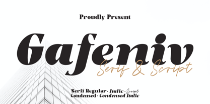 Gafeniv is Duo font Serif & Script. It has a elegant, and modern look which can be used for logos, establishing brand identities, crafting invitations, creating stunning stationery, shaping wedding designs, or producing eye-catching social media posts. Features: 5 Styles Font Numbers and punctuation Multilingual PUA encoded Thank You
 - Cracksmoon by Zamjump,
$15.00 Cracksmoon was hand-drawn with a marker pen and converted to font - and like the marker, it has natural edges and realistic shapes. Includes bonus ligatures and style swashes. Perfect for designs where you need a font that's a little rougher around the edges. Including : Alternate Multilingual support
 - Break Snooze by Crumphand,
$30.00 Introducing, Break Snooze fonts. Break Snooze have a unique shape, rounded and fun. Comes with 3 style Regular, Outline and Extrude, then can mix and match with Stylistic Set. What's Included Inside The Fonts ? Uppercase Lowercase Symbols Numerals Stylistic Set 1 Stylistic Set 2 European Multilingual Thank you, Regards!
 - Bolgate by Arsa Visual,
$9.00 Bolgate is a beautiful caligraphy font. This font works really well for Logos & Apparel Design. It's also great for creating Prints or Merchandise, as you can use the illustrative qualities of the shapes to create an art piece. Product includes: • Stylistic Alternates of Uppercase and Lowercase • Ligatures • Swash
 - Rational TW by René Bieder,
$39.00 Rational TW is the typewriter addition to the Rational family. It is a monospaced font building on the same principles as its proportional, neogrotesque brother, such as maximum legibility and flexibility while combining Swiss and American gothic elements with a modern aesthetic. Due to the monospaced environment, some of its letter shapes like “r”, “m”,“f”, “i” and “w” have been slightly adapted but kept the same in appearance. Rational TW comes in two version: Rational TW Display and Rational TW Text. As indicated by its name, Rational TW Text is not limited to, but works best in small font sizes because it features distinctive letter shapes like a double storey “a” or “g” in order to help differentiate similar glyphs in small sizes. Rational TW Display, on the other hand, creates a geometric uniformity by implementing round shapes in “a” and “g”, giving it a subtle friendly and open character. Unlike many other monospaced fonts, Rational TW has a large amount of opentype features like small caps, alternative glyphs, case sensitive shapes, and many more making it the perfect choice for countless scenarios. With more than 700 glpyhs per font, it performs excellently in any project from print to digital.
 - Winter Glows by Fargun Studio,
$14.00 Thanks for checking out Winter Glows! A fabulously fun yet elegant script font with tons of energy, allowing you to create beautiful hand-made typography in an instant. With extra bouncy curves & loops, Winter Glows is guaranteed to make your text stand out - perfect for logos, printed quotes, invitations, cards, product packaging, headers and whatever your imagination holds. What's really awesome is that Winter Glows comes with a complete set of lowercase alternates, which allows you to create even more authentic custom-feel text. Another great feature is the bonus ornaments font, which allows you to add some really unique and elegant finishing touches to your script text. Winter Glows Family includes 5 font files; Winter Glows • A handwritten script font containing upper & lowercase characters, numerals and a large range of punctuation. Winter Glows Alt 1 • This is a second version Winter Glows, with a completely new set of both lower and uppercase characters. this versions do not contain as many glyphs as the Regular style. If you wanted to avoid letters looking the same each time to recreate a custom-made style, or try a different word shape, simply switch to this font for an additional layout option. Winter Glows Alt 2 • This is a second version Winter Glows, with a completely new set of both lower and uppercase characters. this versions do not contain as many glyphs as the Regular style. If you wanted to avoid letters looking the same each time to recreate a custom-made style, or try a different word shape, simply switch to this font for an additional layout option. Winter Glows Alt 3 • This is a second version Winter Glows, with a completely new set of both lower and uppercase characters. this versions do not contain as many glyphs as the Regular style. If you wanted to avoid letters looking the same each time to recreate a custom-made style, or try a different word shape, simply switch to this font for an additional layout option. Winter Glows Extras • A set of hand-drawn swashes & doodles, the perfect finishing touch to underline your Winter Glows text & doodles for perfect lettering logos. Simply install this as a separate font, select it from your font menu and type any A-Z, a-z & 0-9 character to create a swash & Doodles. Standard Ligatures • Are also available for several lowercase characters (double-letters which flow more naturally). Ligatures will automatically replace the standard letter pairs whenever available, when using any OpenType capable software.
 - Bourton Text by Kimmy Design,
$25.00 Bourton Text is a modern sans-serif typeface family perfect for both text type settings and display purposes. While it’s not a layering type family like its brother, Bourton, it come packed with features, extras and over 2,000 characters that make it stand on its own. HISTORY Bourton Text is a new take of the Bourton family that was one of the best-selling and favorite fonts of 2016. After countless requests for lowercase alphabet, or suggestions for a font pairing with Bourton, this new text setting family is based on the original shapes of Bourton. DESIGN & CREATION In taking Bourton Base was the starting point as they narrowest width and boldest weight. From there, lowercase shapes were designed that matched the aesthetic and details of the popular capitals. As Bourton was a heavy display font, some small tweaks were done to make it more fitting for smaller text settings, including reducing the letter-spacing and reworking some counters. Some areas needed complete reconstruction, such as the figures. The design of those began anew with a style that worked with the capitals and lowercase but also as a standalone set. Currency shapes were updated to match the numerals. Punctuation was also reimagined to work better in smaller type settings. Diacritics and extended language support was also updated and expanded to include full Latin plus language support for 219 latin based language spoken in 212 countries. Once the basic alphabet for Bourton Text Bold Narrow was formed, the font was expanded in both weight and width. Taking the weight from Bold down to Hairline, it allowed for more range in use. The typeface needed to be expanded in order to reach better as a book weight and width, in addition to a regular width, a wider version was create as well. FEATURES Once the extremes were set in place, small capital forms were designed for text and display purposes. These also allow for nested capital letters, lifted small caps and other display features offered in the typeface. One of the most popular fonts in the Bourton layering font family is Bourton Line. This led to an experimentation with rounded Bourton Text completely and thus a complete set of duplicated characters with rounded terminals. By using the Opentype Panel, a rounded font is a single click away. Every feature has been carefully thought out and updated across the entire font. In total, Bourton boasts over 2,300 glyphs, 42 font files with 3 widths and 7 weights in upright and italic.
