10,000 search results
(0.069 seconds)
- Akon by Ahmet Altun,
$19.00 Akon Font Family comes in 2 weights; Regular and Bold. It is completely hand-drawn. The Akon Font Family has a few ornaments and stylistic alternates, ligatures, small capitals, Scientific Inferiors and so. This font family would fit in your mobile application designs magnificently and is a great choise for poster design. With this font family, you can create eye-pleasing and nice works such as posters, printings, t-shirts, adds, magazines etc.
 - Hello Arfelina by Stripes Studio,
$20.00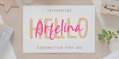 Hi, Introducing the latest styles Hello Arfelina Font Duo with the kind of modern hand scratches, I hope you are interested in this font, if you want to use for your work this font can be used easily and simply because there are a lot of features in it to contain a complete set of letters lower and uppercase letters, assorted punctuation, numbers, and multilingual support. font also contains several ligatures and alternate style Stylistic.
 - William Milner by Silverdav,
$18.00 Introducing “William Milner” a modern Calligraphy font, created because it was inspired by a famous Calligraphy Writing Expert, we made it by adding digital touches to beautify it so that the result is a beautiful and stunning font. The William Milner font has Alternate characters that you can use to complete your design to make it more beautiful and aesthetic. This font is very suitable for branding, logotype, magazine covers, quotes, wedding invitations, and others.
 - Quintaras Signature Script by Maulana Creative,
$14.00 Quintaras is a complete script and sans font duo. With expressive signature mono-line stroke and condensed sans solid and outline stroke, fun character with some of ligatures. To give you an extra creative work. Quintaras font support multilingual more than 100+ language. This font is good for logo design, Social media, Movie Titles, Books Titles, a short text even a long text letter. Make a stunning work with Quintaras font. Cheers, MaulanaCreative
 - Imperial Signature by Silverdav,
$18.00 Introducing “William Milner” a modern Calligraphy font, created because it was inspired by a famous Calligraphy Writing Expert, we made it by adding digital touches to beautify it so that the result is a beautiful and stunning font. The William Milner font has Alternate characters that you can use to complete your design to make it more beautiful and aesthetic. This font is very suitable for branding, logotype, magazine covers, quotes, wedding invitations, and others.
 - !CRASS ROOTS OFL - Unknown license

- FS Shepton by Fontsmith,
$80.00 Handy Andy Andy Lethbridge had only just completed his graphic design BA at the University of Portsmouth when he was spotted by Jason, who’d seen Andy’s exquisite hand lettering at his degree show and on Instagram. Keen to push the handwritten theme further, having recently launched a digitally-created, chalky script font (FS Sammy), Jason offered Andy a job and the chance to develop a suite of more stylised, truly hand-drawn fonts. Andy duly got out his pads, pencils and pens, and started experimenting with styles and textures. Magic followed. Imperfection perfected Most ‘handwritten’ typefaces are created entirely digitally. Not FS Shepton. From the start, the intention was to create a collection of alphabets of similar character but different texture and style – 100% hand-drawn and purposely imperfect, with the kind of inconsistent, organic shapes and textures of market stall signs, dashed off in chalk or paint. FS Shepton Regular, drawn with a wet brush pen, is solid with a rough outer edge and a casual but controlled feel. The dry brush used to create FS Shepton Light gives it more inner texture and a more formal, slanted, calligraphic style. FS Shepton Bold, drawn using a wider, looser dry brush pen, has a woody grain in the middle of its broad strokes and greater solidity where the brush moves more slowly. Fresh as a daisy Think of FS Shepton not as a family of three weights of the same font so much as a collection of three fonts penned by the same author. All of them – the light, regular and bold – were created independently as display fonts that offer something different to labelling, packaging, point-of-sale and advertising. Lovingly crafted by hand, they’re a good match for products and settings that share the same artisinal qualities: organic foods, drinks and healthcare products, as well as premium chocolate, coffee and condiments.
 - PAG Smoke by Prop-a-ganda,
$19.99Prop-a-ganda offers retro-flavored fonts inspired by lettering on retro propaganda posters, retro advertising posters, retro packages all the world over. This is perfect font for your retrospective project. PAG Smoke is very heavy geometric font. Its unique shape is like a monster for your design project. - Aguero Sans by Craft Supply Co,
$15.00 Aguero Sans – Font Family is a modern serif font family whose design refers us to the style of modern sans serif. The distinctive features of Aguero Sans – Font Family are the relatively low contrast of strokes, the slightly squarish shapes of round characters and the emphasized business like simplicity.
 - Aloyesia by Eotype,
$16.00 Aloyesia is a condensed serif display font that has beautiful curves. This unique font is perfect for creating beautiful logotypes, stunning magazine designs and more. Aloyesia provides a collection of glyphs with unique shapes. With alternative styles and ligature features, this font is perfect for complementing various projects.
 - AT Hazchel by Amera Type,
$15.00 Hazchel was inspired by experimental fonts that we visualized subconscious shapes capable of immersing our souls even more deeply . The decorative typeface makes this font easy to read and thus acquires a modern value for titles, signage and more decoration. This font also comes with 80+ special ligature style
 - Ameo by artsterdam,
$5.00 Ameo is a modern sans-serif font with flowinglines with sharp edges. The font has three sizes: bold, regular and light. Uppercase, lowercase letters, as well as numbers and symbols are included. Ameo is a simple font and has a modern look, so it will suit many projects
 - Feogra by limitype,
$20.00 Feogra is a font inspired by the geometric shape of a robot designed in a modern style that makes this font look futuristic and unique, suitable for your modern design and requires a bold and prominent typeface. This font can also be applied to posters, magazines, etc. Feautures: All Caps Font Numbers Symbols Multilingual
 - Jhaneponto by Liartgraphic,
$18.00 Jhaneponto is a display font with a hint of a modern blackletter style. Jhaneponto font is suitable to use for logos, titles, landing pages, leaflets, and others. With its shape and uniqueness, you will definitely like this font! This font is PUA encoded which means you can access the available glyphs and swashes with ease!
 - Karmina by TypeTogether,
$49.00 Karmina is a text typeface developed mainly for pocket books and budget editions. It was built to withstand the worst printing conditions: low quality papers, high printing speed with web presses and variations in the ink level of the printing press. Some of Karmina's most representative features are the rather large serifs, intended to work perfectly in small reproduction sizes, the sharpness of the shapes, including some calligraphic reminiscences, and the large and yet graceful ink traps in the acute connections. Structurally, Karmina combines a significantly large x-height with relatively compressed letterforms. The result of these features grants Karmina outstanding legibility and economy. Karmina features four weights and 800 characters per weight, including small caps, discretionary ligatures, fractions and a complete range of numerals for every use. It also supports over 40 languages that use the latin extended alphabet. Karmina was selected in the text typography category at the Letras Latinas exhibition 2006 and won a merit in the European-wide ED-Awards competition 2007. Karmina Basic is a reduced version of Karmina. It is still an OT-font but without any particular features except of a set of ligatures, class-kerning and language support including CE and Baltic.
 - Kaat by ChrisNuijen.com,
$29.00 Kaat is a new type (2013). It was designed by Chris Nuijen and named after his daughter Kaat. It represents the period in which everyone has their face behind the latest mobile phone screen or interactive games console. "Kaat"is slick, modern and progressive, to reflect our busy immediate life style, whilst providing the essentials in a period where people can be judged on television. Kaat is here to stay and to evolve. Everyone wants to try to be that little bit different, but essentially we are all the same, with the same inherent needs, just like babies or children. We need to be fed, watered, nurtured and loved, the only difference is in today's world you can do all that from behind a screen. "Kaat" bridges that gap, transcending the basic needs of type, with the sophistication and fast paced sharpness of today, everyone wants to be different but we all stay the same, this is a reflection in the thickness and shape of each glyph. The font represents how we are molded and cast differently in yet we still stay the same, because we need the repetition! Everything needs to be done quicker, simpler and cheaper. We eat we sleep we communicate.
 - deccodisco - Personal use only

- Progeny by Type Associates,
$35.00 Progeny is a single-stroke freehand informal script that began life as a logo for a fast food company. That logo was rejected but when I added a suite of swash caps and a few extra ligatures and my trademark underlines it all started to come together as a font. Then I used it successfully for another logo and I proceeded to complete the weight variations that emerged during the first logo design, rounding the lighter weights to give a more friendly, softer look. That treatment didn't suit the bold weight but sharp corners did not detract from the robust, legible headliner that emerged. All weights work in all-lowercase, all-capitals, lowers with swash or regular initial caps and surprisingly – in all-caps with swash initials.
 - Stencil Moonlight by Linotype,
$29.00Latvian designer and educator Gustav Grinbergs created Stencil Moonlight as an attempt to slightly lighten up the stencil type scene. Intended as a lively, semi-formal face, its shapes are smooth and compact. It leaves a very heavy feeling on the page, as its letters display a very fat bold design. Stencil Moonlight is available is two separate font styles, Regular and Small Caps. When used together, the Stencil Moonlight family can create the perfect combination for your next display need. Stencil Moonlight works best in larger sizes, where it is clear that its forms stem from an experiment with stencil design. Grinbergs recommends the face for application in package design, advertising, poster design, and perhaps even for the subtitling of foreign films! - Boboli by Stefano Tonti,
$35.00 The Boboli garden in Florence (16th century) is one of the first examples of Italian renaissance garden, where nature was shaped into geometric beauty; the Boboli font was designed in the same spirit, filtered by a Modernist view. It comes in two sets, Autumn/Winter and Spring/Summer: by mixing them you can compose the typographic season of your choice. From the geometric, minimal Fall/Winter set stem the leaves of the baroque-esque Spring/Summer set, with many stylistic alternatives that allow perfect matching. The two opposite styles merge perfectly, because the leaves are not mere decorations but organic part of the structure, achieved by sampling the curves of the basic glyphs. With Boboli design meets nature, Bauhaus goes greenhouse.
 - OT Replica by OzType.,
$35.00 Replica seamlessly blends organic and geometric elements to create a captivating geometric grotesque font that draws its creative essence from the principles and design philosophy of organic architecture. Replica's journey towards this harmonious equilibrium begins with a deep exploration of organic architecture, a design philosophy that celebrates the integration of the built environment with the natural world. Drawing inspiration from the works of architects like Frank Lloyd Wright and Antoni Gaudí, Replica seeks to capture the essence of flowing lines, biomorphic shapes, and the seamless fusion of structure and surroundings. At the heart of Replica's design process lies a commitment to translating these organic principles into a typographic form that resonates with viewers in a way that is both visually captivating and functionally versatile.
 - Oblik Classic by Tour De Force,
$25.00 Like Refused said in their song ”The Shape of new Punk to come”, Oblik could be “The Shape of new Fonts to come”. We present to you our uprising star - Oblik - that could shine in your monitors. Modern family, stylish and secure, with its own personality (it’s photogenic, too), available for all kinds of use, even if you're a doctor or policeman or butcher or truck driver or maybe rock star, this font will rock your world.
 - Sanshiro by Kereatype,
$19.00 Sanshiro is a geometric sans serif font family. Contain 9 weights from Thin to Black with matching Italics. Sanshiro Normal character shapes have optimized proportions and an improved balance perfect to use for text and the heavyweight has a strong character have a unique style with a smooth shape to use for any display. Sanshiro font can improve and be used for any display media to support your visual design. Latest Update: Version 2.001 • PUA Code update • PostScript hinting
 - ZT Kofimoya by Zelow Type,
$14.00 ZT Kofimoya is a brand new font that offers two distinct styles to choose from. The first style features a stiffer sans concept with a somewhat square shape, giving it a modern and assertive appearance. The second style is a normal sans, with a slightly rounded shape, providing a softer and friendlier look. With these two different styles, ZT Kofimoya offers flexibility in design and can be used for a variety of purposes. Thanks for using this font ~ Zelowtype
 - Gaufre de Bruxelles by TypeAddiction,
$10.80 TypeAddiction presents “Gaufre de Bruxelles”, a playful handmade uppercase font. Lowercase letters have filled letters (A, B, D, O etc) and the uppercase letters have unfilled letters. "Gaufre de Bruxelles" means a Brussels waffle in English. The Brussels waffle is a rectangular-shaped waffle and is a Belgian culinary speciality. The characters of the font were inspired by the waffle dough and more specifically the shape that the dough takes when it is poured into the waffle iron.
 - Evuschka by Petra Sucic Roje,
$33.00 A dramatic contrast between thick and thin strokes, “ball” shapes at stroke terminals, and straight hairline serifs are main Evuschka characteristics. In this font, the x-height is specifically accentuated in relation to body height. In spite of its extreme geometrical shape, Evuschka exudes fairytale romance. Belonging to decorative type fonts, it is best suited for headlines, titles, and small amounts of text in large sizes. Evuschka was selected for TDC Certificate of Typographic Excellence 2017.
 - Lil Baby by Nantia.co,
$16.00 Lil’Baby Script Font is a romantic, modern calligraphy typeface, which supports Extended Latin and Greek characters. This font does not only contain a complete set of lower and uppercase letters, punctuation, numbers, but also a set of ligatures. Equally important is the fact that the font has diacritics for multilingual support. Of course, with this typeface, you have access to a complete Greek set of characters, with diacritics and Greek ligatures. Lil’Baby Script is a high-quality calligraphy font that can infuse any project with romantic vibes. Lil’ Baby Script is the perfect wedding font if you want to achieve a dreamy style on your wedding invitation. For a soft, elegant style, you can pair the font with a pastel color palette and creamy papers. Of course, this modern script font is perfect for your graphic design needs like social media quotes, blog headers, posters, stationery, and why not branding, packaging, and logotypes. In addition, this calligraphy font is ideal for the fashion and apparel industry, if you want to achieve a classic chic, yet modern style.
 - Shizzle by 38-lineart,
$15.00 Shizzle is a font with a graffiti marker style. The lettterform of ‘Shizzle’ essentially made by the combination of downward and upward stroke base on -15 degres angle guideline. The basic of downward stroke is pulling pen from the top left to thw bottom right with full width of marker, then the basic shape of upward stroke look like the ligh flick by using the tip of the pen from bottom right to the top left. Inspired by Hip Hop and Rap style style. ‘Shizzle’ is a slang way of saying "Sure". People generally use it to communicate agreement to another person. This term is a product of Snoop Dogg's penchant for replacing the end of words with "izzle" to sound cooler. And ‘Fo Shizzle’ (for sure) this font offers beautiful typographic harmony for a diversity of design projects, including logos & branding, social media posts and advertisements, especially with graffiti look.
 - Lectio by Eurotypo,
$14.00 Lectio is a Roman font based on a Venetian Renaissance early typefaces, but with a modern and expressive design. His obvious calligraphic influence favors continuous text reading. The generous internal "eye" gives Lectio an appropriate legibility, its soft and organic modulation avoids fatigue, its robust character is attractive and stimulating in large bodies, especially for use in headlines. Lectio comes in two versions: Lectio and Lectio B. Lectio has seven weight and their corresponding slanted variables (true italics). Lectio B is composed only of Italics in six weight. The ascenders are slightly lower, the descending are more regular and the oblique trace of some letters have a more constant rhythm. Each of these faces has the optimum amount of contrast agains the background and clear and open internal letter shape. These fonts include diacritics for CE languages, Old Style figures, standard and discretional ligatures.
 - Plinc Kerpow by House Industries,
$33.00 Inspired by the hand-lettered sound effects found in comic books, Dave West takes a three-dimensional deep dive into the genre with his extensive onomatopoeic alphabet originally designed for Photo-Lettering, Inc. The sonorous voice of Kerpow’s caps captures “cartoon” brilliantly, while the accompanying lowercase provides options for broader applications. Turn to Kerpow for eye-catching children’s book covers, fast casual restaurant marketing, or family fun centers, and…BAM!…all eyes will be on your design. Originally drawn in the late 1960s, Kerpow was digitized by Allen Mercer in 2011. Please note that the shaded version of the typeface is composed by layering the Regular font and a separate Drop Shadow font. Some assembly required. Like all good subversives, House Industries hides in plain sight while amplifying the look, feel and style of the world’s most interesting brands, products and people. Based in Delaware, visually influencing the world.
 - Core Sans C by S-Core,
$20.00 Core Sans C family is a part of the Core Sans Series, such as N, M, E, A, D, G, R and B. Core Sans C is inspired by classic geometric sans (Futura, Avenir, Avant Garde etc.). It is based on geometric shapes, like near-perfect circle and square. It has a much higher x-height (height of lowercase letters), an effect which promotes readability especially at small print sizes. The Core Sans C Family consists of 9 weights (Thin, Extra Light, Light, Regular, Medium, Bold, Extra Bold, Heavy, Black) and Italics for each format. Core Sans C supports complete Basic Latin, Cyrillic, Greek, Central European, Turkish, Baltic character sets. Each font includes proportional figures, tabular figures, oldstyle figures, numerators, denominators, superscript, scientific inferiors, subscript, fractions and case features. Core Sans C is an ideal font family for use in magazines, web pages, screens, displays, and so on.
 - Aprek Febux by Twinletter,
$15.00 "Welcome to the vibrant and bold world of typography!" Aprek Febux is a display typeface that adds sharpness, aggressiveness, and excitement to your projects. Aprek Febux, with its unequaled capacity to generate spectacular displays, is the ideal answer for your diverse variety of visual creations. Aprek Febux offers more than simply lovely letters. This font enables maximum versatility and creativity in every step of your design with excellent features such as ligature and alternate. You may quickly construct one-of-a-kind letter combinations to add a personal touch to your projects. We also recognize the significance of engaging with a worldwide audience. As a result, Aprek Febux supports numerous languages, guaranteeing that your communications are clearly received by everyone on the planet. Enhance your projects with the powerful visual appeal of Aprek Febux. Get this font right away and see how your every design becomes more impressive and stylish!
 - TF Wander Cloud by Teenage Foundry,
$19.00 TF Wander Cloud display typeface fonts – unique and innovative designs that are sure to make your project stand out! Each letter in this font is square, with elegant cuts that give the letters shape. This font is perfect for anyone looking to add a touch of modern elegance to their designs. Our typeface display fonts are designed with precision and attention to detail, ensuring that each letter is perfectly balanced and easy to read. The square shape of each letter gives the font a modern and minimalist feel, while the cuts add an extra layer of sophistication and elegance Features: Uppercase, Lowercase, Numeral, Punctuation & Multilingual. For any questions please contact me 🙂 Thanks!
 - Menor by Twinletter,
$15.00 Menor is a graffiti font with a distinctive and appealing abstract shape that has a unique shape in each character, making this font appropriate for your outstanding project. This font also contains an alternation of enormous letters to beautify your project, so don’t wait. Use this typeface once more to create a lovely and stylish project. This graffiti font is great for product logos, poster titles, headlines, packaging, film titles, logotypes, gorgeous writing, and trendy graffiti designs, among other things. Of course, if you utilize this font in your numerous creative projects, they will be perfect and outstanding. Use this typeface right away for your one-of-a-kind and remarkable projects.
 - Qimzy by Gleb Guralnyk,
$14.00 Hello! Introducing a decorative font — Qimzy. It's a smooth shape bold typeface with seamless sticky effect. This font includes lots of multilingual characters (check out a screenshot with available letters and signs). Thank you and wish you a peaceful sky!
 - Namex by BaronWNM,
$14.00 Namex is a handwritten font with serifs. It tends to be a slab serif style while maintaining the hand-drawn shape, making it look original and non-standard. We recommend you use this font for retro and warm decoration designs.
 - Creepy Face by Forberas Club,
$16.00 This font was created with horror genre inspiration but packed with cute shapes. Also suitable for children's horror story books or cartoons. Or maybe you have something interesting that you are interested in using this font? Hope you like it.
 - Cartoon Town by Creaditive Design,
$14.00 Cartoon Town is a cute comic display font featuring well-shaped characters. It will add an incredibly joyful touch to your designs. Add this beautiful font to each of your creative ideas, and notice how it makes them stand out!
 - Gingerbread by Alexandra Korolkova,
$30.00 Gingerbread is a soft and sweet holiday font with extended character set, inspired by soft shapes of sweets and bakery. It is good for greeting cards and other holiday stuff. Especially for Christmas it has a dingbats companion font — Gingerbread House.
 - Ghost Skeleton by Yoga Letter,
$15.00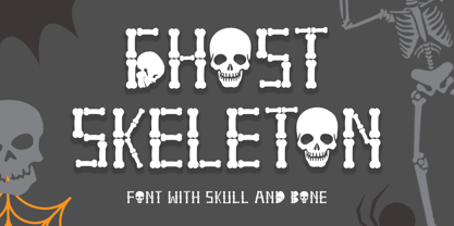 "Ghost Skeleton" is a font made from bones and skull shapes. This font is very simple, easy to use and consists of uppercase, lowercase, numerals, punctuations, and multilingual support. Very suitable for Halloween, comics, movie titles, invitations, social media and more.

