9,281 search results
(0.013 seconds)
- Walftower by Arendxstudio,
$15.00 Walftower - Bold Handwritten Font with its distinctive character that can be easily implemented in your various design projects . Walftowert came with opentype features such stylistic alternates, stylistic sets & ligatures good for logotype, poster, badge, book cover, tshirt design, packaging and any more. Features : • Character Set A-Z • Numerals & Punctuations (OpenType Standard) • Accents (Multilingual characters) • Ligature
 - Chisel Mark - 100% free

- Andada - 100% free

- Signika - 100% free

- Squealer - 100% free

- SF Buttacup Lettering - Unknown license

- SF Buttacup Lettering - Unknown license

- SF Buttacup Lettering Shaded - 100% free

- SF Buttacup - Unknown license

- Fierro by Los Andes,
$16.00 Fierro is a heavy-geometric-retrofuturistic typographic construction that, without any curve, still retains good legibility. These shapes are based on great bended metal pieces, which represent its name, meaning "hardware store". It has been designed to be used in large sizes and for designs with character that look to create a strong visual block. Designed by Jko Contreras.
 - Standard Request by Bogstav,
$18.00 Standard Request is 100% handmade, and was inspired by both grafitti and comic book lettering. When viewed at large sizes, the handmade look and feel really stands out - at the same time, Standard Request, is super legible even at really small sizes. I've added 5 slightly different versions of each letter, and they automatically cycle as you type!
 - Silver Crown by Linecreative,
$16.00 Silver Crown is an Ultra Condensend display font with minimalist characters. It's perfect for logos, name cards, magazine layouts, headers, or even large scale artwork. Silver Crown, a clean sans serif, offers you: 1. Upper and Lowercase characters (All Caps) 2. Ligatures (121 characters) and Stylistic alternates (9 Characters) 3. Multilingual Support (Latin Western Europe), Numbers and Punctuation
 - Penzance by TEKNIKE,
$45.00 Penzance is a display monospace handwriting font. The typeface is a distinct hand drawn font using a fountain pen quill ink style. The Penzance name means "holy headland" in the Cornish language and is derived from the town on the English coast of Cornwall. Penzance is great for display work, invitations, writing, books, posters, logos and headings.
 - Petty Despot NF by Nick's Fonts,
$10.00A typeface named Times Gothic, which made its first appearance in the 1905 ATF specimen book, inspired this headline sans. Use it to add a bit of quirky visual interest to headlines and subheads. Both versions include the complete Latin 1252, Central European 1250 and Turkish 1254 character sets, with localization for Lithuanian, Moldovan and Romanian. - BR Candor by Brink,
$30.00 BR Candor is a geometric sans based on the functional characteristics and raw geometry of early European sans serifs. BR Candor however, is a more modernist interpretation of these classic styles, and its distinctly geometric letterforms produce a strikingly clear and contemporary typographic aesthetic. As the name suggests BR Candor is open, honest and straight talking.
 - Short Message by Arendxstudio,
$14.00 Short Message is a 3 font combination that is suitable for all your design projects that aim to convey your message to your loved ones, with the font packages offered will definitely satisfy you Short Message came with opentype features such stylist ligatures good for logotype, poster, badge, book cover, tshirt design, packaging and any more.
 - Holofernes NF by Nick's Fonts,
$10.00The raw emotional energy of German Expressionism is evident in this font, based on Judith Type, designed by C. H. Kleukens in 1923. This version takes its name from the Biblical character who lost his head to the original font’s namesake. Both versions of the font include 1252 Latin, 1250 CE (with localization for Romanian and Moldovan). - Khayla Almira by Studio Hello Good,
$12.00 Khayla Almira is a clean and elegant sans serif font, this font also provides ligature and alternate letters, this font itself has 6 families, namely regular, line, bold, regular italic, line italic and bold italic. for use as logos, display designs, and also for other purposes, make sure you have this font collection on your device.
 - Originator by TEKNIKE,
$39.00 Originator is a display modular monospace font. The typeface has a distinct technical geometry using sharp angled corners. "Originator" name is derived from Latin and means 'one who first creates or initiates something into existence.' Originator is recommended for display work, branding, logos, technical writing, team sports, aerospace, aviation, automotive, racing, fashion, cinema, architecture, invitations, posters and headings.
 - Mogzilla NF by Nick's Fonts,
$10.00An uncredited typeface discovered within the pages of Alphabete: Ein Schriftatlas von A bis Z named "Fat Cat" provided the pattern for this exercise in minimalist type design. Best used sparingly for inescapable, if somewhat cryptic, headlines. Both versions of this font include the complete Latin 1252 and CE 1250 character sets, with localization for Romanian and Moldovan. - Stove Plate JNL by Jeff Levine,
$29.00 An old printer's advertising cut for Red Star Oil Stoves yielded a typeface that was both vintage and somewhat techno at the same time. Originally drawn as a slanted logo, the individual letters had an array of chamfered, angled and flat sides combined with a bold outline. This font is available in both vertical and oblique versions.
 - Fernburner NF by Nick's Fonts,
$10.00This stunning display face is based on Hans Bohn’s 1929 opus for Gebr. Klingspor, originally named Orplid. One of the treasures discovered in the legendary green vinyl binder that launched Nick’s love of type, it’s a real crowd pleaser. Both versions of this font include the complete Latin 1252, Central European 1250 and Turkish 1254 character sets. - Happy Trip by Vozzy,
$10.00 Introducing vintage label font named Happy Trip. This font has a wide languages support with west european and cyrillic characters (check out all available characters on previews). The font familty has six styles: Regular, Aged, Texture, Outline and three colorful styles. This font will look good on any vintage styled designs like a poster, T-shirt, label, logo, etc.
 - Palo Pinto NF by Nick's Fonts,
$10.00Here’s a typeface with a stance as big as Texas. It’s based on Vincent Pacella’s 1960s oeuvre for Photo-Lettering, Inc. called Pacella Vega Extended 10, and named for a county in Central Texas, home of Possum Kingdom Lake. Both versions of this font include the complete Unicode Latin 1252 and Central European 1250 character sets. - The Morille by Wildan Type,
$15.00 The Morille is display bold serif typeface. The shape is classic and unique style. You can also get more elegant serif in alternate and ligature. With vintage fill It's great for logotypes, wedding invitations, romantic cards, labels, packaging, spelling of names and others. Add to your most creative ideas and watch how they bring them to life!
 - Formosa by Hanoded,
$15.00 Formosa is the old, colonial name for Taiwan. Formosa means beautiful in Portuguese and I think this handwritten typeface has a certain beauty itself. It comes in three styles, all of which make extensive use of ligatures, to give the font an authentic, handwritten feel. Like most of my fonts, Formosa comes with Babylonian language support.
 - Manito LP by LetterPerfect,
$39.00 Manito was designed by Garrett Boge in 1989. He employed a wide pen and angular, sturdy forms to simulate rough-hewn woodcut letters. The font, consisting of both capitals and small caps, provides an ideal graphic complement to collateral of a natural or environmental character. It is named after a native American word for 'Great Spirit'.
 - Falfurrias NF by Nick's Fonts,
$10.00Another in the Whiz-Bang Woodtype series, based on authentic xylographic designs from the late nineteenth century. Named after (surprise!) a small town in Texas. The net effect is a typeface which can add style and warmth to any project. Both versions of this font include the complete Unicode 1252 Latin and Unicode 1250 Central European character sets. - Dime Museum by Solotype,
$19.95This idea of "wrong way weights" was originally called French Clarendon by the Americans, Italienne by the French, and American by the Italians. Sounds like nobody wanted to own up to it. When it was revived by ATF in 1933, it was given the name P. T. Barnum. Many variations have appeared. Dime Museum is an old wood type. - Serid by Samuel Vicente Types,
$22.00 SERID is a display font condensed and regular designed for editorial applications. Inverted contrast, features a serif hybrid that gives a decorative character and personality to the font. Being a display type, intended for use in titles or in small blocks of text, from 24pt. The name SERID comes from the combination of words “SERif” and “hybrID”, resulting SERID.
 - Barely Legal by Vozzy,
$10.00 Introducing a vintage font named Barely Legal. This font was inspired by bootleggers in the 1930s. All available characters you can see at the screenshots. This font has six styles: Regular, Shadow, Texture, Rough, Shadow FX and Texture FX. This font will look good on any retro and mafia styled designs like a poster, T-shirt, label, logo, etc.
 - Neon by Superfried,
$32.50 Neon is an experimental, retro display typeface designed by Superfried. Neon features two styles which can be toggled via shift. As the name suggests styling for the typeface started with classic neon signage, but quickly took a new direction of its own leading to a very distinct and versatile display face. Neon has been featured in Computer Arts magazine.
 - Marcovaldo by Zetafonts,
$51.00 Developed by Andrea Tartarelli as an extension to Calvino typefamily, Marcovaldo is a heavy condensed wedge serif, optimized for display design. The high contrast and rich texture of the old style letterforms marry digital aesthetics in a typeface that is at the same time impactful and refined, with its nod to the Elzevir and DeVinne tradition.
 - ITC Temble by ITC,
$29.99ITC Temble was designed by Andreu Balius and draws influences from the European mediaeval period of King Arthur. The characters combine the angular qualities of mediaeval metallurgy with a modern tempo and the symbols included in the font exhibit the same stylistic forms. ITC Temble is perfect for work which should have a mediaeval or mystical appearance. - Ongunkan Somali Kaddare Script by Runic World Tamgacı,
$100.00 The orthography was invented in 1952 by a Sufi Sheikh, named Hussein Sheikh Ahmed Kaddare. A phonetically robust writing system, the technical commissions that appraised the Kaddare alphabet concurred that it was the most accurate indigenous script and orthography for transcribing the Somali language. Kaddare uses both upper and lower case letters, with the lower case represented in cursive.
 - Loathing by Arendxstudio,
$13.00 Loathing is a bold Display Font with its distinctive character that can be easily implemented in your various design projects . Loathing came with opentype features such stylistic alternates, stylistic sets & ligatures good for logotype, poster, badge, book cover, tshirt design, packaging and any more. Features : • Character Set A-Z • Numerals & Punctuations (OpenType Standard) • Accents (Multilingual characters) • Ligature • Alternate
 - Esperanto by Linotype,
$29.99Franko Luin, Esperanto's designer, on this typeface: Esperanto has a lot in common with classic typefaces, and newer interpretations of the classics. The italic reminds of the lettering idea of the Renaissance and their manuscripts. This typeface's name refers to the international language Esperanto, of course. The font is not compatible with the character set of the Esperanto language - Queen Emirates by Zeenesia Studio,
$16.00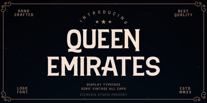 Queen Emirates is a vintage serif font crafted very carefully, Queen Emirates is perfect use for a logo for branding, typography design, badge design, product packaging, invitation, quotes, t-shirt design, label poster, special events and anything that need vintage taste. It came with number & punctuation, stylistic alternate, multilingual support, and PUA encode. Hope you like this product.
 - Allerton by Jeff Levine,
$29.00 Presenting a condensed Art Deco sans serif font with rounded corners and squared inner lines, based on the hand lettered title on the cover of the sheet music for 1944’s “Just A Little Fond Affection”. Allerton JNL is available in both regular and oblique versions, and was named after a neighborhood in the Bronx, New York.
 - Pillow Fight by PizzaDude.dk,
$17.00 A pillow fight is usually quite refreshing, no matter what age you have. And here is a font which has the exact same effect on your designs! The Pillow Fight font is multilingual, handmade and is a kind of fresh unicase with a brushy breeze! Go for sayings, short messages or catching headlines when using Pillow Fight!


